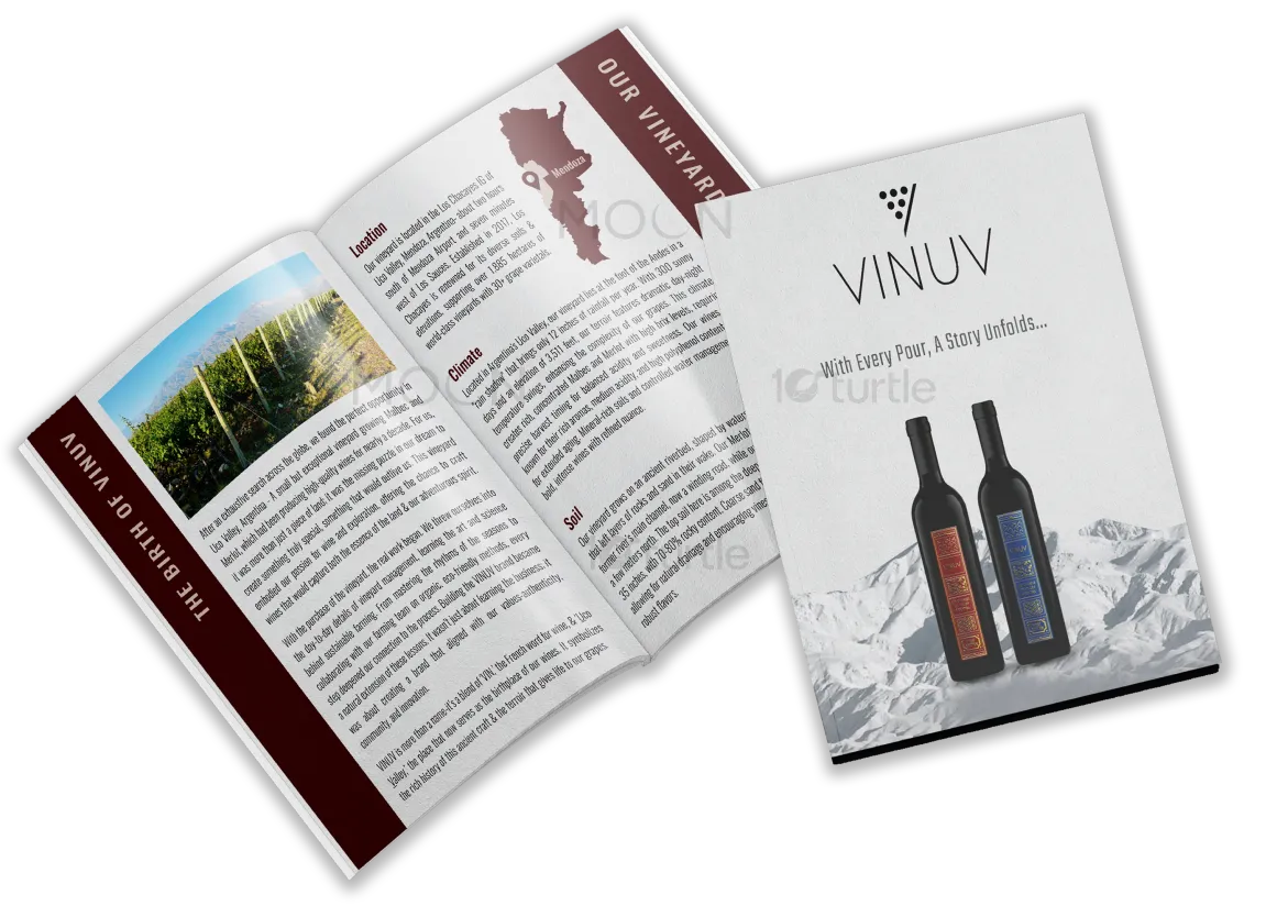
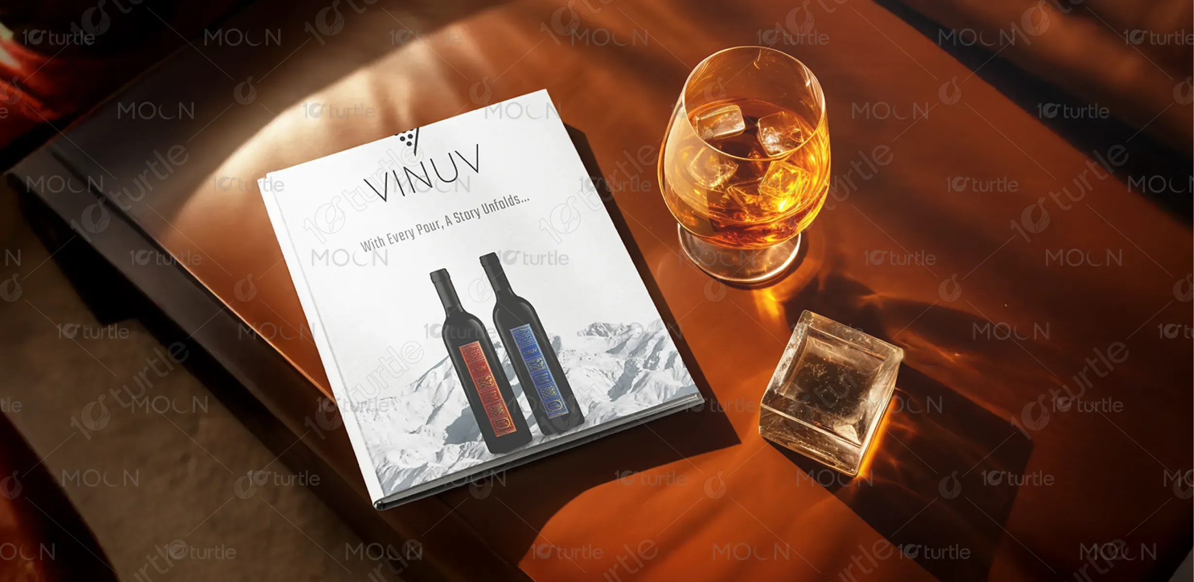
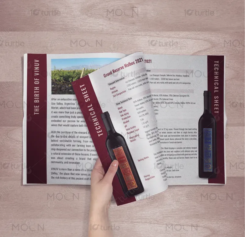
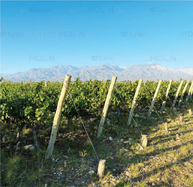
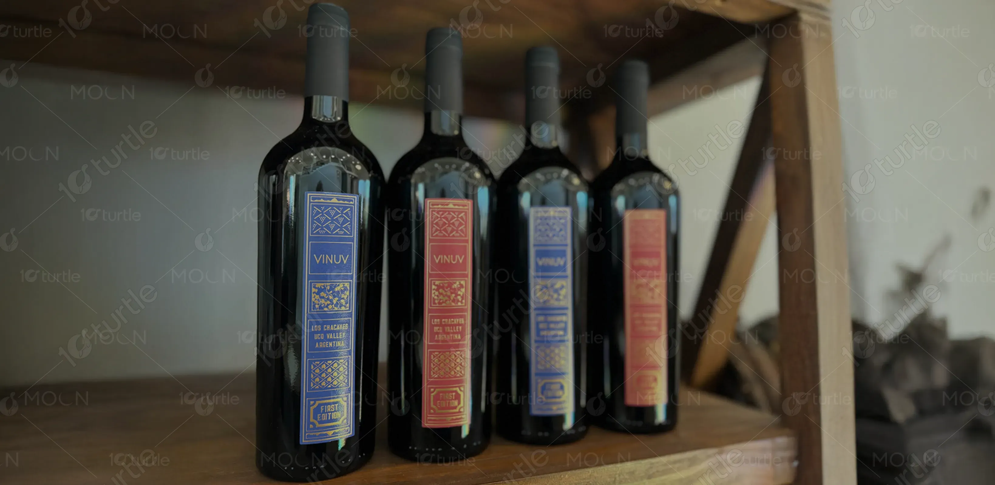
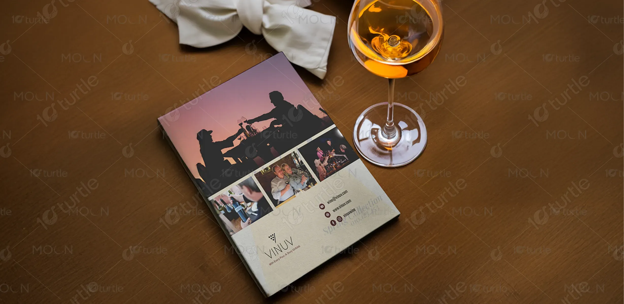
The VINUV brochure captures an elegant, premium aesthetic rooted in storytelling. The design combines minimal white space, refined typography, and rich visual contrast to evoke sophistication and warmth. It features structured layouts with bold bottle imagery and personal narratives, drawing the viewer into a journey that blends luxury with authenticity. The use of clean illustrations, mountain backdrops, and lifestyle photography creates an immersive brand experience—connecting the product to its origin, its makers, and its purpose: wine that tells a story.
Brochure Design
Graphic Design
Industry
Food, Beverage & Hospitality
Tools we used


Project Completion
2025
Key Market
Global
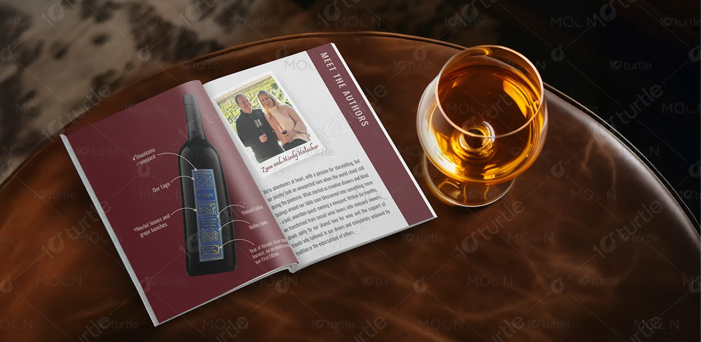
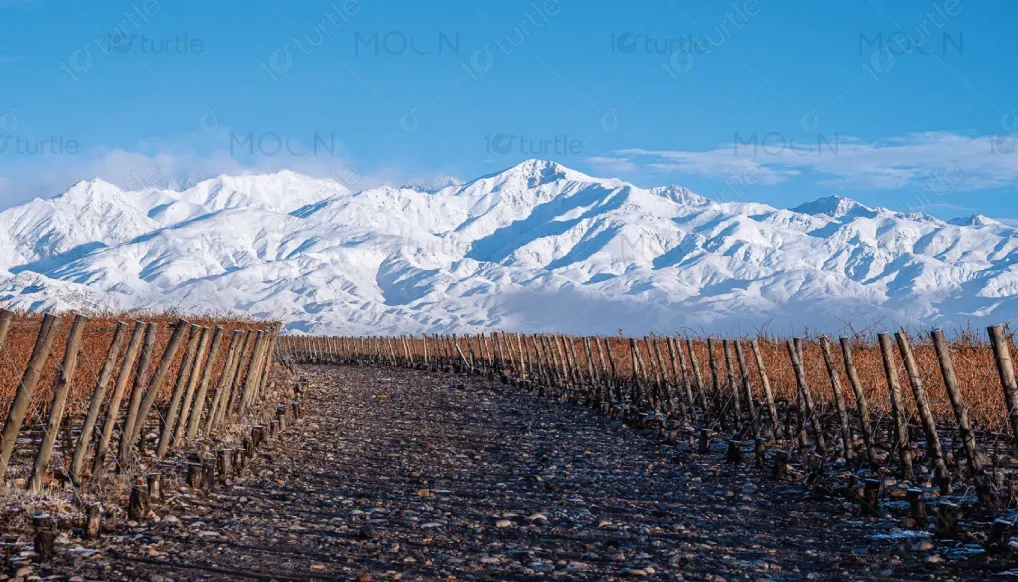
VINUV is a boutique wine brand born from passion and exploration, sourcing premium Malbec and Merlot grapes from Uco Valley, Argentina. Rooted in sustainability and storytelling, each bottle reflects the land's richness and the founders' adventurous spirit. The brochure serves to introduce the brand, narrate its origin, and highlight technical excellence—while offering a peek into the personalities behind it. With limited production, hand-harvested techniques, and distinct flavor profiles, VINUV stands apart in the luxury wine segment.
Industry
Food, Beverage & HospitalityWhat we did
Brochure DesignGraphic DesignPlatform
-The boutique wine industry often lacks personal connection and transparency. Many premium brands focus heavily on status and technicalities, leaving consumers disconnected from the people, stories, and values behind the bottle. This emotional gap makes it difficult for emerging brands to build loyalty. Additionally, generic branding and lack of origin storytelling fail to communicate what truly makes a wine special, especially in saturated markets where authenticity and provenance are key purchase drivers.
VINUV bridges this gap by integrating storytelling and origin directly into its design. The brochure features the founders’ personal journey, vineyard details, and clearly labeled bottle elements to create a transparent and emotional narrative. Through elegant visuals and intimate copy, it forges a personal connection with readers, positioning the wine as both a premium product and a meaningful experience. This storytelling approach strengthens brand identity, consumer trust, and emotional loyalty in a competitive market.
VINUV envisions becoming a symbol of soulful, small-batch winemaking rooted in place and purpose. The long-term goal is to grow as a recognized name in sustainable, narrative-driven wines—blending artistry and agriculture. With continued focus on organic farming, limited editions, and global storytelling, VINUV aims to redefine how wine is marketed: not just by taste, but by the richness of its origin and the journey behind every bottle.
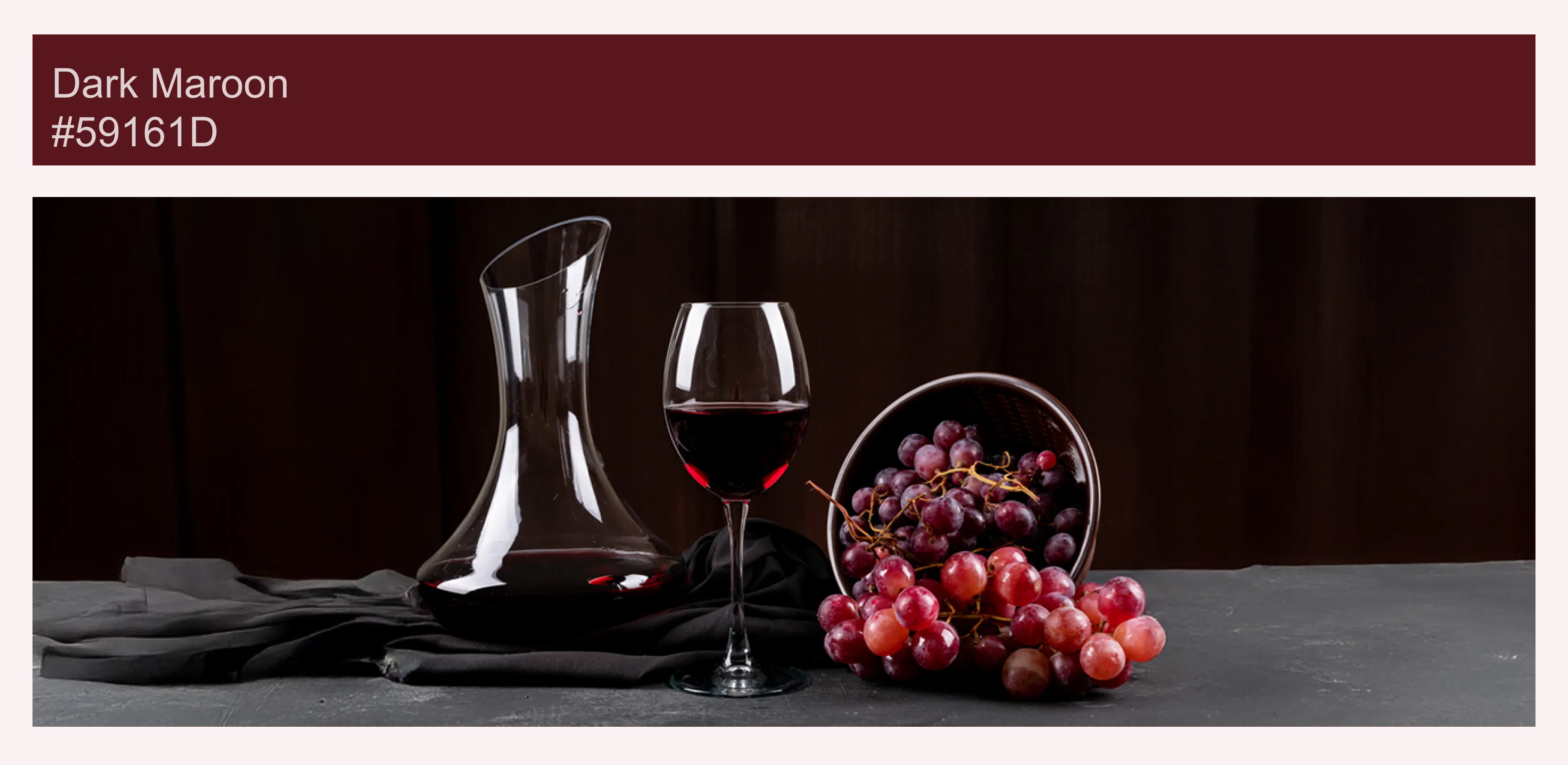
Primary Colors: Deep Burgundy, Rich Violet, and Classic Black – representing the essence of wine and luxury. Accent Colors: Gold and Midnight Blue – used in label detailing to denote refinement, heritage, and prestige. Background/Contrast: Crisp White and Earthy Browns – balancing the composition and evoking vineyard soils, oak barrels, and nature. These tones evoke warmth, sophistication, and authenticity, aligning with VINUV’s elegant yet grounded brand personality.