The design adopts a vibrant and color-coordinated aesthetic tailored to each product variant — purple for sleep, blue for strength, and pink for flavor. Clean typography, high-contrast calls to action, and scattered product elements create visual interest while ensuring clarity. The layout adapts seamlessly across various ad formats, maintaining consistent branding and hierarchy. Background gradients and floating gummies or capsules establish a soft yet dynamic tone, resonating with modern wellness and lifestyle themes to capture attention instantly.
AD Design
Graphic Design
Industry
Healthcare & Wellness
Tools we used


Project Completion
2025
Key Market
Global
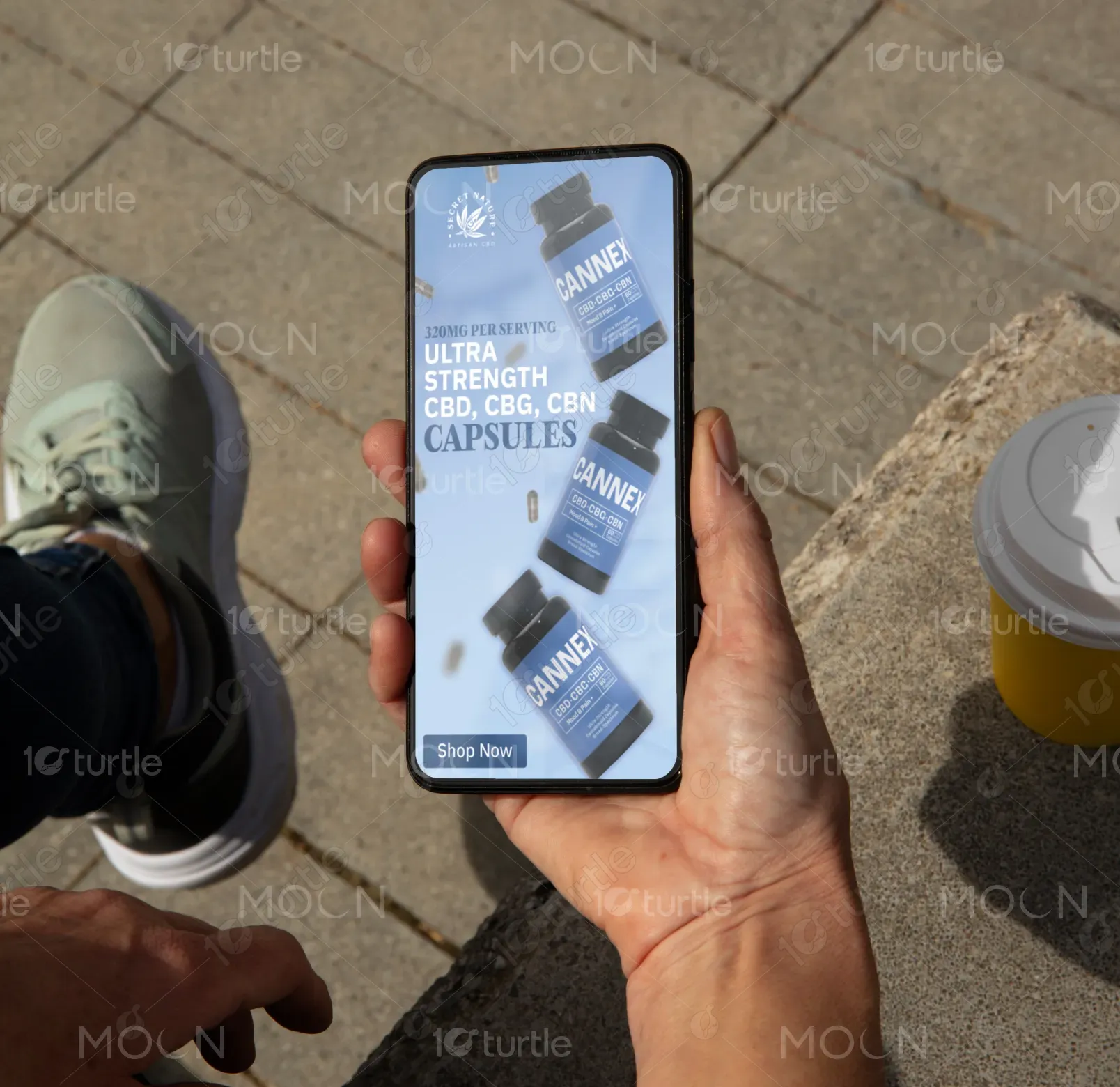
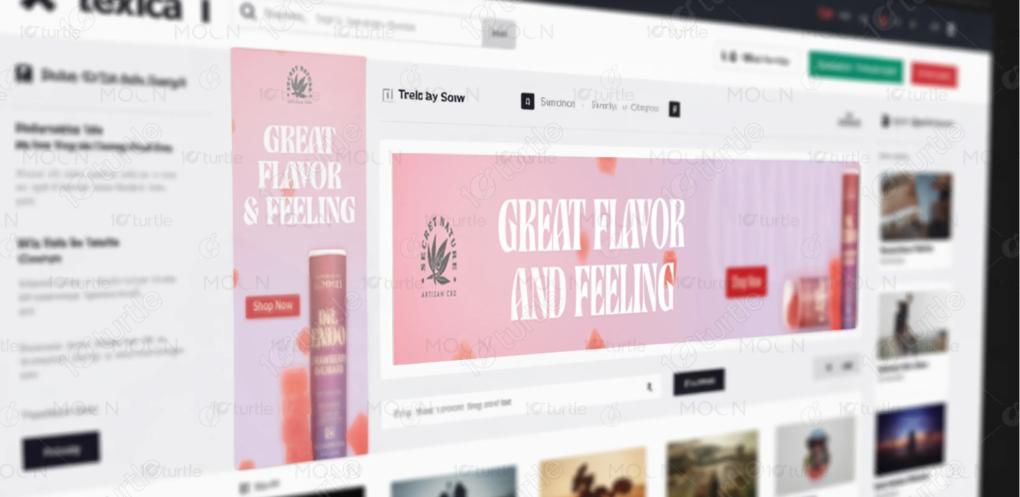
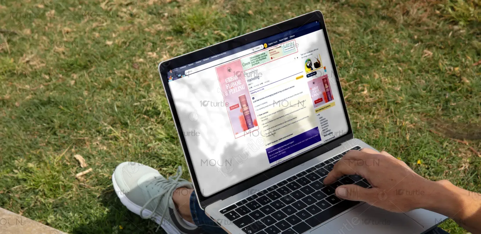
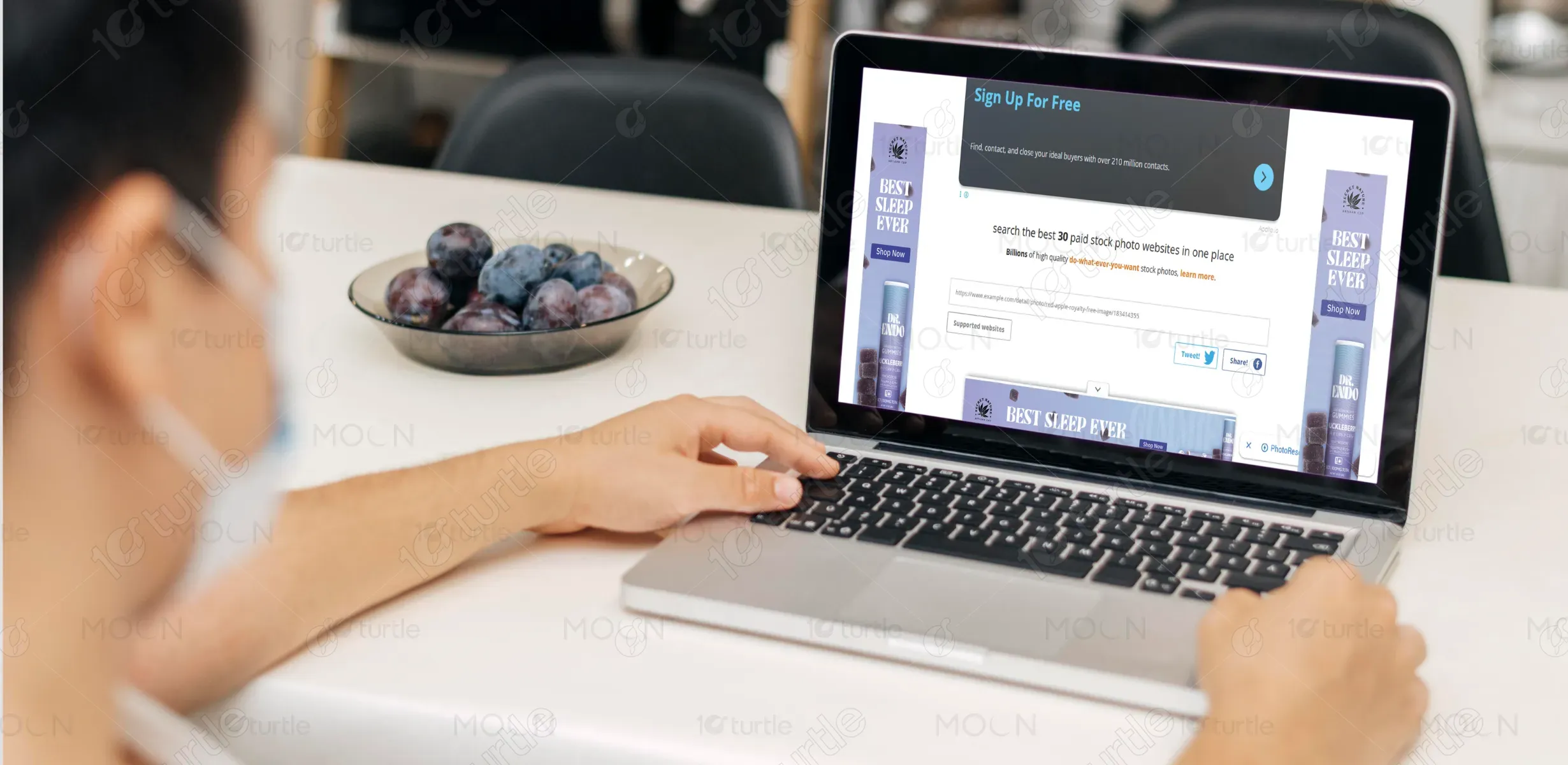
These Google Display Ad Banners promote DR. ENDO Gummies and CANNEX Capsules — premium CBD-based wellness supplements. Each banner is designed to visually represent the product’s key benefit: Sleep Support, Ultra Strength, or Flavor & Feeling. Their unique selling points include high-quality CBD/CBG/CBN blends, eye-catching colors, and consumer-friendly vertical packaging. The clean design and bold typography help the product stand out in a crowded wellness market while clearly communicating its benefit with a quick call to action: Shop Now.

Industry
Healthcare & WellnessWhat we did
AD DesignGraphic DesignPlatform
-A common issue in designing wellness product ads is distinguishing similar-looking supplements in a saturated market, especially when product forms (gummies, capsules) don’t drastically differ visually. Furthermore, ensuring consistency across various ad sizes while keeping legibility, visual hierarchy, and brand identity intact is a challenge. Many banners also fail to maintain user attention due to over-clutter or bland visuals. Another constraint: aligning functional messaging (e.g., sleep aid, ultra strength) with emotional appeal in under 3 seconds of viewer attention.
The banners use color-coded themes and strategic product placement to differentiate product benefits at a glance. Bold headlines like BEST SLEEP EVER or GREAT FLAVOR & FEELING immediately signal the product’s intent. Clear CTA buttons draw user interaction. Floating product imagery and animated elements mimic motion, enhancing engagement without actual animation. The vertical packaging allows better readability even in narrow ad formats. Overall, the user-centric design ensures fast recognition and compelling visual storytelling within a few seconds.
The long-term vision is to position Secret Nature as a visually iconic and trustworthy CBD wellness brand. The goal is to create a design system that scales across seasonal campaigns, product launches, and evolving ad formats while maintaining visual continuity. These banners set the foundation for a recognizable style — bold, clean, and emotionally resonant — enabling the brand to evolve into larger lifestyle categories while staying rooted in premium, plant-based wellness aesthetics.
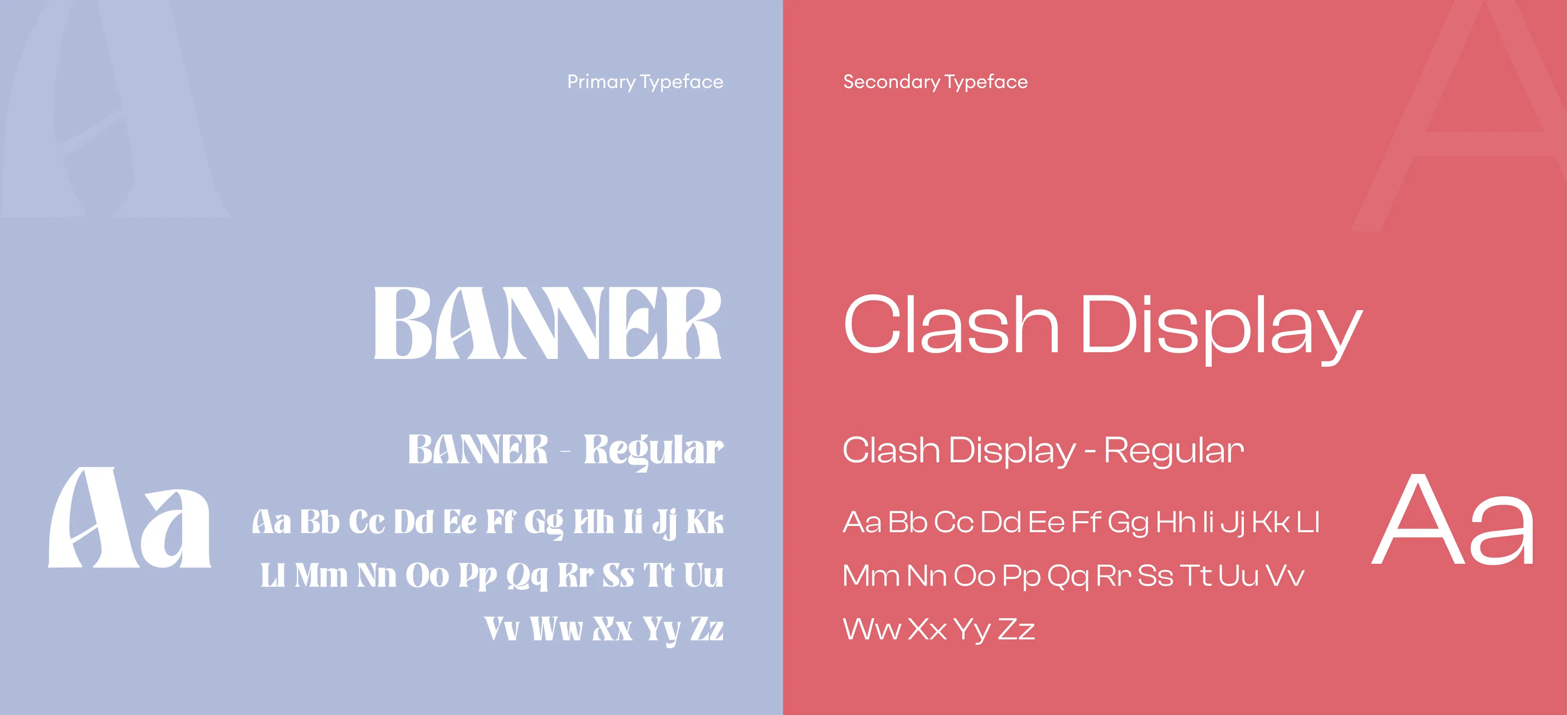
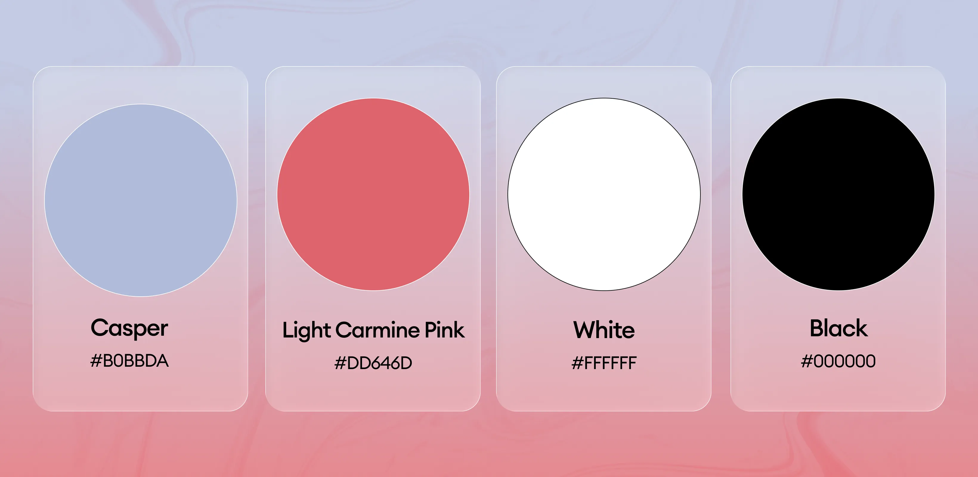
The palette includes Casper, Light Carmine Pink, and White—each chosen to evoke calm sophistication, warmth, and a sense of modern elegance. These colors reflect a soft yet refined aesthetic while complementing both minimal and contemporary furnishings. Light Carmine Pink adds a gentle vibrancy and approachability, while White ensures openness and clarity. Casper, with its subtle bluish-gray undertone, provides balance and depth. This palette not only aligns with timeless décor trends but also elevates brand identity by signaling serenity, creativity, and understated uniqueness.