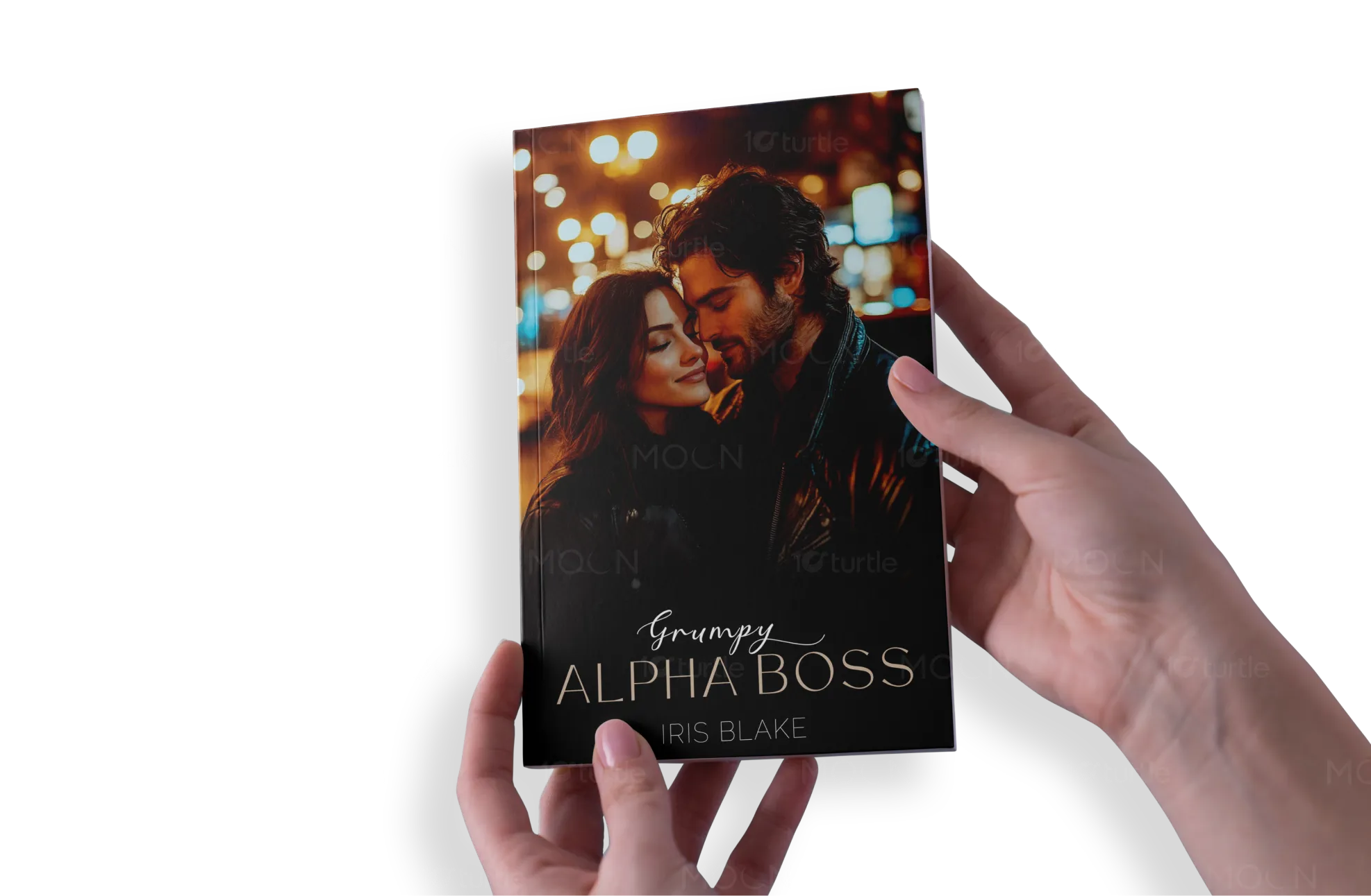
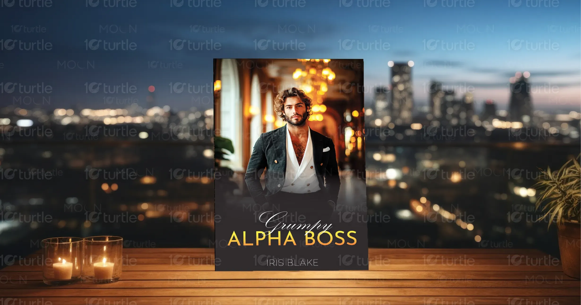
This design merges elegance with emotional intensity, using a glamorous cityscape as the backdrop to frame the chemistry between the lead characters. The first cover portrays a tender yet charged moment between the protagonists, emphasizing romance and emotional vulnerability, while the second cover exudes power and confidence through a sharply dressed male lead. The use of cinematic lighting, luxurious attire, and golden hues creates an aspirational tone, appealing to romance readers who crave drama, passion, and sophistication.
Book Cover Design
Graphic Design
Industry
Arts, Culture & Entertainment
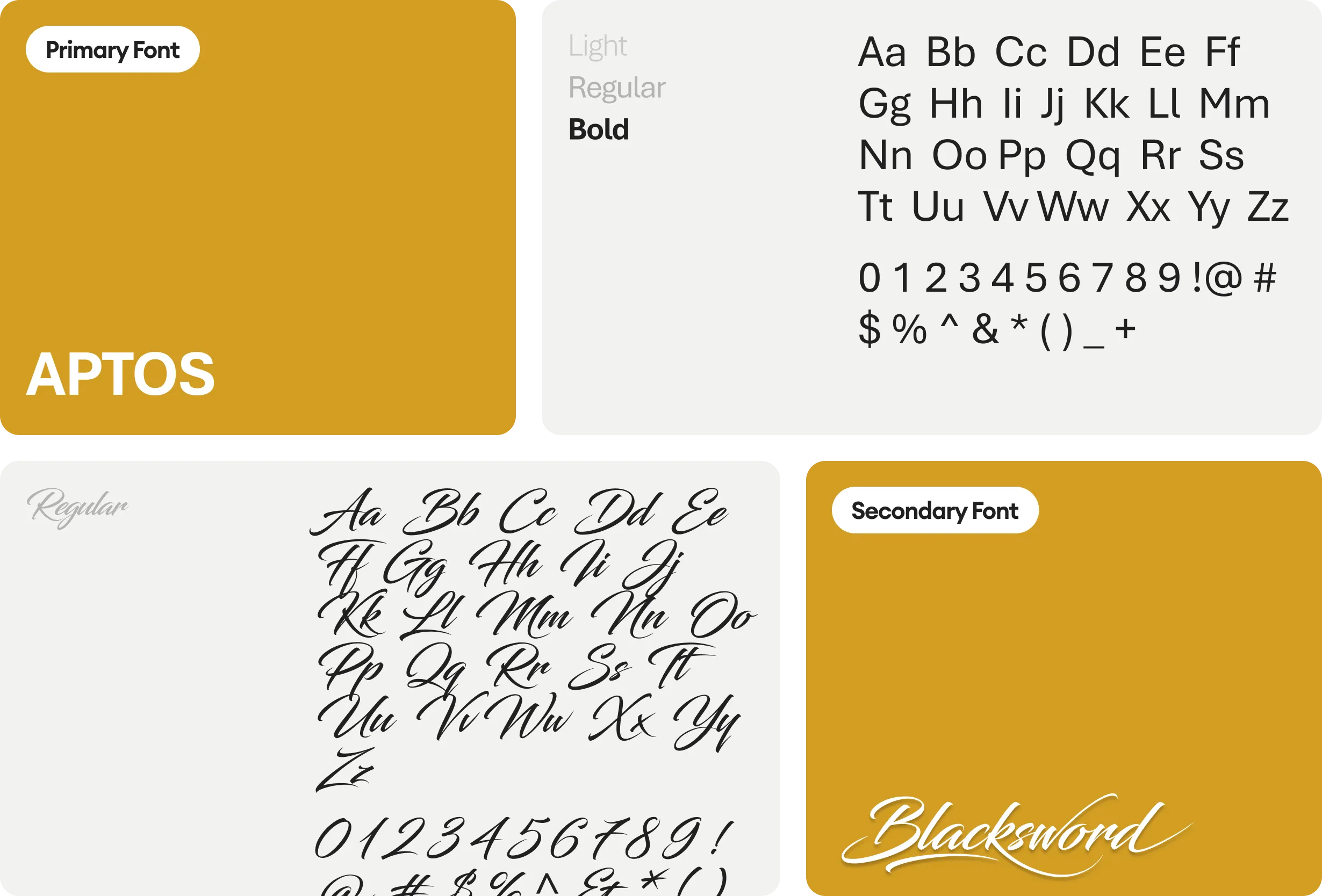
Tools we used


Project Completion
2025
Key Market
Global
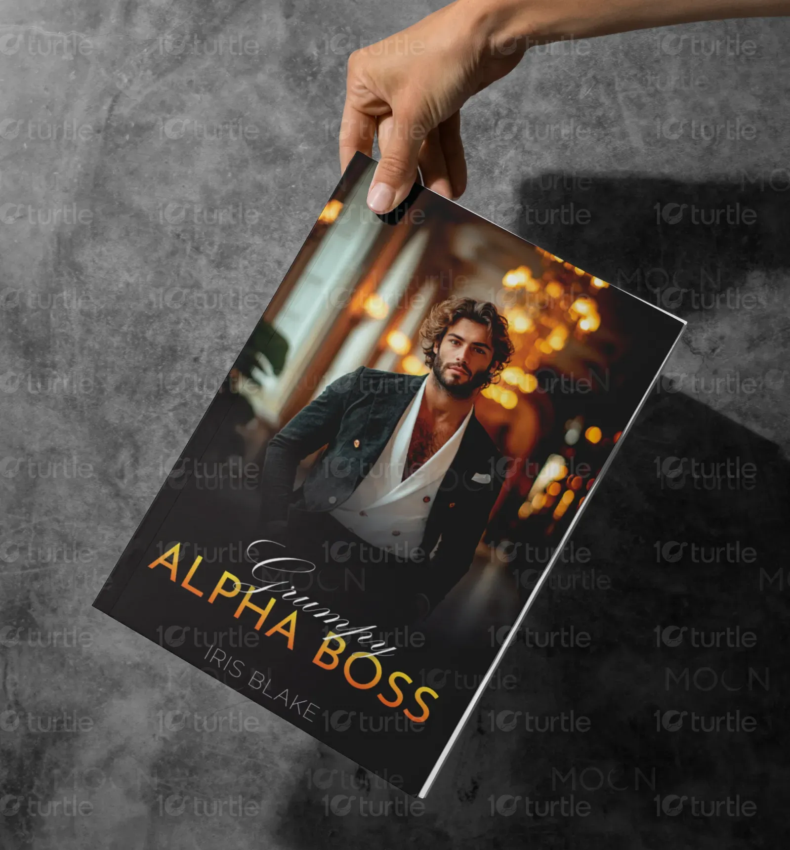
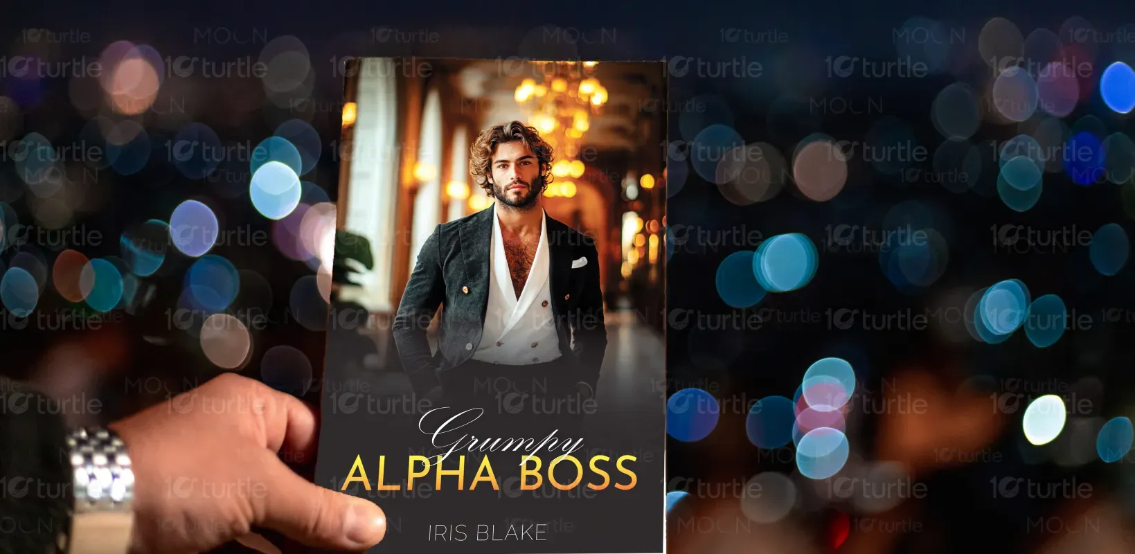
The "Grumpy Alpha Boss" book cover design encapsulates the essence of a steamy romance between a powerful CEO and his unexpected match. It targets readers of contemporary romance and boss-employee love stories. With its cinematic visuals and polished aesthetics, the design stands out in a saturated market, promising a blend of heat, tension, and style. The covers serve both aesthetic appeal and narrative hint, drawing readers into a passionate, high-stakes romance.

Industry
Arts, Culture & EntertainmentWhat we did
Book Cover DesignGraphic DesignPlatform
-Romance covers are abundant and often fall into repetitive tropes that fail to stand out. The challenge was crafting a design that conveys the emotional and thematic depth of the story while avoiding clichés. Many covers focus solely on physical attraction, lacking the emotional nuance or visual storytelling that discerning readers now seek. Striking the right balance between sensual appeal and emotional resonance was key, especially for readers seeking more than a superficial glance.
The design employs a dual approach—romantic intimacy and charismatic authority. One version focuses on mutual vulnerability and attraction with a couple in a close embrace, while the other spotlights a confident alpha male, visually reinforcing the “boss” persona. Both utilize warm lighting and elegant fashion to signify sophistication and allure. This storytelling-through-design method bridges the emotional and aspirational aspects of romance, differentiating it from formulaic competitors.

The long-term vision is to establish a visual identity for a series of “Alpha Boss” romances, each with distinct emotional tones but unified through branding elements like lighting, typography, and color scheme. The goal is to build instant recognition among romance readers, expanding into merchandise, digital promotions, and serialized storytelling formats. This design aims to define a premium sub-genre look in the romance category—one that readers emotionally connect with and visually trust.


The color scheme is a mix of bright blues, greens, and warm earth tones, chosen for their psychological impact on young readers. Blue conveys trust and security, reinforcing the book’s purpose of safety and guidance. Green represents growth and empowerment, aligning with the book’s theme of self-development. Warmer tones like red and orange add energy and excitement, keeping engagement levels high. The combination ensures a visually stimulating experience while maintaining clarity and readability.