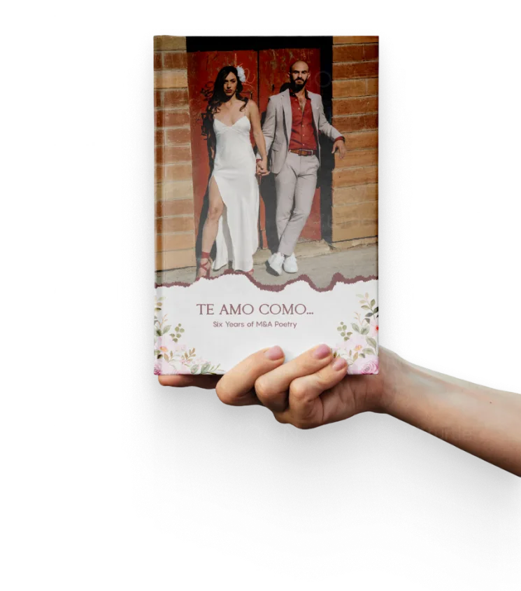
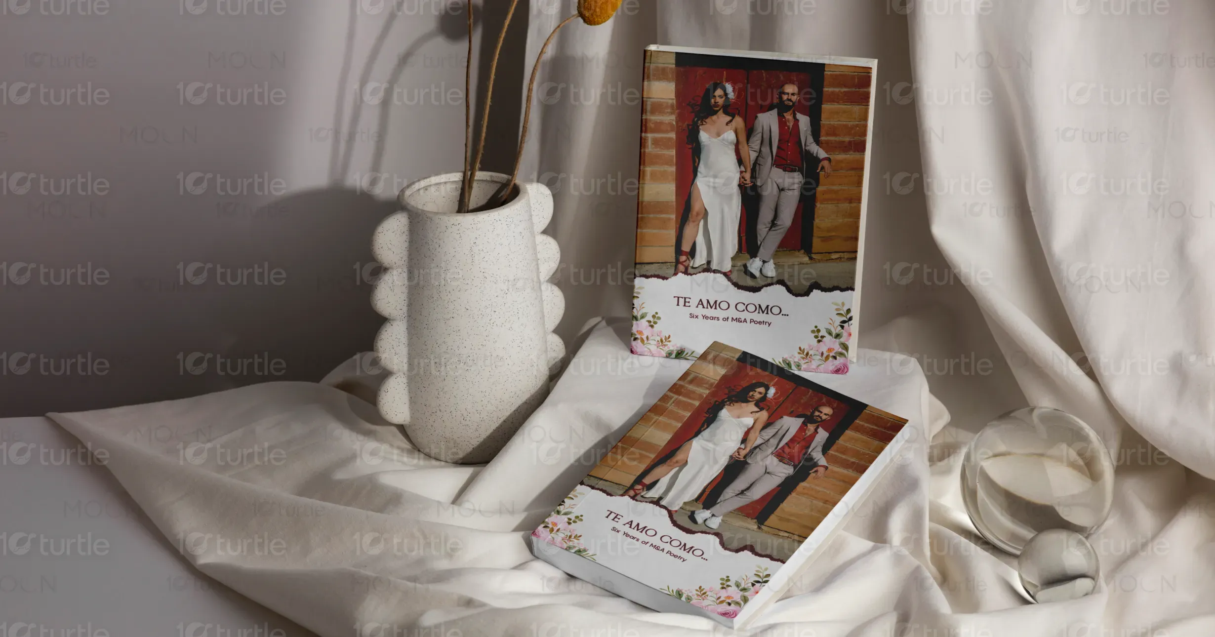
The design embraces romantic minimalism, pairing natural textures with soft floral illustrations and elegant typography. The cover uses a real-life couple portrait against rustic brick, exuding authenticity and intimacy. Inside pages are adorned with subtle watercolor washes and floral borders that frame each poem with a touch of emotional warmth. This concept blends visual storytelling with poetic expression, creating an inviting and heartfelt experience that mirrors the emotional depth of the writing inside.
Poetry Book design
Graphic design
Industry
Arts, Culture & Entertainment
Tools we used


Project Completion
2025
Key Market
Global
“Te Amo Como…” is a curated poetry book capturing six years of heartfelt verses from M&A. It celebrates love, intimacy, and life's shared moments through carefully arranged poems, each dated and location-stamped for authenticity. Unlike traditional poetry books, it visually represents a romantic journey with a strong personal narrative. Aesthetically, it balances warmth and sophistication—making it a perfect gift book or keepsake for couples, readers of romance, and poetry enthusiasts seeking connection and visual elegance.


Industry
Arts, Culture & EntertainmentWhat we did
Poetry Book designGraphic designPlatform
-Many modern poetry books lack emotional visual context, often presenting poems with plain formatting and impersonal covers. This creates a disconnect between content and presentation, making it harder for readers to emotionally immerse themselves in the material. Additionally, the market is saturated with overly abstract or minimalist designs that don’t reflect the human intimacy present in romantic poetry, reducing their gift or keepsake value.
This book design bridges emotional content with thoughtful aesthetics. By integrating real photography, soft floral embellishments, and location-based poem dates, it creates a deeper reader connection. The interior layout is soft yet structured, ensuring readability while enhancing the emotional tone through design. These personalized elements transform the poetry into an experience, making it more memorable, relatable, and visually expressive—ideal for readers seeking both beauty and sentiment in literature.

The long-term vision is to establish “Te Amo Como…” as a series that evolves with time—documenting emotional growth, seasons of love, and life’s poetic transitions. The brand aims to become a benchmark in emotional publishing: a blend of poetic storytelling and visual elegance. Future editions may include limited collector’s versions, multilingual releases, and interactive digital formats, all focused on deepening the reader’s personal and aesthetic experience with poetry.

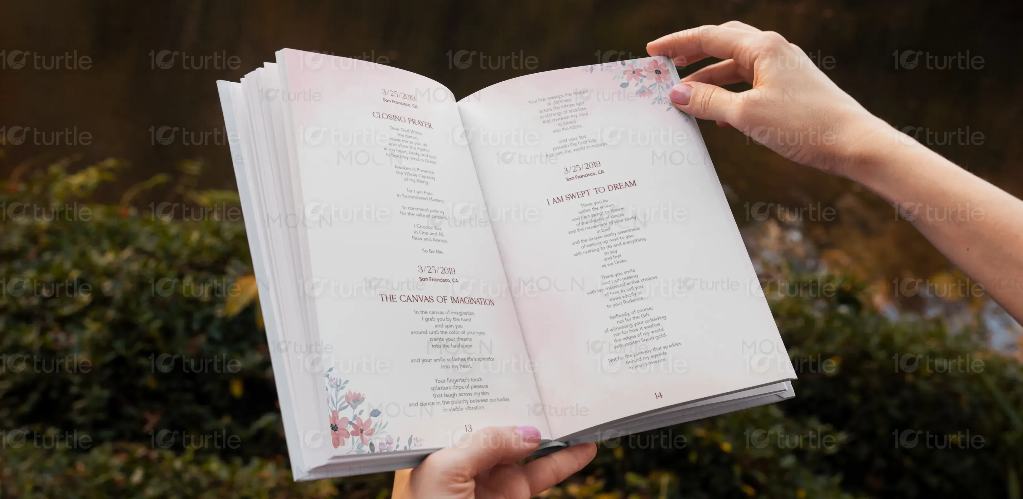

The palette includes warm neutrals, soft blush pinks, and earthy tones. These evoke feelings of intimacy, calm, and romance. The cover's terracotta brick background grounds the design in realism and warmth, while the pastel floral accents add grace and softness. Inside pages continue this palette with delicate watercolor washes and floral motifs, aligning with the emotional depth of the poems and reinforcing the brand’s tone of elegant sentimentality.