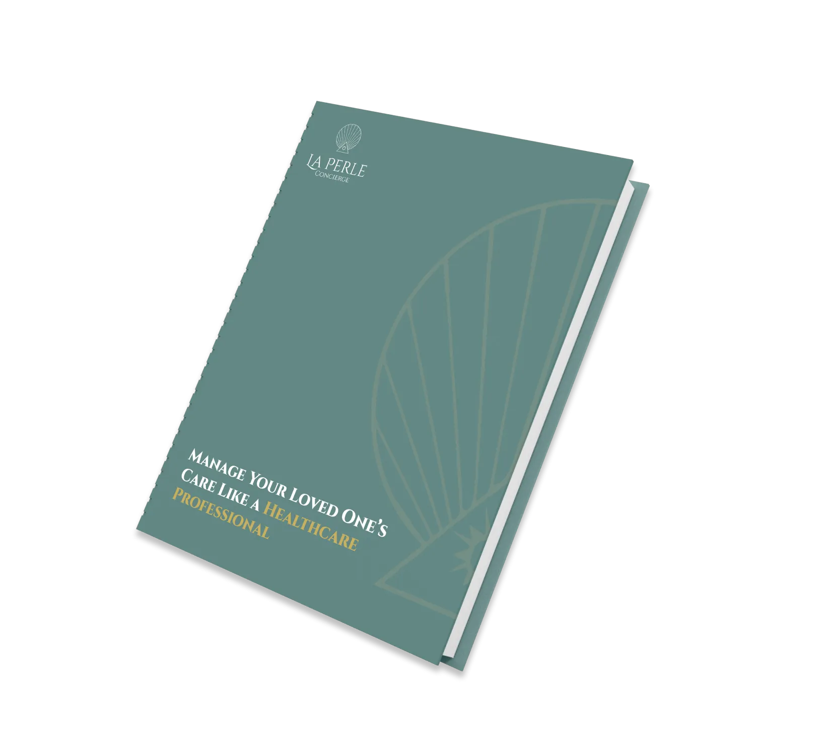
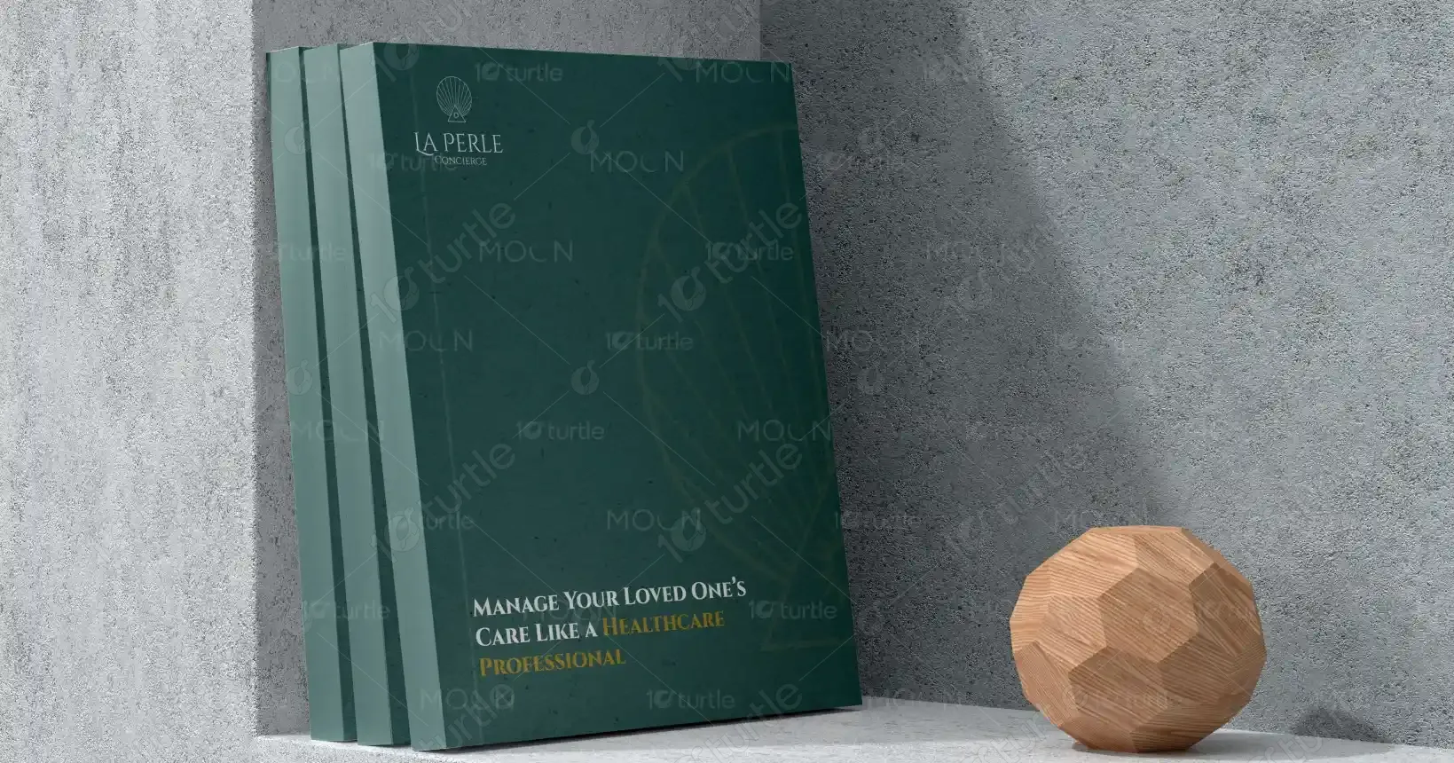
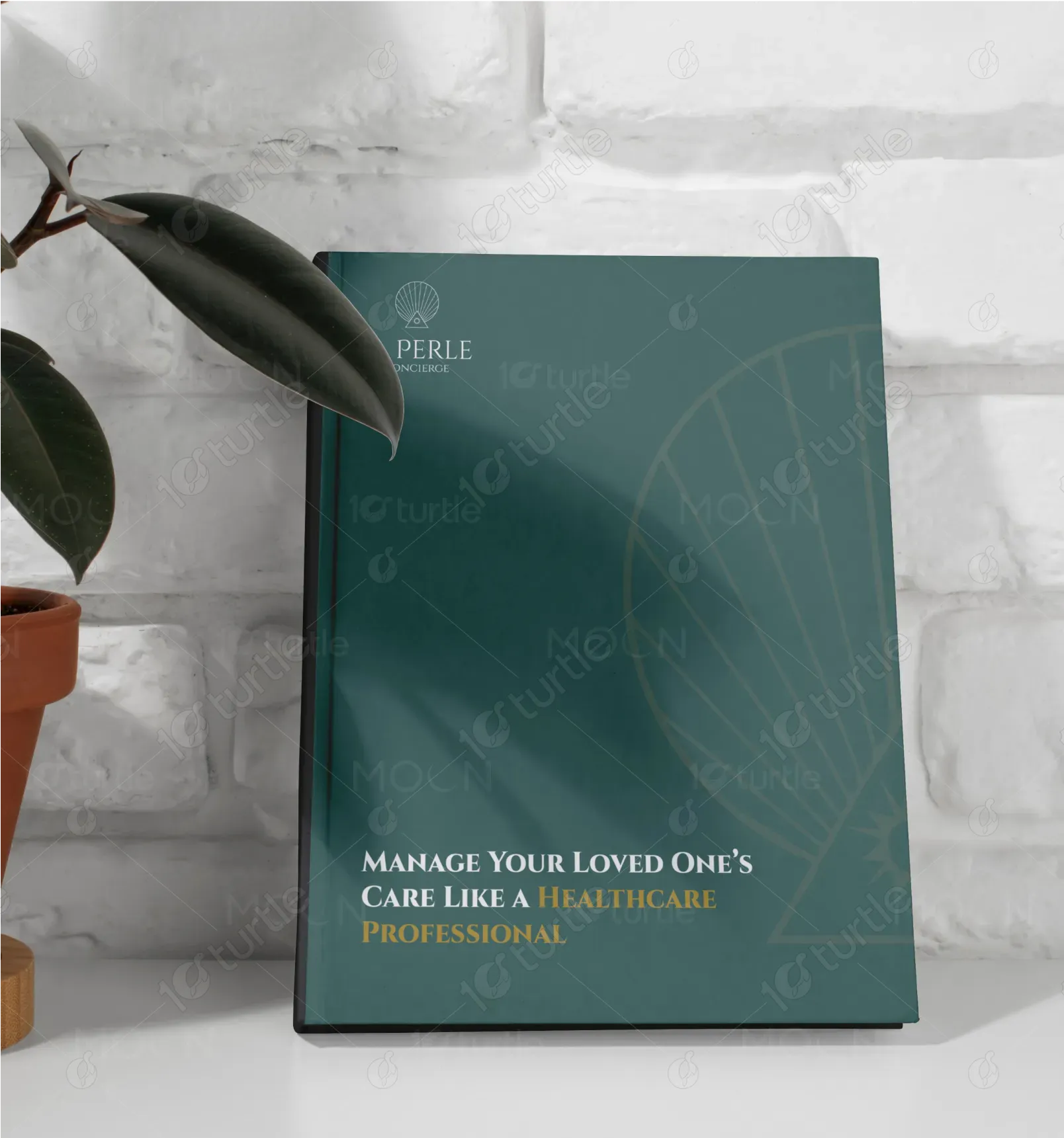
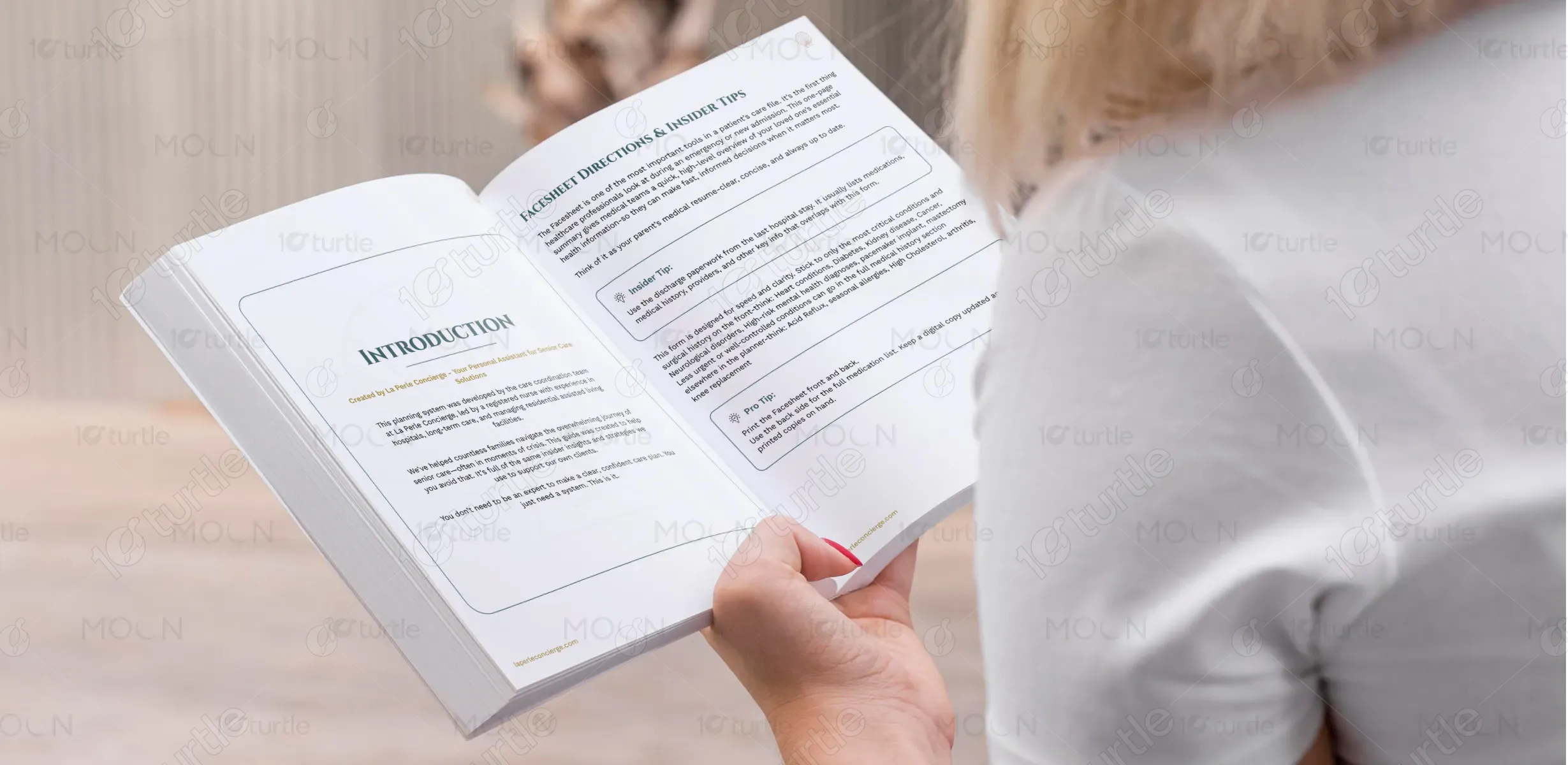
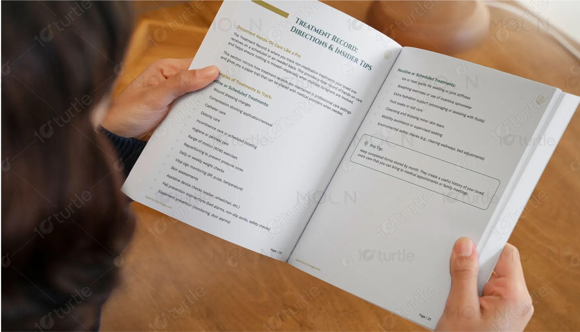
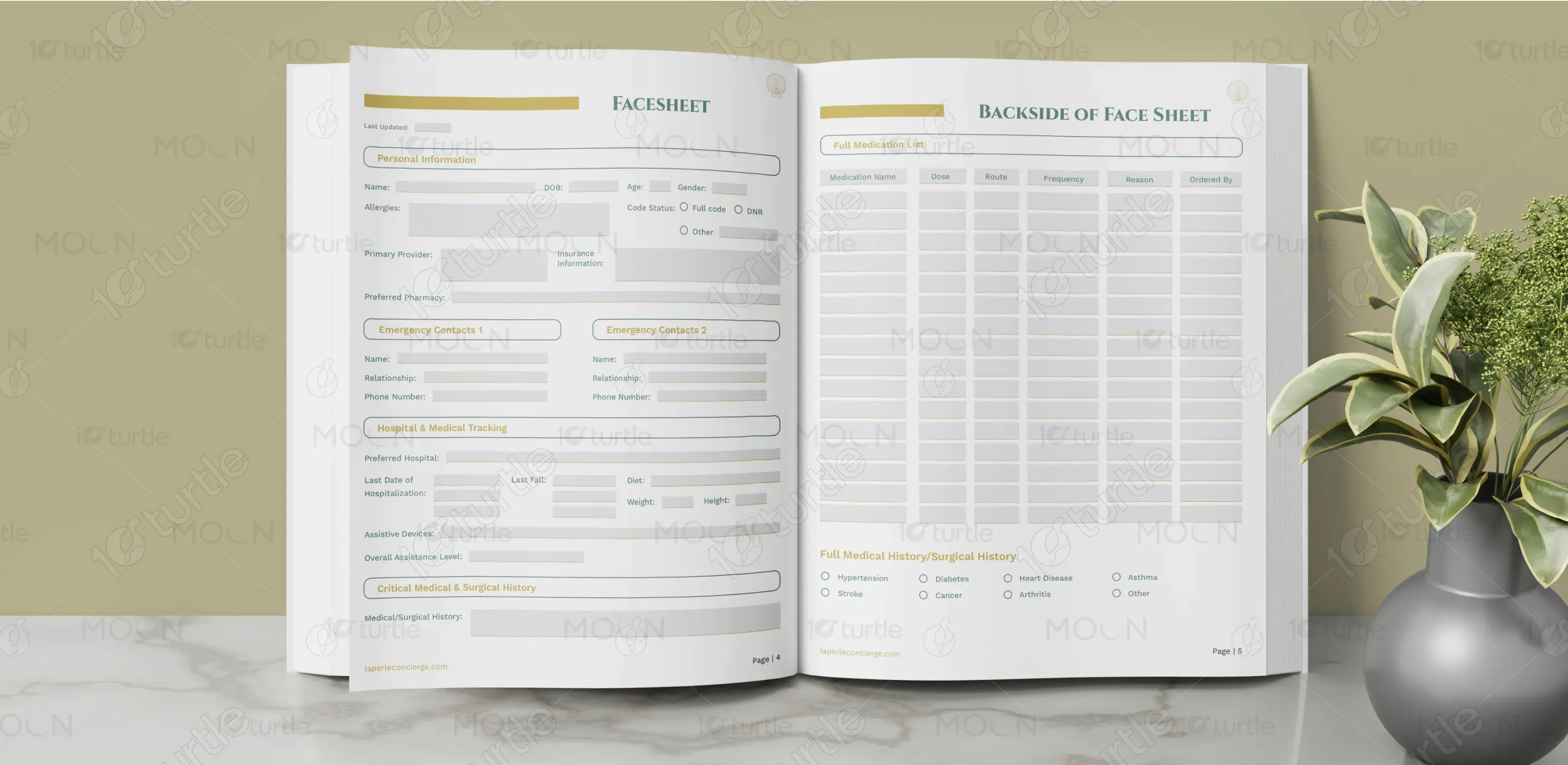
The workbook design blends a serene, professional aesthetic with user-friendly layouts, aimed at caregivers. A deep green cover signifies trust and calmness, while gold accents elevate the perception of professionalism and warmth. Interior pages maintain clean typography with clearly segmented sections for readability and ease of use. Thoughtfully placed icons, headers, and spacing guide users through content intuitively, making complex care information accessible. The layout encourages interaction, note-taking, and practical learning, all within a visually appealing and supportive framework.
Workbook Design
Graphic Design
Industry
Healthcare & Wellness
Tools we used


Project Completion
2025
Key Market
Global
This workbook, “Manage Your Loved One’s Care Like a Healthcare Professional,” is a hands-on guide for family caregivers navigating the challenges of home care. Created by PERLE Concierge, it transforms medical expertise into digestible, actionable steps. It bridges the gap between professional healthcare standards and informal caregiving. With a premium look and practical interior design, the book empowers non-medical caregivers to manage daily tasks confidently—offering both emotional assurance and procedural clarity in one elegant package.

Industry
Healthcare & WellnessWhat we did
Workbook DesignGraphic DesignPlatform
-Many caregiving guides are either too clinical or too casual—lacking a balance between emotional sensitivity and professional practicality. Caregivers often feel overwhelmed by medical jargon, fragmented information, and unattractive or confusing layouts. In a field where emotional burnout is common, a cluttered or impersonal design adds further stress. This gap calls for a resource that is approachable, informative, and visually calming—offering guidance without overwhelming the reader.
PERLE Concierge’s workbook solves this by delivering a structured, calm, and elegant learning tool. The use of calming hues and simplified instructions breaks down complex healthcare tasks into manageable steps. Smart formatting—like sectioned tips, icons, and consistent typography—reduces cognitive overload. The tone is reassuring and informed, positioning the user as capable and supported. The design not only provides guidance but also instills confidence—making caregiving feel less daunting and more empowered.

PERLE Concierge envisions a future where every family caregiver feels as equipped and supported as a healthcare professional. The long-term goal is to become the go-to companion tool for at-home care, expanding into digital versions, multilingual editions, and specialized modules (e.g., dementia care, post-operative care). By elevating the caregiving experience through thoughtful design and practical education, PERLE aims to redefine non-professional caregiving as a respected, manageable, and empowered role.

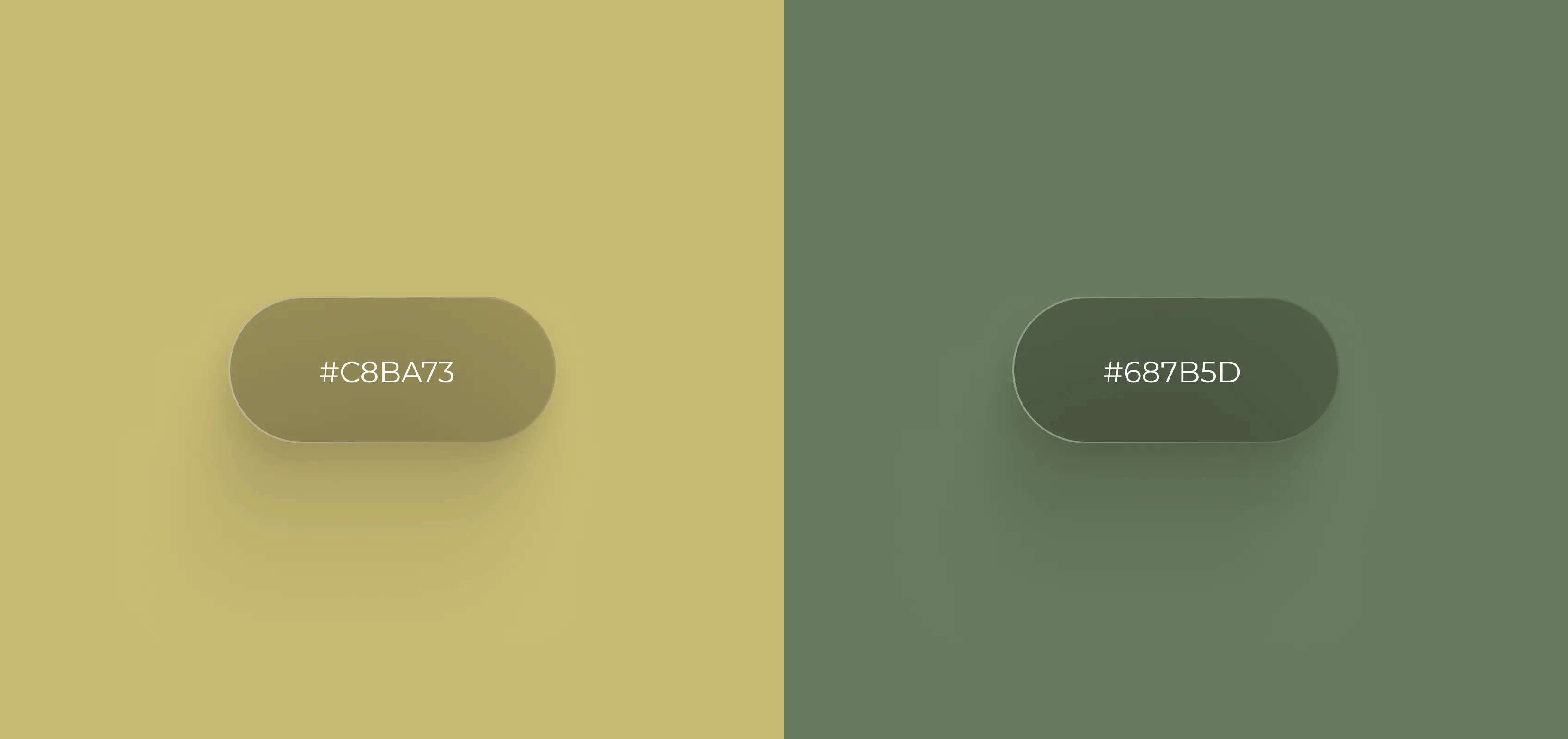
Deep Teal Green (#355e57): Signifies calm, stability, and professionalism—ideal for a healthcare-oriented product. Warm Gold (#d4a24c): Highlights key information with a premium, trustworthy feel, symbolizing knowledge and warmth. White (#FFFFFF): Used generously in the interior to provide visual clarity and space for thought. This palette aligns with the brand’s mission of calm empowerment, balancing emotional reassurance with a high level of professionalism.