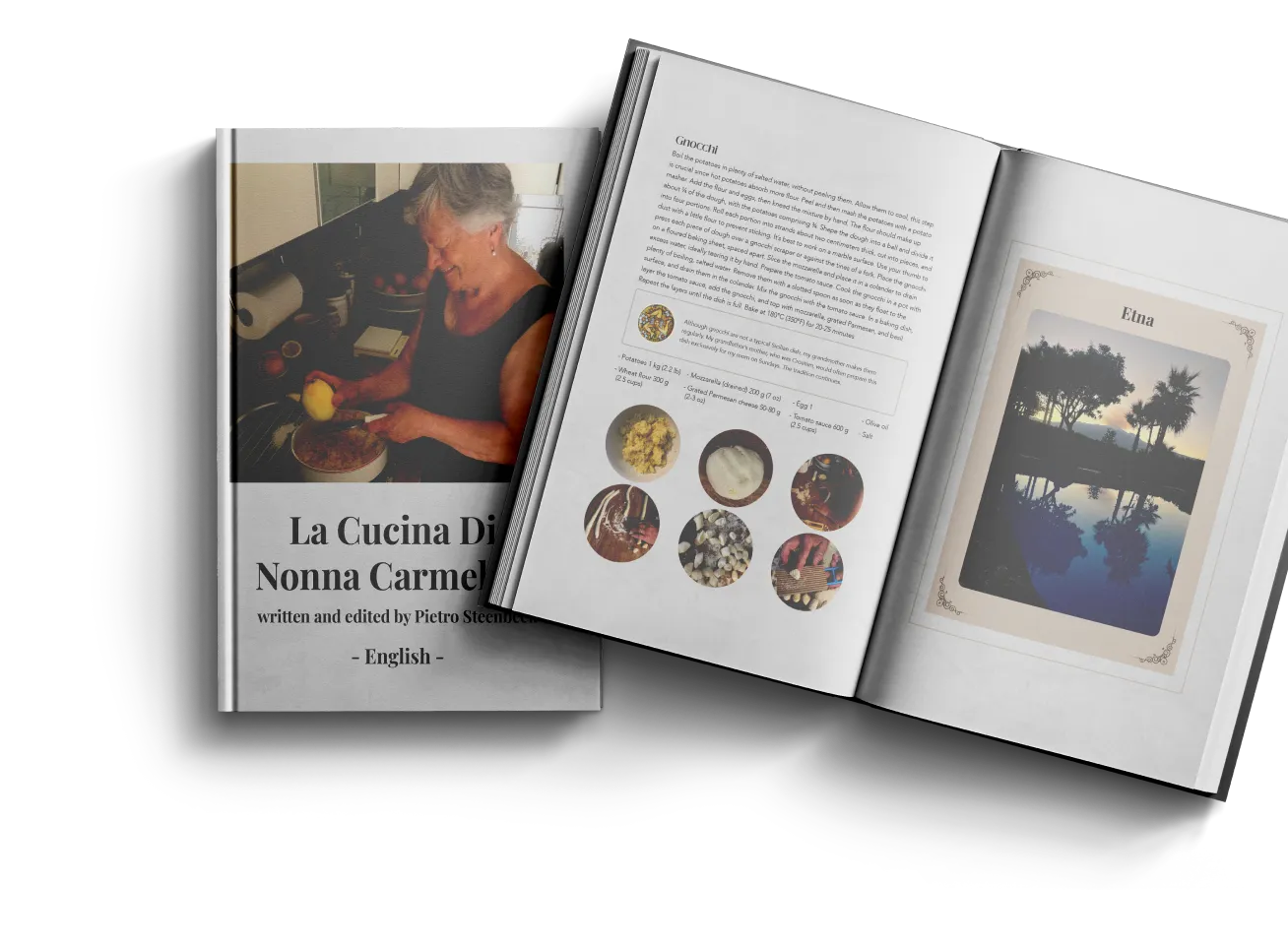
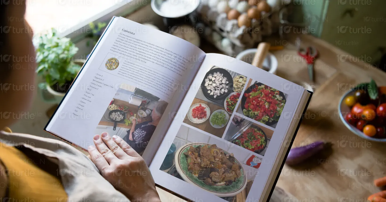
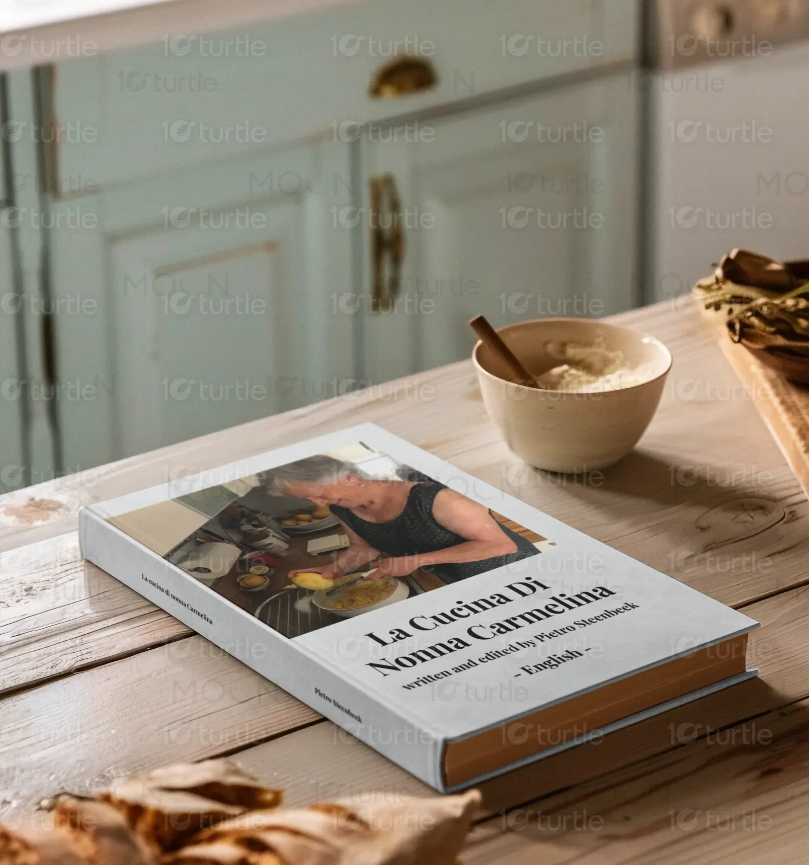
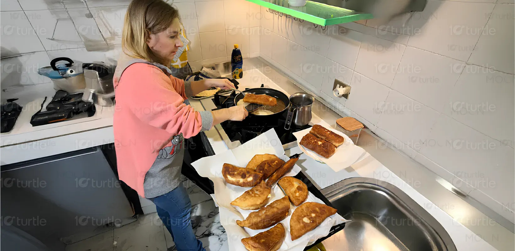
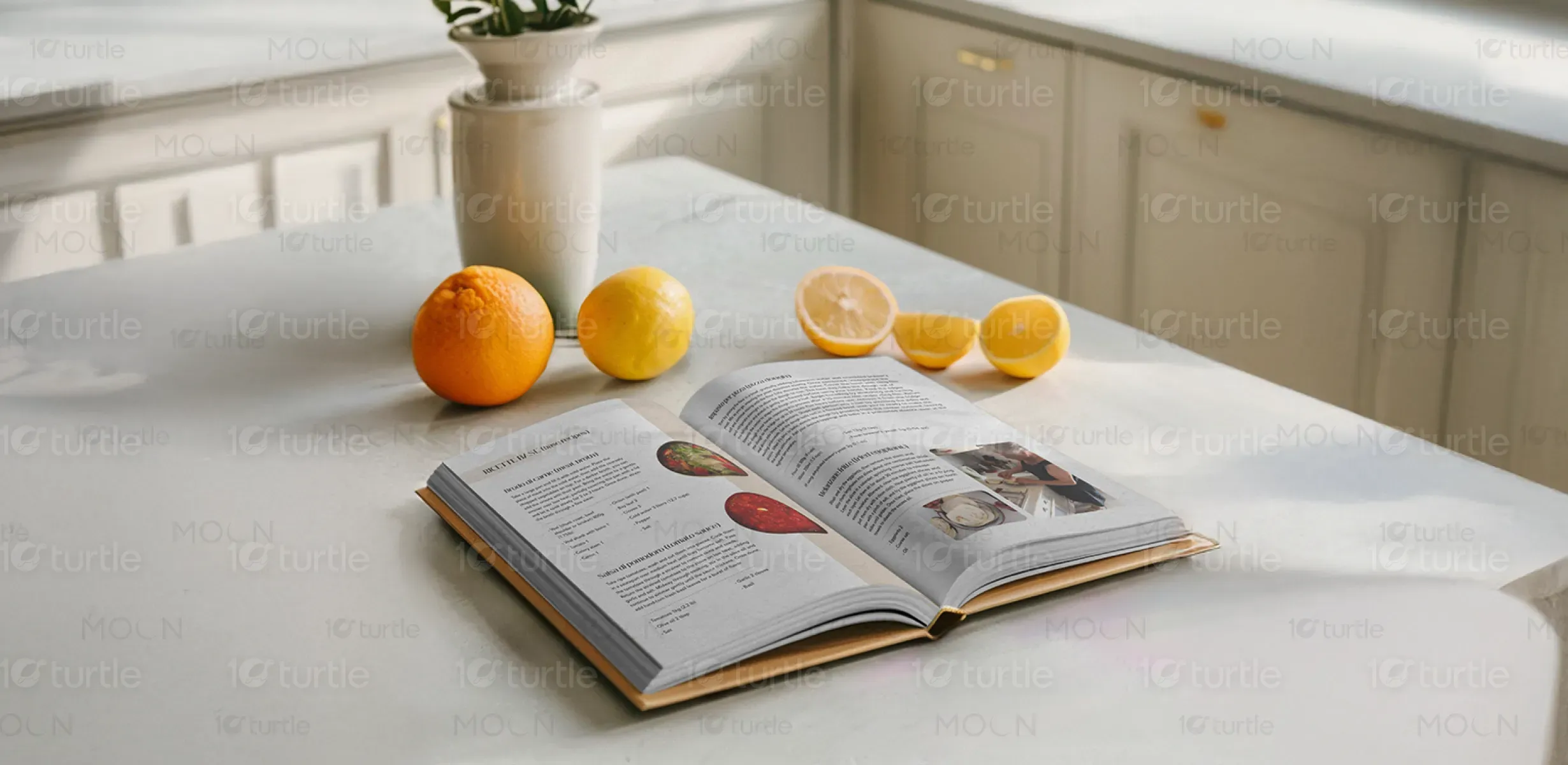
The design merges rustic warmth with clean modernity, reflecting the heart and soul of traditional Italian cooking. A minimalist aesthetic with soft, neutral tones draws focus to vibrant culinary imagery. The cover, featuring Nonna Carmelina in her element, evokes authenticity and nostalgia. Inside, step-by-step visuals, handwritten-style fonts, and natural textures enhance accessibility and emotional connection. The layout is intuitive, celebrating storytelling through food while maintaining clarity and functionality for all readers, from novice cooks to seasoned food lovers.
Book Design
Graphic Design
Industry
Food, Beverage & Hospitality
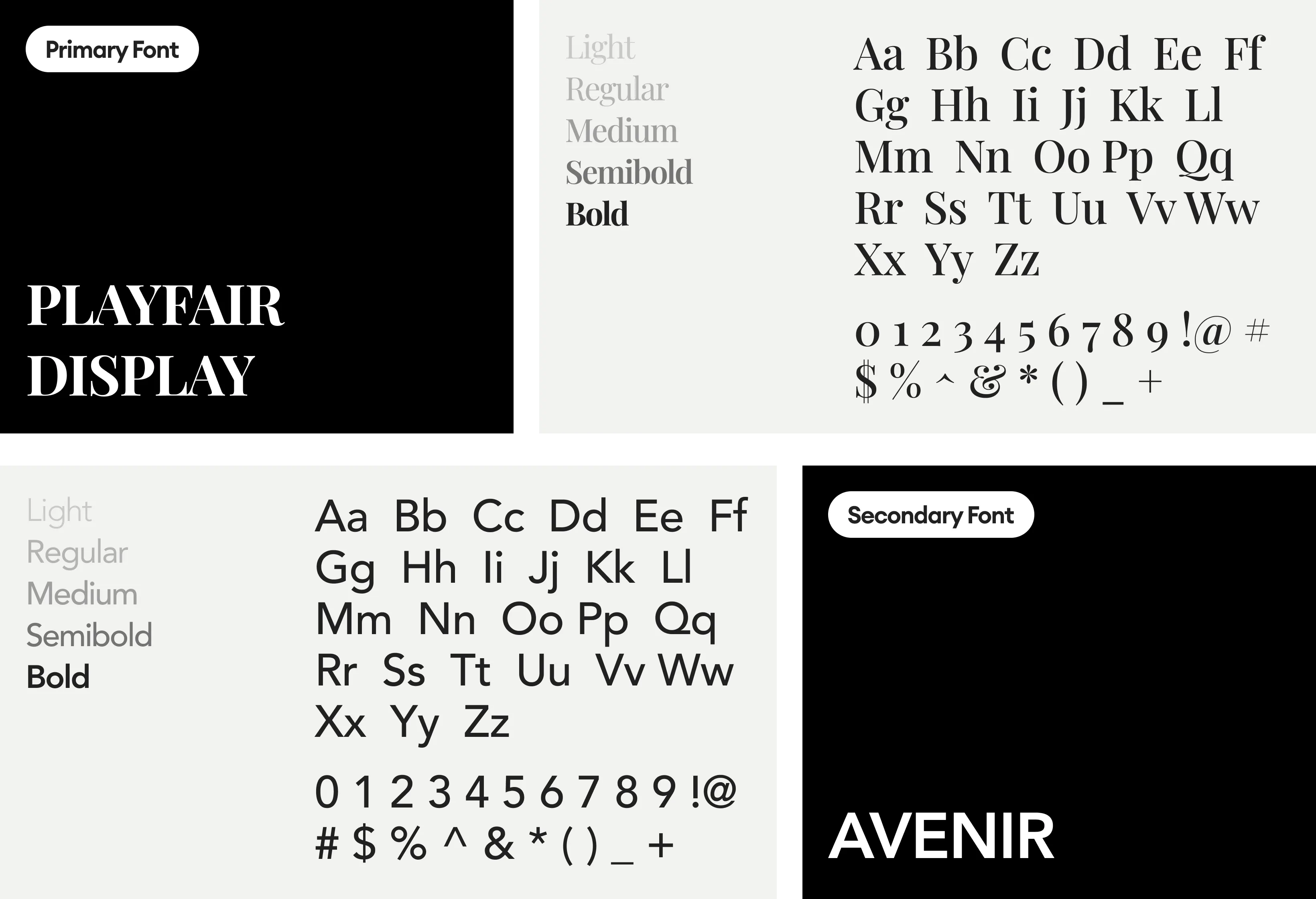
Tools we used


Project Completion
2025
Key Market
Global
La Cucina Di Nonna Carmelina is a heartfelt cookbook that celebrates generational Italian home cooking. Curated by Pietro Steenbeck, it captures authentic recipes passed down through time, paired with engaging visuals and simple instructions. It stands out in the market by blending tradition with a warm, approachable design, appealing to readers seeking genuine culinary heritage. With English translation and home-style photography, it bridges cultural gaps and offers a homely, immersive experience into Italian cooking.
Industry
Food, Beverage & HospitalityWhat we did
Book DesignGraphic DesignPlatform
-Modern cookbooks often lack the warmth and emotional connection that traditional cooking brings. Many present recipes clinically, ignoring the heritage, context, and human element behind the food. For home cooks seeking authenticity, these designs feel sterile and disconnected. There’s also a gap for bilingual or culturally rich cookbooks that are visually engaging yet easy to follow—especially for those learning to cook from scratch or connecting with family traditions.
This design integrates storytelling with practicality—featuring real images of Nonna Carmelina preparing meals, which fosters trust and relatability. The bilingual (Italian-English) approach ensures accessibility, while the step-by-step visuals simplify complex recipes. Thoughtful layout choices like large visuals, clear headings, and soft typography make navigation seamless. It’s a hybrid between a family heirloom and an instructional guide—rooted in tradition but refined for modern readers.
The long-term vision is to expand La Cucina Di Nonna Carmelina into a culinary heritage series—spotlighting grandmothers and traditional cooks from different cultures. The goal is to preserve endangered family recipes and elevate everyday home cooks to storytelling icons. It aims to build a legacy brand synonymous with warmth, authenticity, and the joy of cooking, potentially extending into merchandise, video content, and interactive cooking experiences.
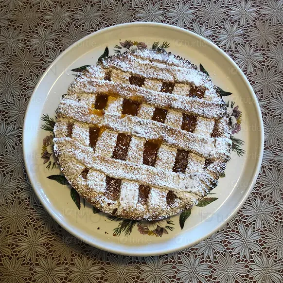
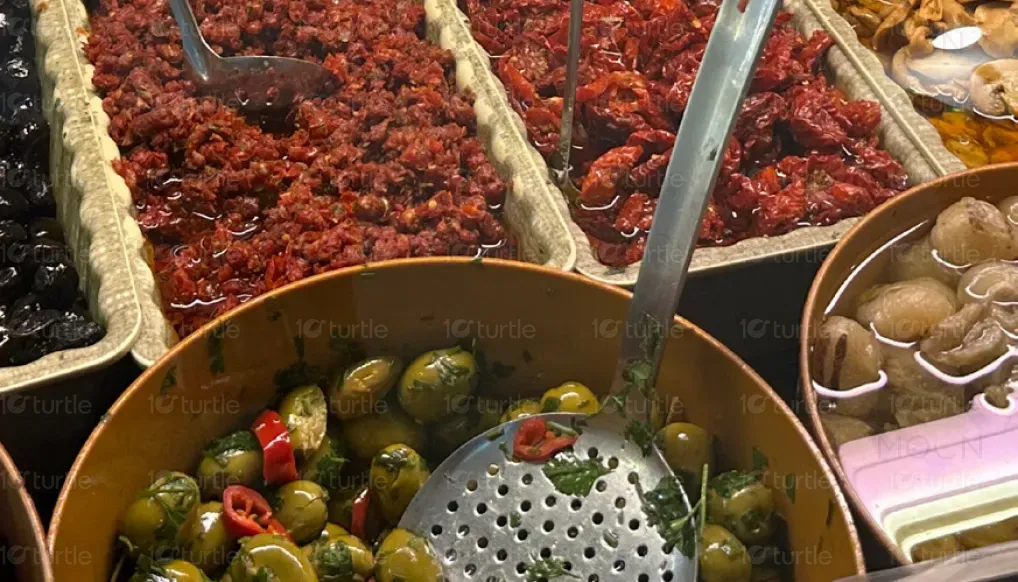
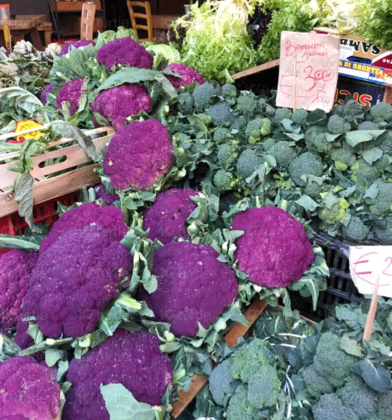
The color palette combines soft beige, creamy whites, and warm browns with accents of natural greens and rich food tones like tomato red and eggplant purple. These colors evoke the rustic charm of an Italian kitchen and highlight the freshness of ingredients. The neutral backdrop ensures the food photography pops, while the earthy tones reflect warmth, comfort, and authenticity—mirroring the essence of Nonna Carmelina’s cooking style and Italian family traditions.