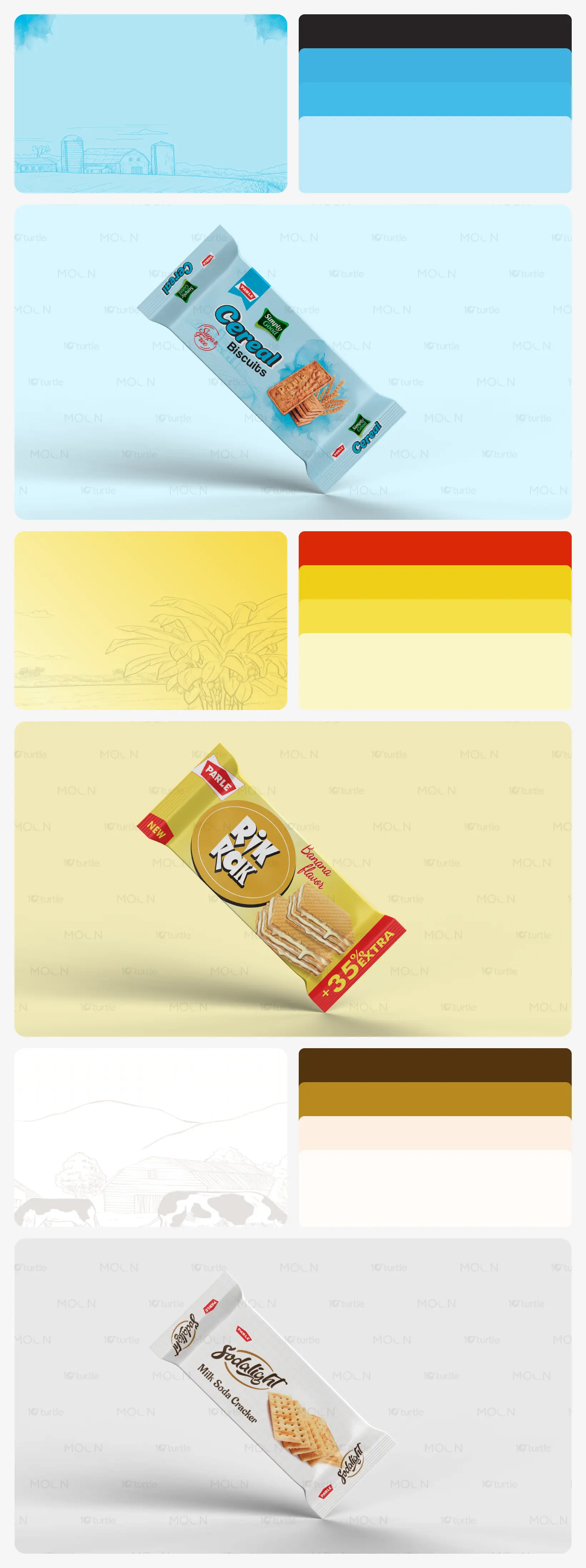
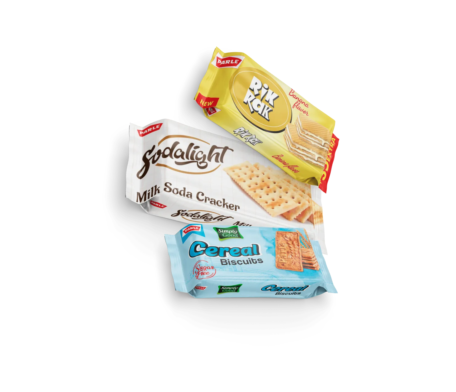
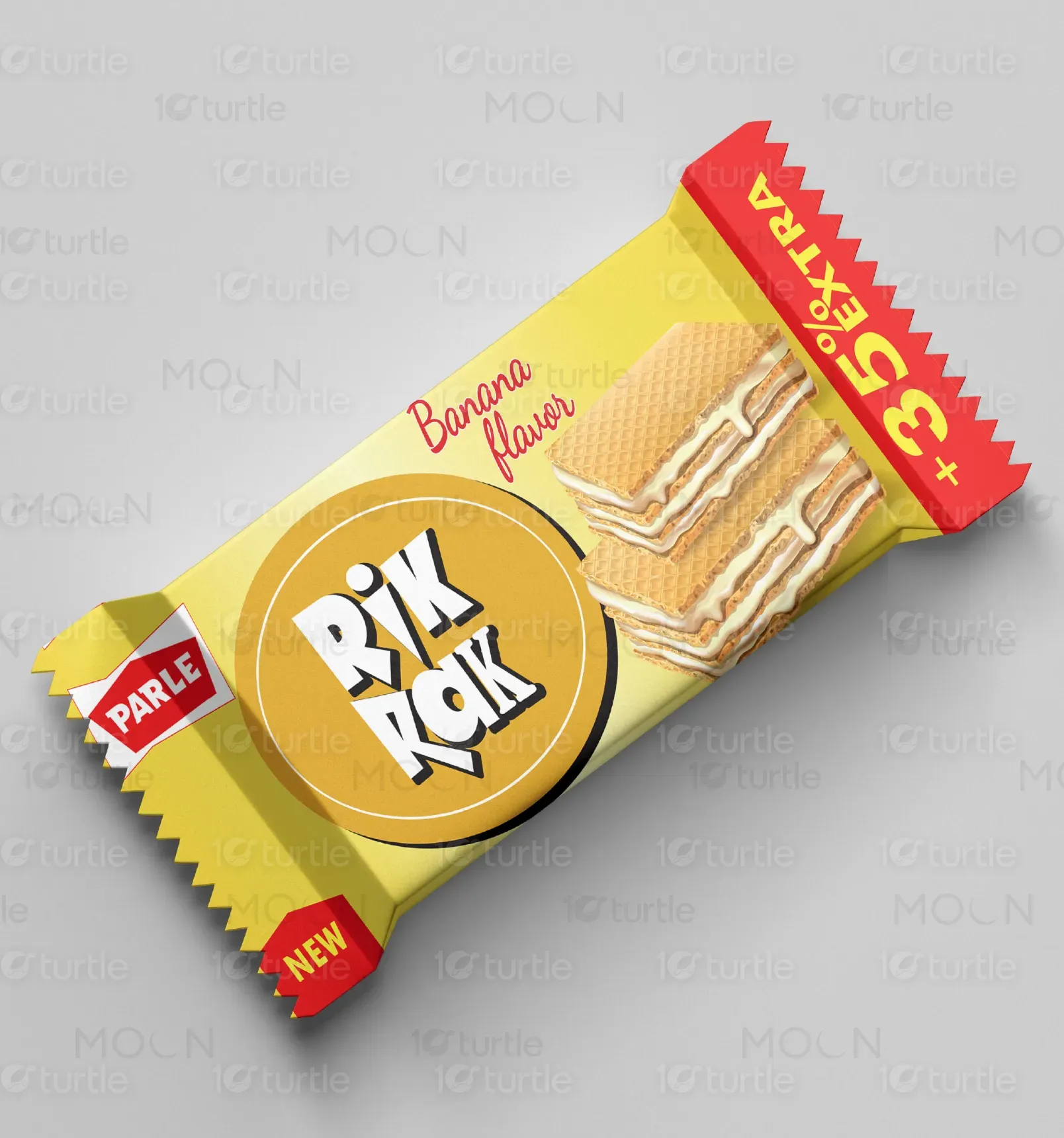
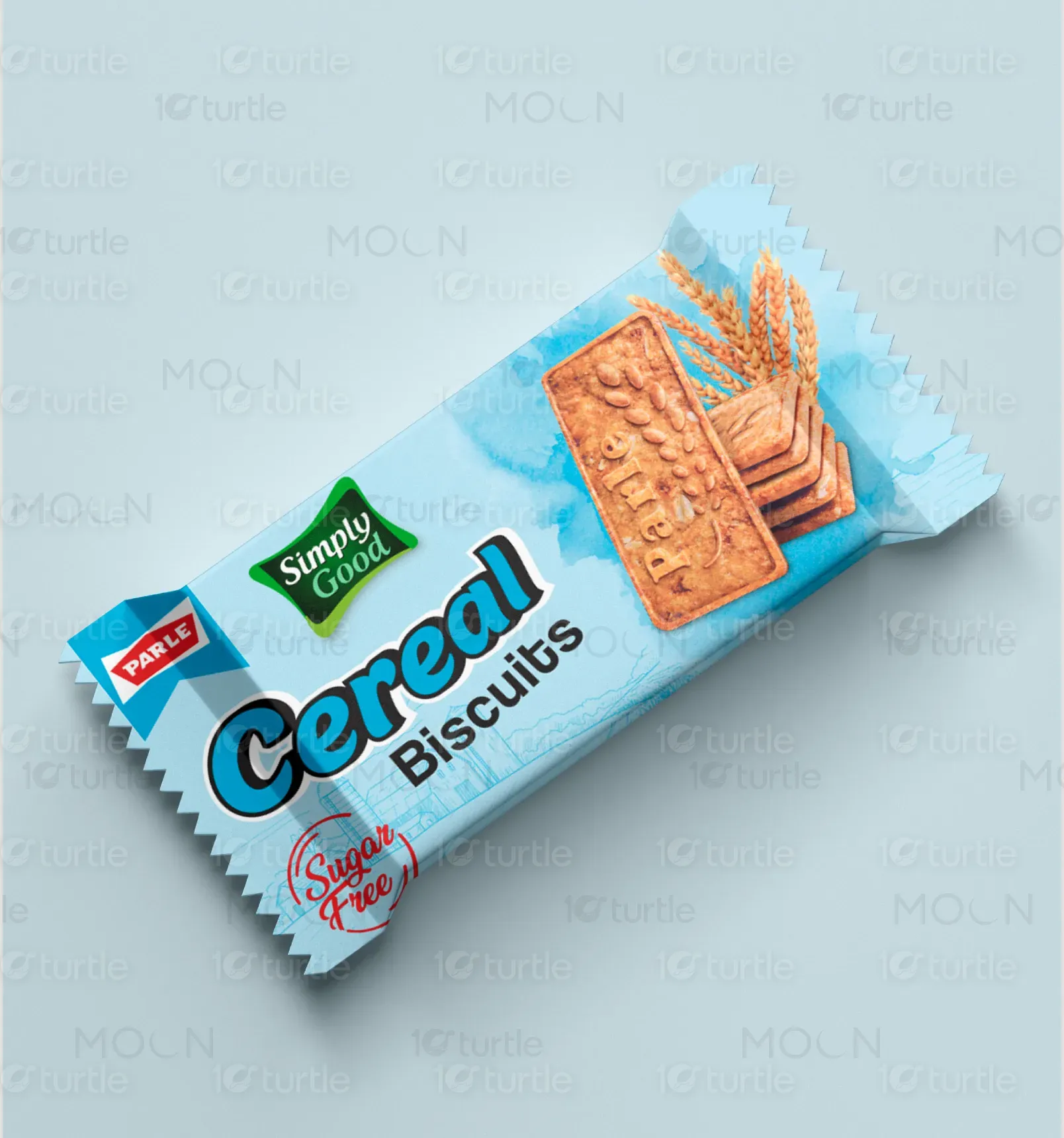
This packaging design for parle embodies a perfect blend of creativity, functionality, and brand storytelling. Clean and modern, it reflects a commitment to quality, innovation, and attention to detail. The thoughtful use of bold yet approachable typography paired with a harmonious color palette conveystrust and professionalism while capturing the essence of the product. Every element is carefully crafted to ensure visual appeal and practicality,creating an engaging unboxing experience. Designed to captivate at first glance, the packaging balances timeless aesthetics With a contemporaryedge, perfectly aligning with the brand's vision to stand out and connect with its audience.
Graphic Design
Packaging Design
Industry
Food, Beverage & Hospitality
Tools we used



Project Completion
2024
Key Market
Ghana & Global
The Parle packaging portfolio focuses on combining creativity, functionality, and brand storytelling to create impactful and timeless designs. The packaging is designed to appeal to diverse consumers by highlighting product quality, ensuring practicality, and aligning with the brand's legacy of trust and innovation.
Industry
Food, Beverage & HospitalityWhat we did
Graphics DesignPackaging DesignPlatform
-Parle faced the challenge of creating modern, impactful packaging that, Highlighted their latest product range, Balanced vibrant aesthetics with functionality, Ensured brand consistency across multiple SKUs, and Communicated product quality and stood out on shelves globally.
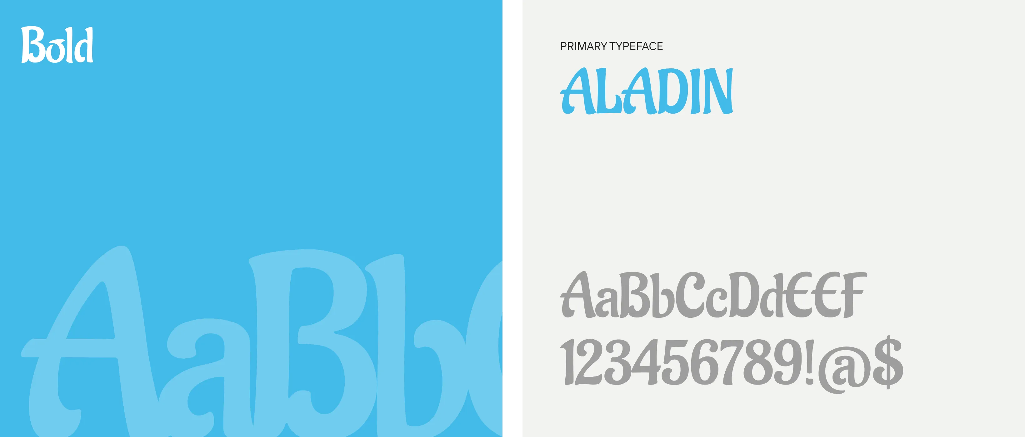
The design approach involved, Meticulously crafted layouts with vibrant, high-resolution visuals, A thoughtful typographic hierarchy for readability and recognition, Tailored designs for different product ranges using bold colors, clean typography, and illustrations, A harmonious blend of aesthetics and practicality to ensure high shelf appeal and brand differentiation.
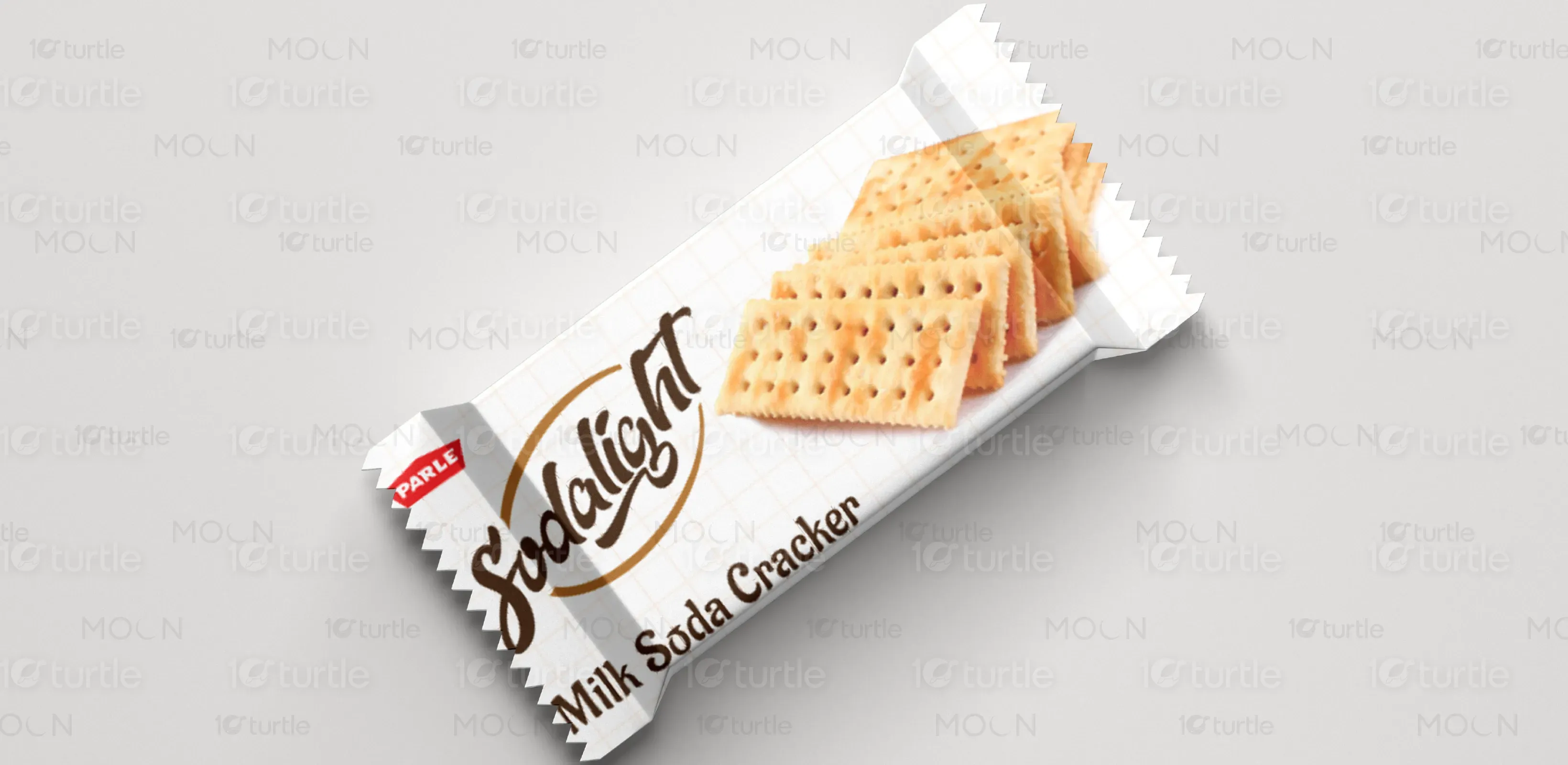
To transform Parle’s ideas into timeless and impactful packaging designs that resonate with diverse consumers globally. The vision reflects the values of trust, innovation, and quality through designs that are creative, functional, and modern.
The Parle logo is clean, recognizable, and versatile. It serves as a central element of the packaging, ensuring consistency and reinforcing brand identity across diverse products.
The color palettes are thoughtfully crafted to reflect each product's essence: calming blues for health and purity in cereal biscuits, vibrant yellows and golds for energy and freshness in Rik Rak Banana, and warm browns and creams for naturalness in milk soda crackers. Each palette ensures high shelf appeal and aligns with the product's identity.
