This case study details the redesign of a website for a hydraulics specialist, focusing on improving user experience, highlighting comprehensive services, and establishing a stronger online presence.
UX Design
UI Design
Research
Website Design
Industry
Industrial Service Website
Tools we used


Project Completion
2024
Live Url
https://narkehydraulik.se/
The client, a specialist in all things hydraulics, aimed to modernize their online platform to better reflect their expertise and comprehensive service offerings. Their existing online presence was outdated and didn't effectively communicate the full range of services they provide, from repairs to complete system design.
Industry
Industrial Service WebsiteWhat we did
User ResearchUI UX DesigningDesign AuditPlatform
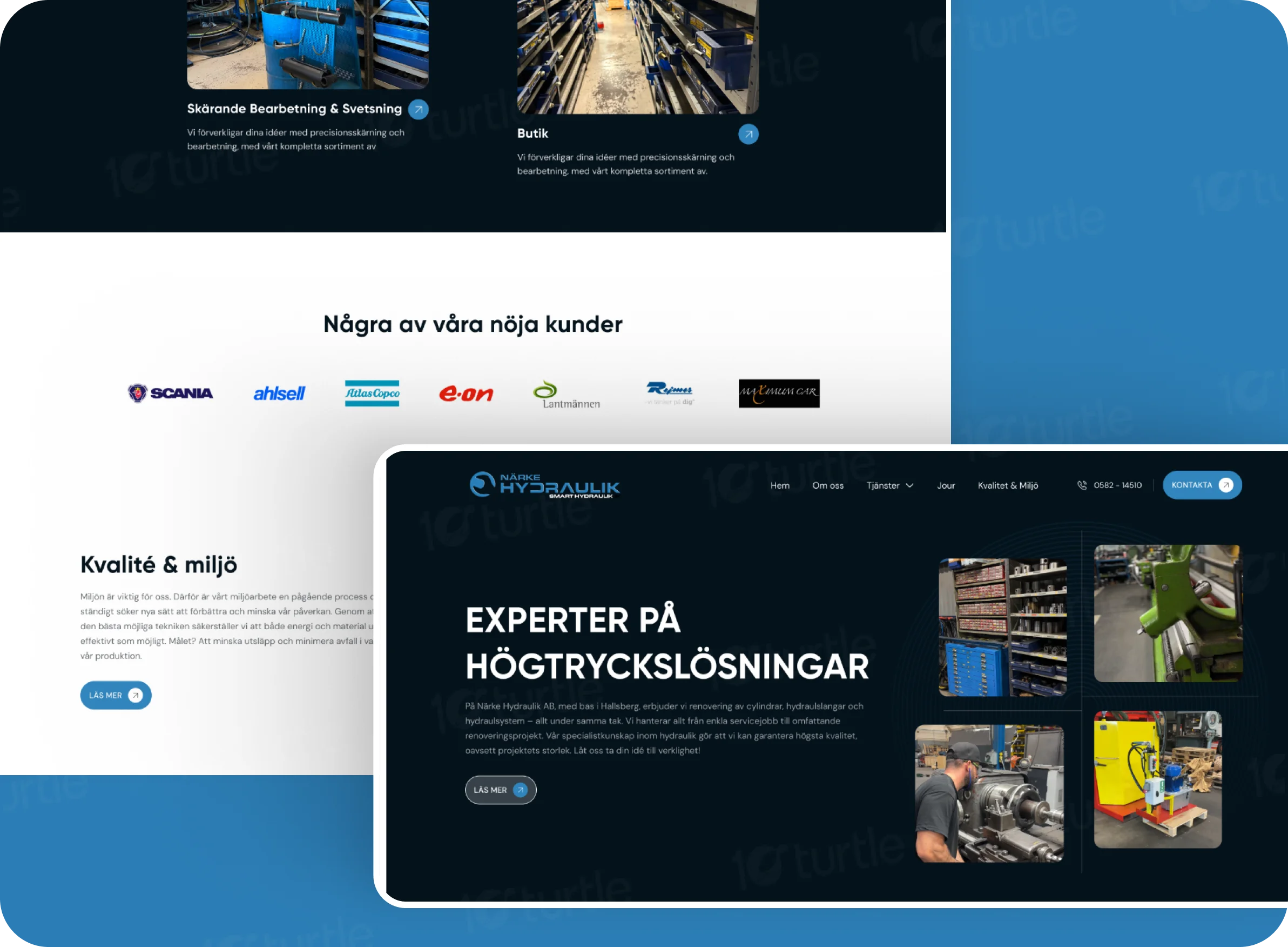
Industrial ServiceThe existing website suffered from unclear messaging, an outdated design, poor navigation, and a lack of visual appeal, hindering its ability to effectively communicate the client's comprehensive hydraulic expertise and attract new business.
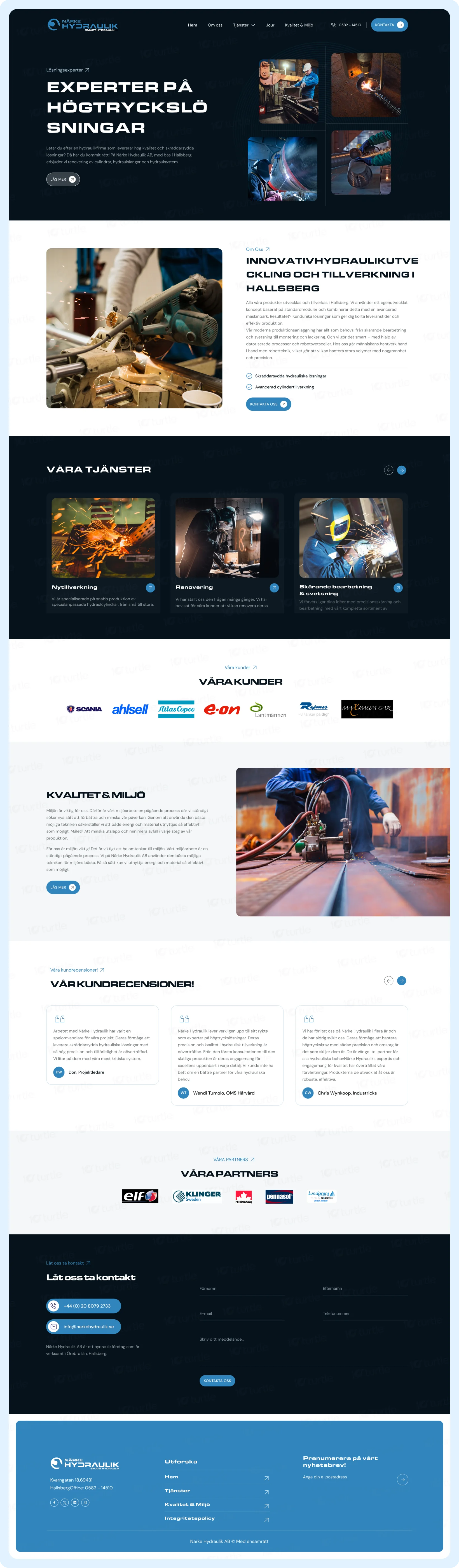
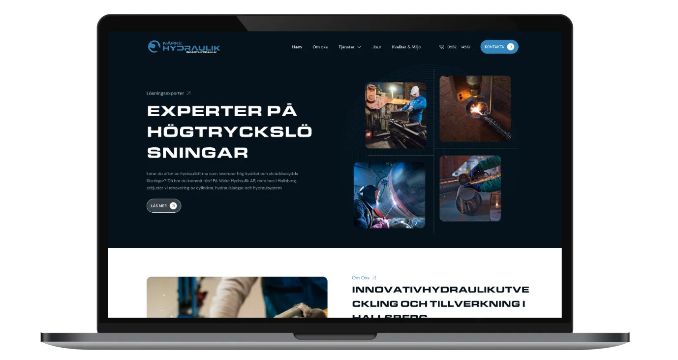
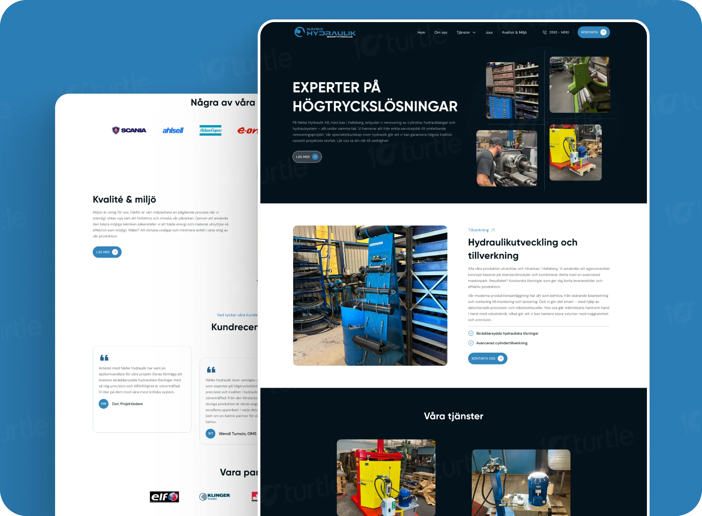
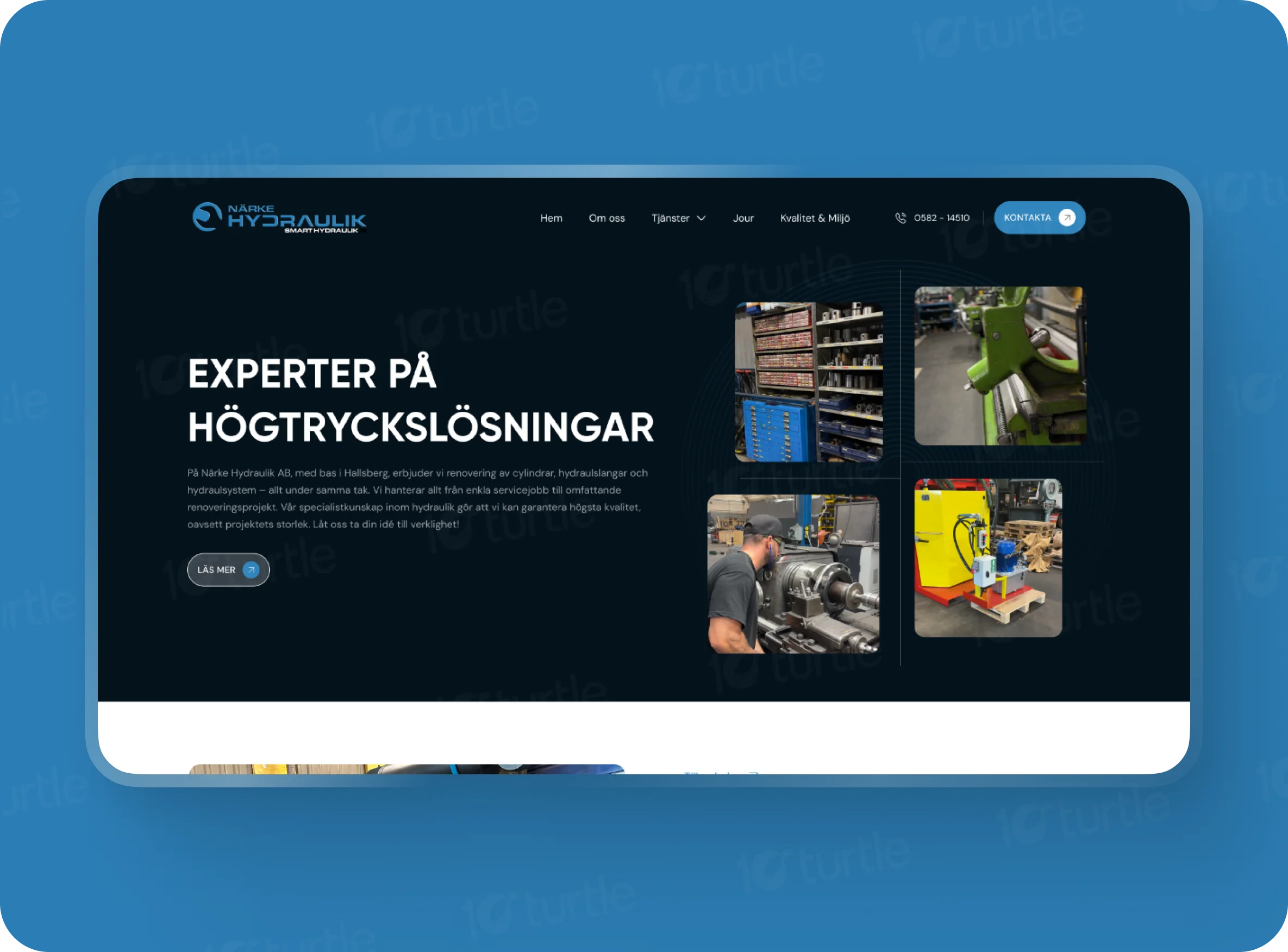
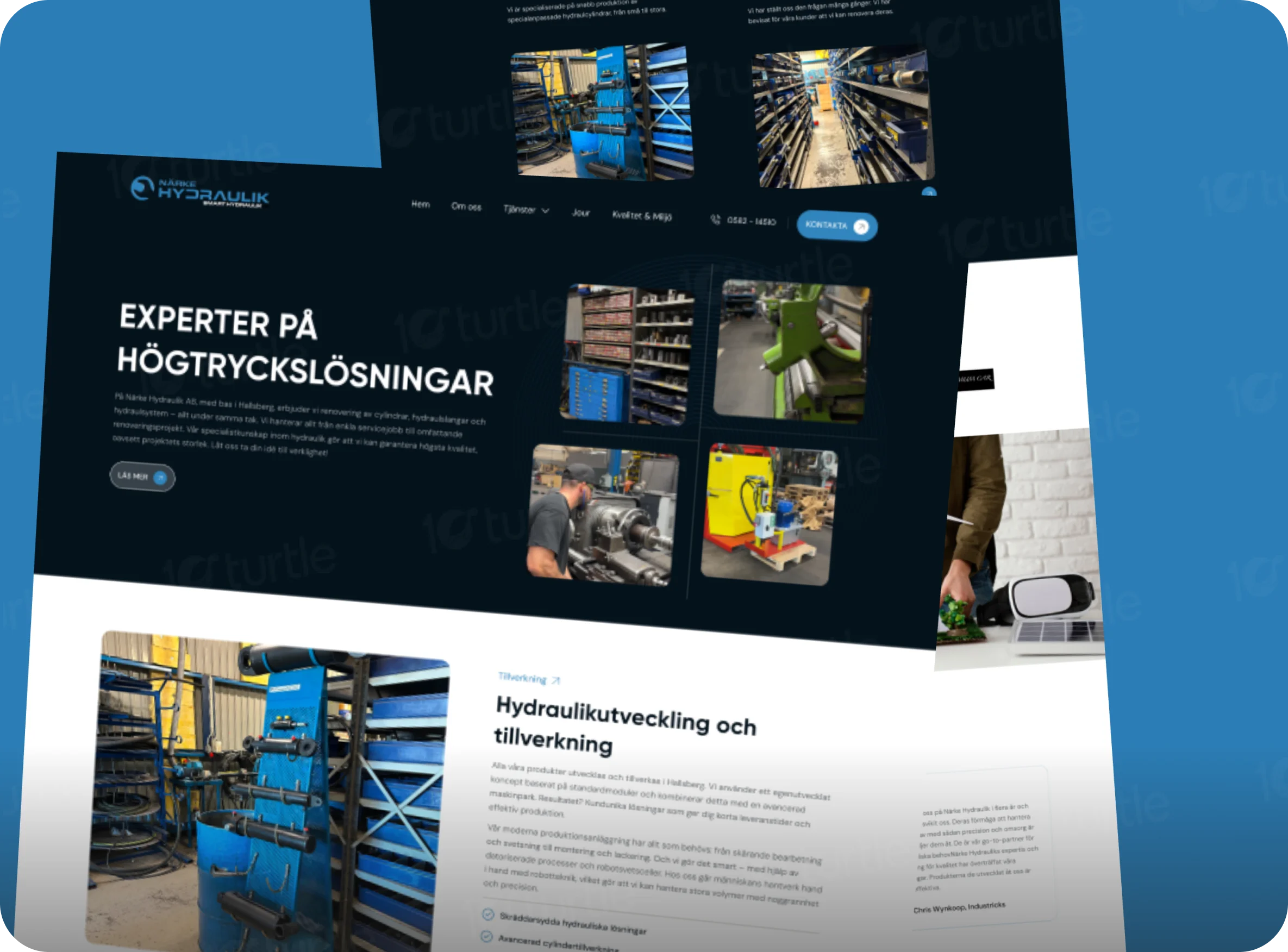
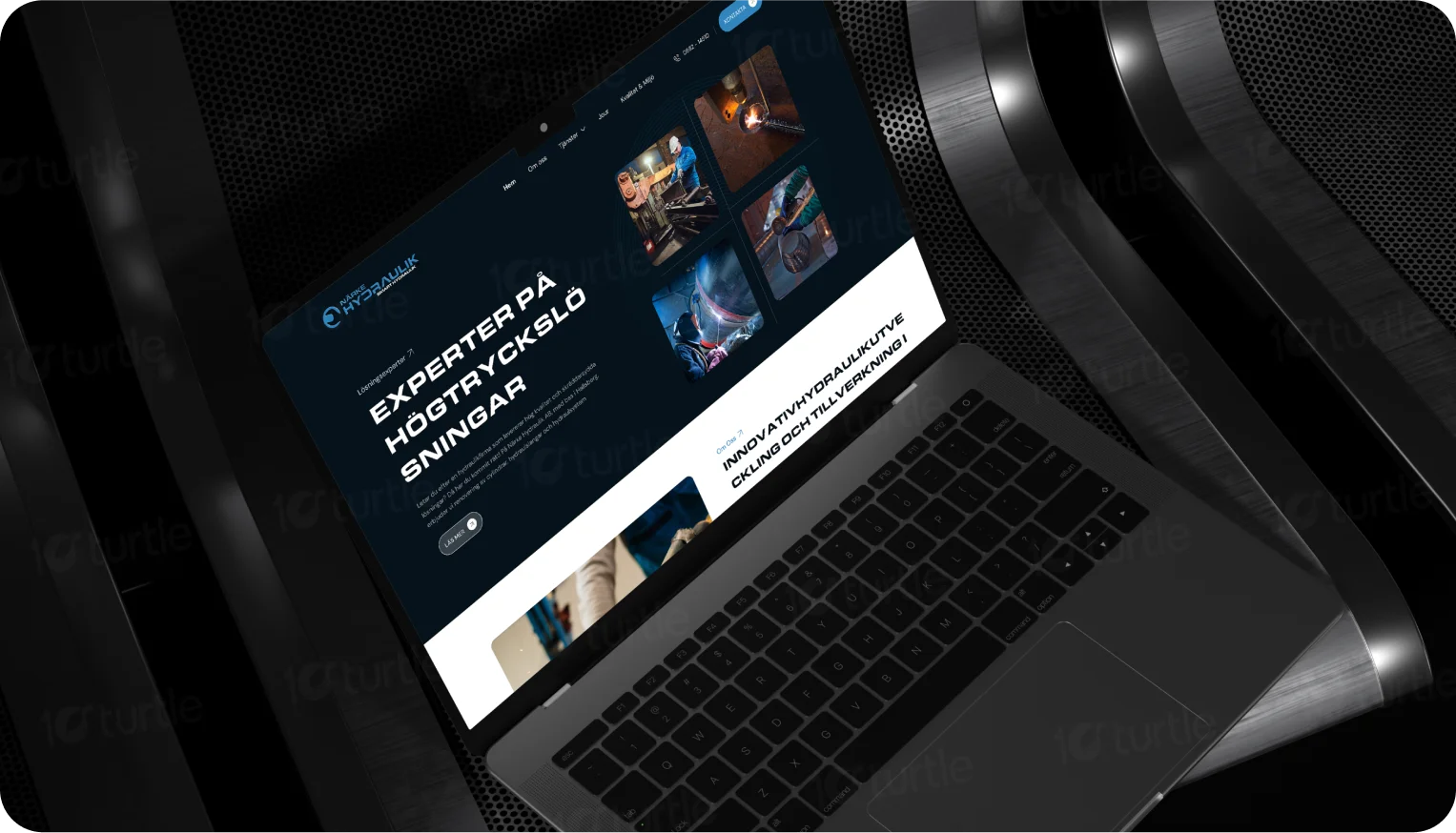
The redesign addressed these issues by refining the core message to be more concise and impactful, focusing on positioning the client as a one-stop shop for all hydraulic needs. A clean, modern design was implemented, incorporating professional imagery and a user-friendly layout to enhance visual appeal and user experience.
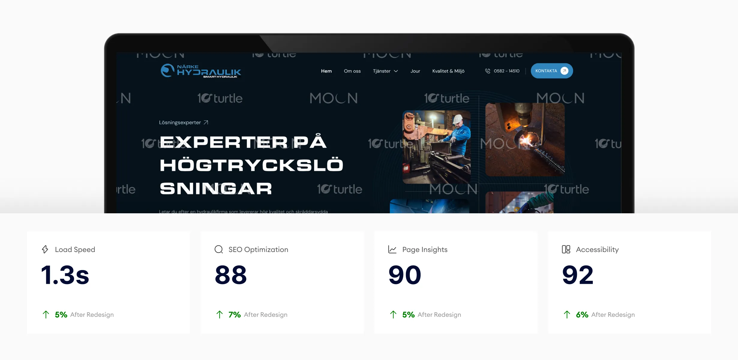
The website’s optimizations in load speed, SEO, and accessibility contribute to a smoother, more engaging user experience. The high page insights score indicates strong user engagement, while accessibility improvements ensure a better experience for all users. These enhancements ultimately lead to higher conversion rates and user satisfaction.
The client envisioned a website that would clearly communicate their comprehensive hydraulic expertise, spanning from repairs to the design and installation of new systems, establishing them as a trusted and reliable partner for all hydraulic needs. This new online presence aimed to attract new clients and generate leads by presenting a professional and modern image of the company, effectively showcasing their capabilities and solidifying their position as industry experts.
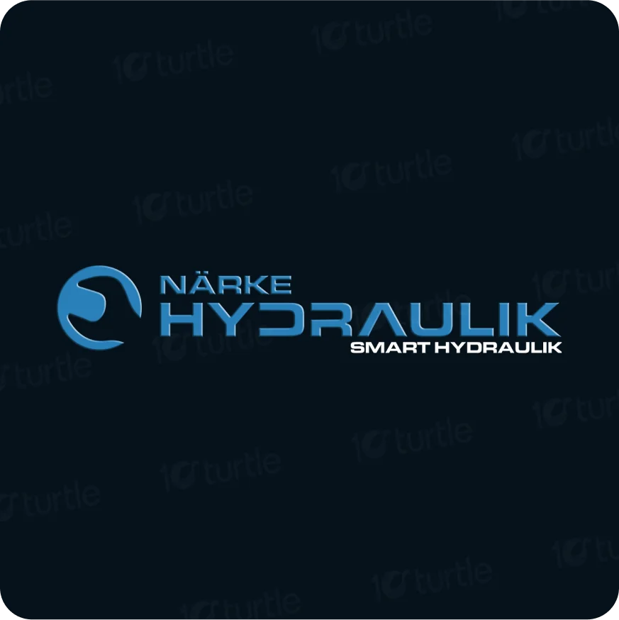
The Närke Hydraulik logo features a stylized, blue water droplet, representing the flow of hydraulic fluid. The company name is prominently displayed in a bold, sans-serif font, with "Smart Hydraulics" positioned beneath in a smaller, complementary font. The dark blue background provides a striking contrast, making the logo visually appealing and memorable.
The app uses Space Shango, a modern sans-serif font, for clarity and elegance. Bold weights highlight headings and actions, while regular and light weights ensure readability and subtle guidance throughout the interface.
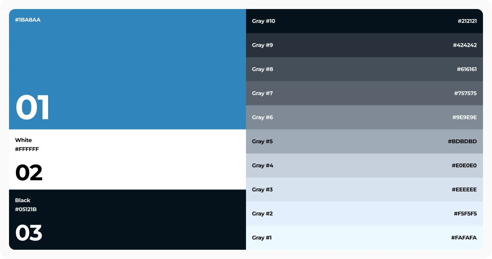
The color palette for this design draws inspiration from the Närke Hydraulik logo, employing a primary blue (#3185BD) that evokes water and fluid movement, reflecting the company's hydraulic expertise. This primary blue is complemented by a secondary dark blue (#05121B) and white (#FFFFFF) for contrast and visual hierarchy. A range of shades and tints for each color creates depth and versatility, allowing for a cohesive and visually engaging design across various elements of the website and marketing materials.
The wireframe focused on a clear information hierarchy, prioritizing key services and contact information. It outlined the layout of each page, ensuring a logical flow and user-friendly experience. This would have included sections for services, about us, contact, and potentially a blog or news section.