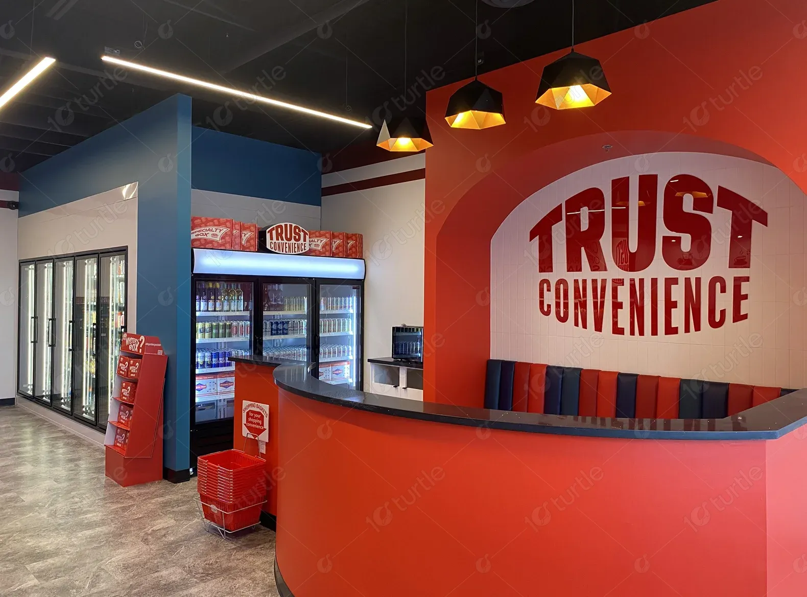
This case study explores the journey of Trust Convenience Store, a brand committed to making everyday life easier for customers. From its humble beginnings as a small local shop, it has grown into a trusted destination known for quality products, exceptional service, and a wide selection of snacks, chocolates, energy drinks, and more.
UX Design
UI Design
Research
Website Design
Industry
Convenience Retail shop
Tools we used


Project Completion
2024
Trust Convenience Store, a leader in everyday essentials, sought to enhance its brand presence and customer experience. With a focus on providing quality snacks, chocolates, energy drinks, and more, the store aimed to modernize its retail approach. Their previous setup lacked the engagement and accessibility needed to showcase their diverse product range, making it essential to revamp their platform for better convenience and visibility.
Industry
Convenience Retail shopWhat we did
User ResearchUI UX DesigningDesign AuditPlatform
-Trust Convenience Store faced challenges with limited brand visibility, outdated presentation, and an inconsistent product showcase. Customers found it difficult to explore the wide range of snacks, chocolates, and beverages, leading to missed engagement opportunities.
To address these issues, a fresh and modernized approach was introduced. The store’s branding was refined to emphasize convenience and quality, while a visually engaging layout was implemented to enhance product display.
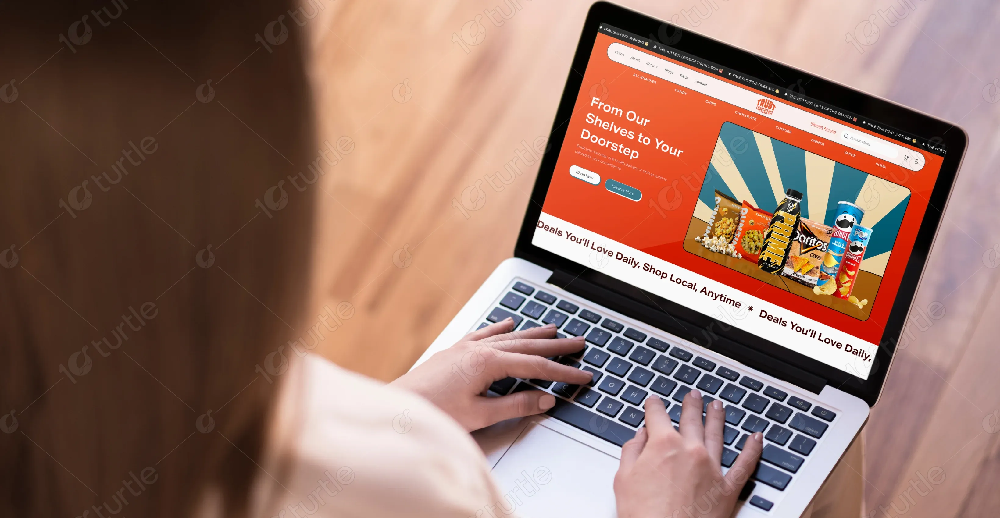
Trust Convenience Store envisioned a website that would seamlessly showcase its extensive range of snacks, chocolates, energy drinks, and everyday essentials. The goal was to create a user-friendly and visually appealing platform that reflects the brand’s commitment to quality and convenience. This new digital presence aimed to attract more customers, improve accessibility, and establish Trust Convenience Store as a go-to destination for quick and easy shopping.

The Trust Convenience logo features a sleek, modern design with a stylized, bold letter 'T' intertwined with a minimalistic shopping cart icon, representing convenience and the seamless shopping experience the brand offers. The company name is displayed in a clean, sans-serif font, with the tagline 'Convenience at Your Doorstep' positioned beneath in a smaller, complementary font. The color scheme, featuring shades of blue and orange, creates a balanced contrast that’s both eye-catching and professional, making the logo memorable and instantly recognizable.
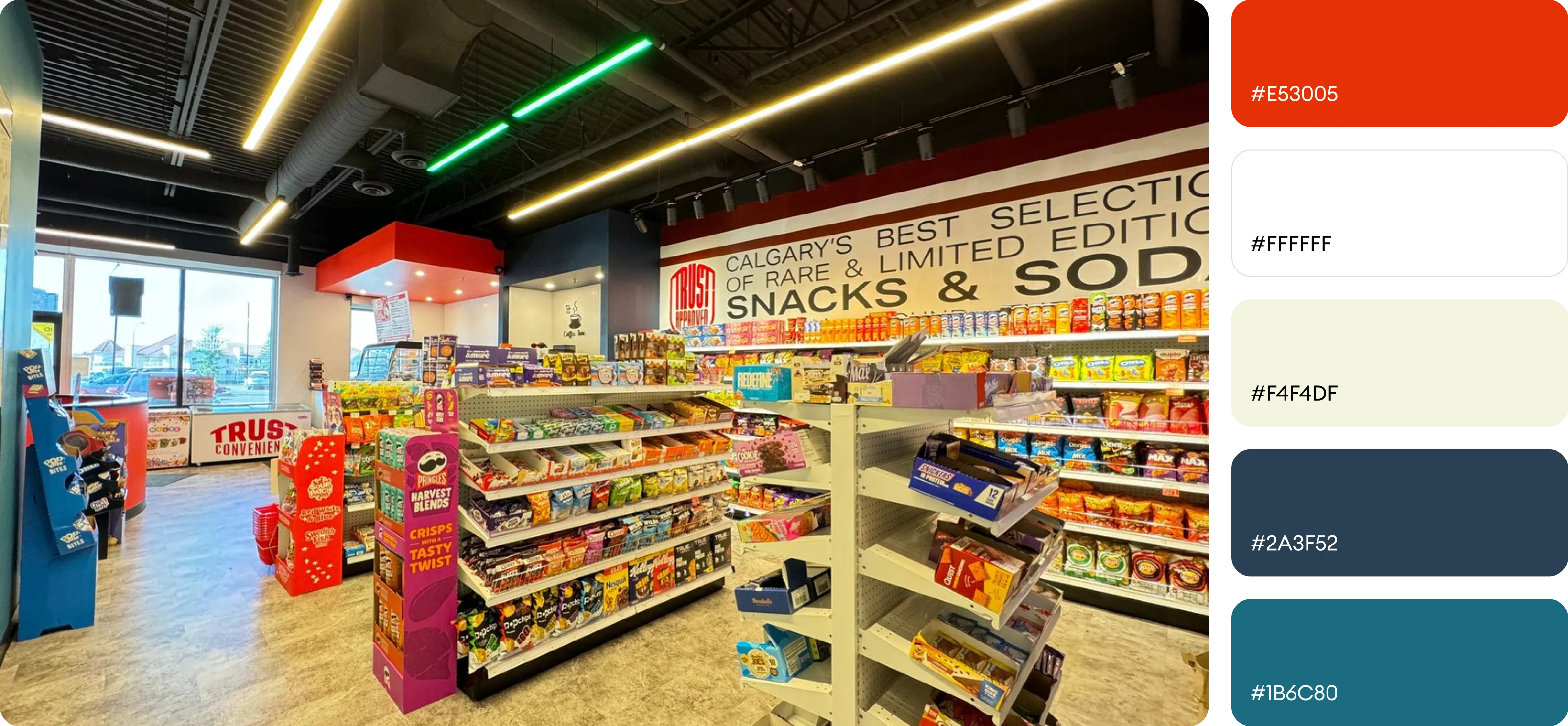
The color palette for Trust Convenience draws inspiration from the brand’s core values of trust, reliability, and innovation. The primary color, red (#E53005), symbolizes energy, excitement, and the brand's bold approach to offering convenient products. This vibrant red is balanced with a secondary dark blue (#2A3F52), which serves as a grounding element, providing a sense of stability and professionalism.
The wireframe for Trust Convenience focuses on a seamless user experience with a clear information hierarchy. It prioritizes essential sections, such as Vapes & Alcohol, Mystery Box, and New Products, ensuring that customers can easily navigate through key offerings.