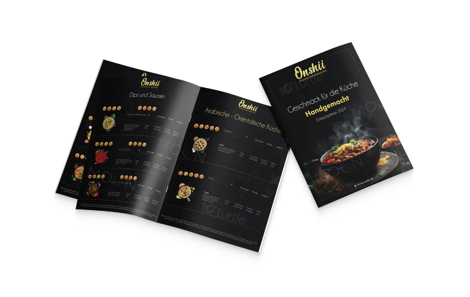
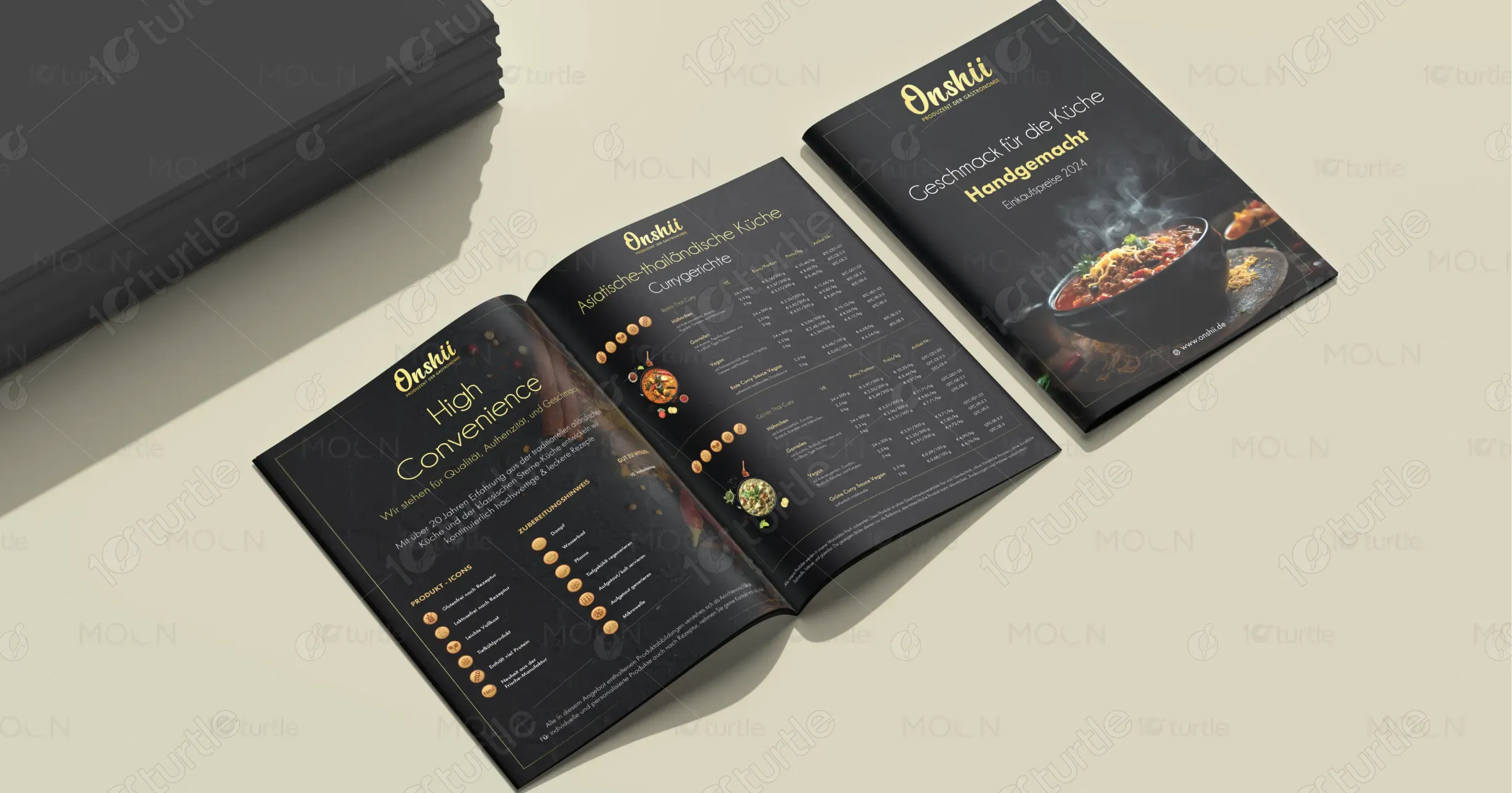
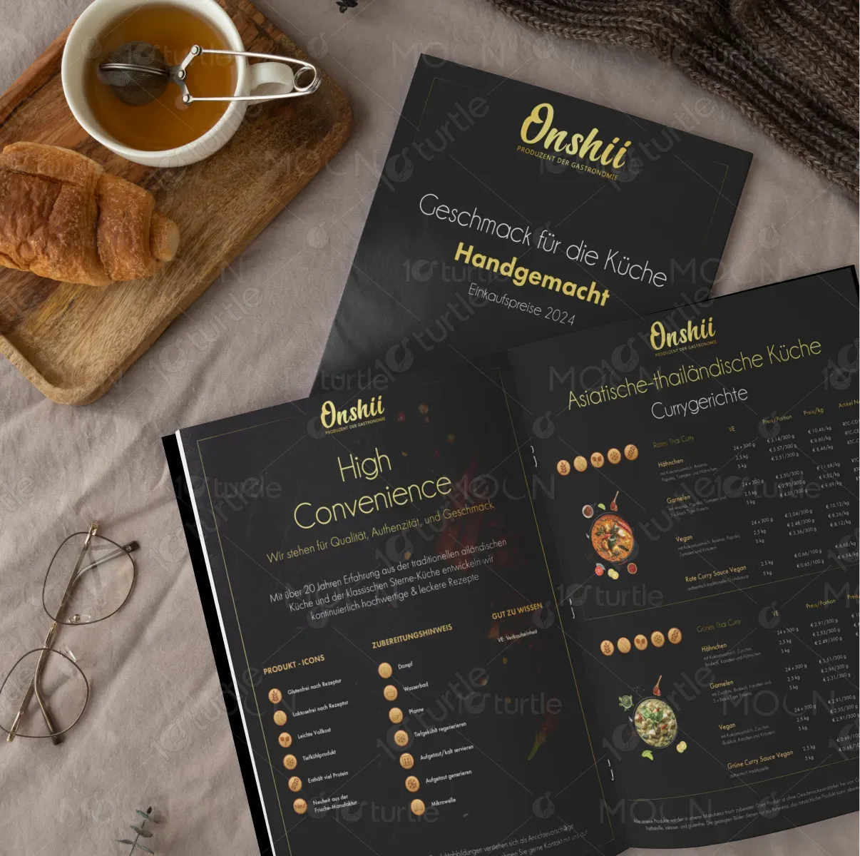
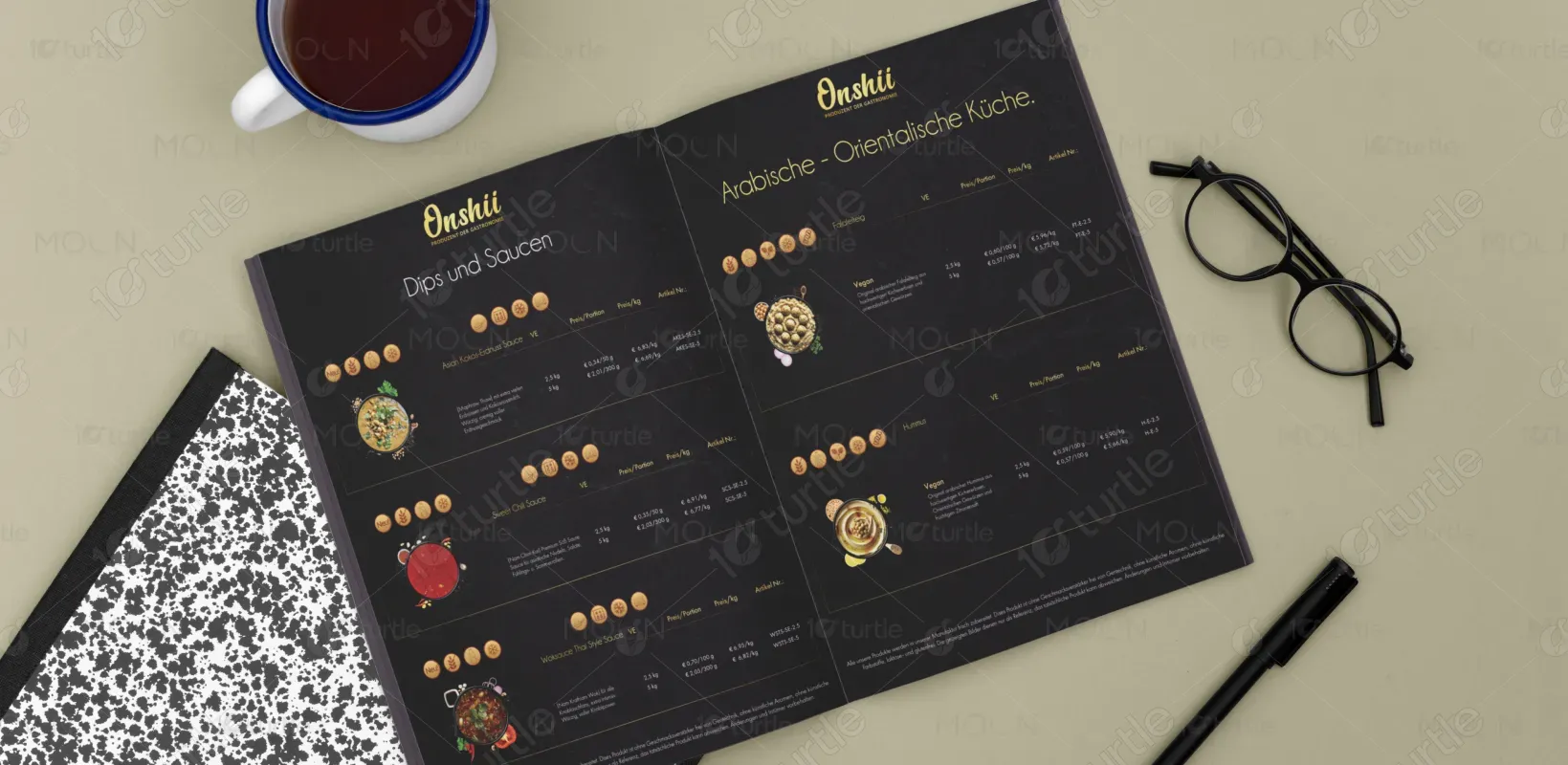
The brochure and sell sheet design blends premium aesthetics with a clean, modern layout to reflect culinary sophistication. A rich black background with golden accents projects luxury and quality, while vibrant food imagery adds warmth and appetite appeal. Consistent use of icons, structured typography, and a grid-based layout enhances readability and product navigation. This visual approach creates a professional yet inviting brand presence, aligning perfectly with Onshii's promise of hand-crafted, authentic Asian-Thai cuisine for gastronomy professionals.
Brochure Design
Shell Sheet Design
Graphic Design
Industry
Food, Beverage & Hospitality
Tools we used


Project Completion
2025
Key Market
Global
This brochure and sell sheet promote Onshii’s handcrafted Asian-Thai culinary offerings tailored for the professional gastronomy market. Designed to inspire confidence and convenience, the materials showcase an extensive product range, preparation methods, and unique selling points such as vegan options and recipe flexibility. With a premium look and organized layout, the materials serve both as a brand introduction and a practical ordering tool. Onshii's blend of authenticity, variety, and high production quality sets it apart in a competitive market.
Industry
Food, Beverage & HospitalityWhat we did
Brochure DesignShell Sheet DesignGraphic DesignPlatform
-One key challenge was visually balancing authenticity and professionalism while avoiding cliché Asian-themed design tropes. Many foodservice brochures either overuse cultural motifs or lack warmth, which risks alienating a global audience. Another challenge was condensing complex product data—like weights, portion sizes, and pricing—into a clean, digestible layout without overwhelming the viewer. Achieving this clarity while maintaining brand elegance required thoughtful typographic hierarchy and iconography.
The solution involved a dark, neutral background that allows vibrant food photography and gold typography to stand out, communicating richness and quality. A system of intuitive icons and tabular layouts was developed to simplify product selection and comparison. Strategic visual spacing and alignment ensure easy navigation. The brochure merges brand storytelling with functionality—conveying the handcrafted, high-standard nature of Onshii’s offerings while guiding professionals through product details quickly and efficiently.
The long-term vision is to establish Onshii as a trusted premium supplier in the foodservice sector, recognizable for both quality and visual identity. This design aims to create a timeless visual language that can be extended across digital catalogs, packaging, and marketing collateral. As the brand evolves, the materials can easily scale with new product lines and seasonal promotions while retaining consistency and emotional resonance with professional buyers.
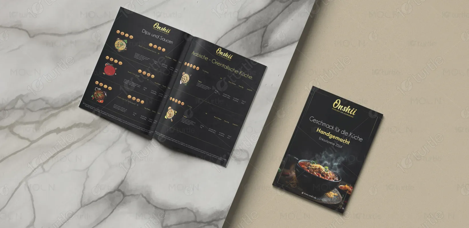
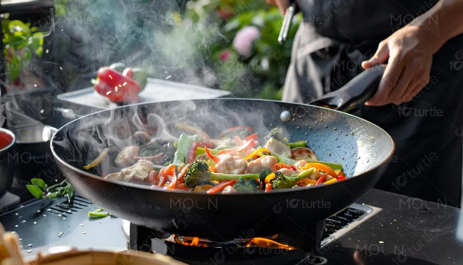
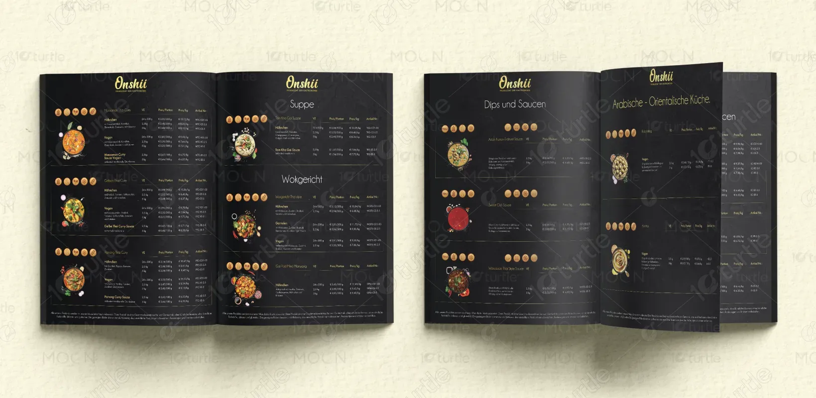
The color palette features deep black, warm gold, and accents of natural food tones (orange, green, red). Black conveys elegance and professionalism, allowing the gold to symbolize premium quality and trust. These colors align with Onshii’s identity as a high-end culinary brand and evoke feelings of warmth, richness, and authenticity. The consistent use of this palette enhances brand recognition and lends a refined, polished aesthetic to the overall presentation.