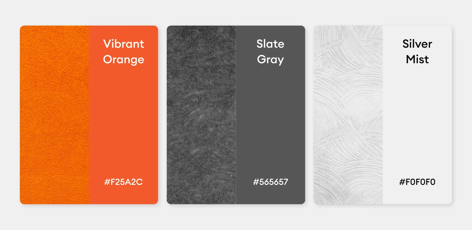
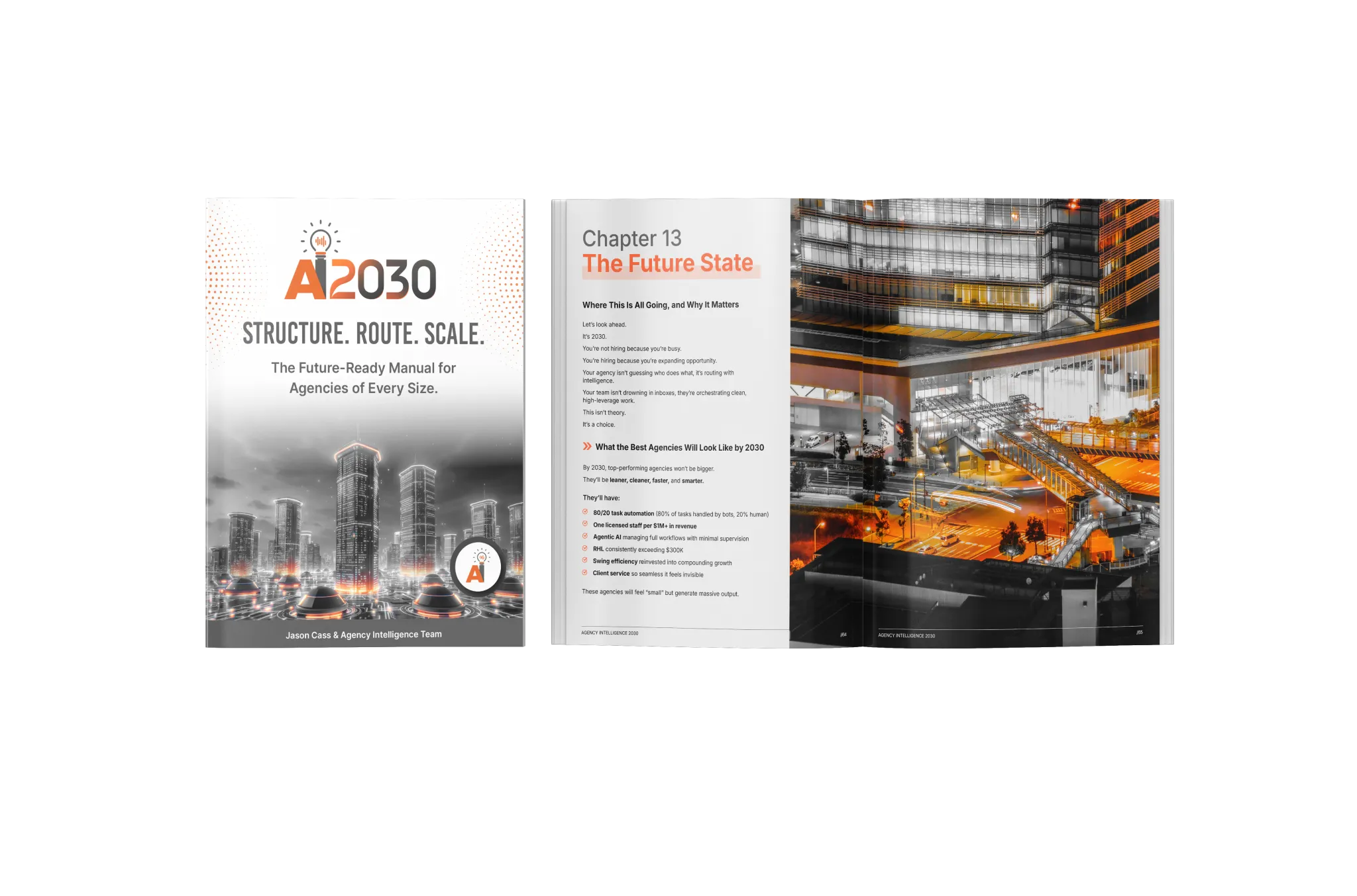
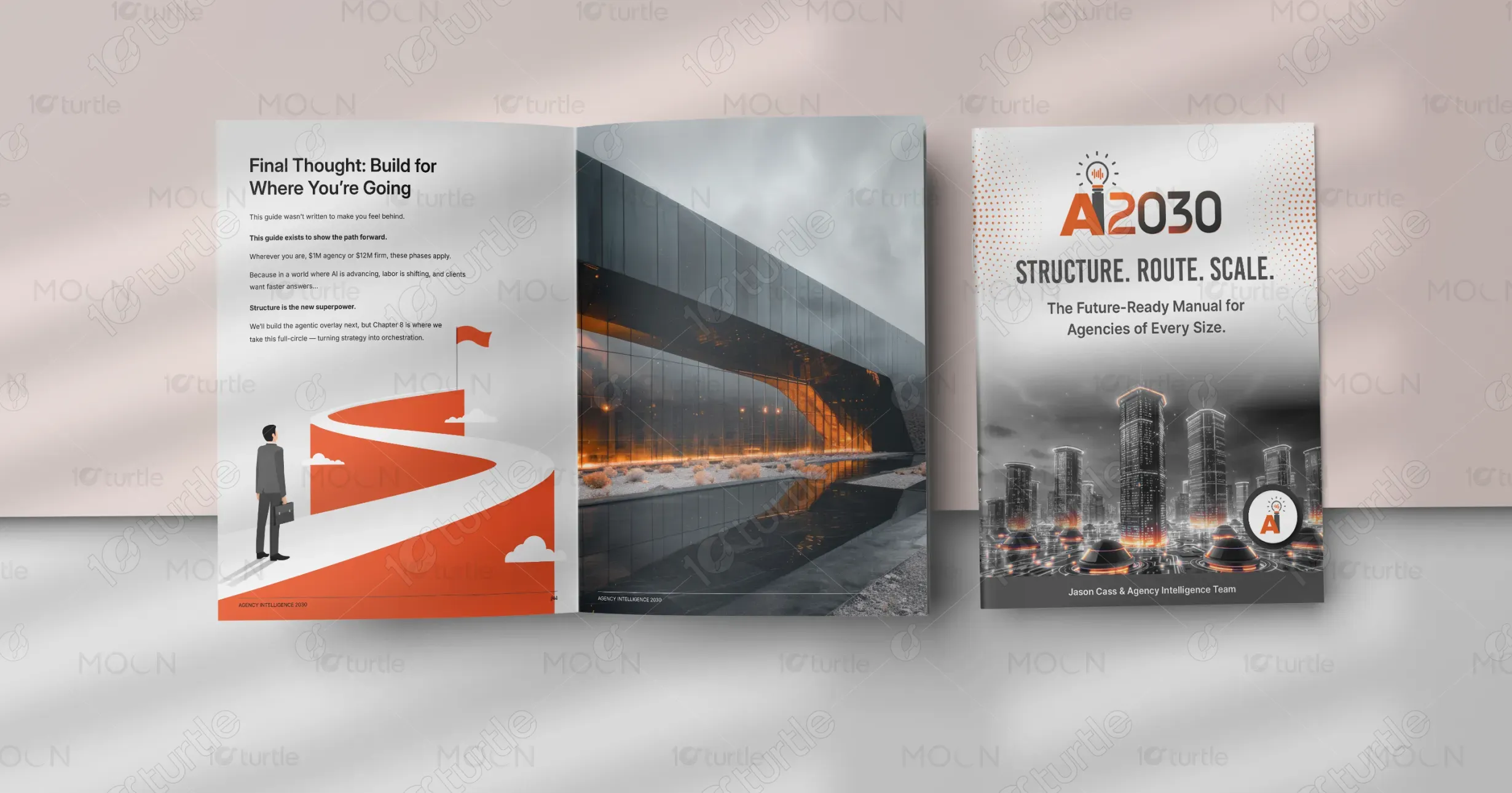
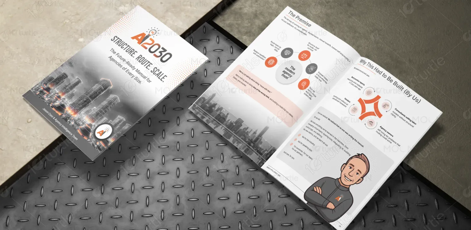
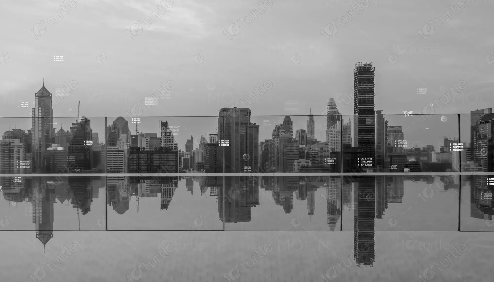
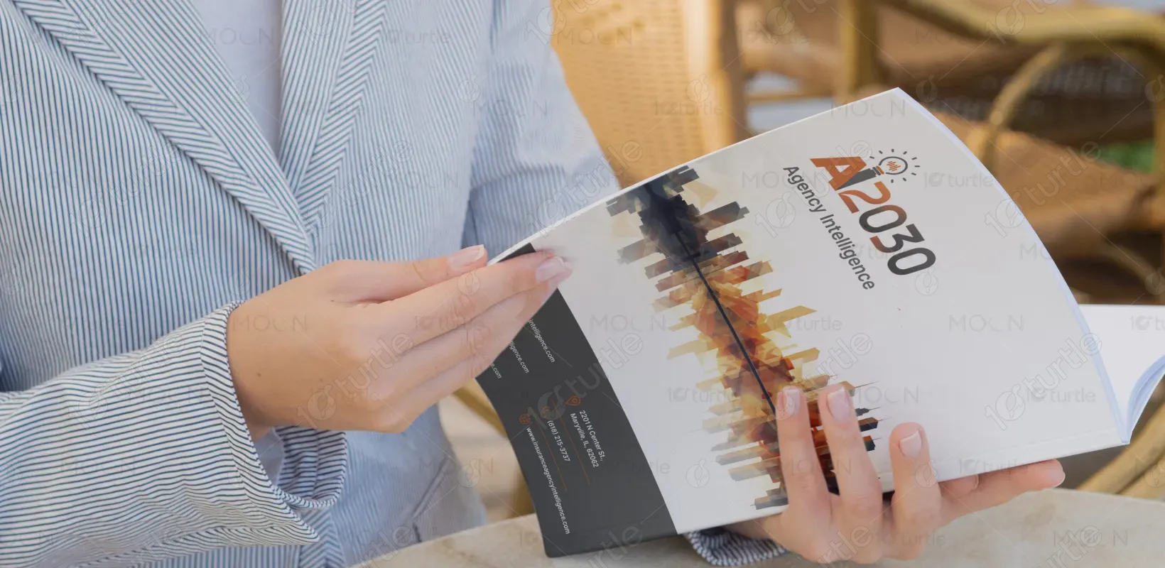
The AI2030 manual embraces a futuristic, structured design language that mirrors the technological innovation it promotes. Using a sleek grayscale palette with vibrant orange accents, the aesthetic strikes a balance between professionalism and boldness. The clean typography and symmetrical layouts create clarity, while the imagery—urban skylines and abstract paths—symbolizes progress and vision. This editorial design effectively communicates strategy and sophistication, making it ideal for modern agencies navigating the AI revolution.
Booklet Design
Graphic Design
Industry
Technology, SaaS & Startups
Tools we used



Project Completion
2025
Key Market
Global
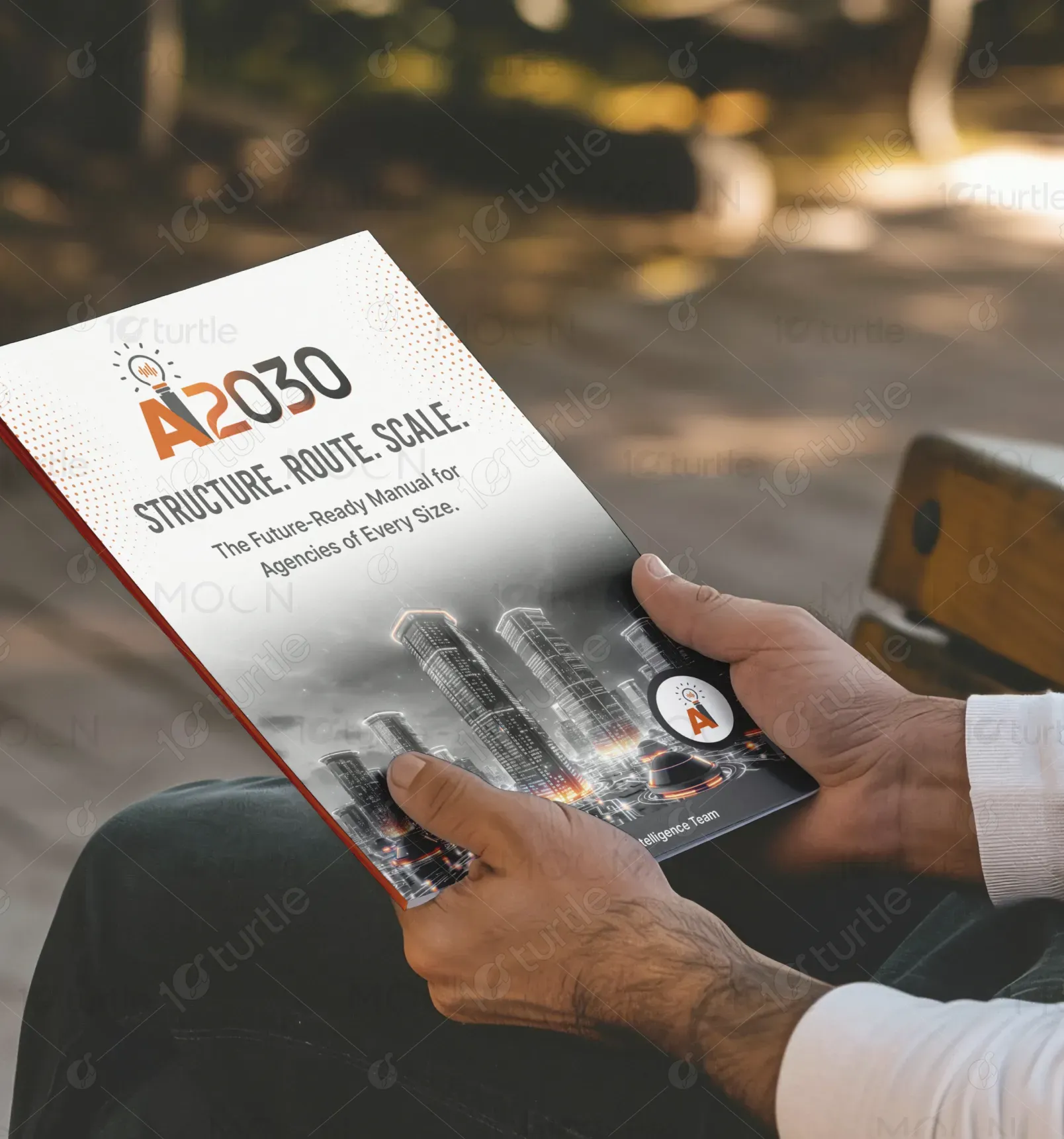
AI2030: Structure. Route. Scale. is a future-forward manual tailored for marketing and creative agencies adapting to the evolving AI-driven landscape. Designed for agencies of all sizes, this guide outlines strategic frameworks, scalable structures, and actionable paths toward AI integration. With an emphasis on practical execution over trend-chasing, it’s a go-to resource for sustainable growth. The sleek visual identity and informative tone reinforce the manual’s role as a premium, must-have tool for future-ready professionals.

Industry
Technology, SaaS & StartupsWhat we did
Booklet DesignGraphic DesignPlatform
-The challenge was crafting a design that appeals to both traditional agencies and tech-forward innovators. Many AI-related materials tend to be visually overwhelming or overly technical, alienating a large portion of the target market. There was also a need to visually represent "structure" and "scalability" without resorting to clichés like gears or robots. Balancing future aesthetics with human relatability was key to avoiding the cold, inaccessible feel common in tech publications.
The design addresses this gap by blending structured, modernist architecture imagery with symbolic illustrations like a roadmap and futuristic cityscapes. This reflects both the logical and visionary aspects of AI integration. The orange highlight color acts as a consistent visual anchor, drawing attention to critical information. Typography is clean and legible, reinforcing accessibility. The layout is modular—allowing information to be digested in chunks, which aligns with how agency leaders process strategic insights.
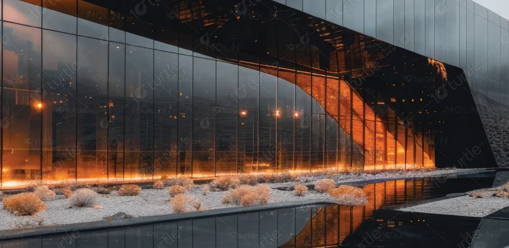
AI2030 is more than a manual—it’s designed to become an evolving thought-leadership asset. The goal is to continuously update it with new frameworks, success stories, and market data, making it a living resource. Long-term, it aims to be the industry standard for AI adaptation in agencies, influencing both design thinking and operational shifts. Visually, the design will inspire spin-offs—workshops, video series, and digital tools—while maintaining a consistent, recognizable brand identity.

These colors represent structure, stability, and modern professionalism, while the accent tone injects energy, innovation, and urgency—perfect for highlighting strategic inflection points. Lighter tones provide clarity and breathing space, enhancing readability and maintaining strong visual focus.
