This project focuses on designing a landing page for a fitness brand led by Dr. Stoll Cohen. The brand's mission is to empower individuals through tailored health programs, personal coaching, and fitness consultations. The goal was to create a compelling digital presence that reflects both the grit and growth mindset of its audience.
UX Design
UI Design
Research
Websites Design

Industry
Healthcare & Wellness
Tools we used

Project Completion
2024
The primary goal was to design a landing page that clearly communicates the brand’s multifaceted offerings, builds trust through testimonials and credentials, and drives user engagement through storytelling and calls to action. The scope included layout design, UI/UX refinement, content structuring, and visual identity integration.
Industry
Healthcare & WellnessWhat we did
User ResearchUI UX DesigningResponsive ExperiencePlatform
-Before this redesign, the brand lacked a cohesive digital identity. The existing platform failed to convey the depth of services, lacked conversion-focused structure, and did not emotionally connect with the target audience. There was a clear need for a more personalized, motivating experience that could drive real user action.
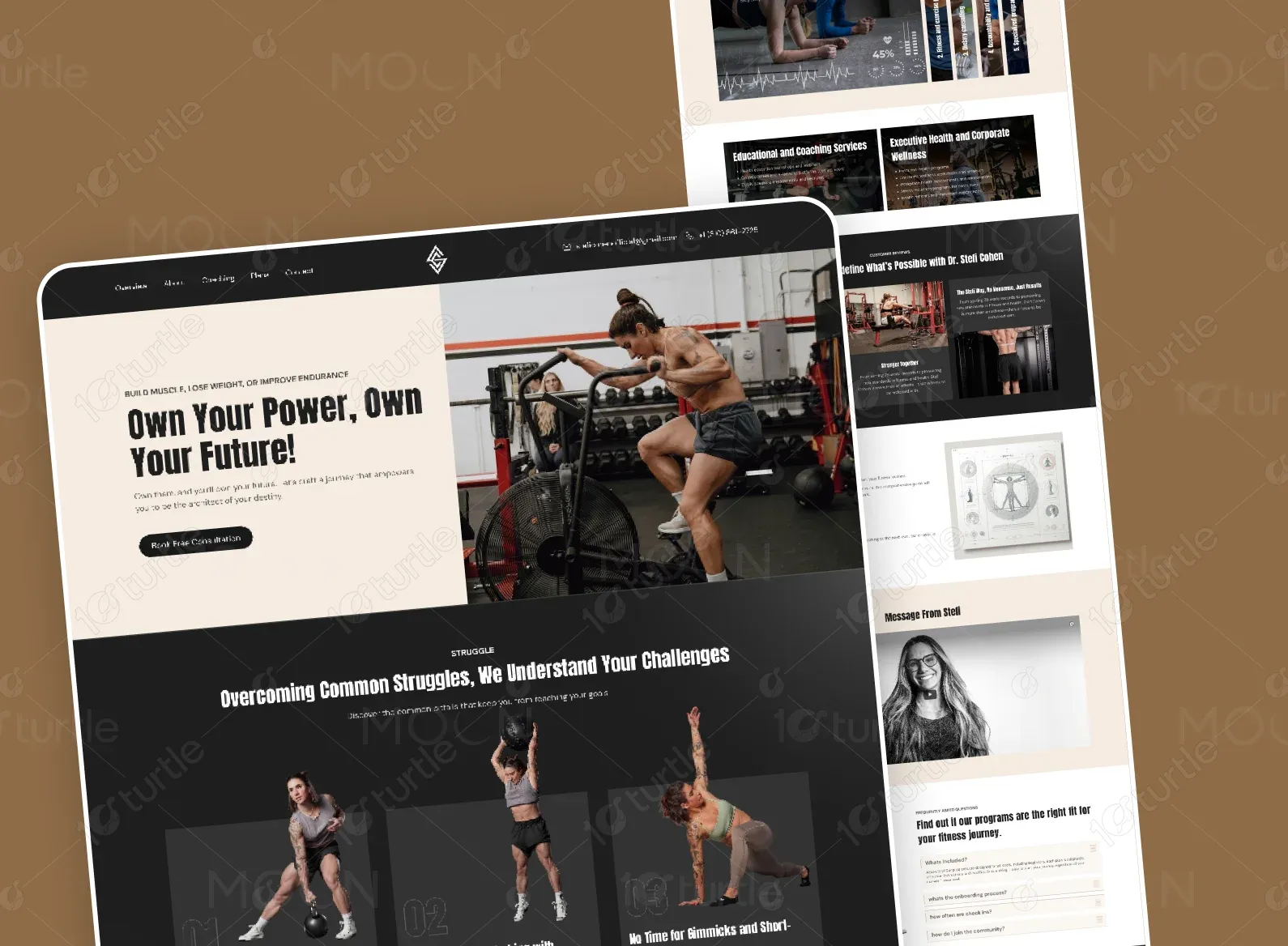
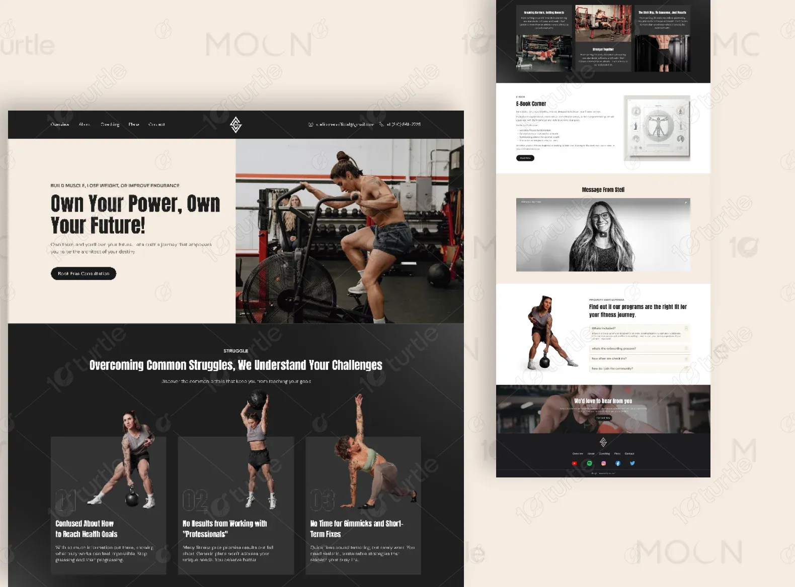
We built a high-impact, emotionally charged landing page centered around storytelling, strong visuals, and seamless flow. Each section is crafted to guide users—from awareness to trust to action. We highlighted client testimonials, integrated personalized offerings, and clearly segmented services for better discoverability. The strategic use of contrasting light and dark blocks ensures visual interest and user retention.

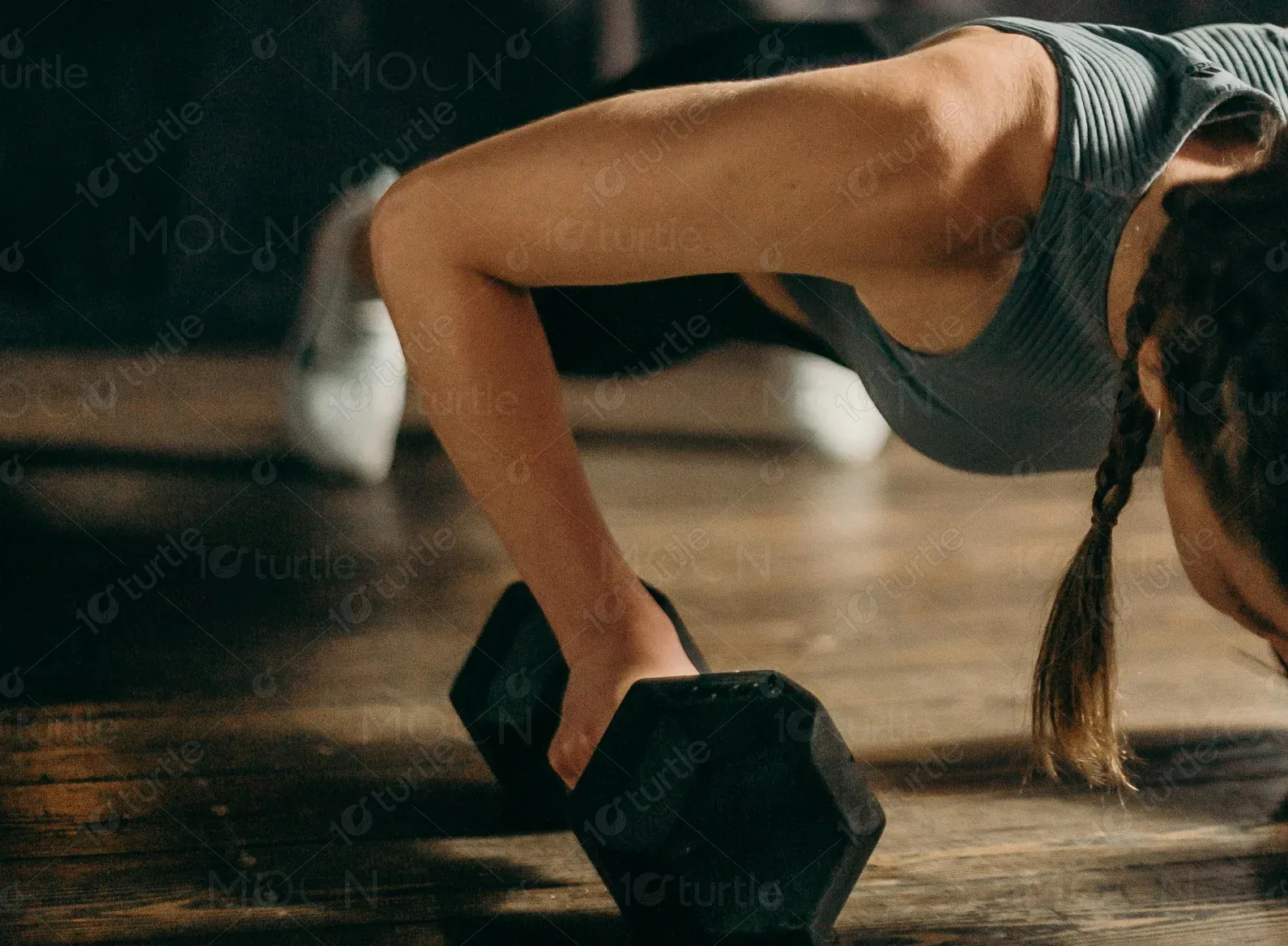
The client envisioned a gritty, honest, and empowering aesthetic. They wanted to move away from sterile fitness clichés and instead create something raw yet polished—something that feels human, real, and inspirational. Inspirations included brands like Onnit, Mountain Tactical Institute, and Jocko Fuel—brands that reflect strength, intelligence, and authenticity.
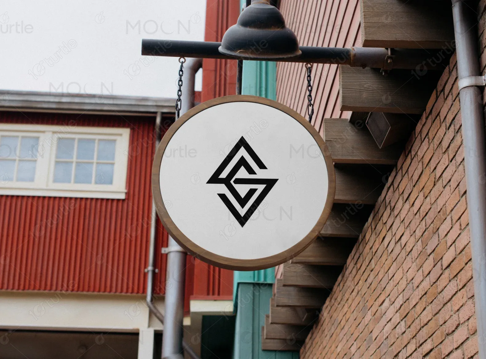
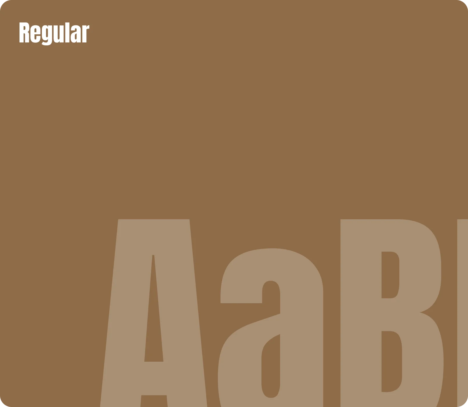
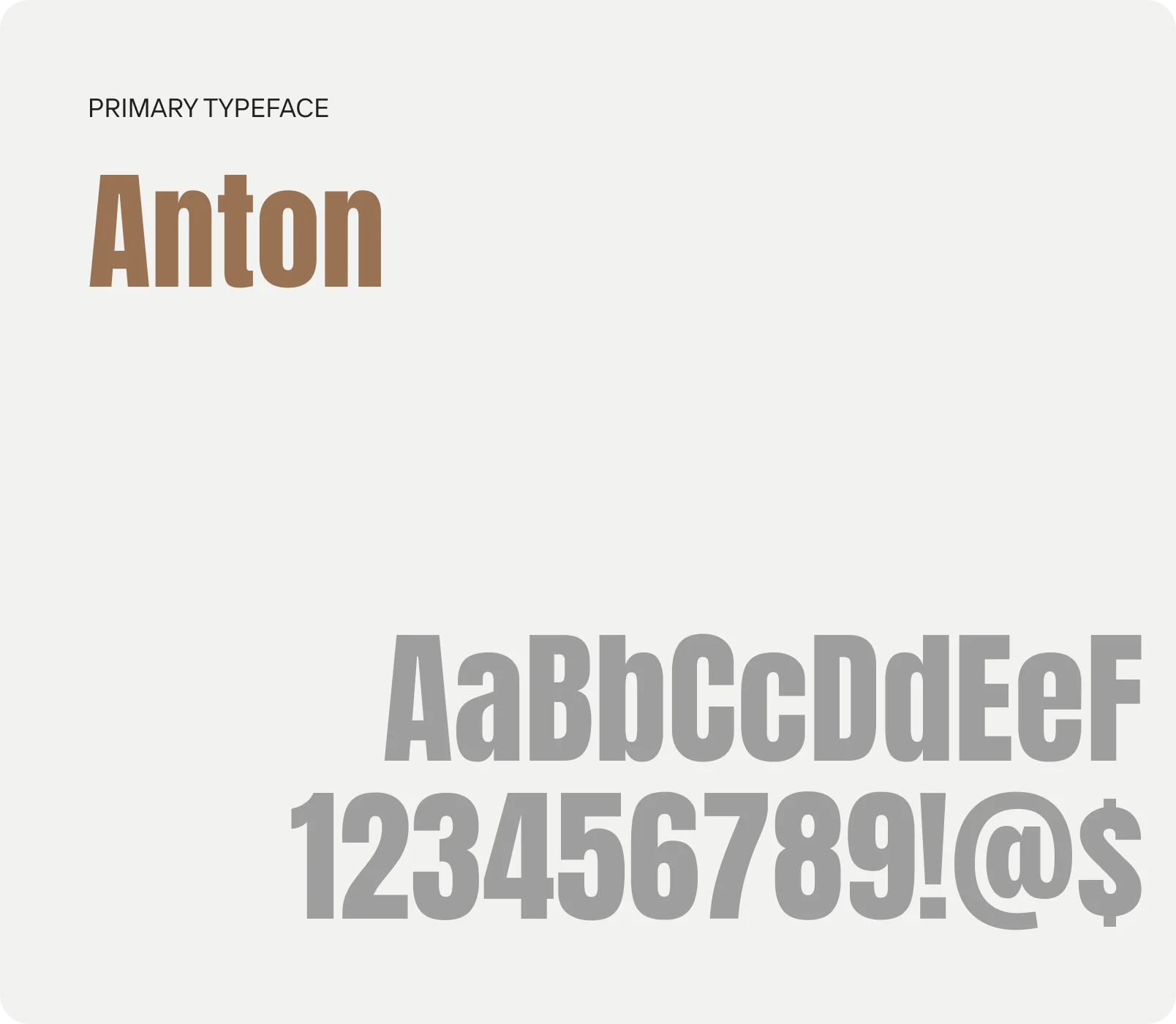
The logo appears top center, symbolizing balance and structure. It is minimalistic, geometric, and modern—reflecting stability and transformation. The logo design supports brand recognition while maintaining a professional and clean visual identity.
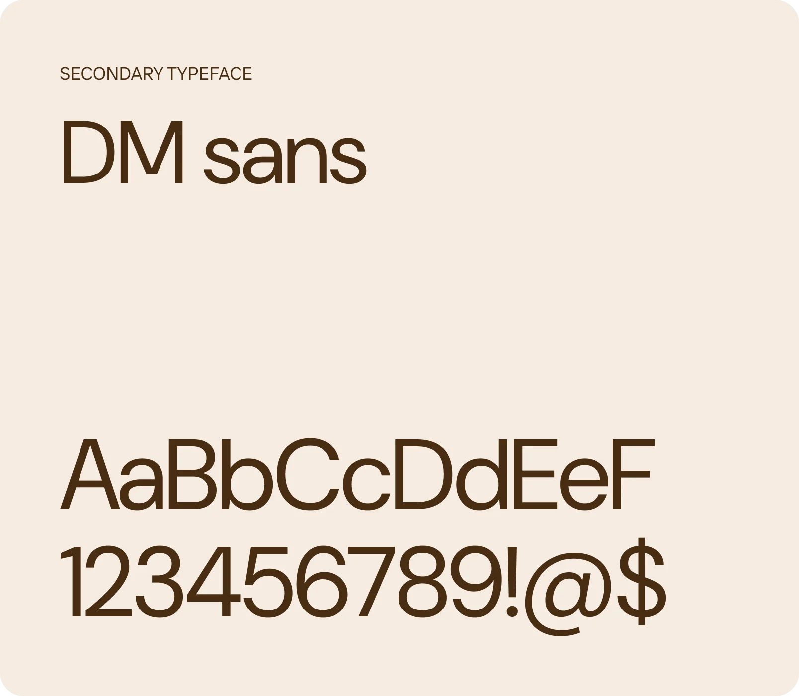
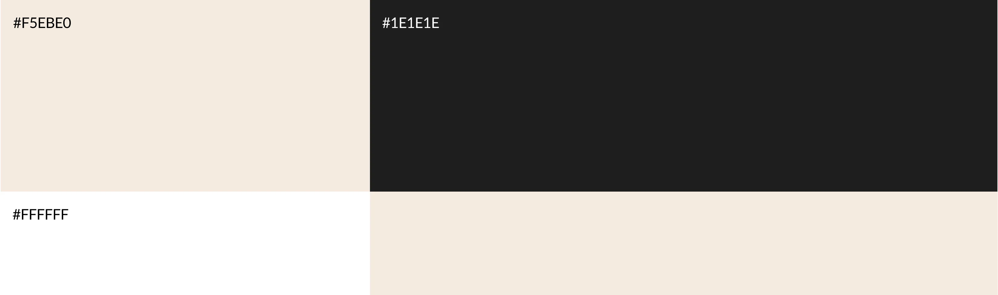
The color palette combines strength and clarity through bold contrast. #1E1E1E conveys power and authority, #F5EBE0 adds a warm, calming balance, and #FFFFFF ensures clean readability. Together, they reflect a grounded yet empowering brand identity.
Early wireframes focused on modular sectioning—clearly defining intro, pain points, solutions, testimonials, services, and conversion triggers. The layout was vertically structured for smooth scrolling with sticky navigation to keep key actions always accessible.