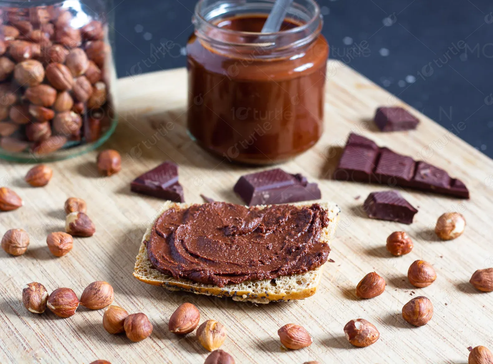
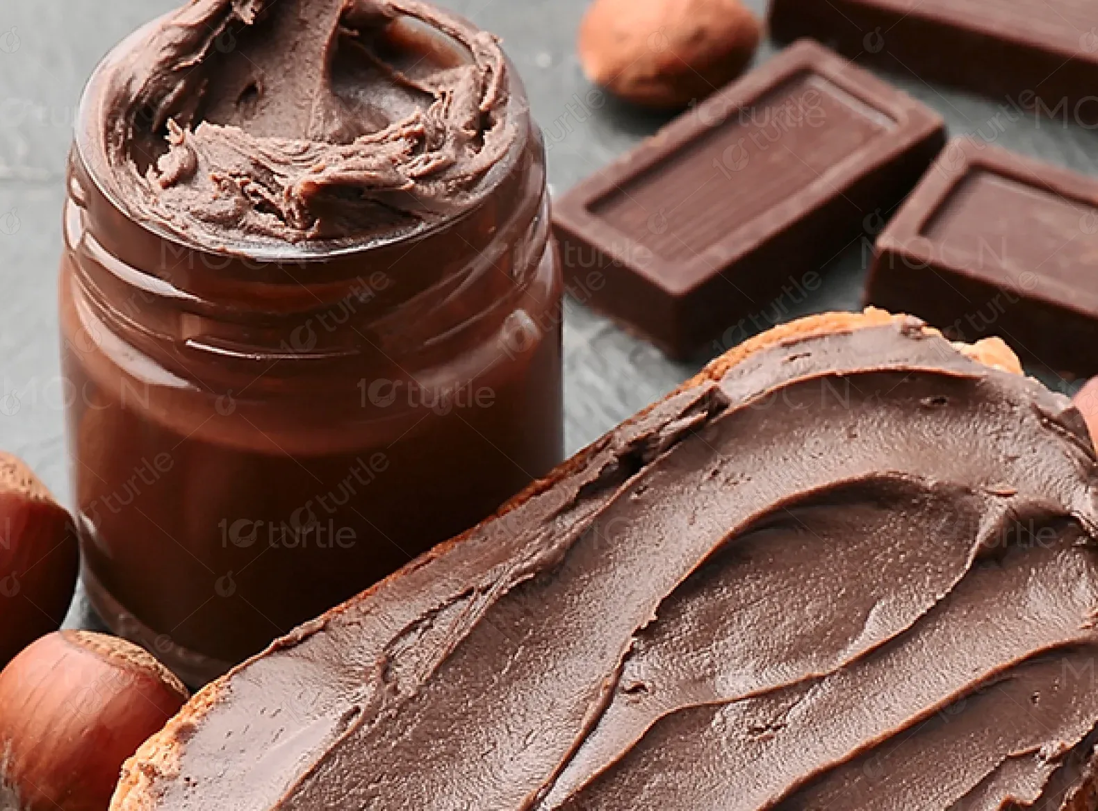
Vital Tropics celebrates the rich agricultural legacy of the Blue Mountains of Jamaica. Offering a curated selection of cocoa-based spreads and powders, the brand is synonymous with authenticity, nutrition, and pleasure. With a strong emphasis on natural ingredients and traditional values, Vital Tropics is as much about experience as it is about taste.
UX Design
UI Design
Websites Design
Industry
Food, Beverage & Hospitality
Tools we used


Project Completion
2024
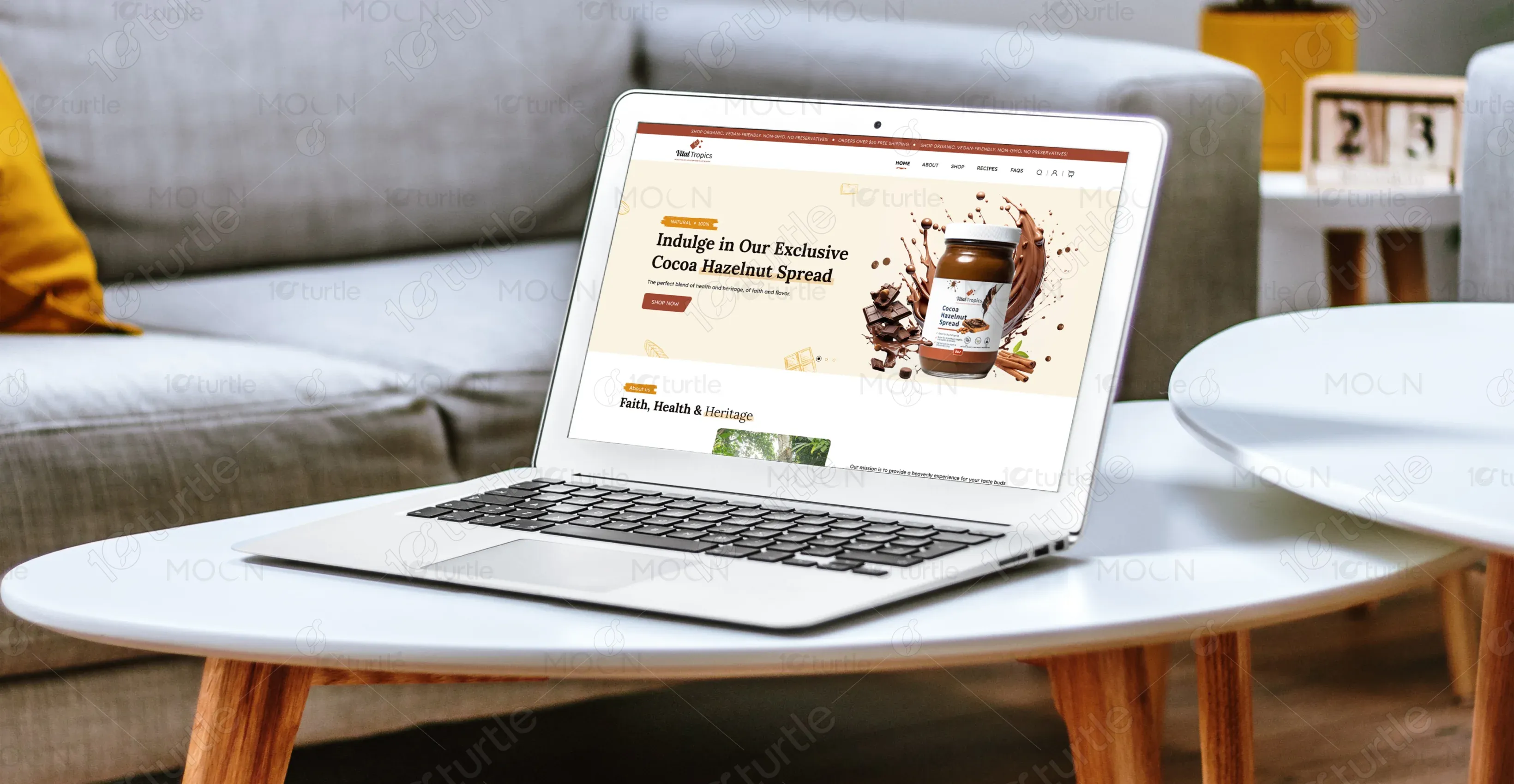
The primary goal of this project was to establish an engaging and conversion-optimized e-commerce homepage that encapsulates the brand’s identity and showcases its key products. The client sought a layout that was warm, trustworthy, and modern, with a focus on storytelling and visual appeal
Industry
Food, Beverage & HospitalityWhat we did
User ResearchUI UX DesigningPlatform
-The client previously lacked a digital presence that effectively communicated the brand story or highlighted product quality. There was no emotional connection, limited product discoverability, and an absence of clear user flow to guide customers toward purchase decisions. The need for a refined, brand-aligned online storefront was critical.
The new homepage was crafted to evoke trust, heritage, and delight through a clean, mobile-responsive layout. It opens with a striking hero section that highlights the signature product, followed by storytelling visuals that connect users to the brand’s Jamaican roots. Product bundles and offerings are showcased with intuitive cards, while strategically placed CTAs and an FAQ section drive conversions and build confidence.
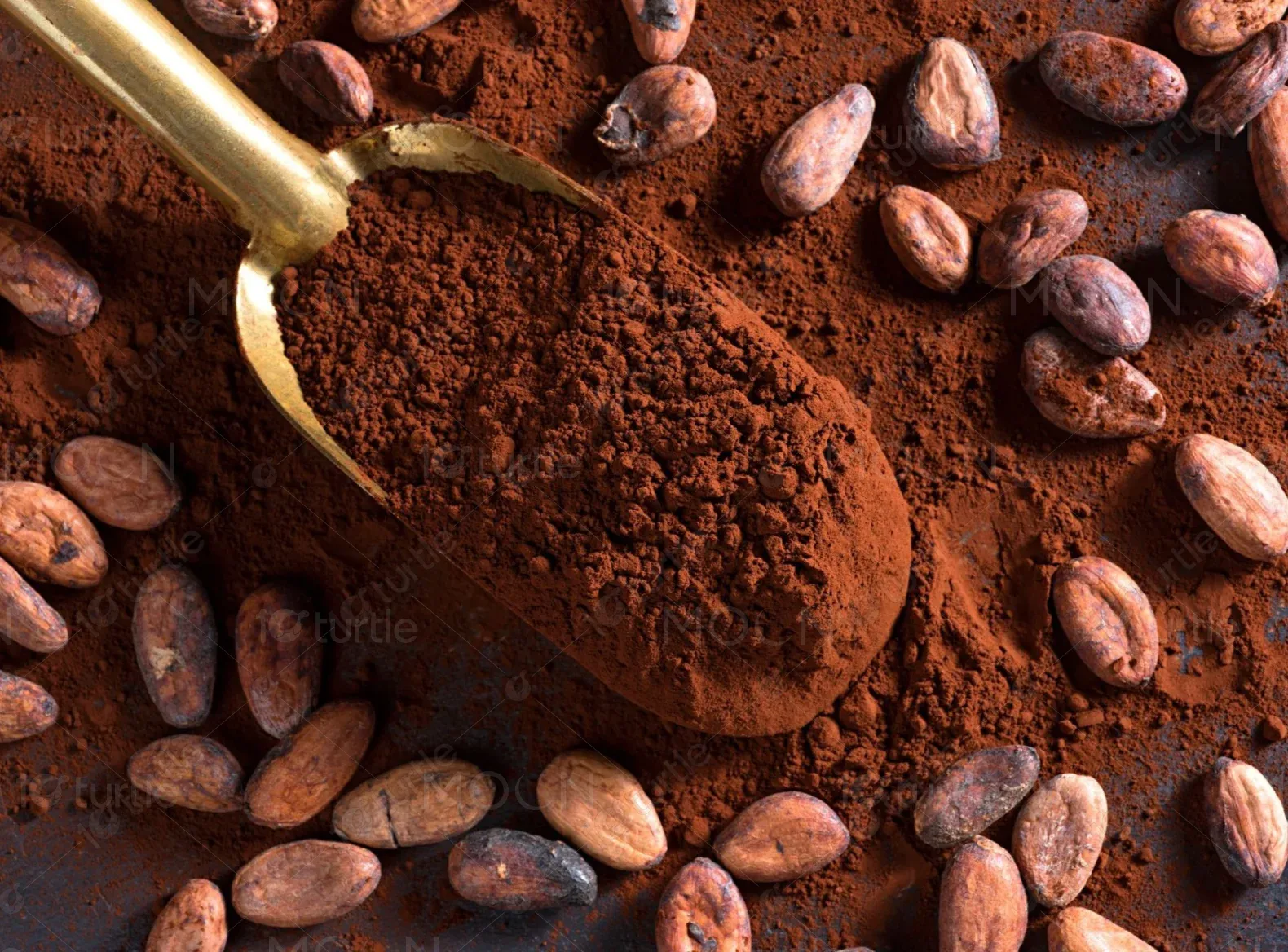
The client wanted a design that blended earthy, tropical warmth with a touch of luxury—paying tribute to Jamaican culture through imagery of cocoa farming and local life. While grounded in heritage, the look needed to remain clean and commercially appealing for a global audience, drawing inspiration from brands like Lakrids by Bülow, Tony’s Chocolonely, and Alaffia.
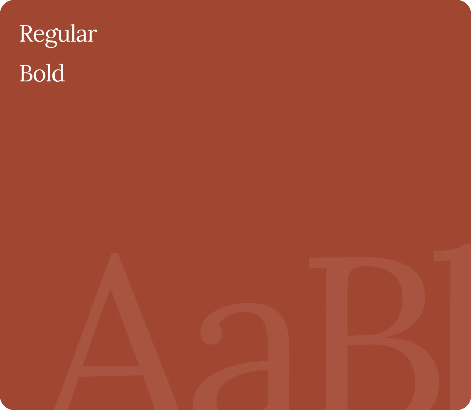
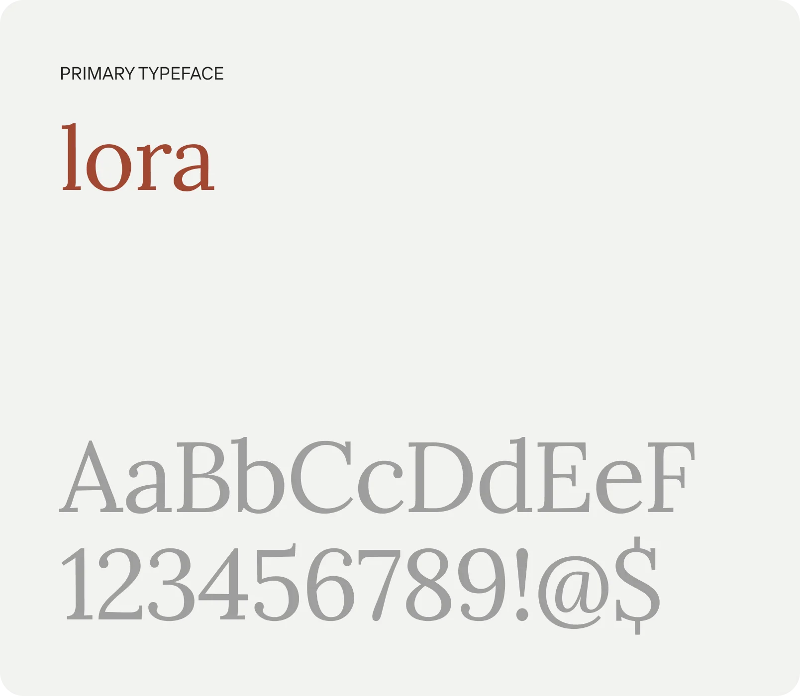
The Vital Tropics logo is simple and elegant, featuring a tropical motif that speaks to authenticity and warmth. The typeface is clean and modern, while the iconography alludes to natural produce and traditional values.


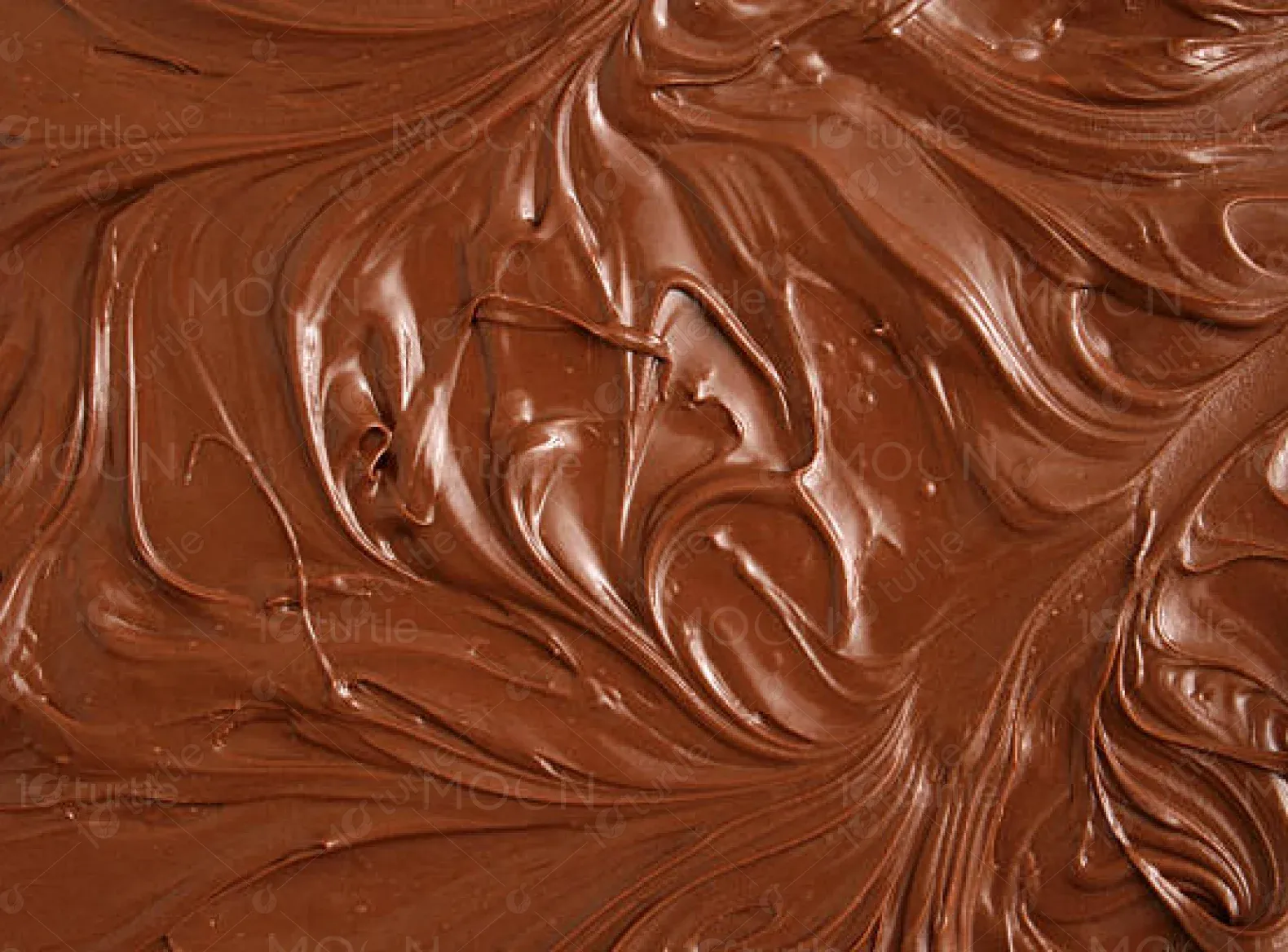
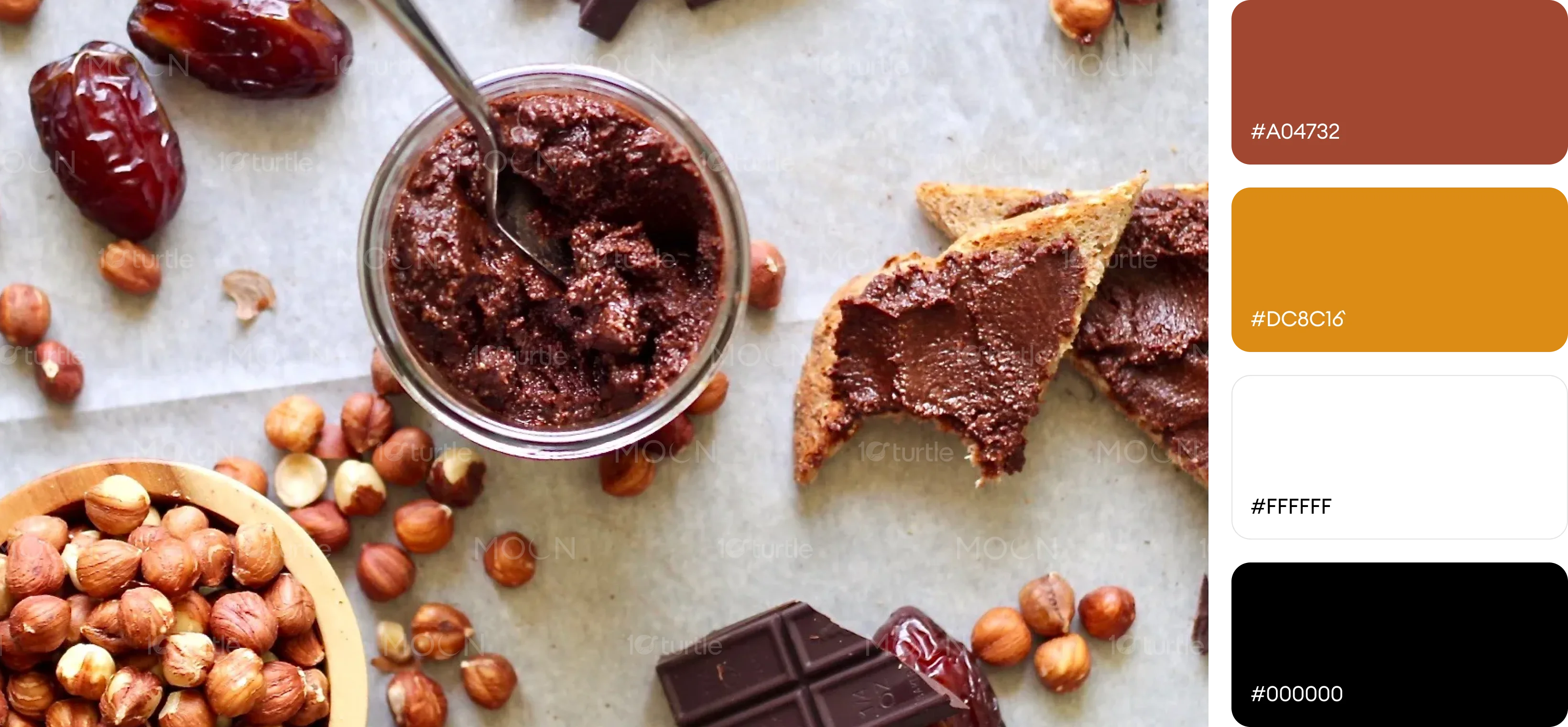
The primary colors—Deep Brown (#A04732) and Hazelnut Cream (#DC8C16)—were chosen to evoke richness, warmth, and a sense of natural indulgence. Together, they reflect the brand’s heritage and stimulate appetite while maintaining a clean, inviting aesthetic.
The early wireframes prioritized product visibility and brand heritage, featuring a hero banner, storytelling section, product bundles, and an FAQ. Designed in grayscale, they focused on layout and content hierarchy before introducing color and visuals.