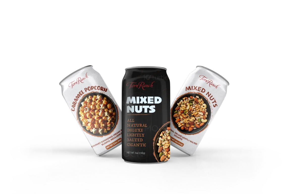
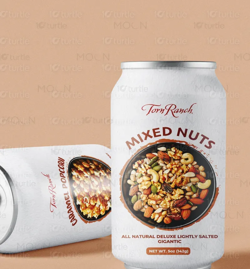
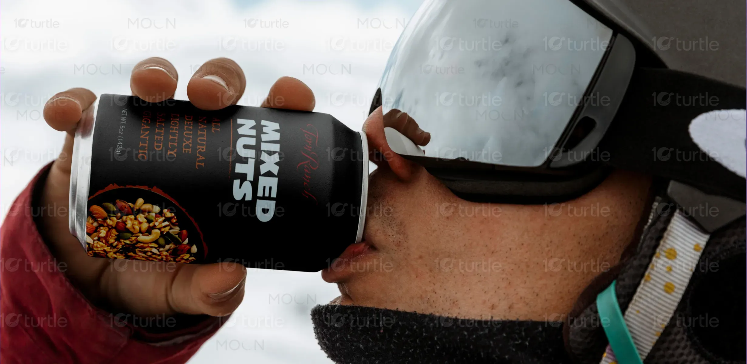
Torn Ranch’s beverage collection blends sophistication with natural indulgence, offering an unparalleled sensory experience. Crafted with premium, all-natural ingredients and presented in sleek, elegant packaging, each drink is designed to delight. Whether you’re looking for a refreshing boost or a moment of tranquil indulgence, our beverages deliver a luxurious taste in every sip. Perfectly complemented by our signature caramel popcorn or mixed nuts, Torn Ranch invites you to elevate your moments with a harmony of flavour and elegance.
Label Design
Graphics Design
Industry
Food, Beverage & Hospitality
Tools we used


Project Completion
2025
Key Market
Global
The design captures Torn Ranch’s dedication to artisanal quality and indulgent experiences, with a focus on its premium snack and beverage collections. It seamlessly blends aesthetic sophistication with product-centered storytelling, highlighting the brand’s commitment to excellence, natural ingredients, and sustainable practices.
Industry
Food, Beverage & HospitalityWhat we did
Label Design Graphics DesignPlatform
-Torn Ranch's new visual identity highlights the premium quality and natural goodness of their beverages. The updated designs emphasise the brand's sophisticated and indulgent feel, showcasing the perfect pairing with their signature snacks. This cohesive visual language aims to elevate the brand and drive customer engagement.
To enhance Torn Ranch's visual communication, we will develop a cohesive design language that reflects the brand's premium quality and indulgent nature. This includes updating packaging and marketing materials with sleek aesthetics and clear messaging. The visuals will emphasise the natural goodness and unique sensory experience of the beverages. We will also highlight the perfect pairing of beverages with Torn Ranch's signature snacks. Ultimately, the goal is to create compelling visuals that drive customer engagement and boost sales.
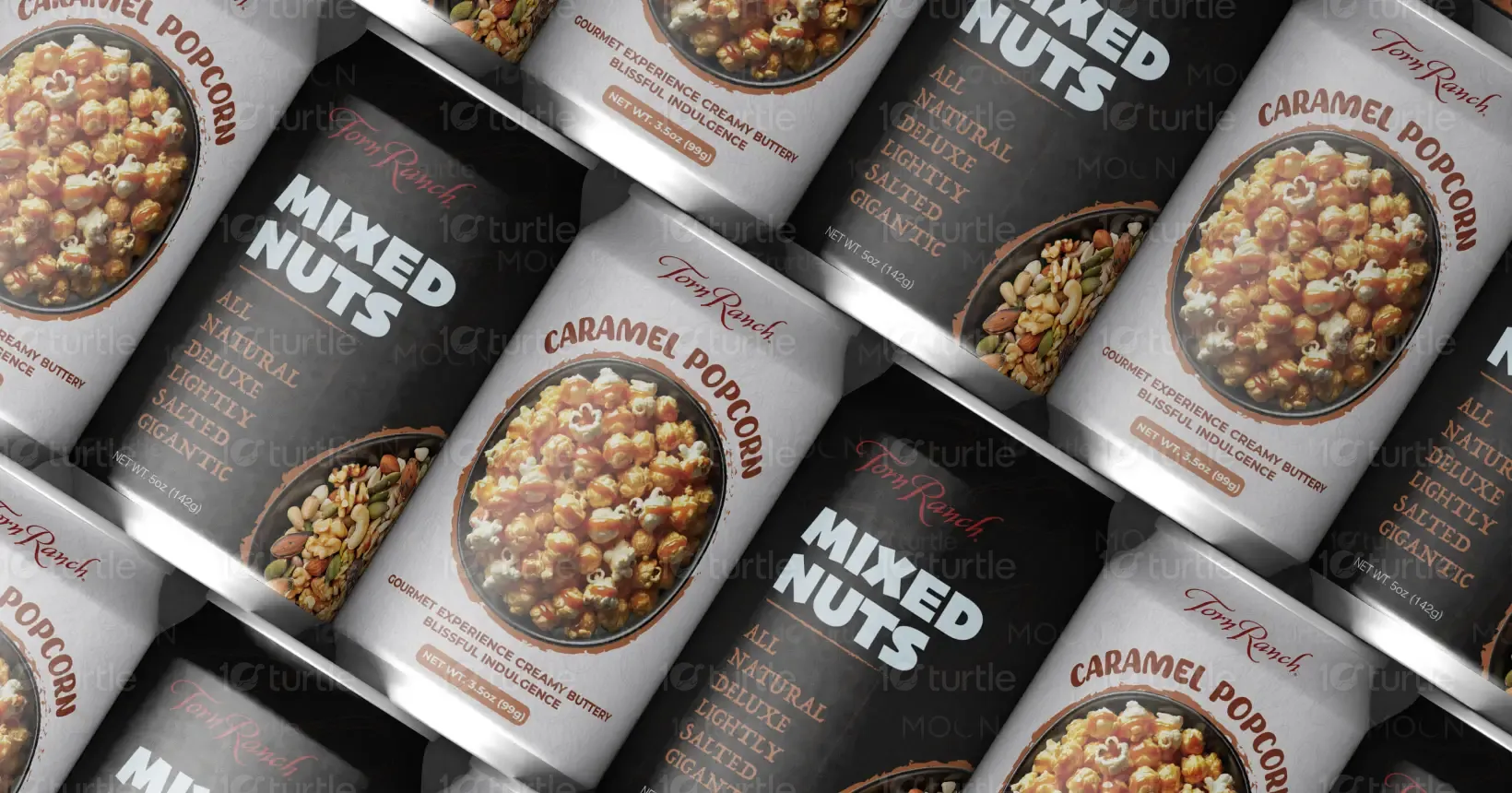
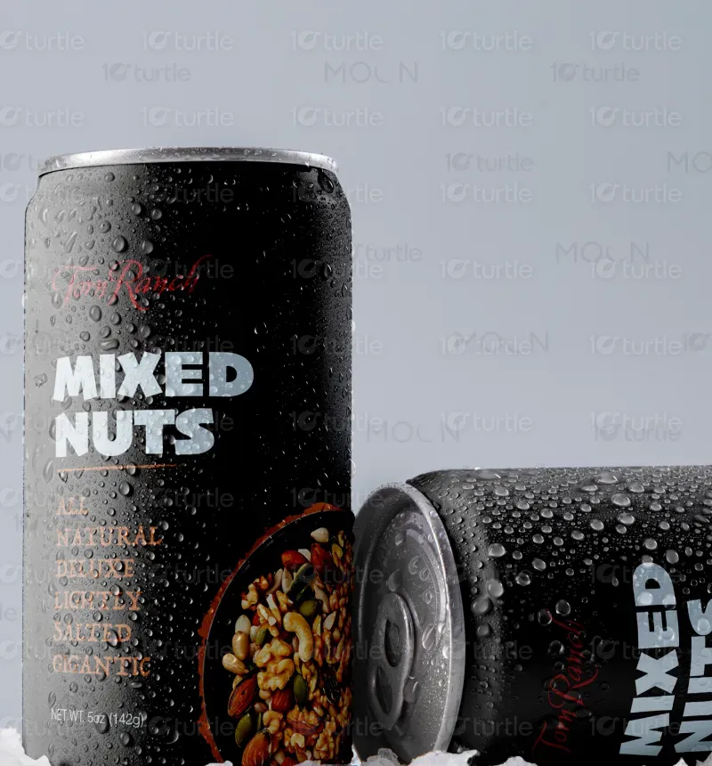
Torn Ranch's label design emphasizes natural ingredients and gourmet indulgence through a clean, modern aesthetic. Different versions cater to specific product lines while maintaining brand consistency. The mission is to visually communicate premium quality and inspire customers to savor life's delightful moments.
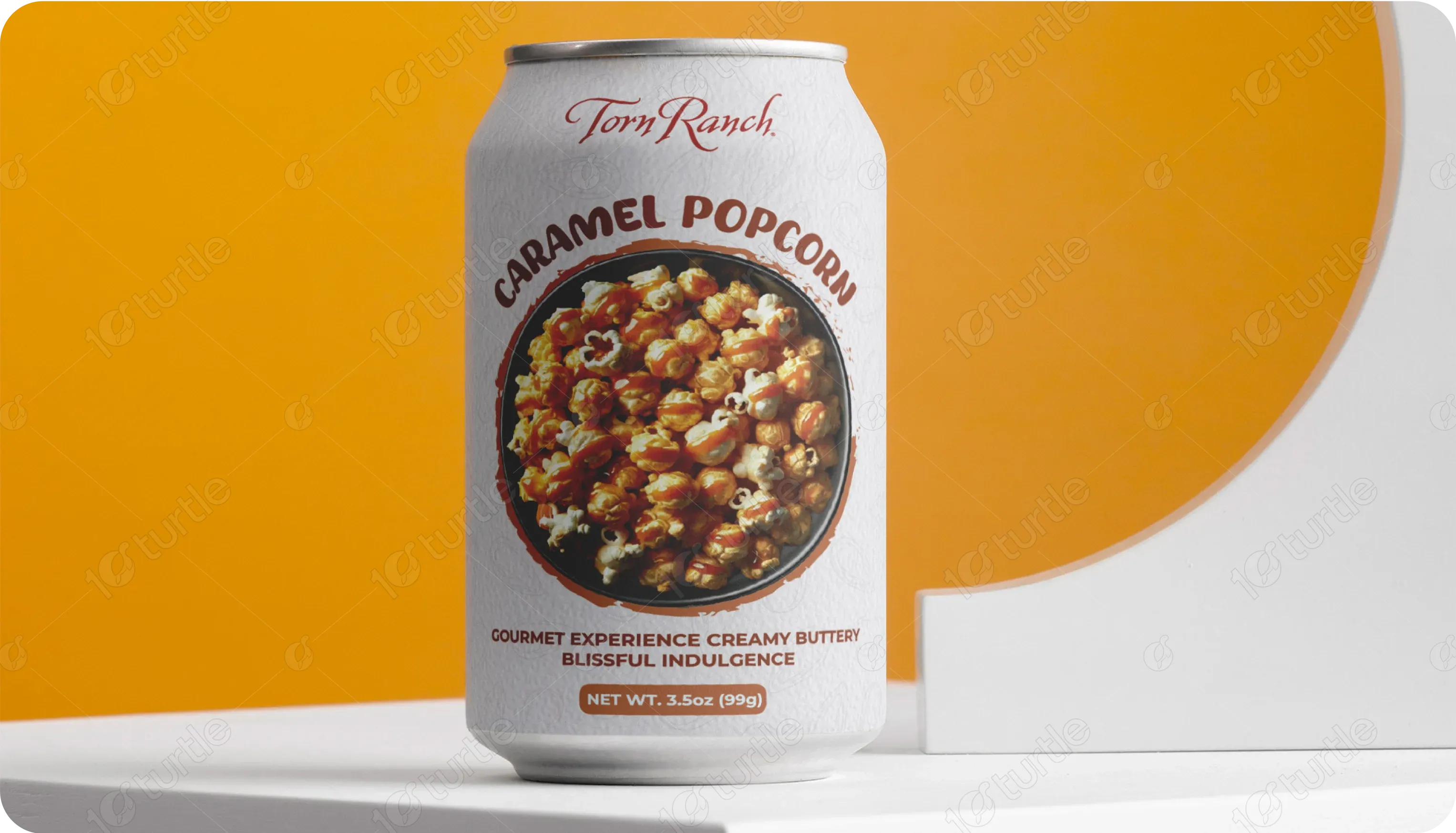
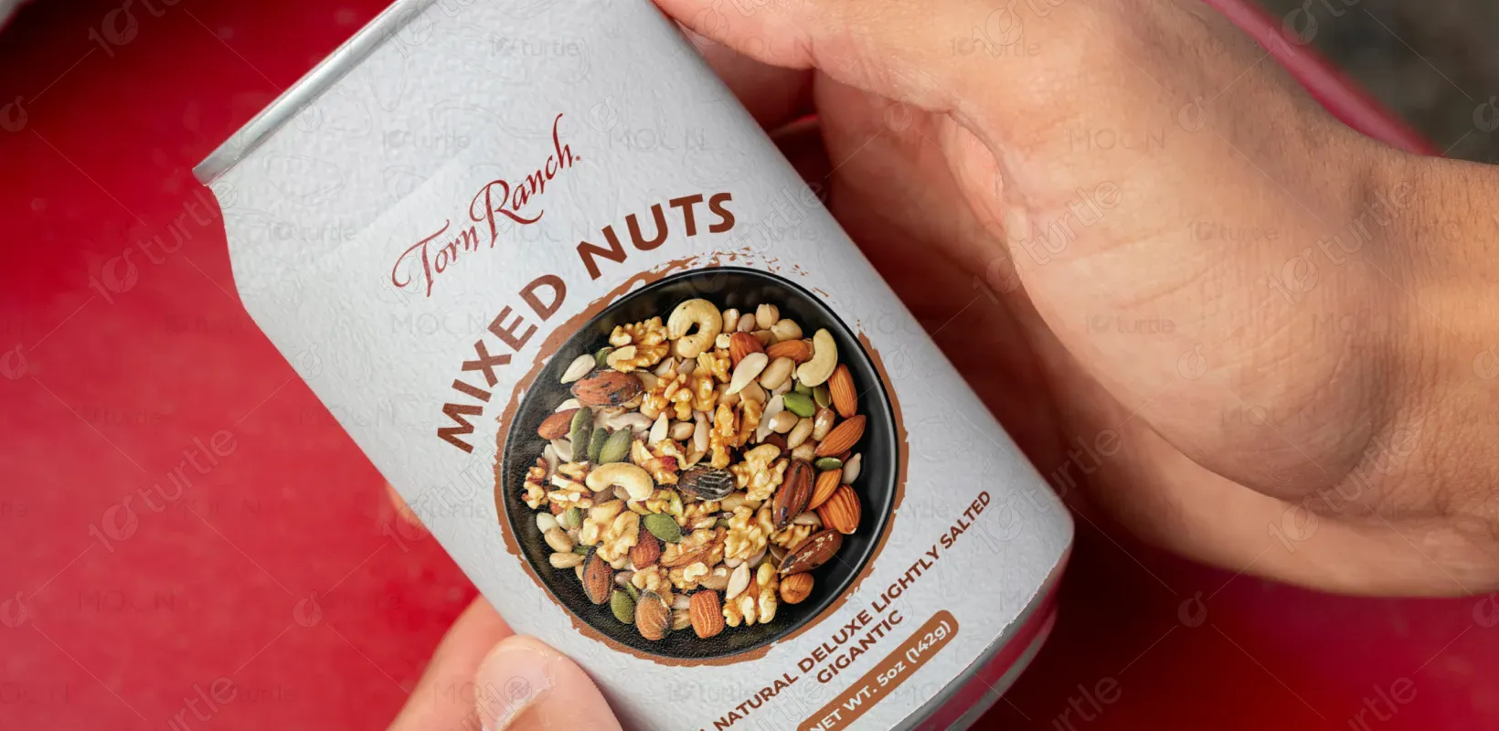
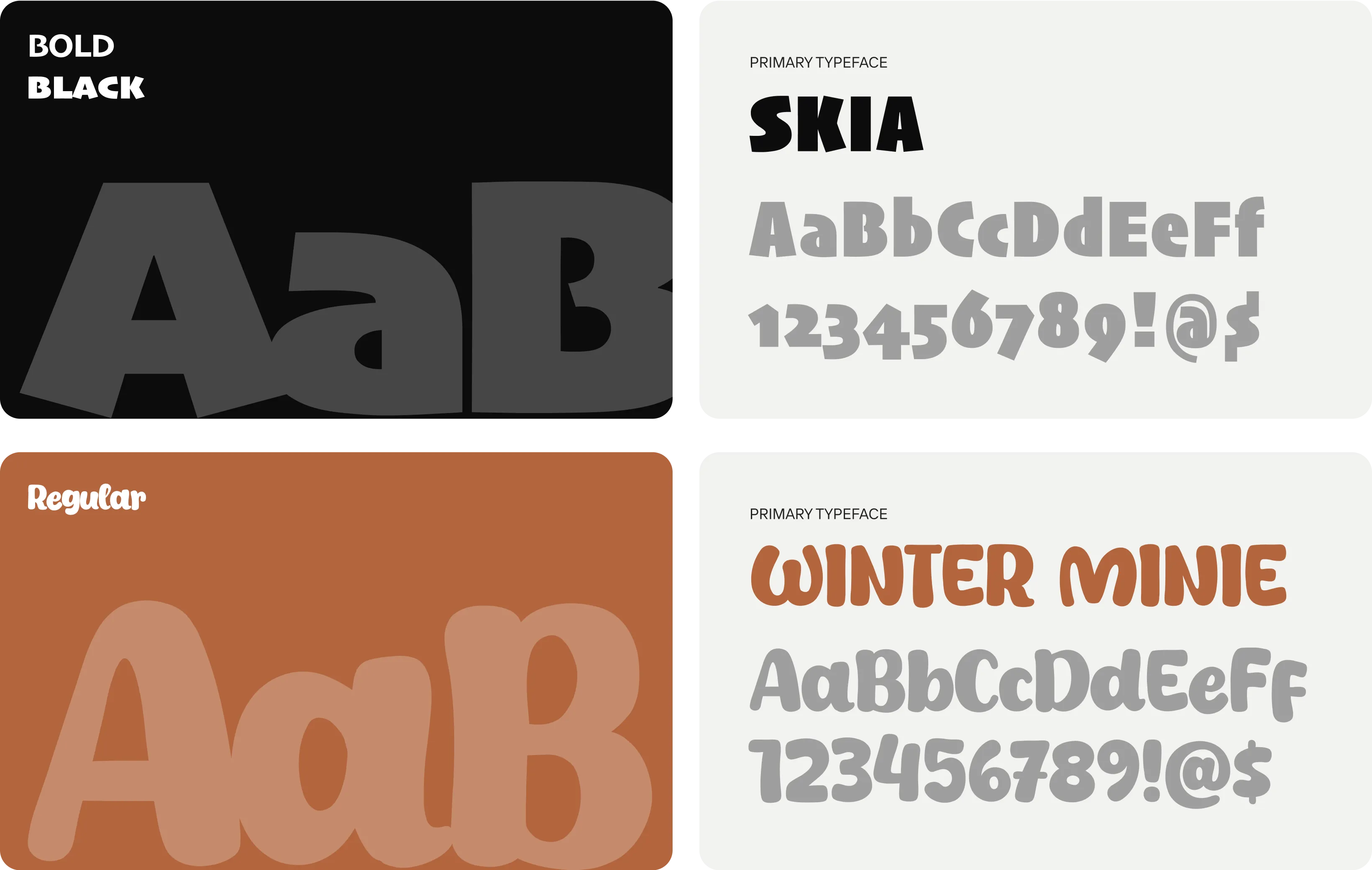
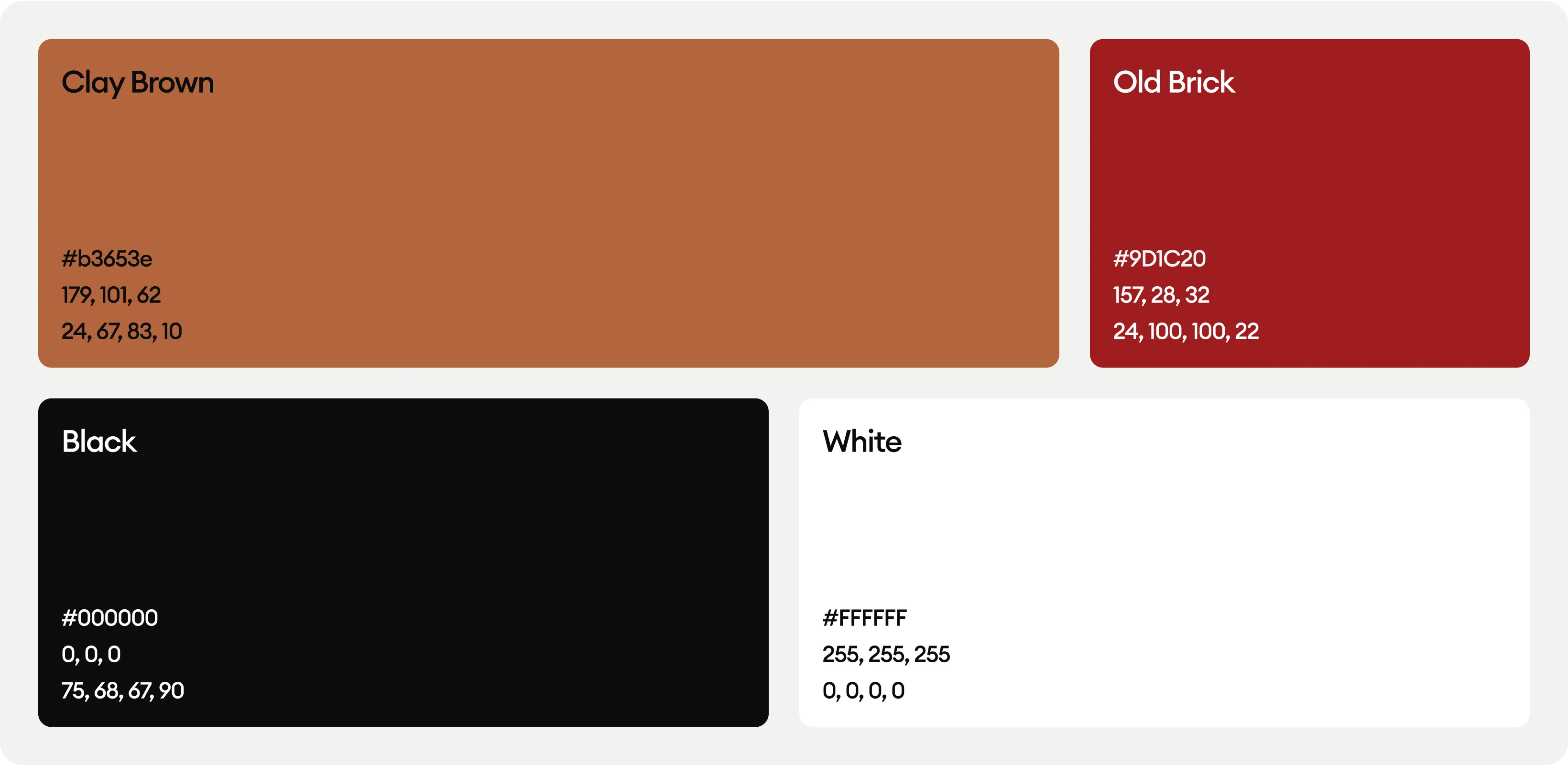
The can label design features Clay Brown for warmth and a natural, eco-friendly feel, complemented by Old Brick for boldness and vitality in logo. Black adds sophistication and contrast, while White ensures clarity and approachability. Together, these colors create a grounded, professional, and inviting visual identity.