Calico is a forward-thinking brand that combines trust, innovation, and diversity to elevate everyday essentials. Inspired by the unique patterns and adaptability of calico cats, the brand symbolizes variety and versatility across its range of products. Founded by brothers Devin and Danny.
Branding
Graphic Design
Logo Design
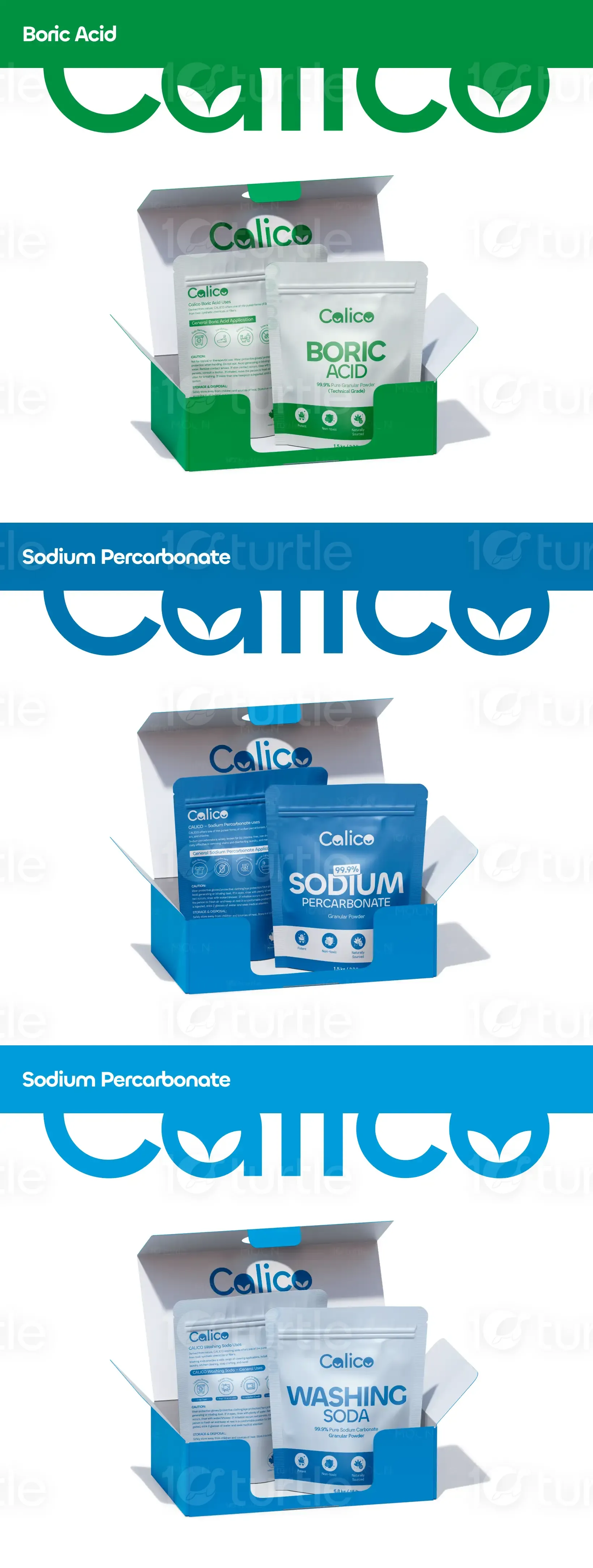
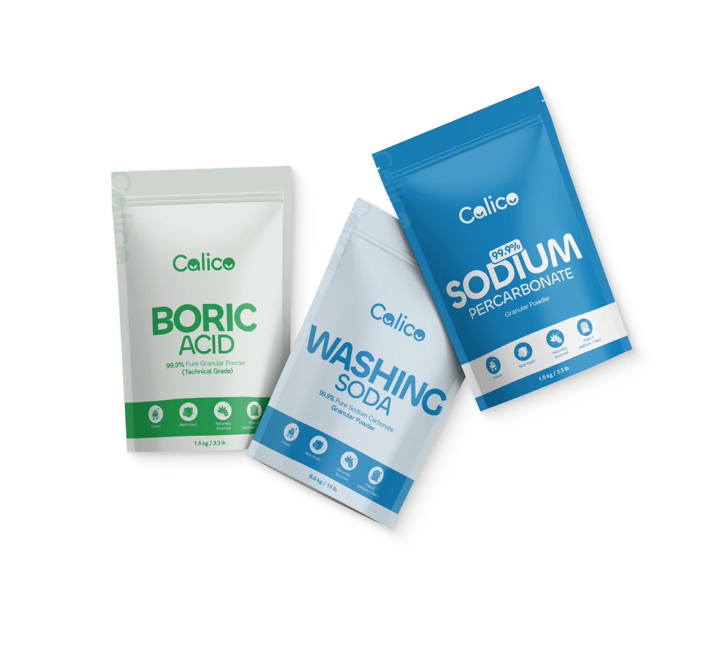
Packaging Design
Industry
Healthcare & Wellness
Tools we used


Project Completion
2024
Key Market
Global
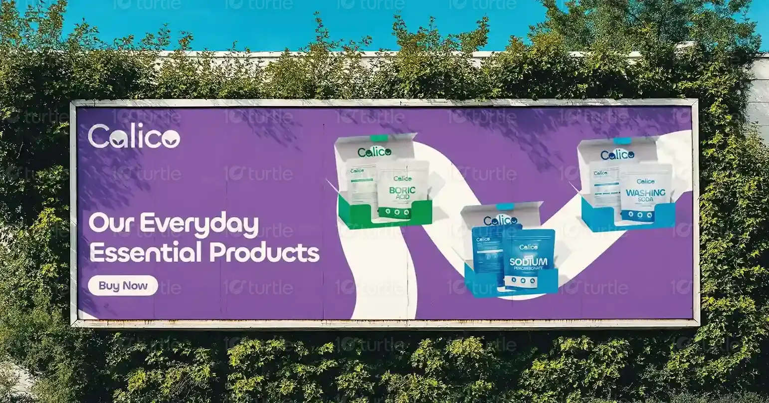
The name "Calico" was inspired by the diverse patterns and colors of calico cats, symbolizing the variety of chemical products we offer. The business was founded by Devin and his brother Danny, who have a strong background and interest in chemistry.They started with basic household chemicals but aim to expand into more complex chemicals and nutritional supplements over time. The goal is to provide customers with trustworthy and highest grade /diverse chemical product options.
Industry
Healthcare & WellnessWhat we did
Packaging DesignLogo DesignGraphics DesignBrandingPlatform
-Calico, a brand specializing in household chemicals with ambitions to expand into nutritional supplements, faces the challenge of creating a cohesive brand identity that reflects both trust and innovation. The goal is to appeal to a diverse global audience while emphasizing safety, quality, and eco-consciousness. Balancing its existing product line with future aspirations demands a versatile yet consistent visual and strategic approach.
To address these challenges, Calico adopted a comprehensive branding approach that captures its values and goals. The visual identity was inspired by the patterns of calico cats, symbolizing diversity and adaptability, qualities intrinsic to the brand’s ethos. A modern and versatile logo, complemented by carefully selected typography, was designed to exude professionalism and approachability.A calming and natural color palette was chosen to reflect the brand’s commitment to safety and eco-consciousness. Clear and functional packaging was developed to ensure effective communication of product safety and quality, with flexibility to accommodate the brand’s future expansion into nutritional supplements. To solidify its presence in the digital landscape, comprehensive brand guidelines were created to ensure consistency across all platforms.
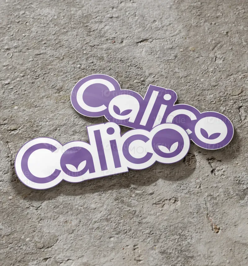
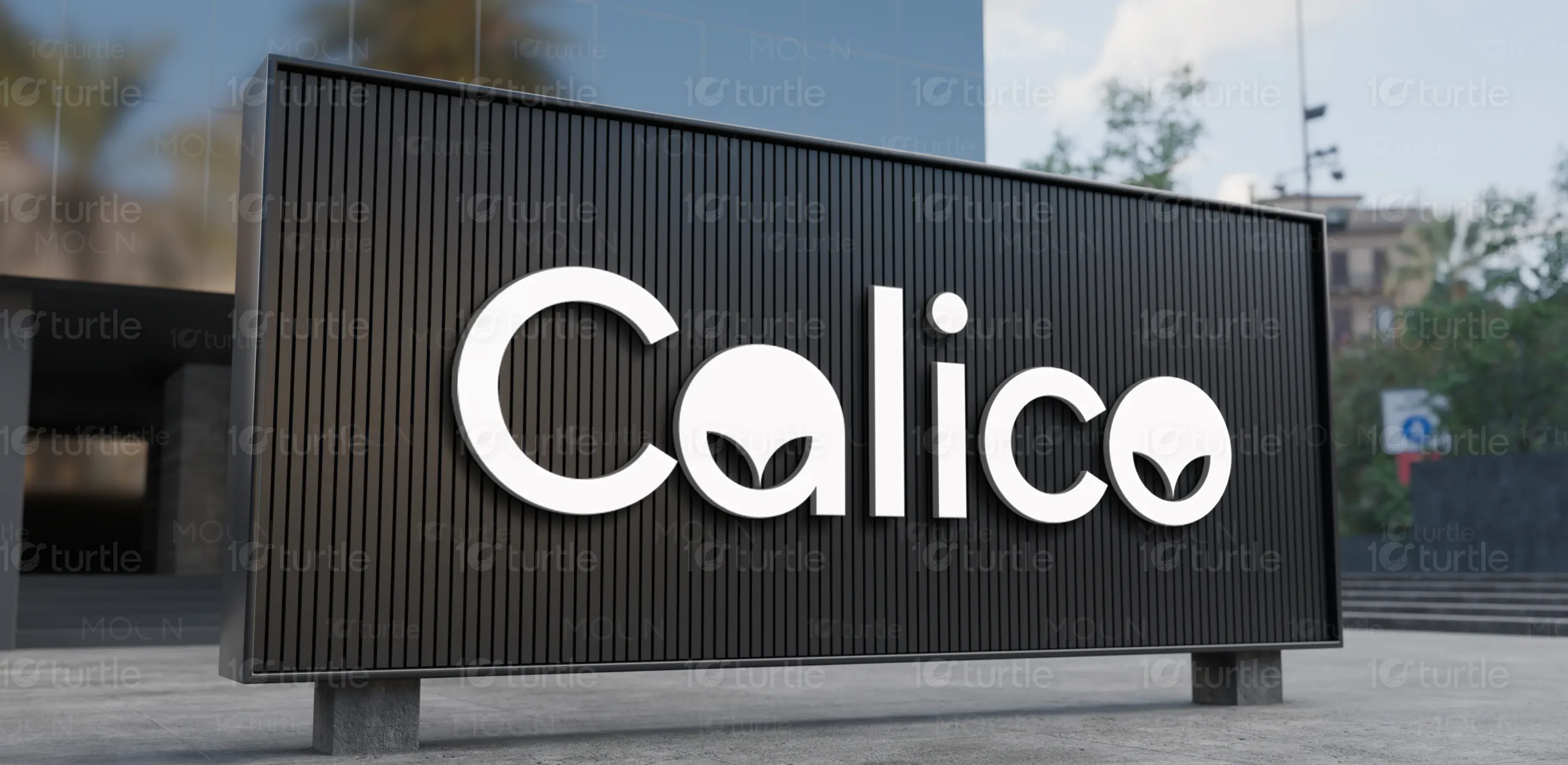
The development of Calico’s logo was inspired by the diverse patterns and vibrant characteristics of calico cats, mirroring the variety and adaptability of the brand’s product offerings. The design process involved conceptualizing ideas that blend themes of diversity and scientific precision.
Multiple iterations were explored, focusing on geometric shapes and brand-aligned colors to ensure a design that is both modern and versatile. The final logo is sleek and professional, embodying the core values of innovation and reliability while resonating with a wide audience.
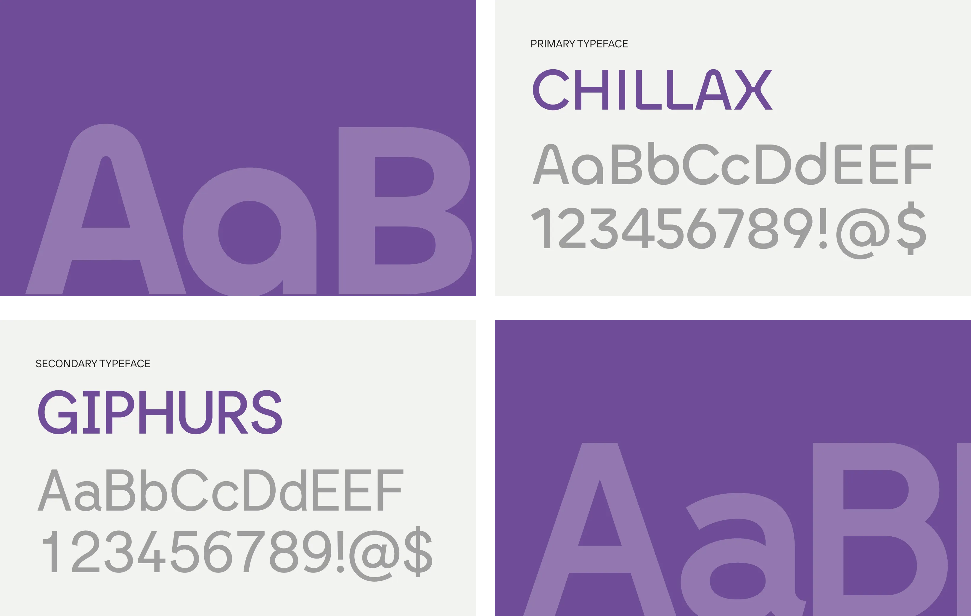
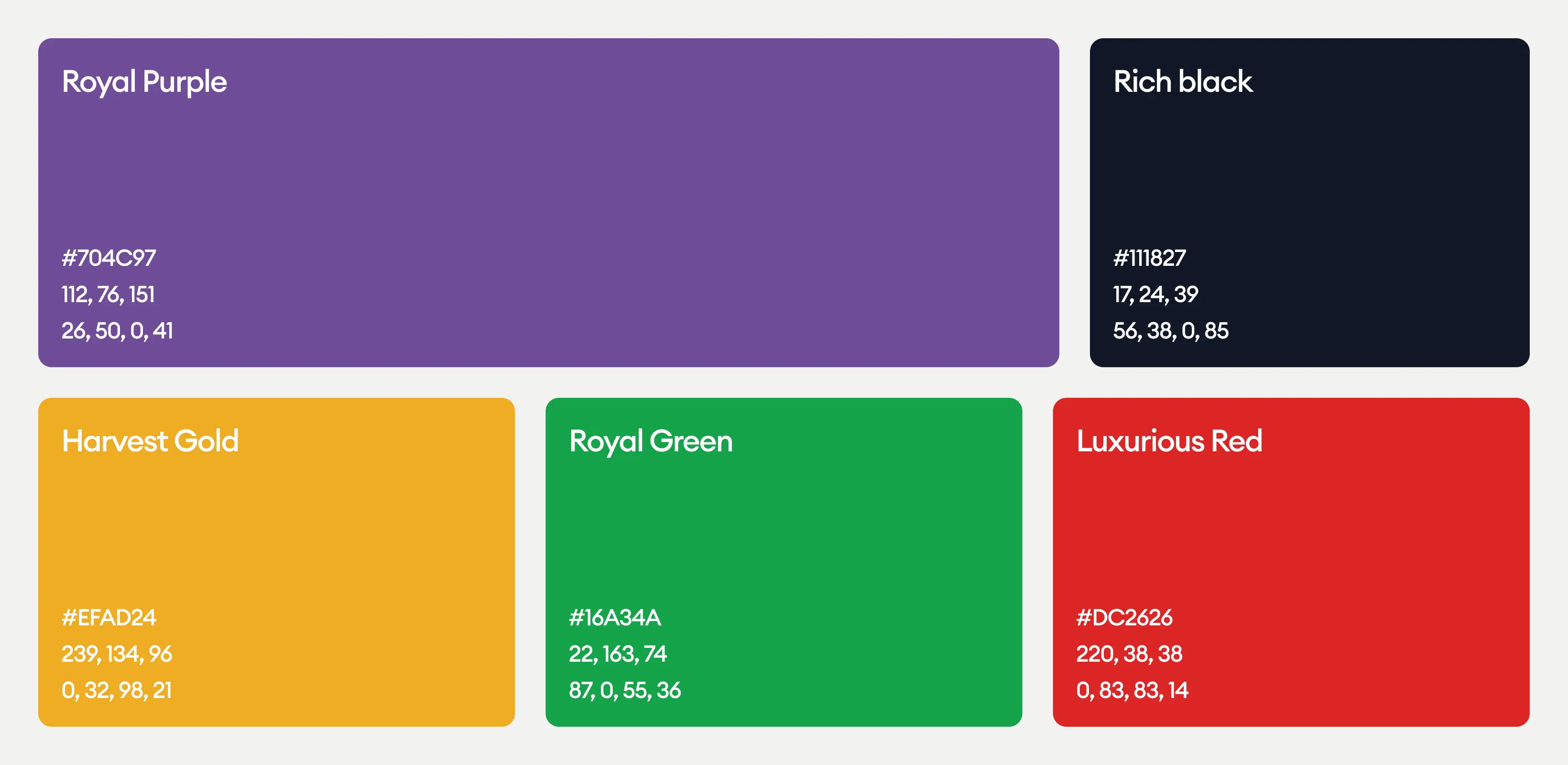
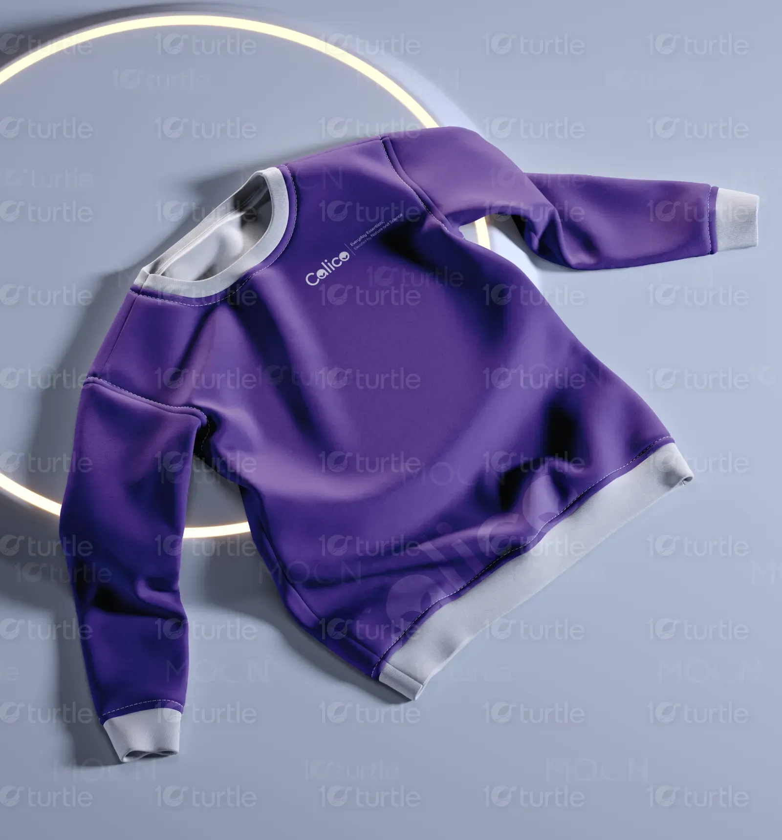
Calico’s color palette is a harmonious blend of shades that reflect the brand’s core values and vision. The sophisticated Royal Purple symbolizes innovation and forward-thinking, while the deep Rich Black conveys trust, reliability, and safety. Harvest Gold brings warmth and positivity, creating an approachable and welcoming feel.