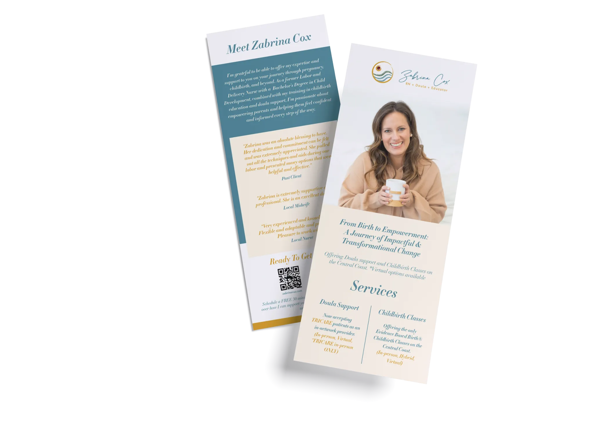
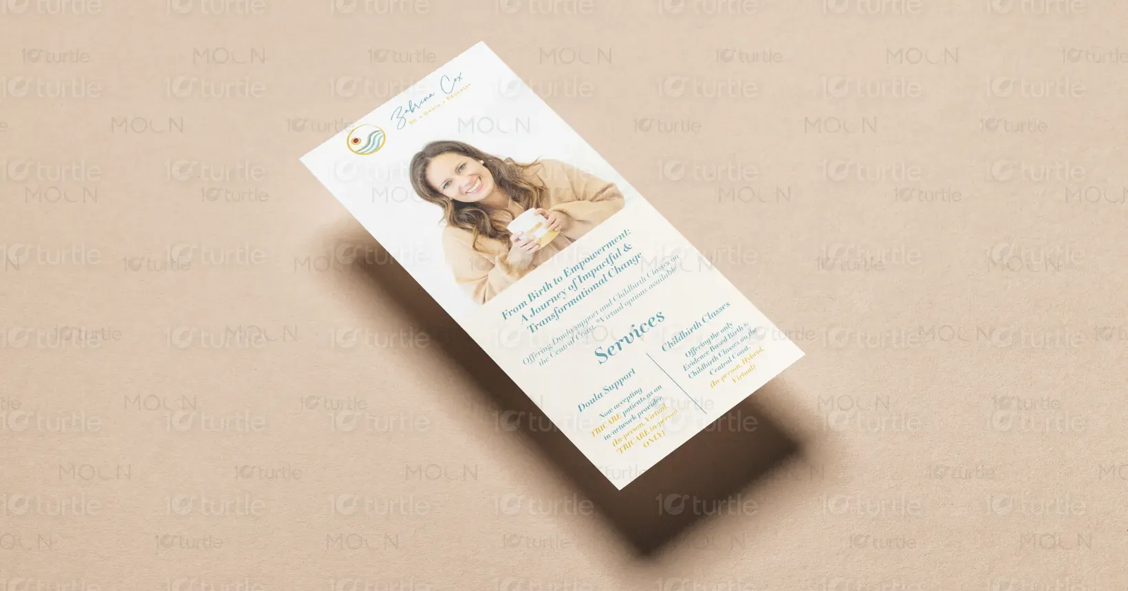
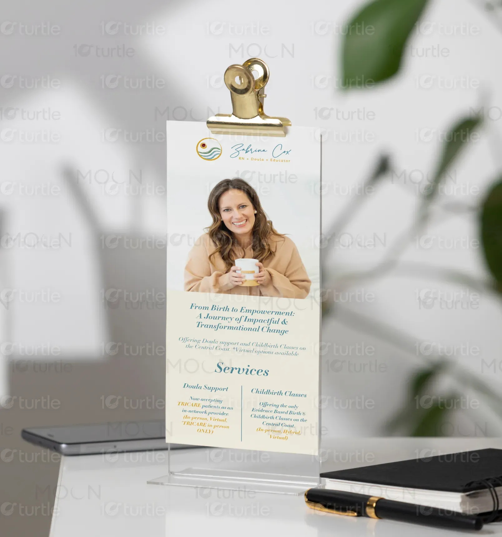
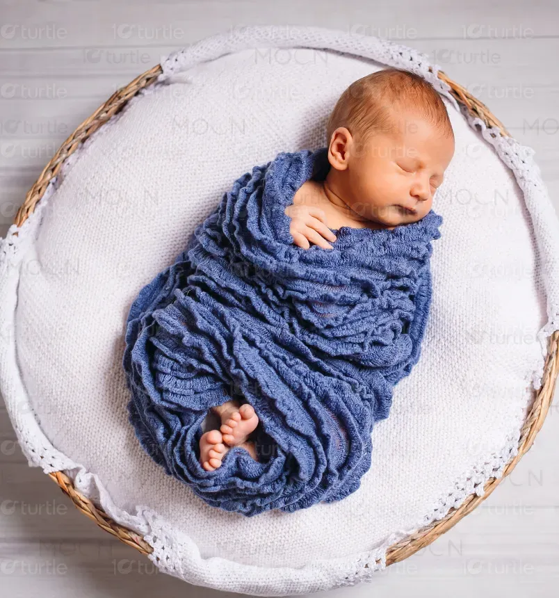
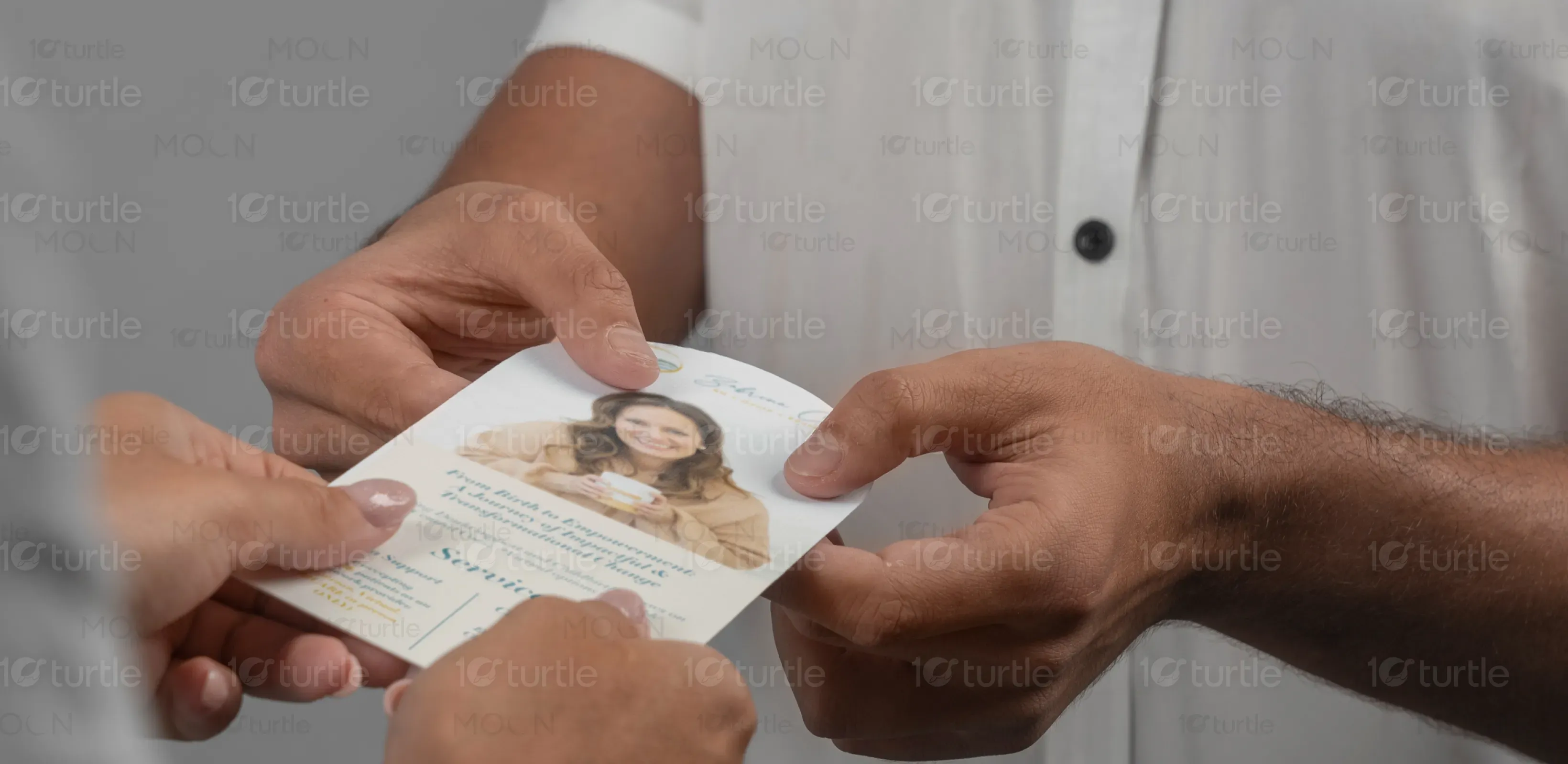
The design of the rack card blends warmth and professionalism, using soft, calming colors like light pink and pastel hues to evoke a sense of trust, comfort, and care. The layout is clean and simple, with ample white space to enhance readability. Key elements include clear typography, strong headings, and inviting images of supportive care that align with the doula services being offered. The card provides both visual appeal and informational clarity, ensuring it effectively communicates the company’s compassionate services to potential clients.
Rack Card Design
Graphic Design
Industry
Healthcare & Wellness
Tools we used


Project Completion
2025
Key Market
Global
This rack card promotes Zabrina Cox’s Doula Services, offering childbirth education and doula support to clients on the Central Coast, with both in-person and virtual options. The design introduces Zabrina’s expertise, including her background as a Labor and Delivery Nurse and Child Development degree, with testimonials from past clients and local professionals. It also highlights TRICARE acceptance and evidence-based classes, positioning the services as both professional and personal, catering to a wide range of client needs in pregnancy and childbirth.
Industry
Healthcare & WellnessWhat we did
Rack Card DesignGraphic DesignPlatform
-The gap in the market lies in providing a personalized yet professionally credible service in the doula and childbirth education space. Many prospective clients are overwhelmed with options, seeking a trustworthy and knowledgeable doula. The challenge is balancing the comforting and empathetic nature of the service with the professional qualifications of the provider. Clients may struggle to find someone who offers both technical expertise and the emotional support needed during pregnancy, labor, and early parenthood.
This rack card effectively communicates Zabrina Cox’s unique value proposition. By combining her professional background in nursing and child development with her doula training, the design provides clarity on her comprehensive services. The layout offers easy-to-understand service descriptions while reinforcing her professionalism through testimonials. The free discovery call provides a low-pressure way for potential clients to get started, addressing the emotional and informational needs of expecting parents, ensuring they feel confident and supported.

The vision for the rack card is to establish Zabrina Cox as a go-to expert in childbirth support, helping clients through a transformative experience with trust, care, and compassion. Long-term, the design aims to create a memorable brand identity for Zabrina, making her services easily recognizable to potential clients. It also aims to expand awareness of her services and increase client engagement, ultimately impacting the Central Coast community by offering reliable and supportive doula services that make a positive impact on expecting families.


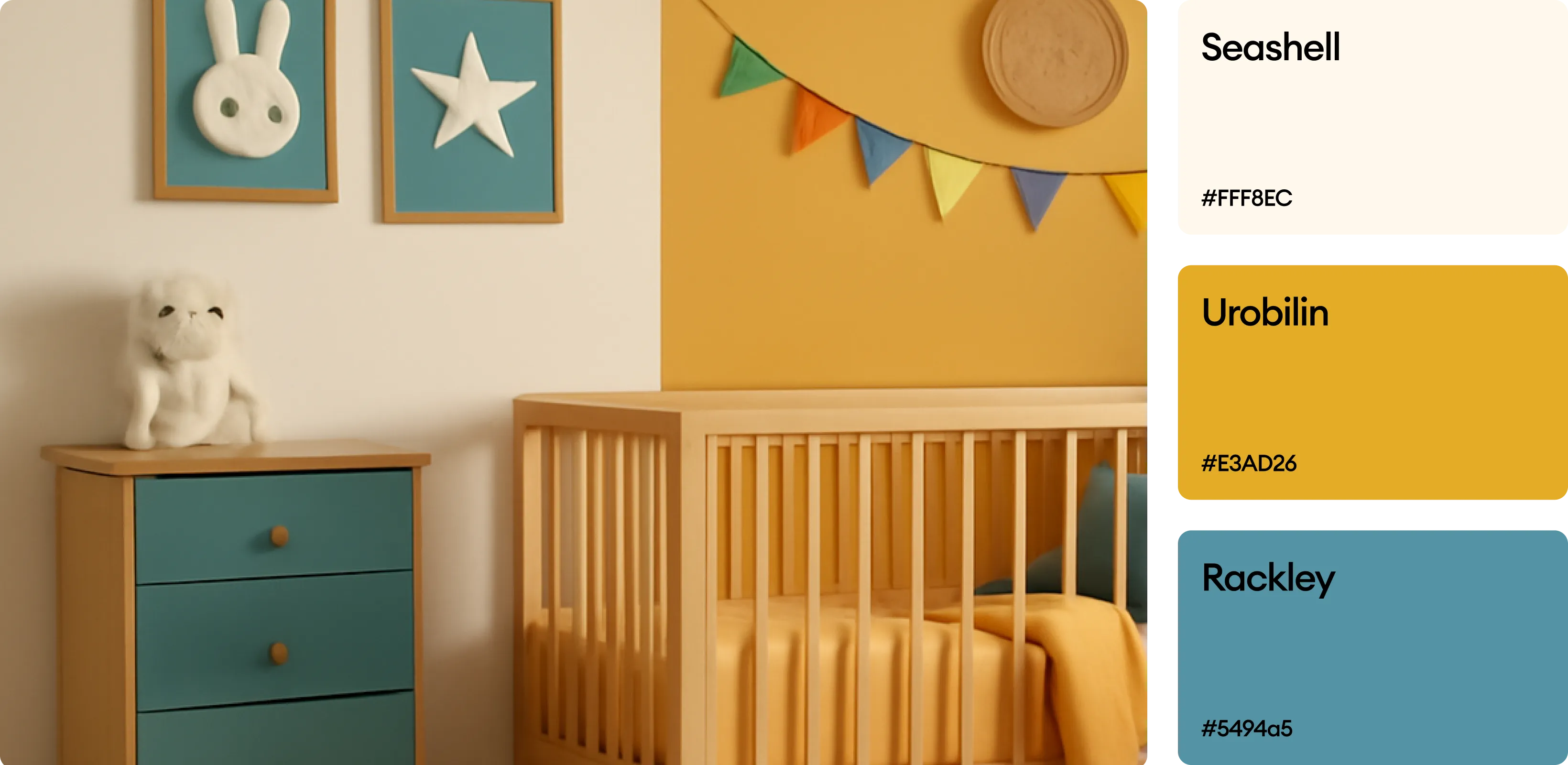
The color scheme is a mix of bright blues, greens, and warm earth tones, chosen for their psychological impact on young readers. Blue conveys trust and security, reinforcing the book’s purpose of safety and guidance. Green represents growth and empowerment, aligning with the book’s theme of self-development. Warmer tones like red and orange add energy and excitement, keeping engagement levels high. The combination ensures a visually stimulating experience while maintaining clarity and readability.