This presentation exudes a clean, informative, and contemporary aesthetic, marrying clarity with authority. Using minimalist layouts, intuitive typography, and a palette that's both calming and professional, it balances emotional resonance with factual density. The design is sectioned smartly to guide the viewer through a complex journey with ease — from chaotic mortgage mazes to victorious key-grabbing moments. Emphasis is placed on user engagement through bold headings, icons, and digestible visuals that support Ciarán’s authentic and relatable narrative voice.
PPT Design
Graphic Design
Industry
Property, Construction & Real Estate
Tools we used


Project Completion
2025
Key Market
Global
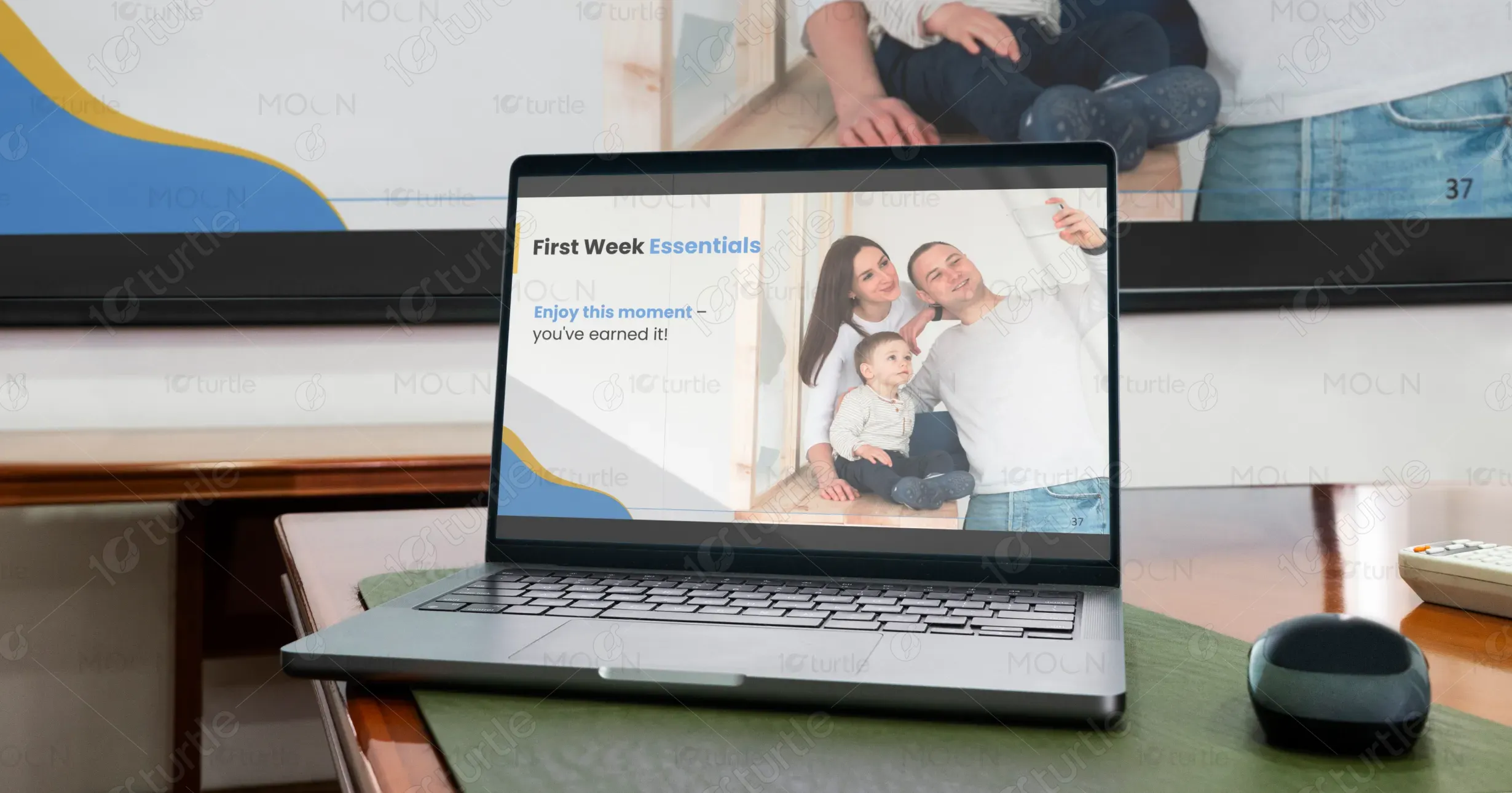
“How to Buy a Home in Ireland” is a meticulously structured guide curated by Ciarán Mulqueen — a former teacher turned property market crusader. Aimed at first-time buyers and overwhelmed dreamers, the presentation demystifies Ireland’s notoriously convoluted home-buying process. It tackles every stage — from mortgage prep to bidding wars and renovation realities — with realism and warmth. The product's unique value lies in its lived-experience-backed advice, actionable hacks like the "Letter Trick," and digestible, jargon-free delivery wrapped in a visually engaging format.

Industry
Property, Construction & Real EstateWhat we did
PPT DesignGraphic DesignPlatform
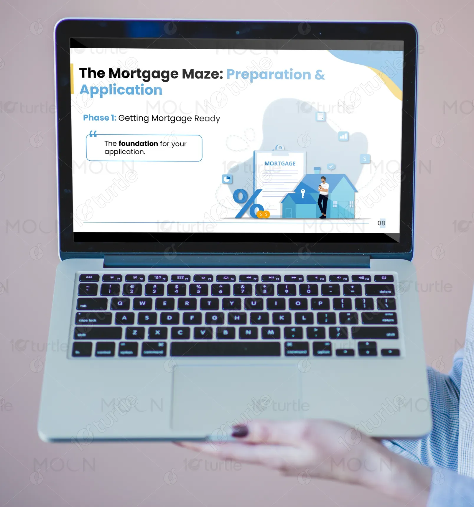
-The core challenge was to transform an overwhelmingly intricate and emotionally charged journey — the Irish home-buying process — into a clear, confident, and accessible experience. The market is riddled with confusion: ever-changing policies, aggressive bidding wars, and bureaucratic delays. First-time buyers feel lost, intimidated, and financially strained. This design had to bridge a serious knowledge gap without overwhelming users — all while remaining approachable, non-patronizing, and motivational. In short: make chaos look conquerable without dumbing it down.
The design’s solution lies in its step-by-step modular narrative paired with calm visual pacing. Each phase of the journey is demystified using simple icons, relatable anecdotes, visual aids, and bold typographic structure. It translates legalese and lender-speak into human language, empowering users. The inclusion of tools (credit report tips, checklist summaries, etc.) provides a sense of progress and control. Above all, it fosters confidence by delivering actionable guidance through a voice of experience — not authority — which users trust.

The long-term vision is to establish this guide as the go-to template for property education in Ireland — from digital webinars to workshops and even school curricula. It aspires to modernize how people engage with real estate knowledge, making it inclusive, digestible, and shareable. Future iterations could be interactive or app-integrated, with built-in tools like mortgage calculators or area research dashboards. The ultimate goal: to revolutionize consumer empowerment in housing through education-first design that resonates far beyond this single deck.


The chosen color scheme leans into soft neutrals paired with strategic pops of navy and deep teal — evoking professionalism, trust, and stability. These colors are psychologically aligned with security and financial prudence, helping ease the emotional friction often tied to property buying. The palette also reflects the brand’s approachable-yet-expert tone: it's not intimidating like cold corporate blues, nor unserious like playful pastels. The colors support clarity of information, draw focus to key sections, and deliver calm amidst the cognitive storm.