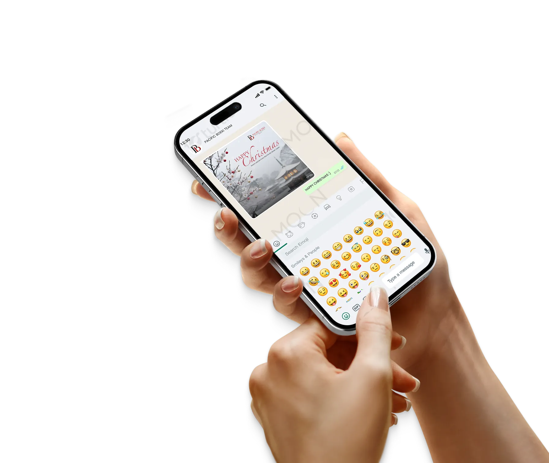
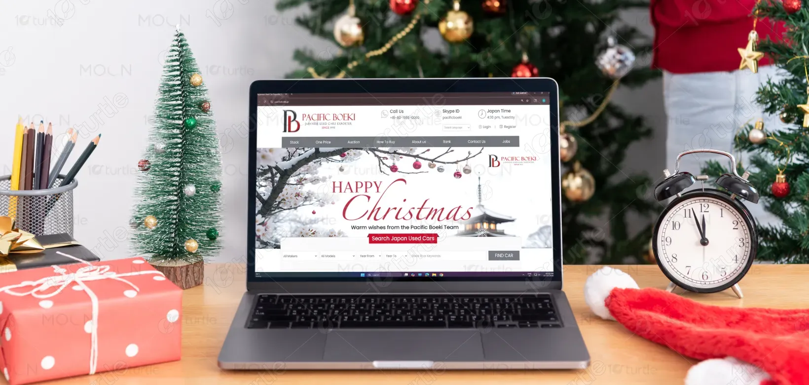
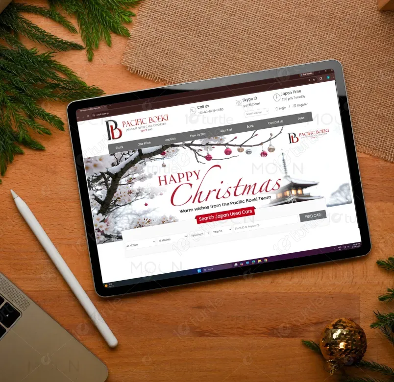
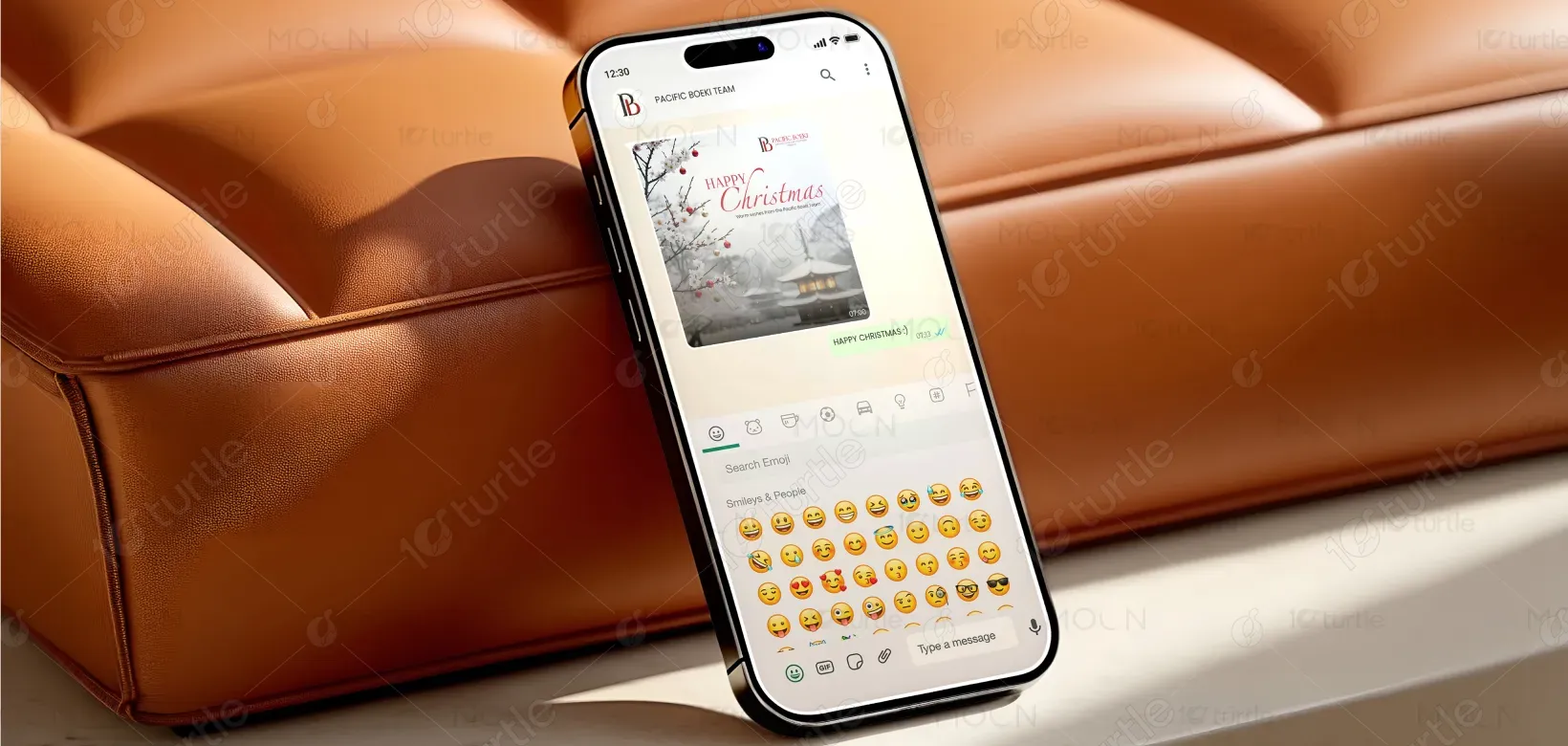
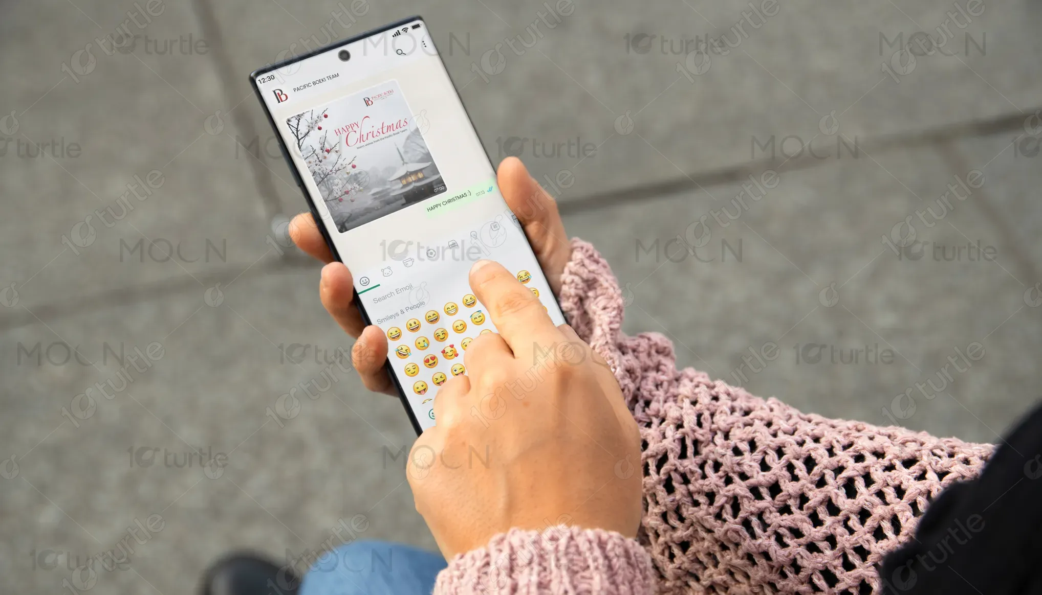
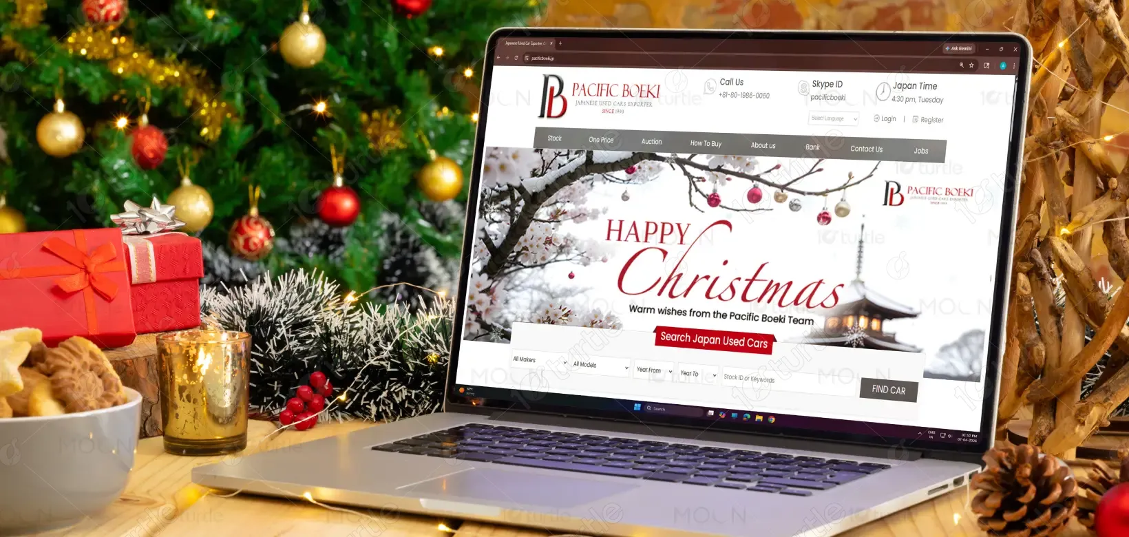
The design adopts a minimal yet festive winter aesthetic, blending Christmas warmth with subtle Japanese visual influence to reflect the brand’s identity. A balanced layout with clear hierarchy ensures the greeting “Christmas” remains the focal point, supported by clean typography and soft supporting text. The use of deep crimson red against a calm snowy background creates strong contrast while maintaining elegance, and carefully placed visual elements like snowfall and delicate branches enhance the seasonal mood without overwhelming the composition, making it highly effective for both email and mobile viewing.
Banner Design
Graphic Design
Industry
Transport, Automotive & Logistics
Tools we used


Project Completion
2025
Key Market
Global
This banner is created for Pacific Boeki as part of a seasonal communication campaign aimed at sharing Christmas greetings with global clients and partners. The design serves both a functional and branding purpose by delivering a festive message while reinforcing the company’s professional and culturally rooted image, ensuring it aligns with the automotive export industry while maintaining a warm and approachable tone across digital platforms.

Industry
Transport, Automotive & LogisticsWhat we did
Banner DesignGraphic DesignPlatform
-Holiday banners in corporate communication often suffer from generic visuals, cluttered layouts, and poor adaptability across devices, leading to reduced engagement and weak brand recall. For a globally operating company like Pacific Boeki, the challenge was to create a design that stands out visually, communicates clearly on mobile-first platforms like email and WhatsApp, and maintains a strong connection to its Japanese identity without appearing overly decorative or distracting.
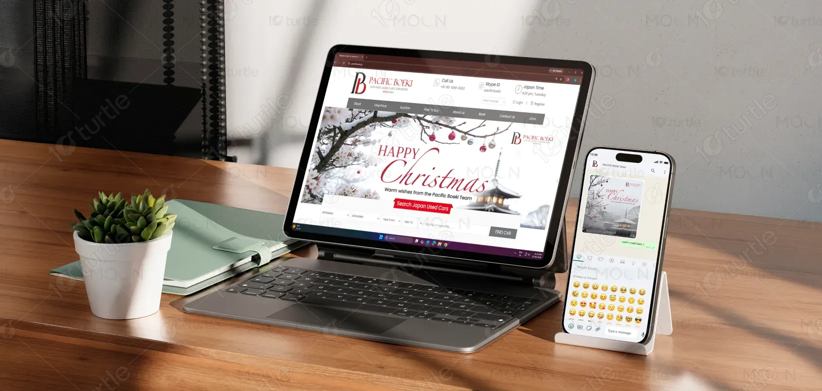
The design addresses these challenges through a clean, user-focused layout that prioritizes readability and visual clarity across screen sizes. Strategic use of whitespace, strong typography contrast, and a limited yet impactful color palette ensures the message is easily understood at a glance. By integrating subtle Japanese-inspired elements within a winter setting, the design achieves a unique cultural balance, while its adaptable structure allows seamless resizing for email newsletters and WhatsApp formats without losing visual integrity.
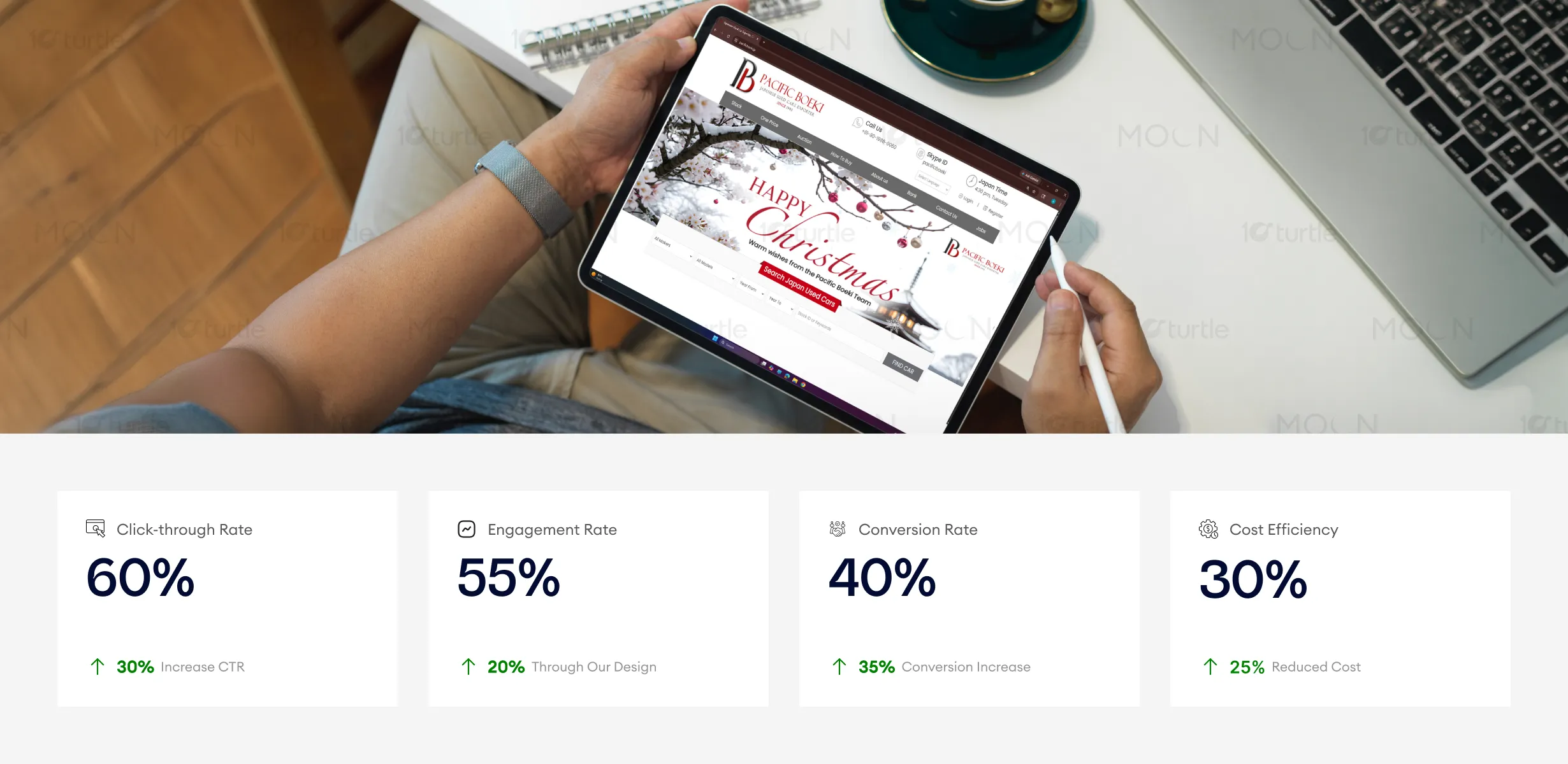
The design successfully blends a festive, seasonal aesthetic with modern simplicity, creating an inviting atmosphere that increases both engagement and conversion. The use of clear typography and strategic visuals drives a higher click-through rate, while the subtle, elegant elements reinforce the brand’s identity. To further boost these metrics, focusing on targeted, seasonal campaigns and leveraging the design in different formats (such as ads or social media) could drive even more engagement and sales.
This design supports Pacific Boeki’s long-term vision of presenting itself as a globally trusted brand with strong Japanese roots by establishing a consistent visual language that can extend across future campaigns. The approach emphasizes simplicity, cultural authenticity, and modern elegance, enabling the brand to maintain recognition and relevance while adapting to different seasonal themes and digital touchpoints over time.
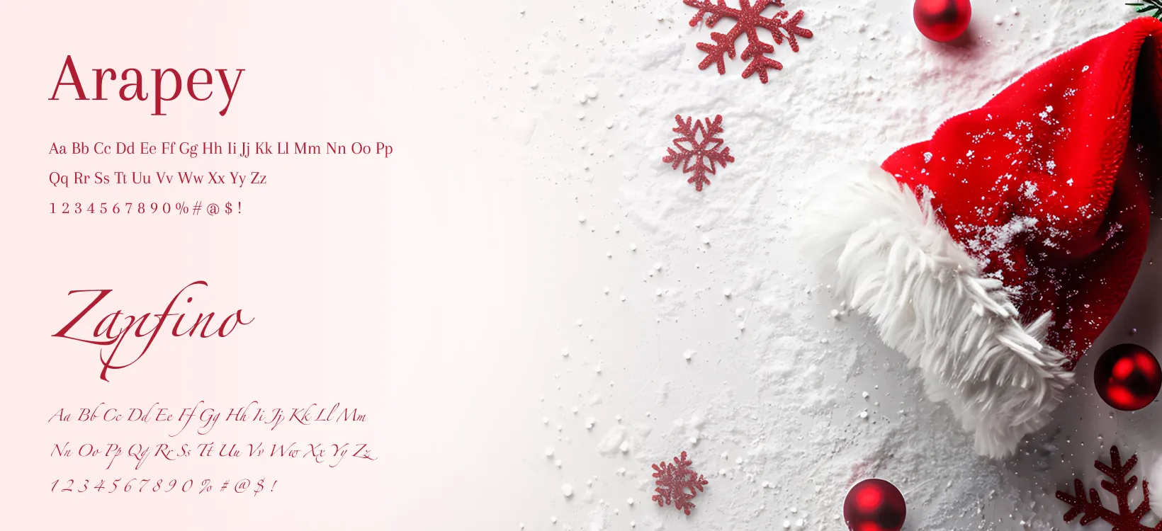
The color palette is centered around deep crimson red, symbolizing celebration and warmth, paired with soft whites and muted greys to create a calm winter atmosphere, while near-black tones add depth and a premium feel. The visual language combines snowfall effects, subtle natural elements, and refined typography to create a harmonious and elegant composition that aligns with both festive emotions and the brand’s professional identity, ensuring consistency and readability across different digital formats.