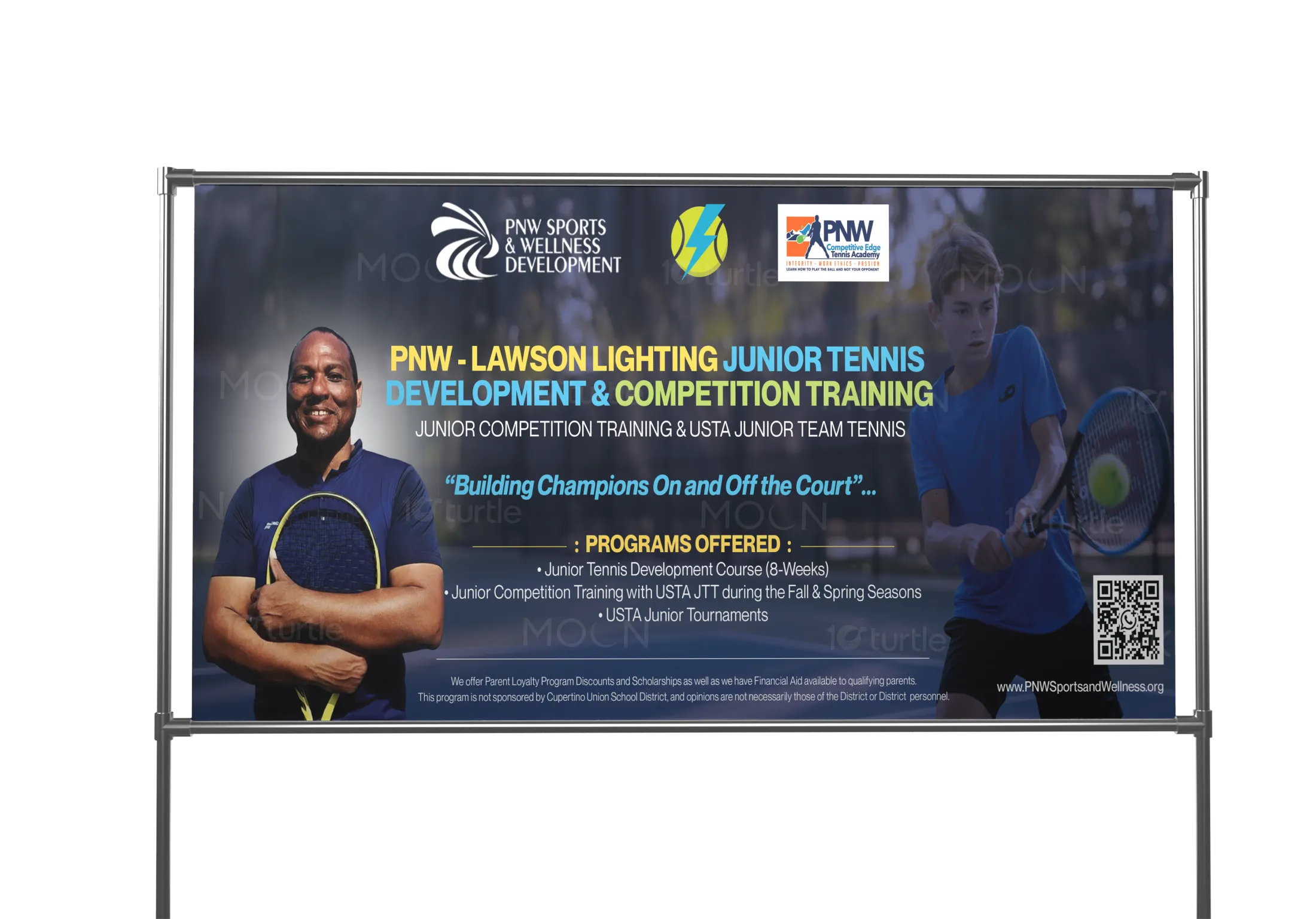
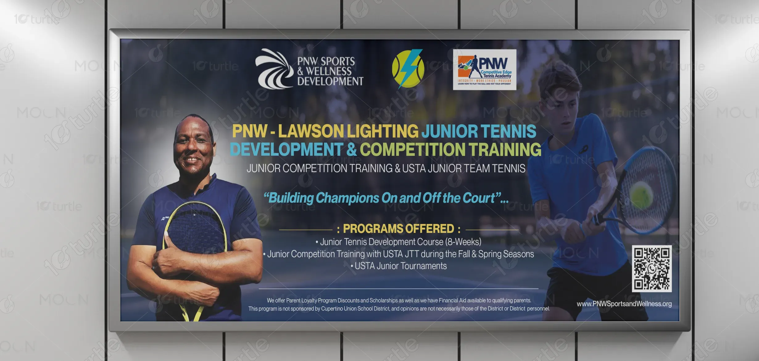
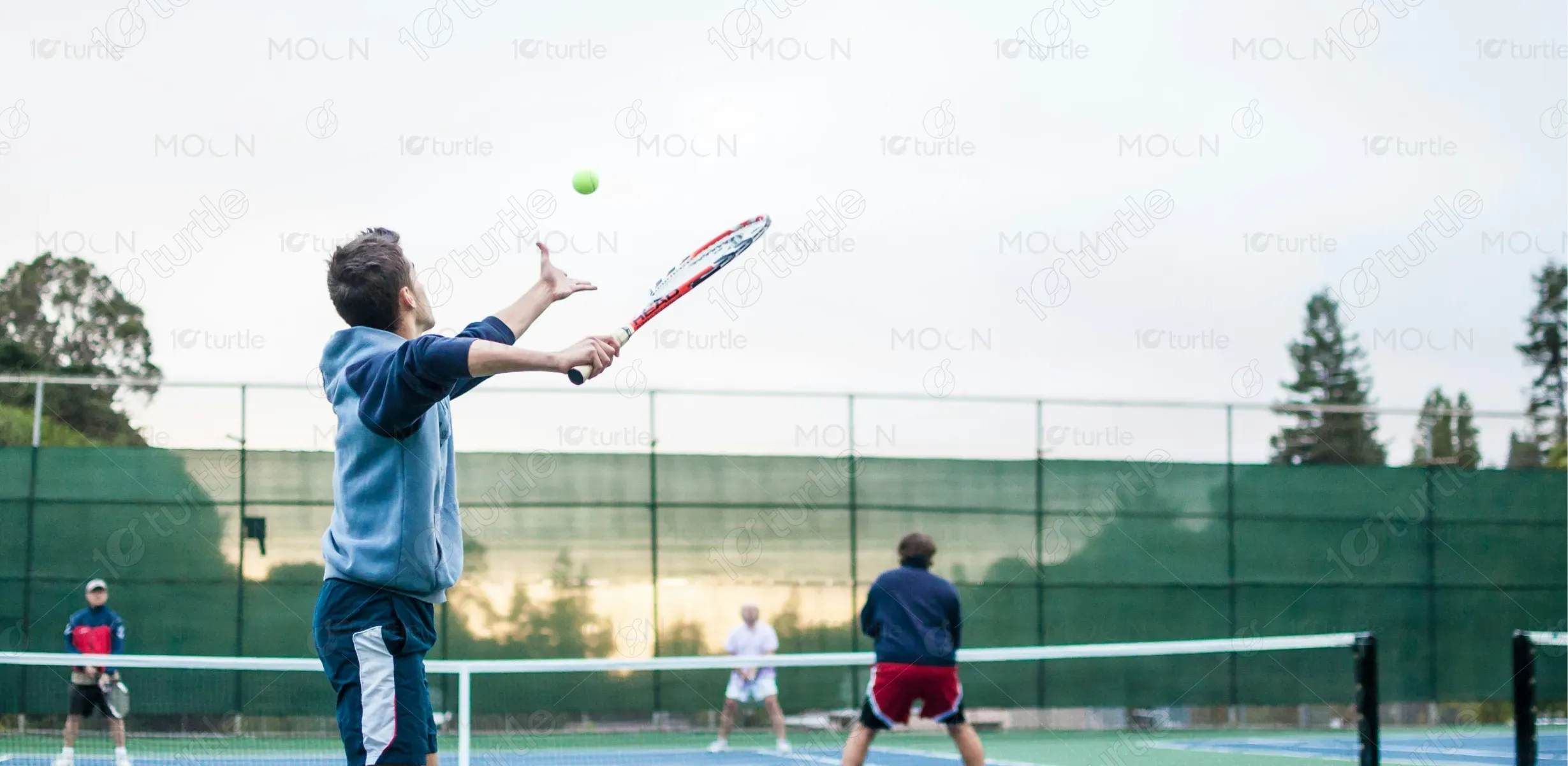
The banner design blends energy, discipline, and aspiration through bold typography and dynamic sports imagery. A strong visual hierarchy ensures readability from long distances, while action-driven photography communicates movement, focus, and competitive spirit. Clean layouts and balanced spacing allow program details to remain clear without clutter. The design emphasizes professionalism and trust, reflecting a structured training environment that appeals to both young athletes and parents while maintaining a motivating, high-performance sports aesthetic.
Banner Design
Graphic Design
Industry
Education & Training
Tools we used


Project Completion
2025
Key Market
Global
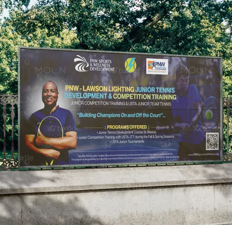
This banner promotes the PNW – Lawson Lighting Junior Tennis Development & Competition Training Program, designed to support junior athletes through structured development and competitive exposure. It highlights USTA-aligned training, seasonal competition, and long-term skill building. Positioned within youth sports and wellness education, the banner serves as a clear, high-impact communication tool for facilities, courts, and public spaces, combining athletic credibility with community-focused messaging.
Industry
Education & TrainingWhat we did
Banner DesignGraphic DesignPlatform
-Many junior tennis programs struggle with unclear communication and inconsistent branding, making it difficult for parents and athletes to understand program value. Overcrowded visuals, weak hierarchy, or low-contrast designs often reduce visibility in large venues. This lack of clarity can lead to missed enrollment opportunities and diminished trust. The challenge was to present detailed program information in a bold, readable format suitable for large-scale outdoor and indoor environments.
The banner addresses these challenges through a structured layout, high-contrast color usage, and concise content organization. Key information—program name, purpose, offerings, and tagline—is immediately visible. Athlete imagery reinforces authenticity and aspiration, while clean typography ensures legibility at a distance. The inclusion of web access and program highlights simplifies decision-making for parents, turning passive viewing into active engagement.
The vision is to establish PNW Sports & Wellness Development as a trusted leader in junior athletic training. The brand aims to foster disciplined, confident athletes while promoting personal growth beyond sport. As the program expands, its visual identity will continue to represent excellence, accessibility, and community impact—positioning PNW as a long-term partner in youth development and competitive success.
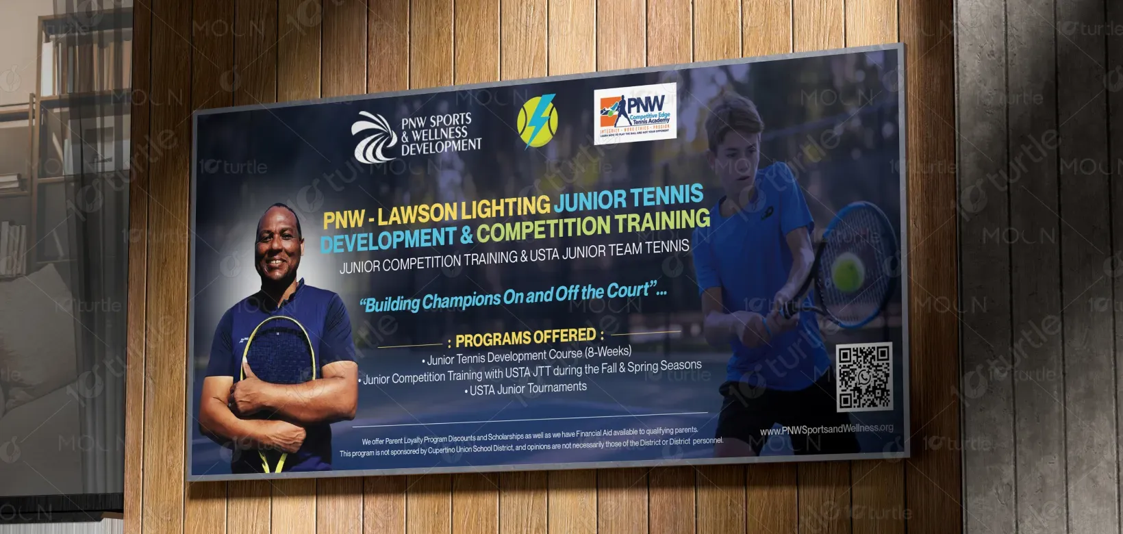
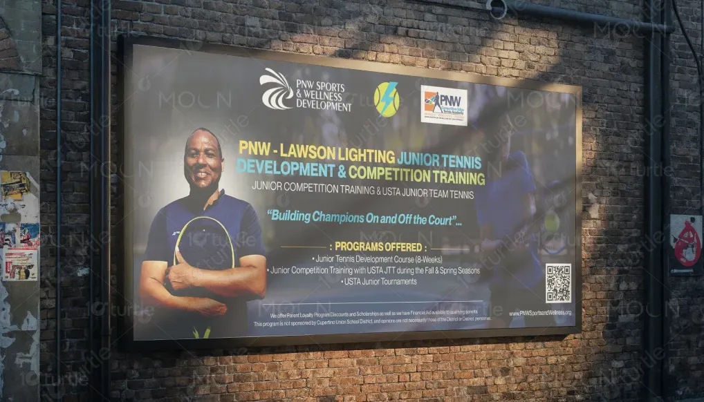
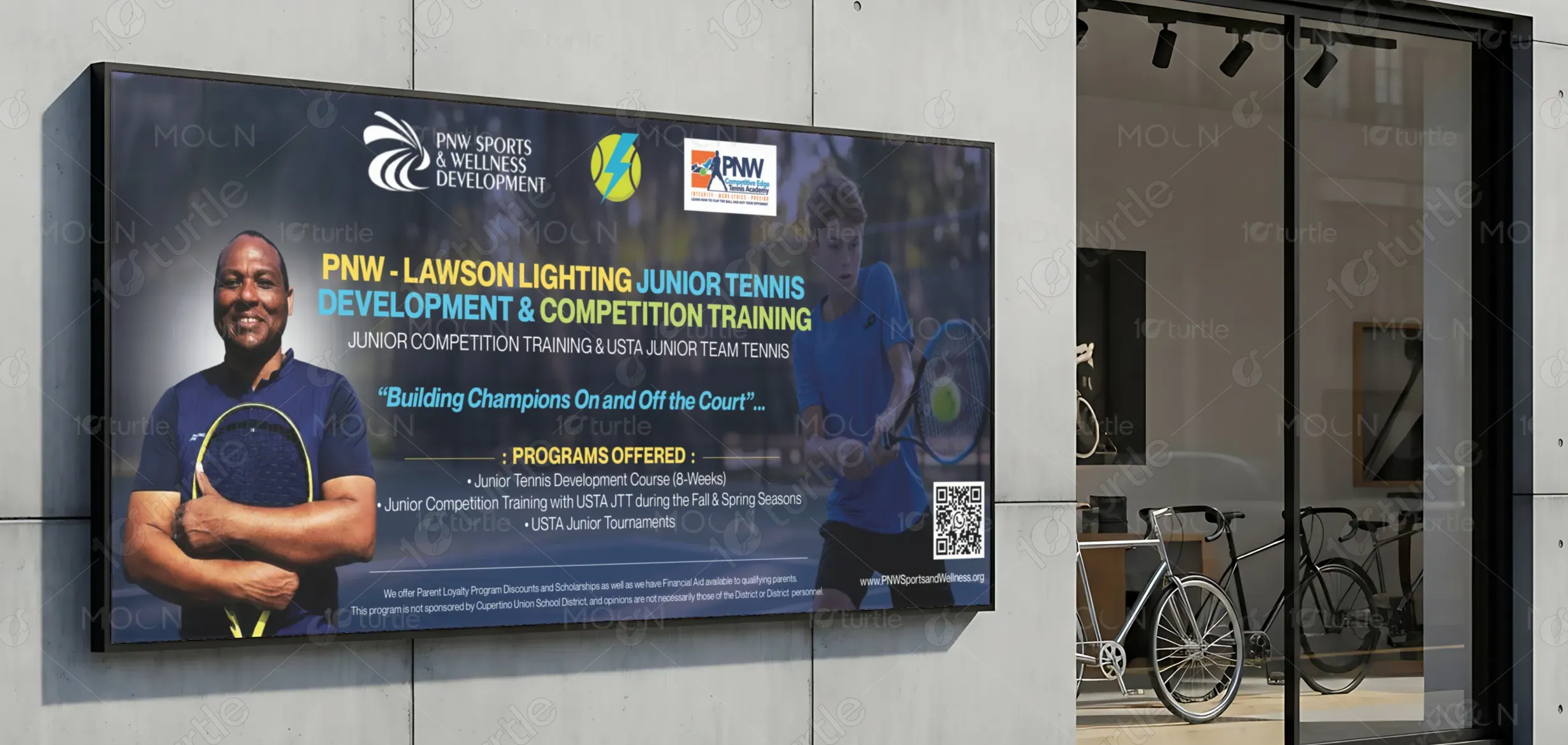
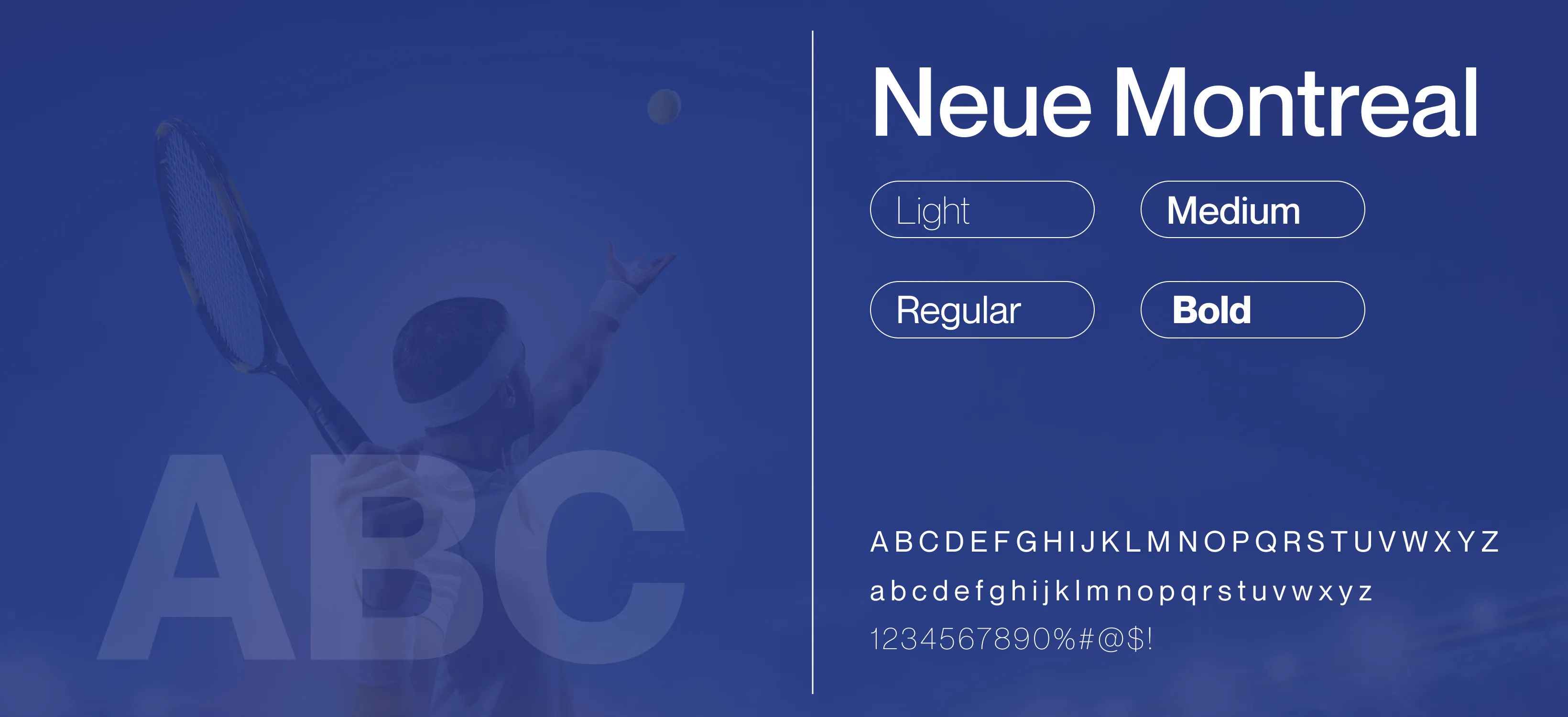
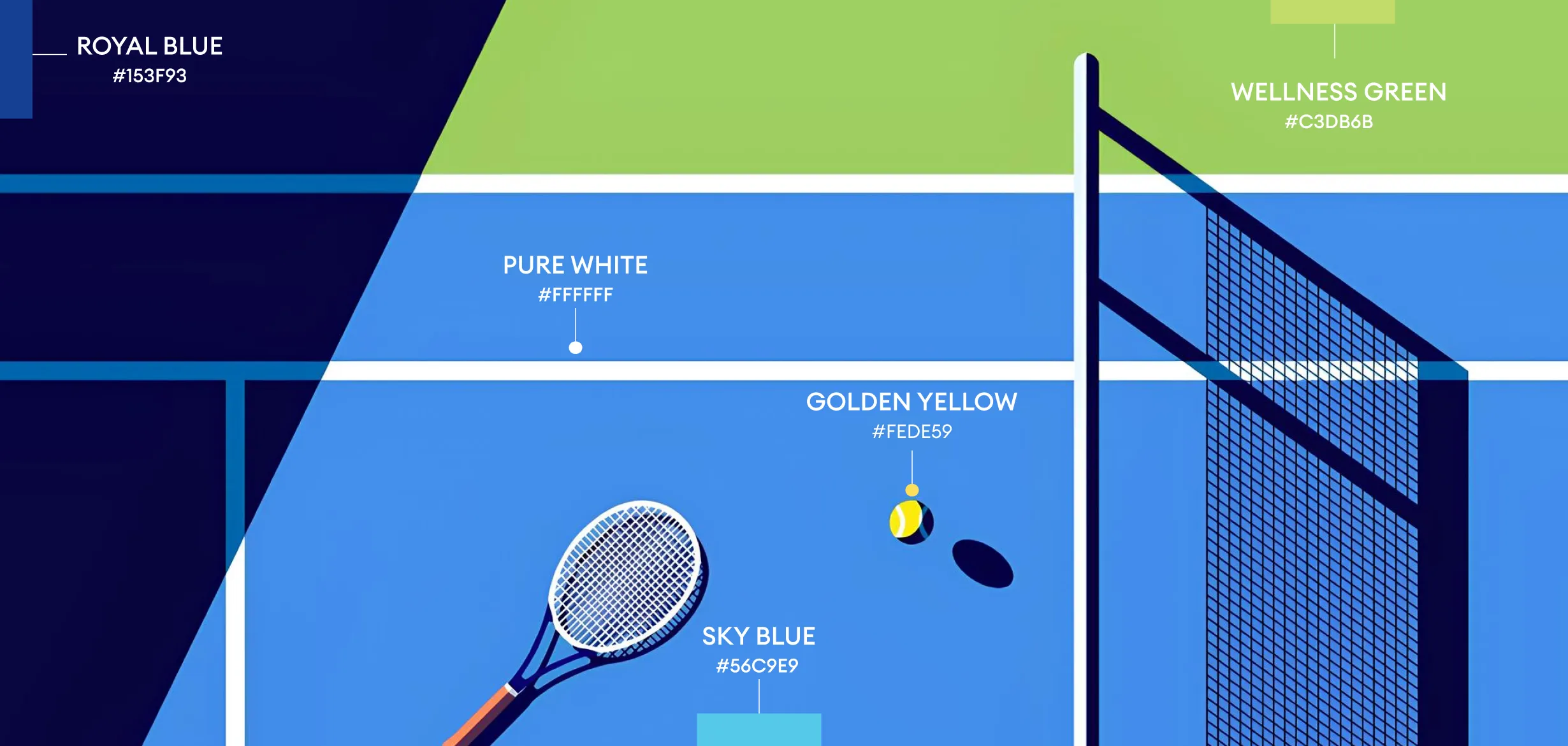
The color palette combines deep blues and greens with vibrant accent tones to evoke trust, stability, and athletic energy. Dark backgrounds enhance contrast and legibility, while bright highlights draw attention to key messages and calls to action. This balance creates a professional yet motivating atmosphere, aligning with the discipline of competitive tennis and the encouragement required for youth development.