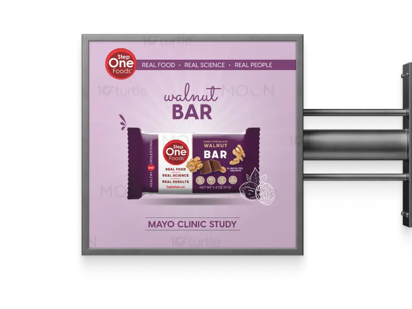
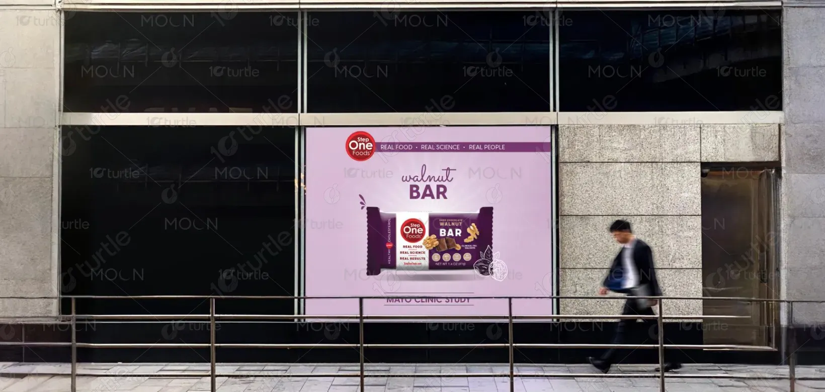
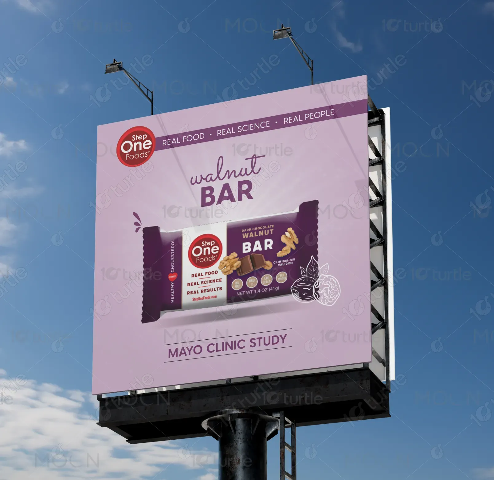
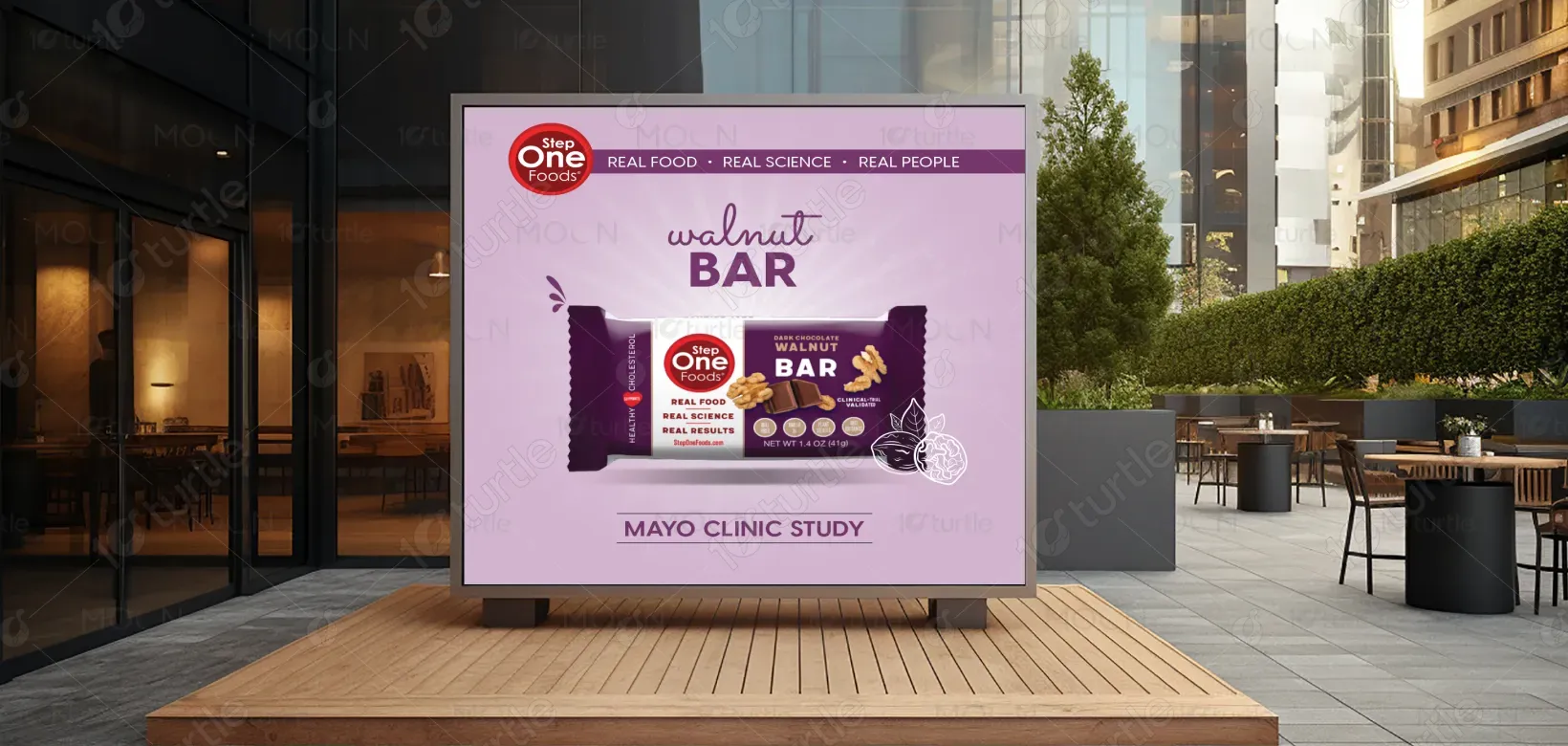
The banner design follows a clean, modern aesthetic with bold typography and balanced visual hierarchy to capture attention instantly. A strategic use of imagery and whitespace ensures readability while guiding the viewer’s eye across key information. The layout integrates brand colors and elements to create a cohesive look that feels both professional and approachable. Overall, the design focuses on delivering clarity, brand consistency, and visual impact, making it suitable for both digital and print use.
Banner Design
Graphic Design
Industry
Food, Beverage & Hospitality
Tools we used


Project Completion
2025
Key Market
Global
This banner design serves as a powerful communication tool to promote the brand’s message in a visually engaging way. It highlights the core offering with a structured layout, professional fonts, and a contemporary look that resonates with modern audiences. By combining striking visuals and a clear call-to-action, it ensures maximum visibility and memorability. Its unique selling point lies in its simplicity and elegance—delivering impactful messaging without overwhelming the viewer.
Industry
Food, Beverage & HospitalityWhat we did
Banner DesignGraphic DesignPlatform
-One major challenge in banner design is striking the right balance between aesthetics and functionality. Many banners either appear too cluttered with excessive text and visuals or too minimal, failing to convey the message effectively. This often leads to reduced audience engagement and message dilution. For example, banners at events or social media feeds often get ignored because they lack strong visual hierarchy and clarity. The gap lies in creating designs that stand out yet communicate clearly at a glance.
This design addresses the challenge by focusing on clarity, visual hierarchy, and brand alignment. Large, impactful typography ensures key messages are noticed instantly, while supporting visuals and balanced spacing maintain a clean flow. The color scheme and imagery reinforce brand recognition while evoking the right emotions. By removing unnecessary clutter and highlighting only essential content, the design ensures better audience retention and stronger brand recall in competitive spaces like events, digital ads, or promotional campaigns.
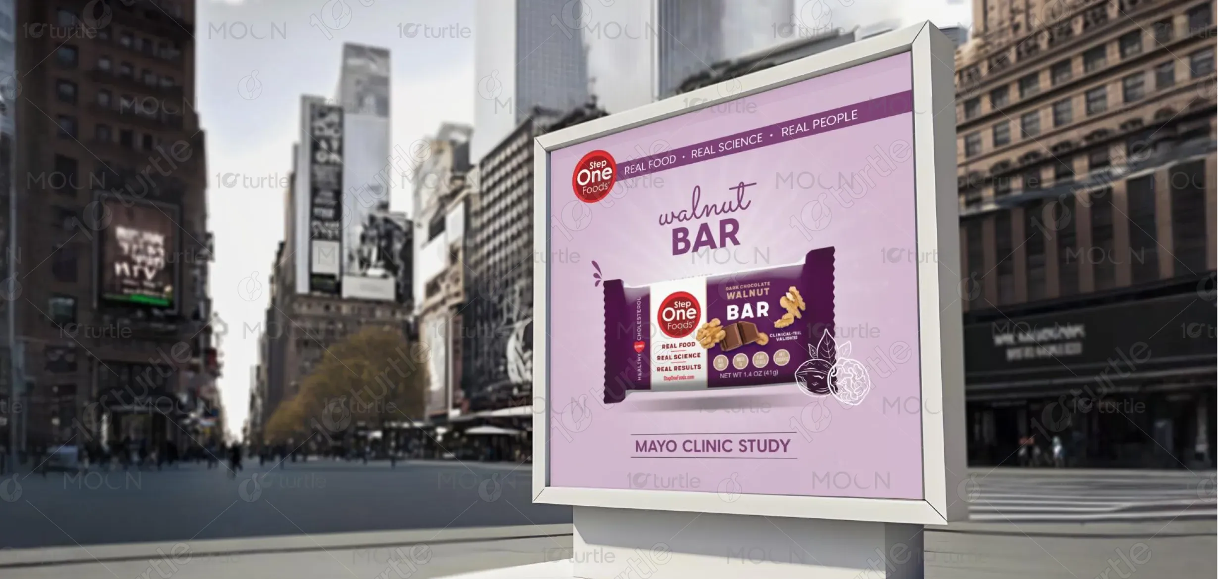
The long-term vision of this design is to establish a consistent visual identity that audiences immediately recognize and trust. Beyond this banner, the design language can evolve into a broader brand system—including digital campaigns, product packaging, and corporate communications—ensuring consistency across platforms. Its goal is not only to capture short-term attention but also to contribute to a lasting brand impression that builds loyalty, credibility, and industry presence over time.
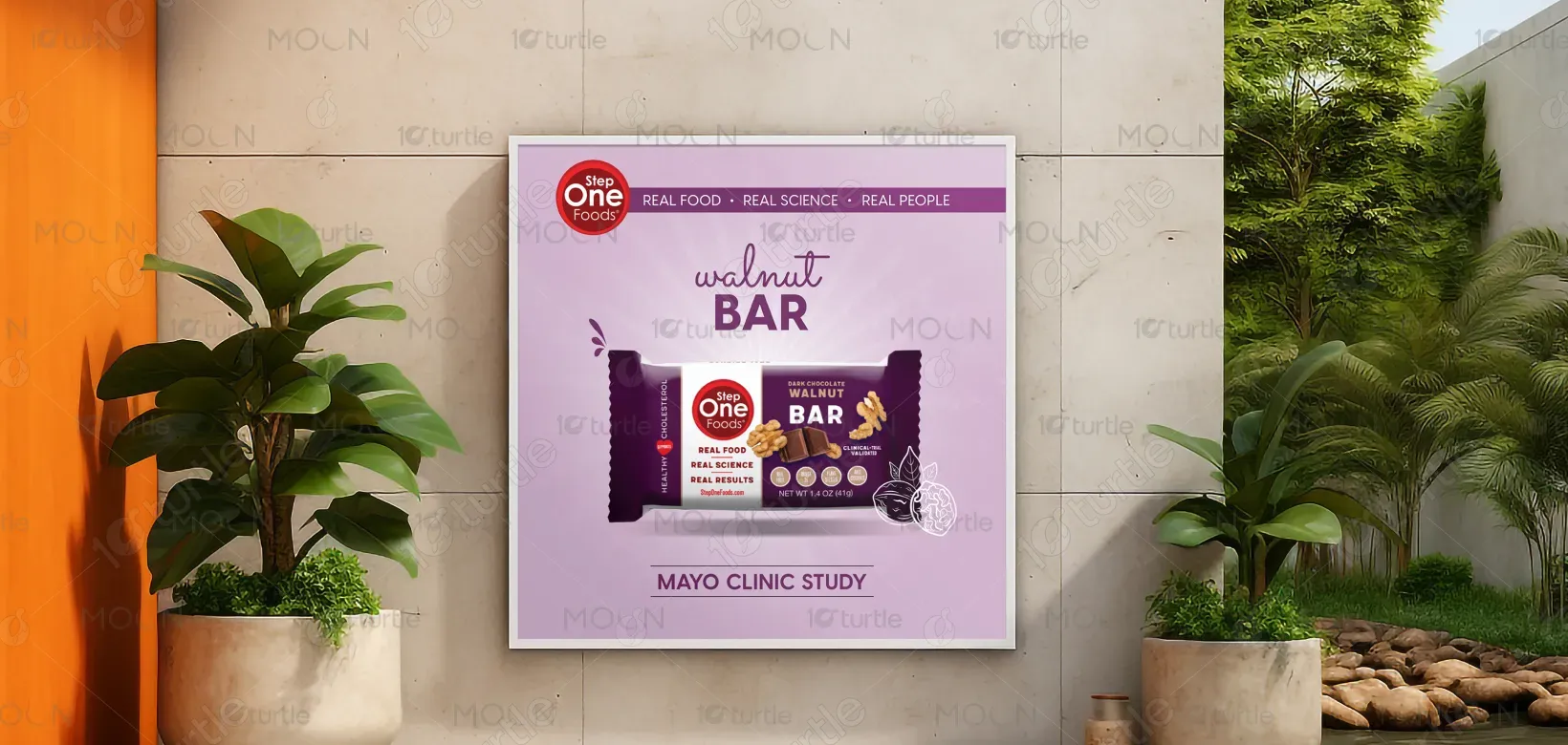
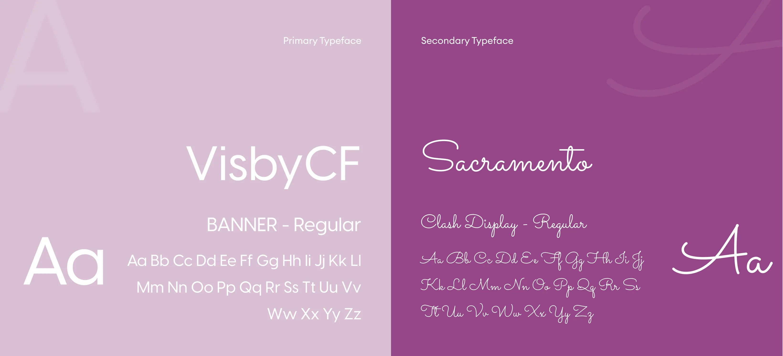
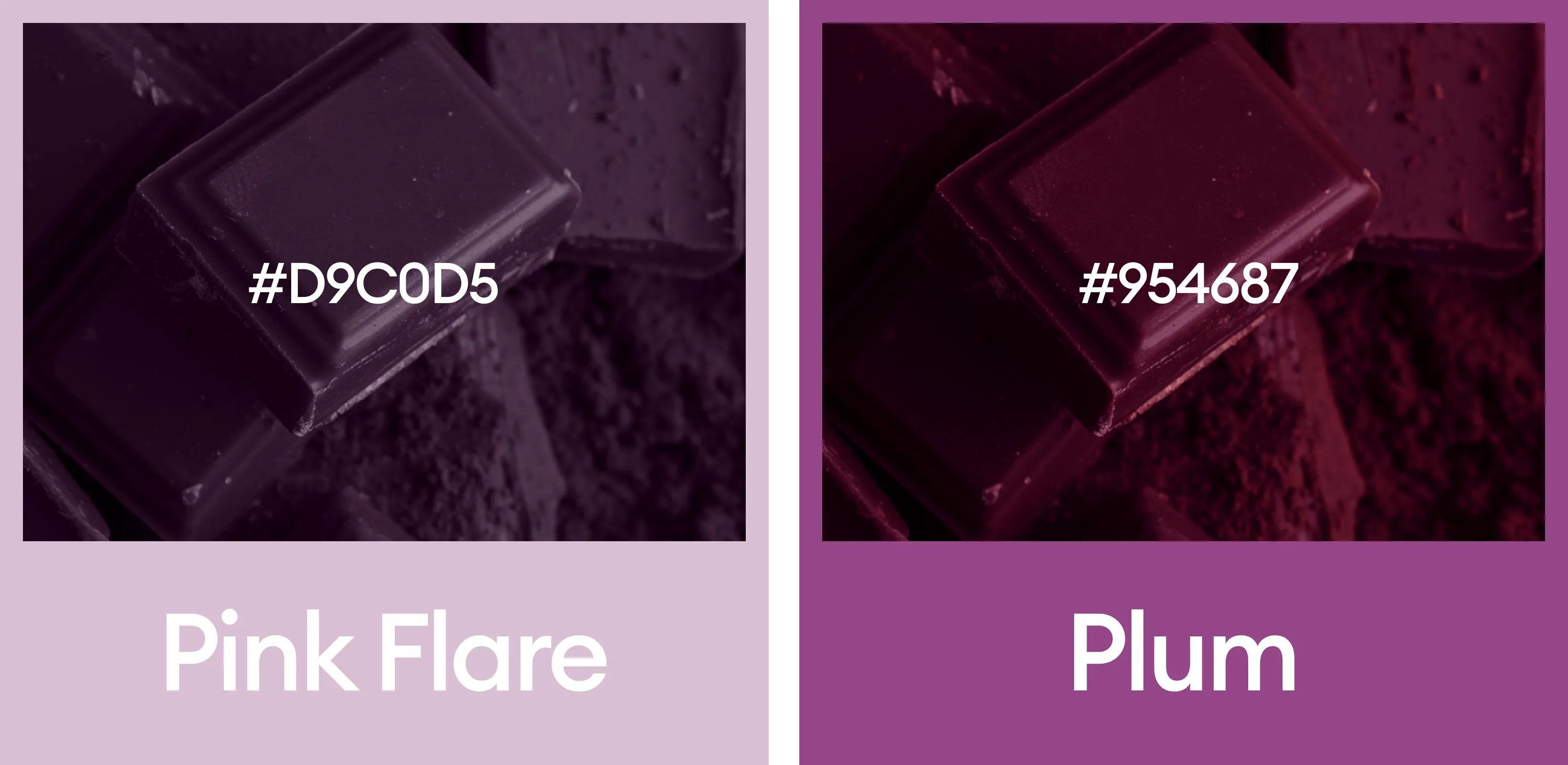
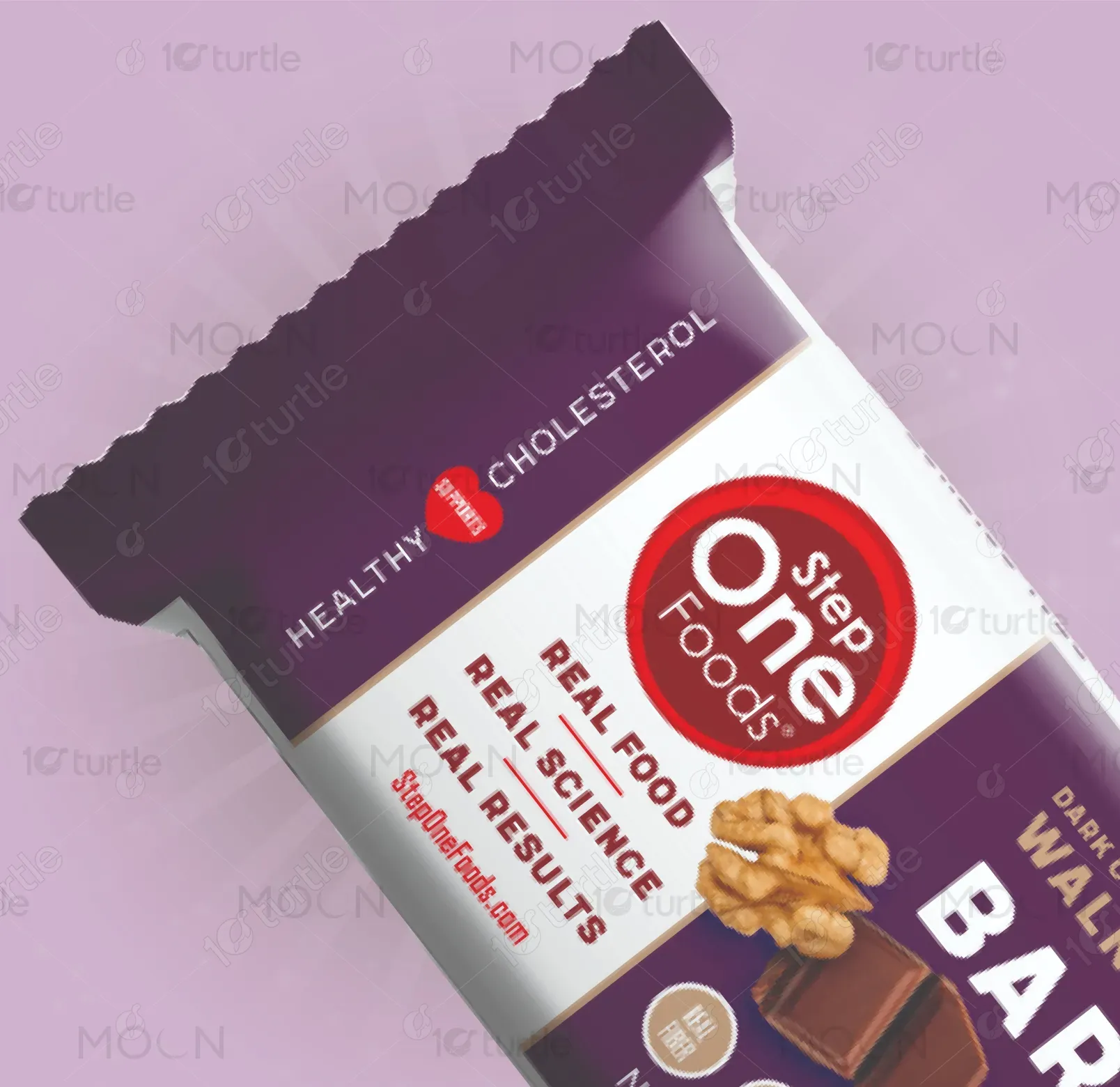
The chosen color palette combines bold, eye-catching tones with neutral accents to achieve balance. The primary brand color conveys energy, optimism, and visibility, while secondary shades add professionalism and depth. This combination creates emotional impact—encouraging trust and engagement—while aligning seamlessly with the brand’s identity. The palette also enhances readability and visual hierarchy, ensuring that both text and visuals stand out clearly, whether the banner is displayed digitally or in print.