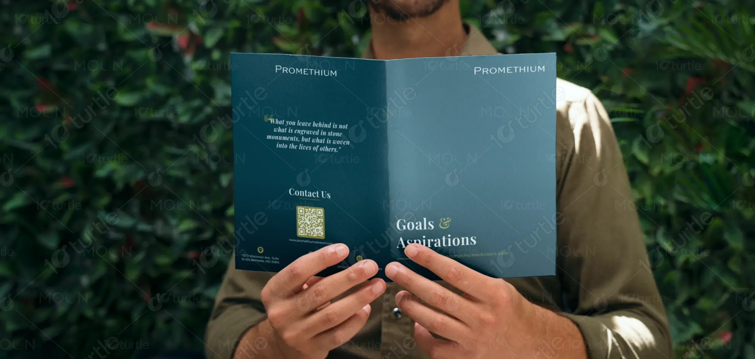
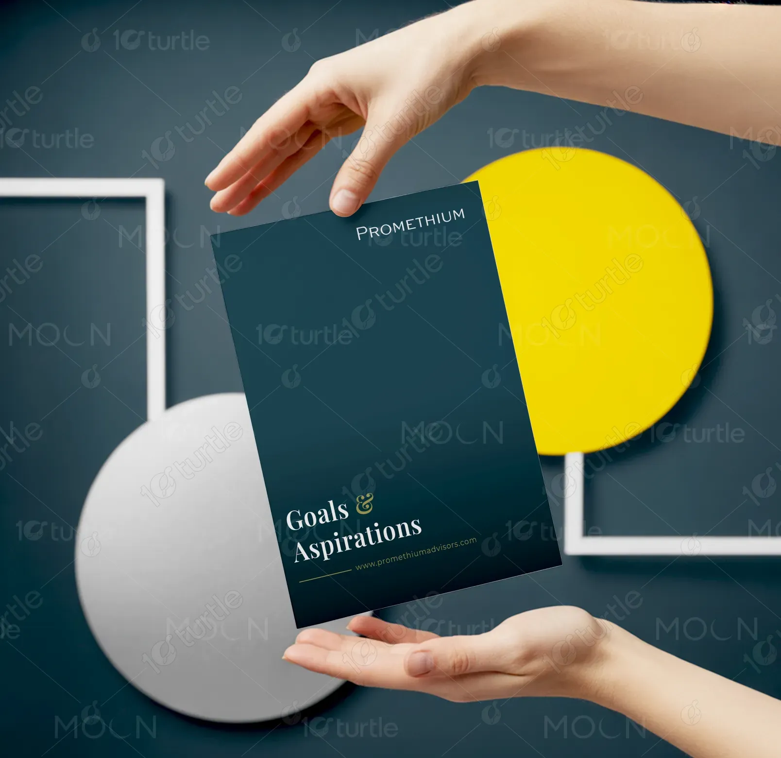
The design centers around clarity, balance, and trust, using a clean and professional aesthetic to reflect Promethium Advisors’ mission of guiding clients toward peace of mind in financial and life planning. The visual approach combines modern typography with subtle, structured layouts that emphasize alignment and reflection. By focusing on harmony between aspirations and practical planning, the design communicates both warmth and reliability. Every element is chosen to inspire confidence while maintaining a sense of simplicity and calm sophistication.
Bi-fold Design
Graphic Design
Industry
Finance, Legal & Insurance
Tools we used


Project Completion
2025
Key Market
Global
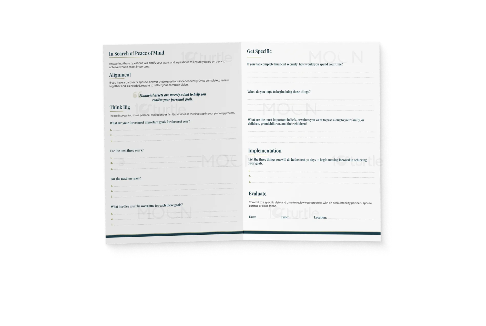
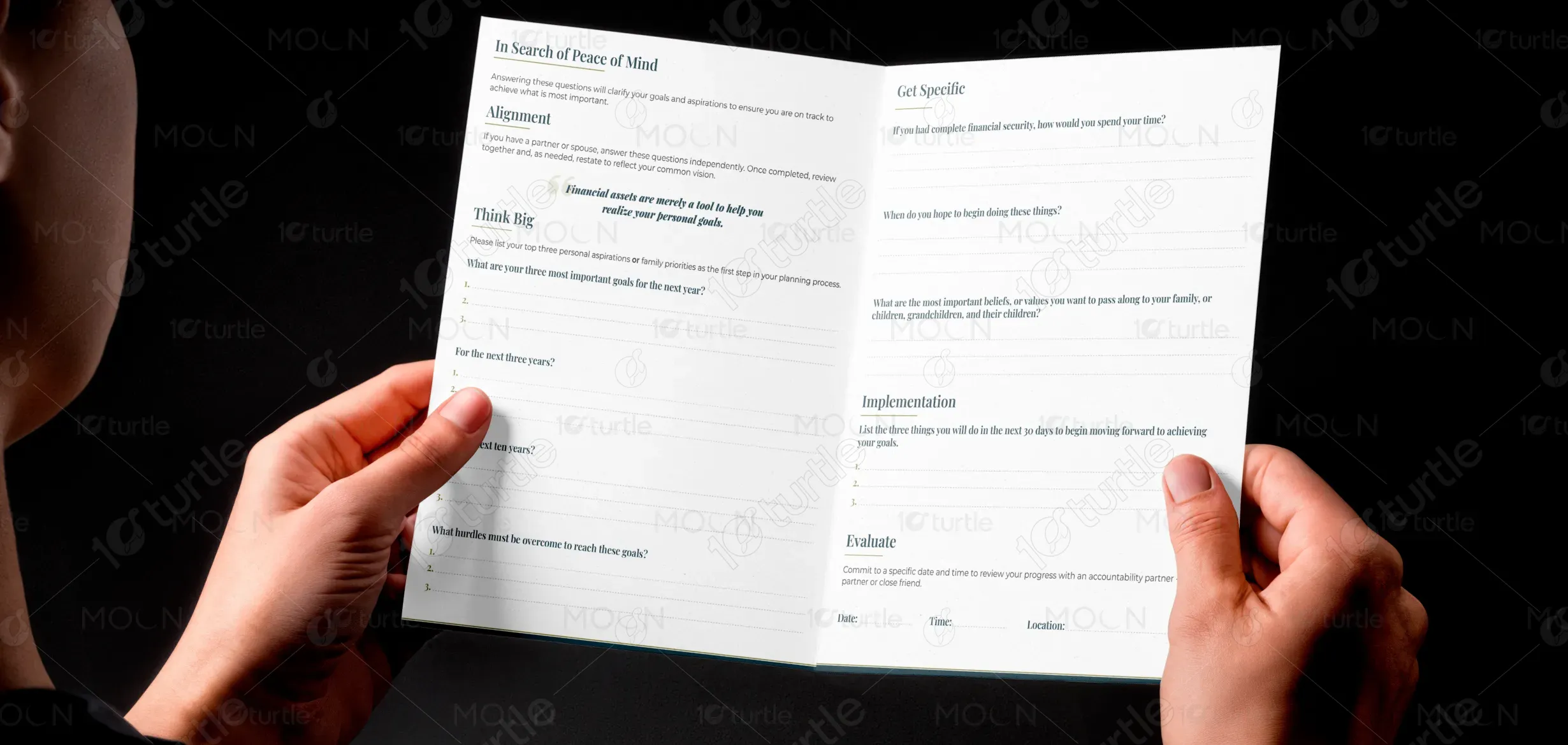
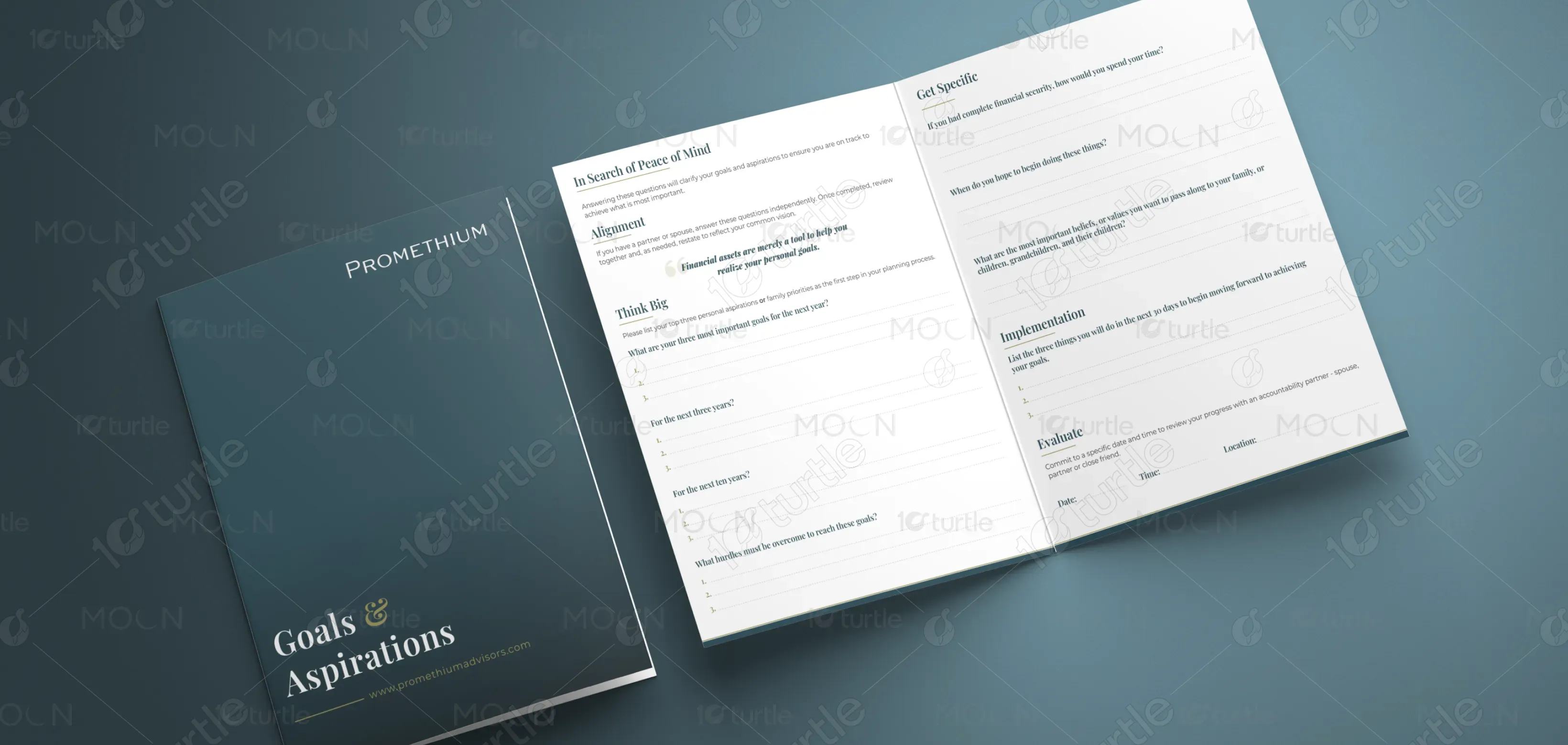
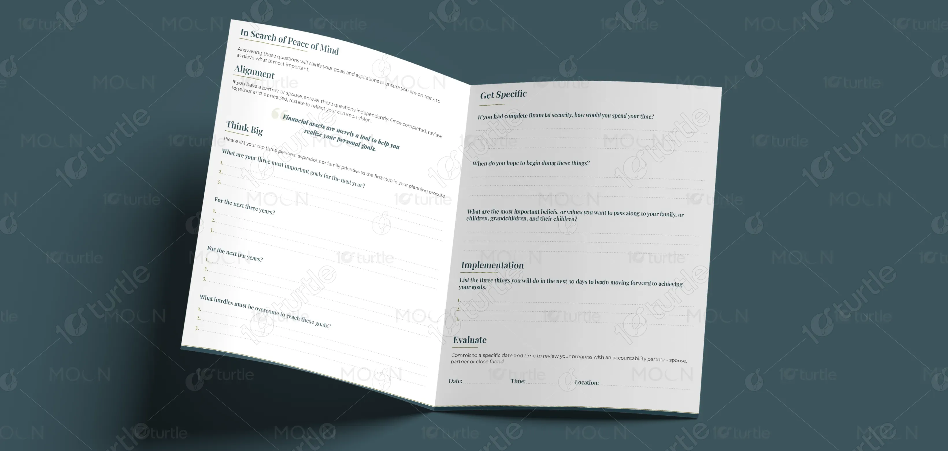
This design serves as a framework for individuals and families to articulate, align, and track their life and financial goals. It blends thoughtful visual storytelling with structured guidance, ensuring that clients not only dream big but also have actionable steps to move forward. Its unique appeal lies in merging financial planning with personal values, making it more than a tool—it becomes a roadmap for fulfillment. The aesthetic remains approachable yet premium, reinforcing trust and long-term commitment.

Industry
Finance, Legal & InsuranceWhat we did
Bi-fold DesignGraphic DesignPlatform
-Most financial and life planning tools feel transactional, overwhelming, or detached from personal aspirations. Traditional approaches often prioritize numbers over meaning, leaving individuals without clarity on why they’re planning in the first place. This gap creates disengagement and anxiety, especially for families navigating shared goals. Real-world example: Many financial advisors focus on investments without addressing values, leading to plans that feel misaligned with actual life priorities. This lack of emotional connection weakens long-term decision-making.
The design reframes planning as a personal journey rooted in aspirations. By asking reflective, value-driven questions and pairing them with structured goal-setting, it bridges the gap between emotional clarity and financial execution. The layout is intuitive, prompting thoughtful responses without overwhelming the user. Promethium Advisors’ branding ensures credibility, while the design creates a calm, guided experience that balances both heart and strategy. This integration transforms planning into a collaborative, meaningful, and motivating process.
The long-term vision is to empower individuals and families to align wealth with values, ensuring financial strategies support what matters most. Promethium Advisors aspires to evolve beyond traditional advisory, becoming a trusted partner for life’s biggest decisions. Over time, the brand aims to set a benchmark in holistic financial planning—where peace of mind and purposeful living are inseparable. The goal is not only to provide guidance but to leave a legacy of clarity, confidence, and alignment.

The palette embraces calm, professional tones—likely soft blues, muted grays, and clean whites—that symbolize trust, clarity, and stability. Blue communicates peace of mind and reliability, while gray adds sophistication and neutrality, keeping the focus on clarity of thought. White space plays a crucial role in evoking openness and simplicity, reinforcing transparency in planning. Together, these colors reflect the brand’s identity: professional, approachable, and purpose-driven, ensuring that users feel both supported and inspired throughout their journey.