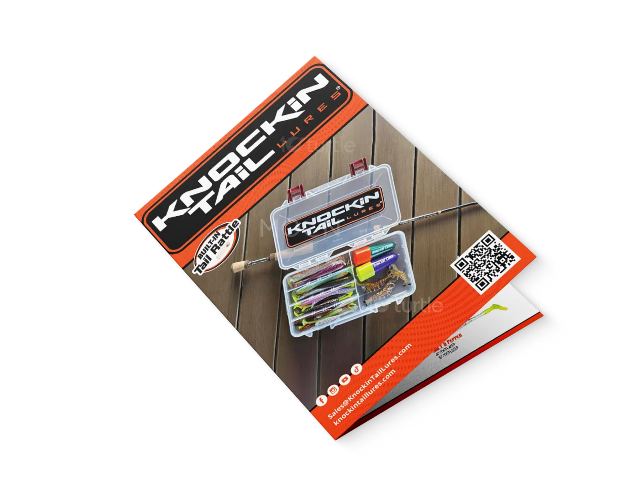
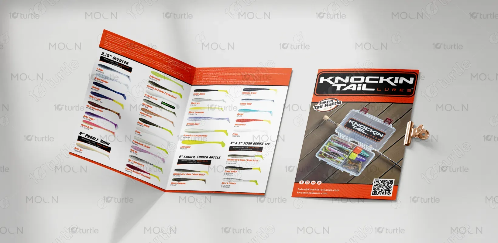
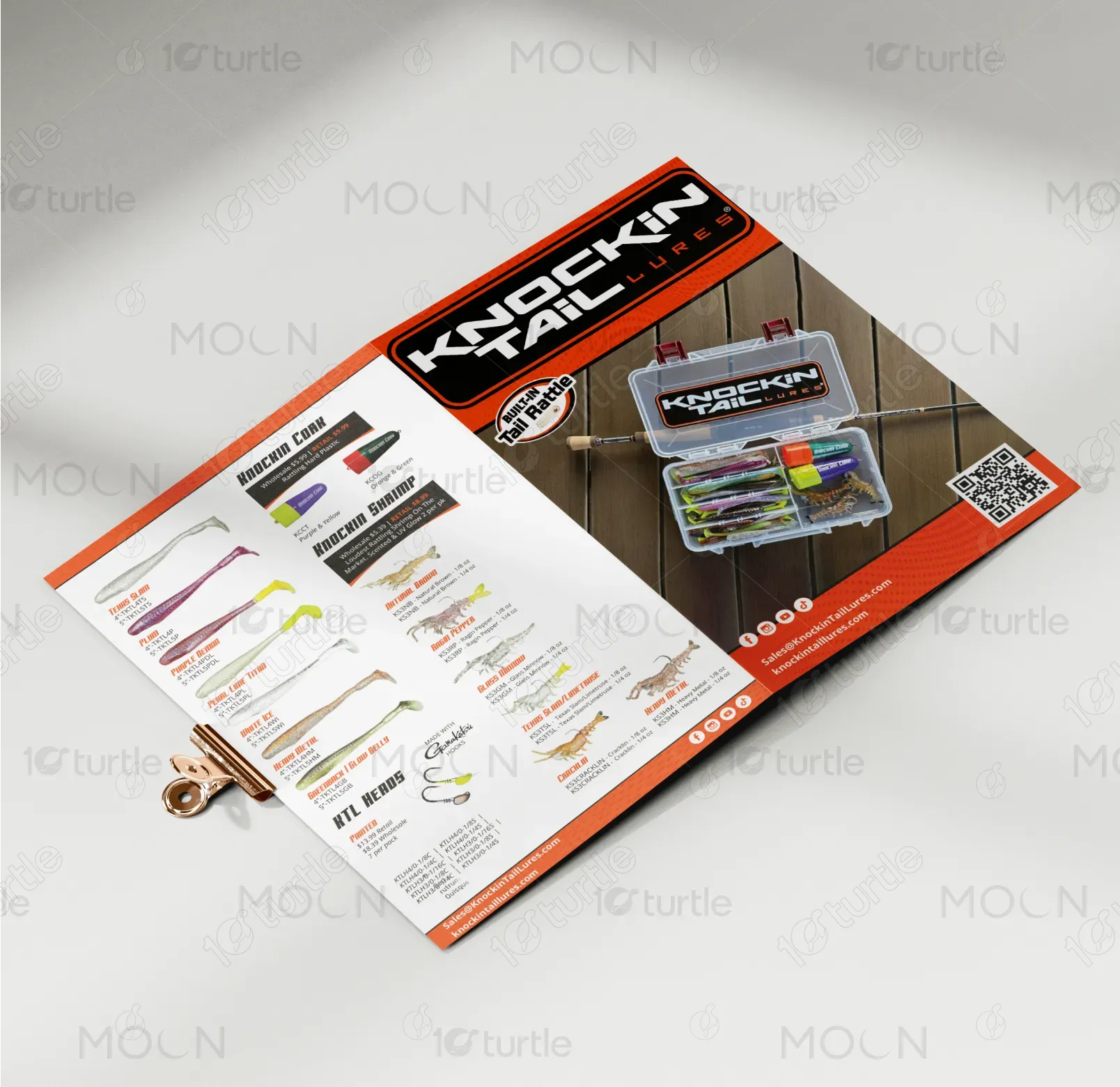
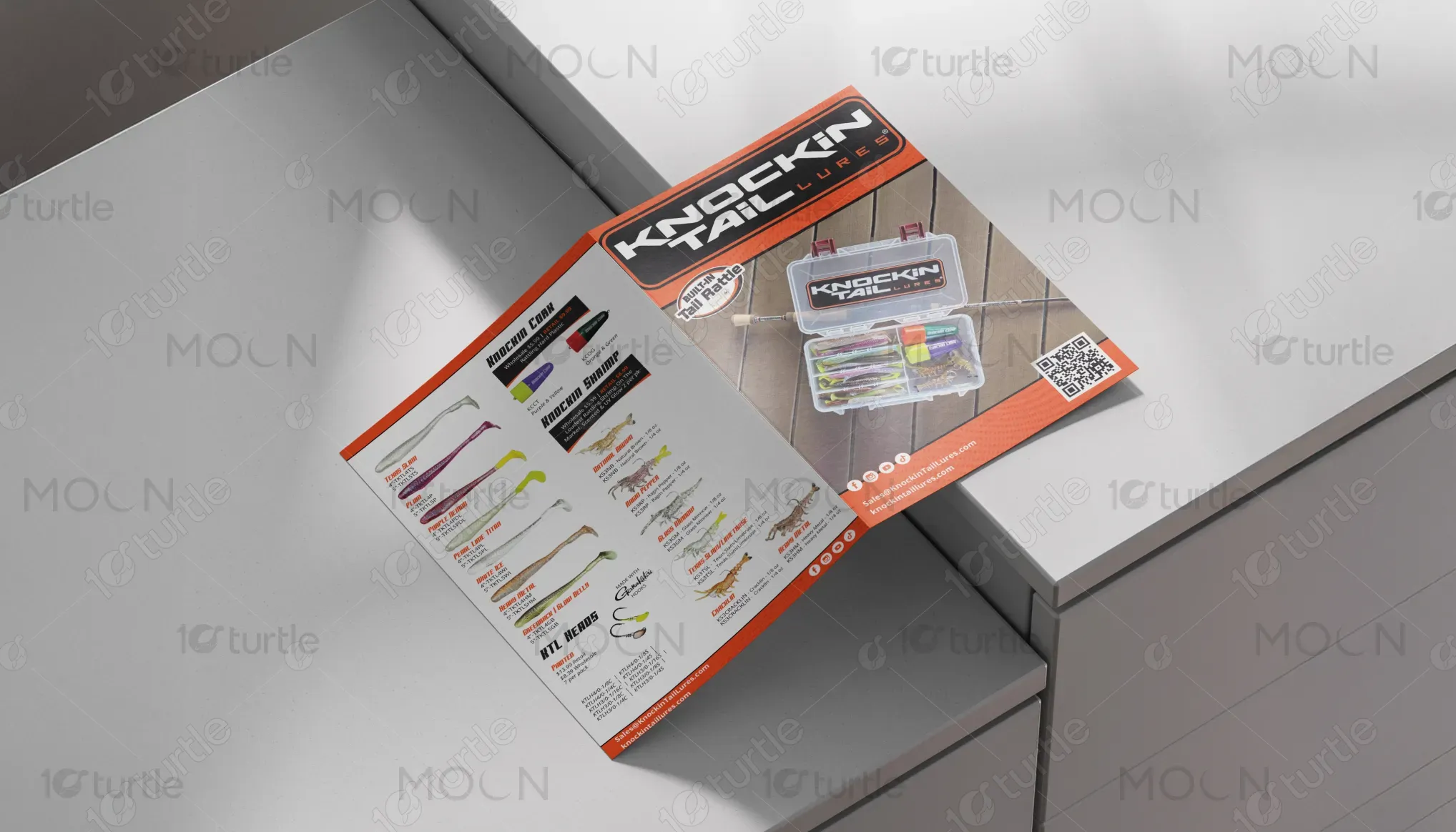
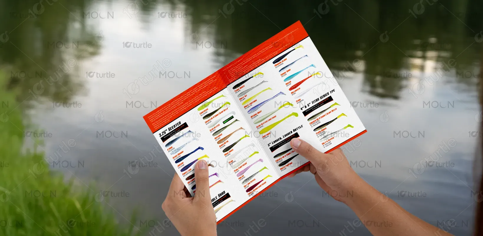
The bi-fold design adopts a bold and dynamic approach, using high-contrast visuals and a modern layout to instantly capture attention. The front cover emphasizes the brand identity with a strong logo placement, product imagery, and a clean yet rugged outdoor theme. Inside, the design transitions into a product-focused layout, highlighting lure variations with clear images, structured typography, and an organized grid system. The use of QR codes, contact details, and vibrant color accents enhances accessibility, professionalism, and consumer engagement.
Bifold Design
Graphic Design
Industry
Consumer Goods & Retail
Tools we used


Project Completion
2025
Key Market
Global
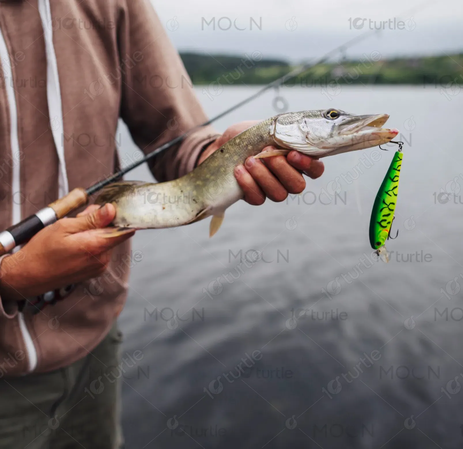
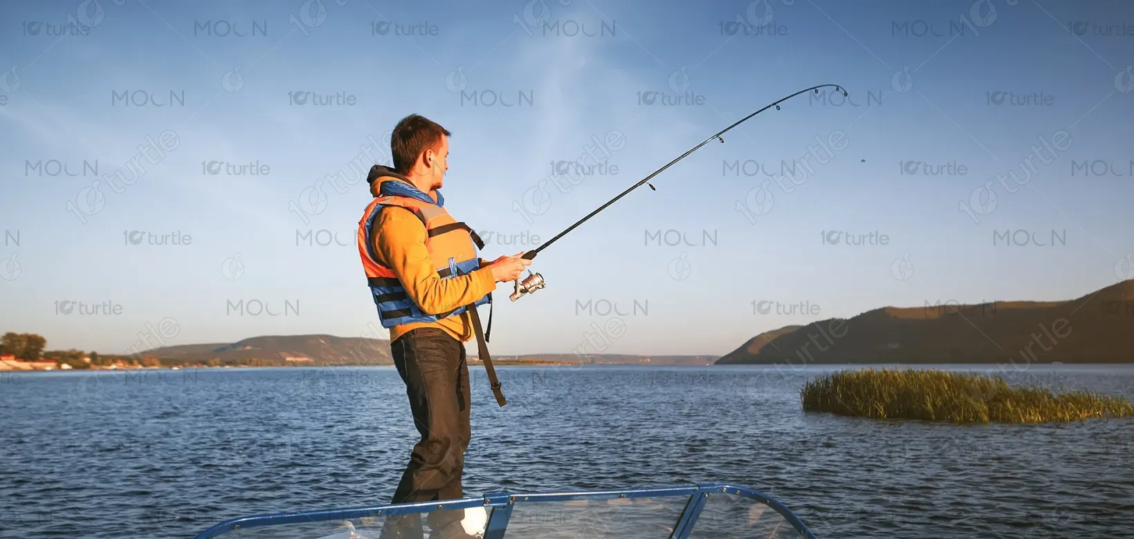
This bi-fold brochure is created for Knockin’ Tail Lures, a fishing lure brand with a unique built-in tail rattle. Its purpose is to showcase the product range in a visually appealing, easy-to-browse format for customers, retailers, and distributors. By combining lifestyle photography with product-focused layouts, the design appeals to anglers seeking innovative gear. The unique selling point is the integrated tail rattle, which sets the brand apart from competitors. The aesthetic blends rugged outdoor appeal with professional clarity.
Industry
Consumer Goods & RetailWhat we did
Bifold DesignGraphic DesignPlatform
-In the fishing lure market, many brochures are either too cluttered with technical details or too minimal, leaving customers without enough information to make decisions. Anglers often struggle to differentiate between lure options, sizes, and features. Additionally, traditional marketing materials fail to connect with modern, tech-savvy buyers who prefer quick access to product info online. The challenge was balancing informative detail with clean design, while ensuring the brand identity stood out in a competitive and visually saturated market.
The design effectively addresses this challenge through a dual-focus approach: a visually striking cover that builds brand recognition, paired with an interior that organizes product variations in a clean grid. Each lure is clearly displayed with its name, color, and size, making comparison simple. The inclusion of QR codes bridges offline and online experiences, giving instant access to digital resources. Bold typography, high-quality images, and structured sections ensure clarity, while the outdoor-inspired visuals connect with the target fishing community.
The long-term vision is to establish Knockin’ Tail Lures as a recognizable and trusted name in fishing innovation. This brochure sets the foundation for a consistent brand identity across print, digital, and retail platforms. Over time, the design strategy will evolve into a complete ecosystem of marketing materials—catalogs, packaging, digital ads—that reinforce the lure’s unique features. The ultimate aspiration is to become a household name for anglers worldwide, leaving a lasting impression of reliability, innovation, and adventure.
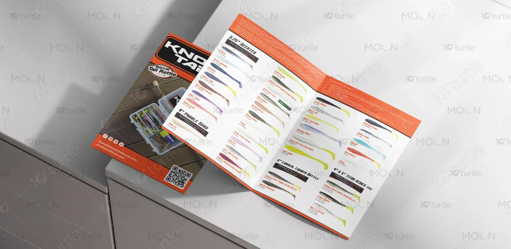

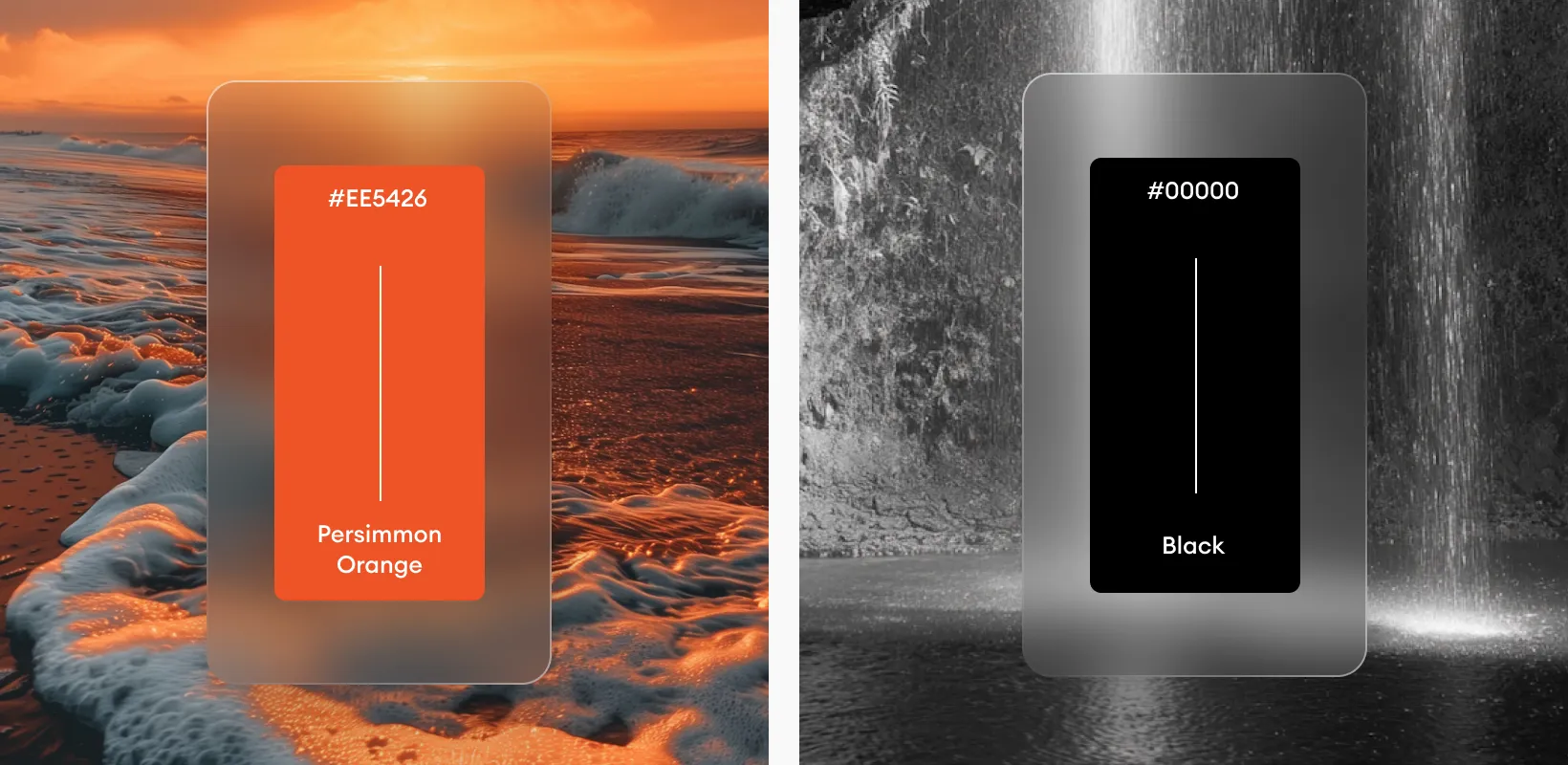
The chosen palette combines bold orange, black, and white, with natural wooden tones from the background imagery. Orange conveys energy, enthusiasm, and action, aligning with the thrill of fishing and the brand’s innovative spirit. Black adds strength, professionalism, and authority, while white provides clarity and balance, ensuring legibility and a clean aesthetic. The natural tones of wood add an authentic, outdoor feel, connecting the design directly to the fishing environment. Together, the palette embodies both ruggedness and modern appeal.