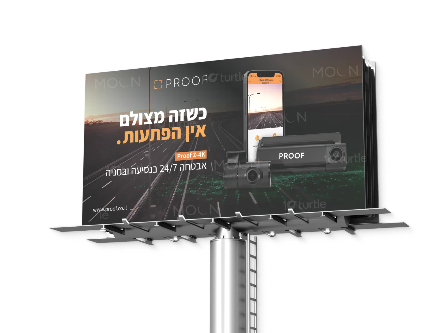
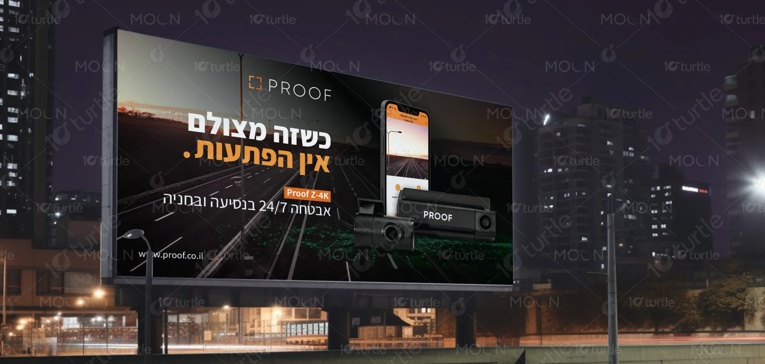
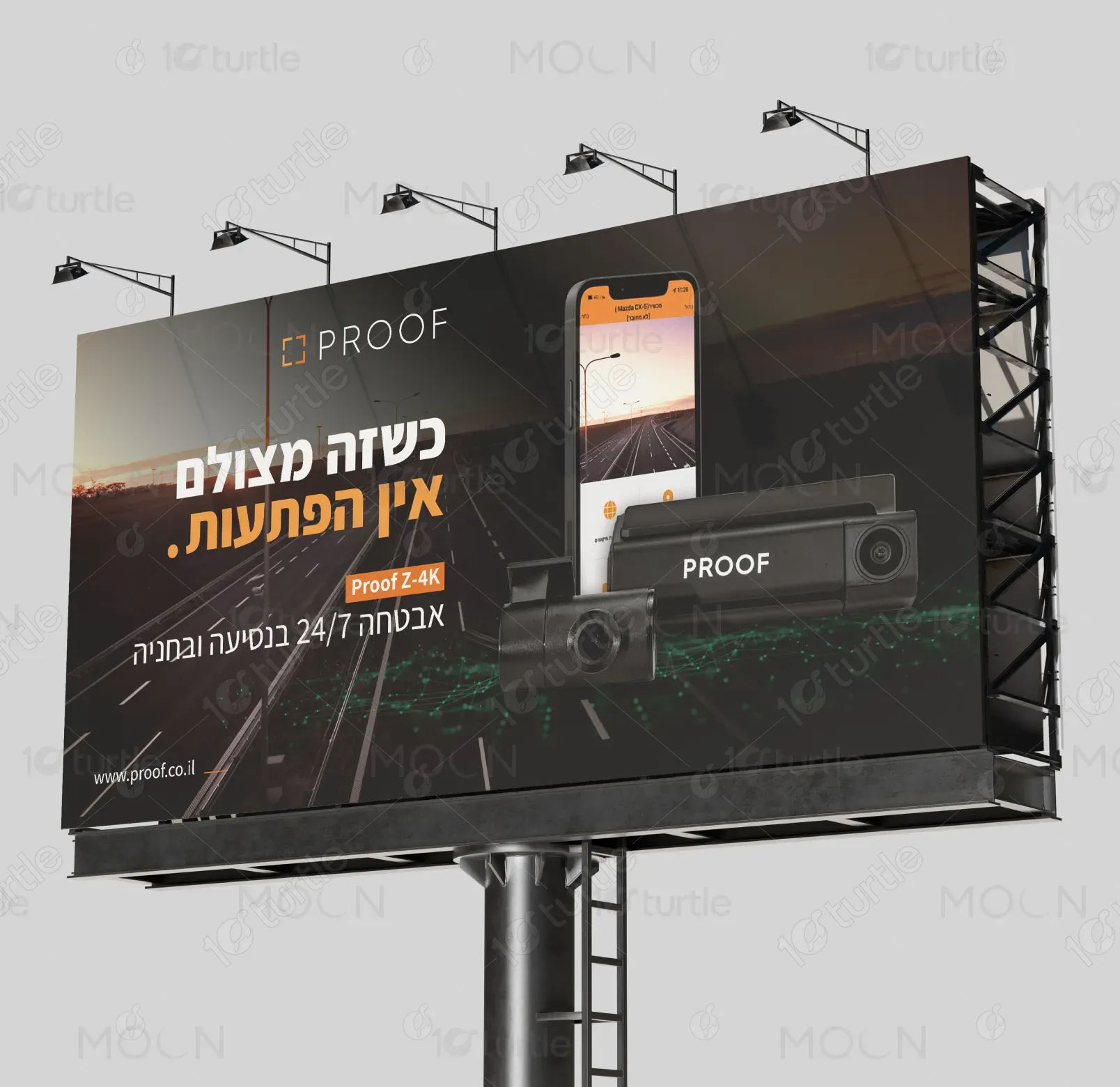
The billboard design for the Proof Z-4K dashcam embodies a sleek, high-contrast aesthetic that merges advanced technology with visual clarity. The composition balances a dark, cinematic background with luminous highlights, emphasizing precision and reliability. Bold Hebrew typography ensures long-distance readability, while the product image and branding integrate seamlessly to reinforce modernity and trust. Every element—color, layout, and tone—works in harmony to capture attention quickly, communicate 24/7 security, and evoke confidence in the brand’s superior technology.
Billboard Design
Graphic Design
Industry
Consumer Goods & Retail
Tools we used


Project Completion
2025
Key Market
Global
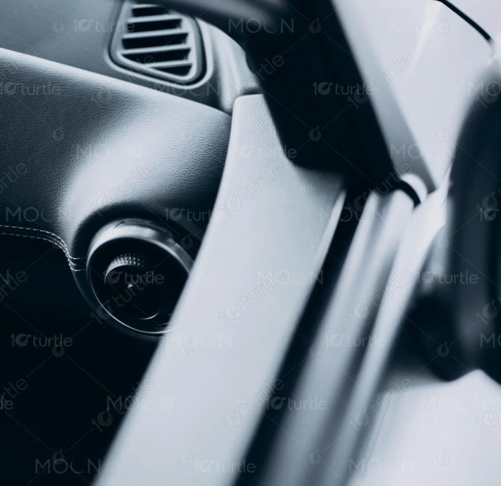
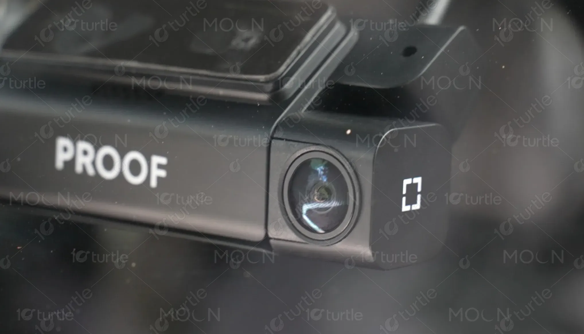
The Proof Z-4K dashcam is a premium in-car security device designed to deliver ultra-high-definition video recording for complete peace of mind. This billboard introduces the product as a fusion of safety and innovation, positioning it as the ultimate protection companion for every journey. Its unique selling points include 4K clarity, continuous 24/7 surveillance, and seamless performance in motion and parking. The design visually conveys reliability and sophistication, aligning the brand with cutting-edge automotive technology.
Industry
Consumer Goods & RetailWhat we did
Billboard DesignGraphic DesignPlatform
-One of the main challenges was crafting a billboard that instantly communicates technological superiority and safety within seconds of viewing—especially to fast-moving commuters. Many roadside ads for similar tech products often look cluttered, lack clear messaging, or fail to translate high-end features visually. The difficulty was to balance premium minimalism with enough visual storytelling to make the brand’s technological strength instantly recognizable from a distance without overwhelming the viewer.
The design achieves clarity through contrast—dark background tones heighten visibility, while the bold, RTL-aligned Hebrew headline delivers immediate recognition. The dashcam and app visuals subtly illustrate function without clutter. Clean typography, strategic spacing, and a controlled color palette guide the viewer’s eye effortlessly from headline to product to URL. Together, these design choices translate complex technological benefits—like 24/7 surveillance and 4K quality—into a visually digestible, high-impact statement suitable for large-format display.

The long-term vision for the Proof brand design is to redefine automotive safety advertising through minimalist sophistication and consistent visual storytelling. By merging technology with emotion, the campaign aims to establish Proof as a symbol of trust, innovation, and peace of mind. As the product line evolves, the visual identity will continue to highlight clarity, precision, and protection—cementing the brand as a benchmark for modern automotive tech in Israel and beyond.
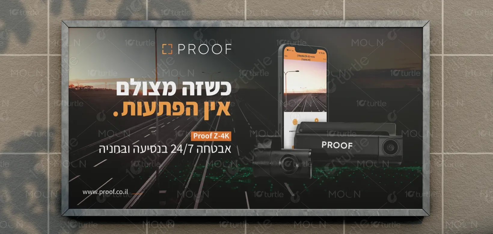
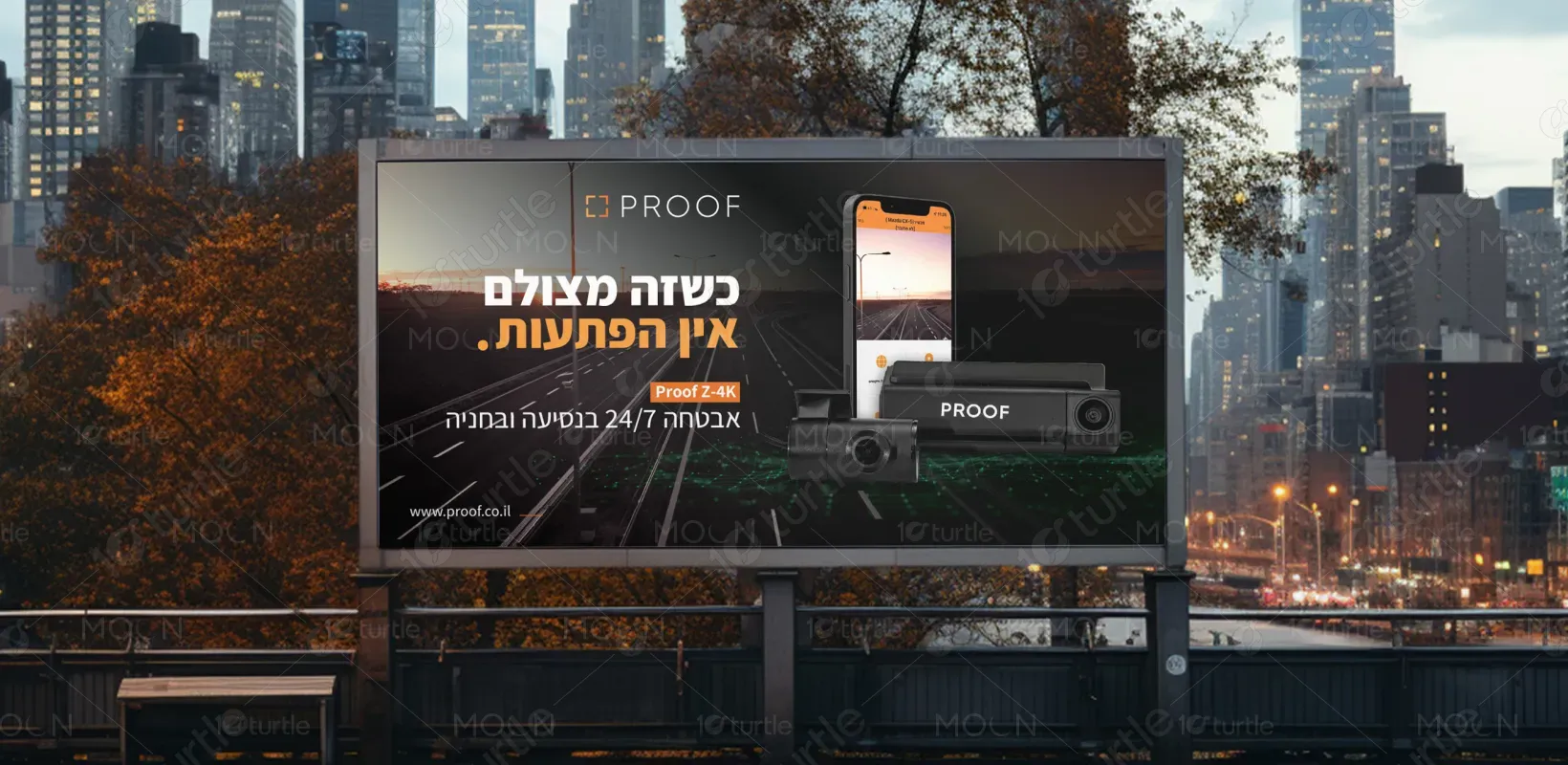
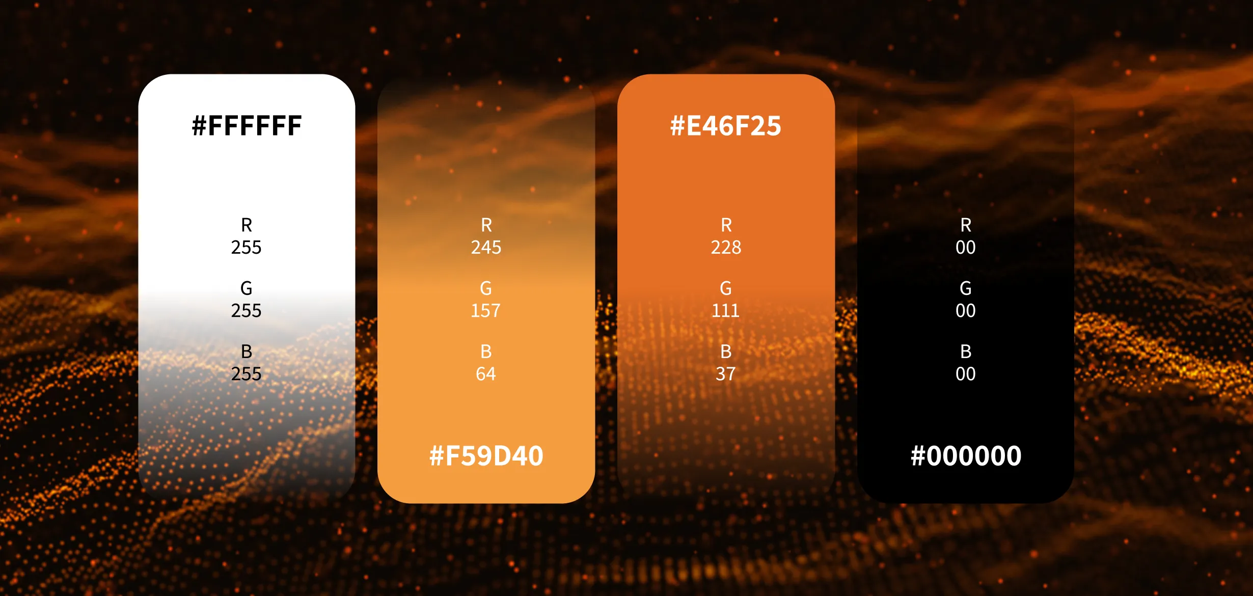
The color palette revolves around deep charcoal, muted black, and cool steel tones contrasted with vibrant orange accents. The dark base signifies reliability, strength, and night-time security, while the orange highlight injects energy, alertness, and technological precision. White typography ensures crisp readability and enhances contrast. Together, these hues reflect Proof’s brand identity—professional, modern, and protective—while creating an elegant visual balance that communicates premium quality and advanced functionality.