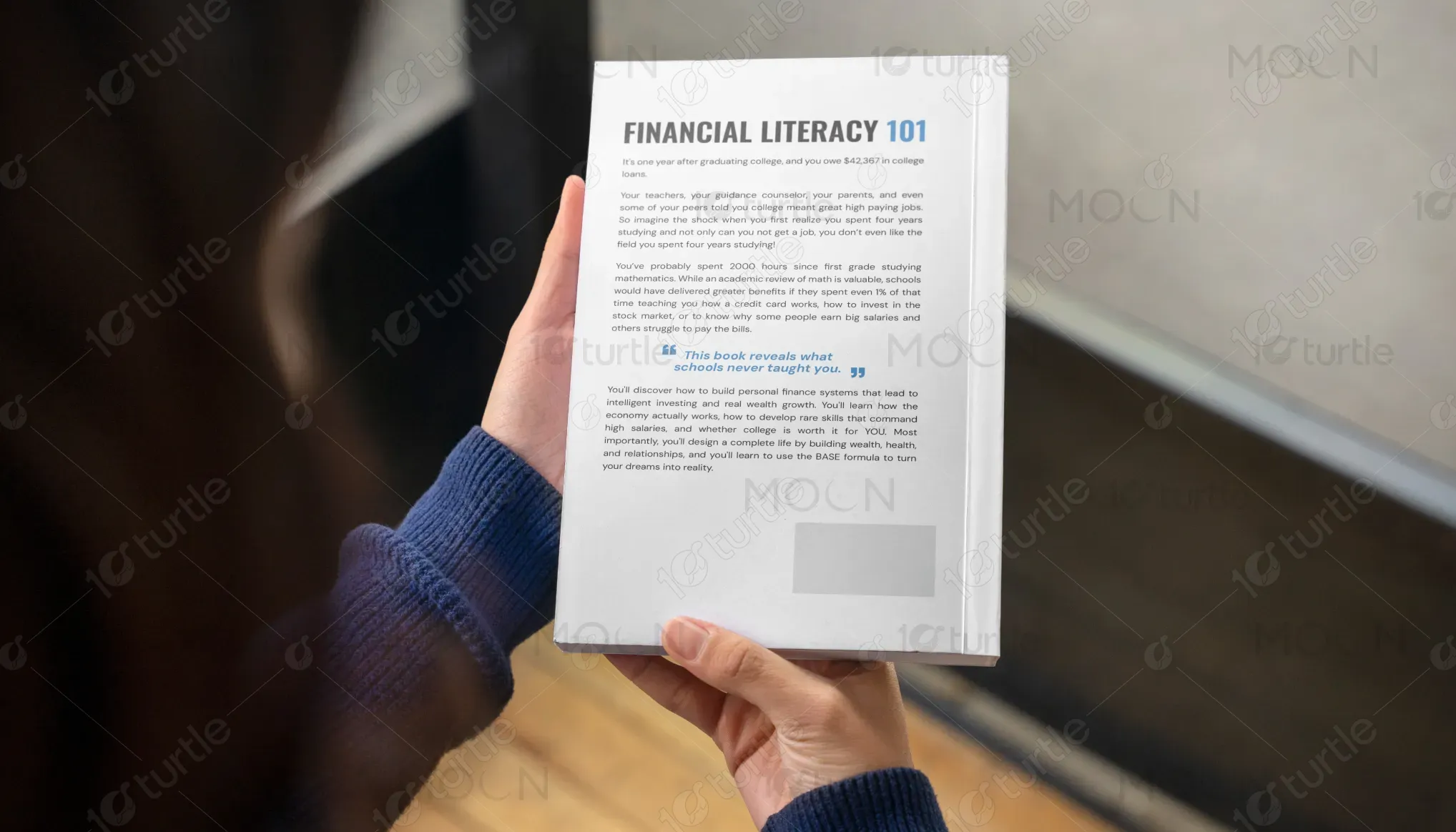
The design for Financial Literacy 101 incorporates a clean, modern, and approachable aesthetic, reflecting the book’s mission to make financial education accessible and engaging. The use of bold typography, with a playful piggy bank illustration wearing sunglasses, conveys a sense of both professionalism and relatability. The color scheme features blue and white tones, symbolizing trust and clarity, while the minimalist design ensures the message is direct and impactful. The cover balances seriousness with a hint of lightheartedness, appealing to young, aspiring readers.
Book Cover Design
Graphic Design

Industry
Finance, Legal & Insurance
Tools we used


Project Completion
2025
Key Market
Global
Financial Literacy 101 is an educational book aimed at demystifying personal finance, career planning, and investing for individuals, especially young adults. With a focus on practical advice that schools often overlook, the book covers topics like budgeting, debt management, and building wealth through investing. The sleek design and accessible language make it perfect for readers new to personal finance, offering clear, actionable insights. Its unique approach blends education with real-life examples, helping readers take control of their financial futures with confidence.


Industry
Finance, Legal & InsuranceWhat we did
Book Cover DesignGraphic DesignPlatform
-The challenge in designing Financial Literacy 101 stems from the need to make a traditionally dry, often intimidating subject approachable and engaging. Many individuals, especially young adults, lack foundational financial knowledge, which can lead to poor financial decisions and long-term struggles like debt accumulation. The financial literacy gap is significant in today's world, where many don't learn about investing, credit, or personal budgeting in school. This lack of knowledge often leads to financial insecurity, missed opportunities, and stress.
The design effectively addresses this issue by presenting financial literacy in an accessible, visually appealing way. The playful piggy bank with sunglasses symbolizes both financial security and a sense of ease—making the topic feel less daunting. The straightforward title and subtitle ensure the reader knows exactly what to expect. Inside, practical advice is paired with clear visuals and step-by-step instructions, empowering readers to apply the principles immediately. This approachable yet professional design invites readers to engage without feeling overwhelmed.

The long-term vision for Financial Literacy 101 is to become a go-to resource for individuals looking to take control of their finances, particularly targeting younger generations. The book aims to evolve into a broader educational brand offering workshops, courses, and digital content, ultimately building a community of financially savvy individuals. By demystifying finance, the brand seeks to have a lasting impact, not just on readers' financial habits, but also on broader societal perceptions of financial education.
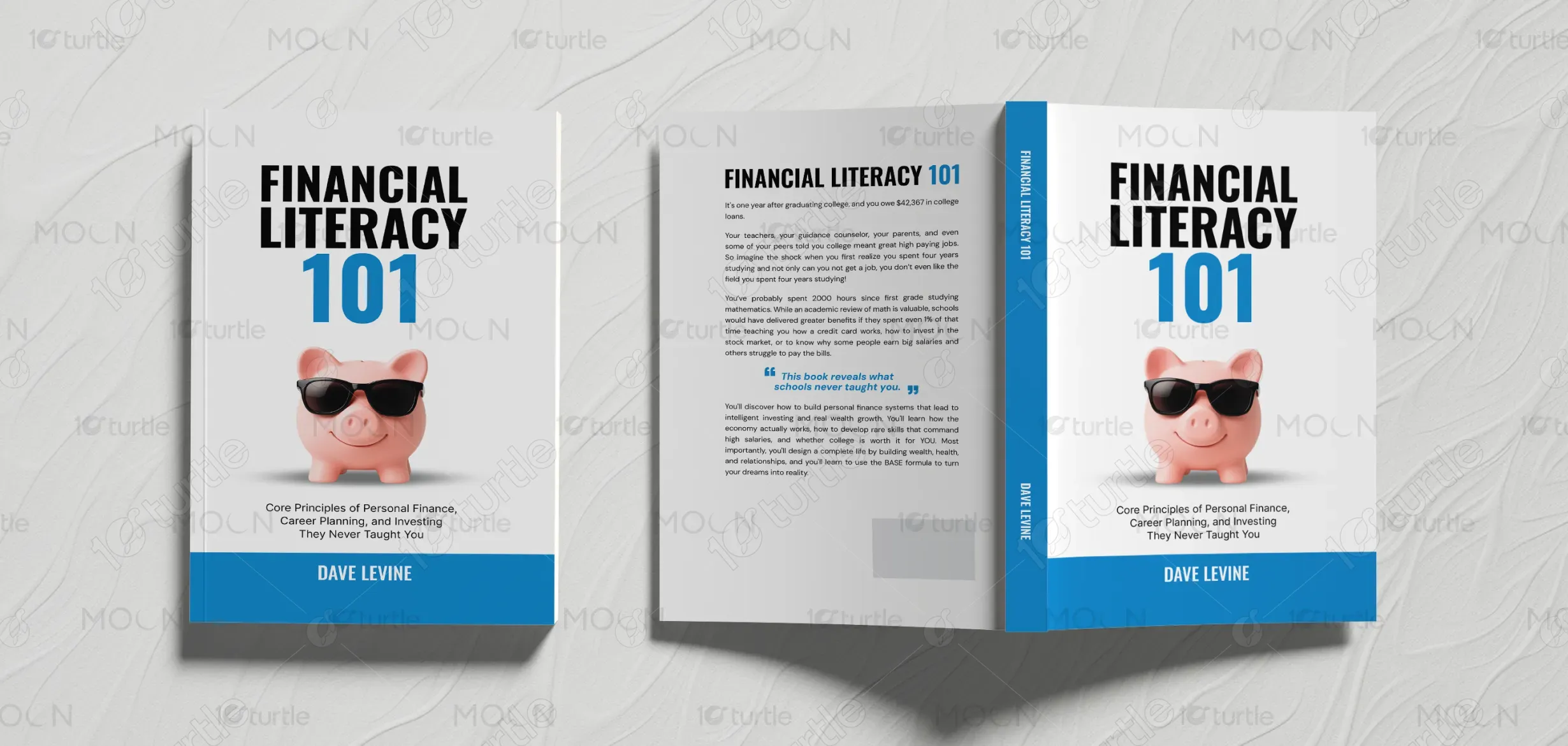


The chosen color scheme of blue and white is both professional and approachable. Blue is often associated with trust, reliability, and stability—qualities that are crucial when discussing personal finance. The white background keeps the design clean, modern, and minimalistic, ensuring clarity and focus. The blue accent on the book’s spine and title adds a pop of color, making the design visually appealing while maintaining a calm, professional tone. This palette aligns perfectly with the brand’s values of simplicity, clarity, and trustworthiness in the financial education space.