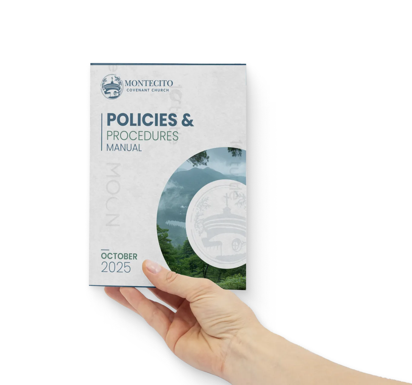
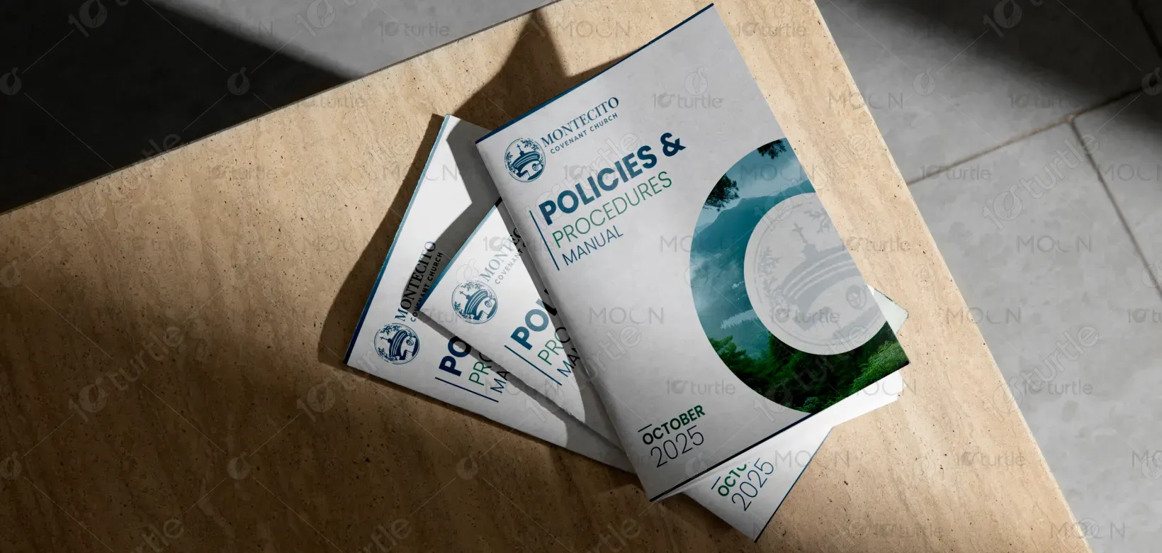
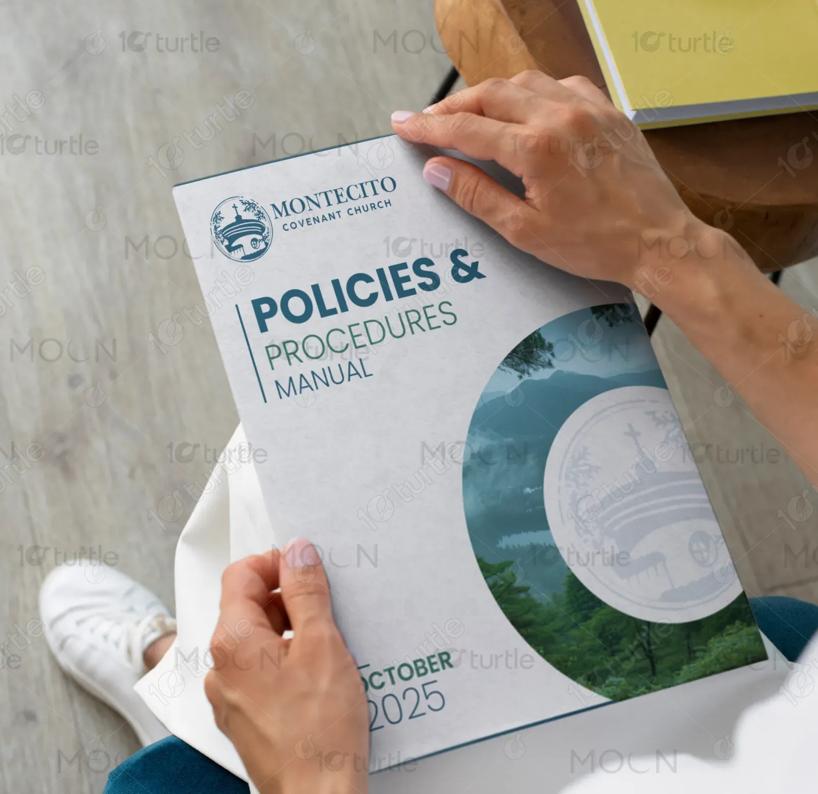
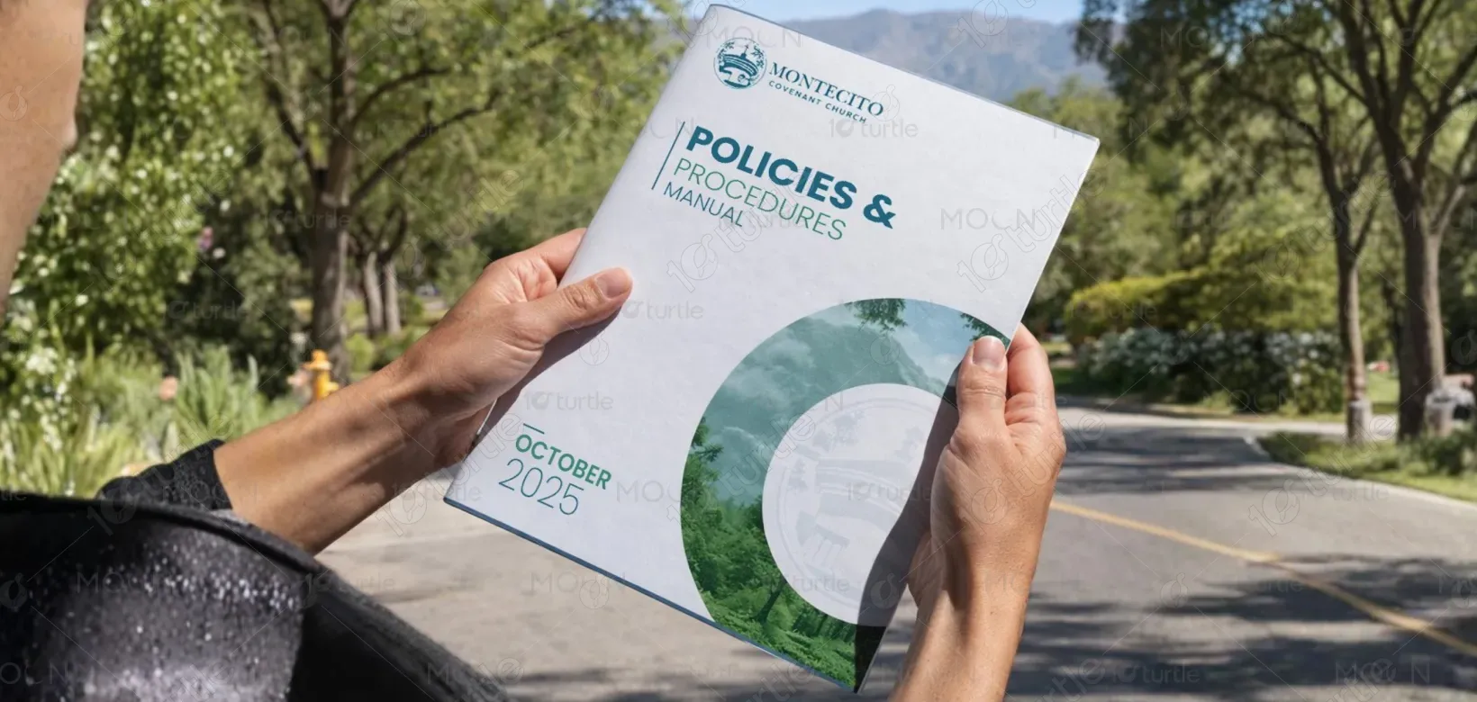
The book cover adopts a clean, structured, and professional design approach that reflects authority and clarity. A minimal layout with strong typographic hierarchy ensures immediate readability, while curved graphic elements introduce visual flow and modernity. The combination of institutional blue tones, soft neutrals, and environmental imagery communicates trust, stability, and responsibility. Clear sectioning of information — logo, title, and publication details — establishes a logical hierarchy, making the cover suitable for corporate and policy-focused audiences.
Book Cover Design
Graphic Design
Industry
Civic, Government & Nonprofits
Tools we used


Project Completion
2025
Key Market
Global
This design represents a Policies & Procedures Manual cover created for an institutional or organizational setting. Its primary purpose is to communicate structured information, credibility, and professional governance standards. The design functions as an official document cover that enhances readability, strengthens organizational identity, and improves document recognition. Positioned within corporate and administrative communication, the cover supports clarity, accessibility, and consistent brand presentation while reinforcing trust and professionalism.

Industry
Civic, Government & NonprofitsWhat we did
Book Cover DesignGraphic DesignPlatform
-Organizations often struggle with policy documents that appear dense, outdated, or visually unstructured, leading to reduced engagement and poor information accessibility. Traditional manual covers lack clear hierarchy, strong branding, and visual clarity, making documents difficult to identify and navigate. This weak presentation can reduce perceived credibility, create confusion, and negatively impact internal communication efficiency. The challenge was to design a cover that communicates authority while improving clarity and usability.
The design addresses these challenges through a structured layout and clear visual hierarchy. Bold typography highlights the document title for immediate recognition, while consistent spacing and alignment improve readability. Curved graphic elements create visual interest without overwhelming the content, balancing professionalism with modern aesthetics. A limited color palette enhances accessibility and brand consistency, while institutional imagery reinforces credibility and context. The result is a user-centric cover that improves document clarity and recognition.
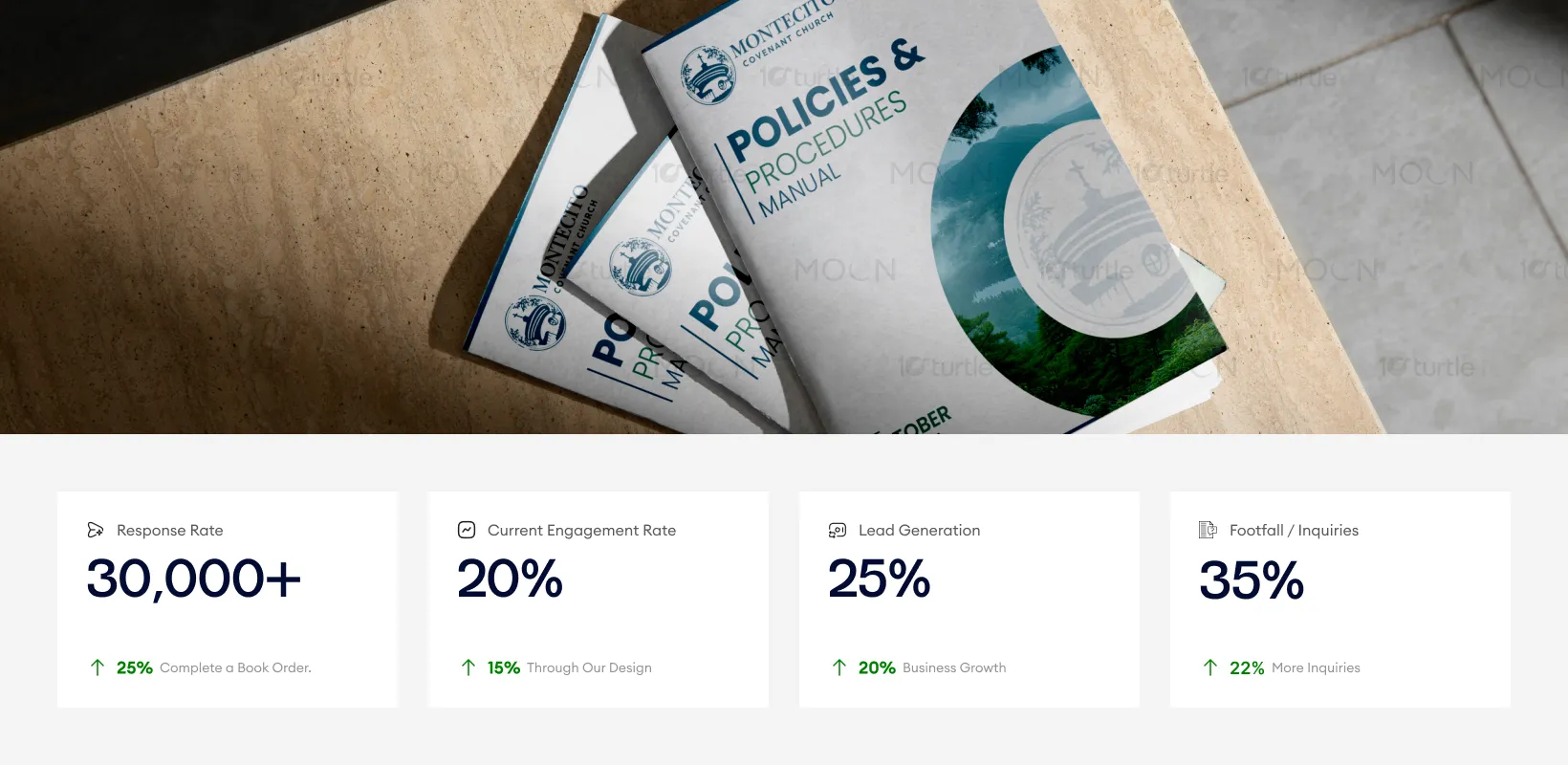
This design effectively balances professionalism with visual appeal, making it ideal for corporate and policy-focused environments. The clear structure, authoritative typography, and subtle use of imagery enhance readability and encourage engagement. By improving clarity and presenting the brand in a visually compelling way, key metrics such as lead generation and inquiries are likely to see growth, particularly from stakeholders who value organized, accessible content.
The design supports long-term organizational consistency by establishing a scalable visual system for official publications and policy documents. Its adaptable structure allows future editions, reports, and manuals to maintain visual coherence while evolving with the brand. The approach positions the organization as structured, transparent, and forward-thinking, helping strengthen stakeholder trust and supporting consistent communication across multiple touch points.

The design utilizes a professional palette of institutional blue, soft gray, and neutral white tones to communicate trust, authority, and clarity. Blue reinforces reliability and stability, while neutral backgrounds enhance readability and reduce visual fatigue. Supporting visual elements such as curved shapes and subtle imagery introduce modernity and visual balance without distracting from the content. This cohesive visual language strengthens brand recognition and ensures consistency across print and digital formats.