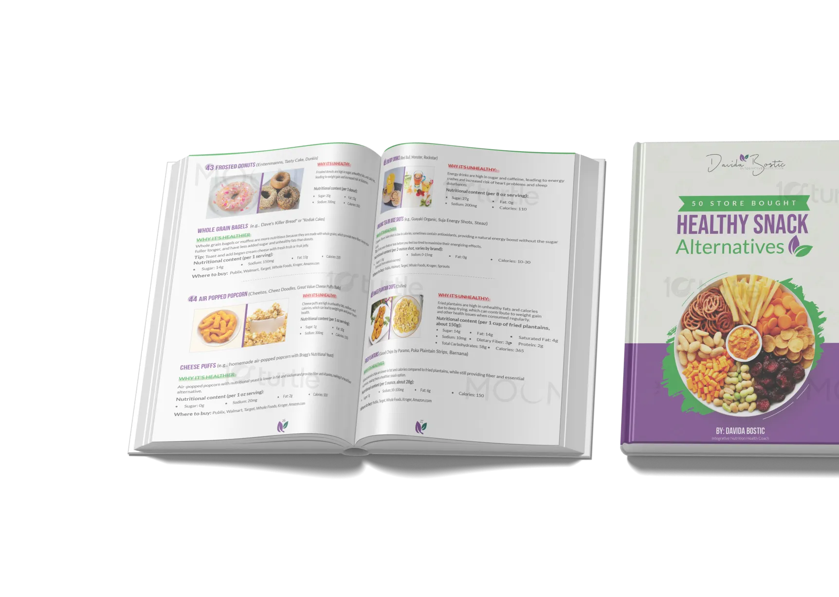
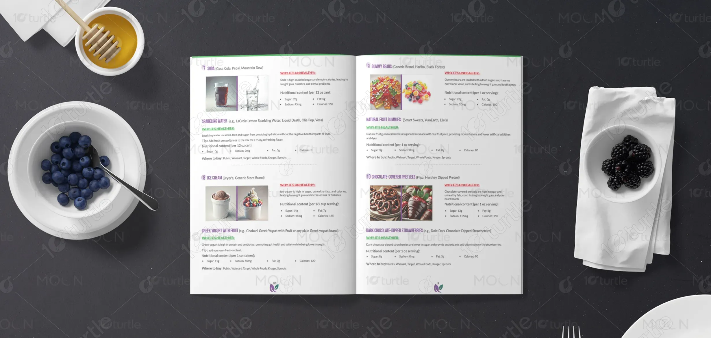
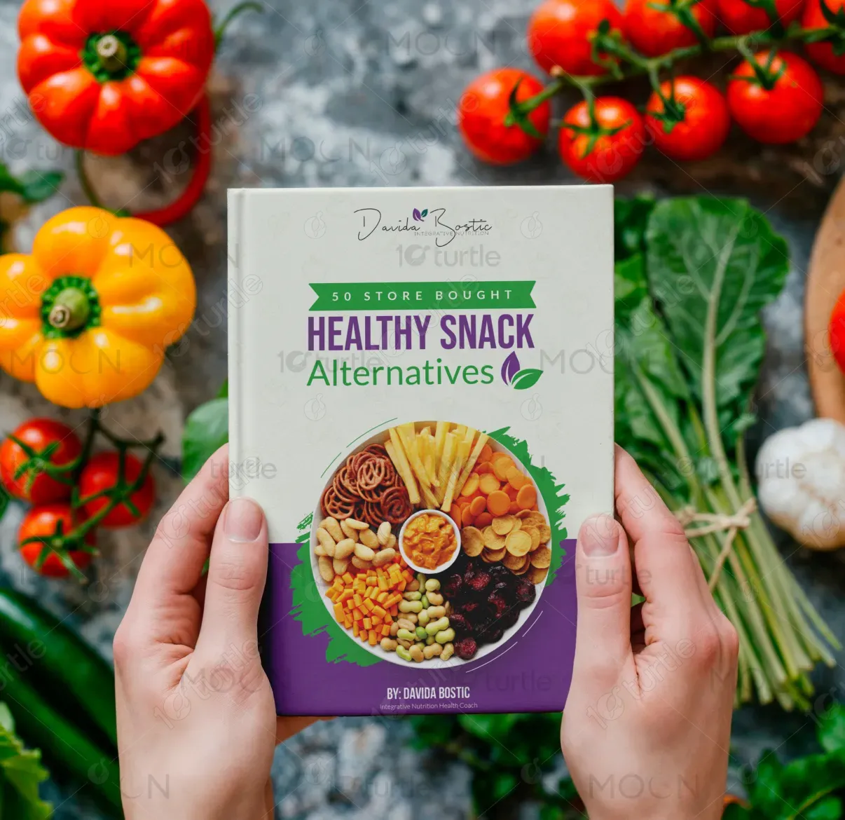
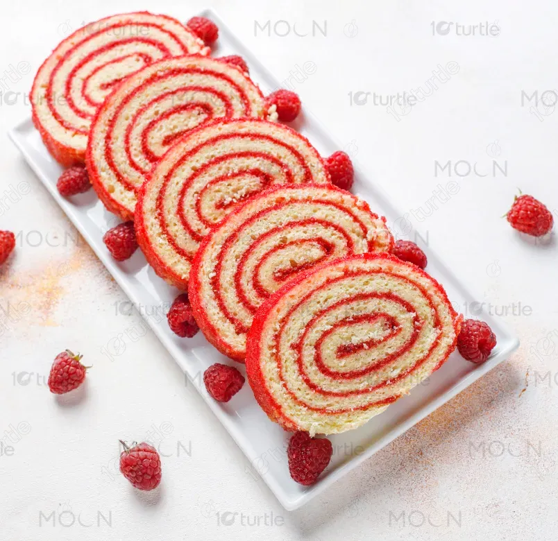
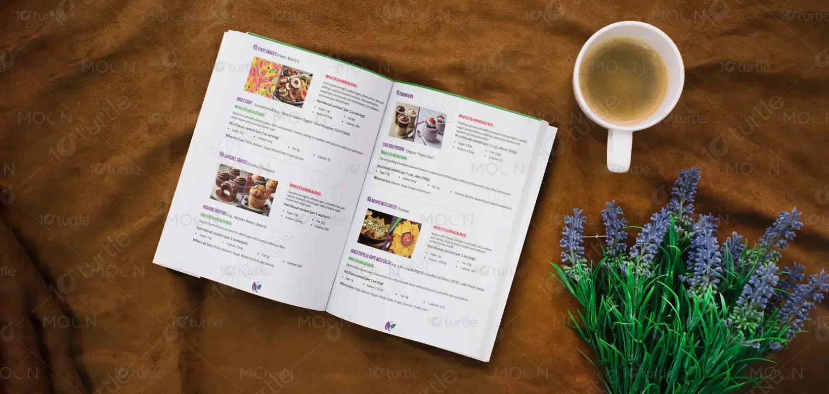
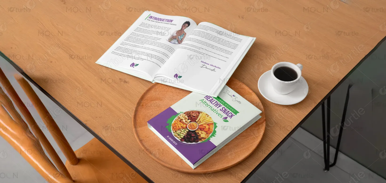
The recipe book design follows a clean, structured, and visually engaging layout that balances readability with inspiration. By incorporating simple typography, intuitive sections, and vibrant imagery, the design highlights the contrast between unhealthy snacks and their healthier alternatives. The creative direction emphasizes practicality, encouraging users to make mindful choices while shopping. Consistent use of space, icons, and nutritional highlights makes the book both functional and inviting. The overall aesthetic ensures a professional yet approachable feel, suitable for everyday readers.
Book Design
Graphic Design
Industry
Food, Beverage & Hospitality
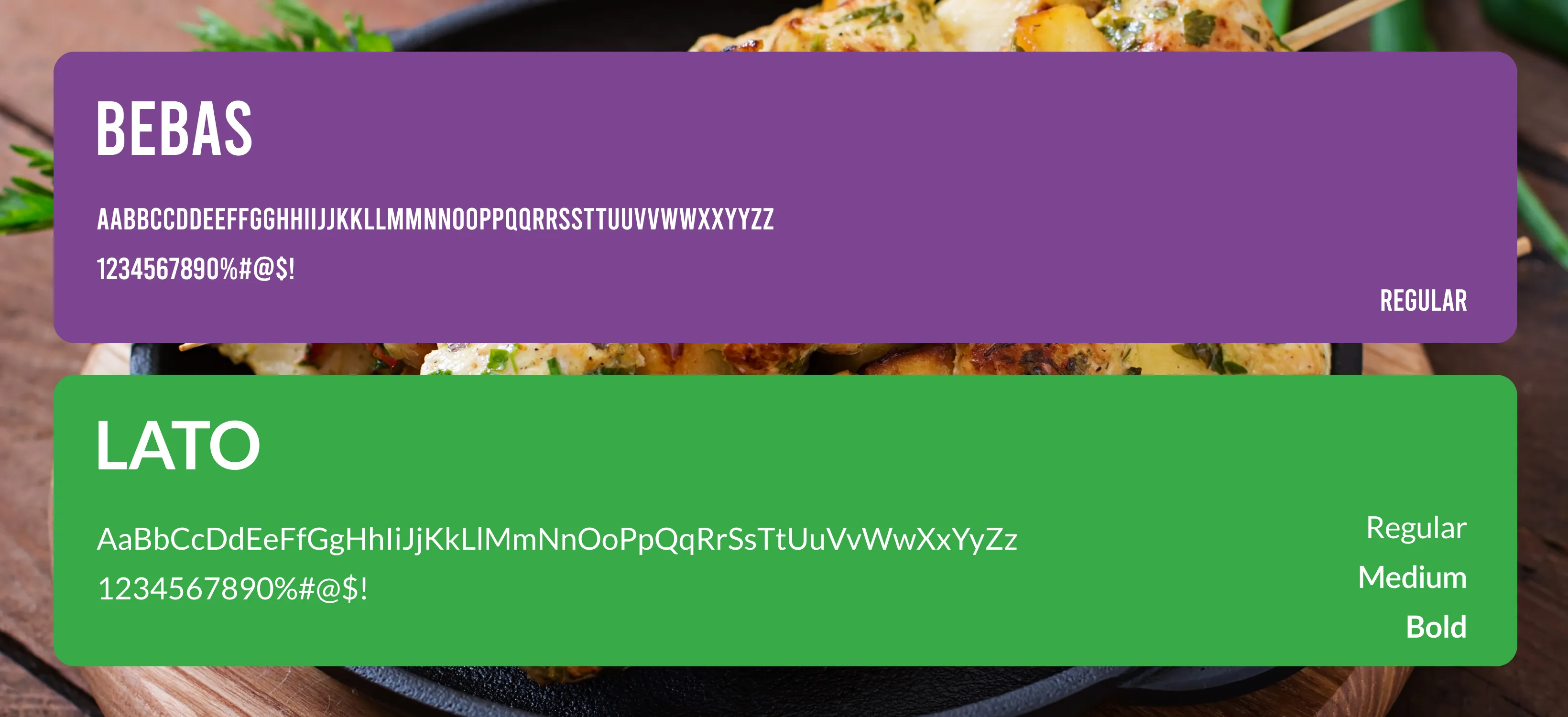
Tools we used


Project Completion
2024
Key Market
Global
This recipe guide offers 50 healthier alternatives to popular store-bought snacks, using the MAI Health Food Model. Its purpose is to educate and empower individuals to make better dietary decisions without sacrificing taste or convenience. The book stands out for its user-friendly presentation, nutritional breakdowns, and practical shopping tips. Unlike typical recipe books, it caters directly to modern busy lifestyles, helping readers swap junk food for accessible, nutrient-rich options. Its unique selling point lies in being both informative and actionable for real-world use.
Industry
Food, Beverage & HospitalityWhat we did
Book DesignGraphic DesignPlatform
-Modern consumers struggle with balancing convenience and health when it comes to snacking. Fast-paced lifestyles push people toward processed snacks, which are high in sugars, unhealthy fats, and additives. The lack of accessible, practical resources often leads to poor dietary habits and long-term health consequences like obesity, diabetes, and fatigue. Many health guides focus on strict diets, which feel overwhelming and unsustainable. The gap lies in providing a simple, relatable, and actionable solution that meets people where they are in their journey.
This recipe book bridges the gap by presenting clear, side-by-side comparisons of unhealthy snacks with healthier store-bought alternatives. It simplifies decision-making with nutritional breakdowns, easy-to-follow swaps, and accessible product suggestions. Designed for practicality, the book ensures that healthier choices are as convenient as their unhealthy counterparts. Its innovative approach lies in blending education with everyday usability, offering readers a sustainable pathway to better eating habits. By focusing on empowerment rather than restriction, it motivates long-term lifestyle changes.
The long-term vision for this product is to become a trusted companion in healthy living, inspiring individuals and families to make informed food choices. Beyond snacks, the brand aspires to expand into meal planning, lifestyle coaching, and wellness resources. The goal is to influence the health industry by making nutrition approachable, practical, and enjoyable. Ultimately, it seeks to create a movement where mindful eating is accessible to all, leaving a lasting impact on community health and personal well-being.

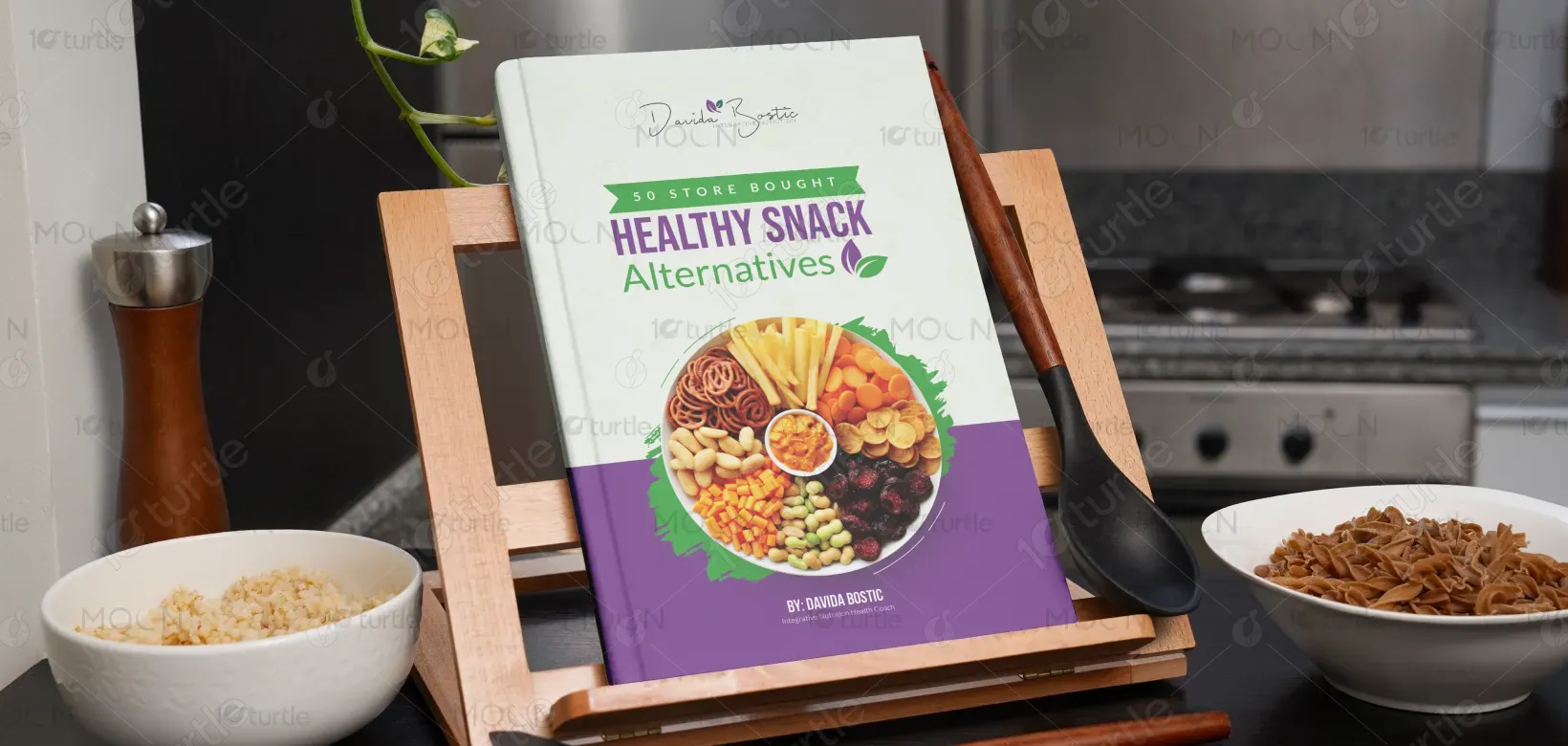
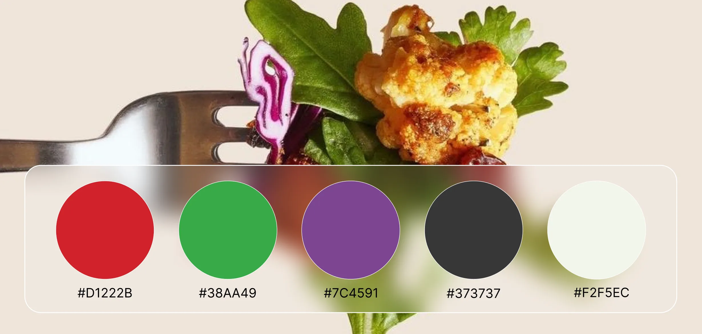
The chosen color scheme leans toward earthy greens, warm neutrals, and vibrant highlights. Green represents health, vitality, and freshness—reinforcing the book’s wellness identity. Warm neutrals ensure balance and readability, making the content approachable. Vibrant accent colors (such as orange or yellow) emphasize key nutritional highlights and call-to-action elements, keeping the design lively and engaging. Together, these tones evoke trust, positivity, and energy, aligning perfectly with the brand’s mission of making healthy choices both attractive and sustainable.