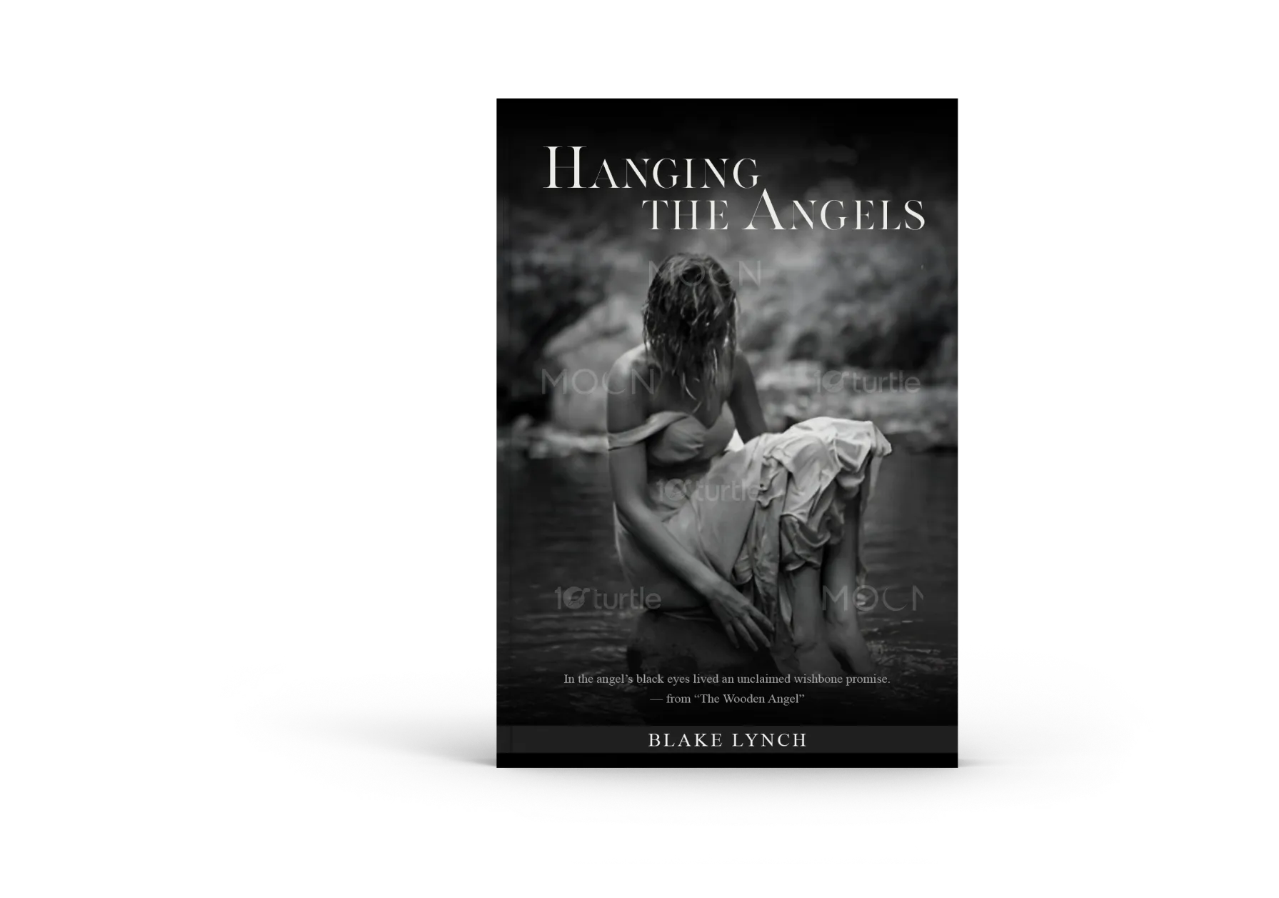
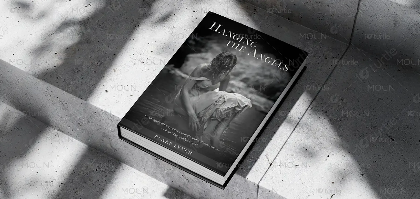
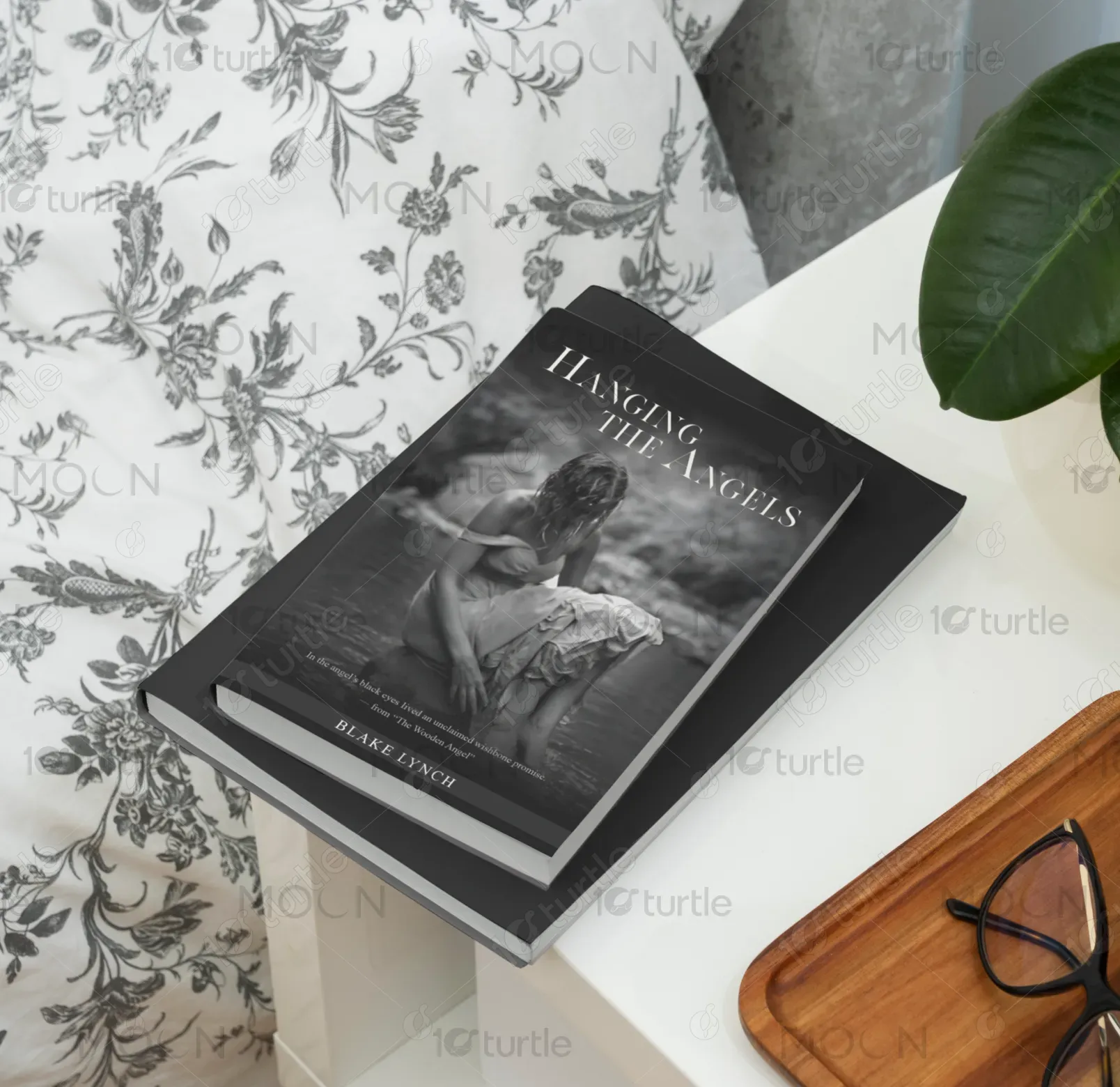
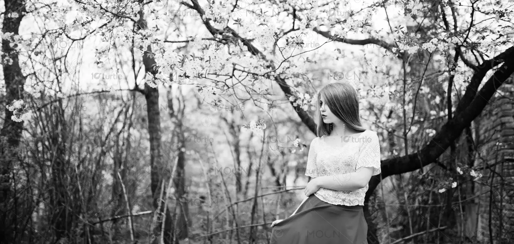
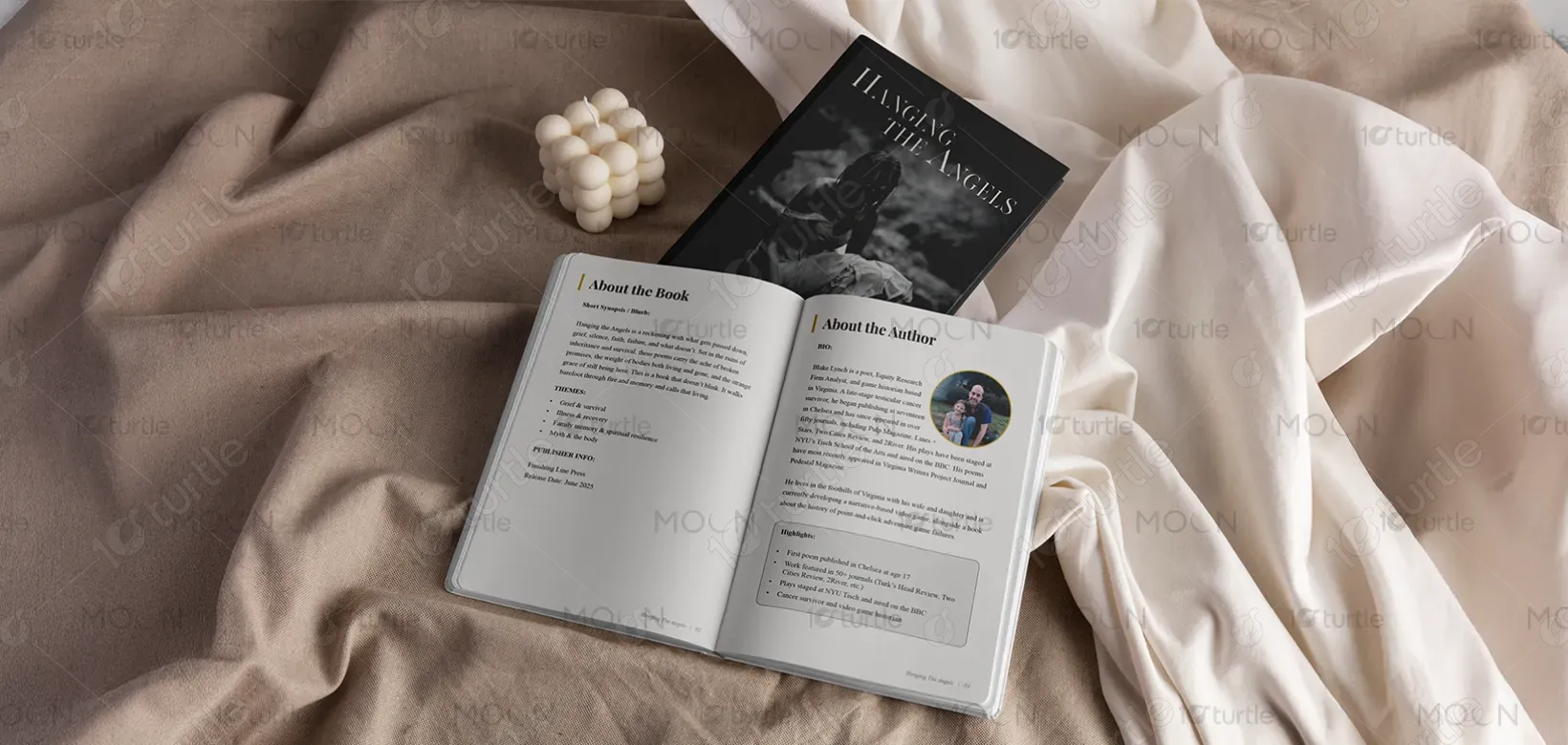
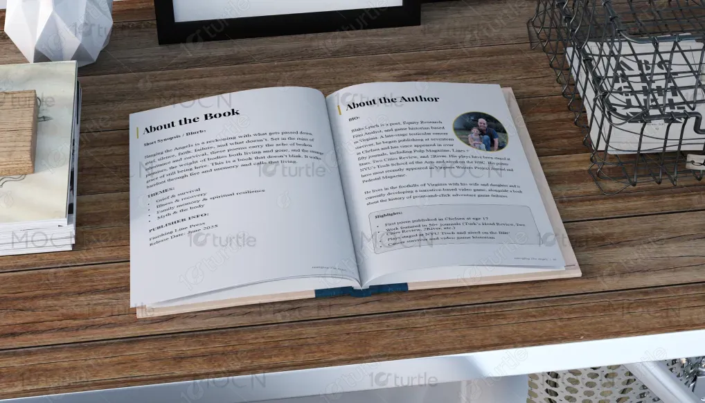
The design of Hanging the Angels reflects a haunting yet graceful aesthetic, capturing the duality of grief and resilience. Clean typography, spacious layouts, and muted tones mirror silence, memory, and vulnerability, while subtle symbolic motifs hint at faith and endurance. The visual language avoids clutter, instead creating intimacy and reflection that parallels the poetry’s raw honesty. This approach ensures the design is not just a container for words, but an extension of the collection’s voice, making the reading experience immersive.
KDP Book Design
Graphic Design
Industry
Arts, Culture & Entertainment
Tools we used


Project Completion
2025
Key Market
Global
Hanging the Angels is a poetry collection by Blake Lynch, published by Finishing Line Press. It explores themes of grief, faith, illness, survival, and spiritual resilience. The work is deeply personal yet universal, addressing inheritance, silence, and the grace of still being alive. Unlike conventional collections, it balances emotional heaviness with moments of clarity and light. Its distinct appeal lies in unflinching authenticity, positioning it as a compelling book for readers seeking literature that heals, confronts, and endures.

Industry
Arts, Culture & EntertainmentWhat we did
KDP Book DesignGraphic DesignPlatform
-Poetry collections dealing with grief and survival often struggle with design that either trivializes the subject through generic imagery or overwhelms it with heavy-handed symbolism. Such approaches can alienate readers by diluting the emotional depth of the work. The challenge is creating a visual identity that resonates with the solemn yet hopeful tone of the book—without relying on clichés like overly dark palettes or predictable religious motifs. Authentic, emotionally aligned design is what the market lacks in this space.
The design of Hanging the Angels addresses this challenge through restraint and symbolism. By using minimalistic layouts, muted colors, and carefully chosen angelic motifs, it creates a space that feels contemplative rather than heavy-handed. This balance respects the depth of the themes while making the book visually approachable. The solution lies in subtlety: letting the typography, imagery, and color palette echo the emotional journey of the poems while keeping the design timeless, user-focused, and emotionally authentic.
The vision for Hanging the Angels extends beyond one collection—it aspires to establish Blake Lynch’s poetic identity as both timeless and transformative. The brand seeks to connect deeply with readers, academics, and literary communities by offering poetry that is honest, resilient, and enduring. The goal is to create a body of work, starting with this collection, that positions Lynch not just as a poet but as a voice of survival and grace, leaving an indelible mark on contemporary literature.

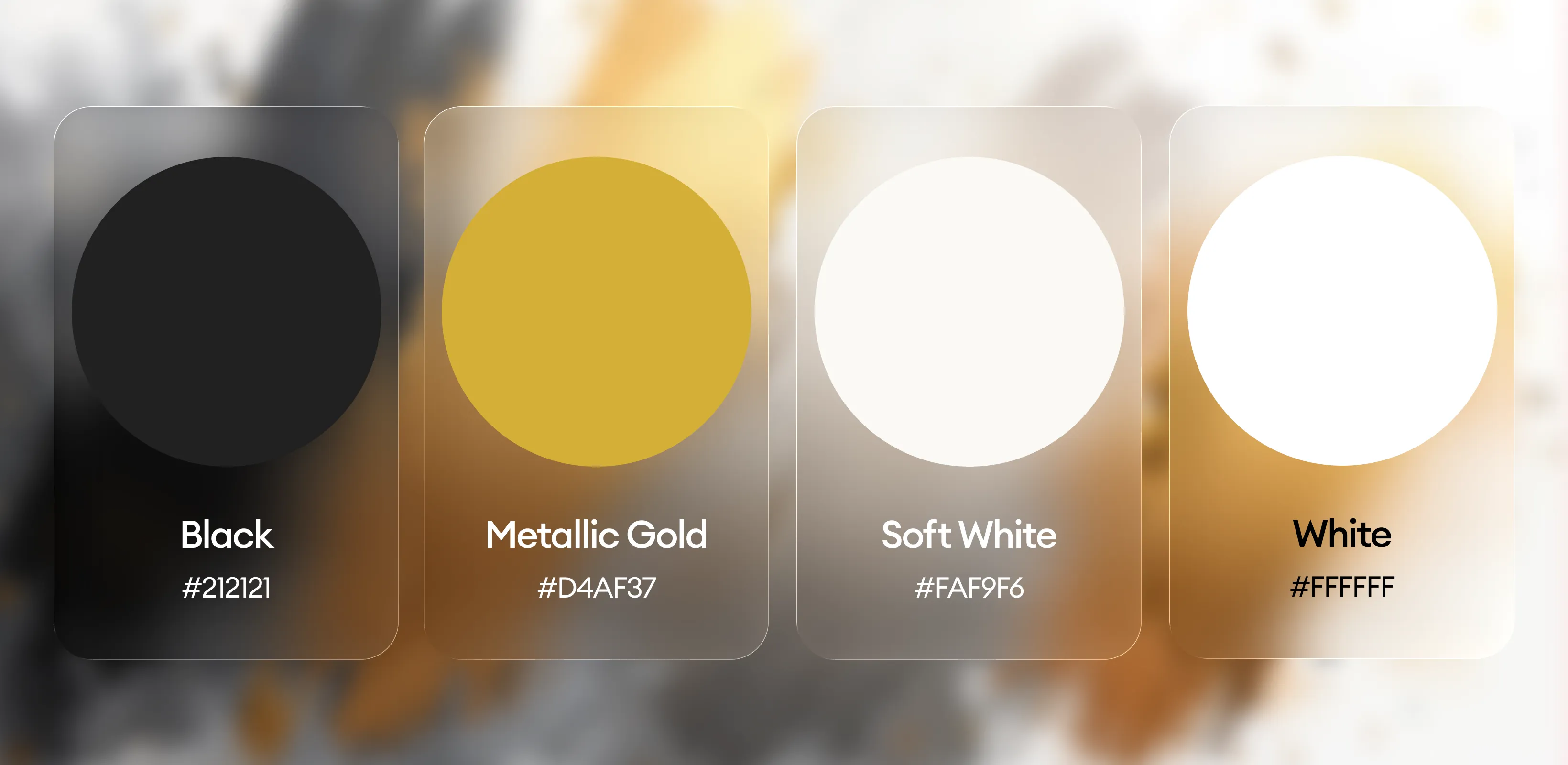
The palette embraces black, gray, and off-white as its foundation, symbolizing grief, memory, and silence. These muted tones are occasionally accented with soft earth or ethereal highlights, representing survival, grace, and quiet transcendence. This restrained scheme ensures the poetry remains the centerpiece, while the colors subtly reinforce the themes of resilience and reflection. By blending somber depth with understated brightness, the palette reflects both the weight of loss and the quiet persistence of hope—perfectly aligned with the collection’s spirit.