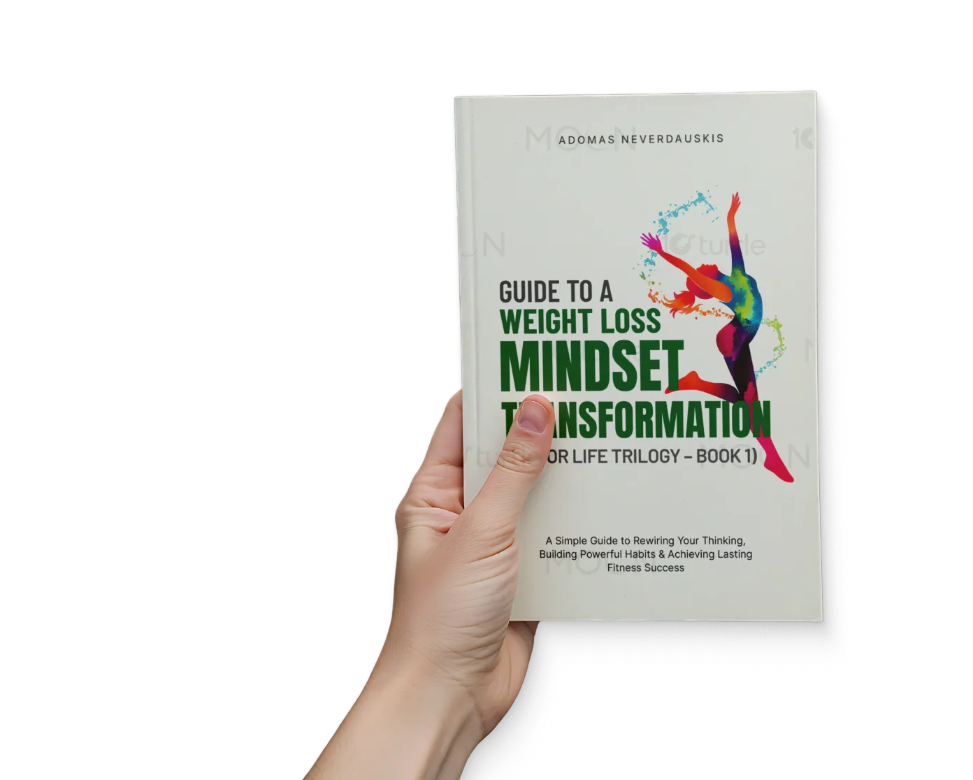
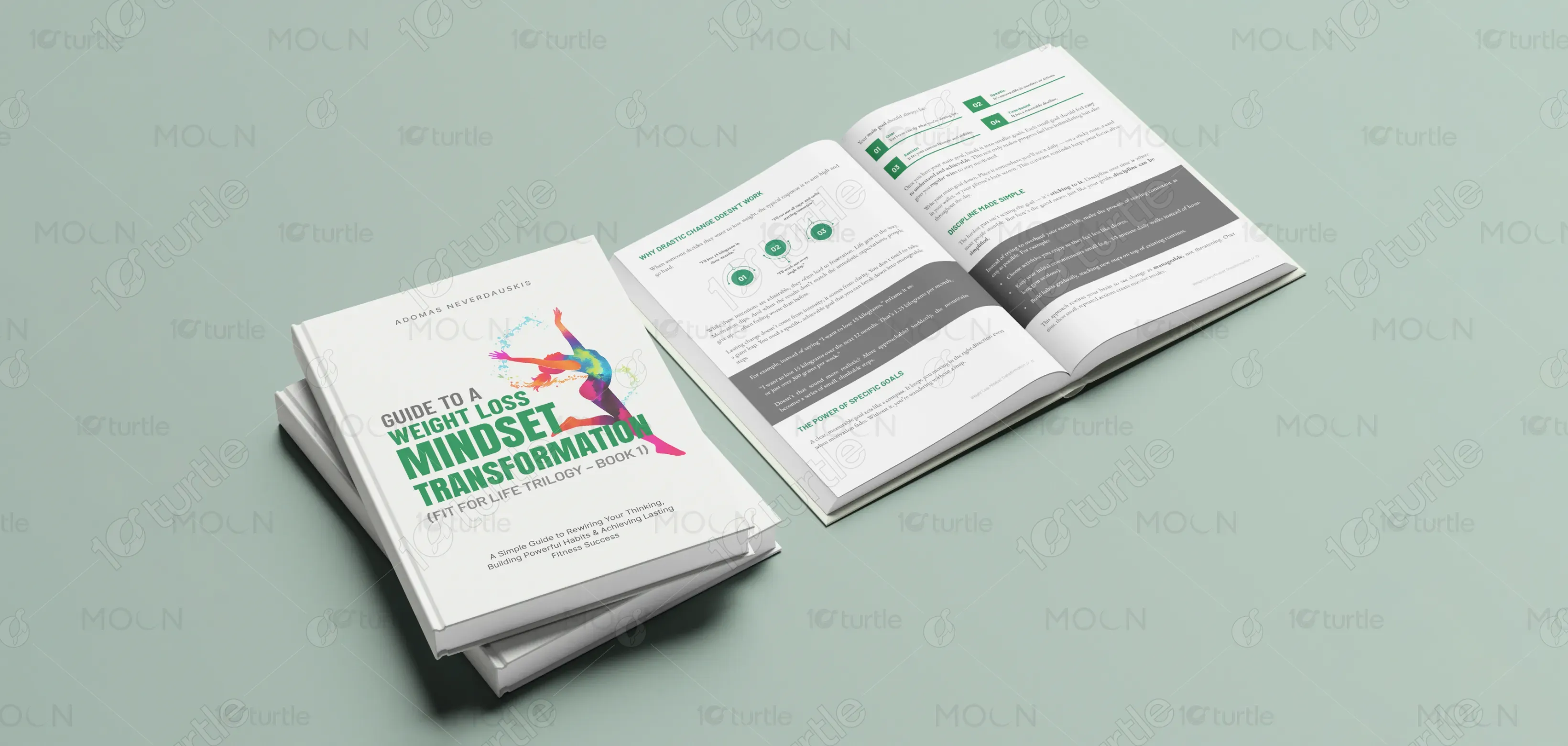
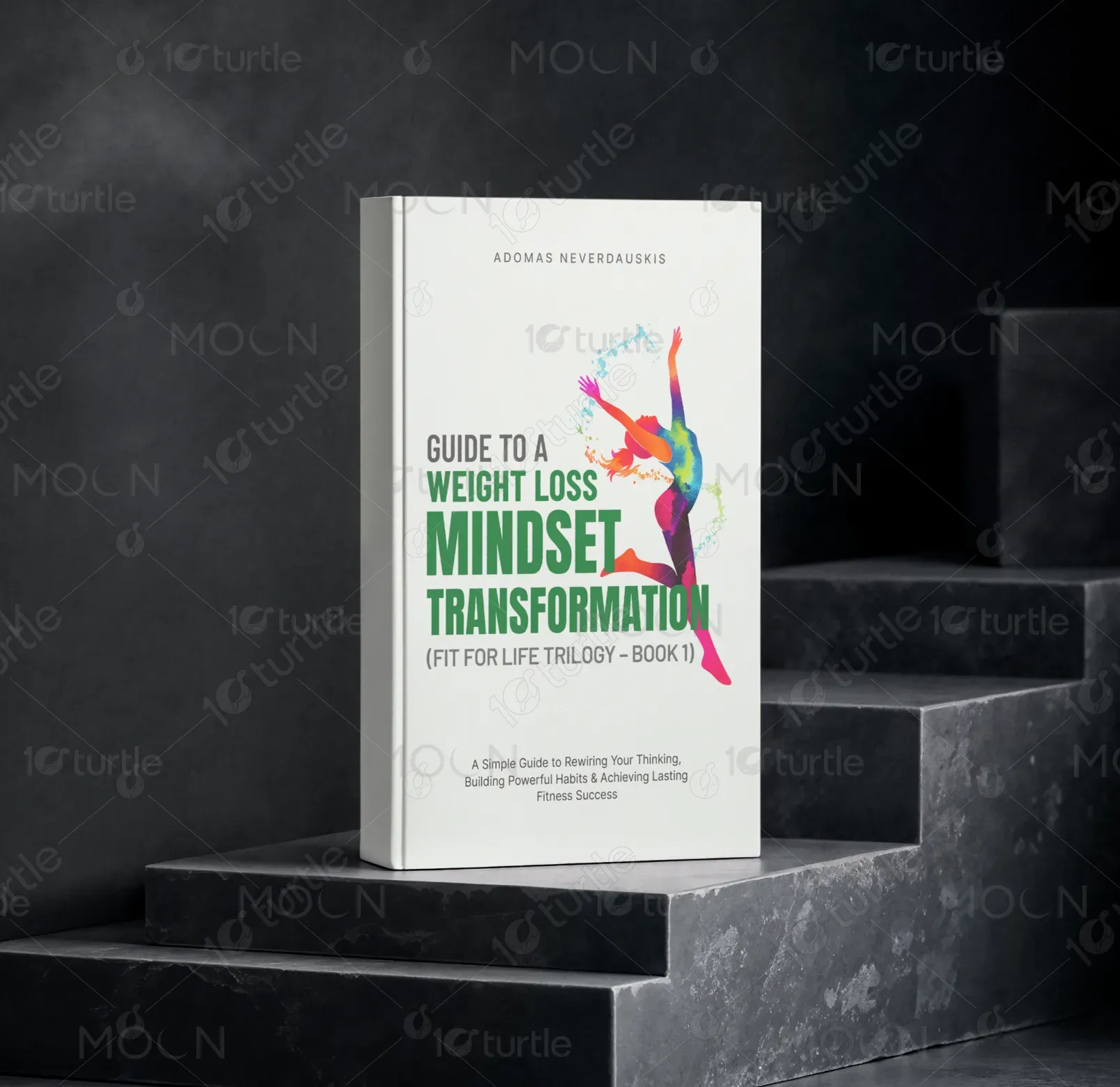
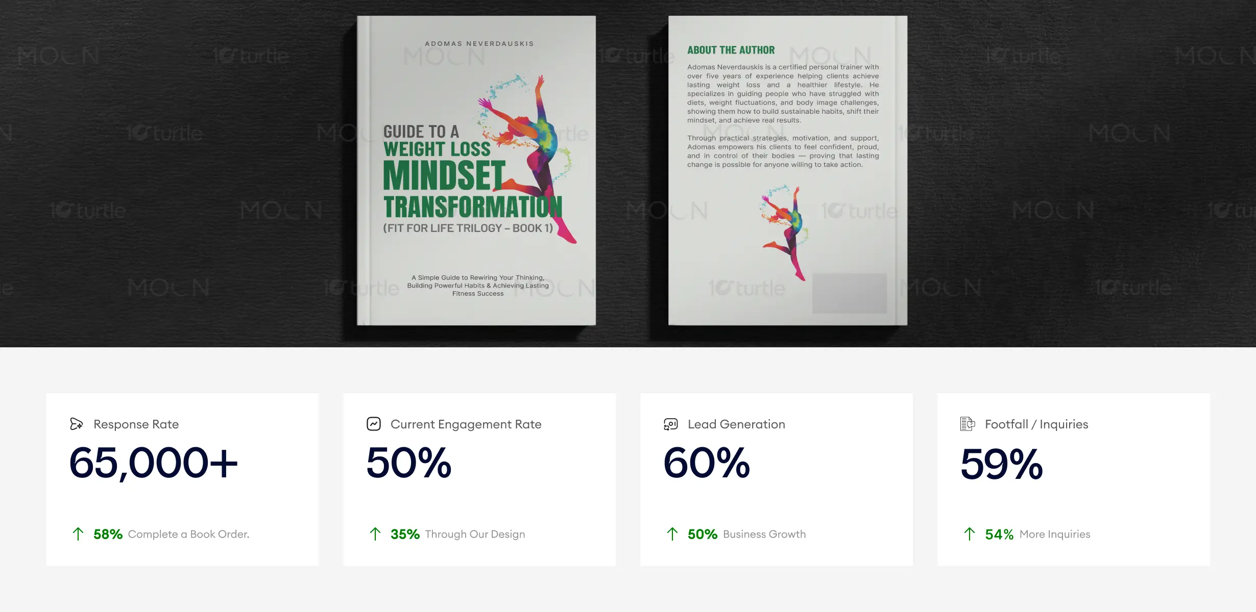
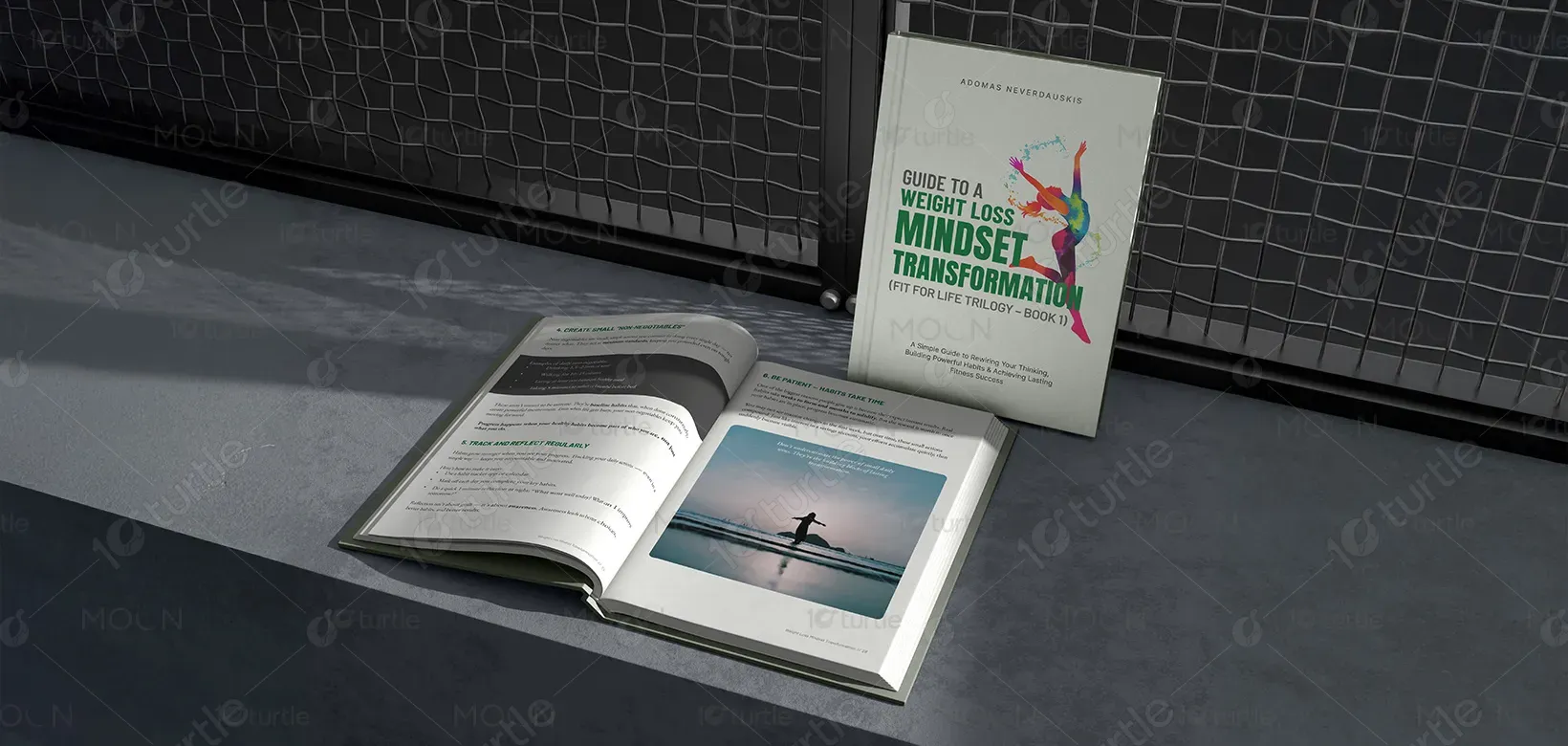
The book design follows a clean, structured, and motivational visual approach that reflects clarity, discipline, and transformation. The layout uses strong typographic hierarchy to guide readers through chapters, key takeaways, and supporting content, ensuring easy navigation and comprehension. Neutral backgrounds combined with bold headings create contrast and maintain readability across print formats. Minimal yet purposeful visual elements reinforce focus on the message without distraction. Consistent typography, spacing, and alignment create a professional and cohesive system that reflects credibility, trust, and long-term personal development.
Book Design
Graphic Design
Industry
Healthcare & Wellness
Tools we used


Project Completion
2025
Key Market
Global
This design represents a mindset-focused weight loss guide aimed at helping individuals achieve sustainable health transformation. Positioned within the fitness and personal development industry, the book emphasizes mental clarity, habit building, and realistic progress rather than quick fixes. The design serves as a functional reading experience that supports learning, reflection, and motivation. It reinforces the book’s core value proposition — helping readers develop long-term behavioral change through structured guidance, clear communication, and an accessible visual format.

Industry
Healthcare & WellnessWhat we did
Book DesignGraphic DesignPlatform
-Many fitness and weight loss books fail to create lasting impact due to overwhelming layouts, poor readability, and lack of emotional connection. Readers often lose engagement because content feels complex, unstructured, or visually inconsistent. Additionally, the market is saturated with quick-result promises, which creates skepticism and reduces trust. Without a clear visual hierarchy and supportive design system, readers struggle to absorb information effectively, which limits retention, motivation, and overall transformation.
The design addresses these challenges through a reader-centric and clarity-focused approach. A structured layout ensures logical content flow, while strong typography establishes clear hierarchy between chapters, key lessons, and supporting text. Consistent spacing and alignment improve readability and reduce cognitive overload. Minimal visual distractions allow readers to focus on the message, reinforcing trust and credibility. The scalable design system ensures consistency across future books in the trilogy, supporting long-term brand recognition and usability.

The clean editorial structure, strong typographic hierarchy, and motivational visual language improve readability and maintain reader focus throughout the book. This clarity encourages deeper engagement, higher chapter completion rates, and stronger word-of-mouth recommendations, ultimately contributing to improved purchase conversions and long-term reader retention.
The design addresses these challenges through a reader-centric and clarity-focused approach. A structured layout ensures logical content flow, while strong typography establishes clear hierarchy between chapters, key lessons, and supporting text. Consistent spacing and alignment improve readability and reduce cognitive overload. Minimal visual distractions allow readers to focus on the message, reinforcing trust and credibility. The scalable design system ensures consistency across future books in the trilogy, supporting long-term brand recognition and usability.


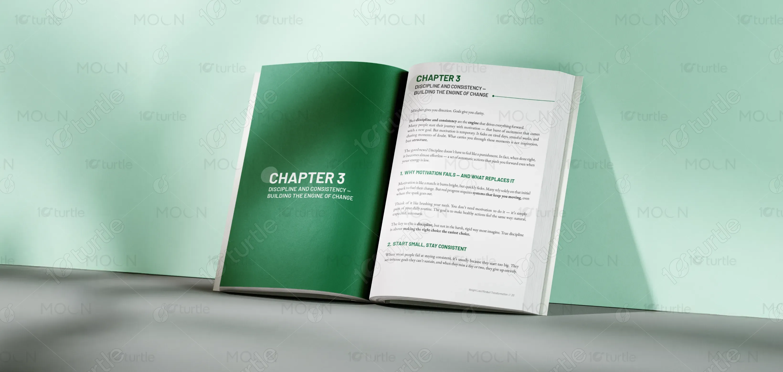
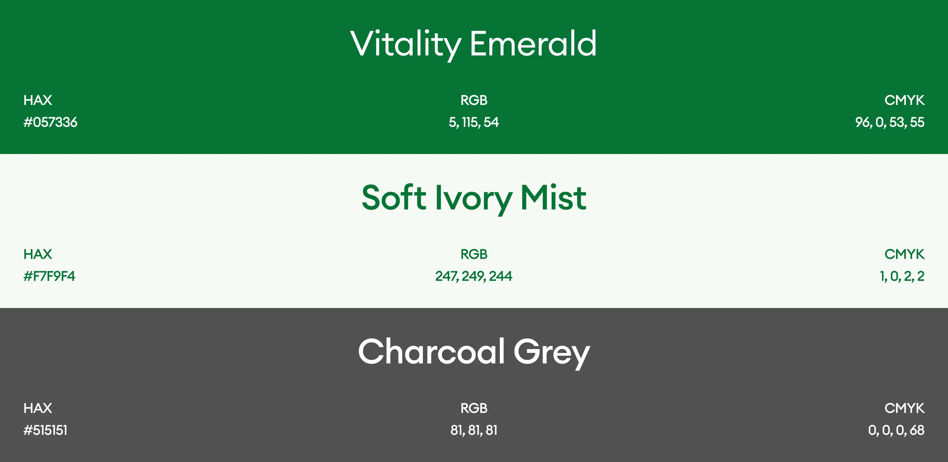
The color palette uses neutral and high-contrast tones to represent clarity, discipline, and focus, which align with the book’s transformational theme. Clean backgrounds combined with strong typographic contrast ensure readability and accessibility across print formats. The minimal visual language reflects simplicity, control, and professionalism, reinforcing the concept of structured personal growth. Consistent typography and restrained visual elements create a timeless and scalable identity that supports recognition across the full trilogy and future brand applications.