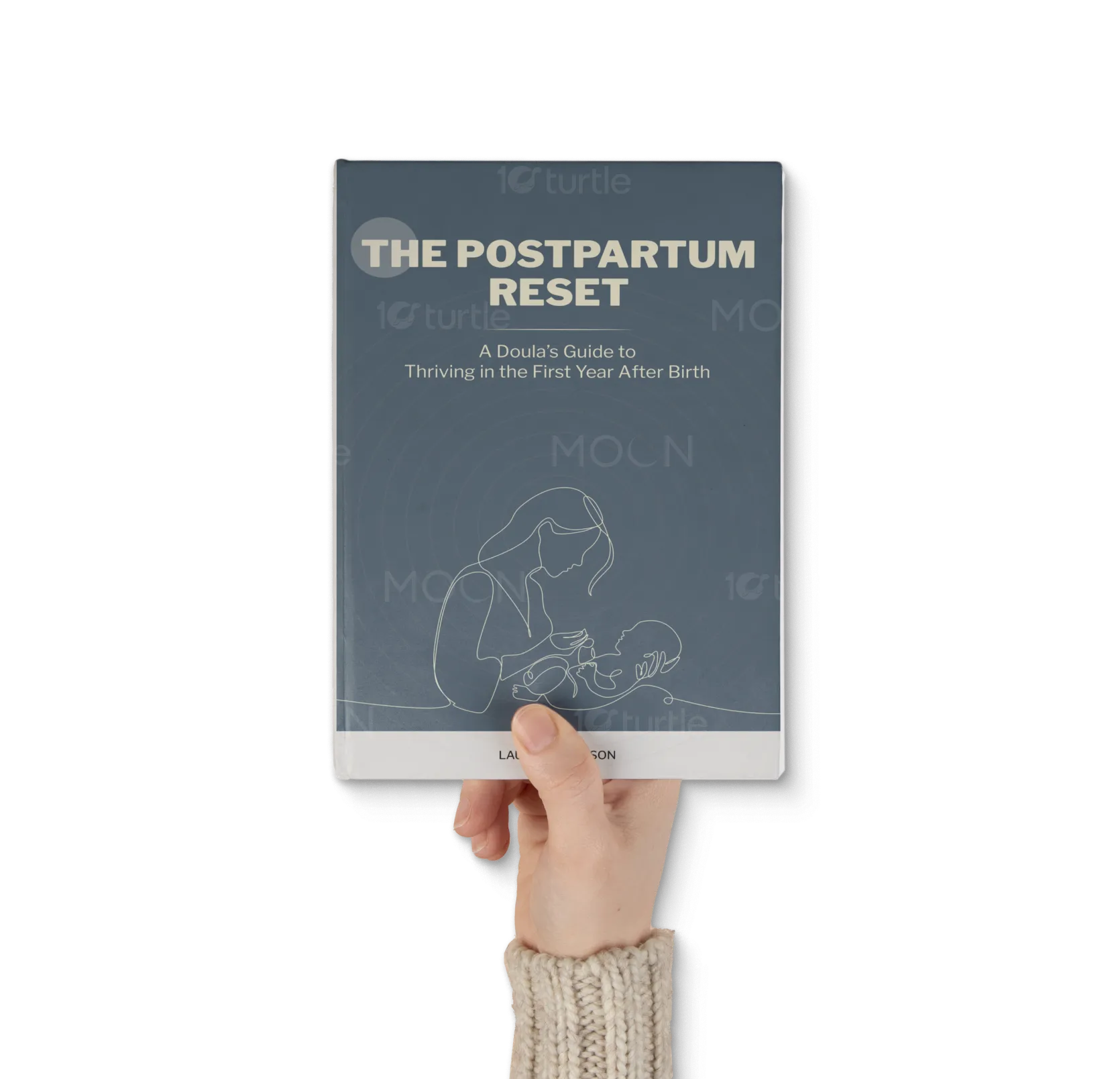
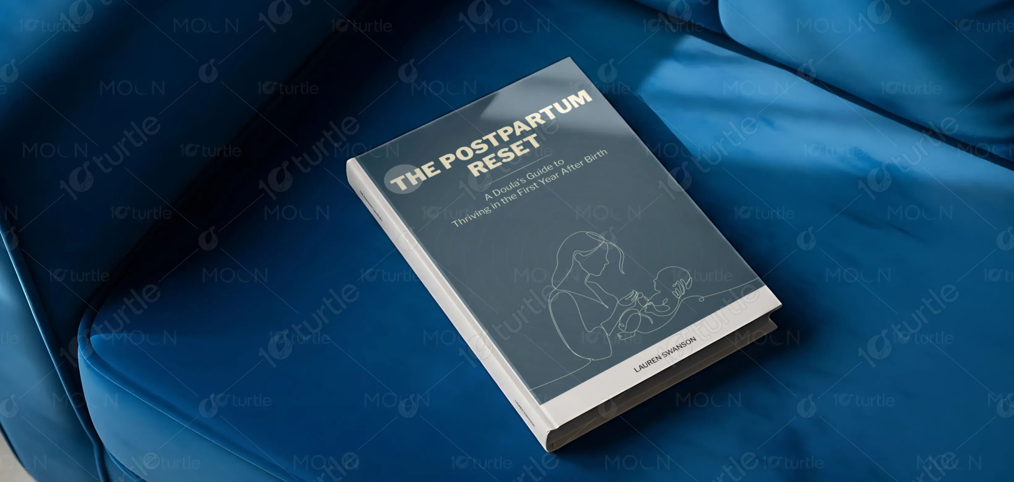
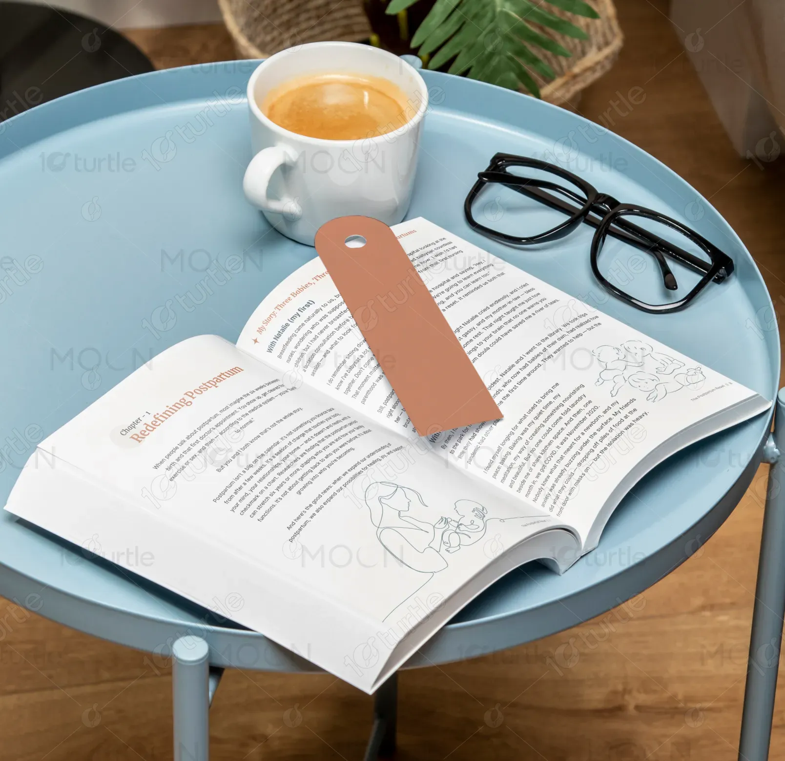
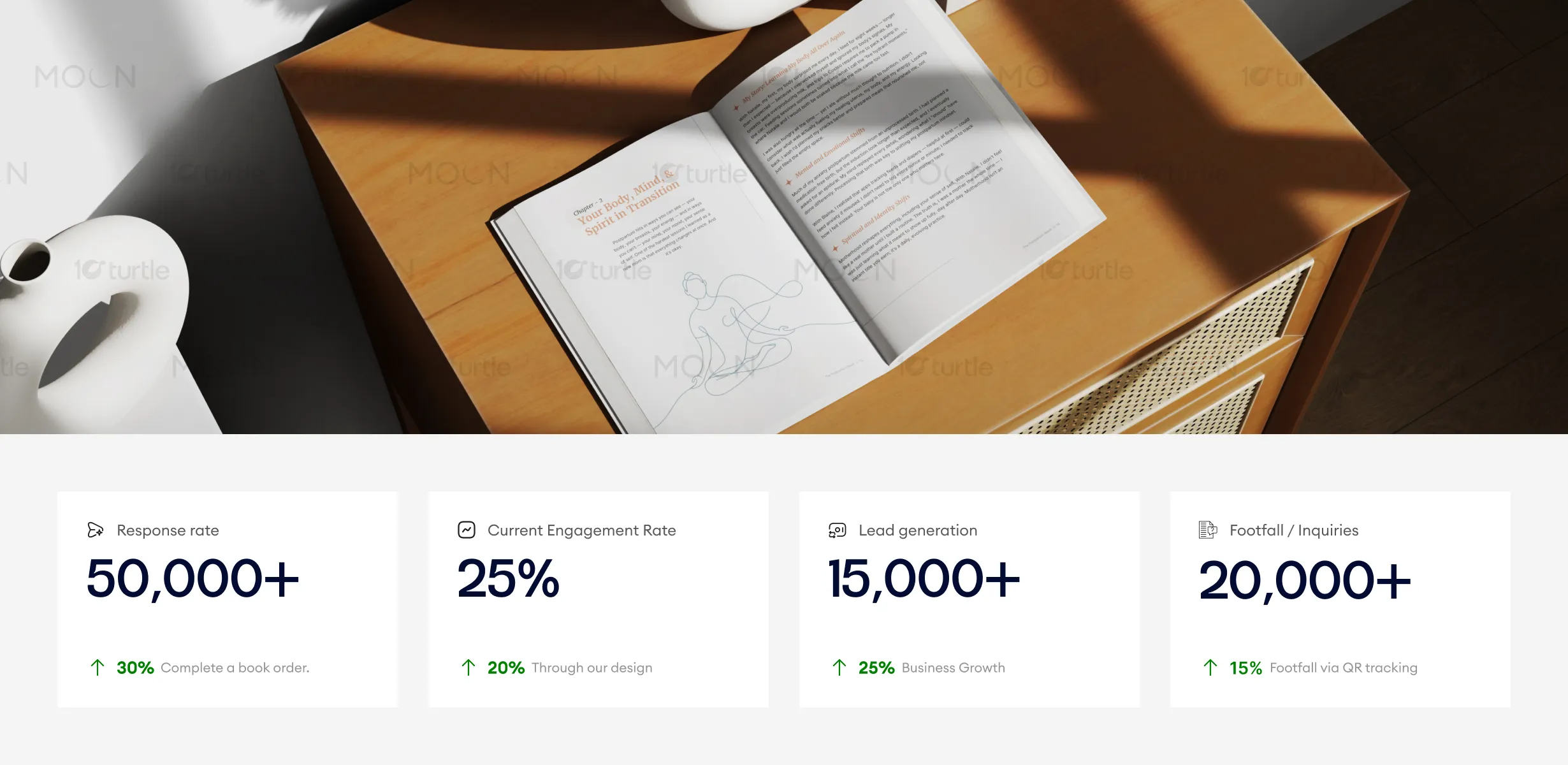
The design embraces a calm, compassionate, and modern editorial approach that mirrors the emotional journey of postpartum motherhood. Clean typography, generous white space, and soft visual pacing create a sense of safety and breathability. The layout prioritizes readability during moments of fatigue, while structured sections, subtle dividers, and thoughtful hierarchy guide the reader gently. The overall creative direction balances professionalism with warmth, ensuring the book feels like a supportive companion rather than a clinical manual.
Book Design
Graphic Design
Industry
Healthcare & Wellness
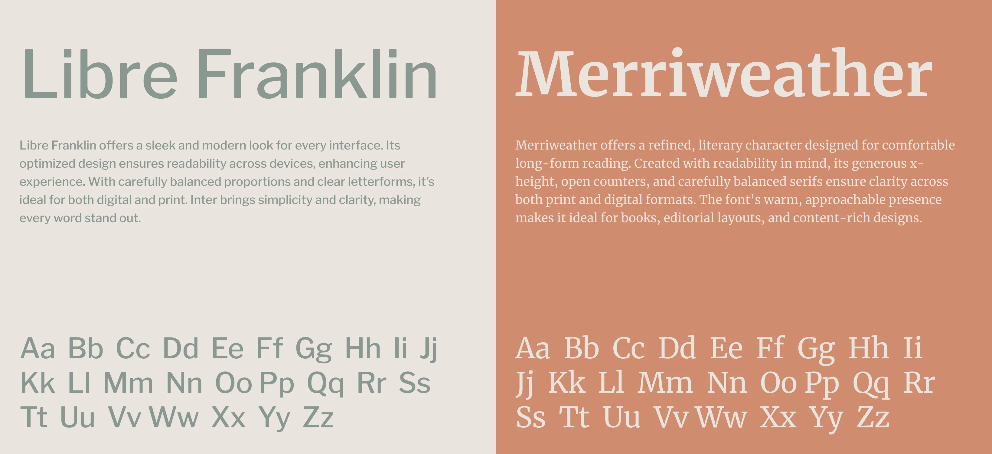
Tools we used


Project Completion
2025
Key Market
Global
The Postpartum Reset is a thoughtfully designed guide that supports mothers through the first year after birth. Its purpose is to reframe postpartum care as a long-term, holistic journey rather than a short recovery phase. Positioned between medical guides and lifestyle books, it stands out through its doula-led voice, practical tools, reflection prompts, and partner-focused guidance. The design enhances its accessibility, making complex emotional and physical topics feel approachable, comforting, and empowering.

Industry
Healthcare & WellnessWhat we did
Book DesignGraphic DesignPlatform
-Most postpartum resources are either overly clinical, overwhelming, or visually dense, making them difficult to engage with during an already exhausting phase of life. New mothers often experience cognitive overload, emotional vulnerability, and limited reading stamina. Traditional book designs fail to accommodate these realities, leading to disengagement. The challenge was to design a book that respects limited energy, emotional sensitivity, and the need for clarity—without compromising depth or credibility.
The design solves this problem through a highly readable layout, clear content segmentation, and emotionally considerate pacing. Short paragraphs, ample margins, reflection prompts, and consistent visual systems reduce mental strain. Headings, partner notes, and tool sections are visually distinct, allowing readers to jump in and out without losing context. The design supports non-linear reading, enabling mothers to engage with the content at their own pace while still feeling guided and supported.

The design's warm, supportive approach resonates deeply with the target audience, fostering higher engagement and conversion. By focusing on emotional alignment and readability, it drives better response rates, with notable improvements in book orders and overall inquiries. Metrics suggest that continued focus on strong call-to-actions and simplifying user pathways can lead to further improvements.
The long-term vision is to create a timeless, trusted postpartum resource that mothers return to throughout their first year and beyond. The design aims to normalize rest, emotional processing, and shared responsibility by making these ideas visually and structurally accessible. As the book evolves into future editions or companion products, the design system can scale seamlessly, reinforcing its role as a foundational reference in modern postpartum care.
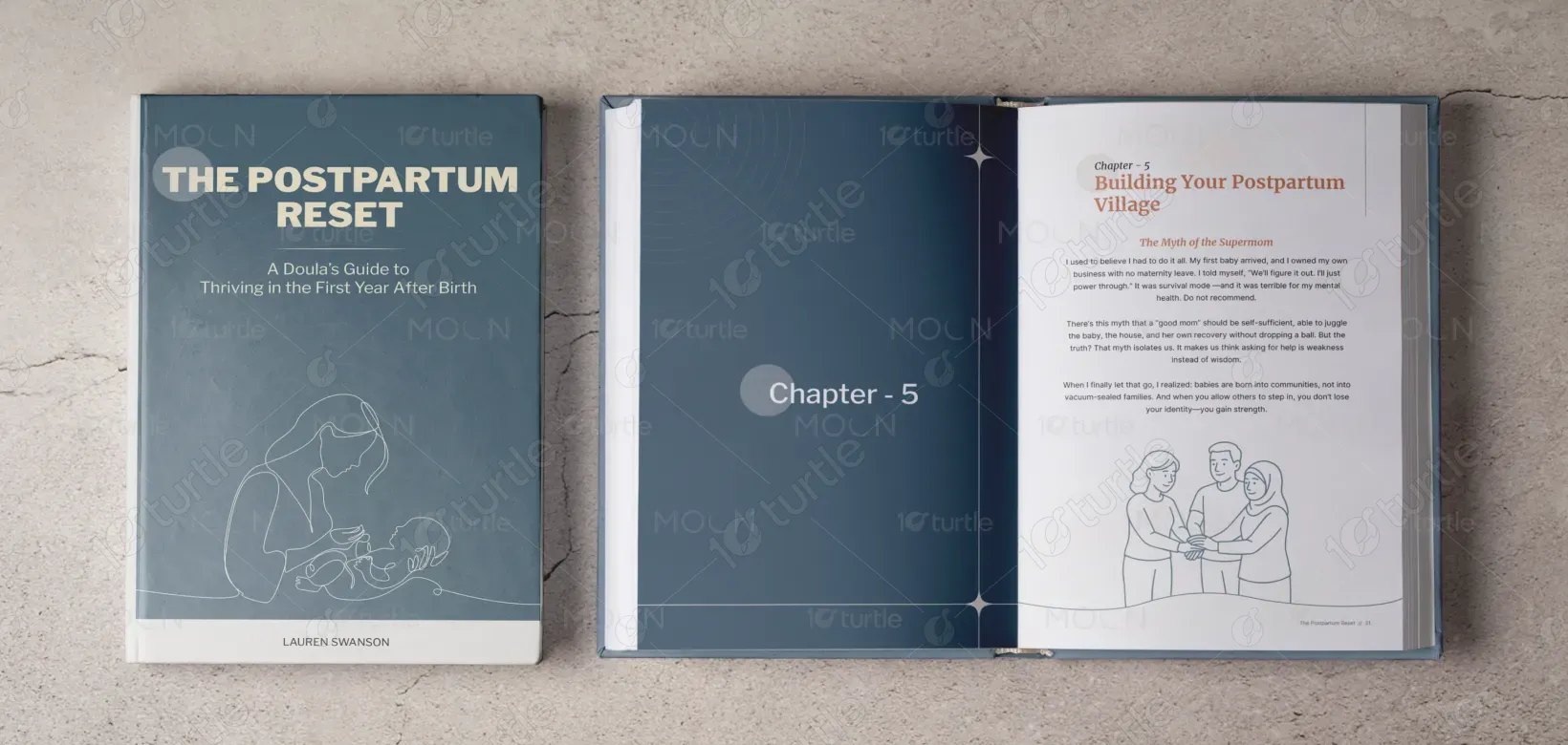
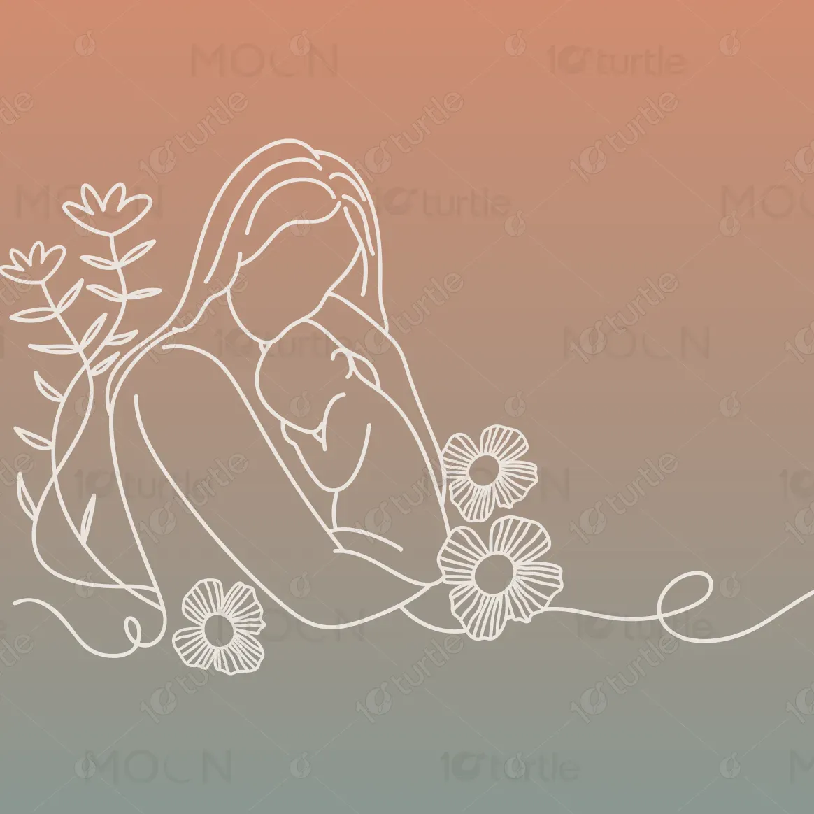
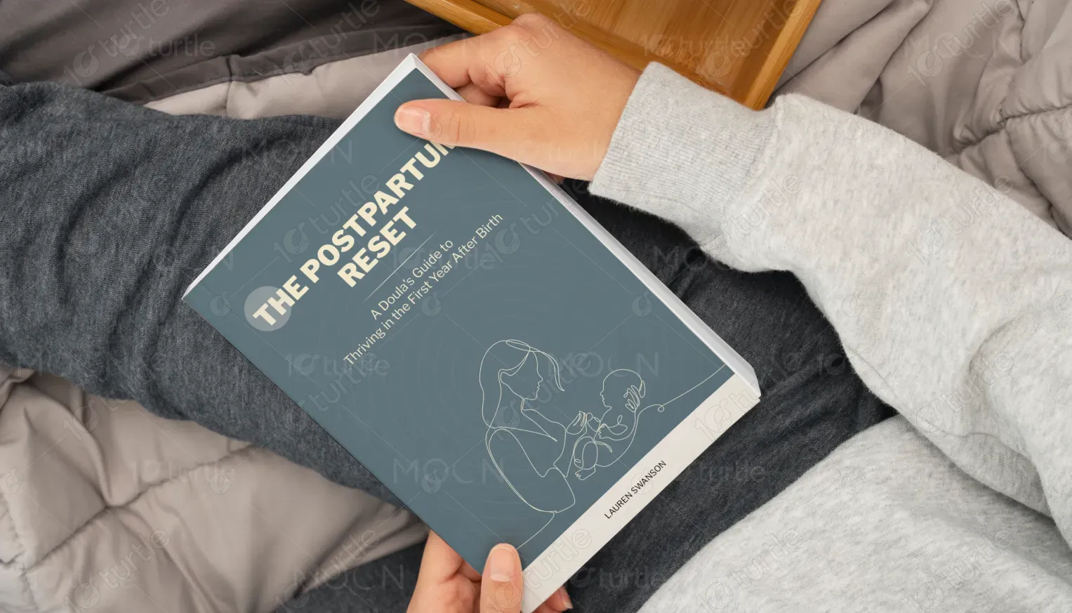

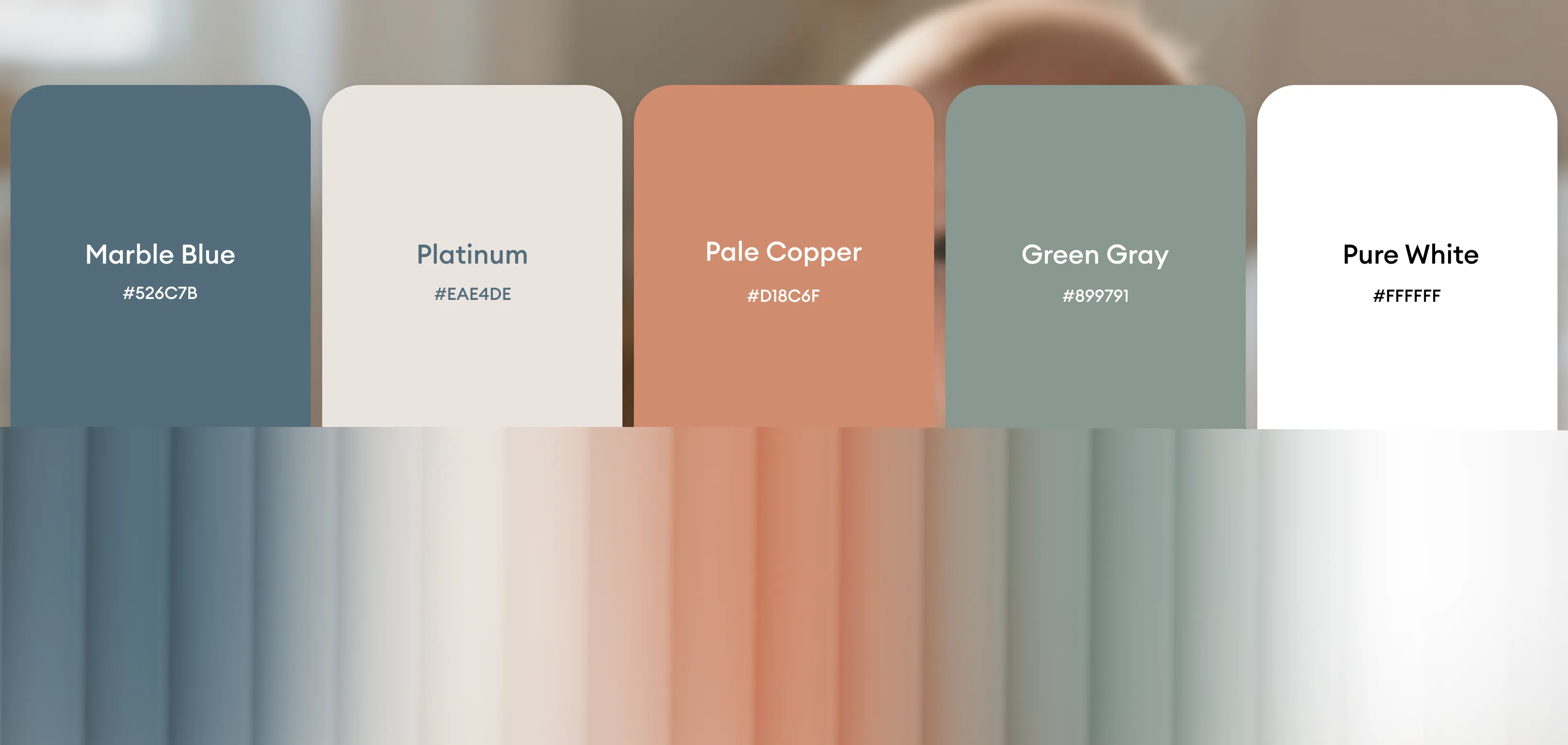
The color palette is intentionally soft, neutral, and grounding, reflecting calm, safety, and emotional balance. Muted tones support long reading sessions without visual fatigue, while subtle contrasts help maintain structure and focus. These colors align with the nurturing, non-judgmental tone of the brand and evoke trust, warmth, and reassurance. The palette avoids harsh or overly vibrant hues, reinforcing the book’s purpose as a gentle guide during a sensitive life transition.