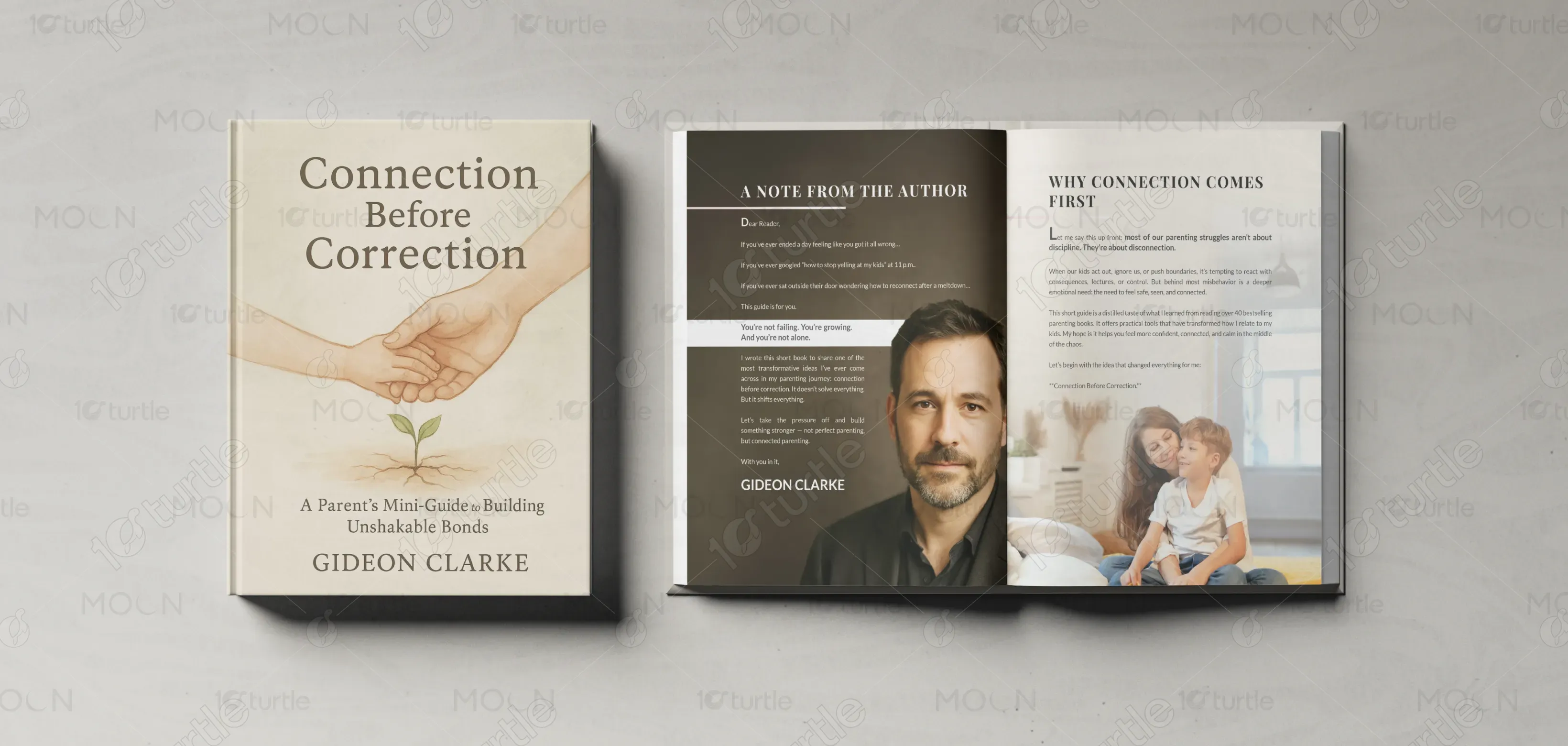
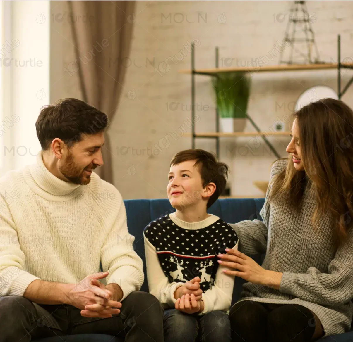
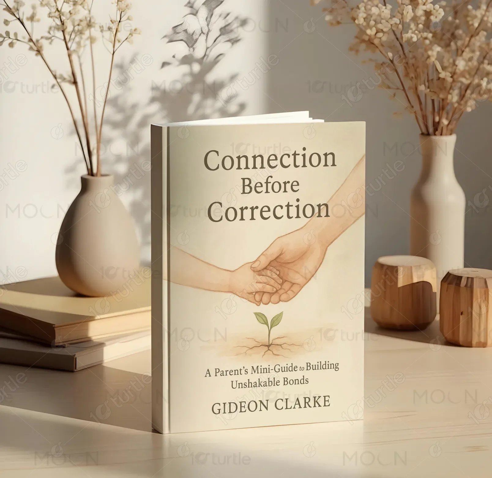
The book design embraces a calm, nurturing, and emotionally warm aesthetic that reflects mindful parenting values. Soft neutral tones, elegant serif typography, and spacious layouts create a premium reading experience. Lifestyle imagery of parents, children, and peaceful home settings adds authenticity and emotional connection. The clean editorial structure ensures readability while maintaining sophistication. Gentle overlays and balanced compositions communicate trust, comfort, and growth. Overall, the creative direction blends modern self-help publishing with heartfelt family-centered storytelling and guidance.
Book Design
Graphic Design
Industry
Arts, Culture & Entertainment
Tools we used


Project Completion
2025
Key Market
Global
The book design embraces a calm, nurturing, and emotionally warm aesthetic that reflects mindful parenting values. Soft neutral tones, elegant serif typography, and spacious layouts create a premium reading experience. Lifestyle imagery of parents, children, and peaceful home settings adds authenticity and emotional connection. The clean editorial structure ensures readability while maintaining sophistication. Gentle overlays and balanced compositions communicate trust, comfort, and growth. Overall, the creative direction blends modern self-help publishing with heartfelt family-centered storytelling and guidance.
Industry
Arts, Culture & EntertainmentWhat we did
Book DesignGraphic DesignPlatform
-Modern parents often feel overwhelmed by conflicting advice, busy lifestyles, and emotional stress, making it difficult to maintain calm and meaningful relationships with their children. Many parenting resources are either too clinical, overly complicated, or visually uninviting, causing readers to disengage. Families need guidance that feels supportive rather than judgmental. For example, parents dealing with tantrums, screen-time conflicts, or communication breakdowns may struggle to find simple, relatable solutions presented in a warm and accessible format.
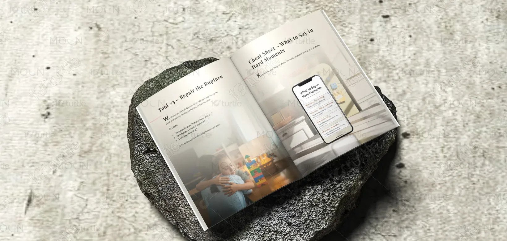
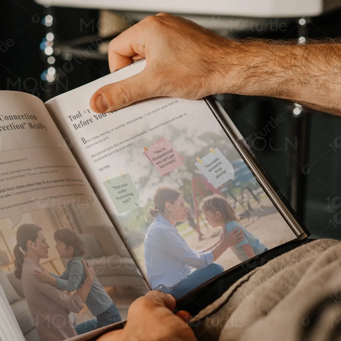
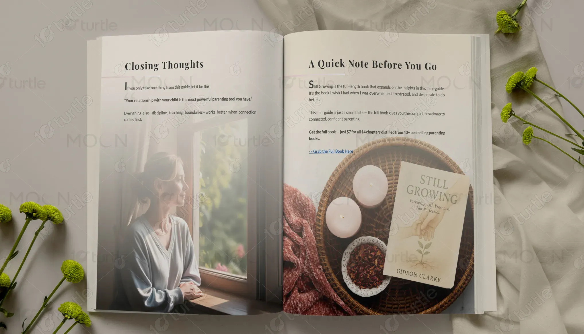
This book solves the problem by presenting parenting advice in a gentle, visually inviting, and easy-to-understand format. Clear chapter structures, practical tools, reflective exercises, and real-life examples help parents immediately apply lessons at home. The emotionally warm photography creates reassurance and relatability, while the elegant layout encourages continued reading. By combining education with empathy, the design transforms complex parenting challenges into manageable steps, helping users feel confident, supported, and motivated throughout their parenting journey.
The long-term vision for Still Growing is to become a trusted parenting companion brand that supports families worldwide through books, digital resources, workshops, and community experiences. It aims to redefine parenting education by making emotional intelligence, connection, and mindful communication mainstream values. Over time, the brand can expand into journals, courses, podcasts, and family wellness products. Its ultimate mission is to create stronger future generations through healthier parent-child relationships and compassionate homes.


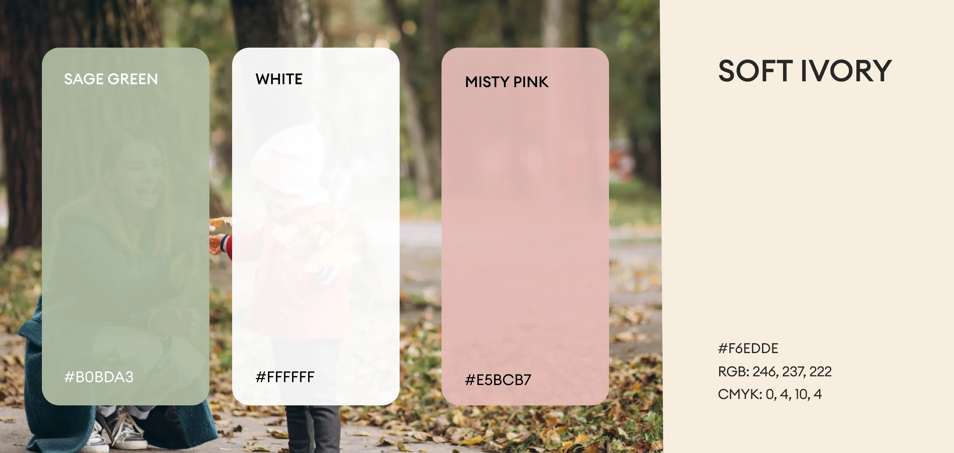
The chosen palette features warm beige, ivory, soft taupe, muted brown, sage green, and gentle charcoal tones. These colors represent calmness, growth, warmth, trust, and emotional balance—perfectly aligned with a parenting wellness brand. Neutral backgrounds create a timeless editorial feel, while earthy accents communicate comfort and authenticity. Green symbolizes development and renewal, reinforcing the “Still Growing” message. The palette enhances readability, evokes serenity, and gives the book a premium, comforting, and approachable personality.