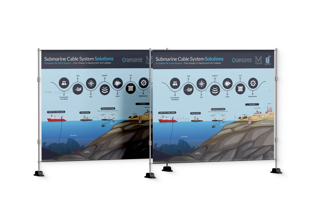
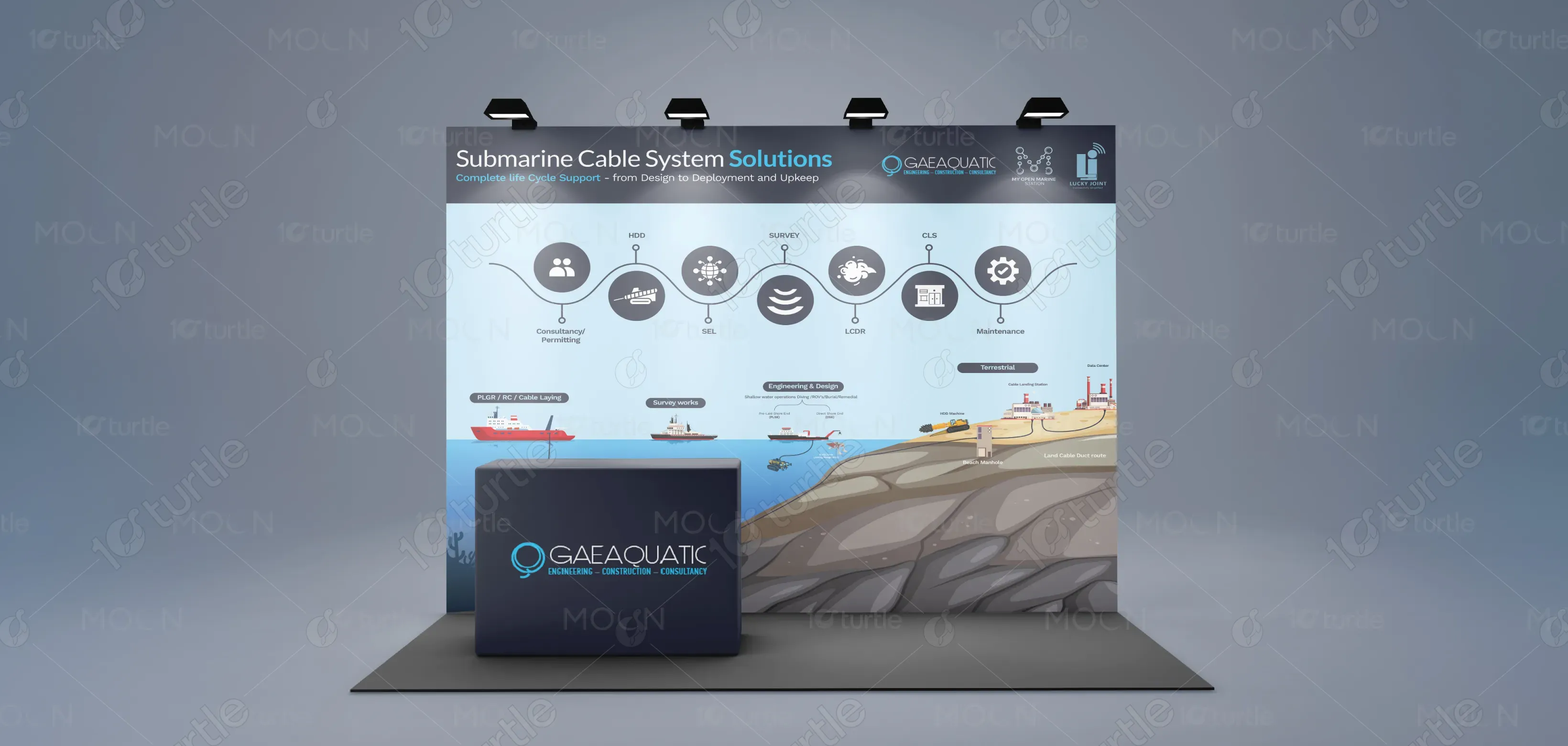
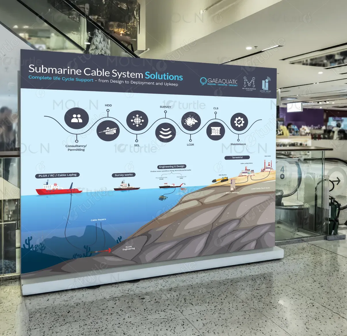
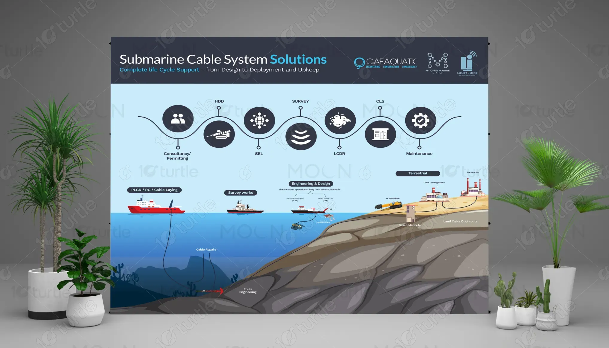
This booth design follows a clean, technical, and professional aesthetic tailored for the submarine cable engineering industry. It uses a visual flow diagram to showcase the complete lifecycle of underwater cable deployment, blending technical icons with an illustrated seabed and terrestrial environment. The color palette combines oceanic blues, neutral greys, and crisp white space to emphasize clarity and trust. The layout balances storytelling with technical accuracy, ensuring the viewer easily understands each stage of the cable system process.
Booth Design
Graphic Design
Industry
Transport, Automotive & Logistics
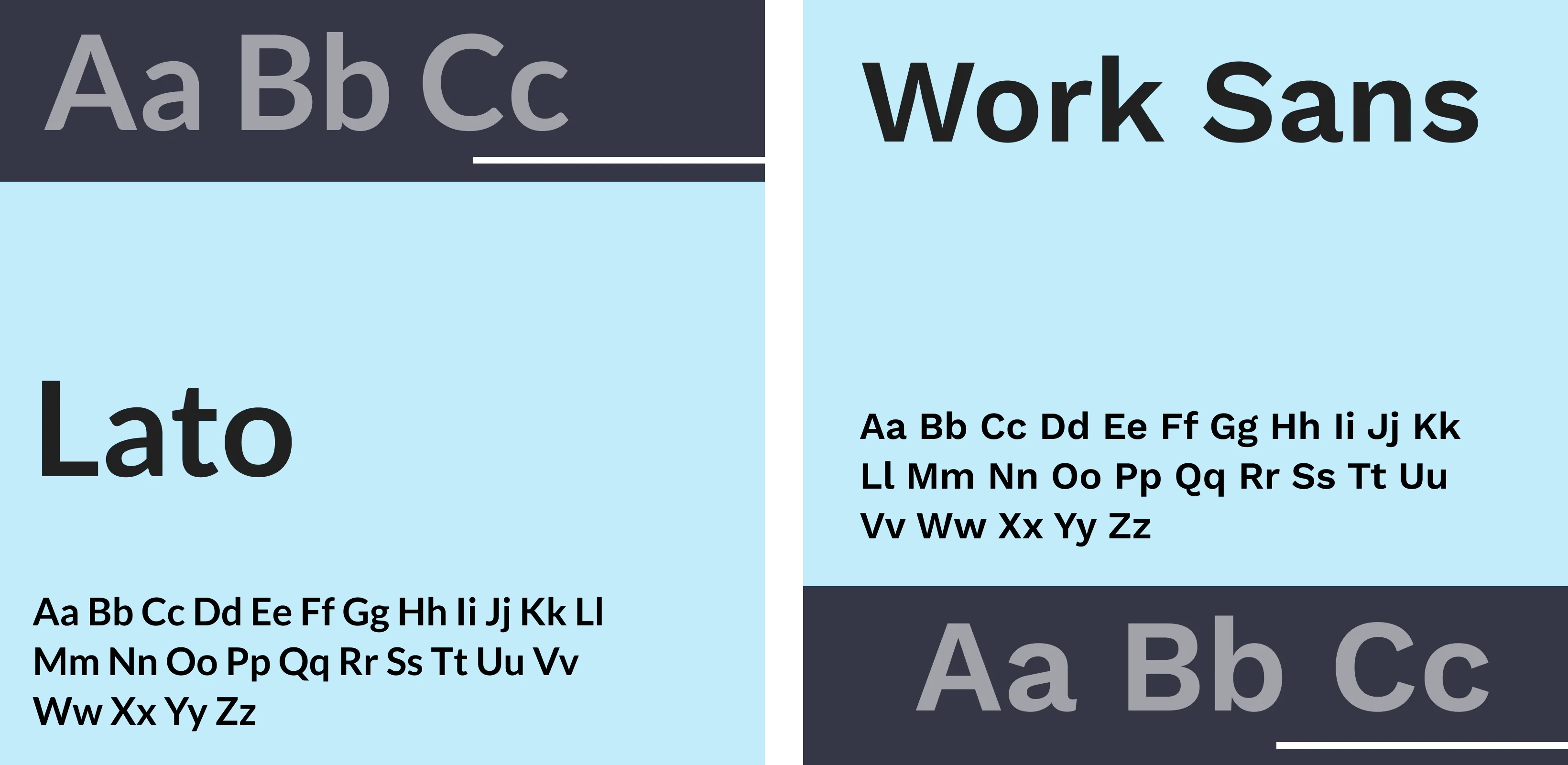
Tools we used


Project Completion
2025
Key Market
Global
The showcased design represents a comprehensive Submarine Cable System Solution that covers consultancy, permitting, surveying, cable laying, engineering, CLS development, and long-term maintenance. It visually communicates the end-to-end lifecycle of subsea cable infrastructure — from ocean to land. The design highlights the brand’s technical capability, operational expertise, and integrated services. Its unique selling point lies in offering a full, streamlined solution rather than fragmented services, making it ideal for telecom, offshore, and marine infrastructure industries.
Industry
Transport, Automotive & LogisticsWhat we did
Booth DesignGraphic DesignPlatform
-Submarine cable projects often suffer from fragmented communication, unclear process documentation, and difficulty explaining highly technical steps to clients and stakeholders. Many companies fail to visually articulate the full cable lifecycle, leading to misunderstandings and delayed approvals. The absence of simplified, accurate, and engaging visuals makes it challenging for non-technical stakeholders to grasp the complexity — especially in exhibitions, pitches, or quick presentations where clarity is critical.
This design solves the communication gap by visually mapping the entire submarine cable journey through intuitive icons, clear process sequencing, and detailed marine-to-land illustrations. It simplifies complex engineering tasks into digestible visuals, helping stakeholders quickly understand workflow, capabilities, and service coverage. The booth’s structured storytelling, paired with technical accuracy, strengthens trust and supports quicker decision-making. Its visual hierarchy ensures that both experts and non-experts can follow the process effortlessly.
The brand aims to become a global leader in seamless submarine cable solutions by integrating engineering excellence with modern visualization and communication. Its long-term vision is to standardize clarity in the subsea cable industry, promote safer and more efficient deployments, and build lasting partnerships with telecom operators, governments, and marine engineering firms. The goal is to be recognized not only for technical expertise but also for transparency, innovation, and reliable lifecycle support.
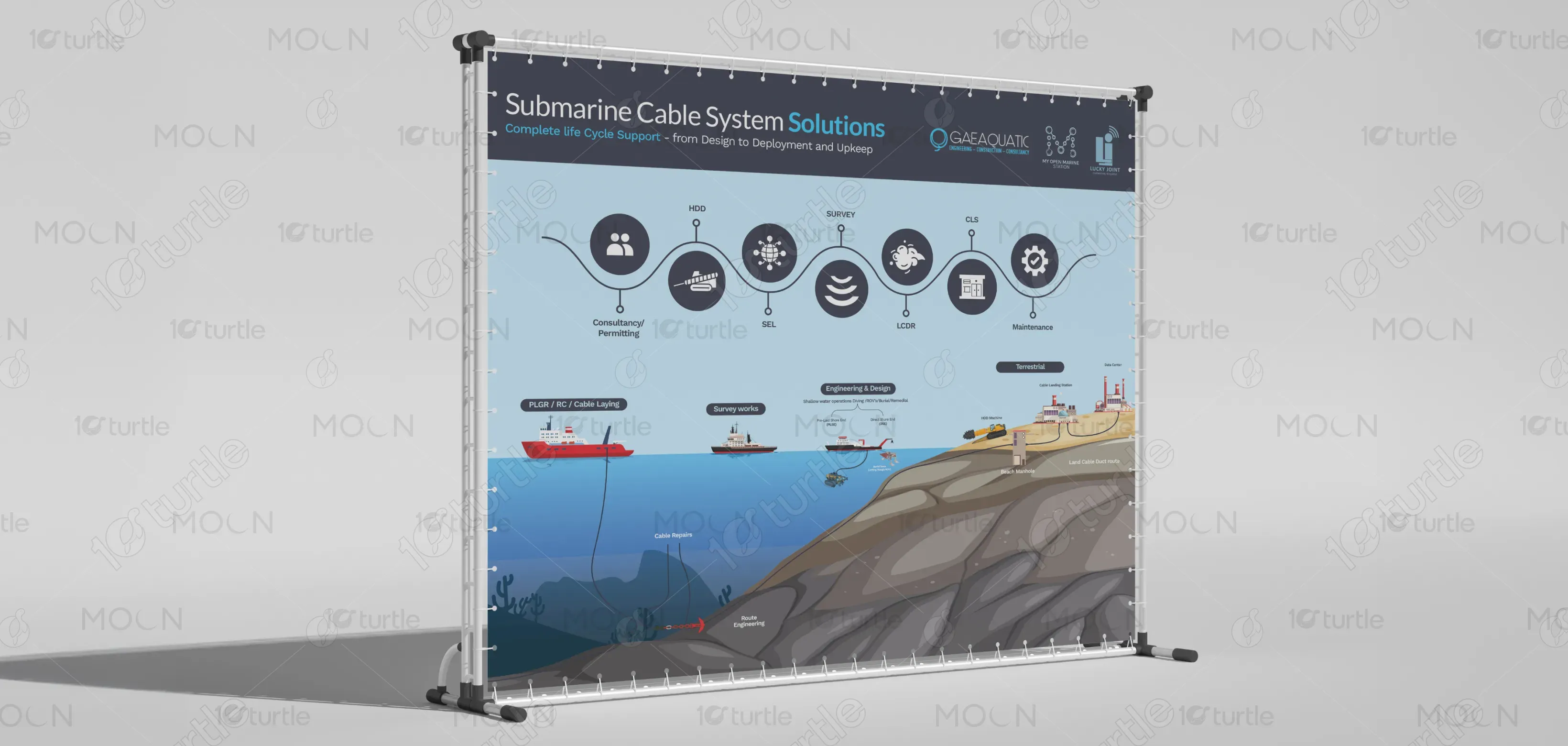
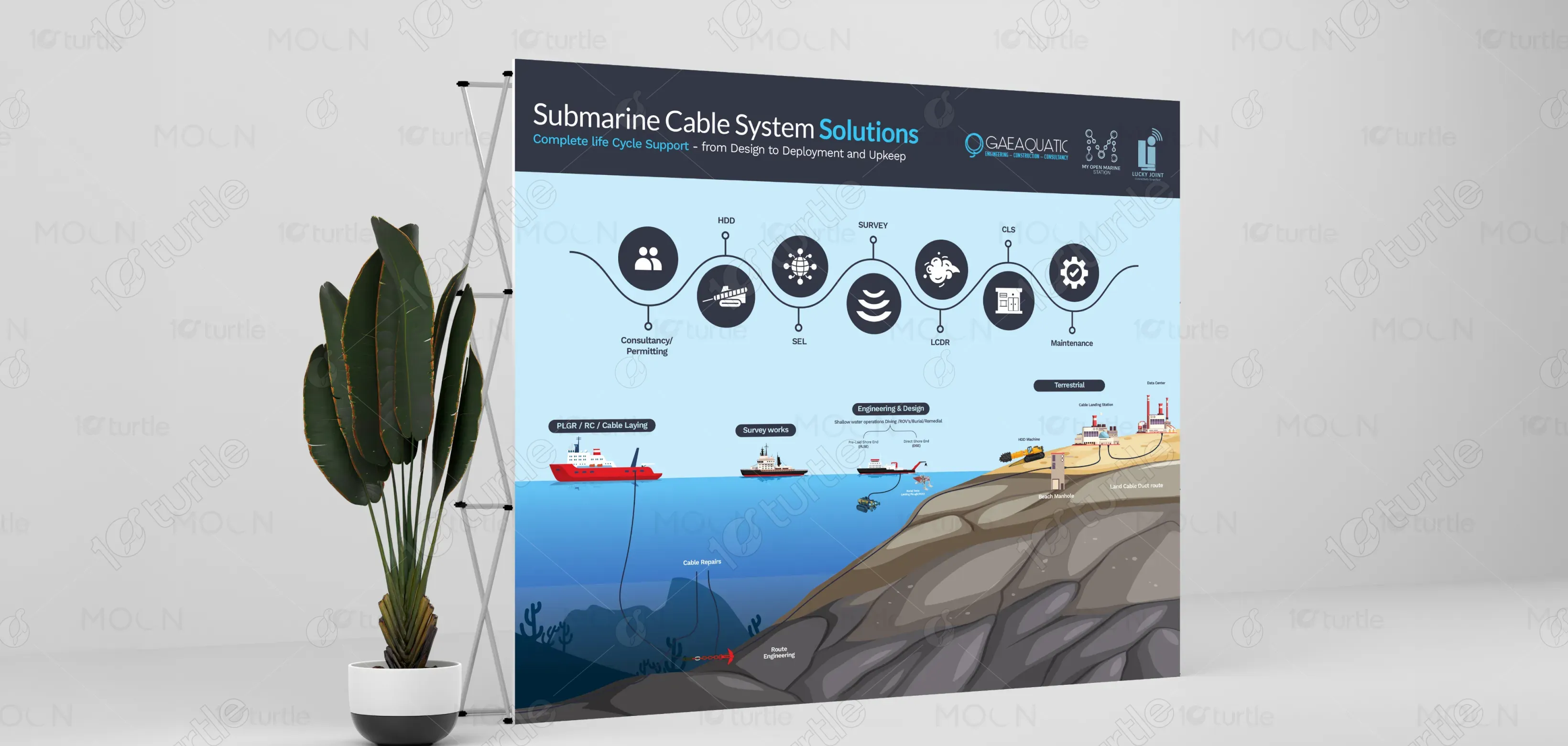
The color palette uses deep ocean blues, symbolizing trust, depth, and engineering precision. Sky blues enhance clarity and technical transparency, while greys and charcoal tones convey professionalism and stability. Accents of soft teal and white improve readability and maintain a clean, modern aesthetic. Together, these colors align with the brand’s marine identity, evoke a sense of reliability, and reinforce the technical, high-precision nature of submarine cable systems.