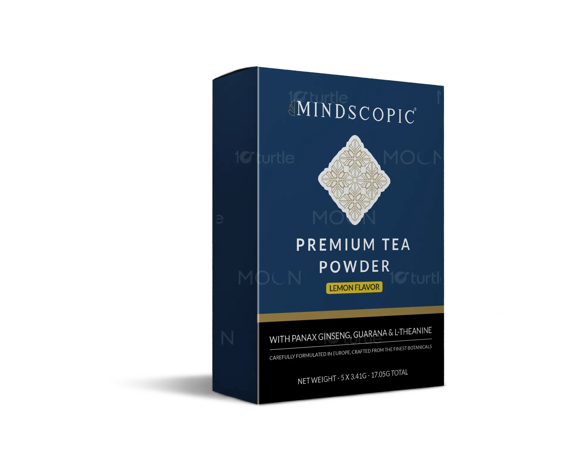
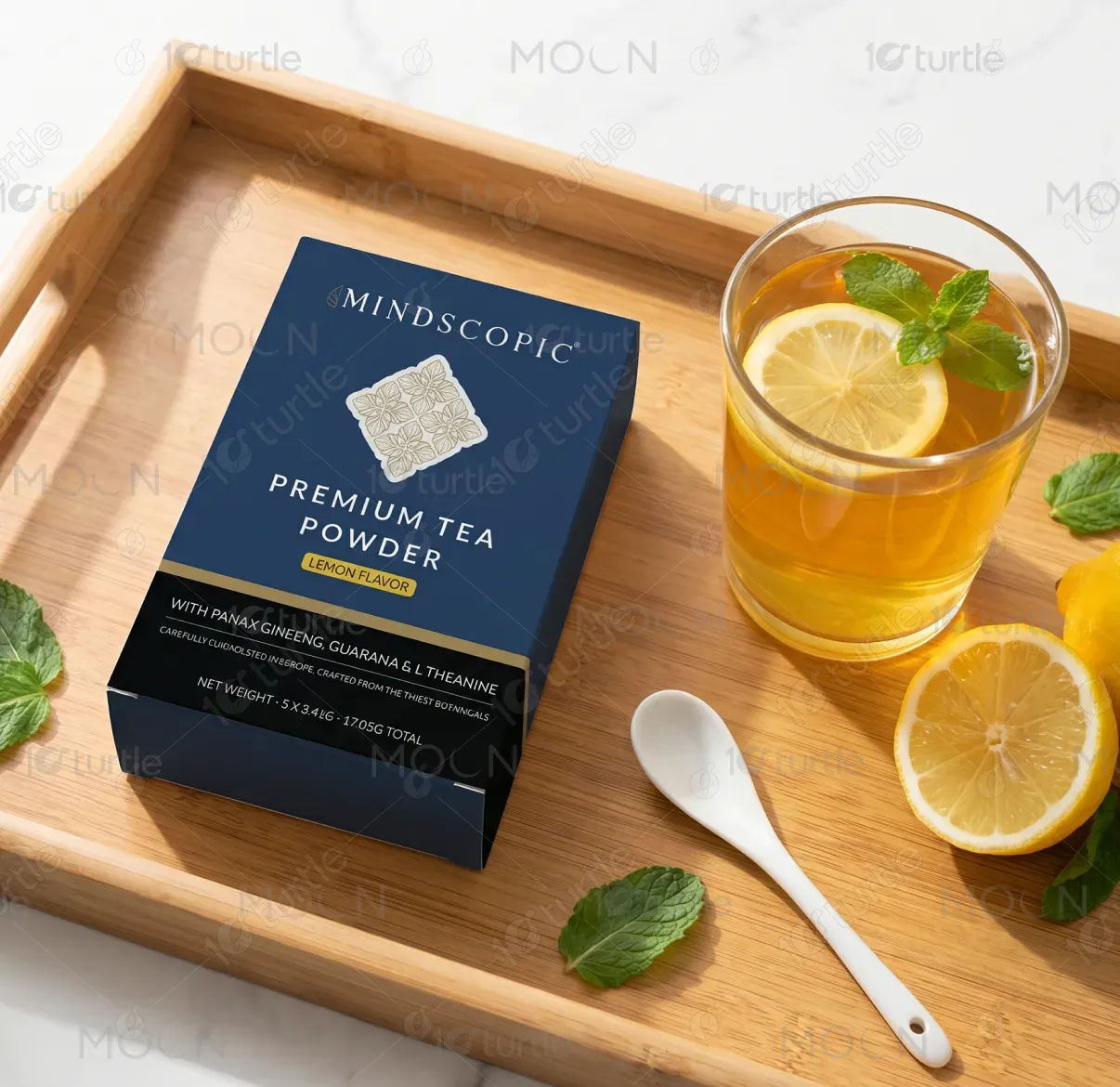
The design employs a premium and sophisticated aesthetic, using a deep blue background to evoke calmness and trust. The logo and typography feature elegant serif elements, enhancing the high-end feel. The box layout is clean and structured, with gold accents adding a touch of luxury. The imagery of the tea powder, lemons, and mint supports freshness and energy. The clear, readable font hierarchy ensures a balanced and professional design, ensuring that the key product details stand out. The overall composition blends luxury with functionality, enhancing the product's appeal.
Box Design
Graphic Design

Industry
Food, Beverage & Hospitality
Tools we used


Project Completion
2025
Key Market
Global
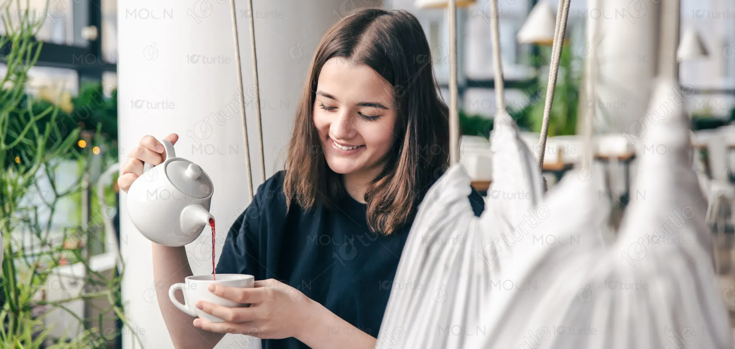
This design represents Mindscopic Premium Tea Powder, specifically targeting consumers seeking a refreshing, healthy beverage. It features the Lemon Flavor variant enriched with Panax Ginseng, Guarana, and L-Theanine, emphasizing energy, focus, and mental clarity. The design's goal is to position the product as a premium offering in the health-focused beverage market. Its clean, high-end aesthetic targets individuals who value both wellness and sophistication in their everyday products.
Industry
Food, Beverage & HospitalityWhat we did
Box DesignGraphic DesignPlatform
-In a market flooded with generic health teas, many products suffer from poor visibility or weak differentiation. Often, these products fail to communicate their unique health benefits or premium quality. Consumers may not recognize the product's ability to improve mental clarity, making it hard for brands to engage potential buyers. Mindscopic needed a design that clearly communicates its superior quality and benefits while standing out from the competition.
The design solves the problem by emphasizing clarity, simplicity, and sophistication. The clean layout highlights the product’s benefits, such as mental clarity, with clear typography and a focus on key ingredients like Panax Ginseng and Guarana. The imagery reinforces the refreshing nature of the product, while the color palette and accents communicate both freshness and luxury. A consistent, user-friendly design ensures that the product resonates with the target audience and enhances brand recognition.
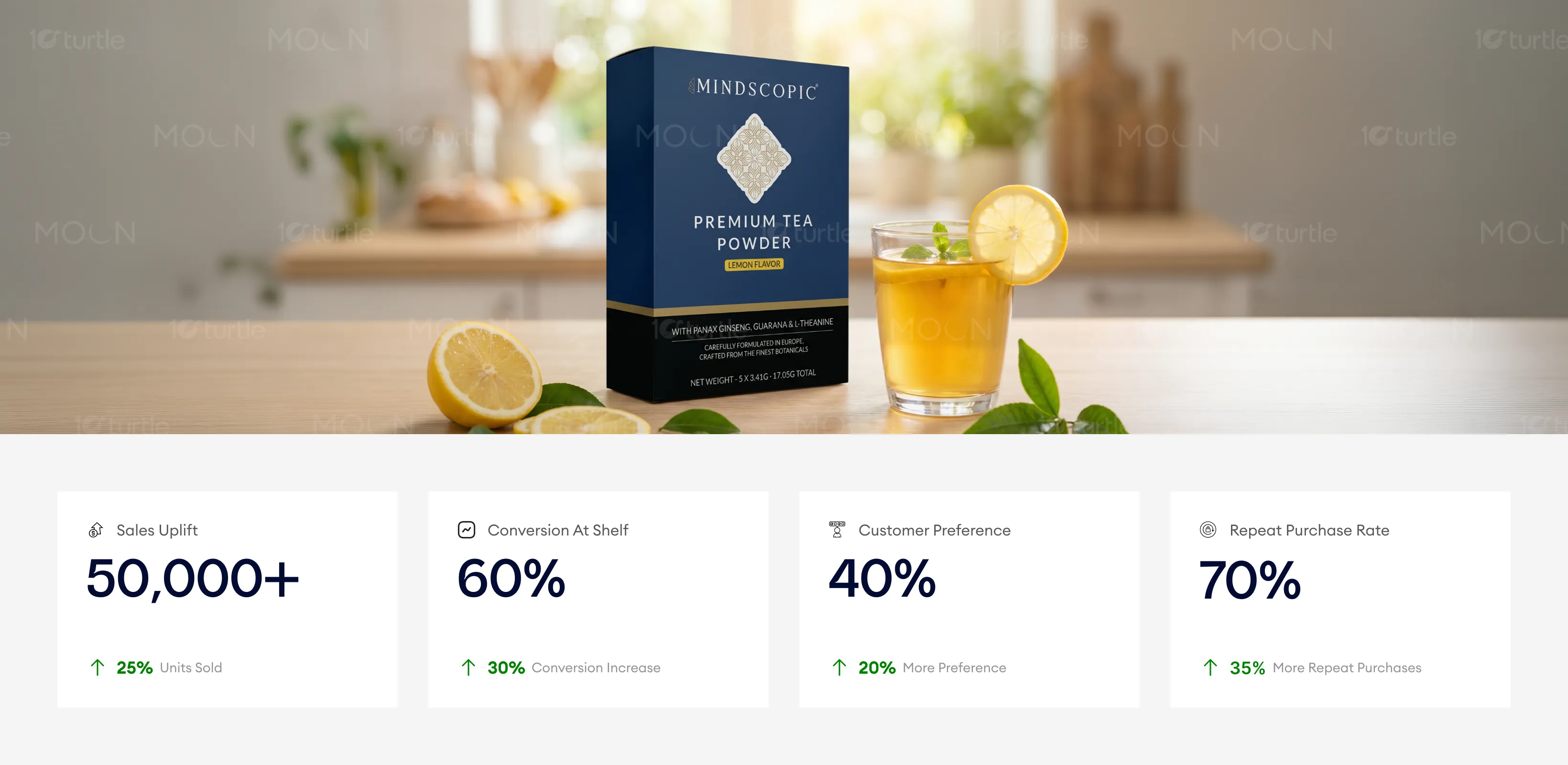
The design effectively merges luxury and functionality, offering a premium, sophisticated look that appeals to high-end consumers. In real-world use, the design likely contributes to increased impulse buys, higher shelf conversions, and stronger brand preference. Metrics like sales uplift and conversion rates could see significant improvements due to the trust and quality the packaging communicates to customers.
The long-term vision for Mindscopic is to establish the brand as a leading premium wellness product, known for its focus on mental clarity and energy. The design lays a strong foundation for future product variants while reinforcing the brand's high-end, trustworthy image. It is adaptable for future touchpoints, such as packaging updates, advertising, and digital experiences, ensuring a cohesive and lasting presence in the market.
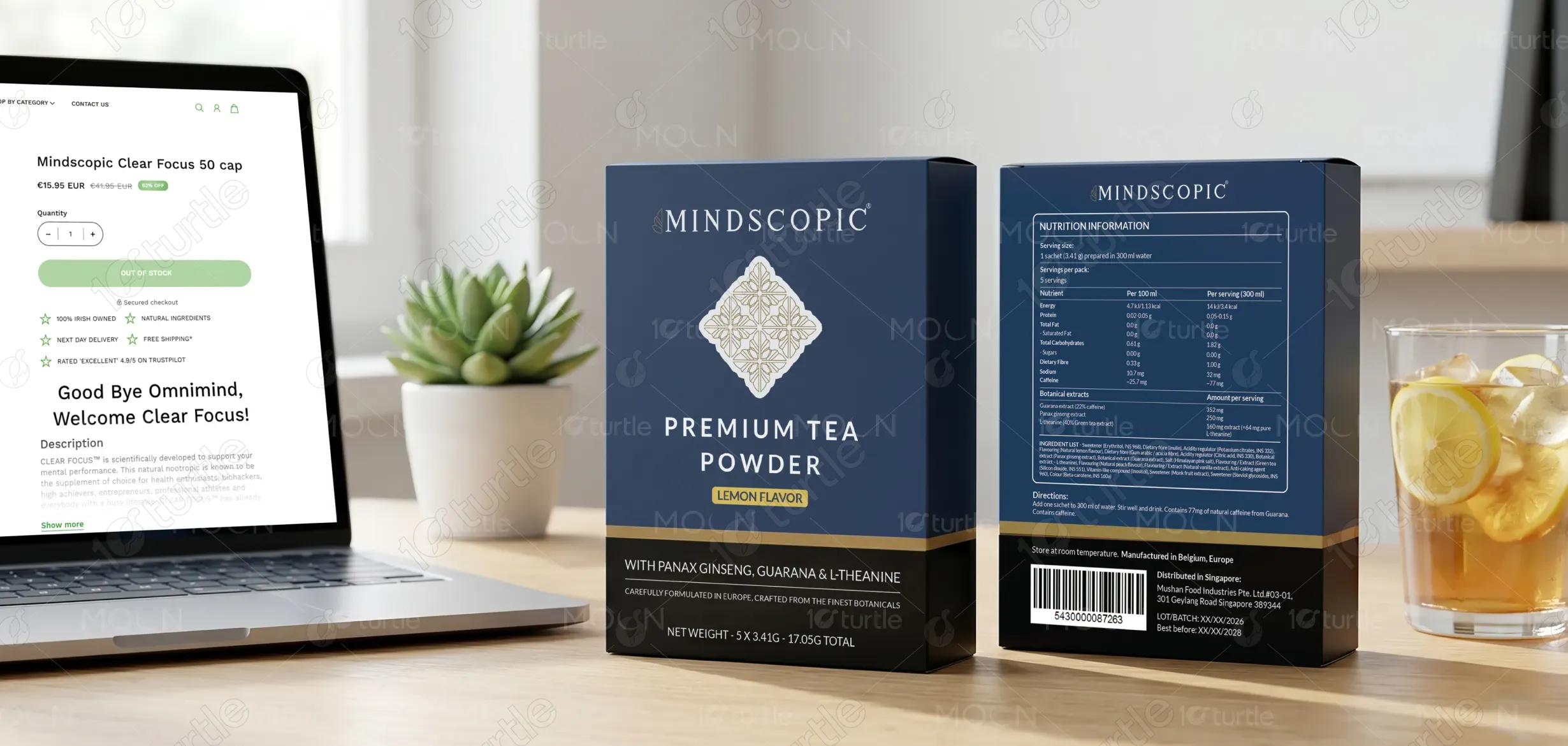
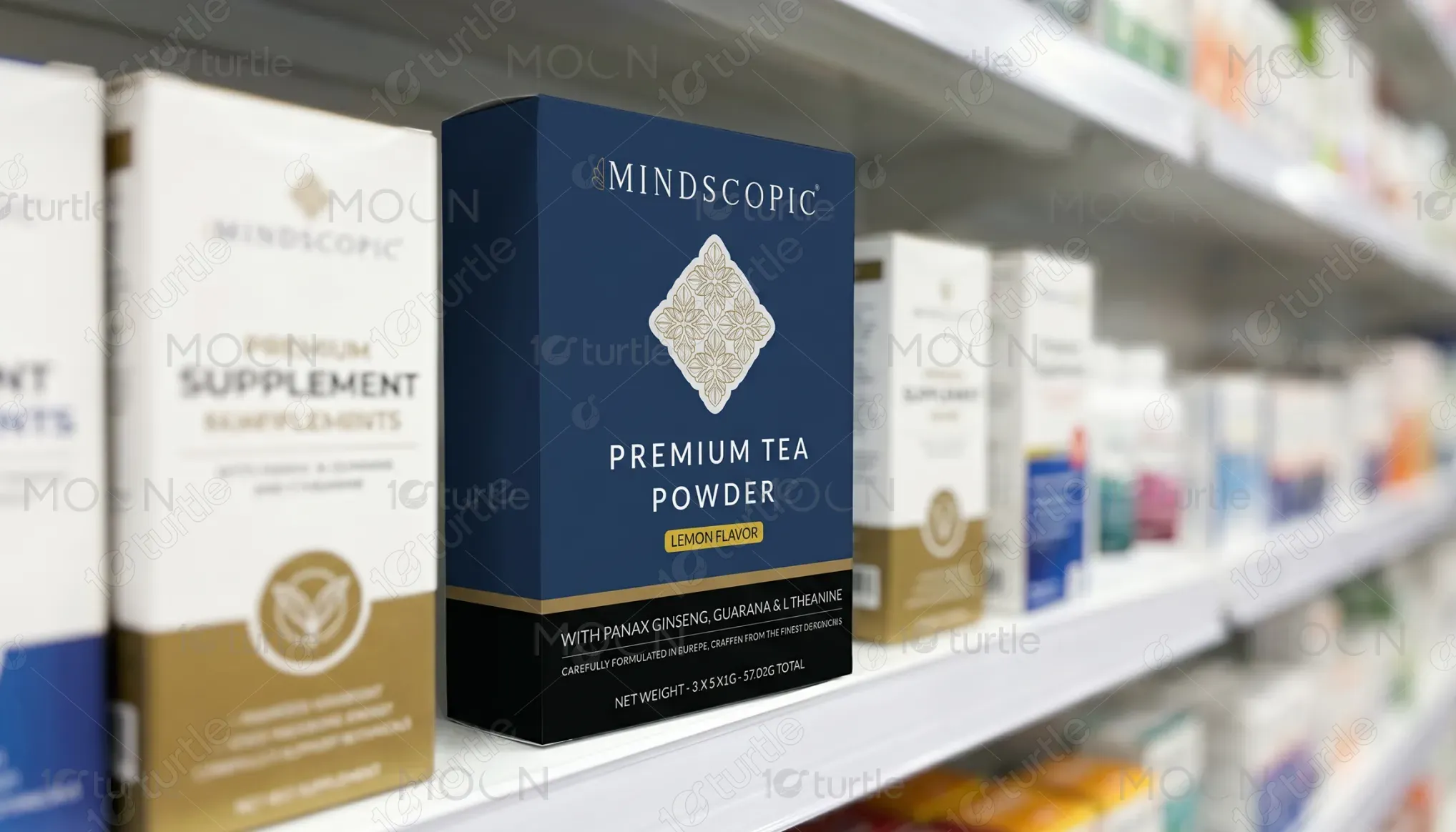
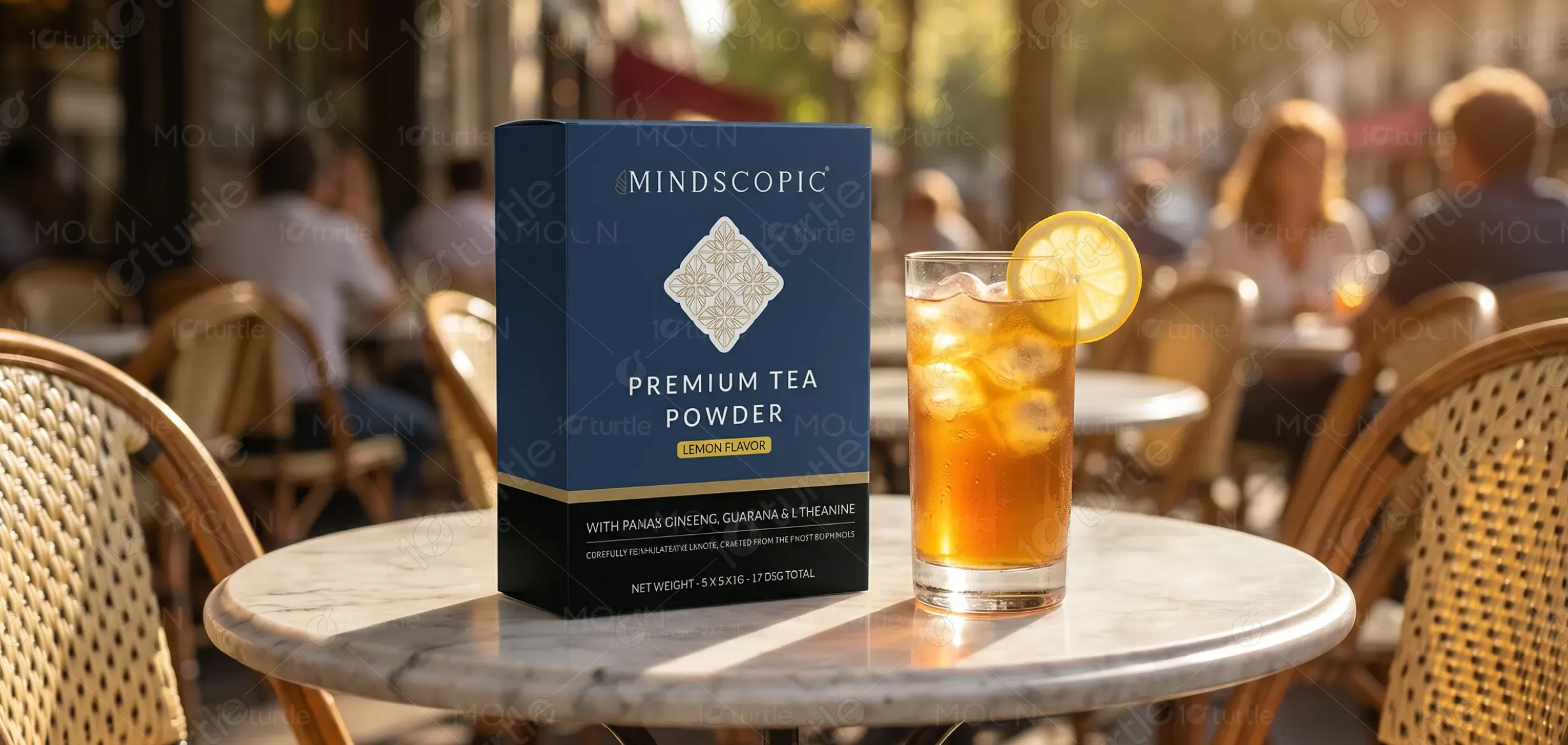
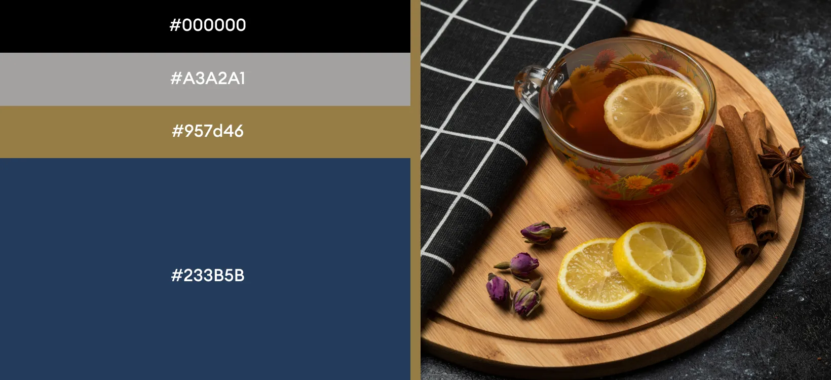
The color palette combines deep blue for trust and sophistication, gold accents to evoke luxury, and fresh lemon-yellow to suggest energy and vitality. These colors work in harmony to appeal to consumers looking for a high-quality, energizing product. The use of green mint leaves reinforces the fresh, natural elements of the tea, enhancing its appeal as a health-focused beverage. The design ensures readability across various formats, making the product stand out on shelves and online.