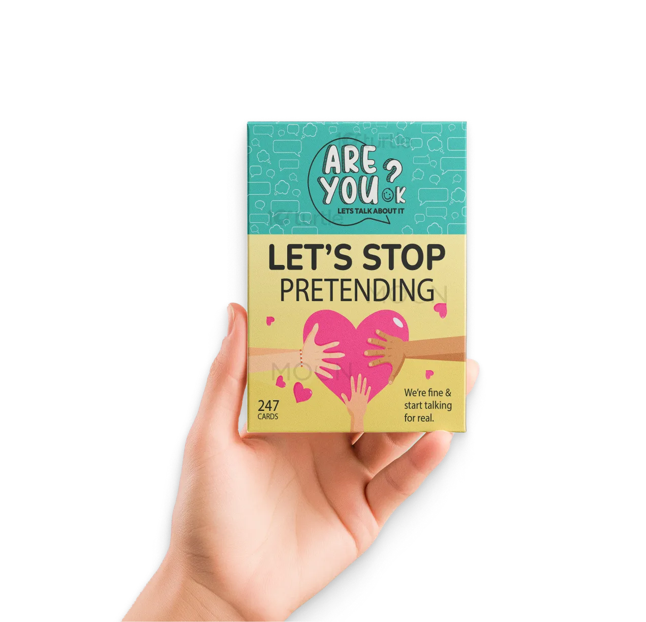
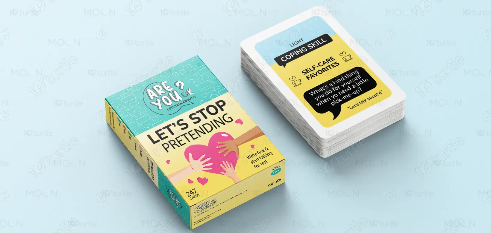
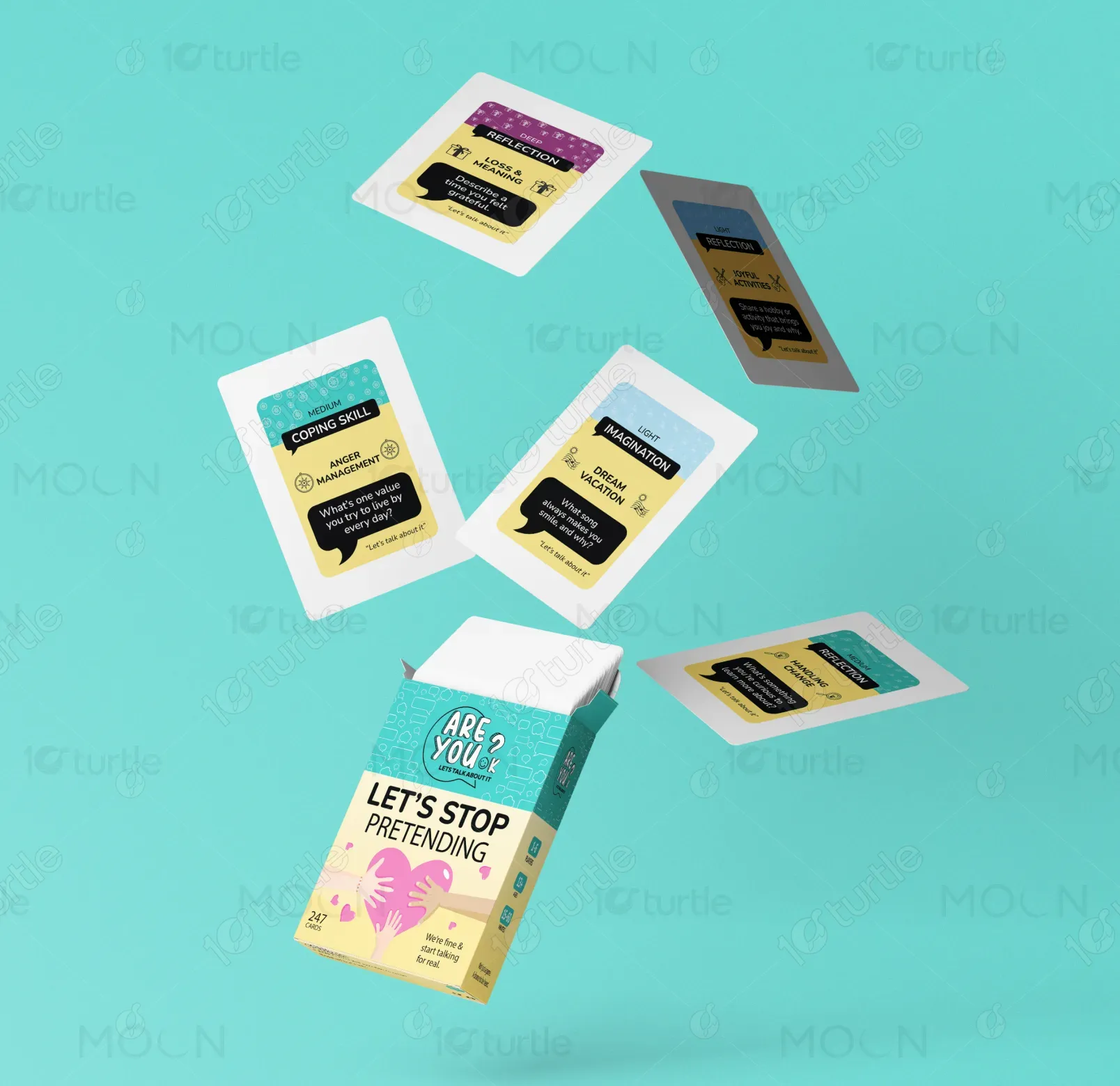
The design follows a playful, approachable style to foster openness and communication. Using bright, engaging colors and friendly, inviting typography, the box and cards create a non-threatening atmosphere for discussing mental health. The visuals are modern, with elements like speech bubbles and hearts to emphasize empathy, connection, and shared understanding. The design is clean, with a clear hierarchy between text and visual elements, ensuring easy readability and a welcoming feel.
box Design
Graphic Design
Industry
Arts, Culture & Entertainment
Tools we used


Project Completion
2026
Key Market
Global
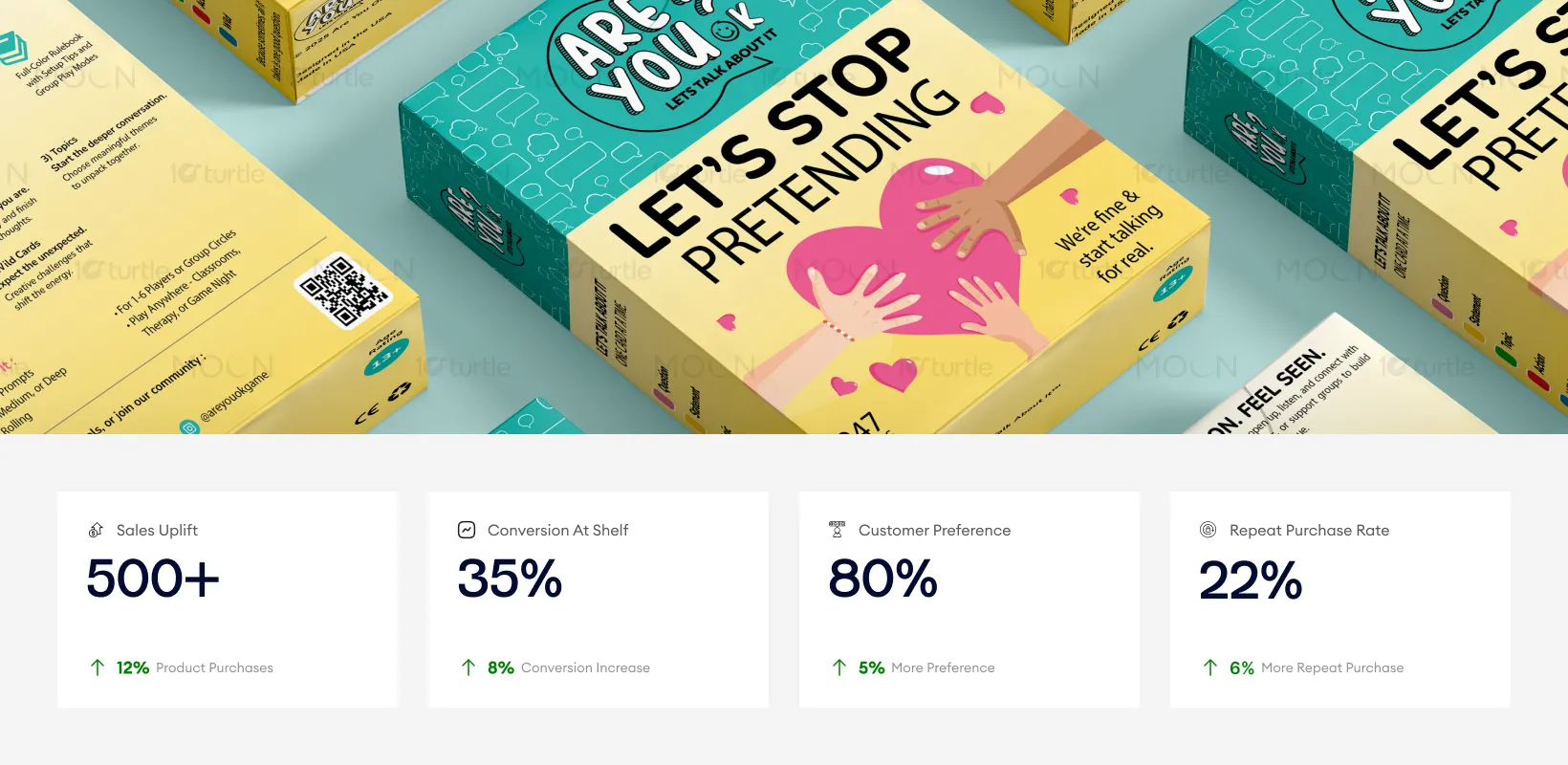
"Let's Stop Pretending" is a card game designed to spark open, meaningful conversations. With a focus on mental health, the game prompts players to reflect on personal experiences, share coping strategies, and support one another in a safe environment. The playful design encourages engagement without judgment, promoting deeper conversations around emotions and well-being. It serves both as an entertaining and therapeutic tool for individuals and groups alike.
Industry
Arts, Culture & EntertainmentWhat we did
box DesignGraphic DesignPlatform
-In today's fast-paced world, many people struggle to connect with their emotions or openly talk about their mental health. Traditional methods of seeking help can feel intimidating or too formal, making it hard for people to start important conversations. As a result, emotional well-being often gets overlooked, and individuals may feel isolated or misunderstood. The challenge is to create a space where people feel comfortable, safe, and motivated to share their thoughts and feelings.
The design of "Let's Stop Pretending" directly addresses this challenge by offering a fun, accessible way to discuss important topics. With a clear, visually appealing structure, the game provides prompts that encourage players to reflect on personal experiences and engage in healthy discussions. By removing the formal barriers often associated with mental health conversations, it helps individuals feel more comfortable opening up. The card-based format allows for group interaction and peer support, ensuring that everyone is heard and valued.
This packaging design effectively enhances customer engagement by creating an approachable and inviting atmosphere. The bright colors and relatable visuals are designed to foster empathy and emotional connection, driving higher sales conversion and repeat purchases. Improved metrics are directly tied to design’s ability to resonate with the target audience and encourage trust.
The vision behind the design is to create a long-lasting platform for mental health conversations. As the brand grows, it will continue to provide innovative ways to break down the stigma surrounding mental health. The design's versatility ensures it can be adapted for various future products, such as specialized editions, digital platforms, or companion resources. Over time, the brand will evolve into a trusted voice in mental well-being, offering tools to foster empathy and understanding across diverse audiences.
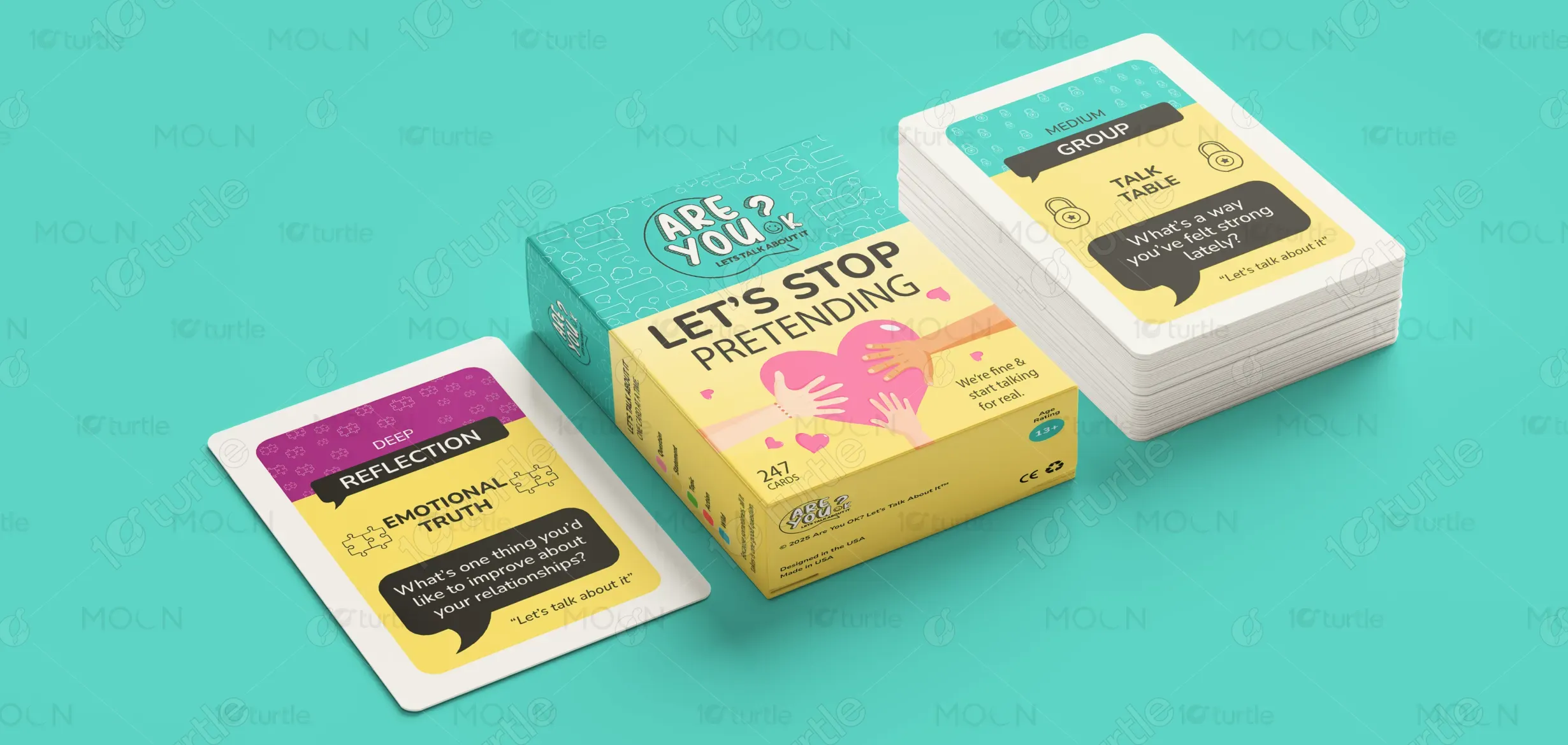
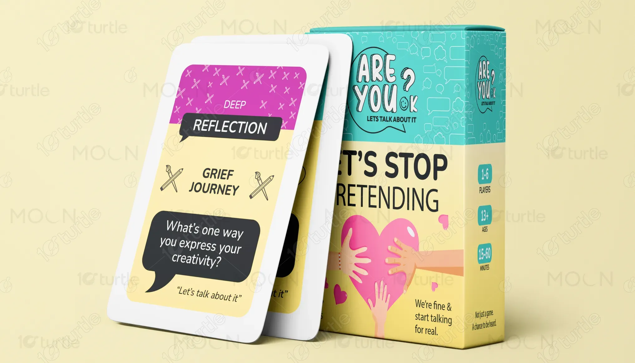
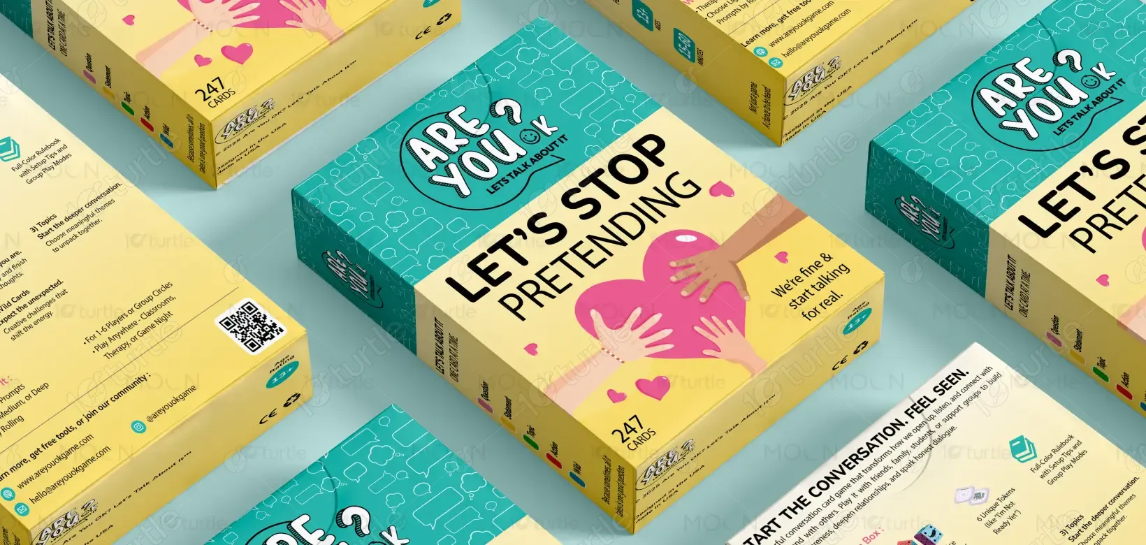
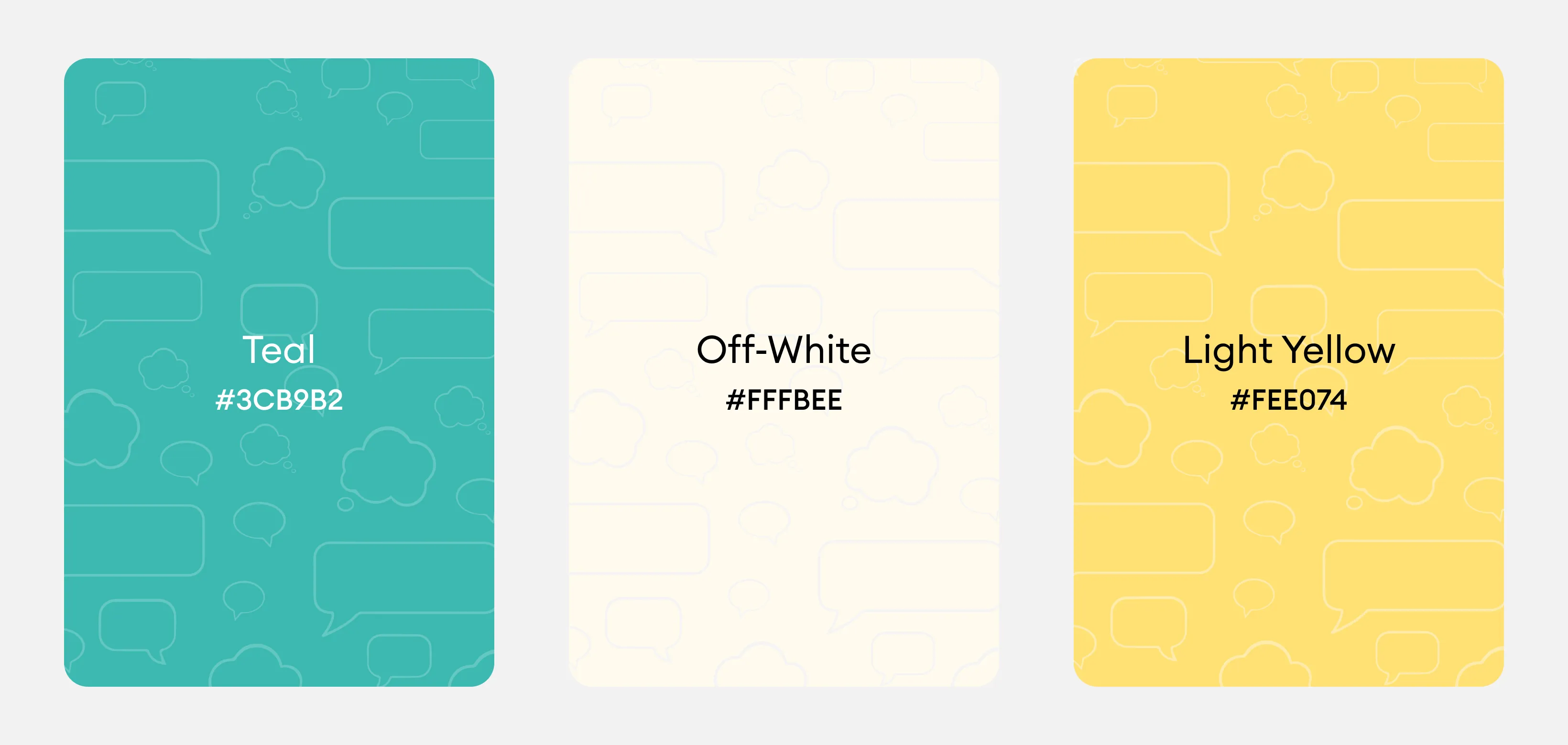
The chosen color palette is bright and calming, combining shades of teal, yellow, and purple. These colors are both inviting and uplifting, promoting feelings of warmth, safety, and positivity. The yellow represents optimism, the teal symbolizes trust and calm, and the purple evokes introspection and creativity. The use of these colors, paired with simple, rounded typography, ensures a user-friendly experience that resonates with the brand’s empathetic and inclusive nature. The design is cohesive across different materials, ensuring consistent recognition and emotional connection with the audience.