Explore the UI/UX case study for SmartIQ, a brain training app with playful game screens, a bold blue identity, and habit-building daily challenges.
Mobile App UI/UX Design
Game App Design
Brand Identity Design
App Icon Design
Dashboard & Onboarding Design
Industry
Health & Wellness / Cognitive Fitness (Brain Training Games)
Tools we used


Project Completion
2026
Industry
Health & Wellness / Cognitive Fitness (Brain Training Games)What we did
Platform
-Brain-training apps live in one of the most saturated corners of the App Store, where dozens of near-identical puzzle games compete for the same few minutes of a user's attention. Most fail not because the games are weak, but because the interface feels cluttered, inconsistent, or generic, causing users to churn within days. For a cognitive wellness product specifically, there's an added burden — the design has to feel credible and calming, not just entertaining, or users lose trust in the brand's promise of real mental benefit. SmartIQ needed an identity and UI system that could unify a dozen different game types under one recognizable, premium look without diluting the fun of individual games.
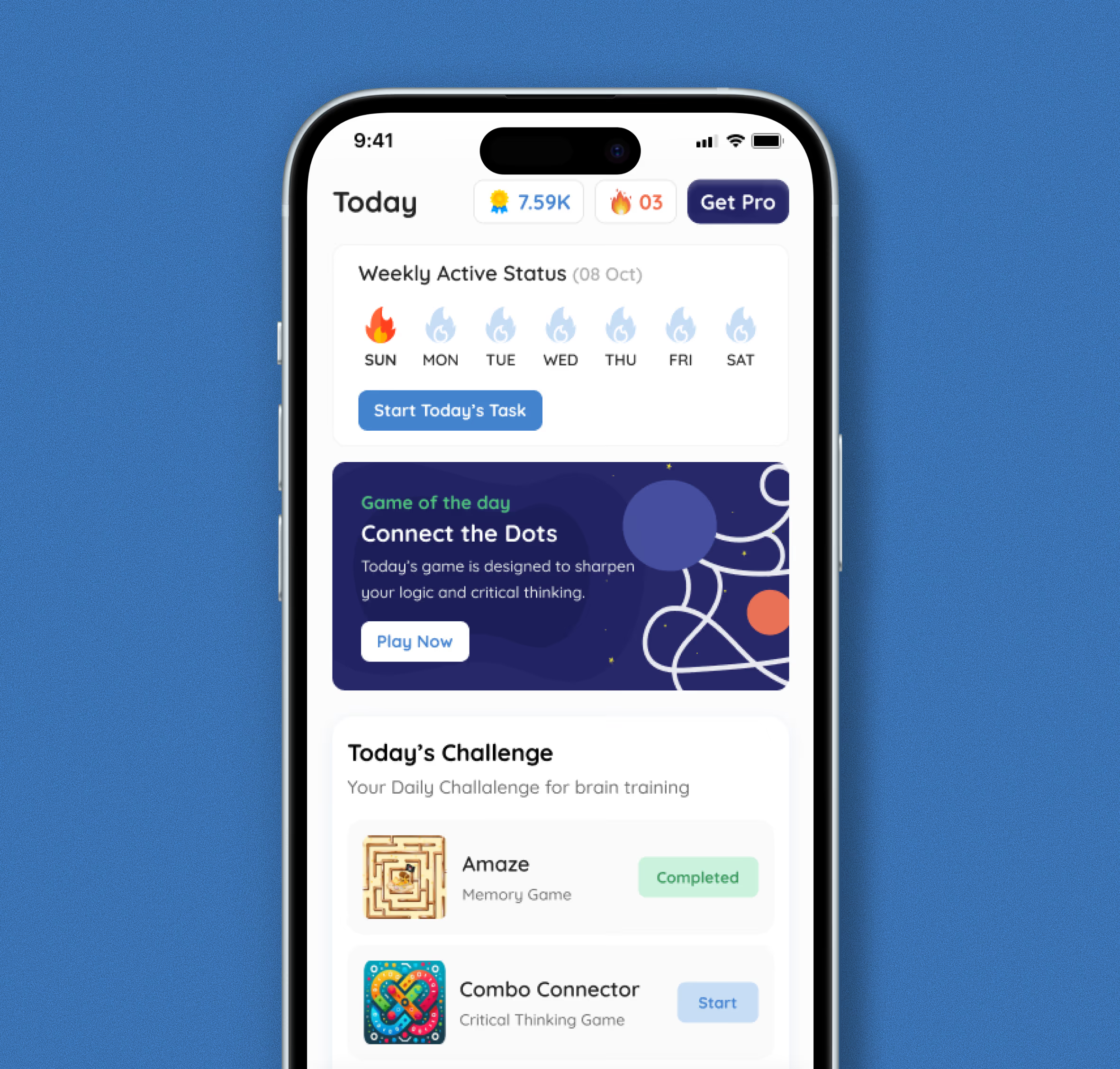
The solution centers on a dual-mode visual system: a bright, friendly blue-and-white language for onboarding, dashboards, and navigation, paired with immersive dark-mode screens for actual gameplay so each puzzle's colors and mechanics can shine. A single puzzle-piece brain icon and the Quicksand typeface tie every touchpoint together, from the app icon to level-complete celebration screens, so the brand feels consistent even as the games vary wildly in style. Card-based layouts on the home screen surface daily streaks, a "Game of the Day," and progress badges, turning a flat game menu into a motivating daily ritual. Clear iconography, benefit callouts like "Decision Making" and "Problem-Solving," and consistent pause/help controls across every game reduce cognitive load so users focus on playing, not figuring out the interface.