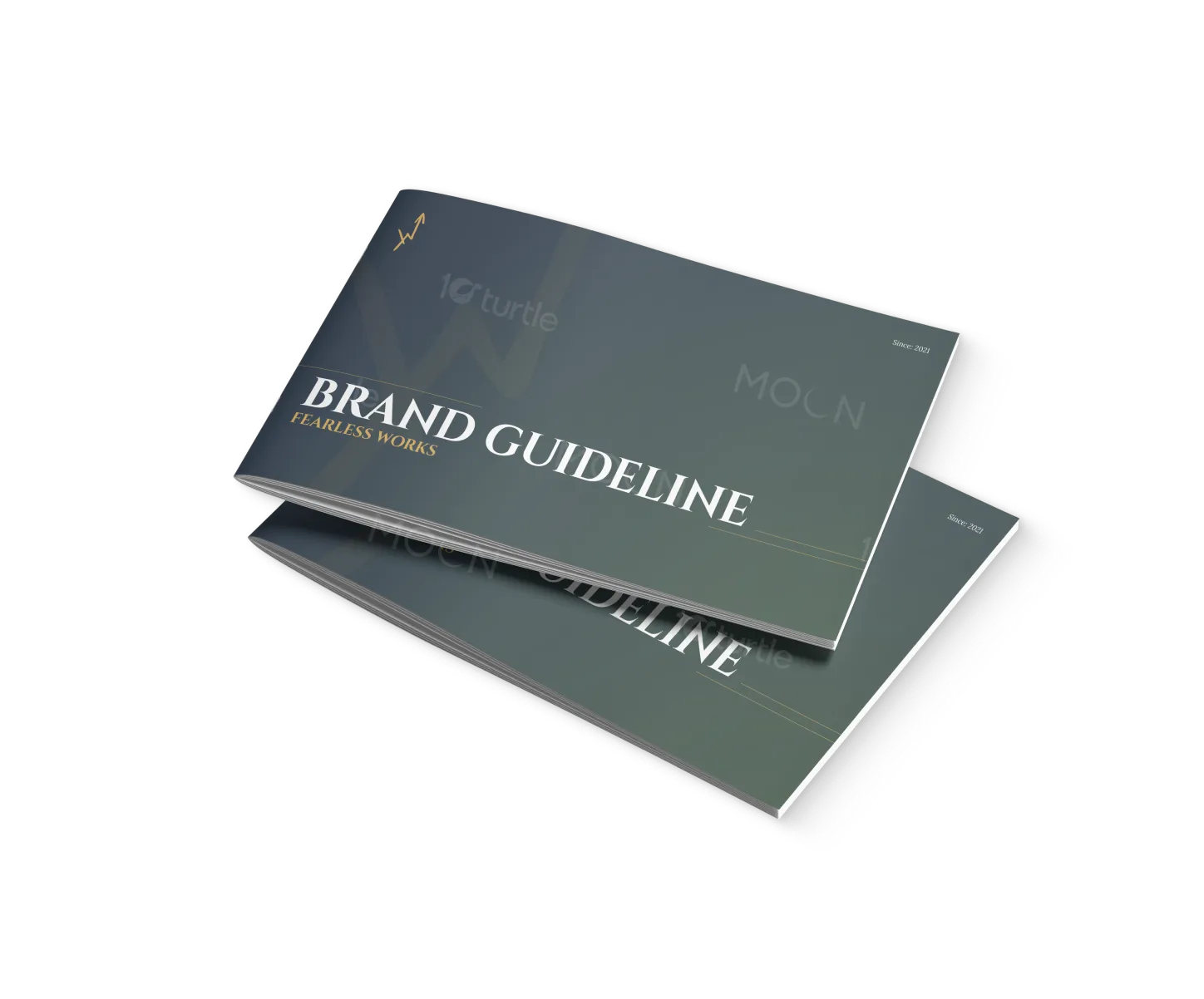
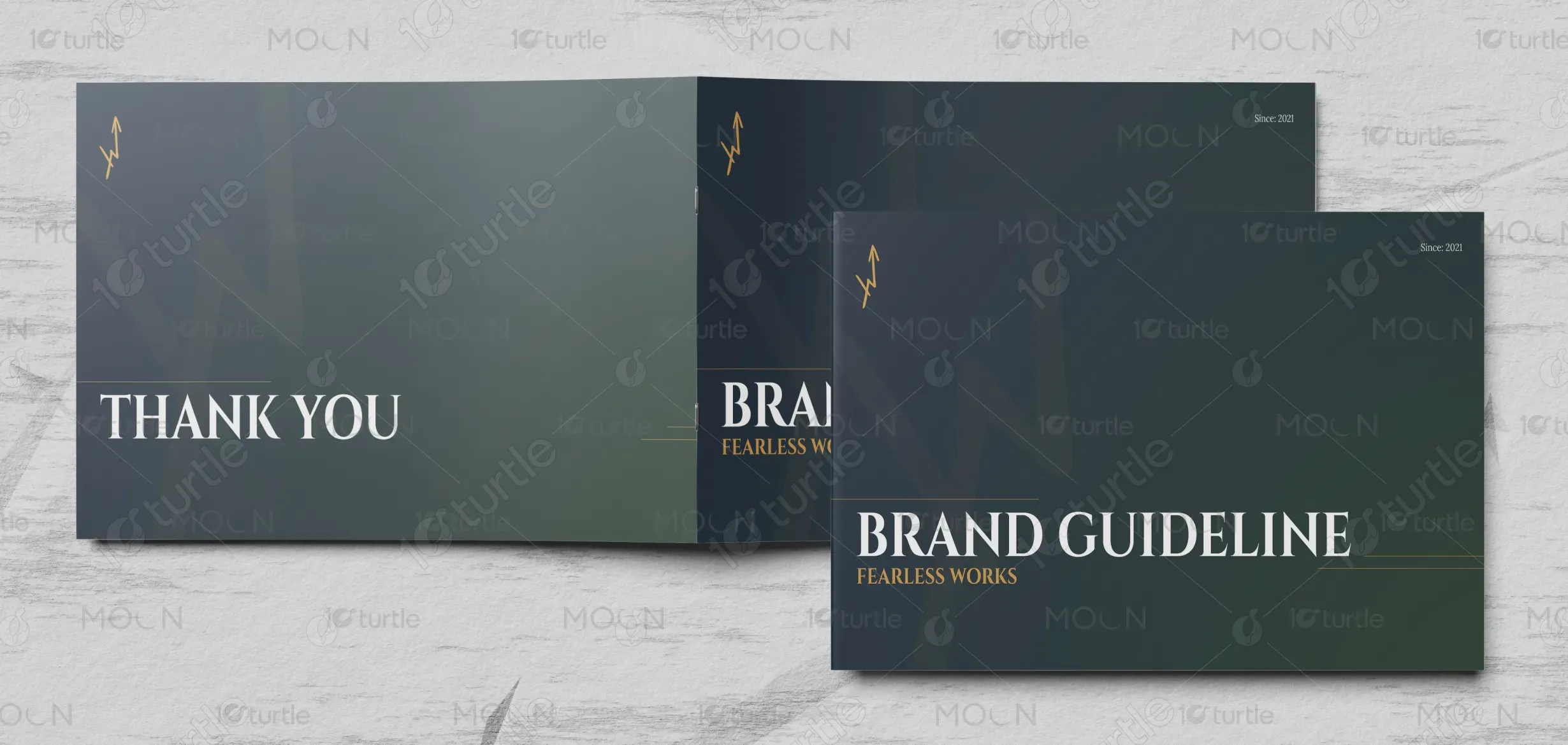
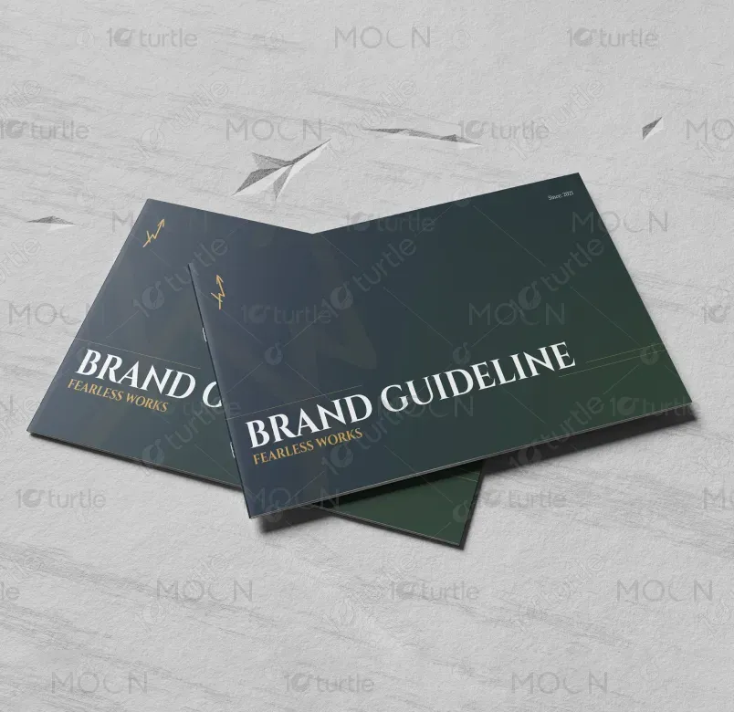
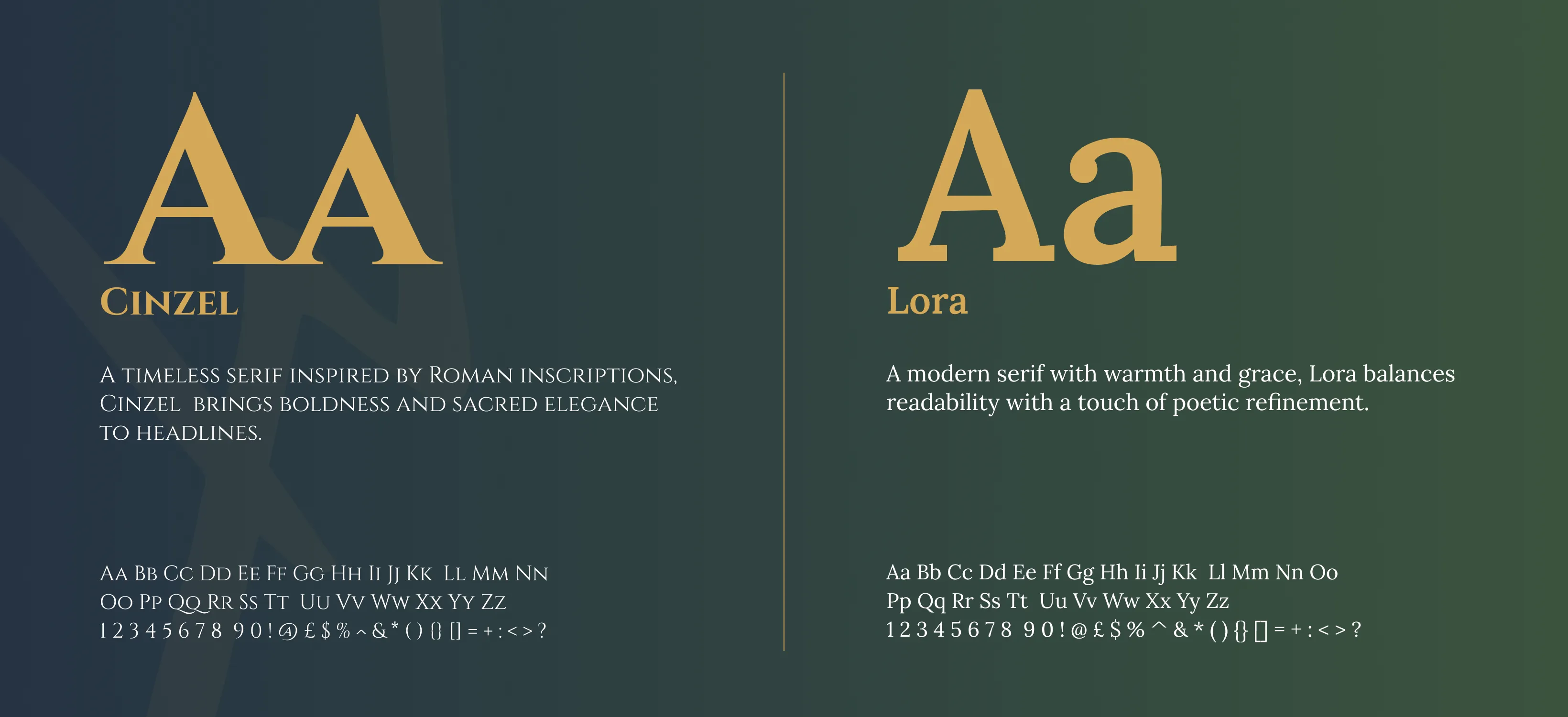
The design concept integrates strength and clarity, reflecting the mission of Fearless Works. With a dark, rich color palette of deep greens and gold, the design captures both professionalism and creativity. The typography balances boldness with elegance, aligning with the brand’s commitment to serving others with clarity. The imagery, consisting of thoughtful visuals, communicates the brand's focus on resilience, restoration, and impactful action. The design hierarchy emphasizes the most important elements to ensure clear messaging and accessibility across all mediums.
Brand Guide Design
Graphic Design
Industry
Civic, Government & Nonprofits
Tools we used


Project Completion
2025
Key Market
Global
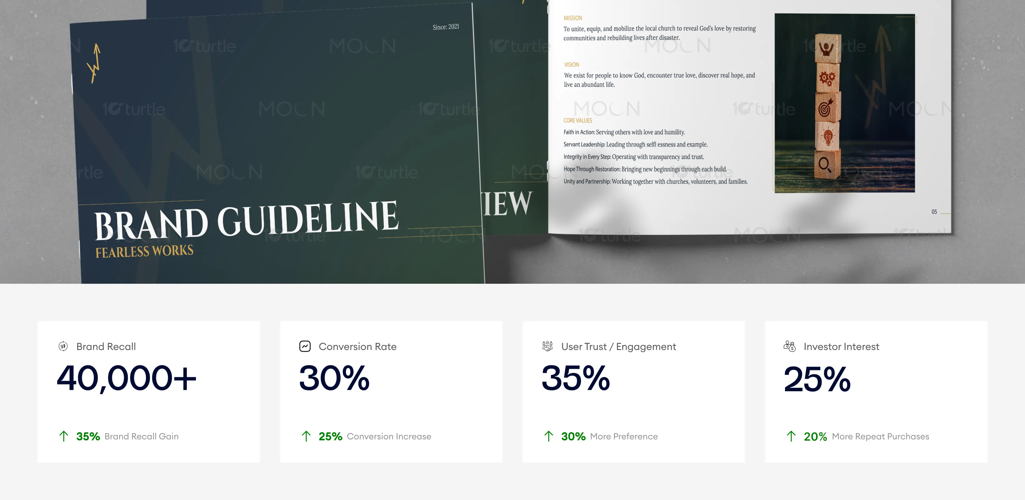
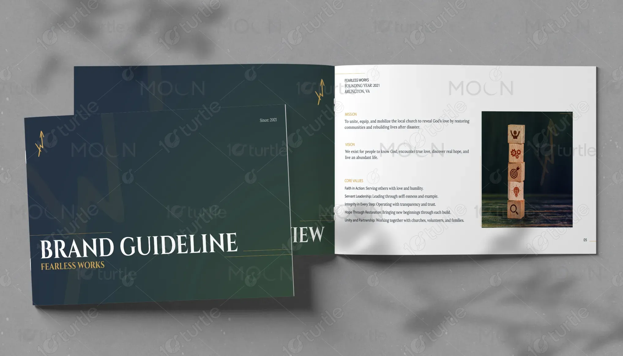
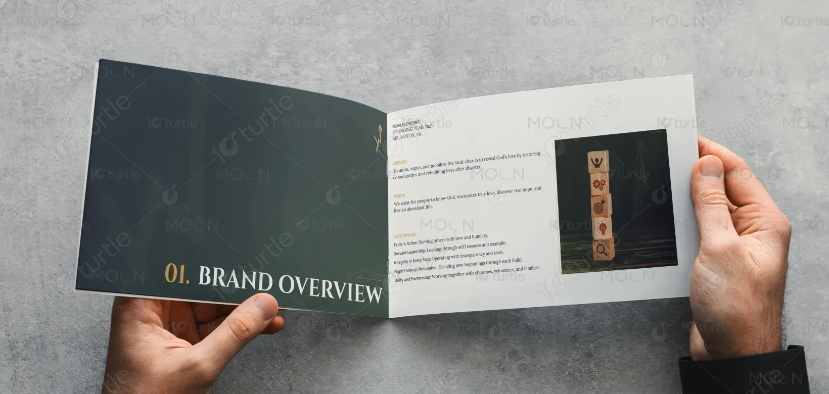
Fearless Works brand guide represents the essence of leadership and service in the nonprofit sector, focusing on empowerment through action. It outlines the visual identity, typography, color palette, and imagery that will unify the brand's communication across all touchpoints. The design’s primary purpose is to establish a strong, cohesive identity that reflects the organization's mission of rebuilding and restoring communities through faith and service.

Industry
Civic, Government & NonprofitsWhat we did
Brand Guide DesignGraphic DesignPlatform
-Many nonprofits face challenges with brand recognition and clarity in their messaging. Without a cohesive visual identity, organizations risk weak audience engagement and difficulty standing out in a crowded market. Fearless Works needed a brand that clearly communicated its core values, mission, and impact in a way that fostered trust and connection.
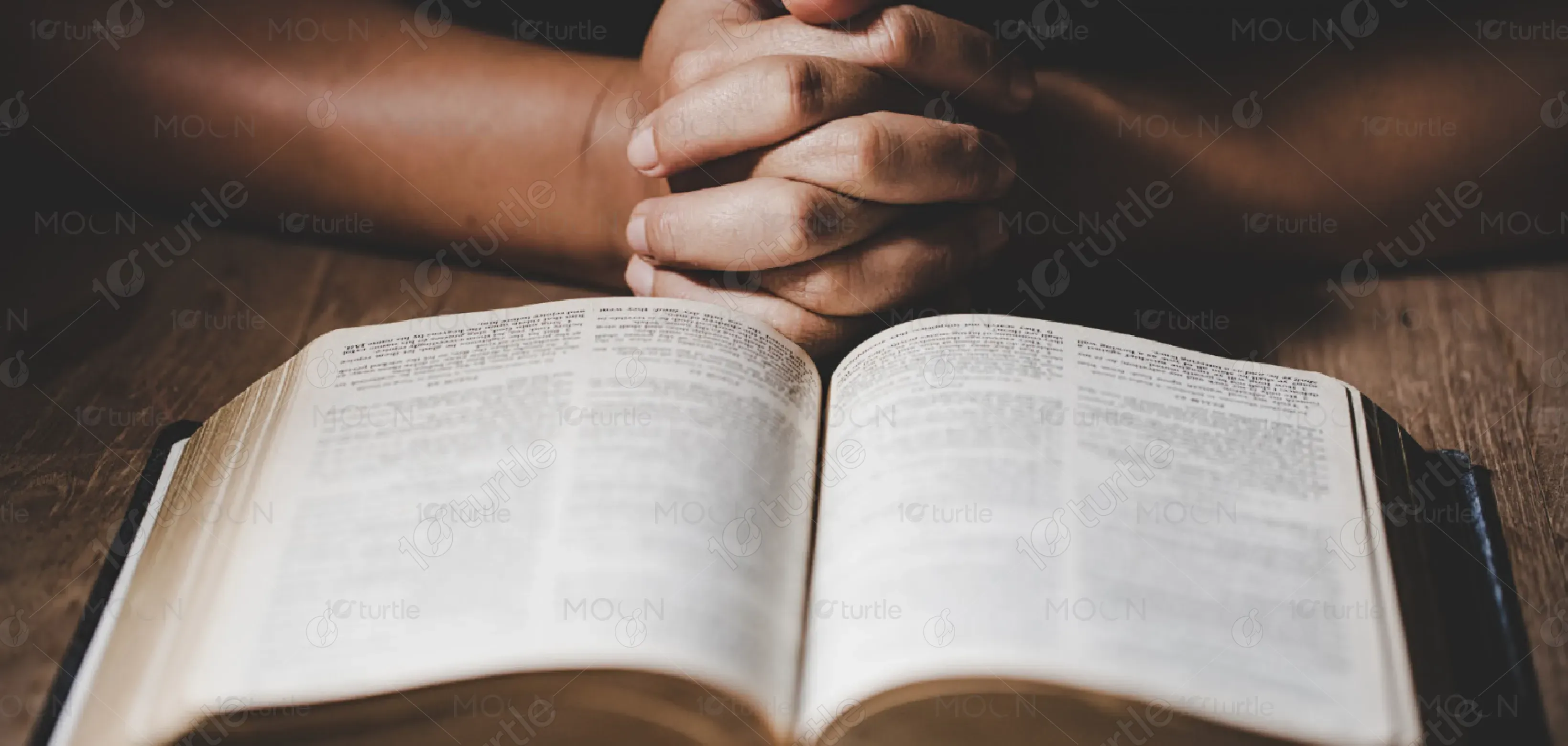
The design approach addresses these challenges by establishing a strong, consistent visual identity that aligns with Fearless Works mission. The design ensures clarity through a user-centric layout, accessible typography, and effective use of color. The brand guide includes elements that can be easily scaled across various platforms and materials, ensuring the brand’s message remains consistent and engaging. The strategic use of imagery adds depth to the narrative, reinforcing the themes of hope and restoration.
The branding design strategically combines strength with clarity, positioning the Fearless Works brand as a trusted and impactful organization. Its bold, rich visuals and thoughtful typography enhance brand recall and drive higher user engagement. Clear messaging combined with cohesive visuals will likely contribute to improved conversion rates and heightened interest from potential investors.
The long-term vision for Fearless Works is to expand its reach and deepen its community impact. The design supports this vision by establishing a strong visual foundation that is adaptable to future touch points, from digital to print materials. As the organization grows, this identity will help position Fearless Works as a trusted leader in disaster recovery and community rebuilding, creating a lasting emotional connection with audiences and stakeholders.
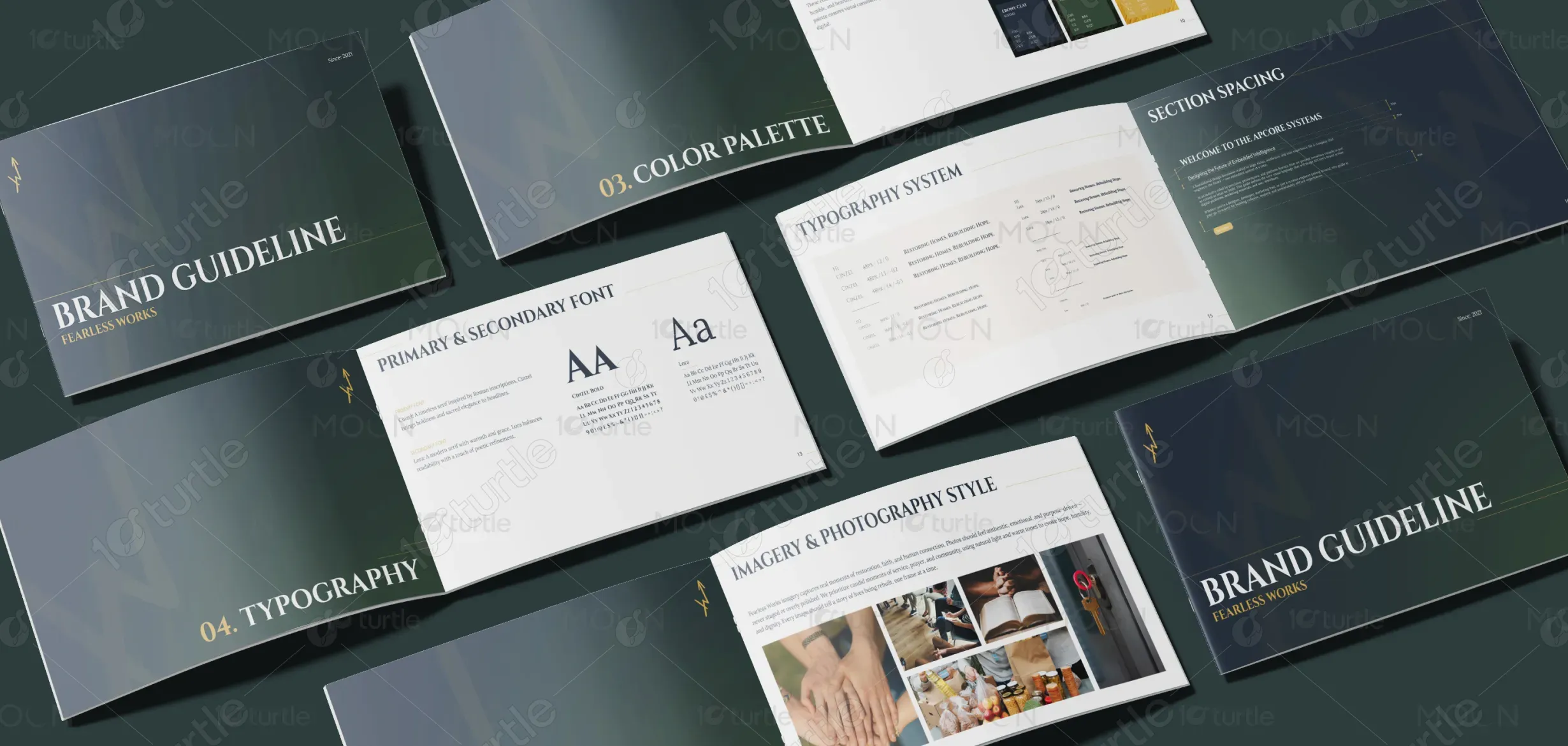
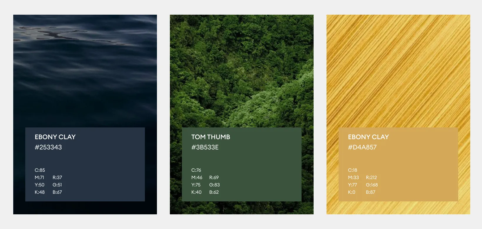
The Fearless Works color palette is rooted in restoration and resilience. Deep, grounding tones like Ebony Clay and Tom Thumb evoke stability, faith, and trust, while Di Serria adds a touch of warmth, hope, and light. These colors work in harmony to reflect the brand’s mission — steady, humble, and heartfelt. Paired with clean neutrals and accent tones, this palette ensures visual consistency across every touchpoint, from print to digital.