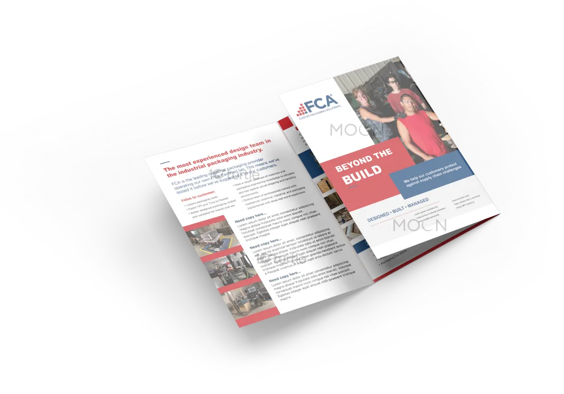
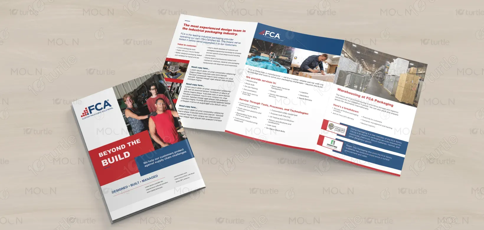
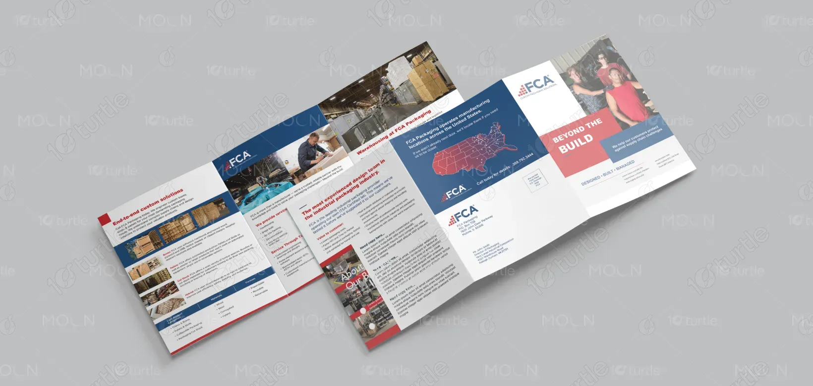
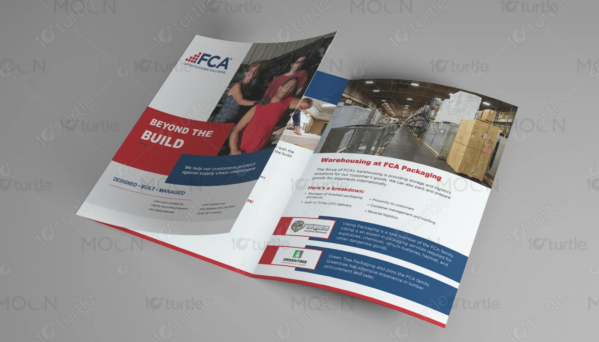
The brochure design adopts a professional and corporate aesthetic, emphasizing clarity and trust. A structured tri-fold layout is used to balance visuals and information effectively. Bold headlines in red highlight key offerings, while a clean white background ensures readability. The use of blue conveys reliability, stability, and professionalism, while supporting images add authenticity by showcasing real operations. The overall creative direction aligns with FCA’s industrial positioning—modern, minimal, and authoritative—designed to communicate value, expertise, and reliability in packaging solutions.
Tri-fold Design
Brochure Design
Graphic Design
Industry
Transport, Automotive & Logistics
Tools we used


Project Completion
2025
Key Market
Global
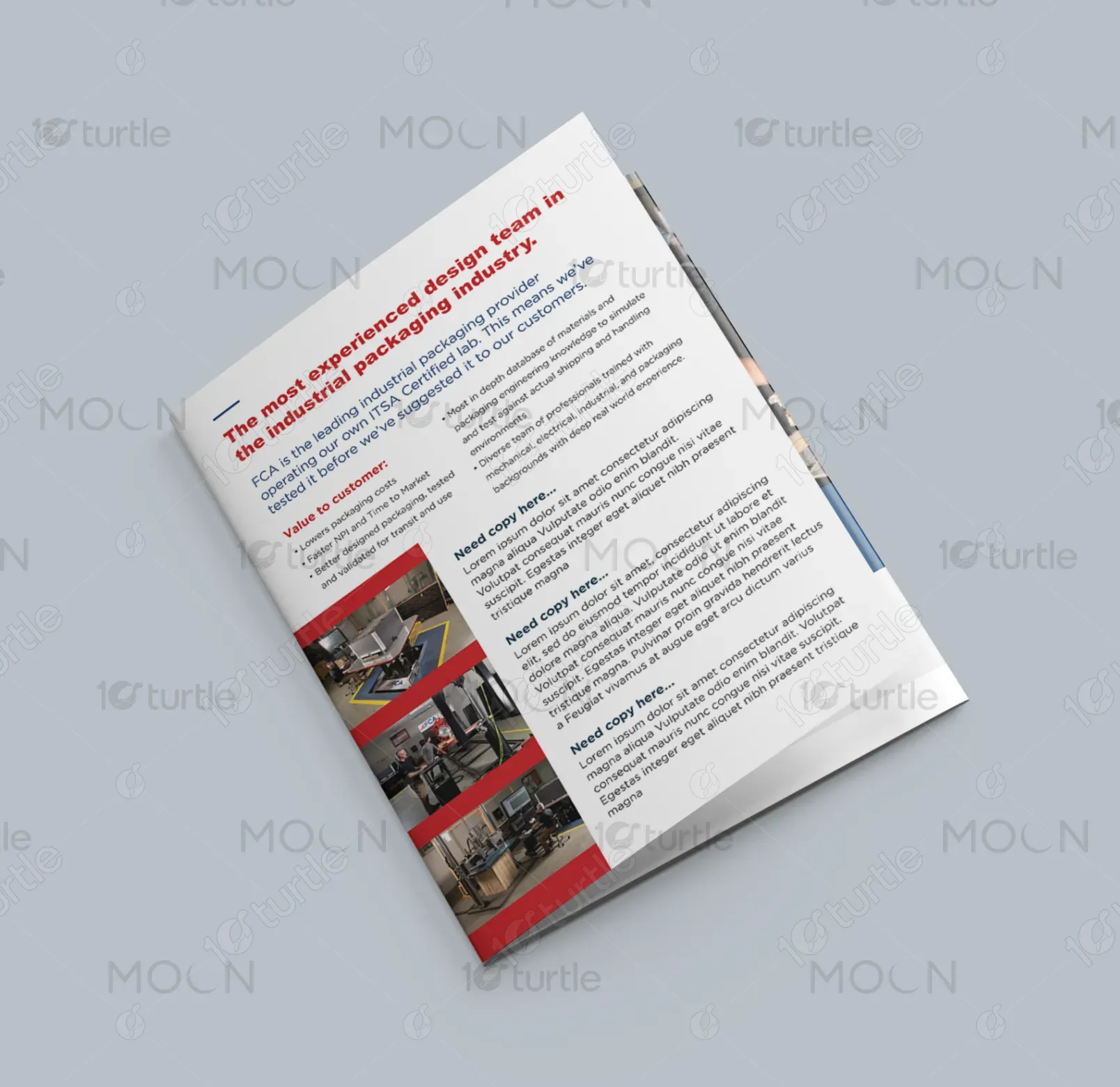
This tri-fold brochure highlights FCA Packaging’s end-to-end industrial packaging solutions. It serves as both a branding tool and an informative piece for potential clients in logistics, warehousing, and manufacturing sectors. Featuring detailed service descriptions, images of operations, and a nationwide presence map, it communicates FCA’s expertise, scale, and trustworthiness. The design ensures customers quickly understand FCA’s unique selling points: customized solutions, certified processes, and a strong distribution network. The brochure appeals through clarity, professionalism, and customer-focused messaging.
Industry
Transport, Automotive & LogisticsWhat we did
Tri-fold DesignBrochure DesignGraphic DesignPlatform
-Industrial clients often face challenges with packaging providers who deliver generic, one-size-fits-all solutions. This creates inefficiencies, increased costs, and risks during global shipping and warehousing. Many companies lack access to providers who combine custom design expertise, certified testing, and large-scale manufacturing under one roof. As a result, businesses deal with fragmented services, inconsistent quality, and logistical hurdles, which ultimately impact timelines and customer satisfaction.
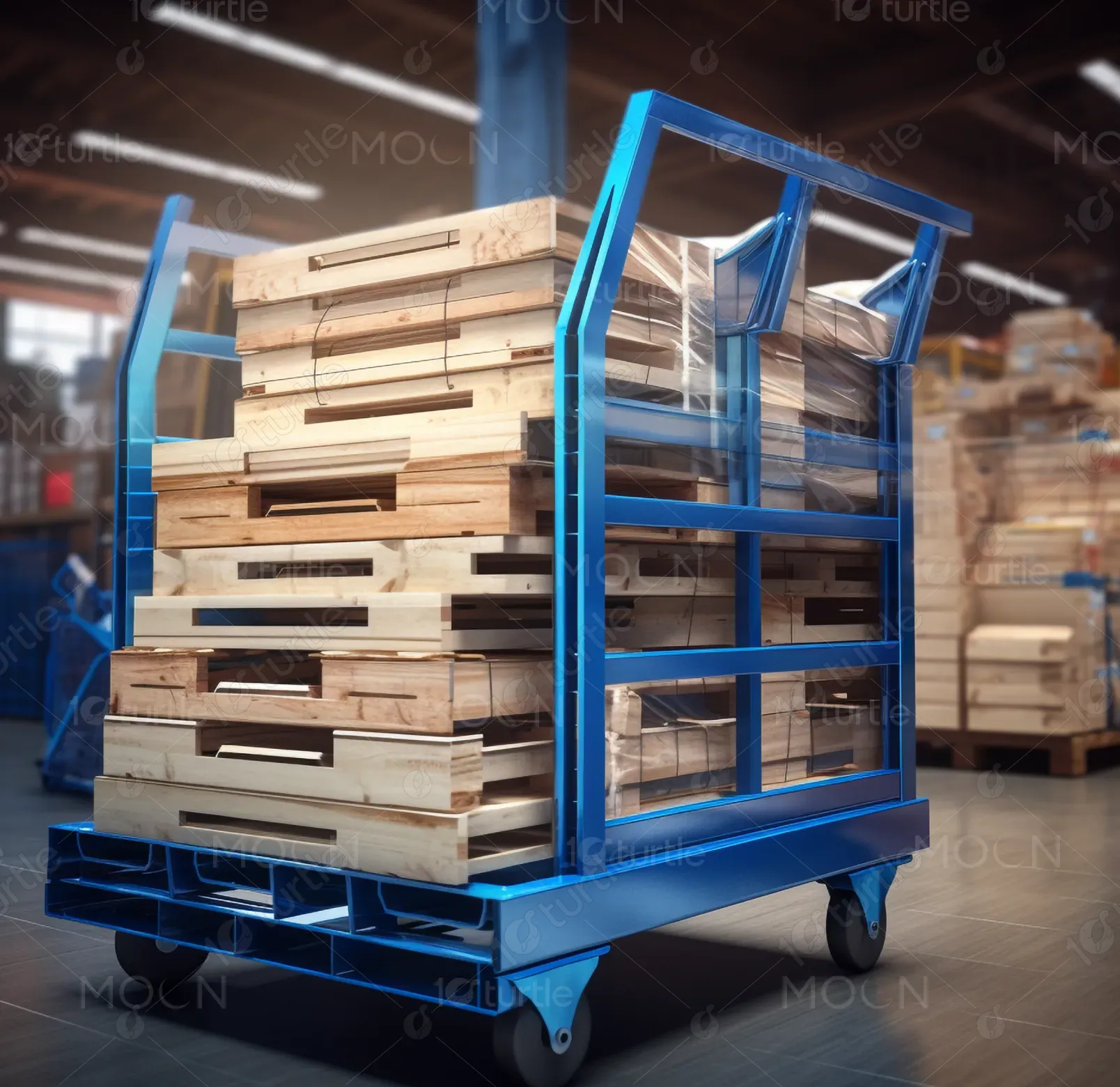
FCA Packaging solves this gap by offering tailored, end-to-end industrial packaging solutions. The brochure emphasizes FCA’s in-house design team, certified testing facilities, nationwide warehousing, and strong logistics support. By showcasing expertise in wood, corrugate, and hybrid solutions, FCA positions itself as a single trusted partner that reduces costs, improves time-to-market, and ensures safe global transportation. The streamlined message, visuals of real operations, and strong brand identity assure clients of both reliability and scalability.

FCA Packaging envisions becoming the leading global partner for industrial packaging by continually innovating design, sustainability, and logistics solutions. The brand aims to set new industry standards in certified testing, customer-centric flexibility, and environmentally responsible materials. Long-term, FCA seeks to strengthen its footprint by expanding its manufacturing network, integrating advanced technology, and offering smarter, more sustainable packaging solutions that redefine efficiency and trust in industrial logistics.

The brochure uses a red, blue, and white palette. Blue symbolizes trust, professionalism, and reliability—qualities central to FCA’s brand identity. Red conveys energy, urgency, and strength, drawing attention to headlines and key service highlights. White creates a clean, structured canvas, enhancing readability and reinforcing transparency. Together, the colors reflect authority, clarity, and customer focus, while aligning with industrial and corporate standards that evoke confidence and long-term reliability.