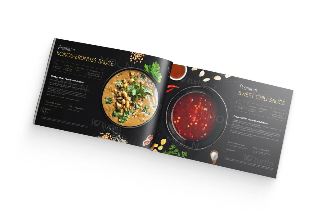
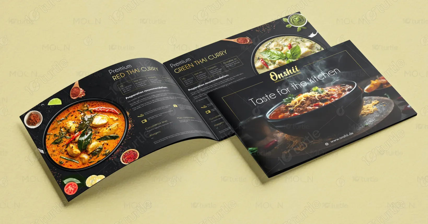
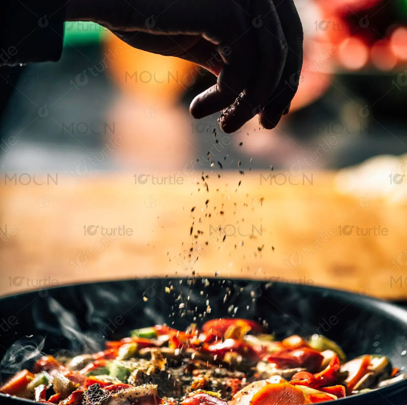
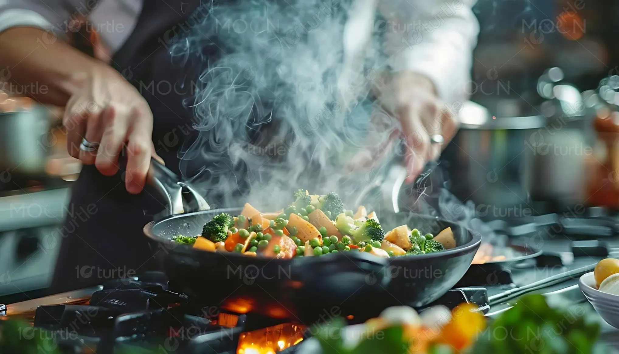
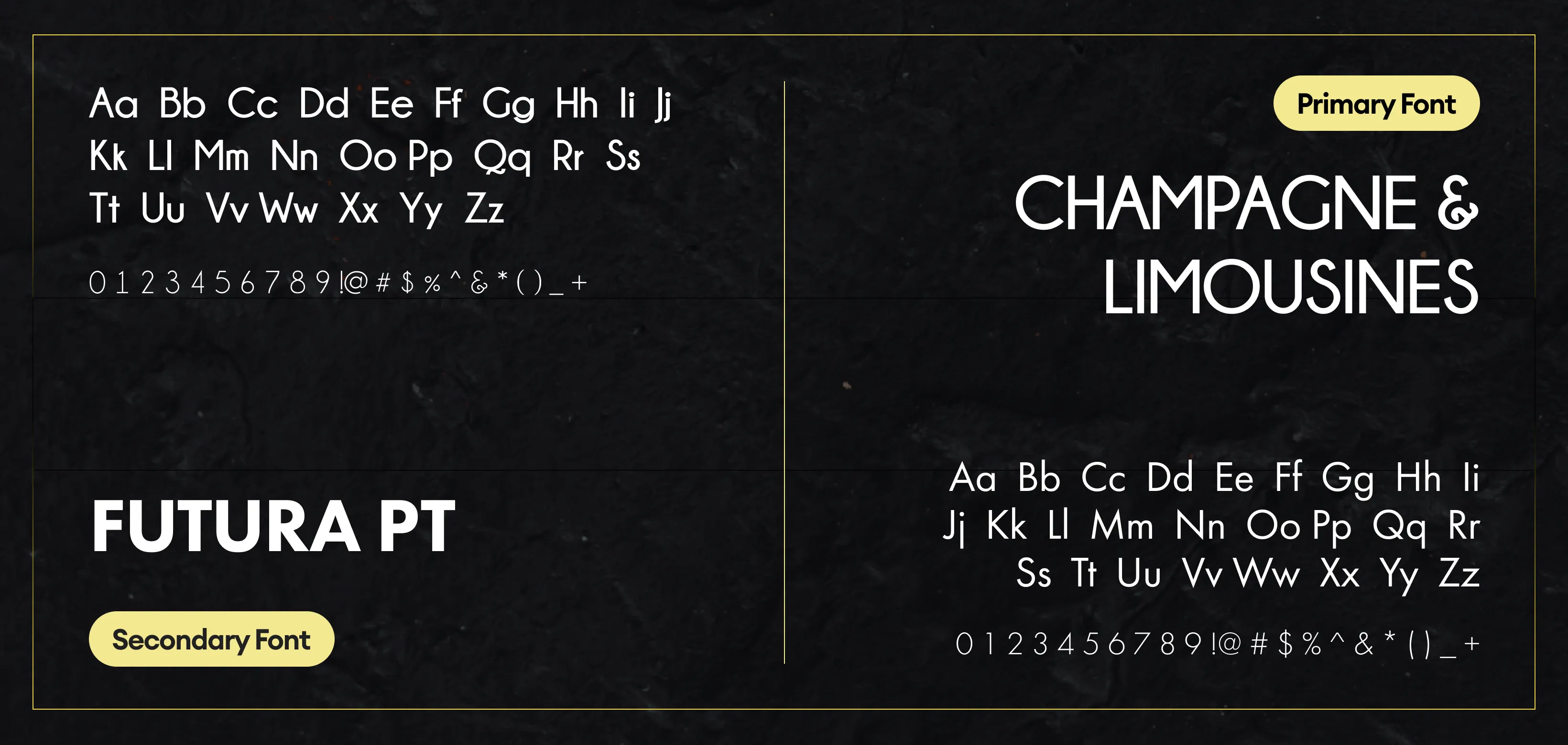
This brochure design embraces a premium culinary aesthetic, combining rich dark backgrounds with vibrant food imagery to create a luxurious and appetizing visual experience. The use of high-contrast lighting highlights the textures and freshness of each dish, while gold accents add a touch of elegance and sophistication. Clean typography ensures readability without overpowering the visuals. The layout is structured yet dynamic, guiding the viewer seamlessly through each product while maintaining a consistent brand identity rooted in quality, flavor, and authenticity.
Landscape Brochure Design
Graphic Design
Industry
Food, Beverage & Hospitality
Tools we used


Project Completion
2025
Key Market
Global
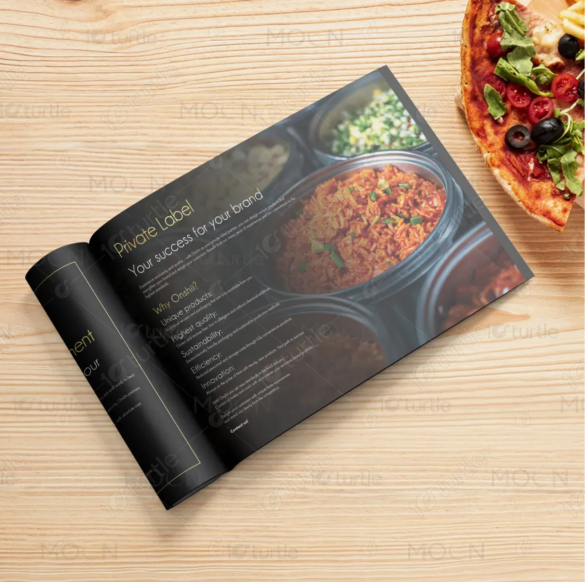
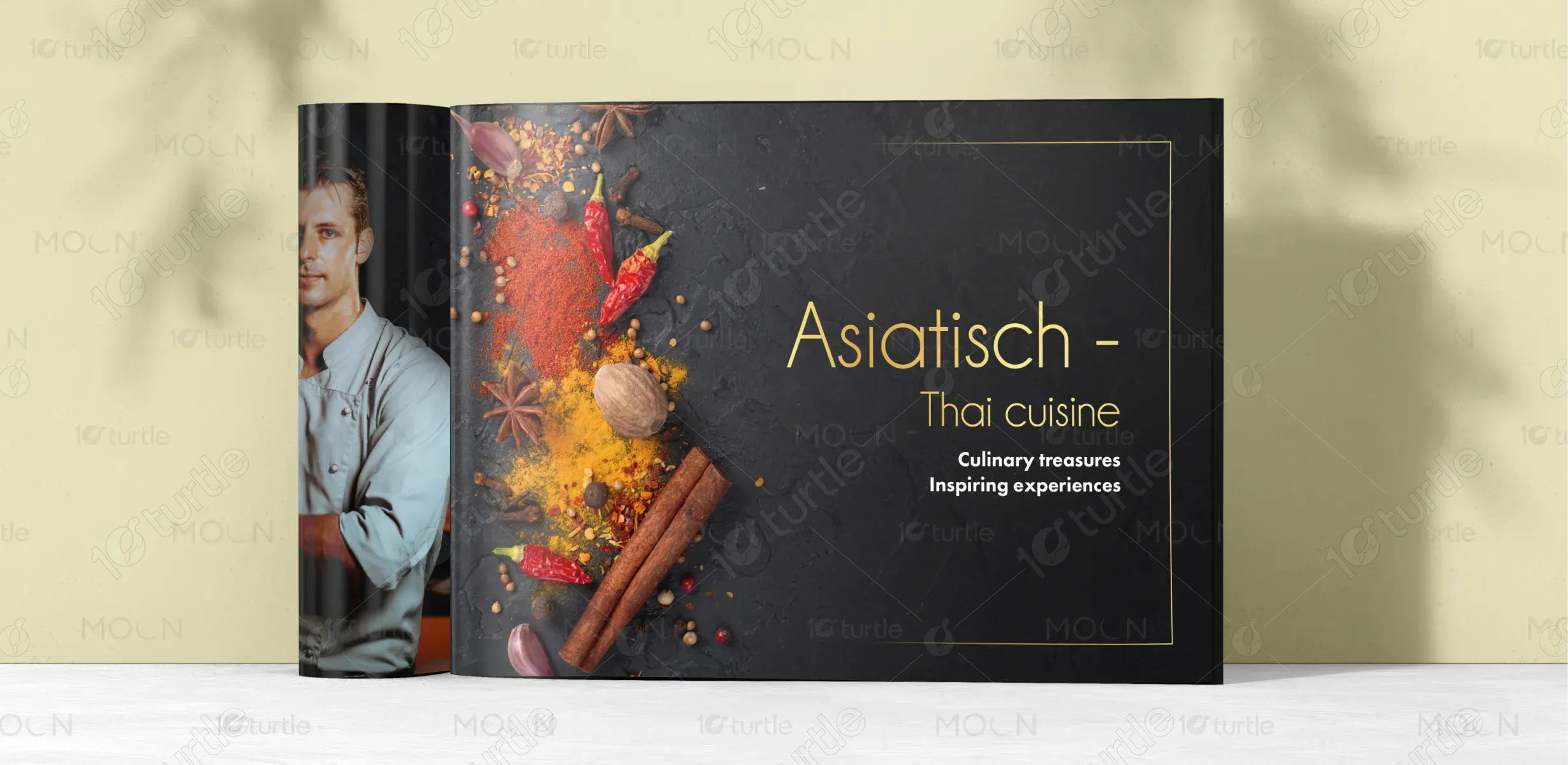
The brochure showcases a premium range of Thai-style ready-to-cook dishes under the Onshii brand. It is designed to highlight product quality, ingredients, and preparation simplicity while appealing to modern consumers who value convenience without compromising taste. The design blends gourmet presentation with informative content, making it suitable for both retail and B2B markets. Its strong visual appeal and structured layout enhance brand perception, positioning Onshii as a high-end, authentic culinary solution provider.
Industry
Food, Beverage & HospitalityWhat we did
Landscape Brochure DesignGraphic DesignPlatform
-In the ready-to-cook food market, many brands struggle to visually communicate premium quality and authenticity. Packaging and brochures often appear generic, lacking emotional appeal and failing to differentiate products on crowded shelves. Consumers find it difficult to trust the quality or origin of such products due to poor presentation. Additionally, overly text-heavy or cluttered layouts reduce engagement, making it hard for users to quickly understand product benefits, preparation methods, and key ingredients.
This design addresses the problem by focusing on strong visual storytelling through high-quality food imagery and a clean, structured layout. The use of dark backgrounds enhances contrast, making dishes appear more vibrant and appealing. Clear typography and organized sections improve readability and quick information access. Subtle graphical elements and icons simplify complex information like preparation steps. The premium color accents reinforce brand value, helping the product stand out while building trust and appetite appeal simultaneously.
The vision for Onshii is to become a globally recognized name in premium ready-to-cook cuisine, known for authenticity, quality, and innovation. The brand aims to bridge the gap between convenience and gourmet dining by offering products that deliver restaurant-quality experiences at home. Over time, Onshii seeks to expand its product range, enter international markets, and build a strong emotional connection with consumers through consistent branding, exceptional taste, and visually compelling design communication.
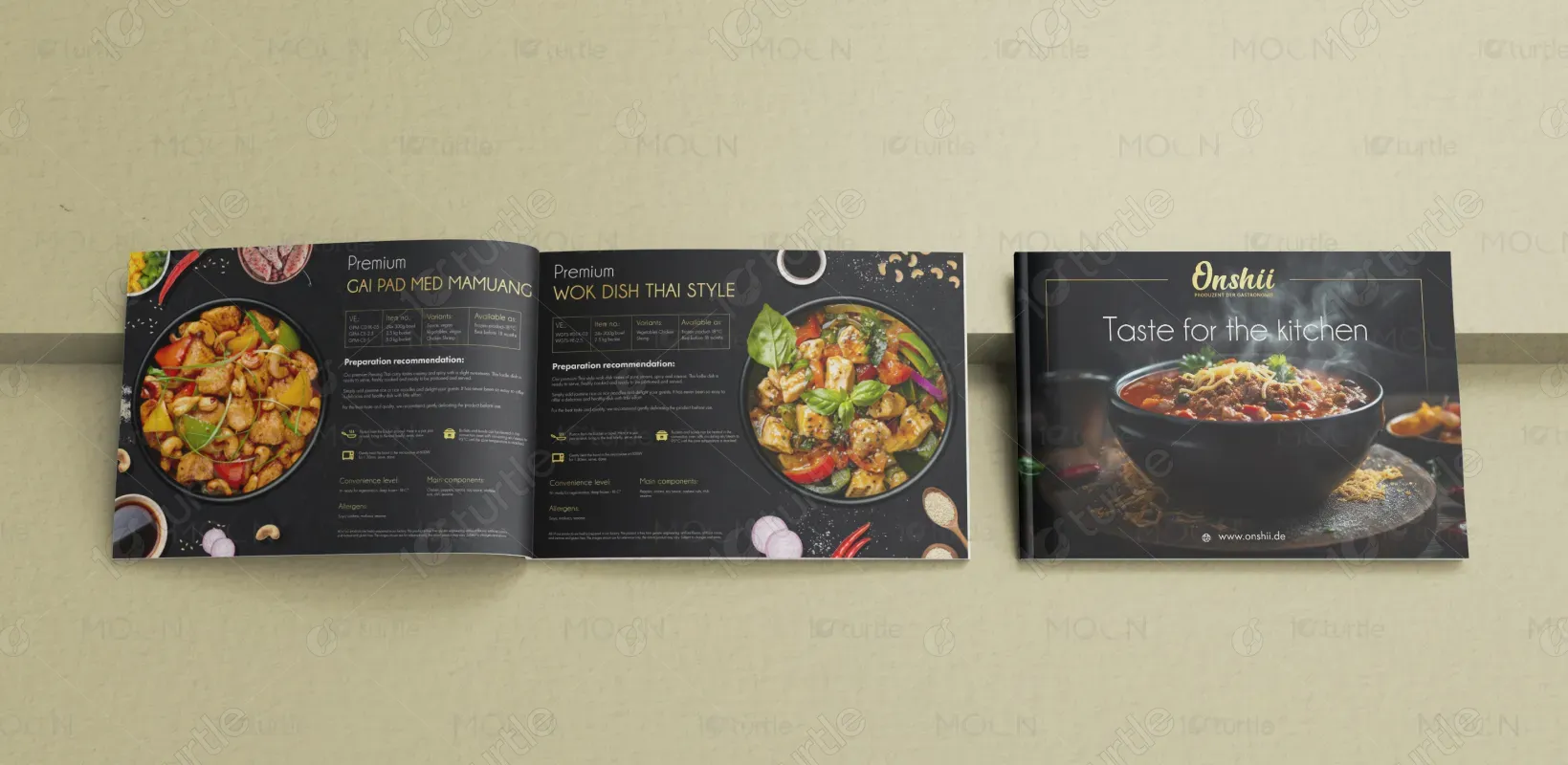
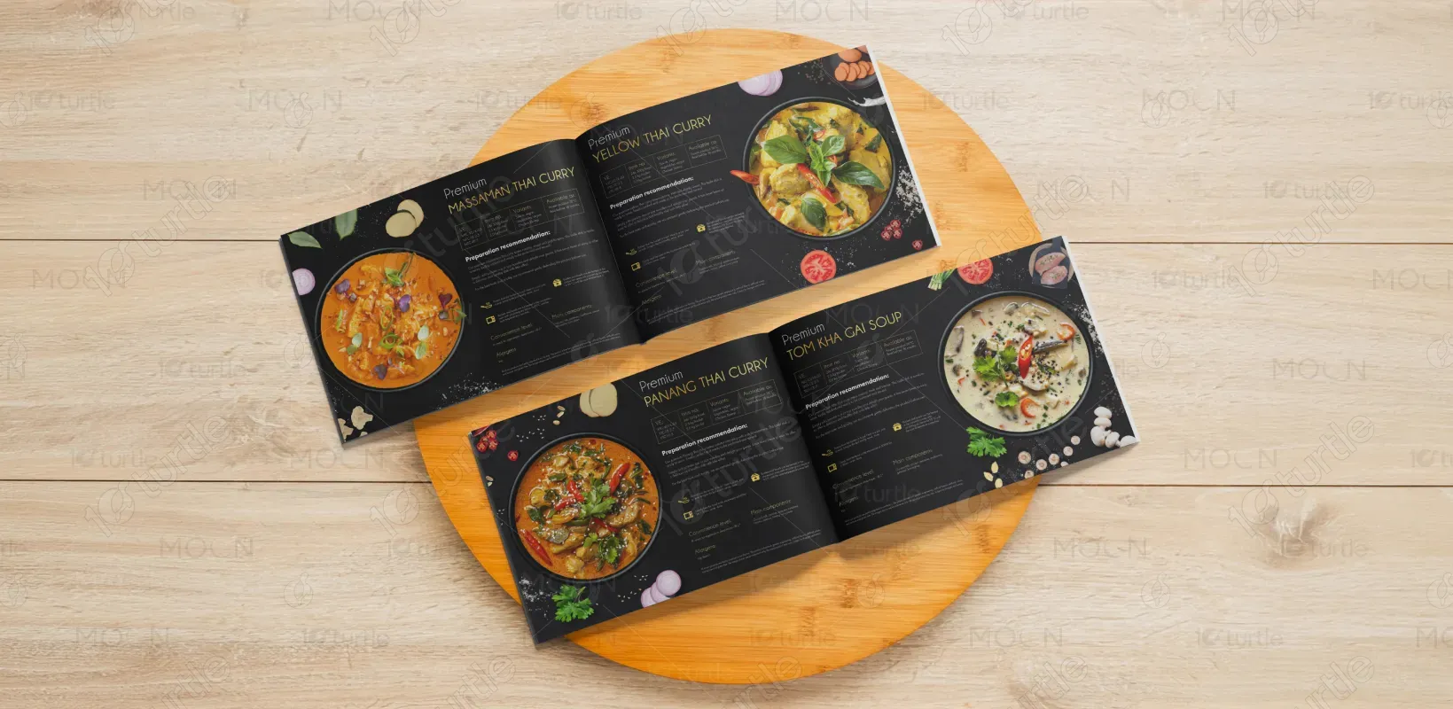
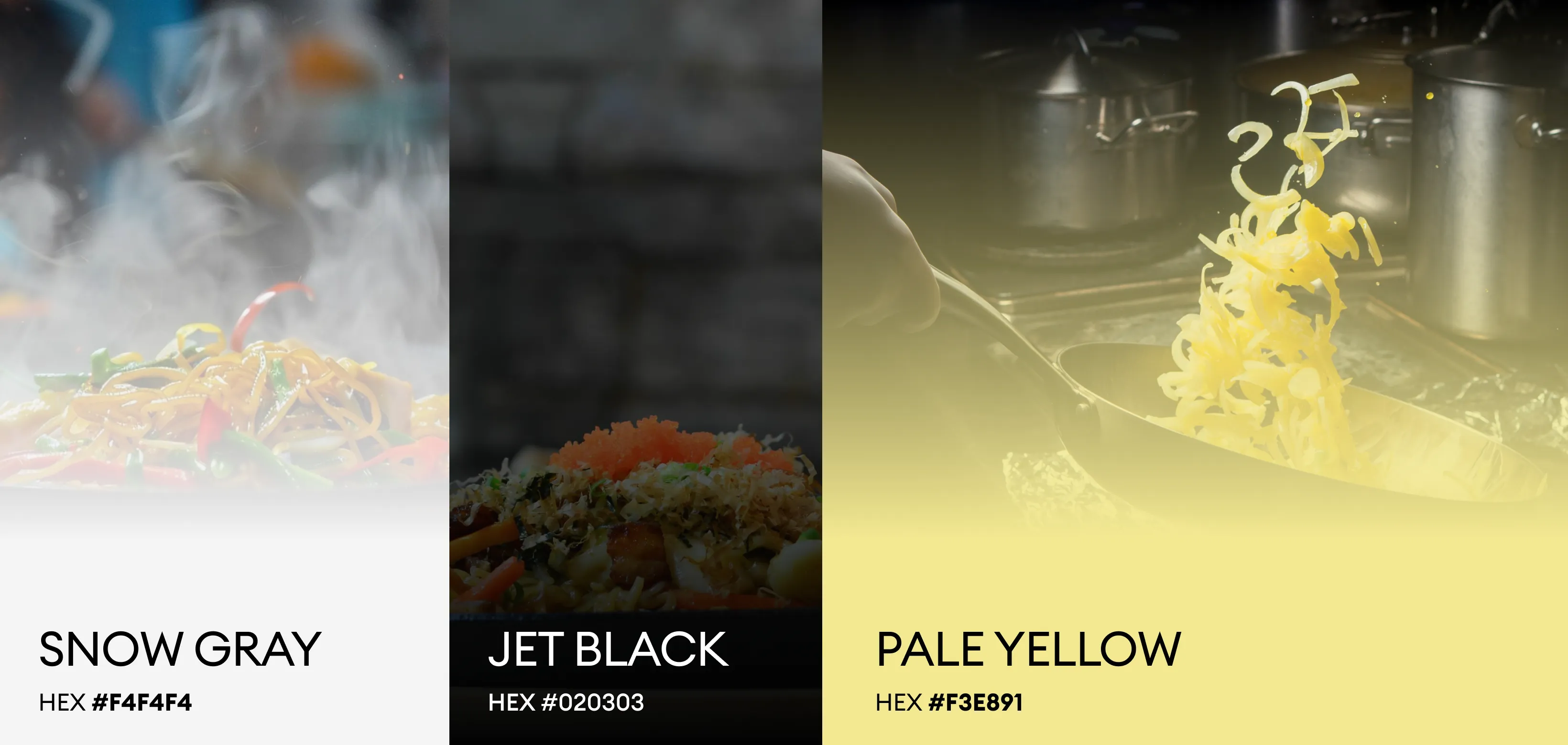
The color palette is centered around deep charcoal black, warm golden tones, and vibrant food colors. The dark background creates a premium and elegant base, allowing the dishes to stand out visually. Gold accents symbolize quality, richness, and sophistication, reinforcing the brand’s high-end positioning. Fresh ingredient colors like green, red, and yellow add vibrancy and evoke appetite appeal. Together, the palette creates a balanced composition that feels modern, luxurious, and highly engaging.