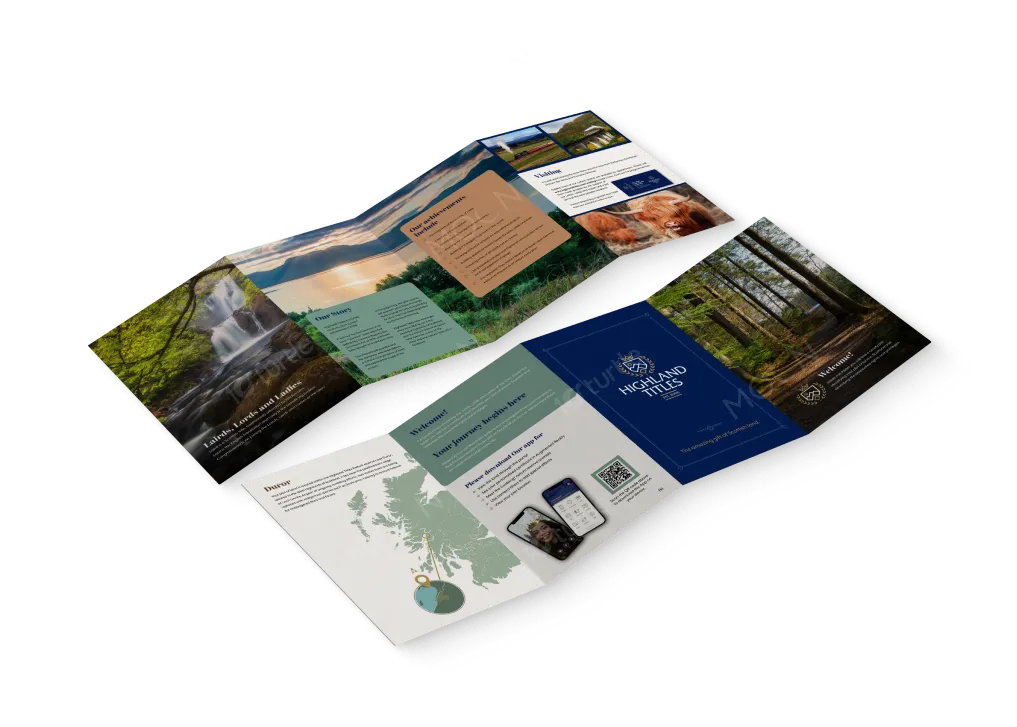
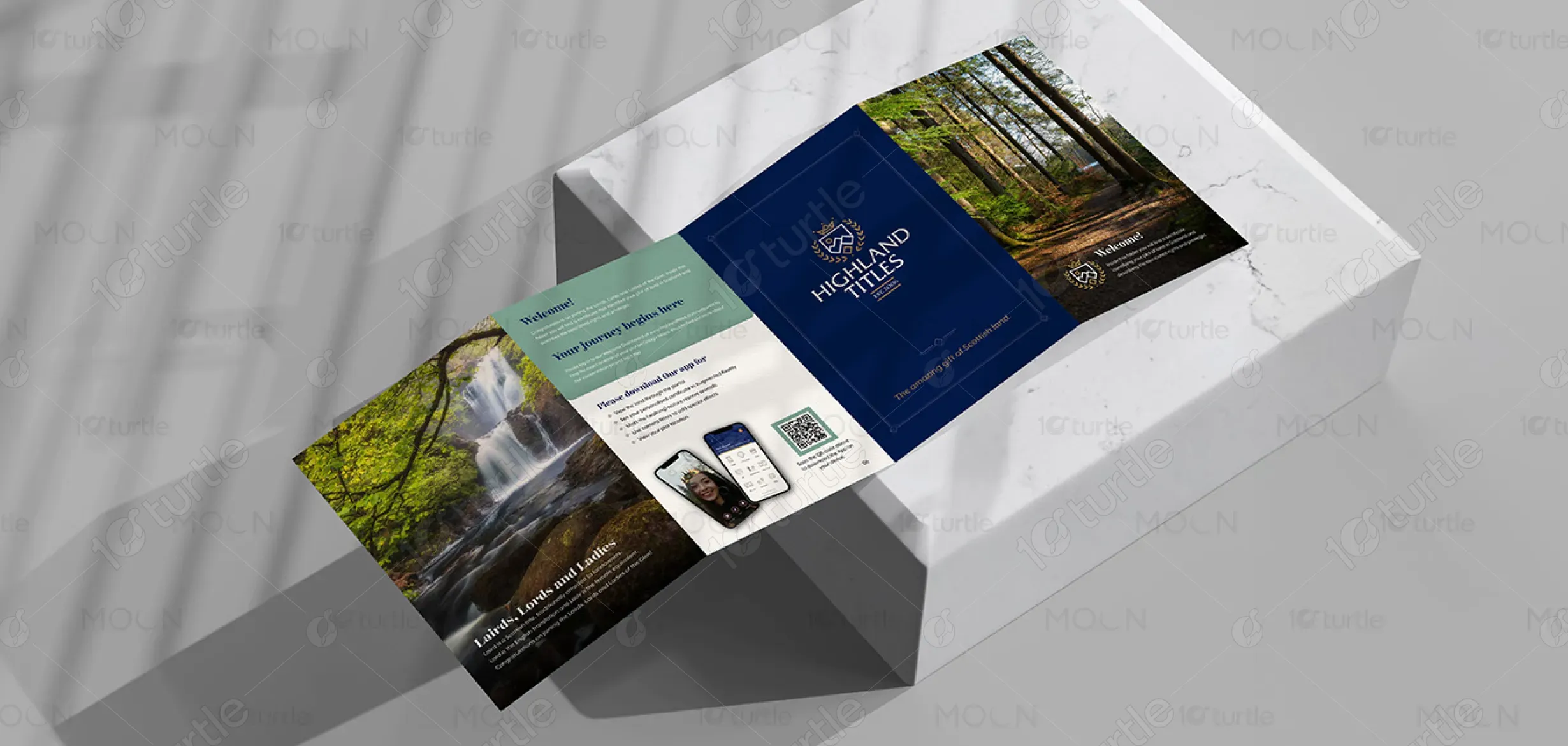
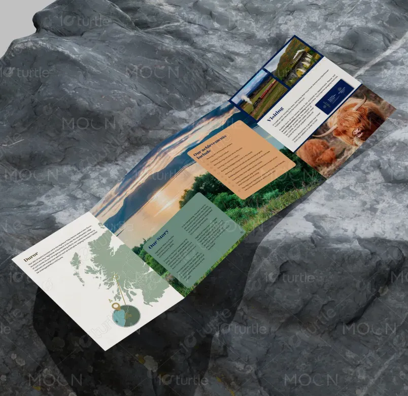
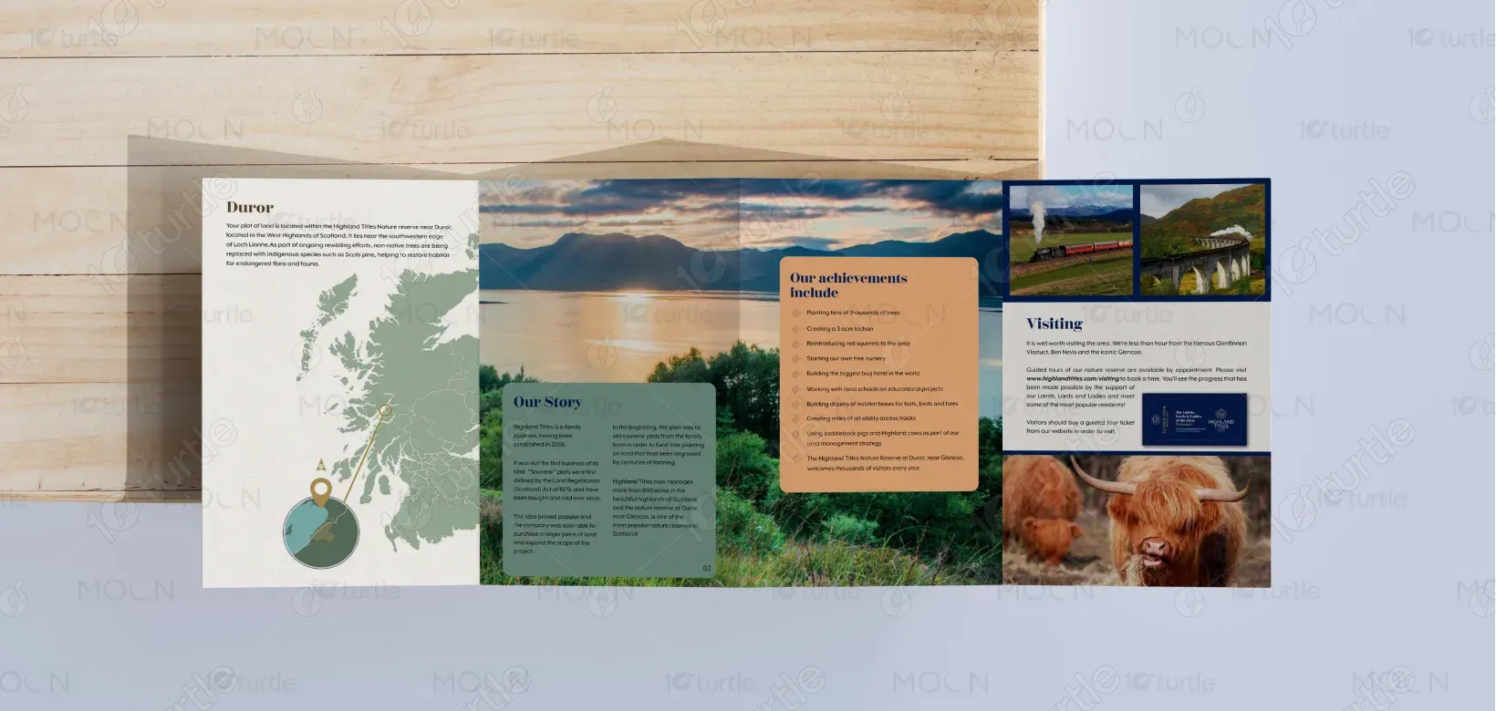
The design embodies the rustic and timeless essence of the Scottish Highlands. The brochure uses earthy tones and organic textures, reflecting the brand’s commitment to preserving the landscape and heritage. The layout offers a mix of informative sections and striking visuals, including maps and images of nature. It is designed to create an engaging narrative, allowing the audience to connect emotionally with the project’s mission. The overall creative direction evokes a sense of adventure, sustainability, and authenticity.
Brochure Design
Graphic Design
Industry
Travel, Tourism & Experiences
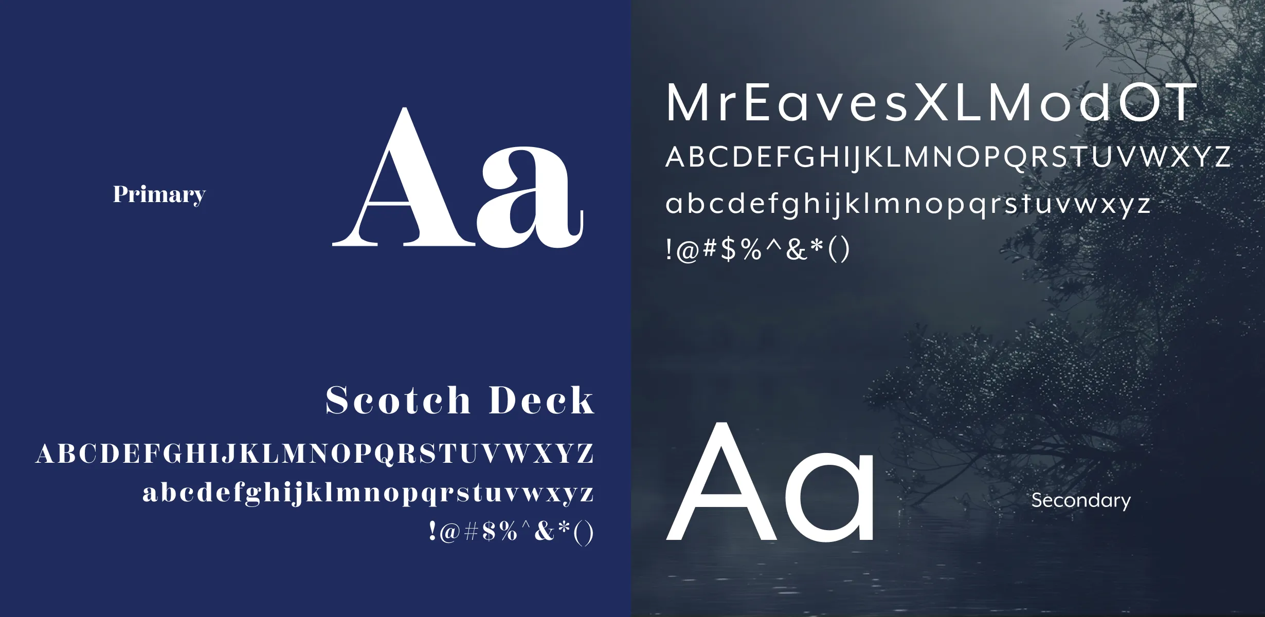
Tools we used


Project Completion
2025
Key Market
Global
Highland Titles offers a unique opportunity for individuals to become part of a conservation project by purchasing small plots of land in the Scottish Highlands. The brochure outlines the company’s mission to preserve the environment while offering customers a chance to protect land, earn a title, and contribute to conservation efforts. With its eco-friendly approach, Highland Titles combines environmental responsibility with a personal and memorable experience, giving buyers a chance to leave a lasting legacy.
Industry
Travel, Tourism & ExperiencesWhat we did
Brochure DesignGraphic DesignPlatform
-Many conservation organizations struggle to engage customers emotionally and effectively communicate the benefits of land ownership. The gap exists in conveying the personal connection that one can have with the land while also highlighting the environmental responsibility. The challenge lies in creating a visual identity that not only conveys this emotional connection but also differentiates the brand from other conservation efforts.
The Highland Titles brochure uses evocative imagery and a simple, clean design to highlight both the personal and environmental aspects of land ownership. By focusing on the unique appeal of becoming a "Lord" or "Lady" of the land, the brochure makes the experience more accessible, memorable, and emotionally engaging. The information is well-organized, and the use of visuals complements the message of sustainability, creating a deeper connection between the consumer and the cause.
The vision for Highland Titles is to grow as a leader in land conservation while making environmental responsibility accessible to a wider audience. The brand aims to become a lasting symbol of sustainability and community involvement, expanding its impact in preserving the Scottish Highlands. The long-term goal is to establish a larger network of like-minded individuals committed to environmental stewardship while creating a personal connection to Scotland’s natural beauty.
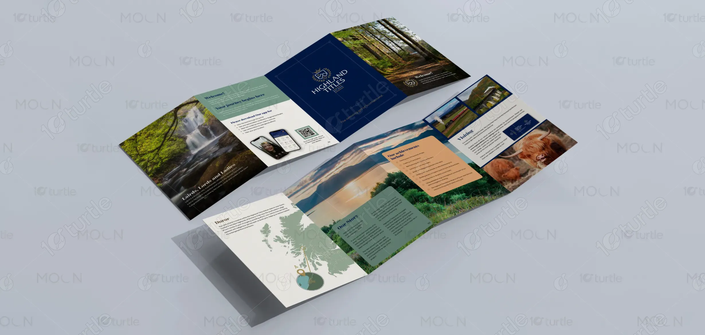
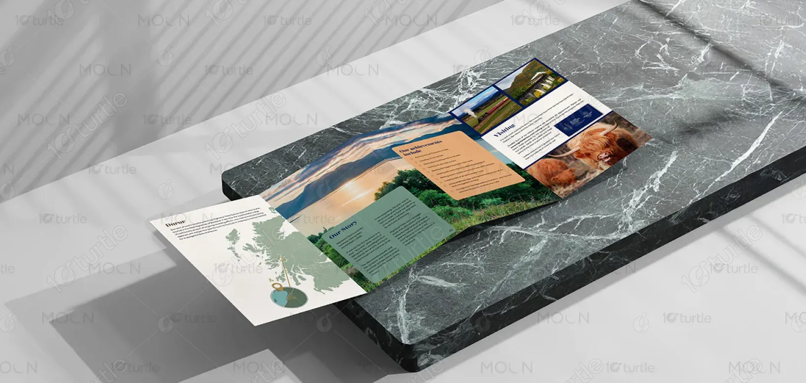
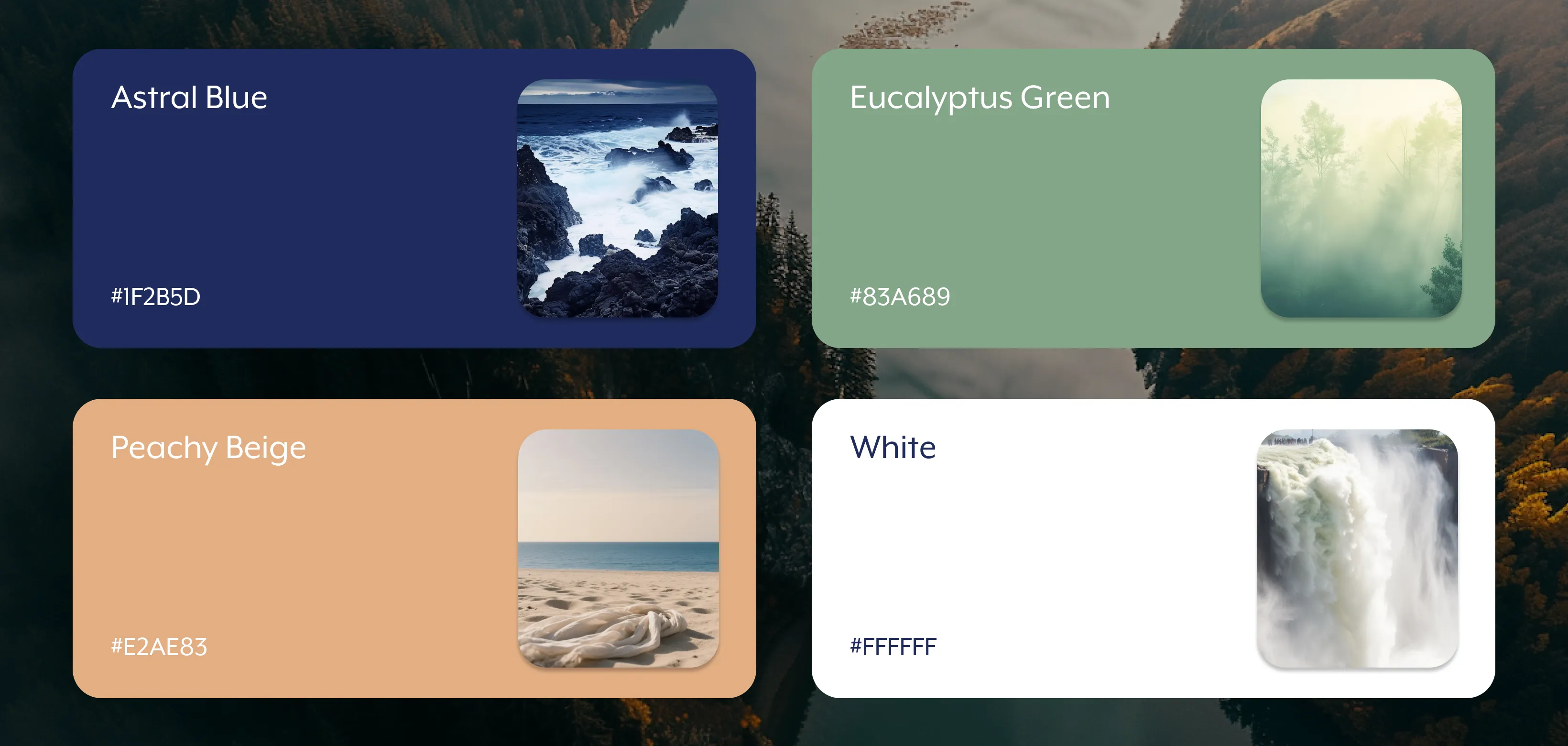
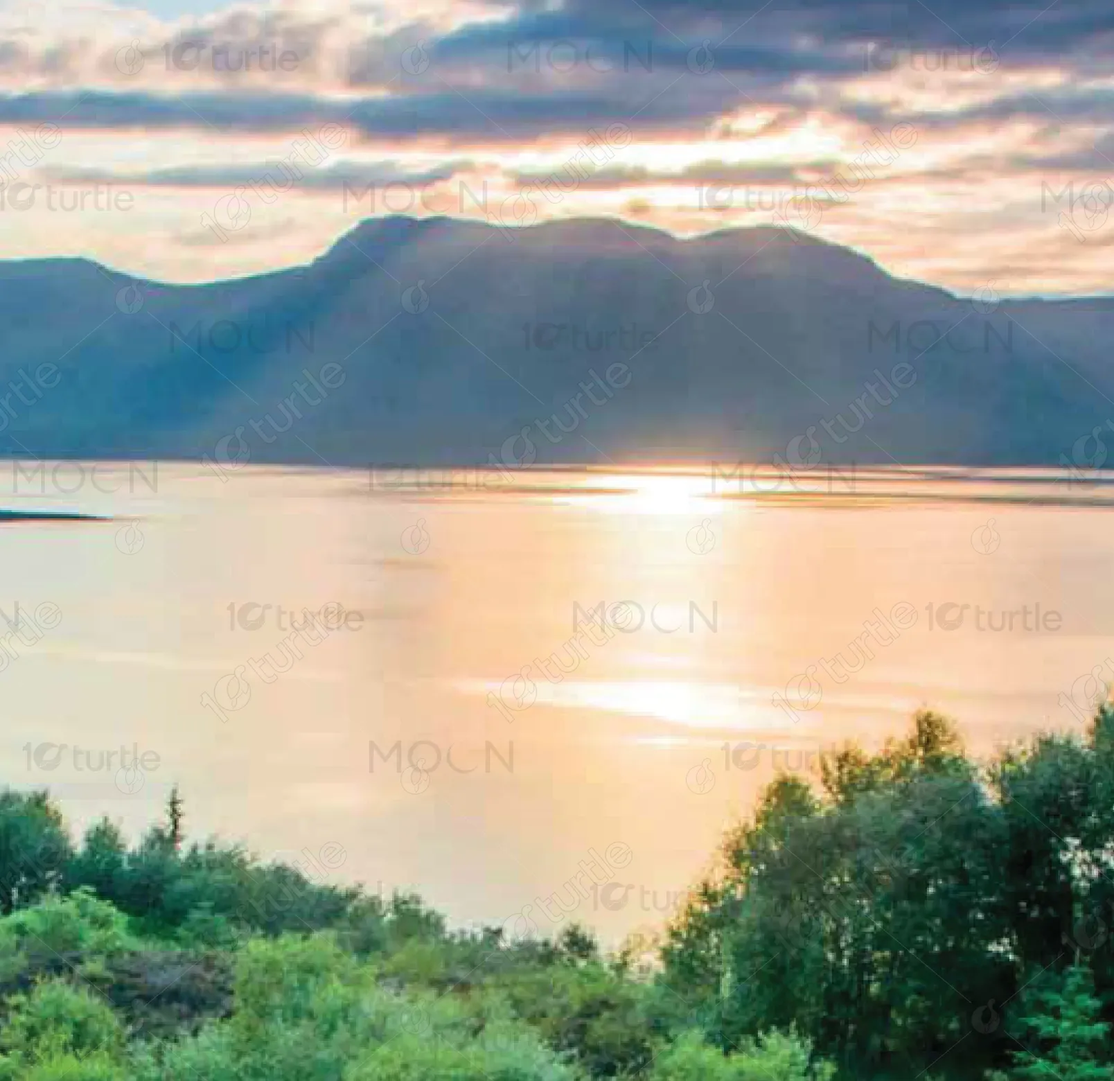
The color palette incorporates earthy greens, soft browns, and natural blues, reflecting the organic and eco-friendly nature of the brand. The use of green evokes feelings of growth, preservation, and tranquility, while brown and blue ground the design, bringing to mind the natural elements of the land. Together, these colors help to reinforce the brand’s commitment to sustainability and evoke a sense of connection with the environment, encouraging customers to feel part of the cause.