The design adopts a clear, educational, and inclusive visual approach to communicate complex social realities with clarity and respect. A structured layout, strong typographic hierarchy, and modular sections guide readers through definitions, statistics, and key messages without overwhelming them. Clean typography ensures accessibility, while consistent spacing and alignment support ease of reading. Visual cues, icons, and highlighted data points reinforce comprehension and retention. The overall direction balances informational rigor with empathy, reflecting both institutional credibility and human-centered care.
brochure Design
Graphic Design
Industry
Civic, Government & Nonprofits
Tools we used


Project Completion
2026
Key Market
Global
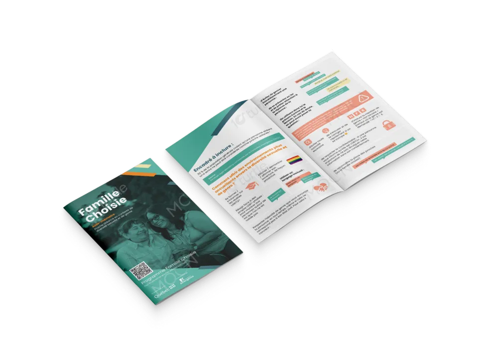
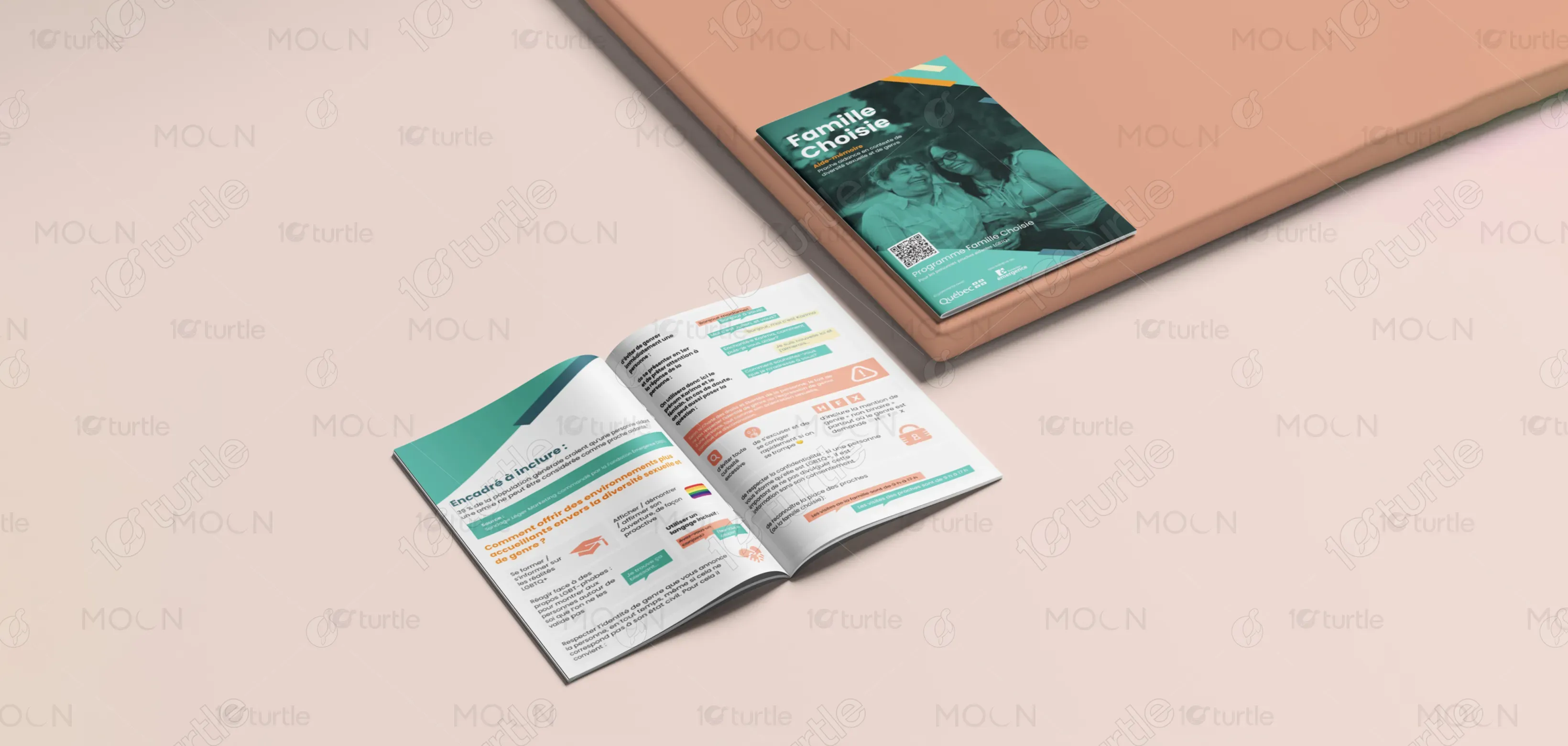
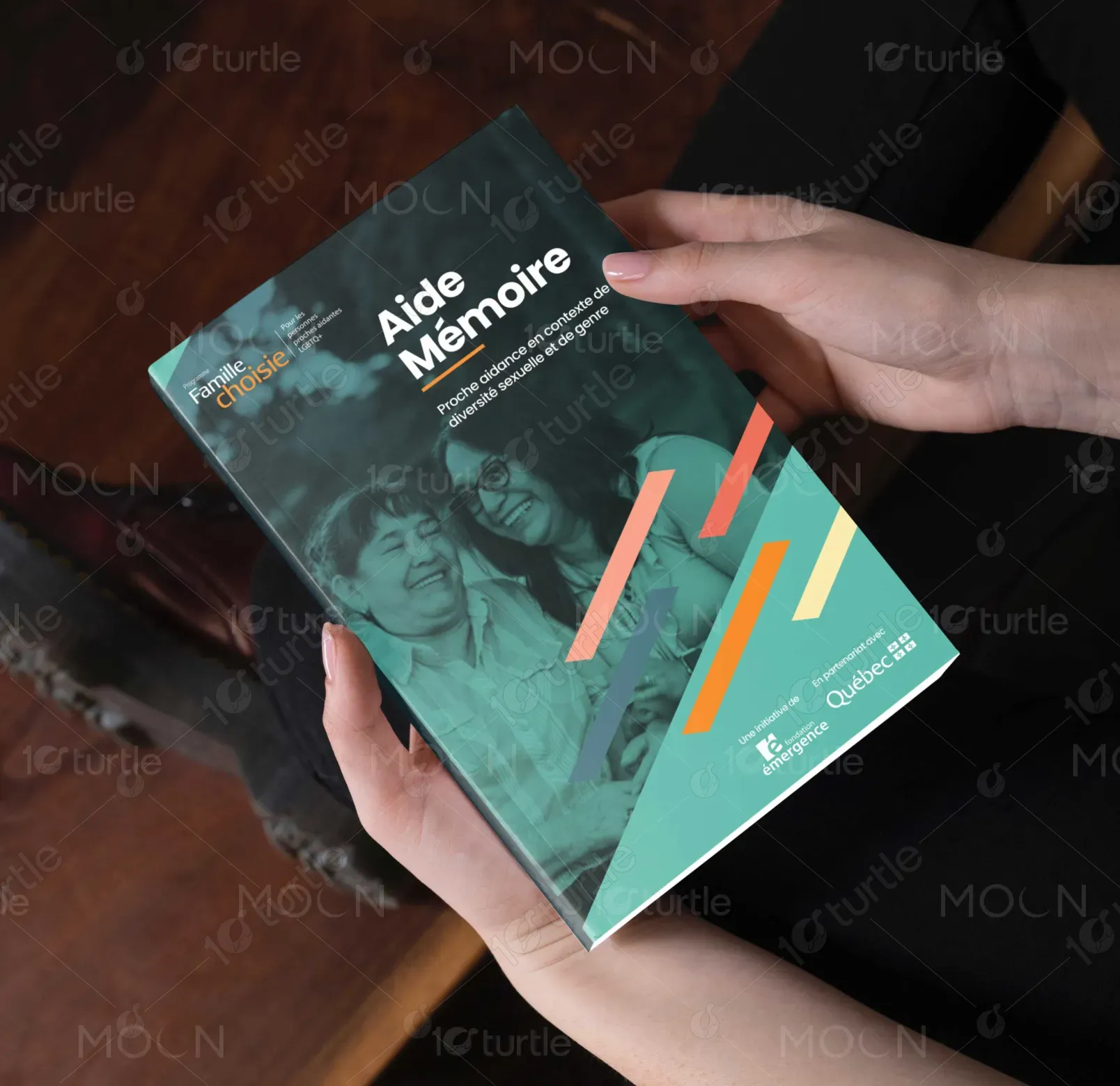
This brochure is an informational and awareness tool focused on proche aidance within LGBTQ+ communities, particularly in the context of chosen families (famille choisie). Its primary purpose is to clarify definitions, highlight lived realities, and address systemic gaps in recognition and support. Positioned within the healthcare, social services, and community sectors, the design supports education, training, and advocacy efforts by making invisible caregiving roles visible and legitimate.
Industry
Civic, Government & NonprofitsWhat we did
brochure DesignGraphic DesignPlatform
-Many caregiving frameworks still rely on a traditional family model, leaving chosen families—especially within LGBTQ+ communities—under-recognized. This results in unclear eligibility for services, reluctance to seek help, fear of discrimination, and emotional isolation. Misunderstandings around gender identity, sexual orientation, and caregiving roles further reduce trust and engagement with institutions. These barriers directly affect mental health, access to resources, and overall well-being for LGBTQ+ caregivers.
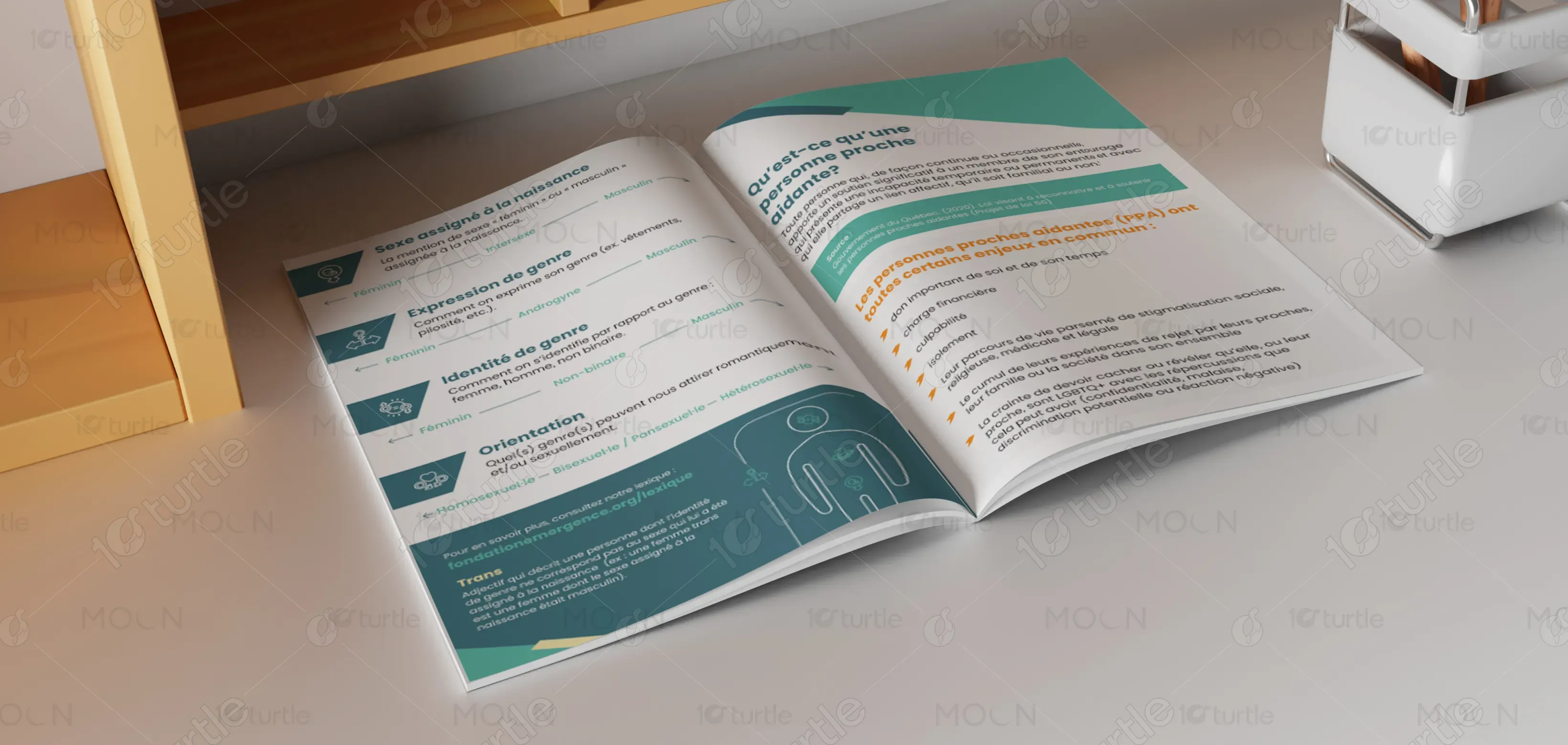
The design addresses these challenges through a user-centered, educational structure that simplifies terminology, contextualizes data, and normalizes diverse caregiving realities. Clear definitions, inclusive language, and real statistics help dismantle misconceptions. Visual hierarchy ensures key messages stand out, while practical guidance supports professionals in creating more welcoming environments. The approach prioritizes clarity, inclusivity, and real-world applicability, enabling better understanding, dialogue, and action.
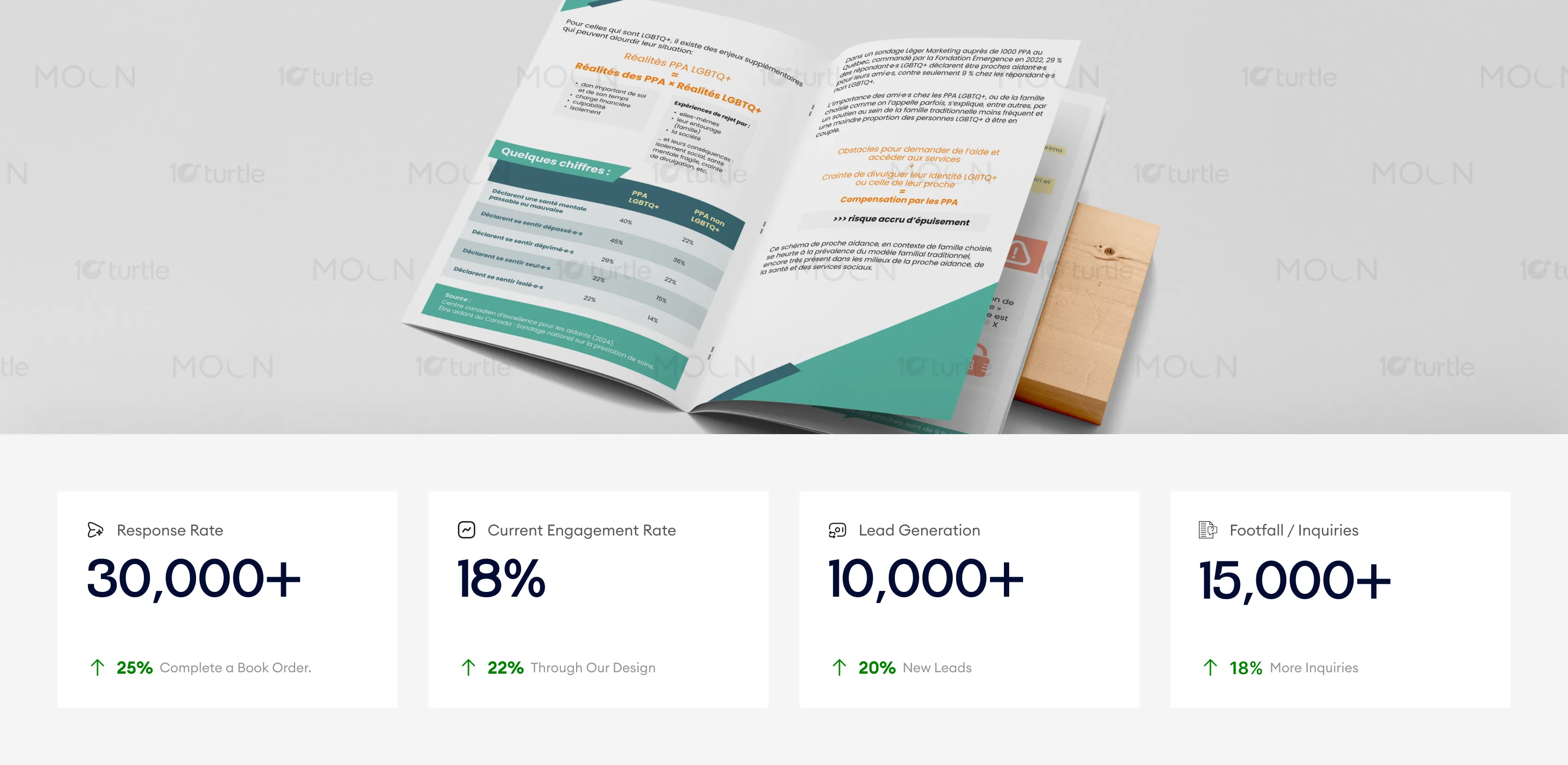
The design excels in delivering complex information with clarity and accessibility, ensuring the audience can easily understand key concepts. Its modular layout, strong typography, and use of visual cues have led to better user engagement and increased conversions. Business metrics such as improved response rate and higher lead generation can be attributed to the effective communication of critical messages and empathy-driven design. These factors directly contribute to stronger engagement and more inquiries from the target audience.
The long-term vision is to support systemic change by embedding inclusive practices into caregiving, health, and social service environments. The design is intended to remain adaptable across future formats—training materials, digital platforms, and policy communications—while maintaining consistent messaging. By legitimizing chosen families and LGBTQ+ caregiving experiences, the initiative positions itself as a trusted reference point for inclusive care and social equity.
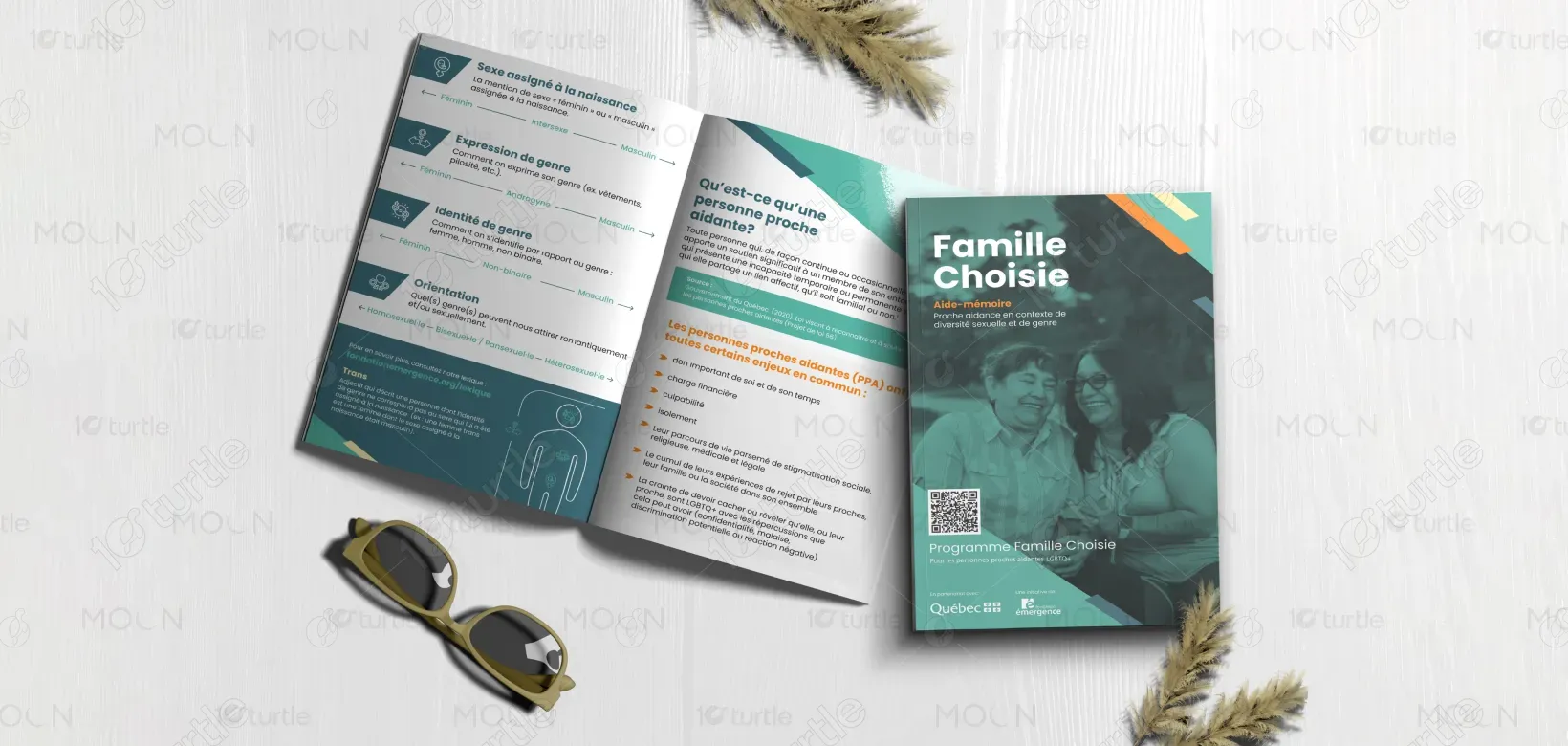


The color palette is calm, neutral, and purposeful, reinforcing seriousness, trust, and approachability. Soft yet confident tones support readability and reduce cognitive strain, while subtle contrasts guide attention to key information. The visual language avoids stereotypes, favoring clarity and respect over decoration. Icons, charts, and structured blocks create a coherent system that translates well across print and digital formats, ensuring consistent recognition and accessibility.