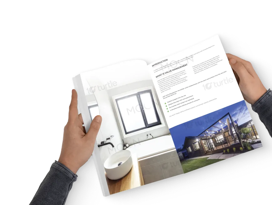
The document design reflects clarity, intelligence, and professionalism—communicating complex information through a visually structured and elegant layout. Clean typography, a balanced grid system, and brand-aligned color accents ensure easy readability and visual hierarchy. Minimal graphic elements, such as lines and shapes, guide the reader’s eye naturally while maintaining a corporate aesthetic. This approach transforms technical content into an engaging, credible, and accessible experience, perfectly aligning with the brand’s goal of delivering knowledge with clarity and impact.
Document Design
Graphic Design
Industry
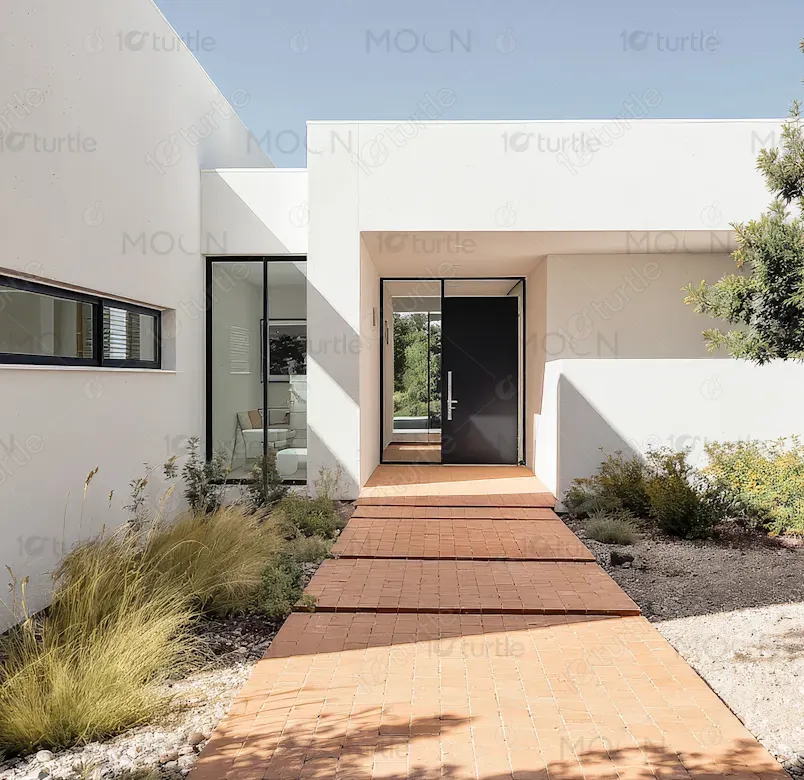
Property, Construction & Real Estate
Tools we used


Project Completion
2025
Key Market
Global
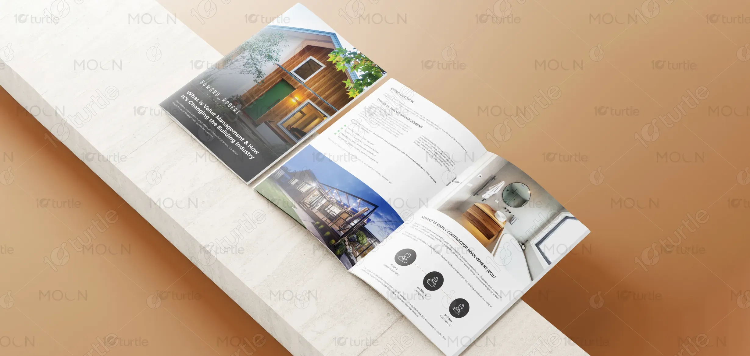
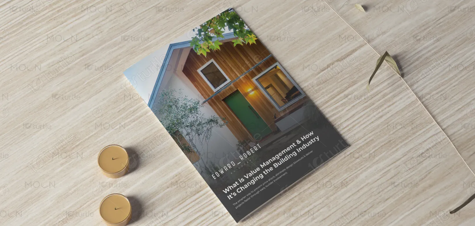
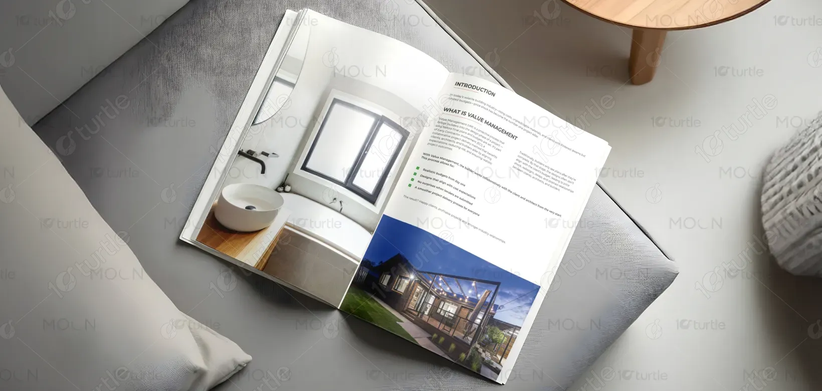
This document design was created to present professional insights on Value Management and Early Contractor Involvement in a clear, premium, and reader-friendly format. Its purpose is to translate industry expertise into a well-structured visual communication piece for builders, architects, and clients. The layout balances technical precision with design simplicity, reinforcing the brand’s image as a modern, reliable authority in the construction and project management field. It combines content clarity with aesthetic sophistication for lasting credibility.
Industry
Property, Construction & Real EstateWhat we did
Document DesignGraphic DesignPlatform
-The key challenge was presenting detailed, text-heavy industry information without overwhelming the reader. Construction-related documents often appear dense, cluttered, or uninspiring—making it difficult for audiences to stay engaged or absorb key messages. The task was to transform complex content into a visually digestible and appealing format while keeping it professional and aligned with industry expectations. Balancing functionality with visual appeal was crucial to ensure comprehension and brand consistency.
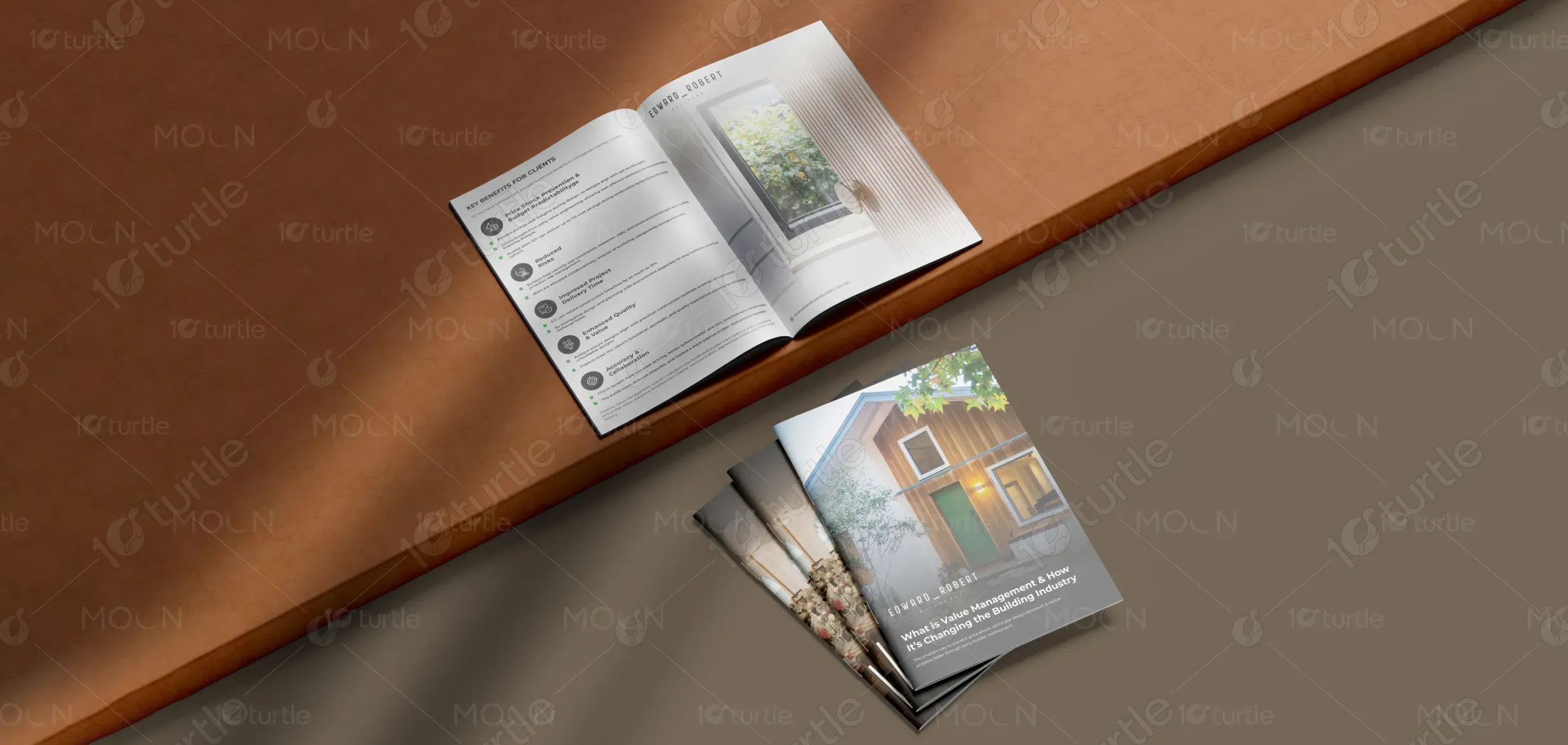
The solution was achieved through a clean, modular document layout emphasizing white space, concise typography, and visual rhythm. Strategic use of brand colors highlights key data, while consistent heading hierarchies and section spacing guide the reader intuitively. Subtle graphic accents and icons enhance navigation without distracting from the content. This design makes the document easier to read, more professional in tone, and visually aligned with the brand’s identity—helping communicate complex information with modern precision.
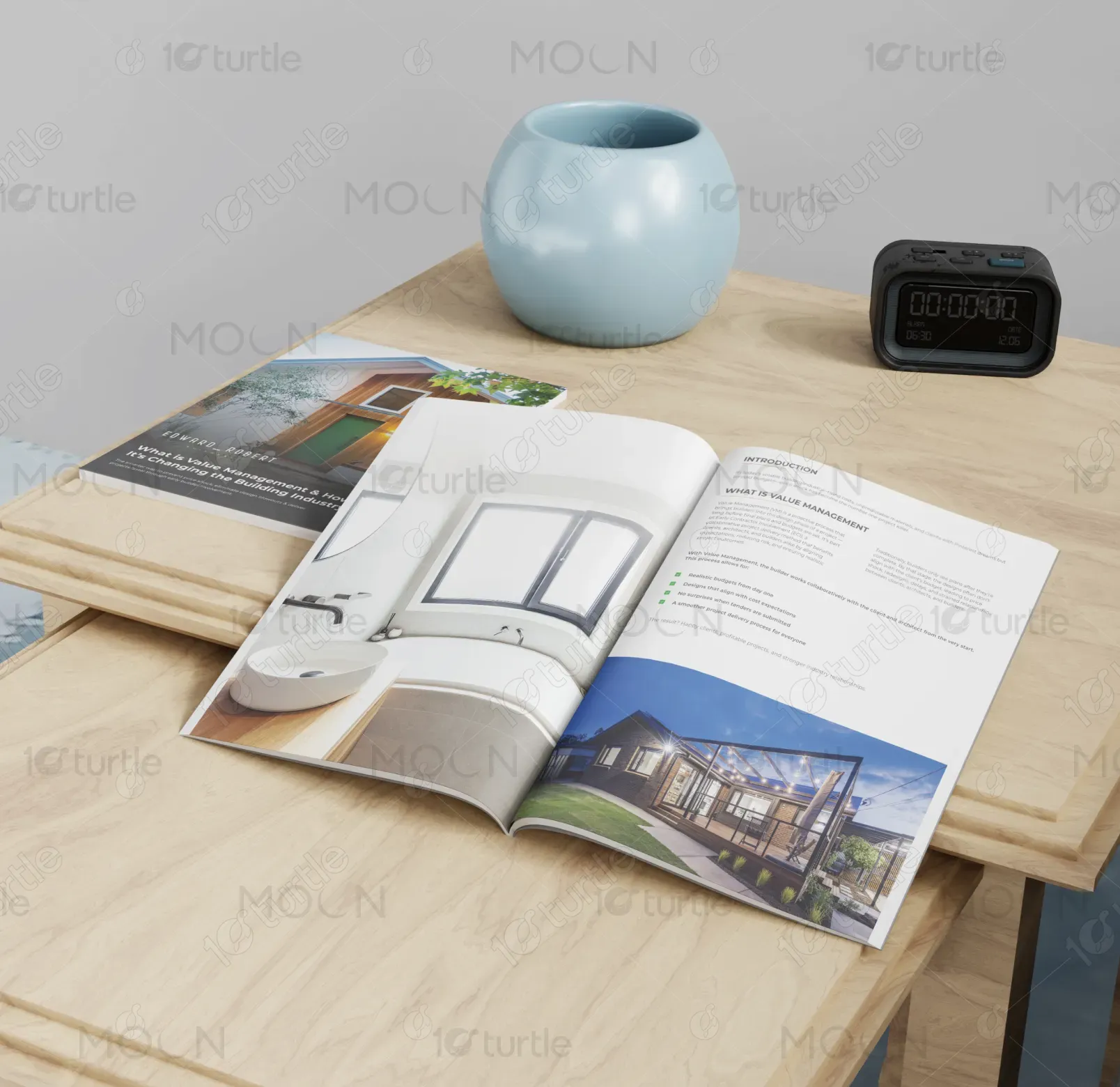
The long-term vision is to establish a consistent document style that strengthens brand identity and communication. This design system can extend across reports, case studies, and marketing materials, ensuring a unified professional presence. The goal is to make technical documentation visually engaging, readable, and credible—helping position the brand as a trusted thought leader in the building and project management industry. Over time, this design approach will enhance recognition, trust, and user experience.
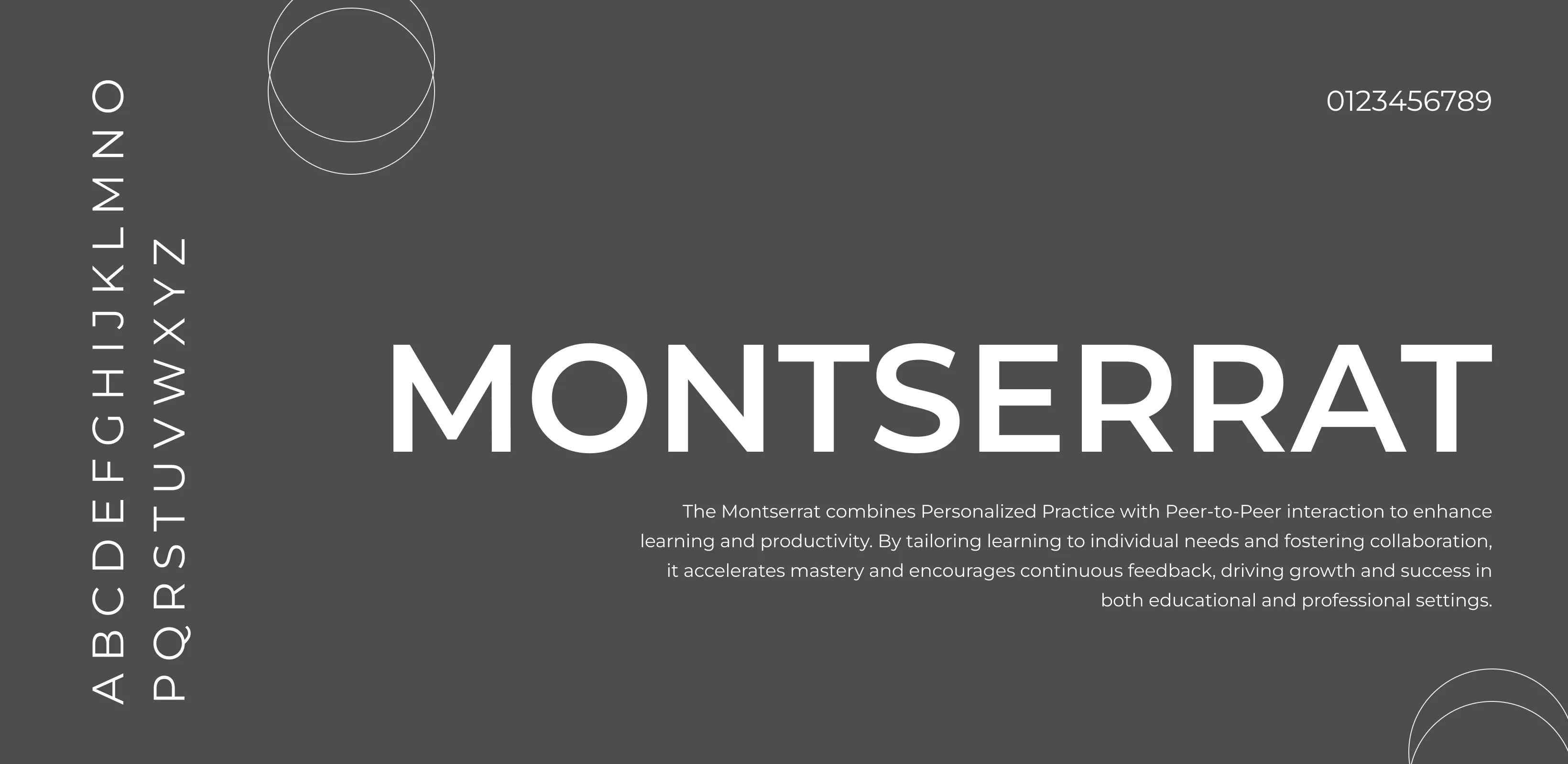
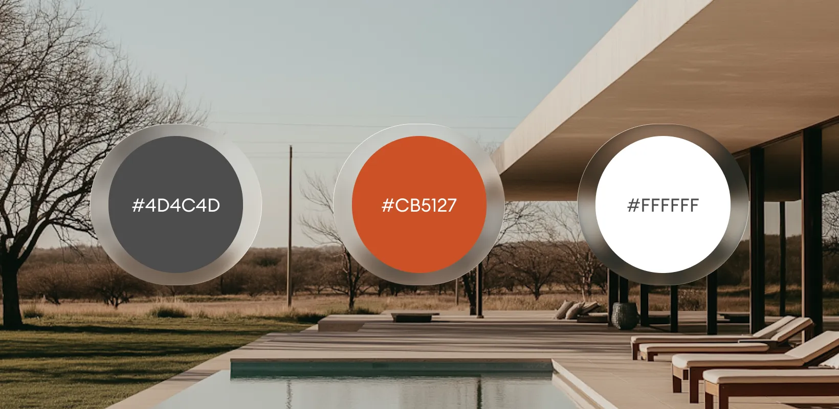
The color scheme combines Liver (#4D4C4D), white, and Chestnut Red highlights for emphasis. Blue represents intelligence, professionalism, and trust—core values of the brand—while white maintains clarity and openness. Grey tones balance the layout, ensuring focus remains on the content. Yellow accentuates key details, symbolizing innovation and optimism. Together, these colors create a visually clean, corporate, and confident aesthetic that aligns perfectly with the document’s informative purpose.