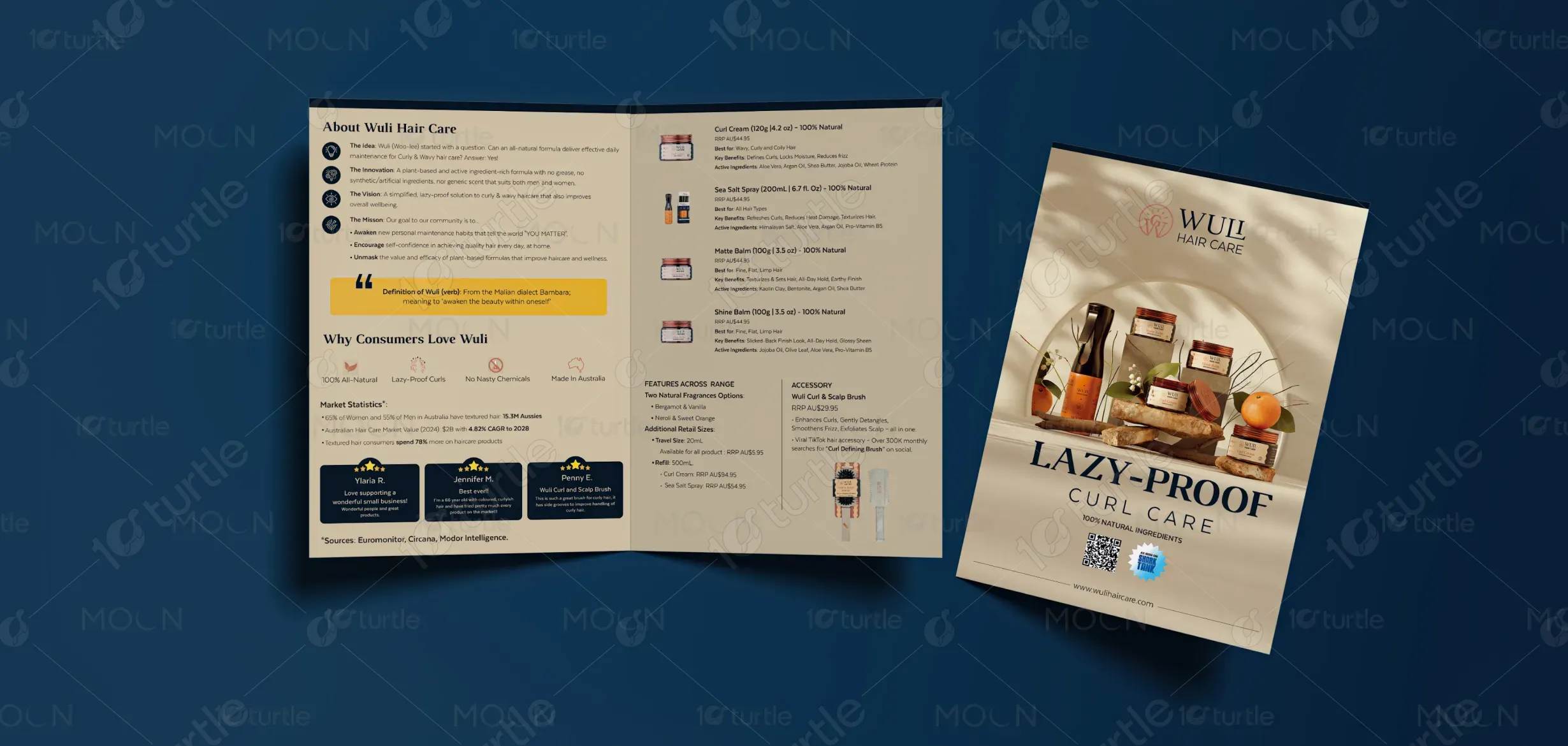
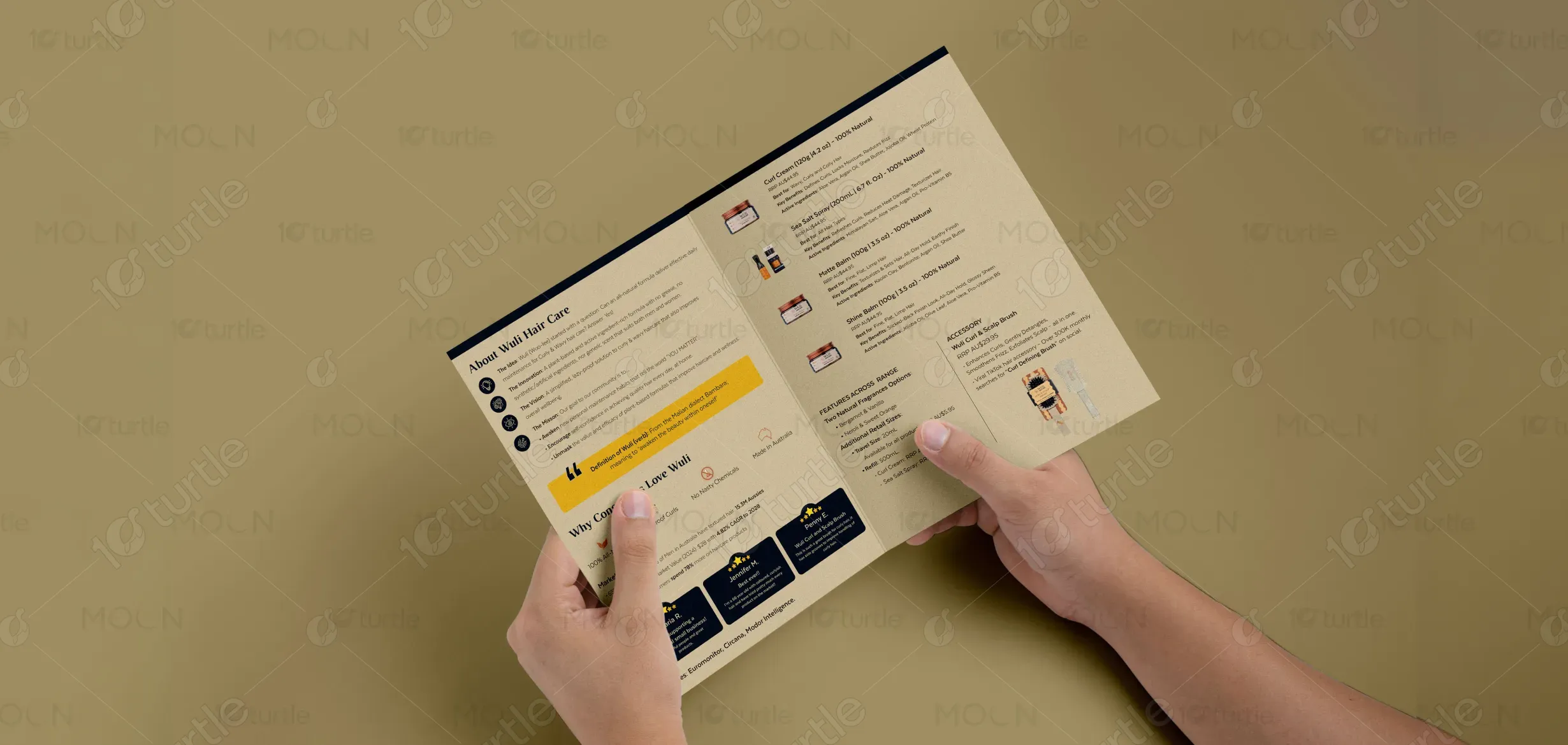
The brochure design for Wuli Hair Care fuses earthy elegance with modern simplicity, capturing the essence of natural beauty in motion. Featuring a soft sun-kissed backdrop, botanical accents, and product staging on organic textures like stone and wood, the layout conveys authenticity and ease. The typography is bold yet balanced, mirroring the brand’s promise of effortless results. A clean grid, natural shadows, and warm highlights create a premium but approachable aesthetic that reflects Wuli’s “lazy-proof” philosophy: simple, honest, and stylishly effective.
Brochure Design
Graphic Design
Industry
Fashion, Beauty & Lifestyle
Tools we used


Project Completion
2025
Key Market
Global
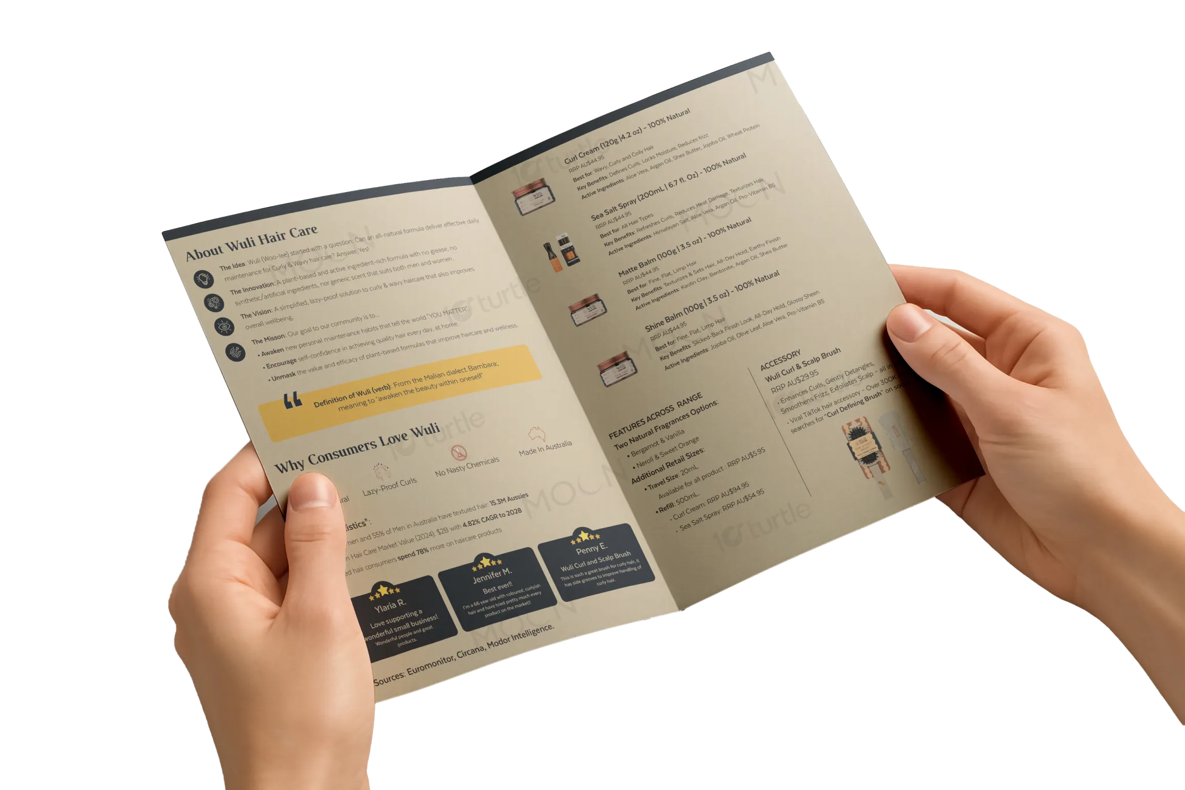
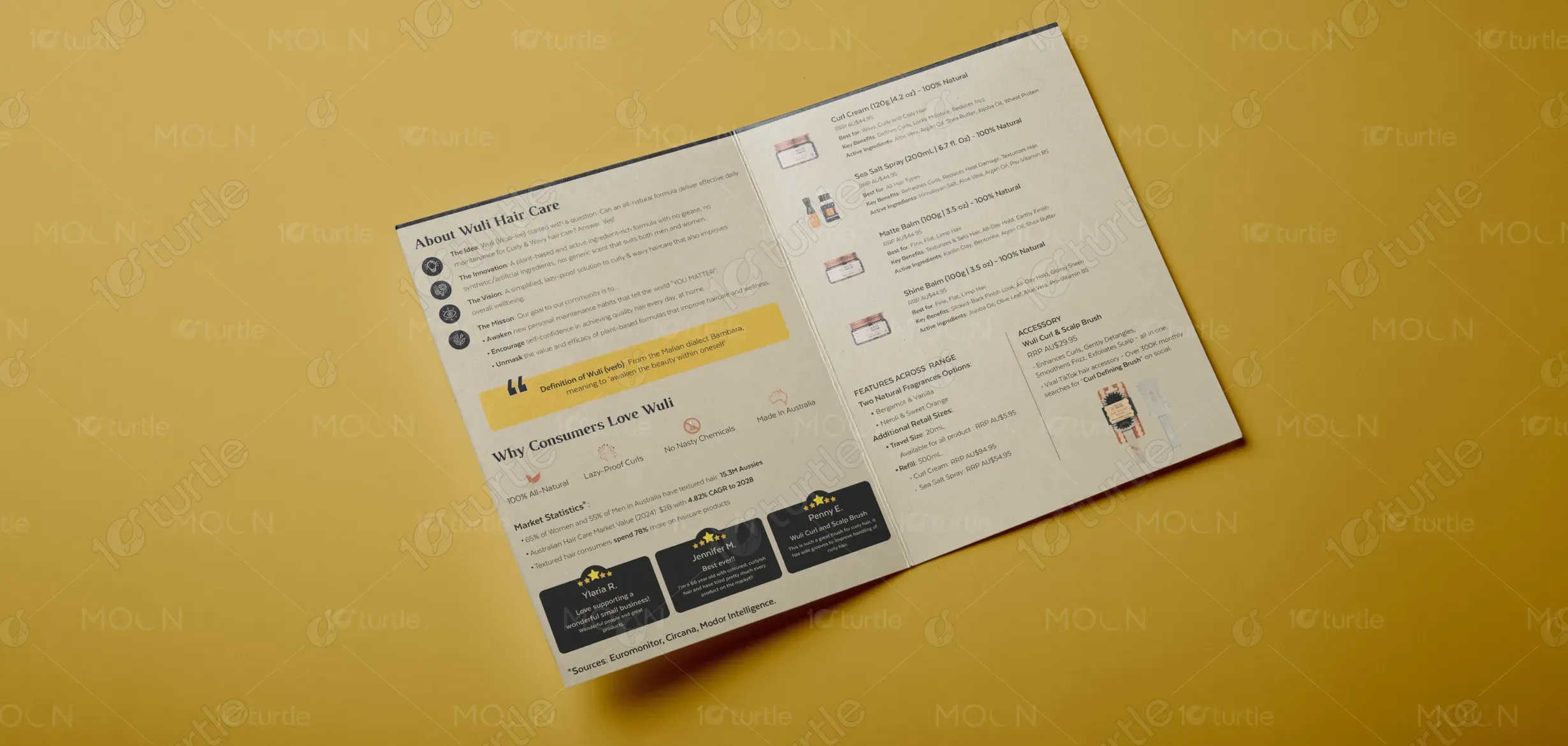
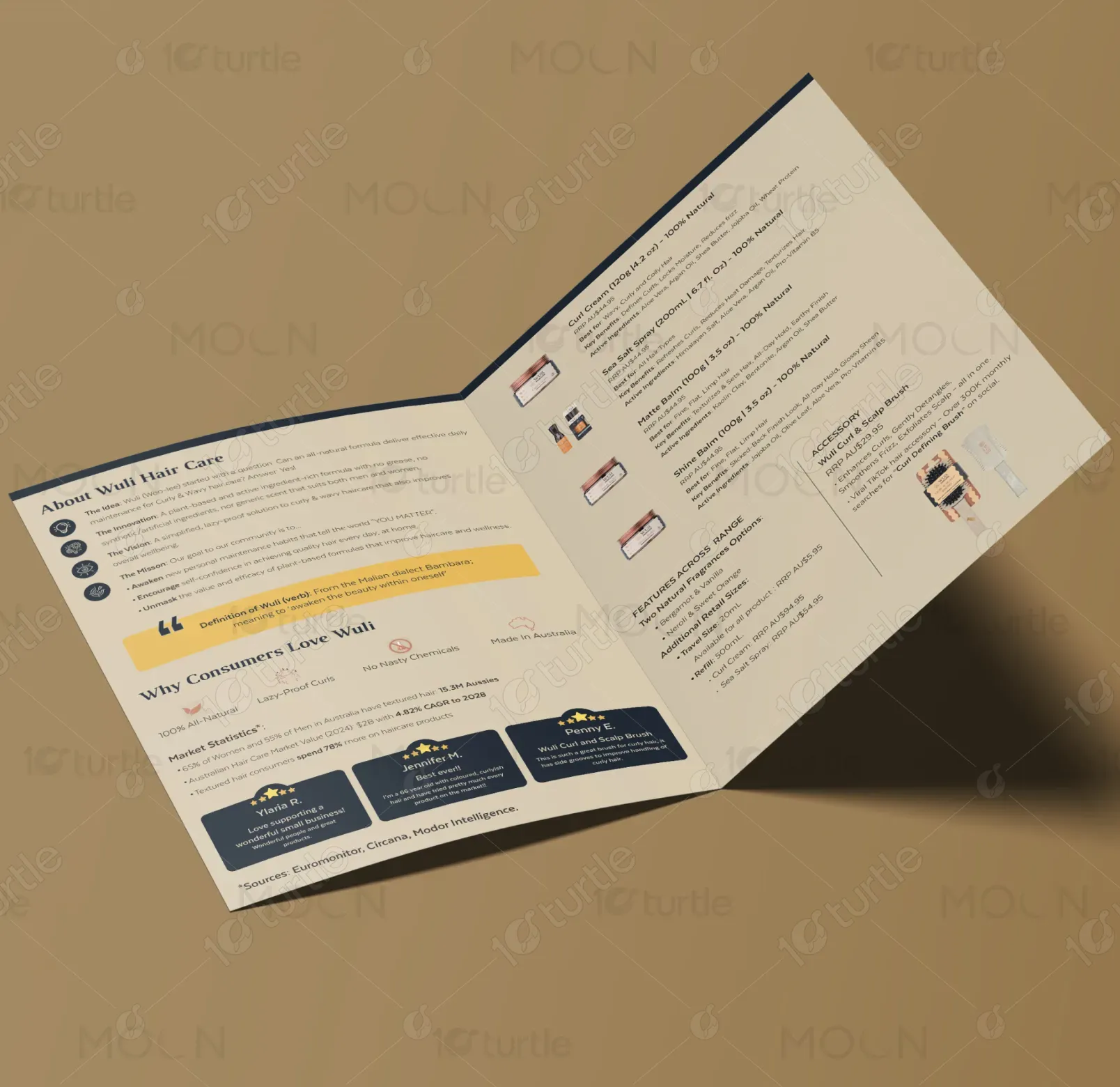
Wuli Hair Care is a proudly Australian-made brand designed for textured hair types, offering low-maintenance yet high-performing curl care products. Its signature “lazy-proof” approach champions simplicity, allowing customers to embrace their natural texture without elaborate routines. Featuring travel-friendly sizes, shelf-ready display units, and strong retail presence, Wuli appeals to both conscious consumers and retailers. Its design, branding, and packaging embody natural confidence—focusing on what works without the fluff, all while looking chic and salon-worthy on the shelf.
Industry
Fashion, Beauty & LifestyleWhat we did
Brochure DesignGraphic DesignPlatform
-The haircare market often overwhelms consumers—especially those with textured hair—with complex multi-step regimens and unclear labeling. Many natural brands lack shelf appeal or feel clinical, while visually appealing ones often compromise on clean, effective ingredients. Retailers face difficulty promoting natural curl products that are both visually compelling and easy to understand for in-store discovery, limiting adoption and slowing growth in this fast-moving category.
Wuli solves this gap by marrying form and function. Its visually clean, nature-inspired design speaks to minimalism and self-care while clearly communicating product usage. The “lazy-proof” concept simplifies routines, making it easy for consumers to adopt without second-guessing. For retailers, the brochure supports in-store visibility with ready-to-go counter displays and travel sizes that drive sampling and conversion. The brand's tone—supported by features on Shark Tank and strong social traction—builds trust through both visual integrity and real-world impact.
Wuli aspires to redefine curl care by making it as accessible and enjoyable as skincare. The long-term vision is to expand its footprint beyond Australia into global beauty markets, offering inclusive solutions for all curl types. It aims to become the go-to brand for effortless, clean haircare—recognized not just for product efficacy, but for empowering a lifestyle rooted in ease, authenticity, and natural beauty. With plans for experiential retail, strategic partnerships, and digital engagement, Wuli is building a movement—not just a product line.
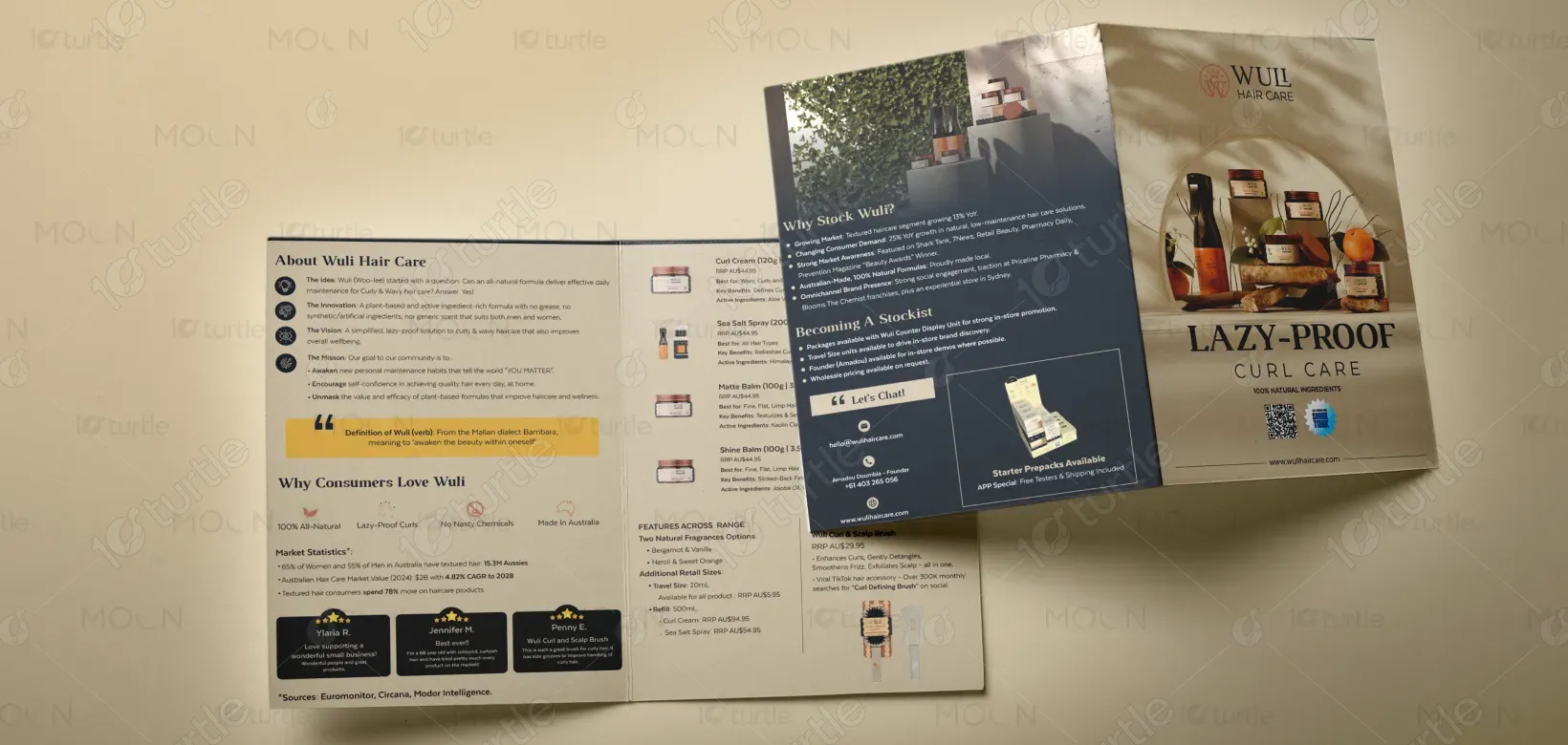
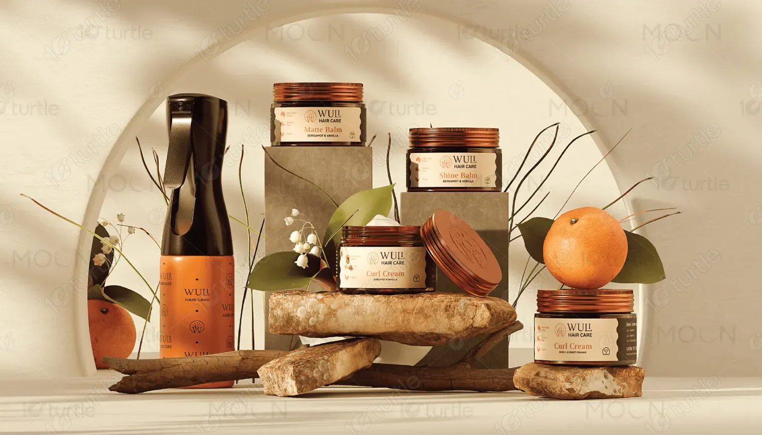
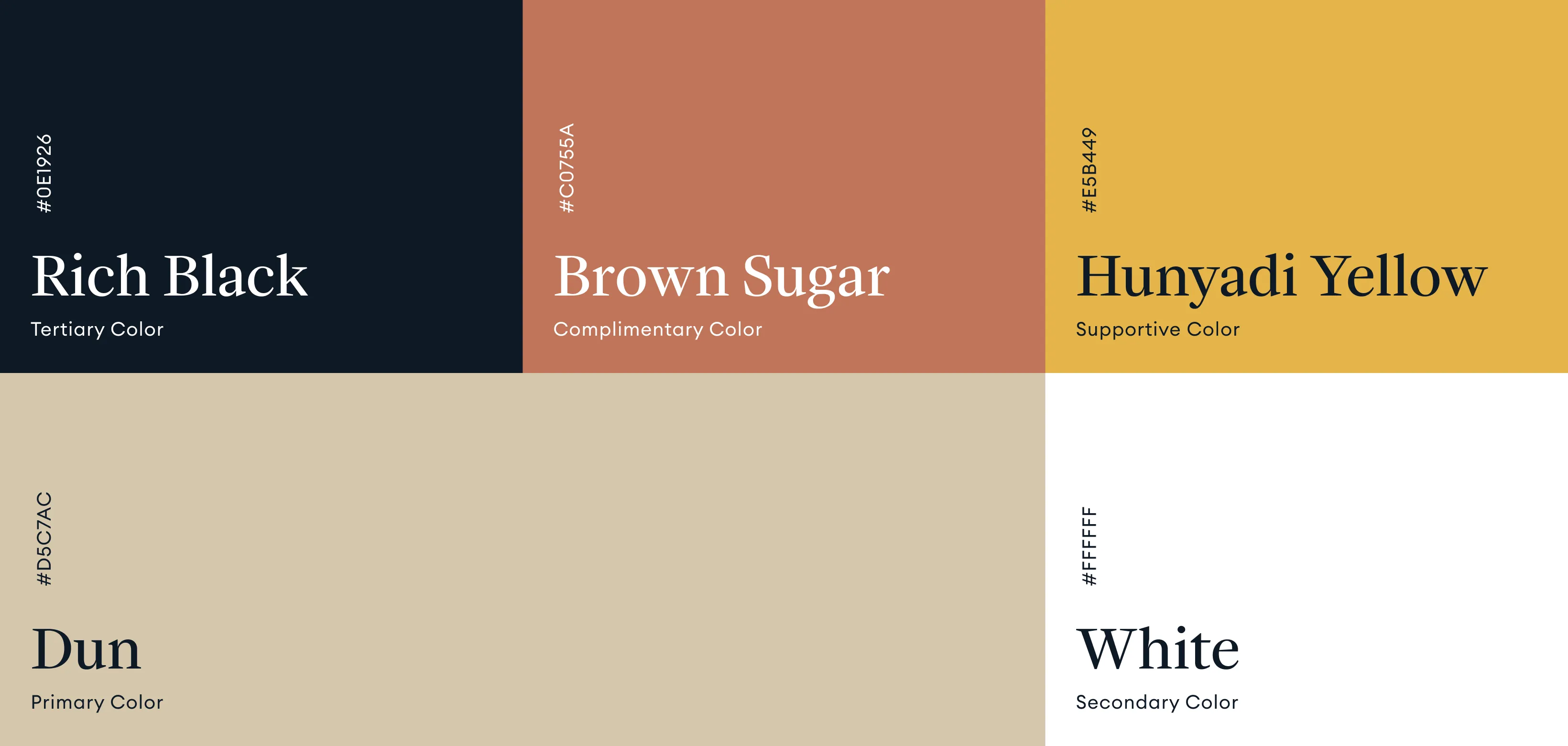
Wuli’s palette draws from natural, sun-drenched tones—warm terracotta, soft creams, muted greens, and deep charcoal navy. The earthy orange reflects vitality, hydration, and warmth, while the cream accents communicate softness and simplicity. The deep navy grounds the design with professionalism, offering contrast and clarity. Together, the colors create a calming yet confident aesthetic that aligns with Wuli’s promise: effortless, effective haircare that feels as good as it looks.