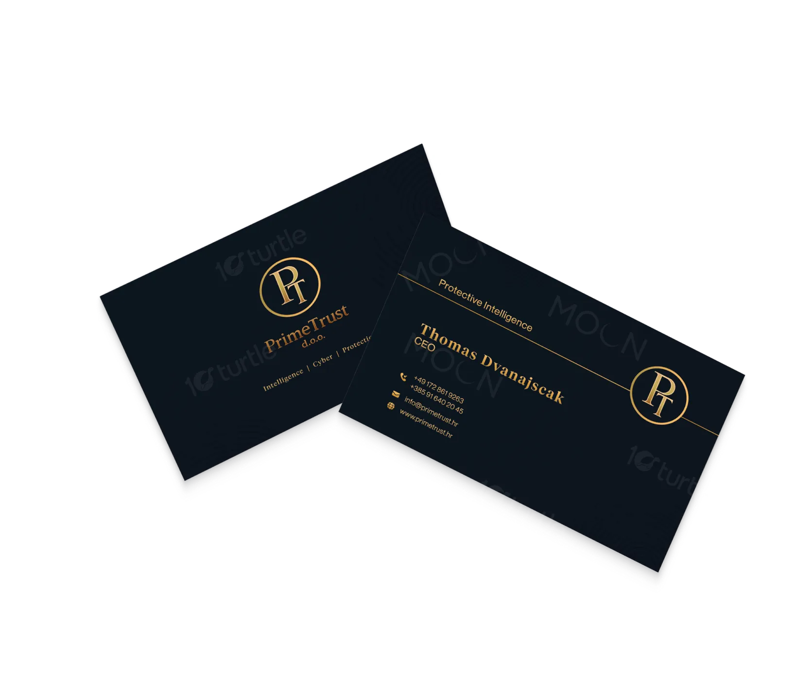
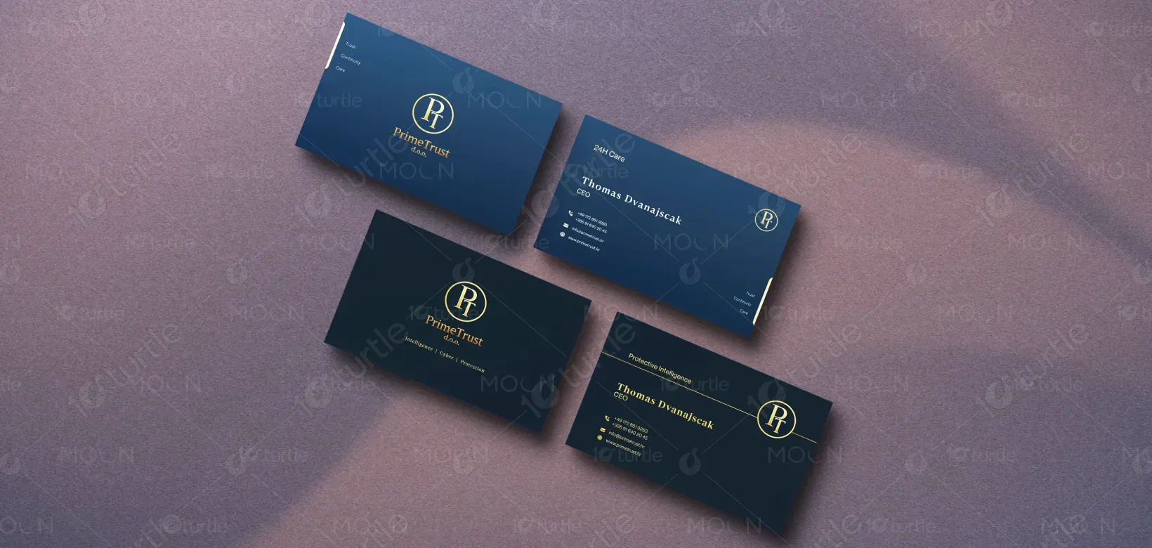
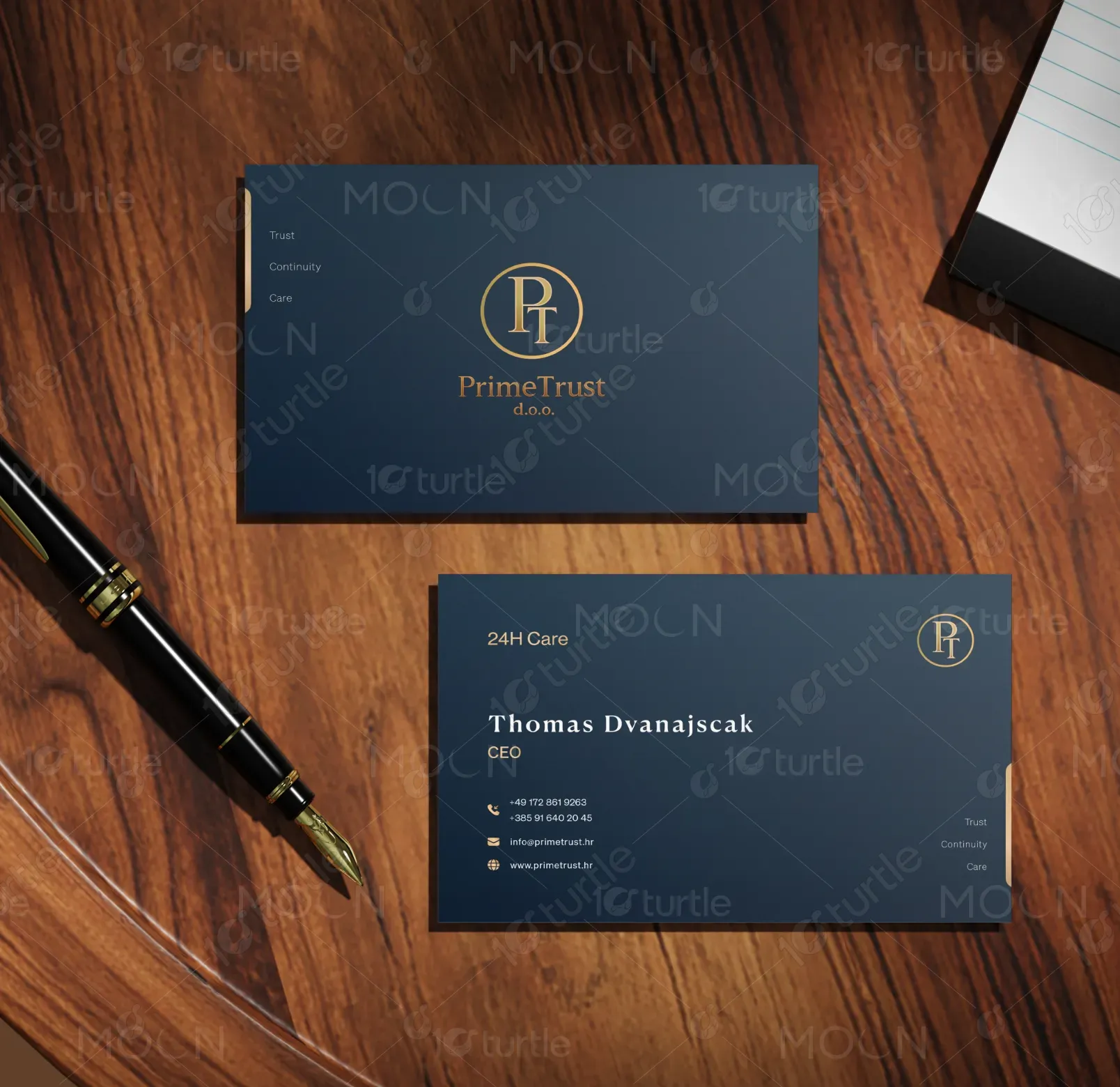
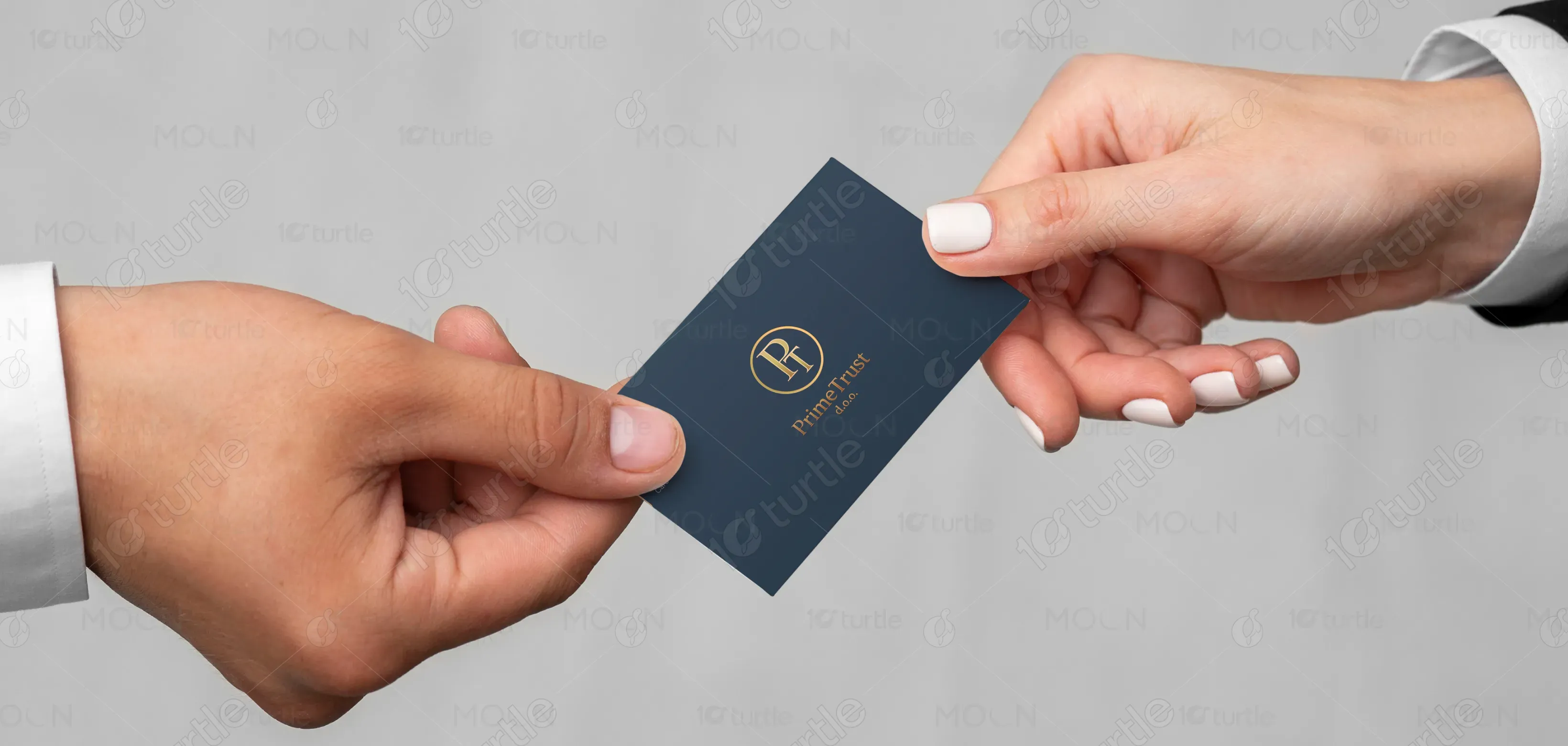
The design adopts a premium, institutional visual direction using a deep navy background paired with gold typography to establish authority and trust. The oval “PT” monogram is positioned as a central brand asset, ensuring strong recognition across both card variants. Typography is clean and structured, with a clear hierarchy that prioritizes the individual’s name, role, and contact details. Supporting phrases such as “Trust, Continuity, Care” and “Intelligence, Cyber, Protection” are integrated subtly to reinforce service pillars without overwhelming the layout. The overall composition balances minimalism with brand presence.
Business Card Design
Graphic Design
Industry
Professional & B2B Services
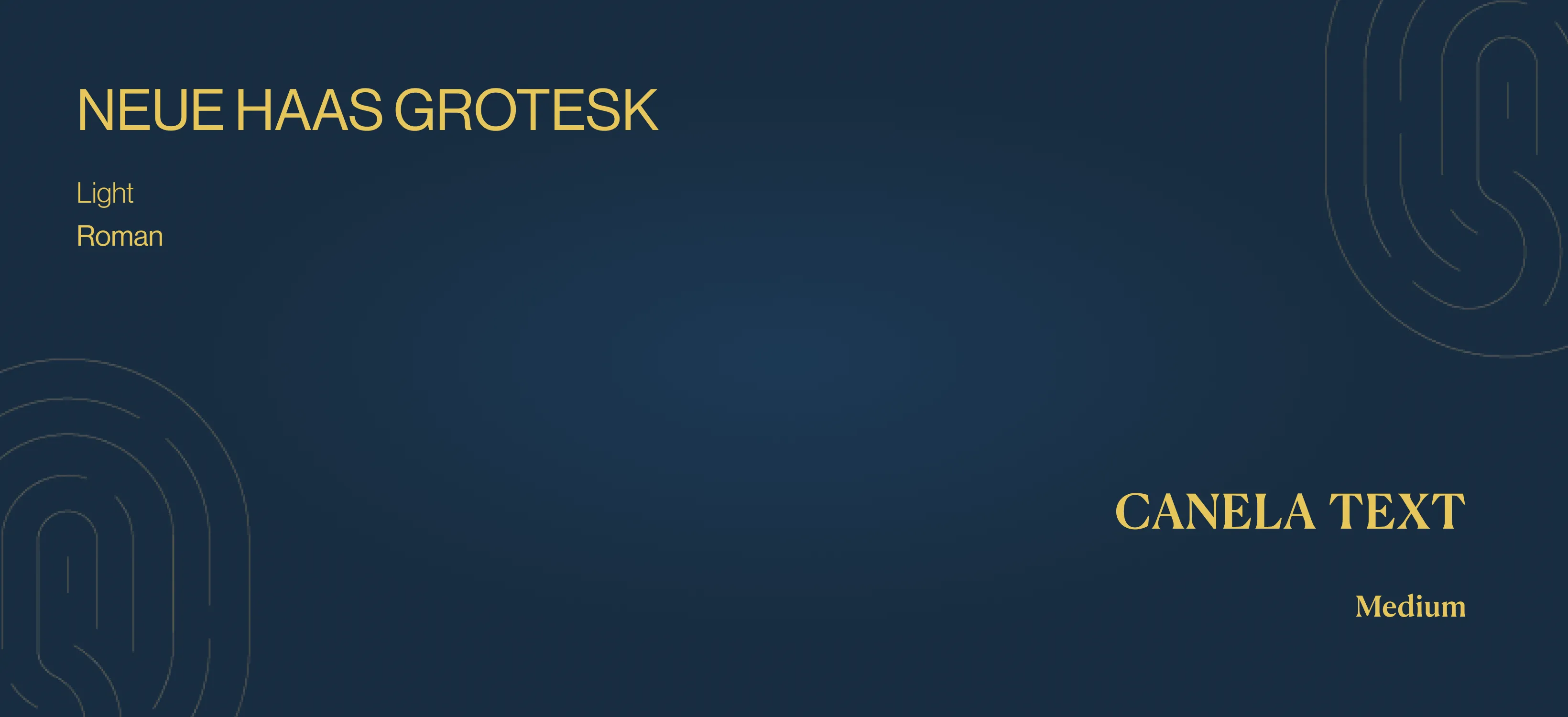
Tools we used


Project Completion
2025
Key Market
Global
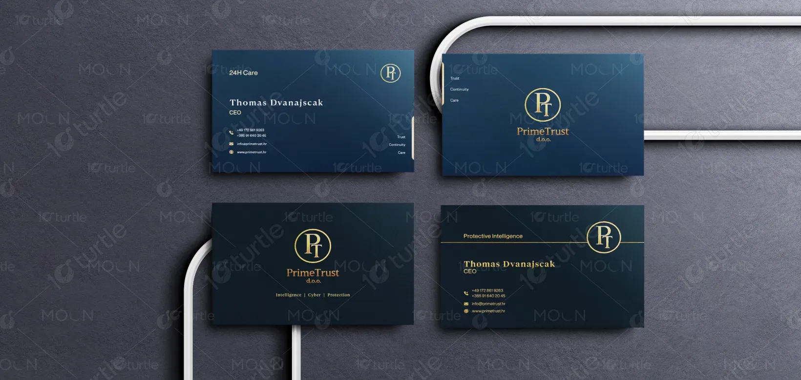
This business card system represents PrimeTrust’s dual service offering—24-hour care and security intelligence. As seen on the front and back layouts and , the cards maintain a unified identity while adapting messaging for each service category. The primary purpose is to communicate professionalism, reliability, and specialization in high-trust industries. The design ensures that both emotional reassurance (care services) and technical credibility (security services) are conveyed effectively through a consistent visual language.

Industry
Professional & B2B ServicesWhat we did
Business Card DesignGraphic DesignPlatform
-The key challenge was to create a cohesive identity that accommodates two distinct service domains—caregiving and security—without diluting the brand. Typically, healthcare-related materials lean toward soft and approachable visuals, while security services demand a more rigid, authoritative tone. Balancing these contrasting perceptions while maintaining clarity, readability, and a premium feel was essential. Additionally, avoiding clutter while presenting multiple contact details and service cues posed a structural challenge.
A unified design system was implemented using consistent color, typography, and logo placement across both cards. Differentiation is achieved through controlled messaging and layout emphasis rather than visual deviation. Strong typographic hierarchy ensures readability, while minimal elements maintain a clean composition. The gold-on-navy palette enhances contrast and perceived value. Strategic placement of service descriptors allows each card to communicate its function clearly while remaining visually aligned with the overall brand identity.

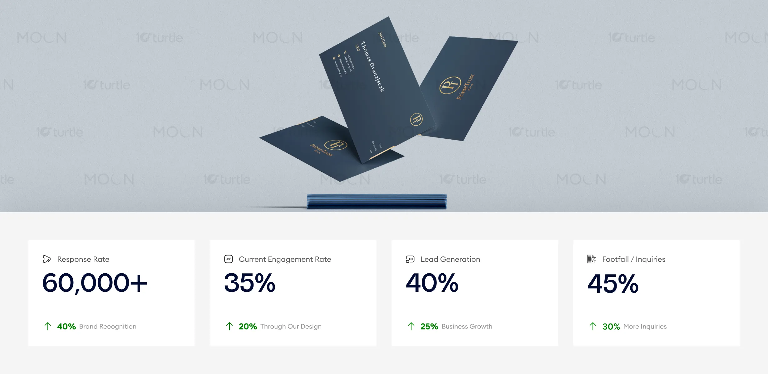
This business card design effectively communicates professionalism and trustworthiness, establishing a strong brand presence with its sophisticated typography and bold monogram. The use of premium colors and clear service pillars has led to higher engagement and inquiries. To further increase these metrics, leveraging the business card design in strategic networking events and ensuring visibility in both physical and digital formats can boost overall lead generation and brand recognition.
The design is built to support long-term brand scalability across multiple services and touchpoints. By establishing a strong, recognizable visual foundation, the identity can extend into stationery, digital platforms, and marketing materials without inconsistency. The system allows future service expansions while maintaining brand cohesion. Over time, this approach positions PrimeTrust as a reliable, premium provider in both care and security sectors, reinforcing trust and recognition across diverse audiences.

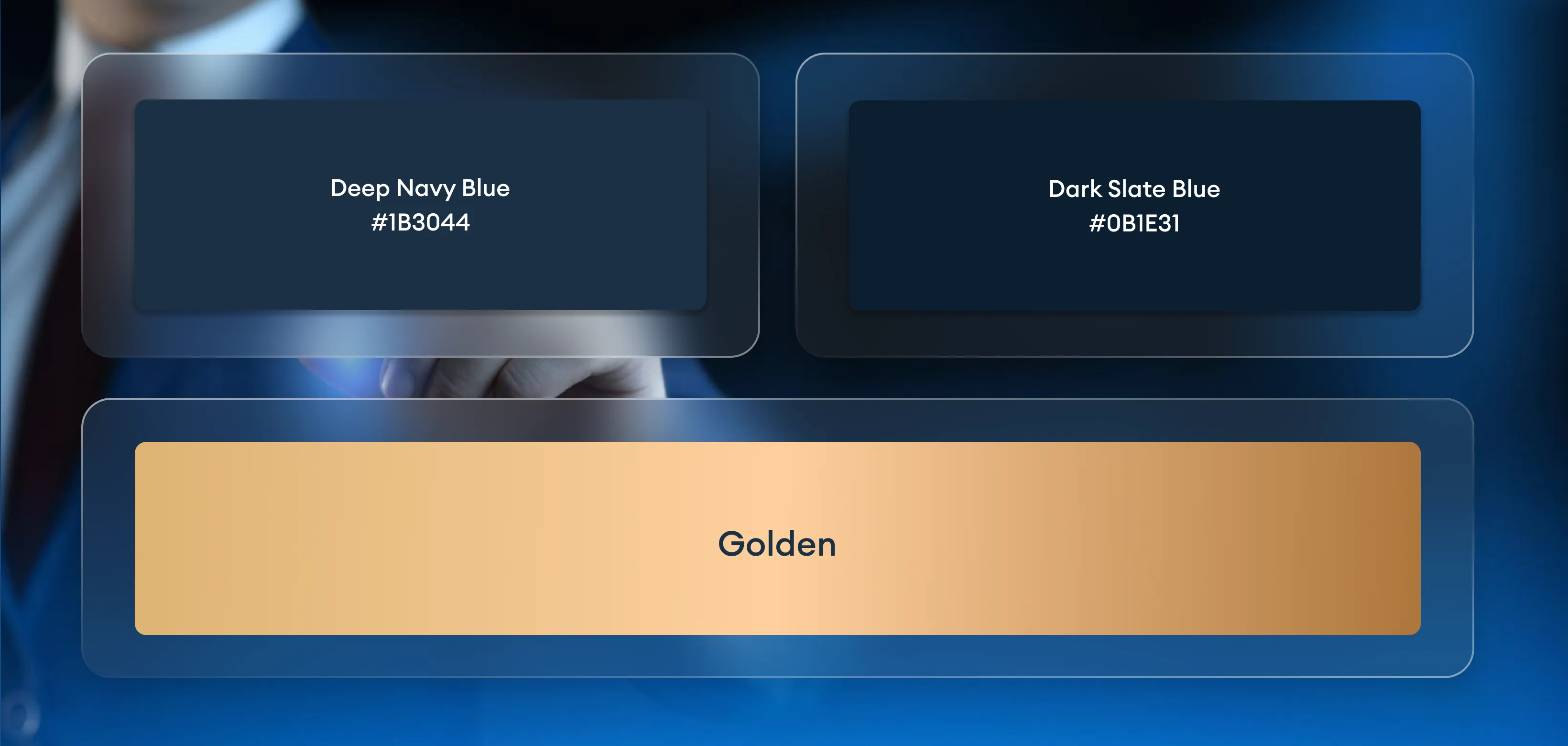
The palette is centered around deep navy and gold, creating a high-contrast, premium visual identity. Navy conveys stability, trust, and professionalism, while gold introduces a sense of quality and authority. Supporting elements are minimal, allowing typography and spacing to drive the design. Subtle graphic treatments and restrained use of icons enhance clarity without distraction. This controlled visual language ensures readability across print conditions while maintaining a refined and consistent brand presence.