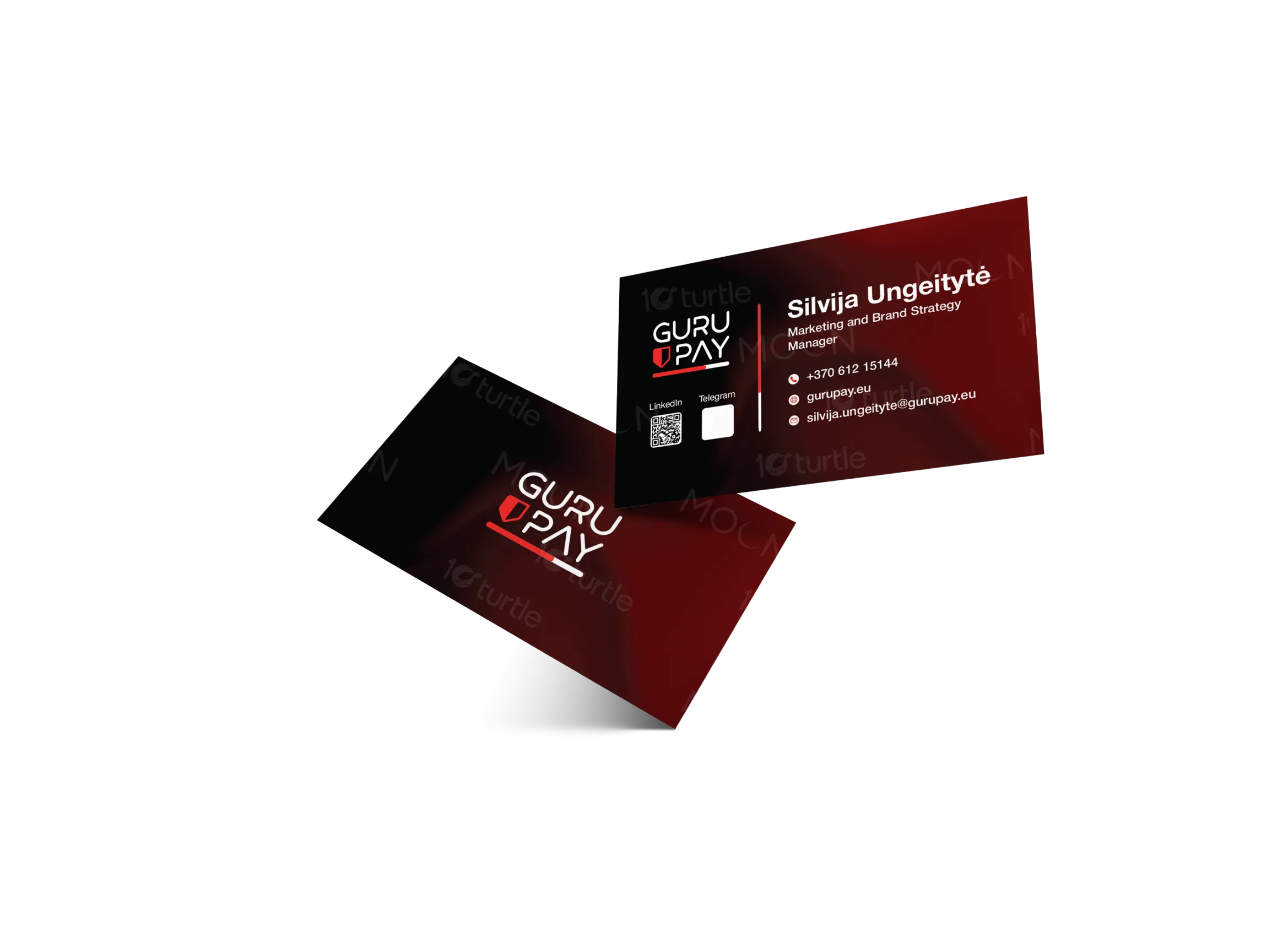
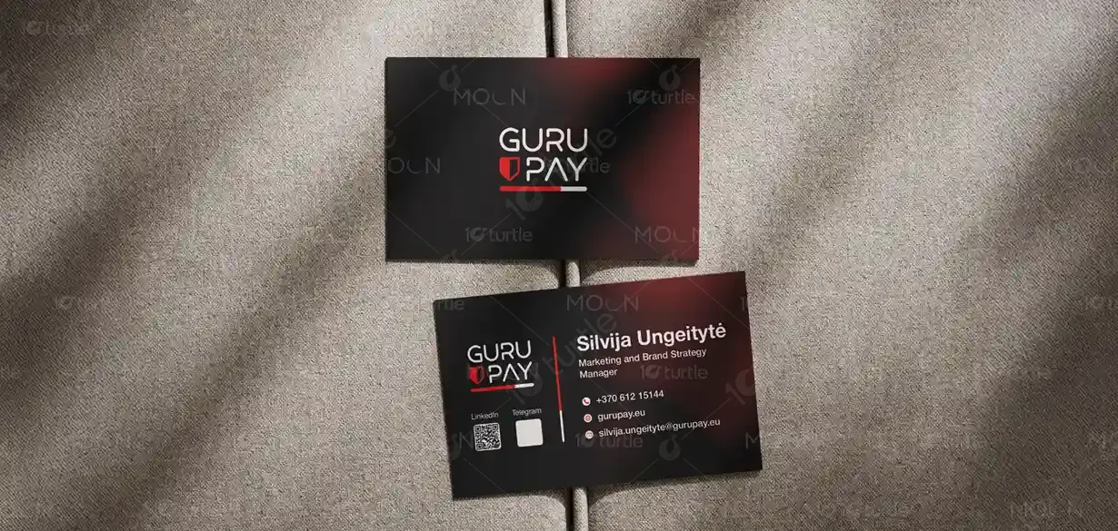
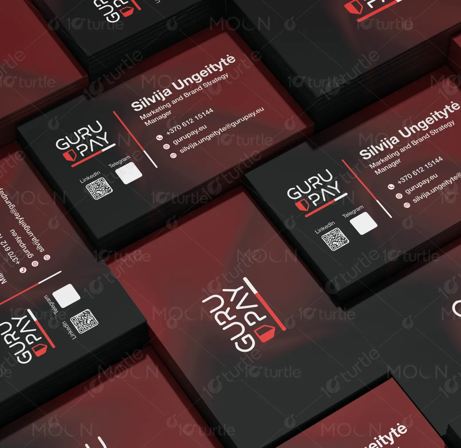
The business card design follows a sleek, modern, and professional visual direction, combining a bold red–black gradient with clean white typography for clarity and impact. The layout highlights essential information through balanced spacing and strong hierarchy, ensuring immediate readability. The left-aligned branding block reinforces identity, while subtle gradients add depth without distraction. Overall, the design blends sophistication with a contemporary fintech aesthetic, creating a powerful first impression that reflects trust, innovation, and brand authority.
Business Card Design
Graphic Design
Industry
Finance, Legal & Insurance
Tools we used

Project Completion
2025
Key Market
Global
This business card design represents a premium branding asset for a fintech/payment solutions company. Its purpose is to communicate professionalism, credibility, and technological advancement in a compact format. By combining striking visual elements with organized contact details, the card ensures lasting brand recall. The bold gradient, minimal icons, and QR codes add both aesthetic value and functional convenience, positioning the brand as modern, efficient, and customer-centric within a competitive financial services market.

Industry
Finance, Legal & InsuranceWhat we did
Business Card DesignGraphic DesignPlatform
-In the fintech sector, business cards often fail to stand out due to overly technical visuals or generic corporate styles. Many lack a memorable identity, making networking less effective. Additionally, cluttered layouts and poor hierarchy lead to difficult readability—especially when contact information is essential. Brands often struggle to balance professionalism with modern appeal, resulting in designs that don’t reflect innovation or trust. This gap reduces brand impact and weakens first impressions during client meetings or industry events.
This design solves the problem through a refined, user-focused layout that prioritizes clarity, elegance, and brand recognition. The bold gradient brings visual uniqueness while maintaining professionalism. QR codes enhance accessibility, enabling instant digital connections. Clean typography and structured spacing improve readability, ensuring contact details are easy to locate. The strong left-aligned brand block ensures immediate visual identity. Together, these elements create a design that is modern, functional, and memorable—perfect for a fintech brand aiming to stand out.

The long-term vision of this design is to establish a cohesive, recognizable brand identity that extends across all corporate materials. It aims to set a standard for modern fintech branding—simple, bold, and impactful. As the brand grows, this visual style can evolve into a broader design system for digital and print assets, reinforcing consistency. The design aspires to create a lasting impression that symbolizes trust, technological advancement, and premium quality within the financial industry.
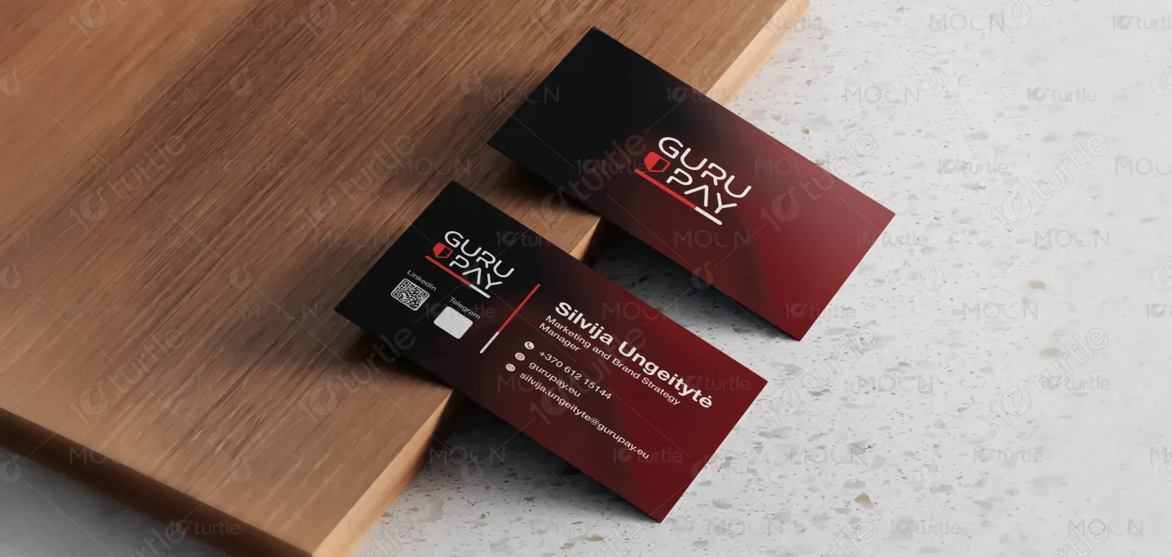

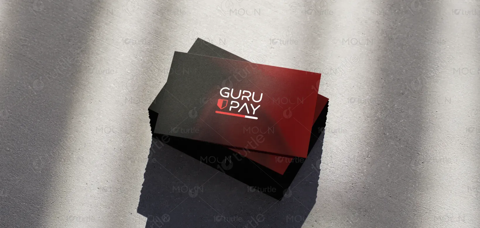
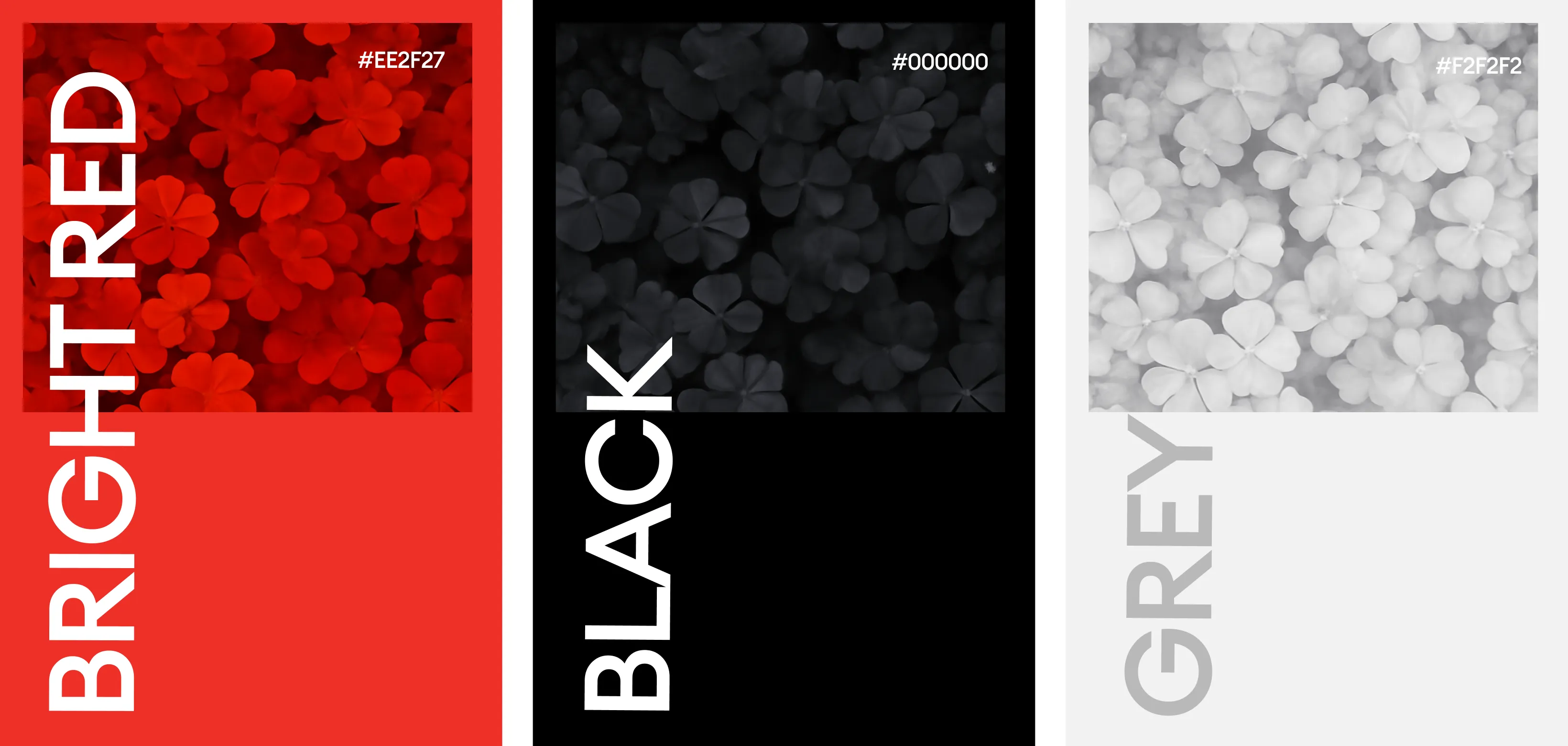
The palette uses a deep black paired with a dynamic red gradient, symbolizing power, security, and innovation. Black conveys professionalism and authority, while red adds energy, urgency, and brand distinction. The gradient seamlessly blends these tones to create depth and modern sophistication. White typography provides strong contrast, improving readability and enhancing the premium look. Altogether, the colors align perfectly with a fintech brand aiming to project confidence, reliability, and forward-thinking design.