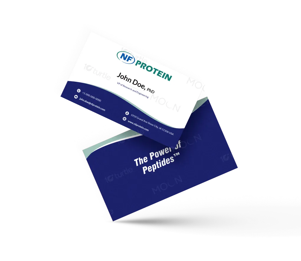
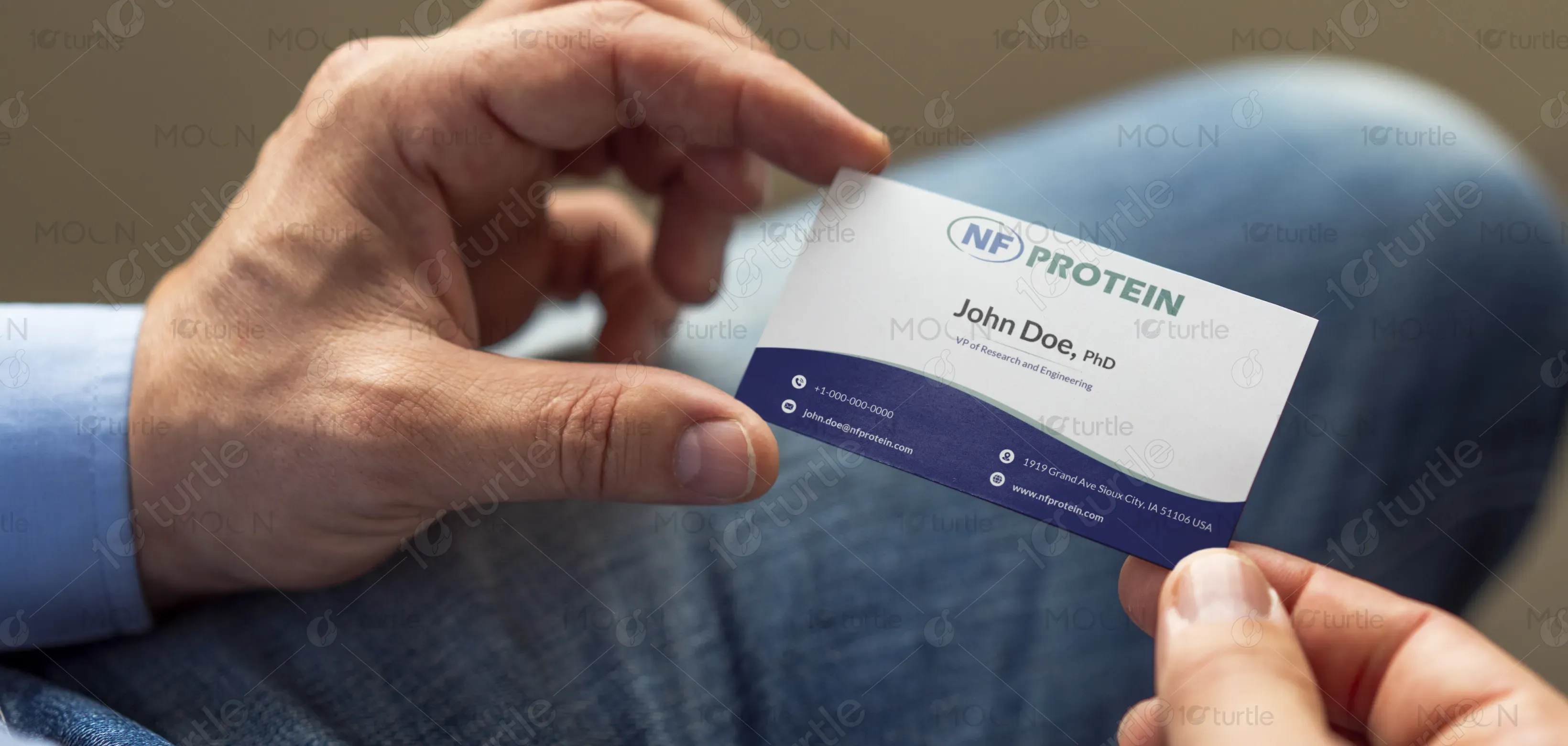
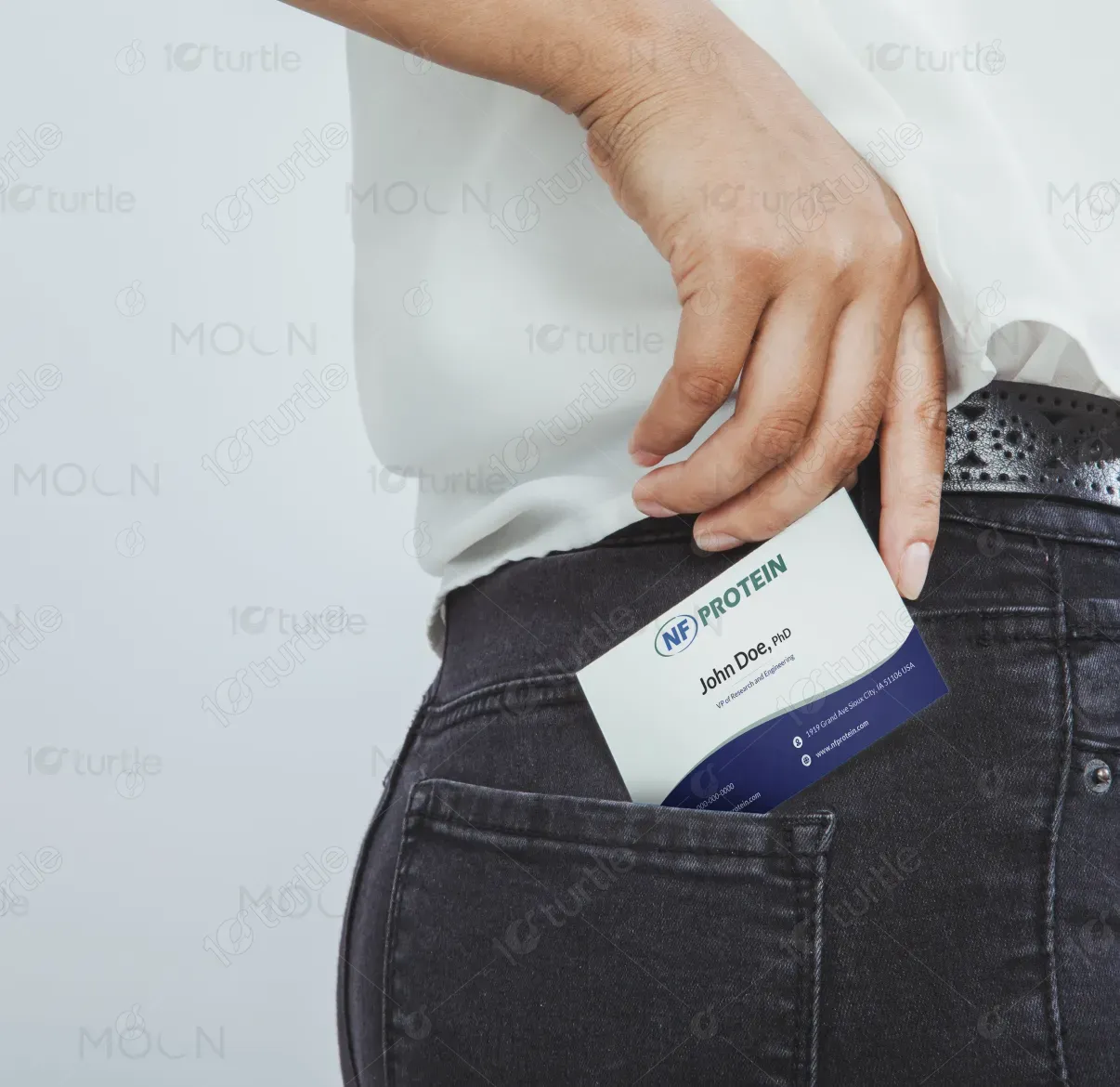
The business card design follows a clean, modern, and science-driven aesthetic that reflects professionalism and credibility. A smooth wave element separates the minimal top section from the rich blue base, symbolizing innovation and forward movement. The layo ut balances typography, branding, and functional details, ensuring clarity and visual hierarchy. The overall direction emphasizes trust, precision, and the scientific foundation of the NF Protein brand. The back side reinforces brand messaging through bold color and a strong tagline presentation.
Business Card Design
Graphic Design
Industry
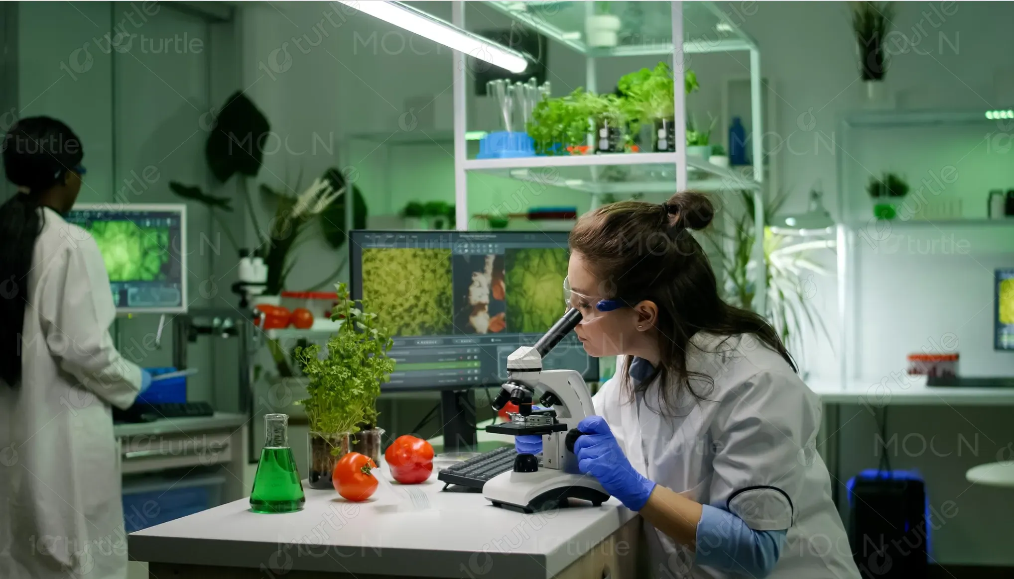
Healthcare & Wellness
Tools we used


Project Completion
2025
Key Market
Global
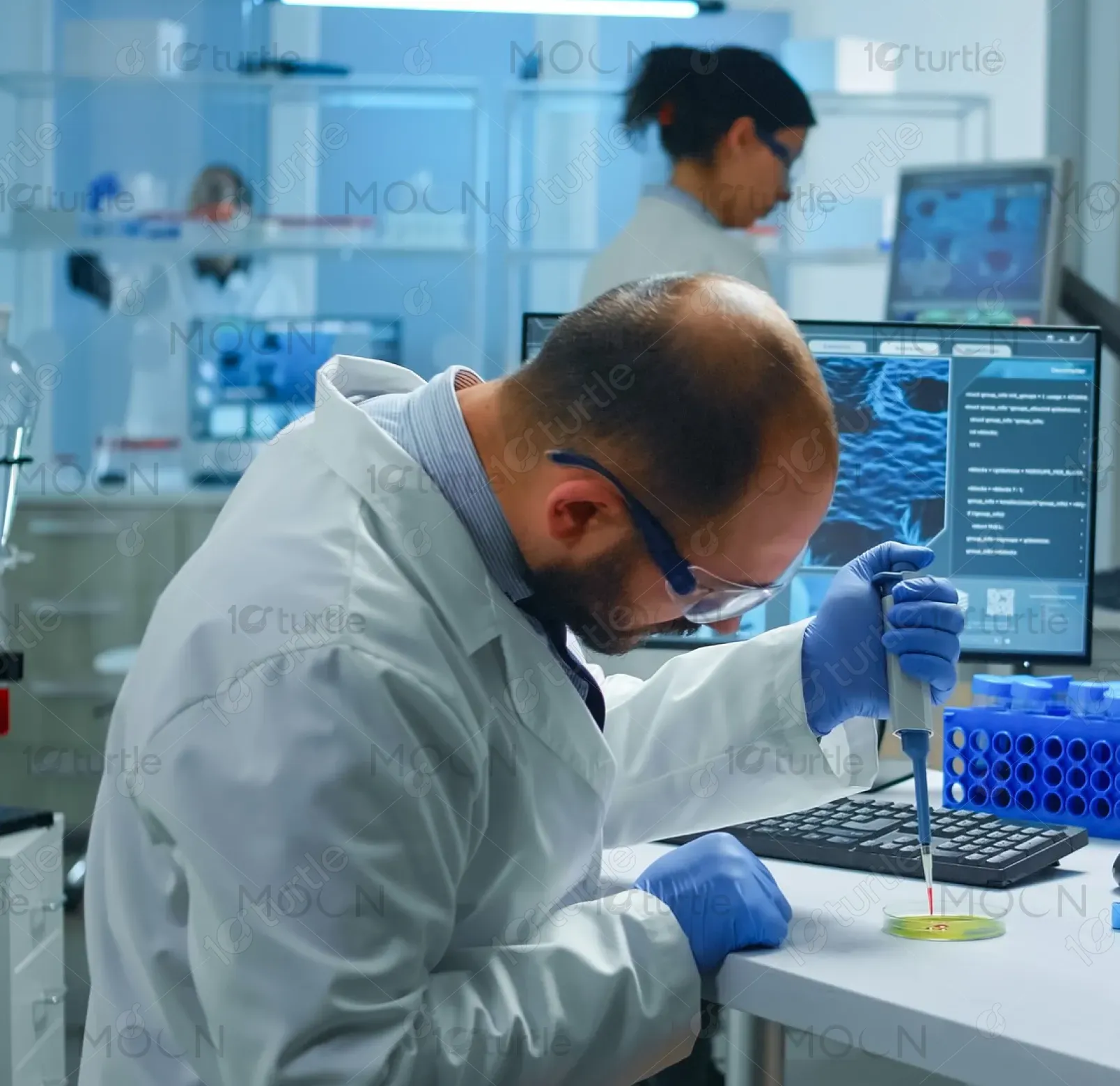
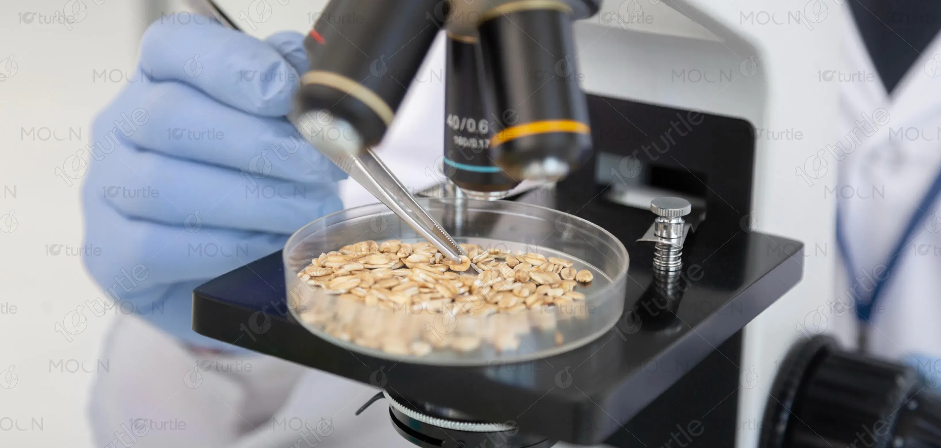
This business card design serves as a professional identity tool for NF Protein, a research-focused biotech brand. The card highlights essential contact information while conveying a scientific and trustworthy visual tone. By combining clean typography, modern waves, and strong brand colors, it reflects the company’s commitment to innovation in peptides and protein engineering. Positioned within the biotech and research industry, the design stands out with its clarity, sophisticated structure, and visually appealing brand consistency.
Industry
Healthcare & WellnessWhat we did
Business Card DesignGraphic DesignPlatform
-Biotech and scientific companies often struggle with business card designs that either look overly clinical or fail to communicate credibility. Many designs lack modern appeal, resulting in cards that don’t resonate with partners, researchers, or investors. Additionally, the challenge lies in balancing detailed information with a clean, readable format. The market lacks identity materials that merge science-driven aesthetics with contemporary design principles—leading to missed opportunities in brand recall and professional presentation.
This design solves the issue by introducing a modern, structured card that blends scientific precision with visual refinement. The wave motif adds movement and personality, while the strong color blocks create contrast and hierarchy. Clear icons improve readability and quick scanning of contact information. The back side reinforces brand identity through a bold tagline. Together, these elements create a visually striking, user-centric design that communicates innovation, trust, and professionalism—ideal for meetings, conferences, and networking.
The long-term vision is to establish a cohesive visual language that strengthens NF Protein’s identity across all corporate materials. This card acts as the foundation for a broader brand system—encompassing stationery, presentations, packaging, and digital assets. The design aims to evolve with emerging scientific trends, maintaining a future-ready aesthetic. Ultimately, it aspires to position NF Protein as a leader recognized not only for scientific excellence but also for sophisticated, memorable branding.
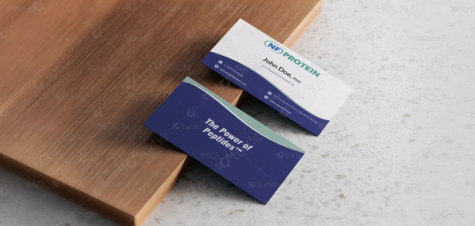
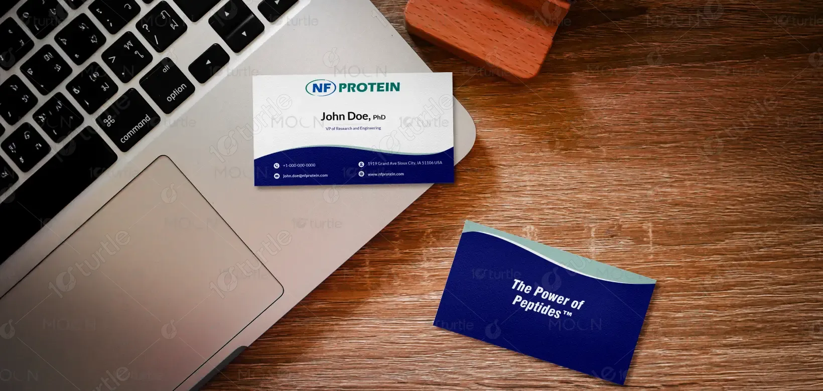
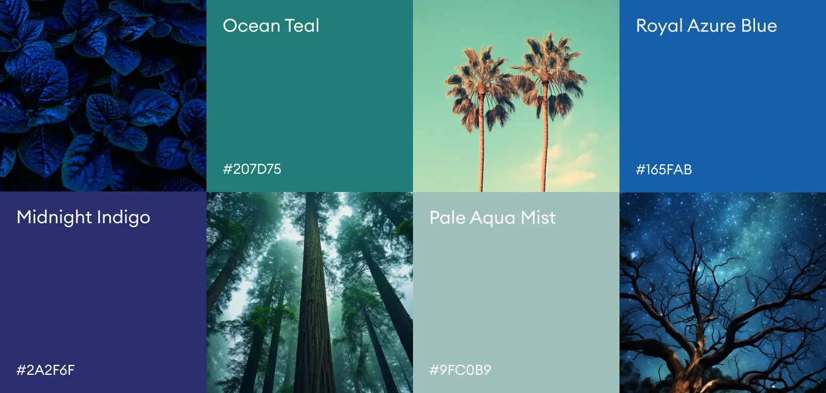
The design uses a refined palette of deep navy blue, teal-green, and white. The navy conveys trust, stability, and scientific authority—ideal for biotech industries. Teal introduces freshness and innovation, reflecting growth and advanced research. White maintains clarity and balance, ensuring the layout feels clean and professional. Together, these colors strengthen brand recognition while inspiring confidence and credibility in every interaction.