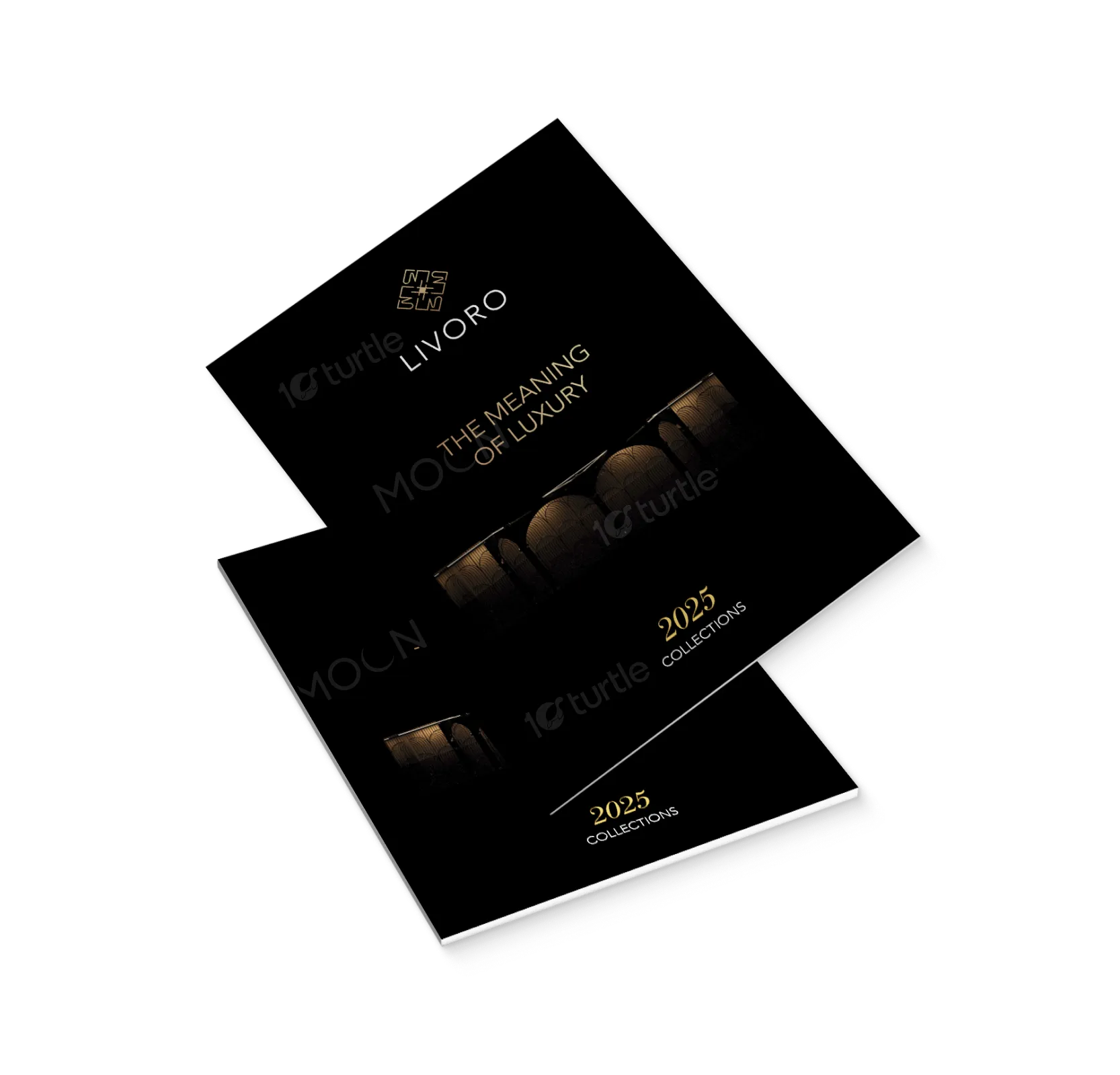
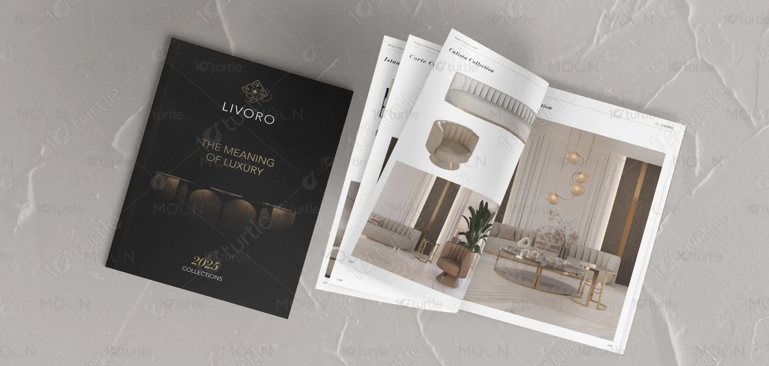
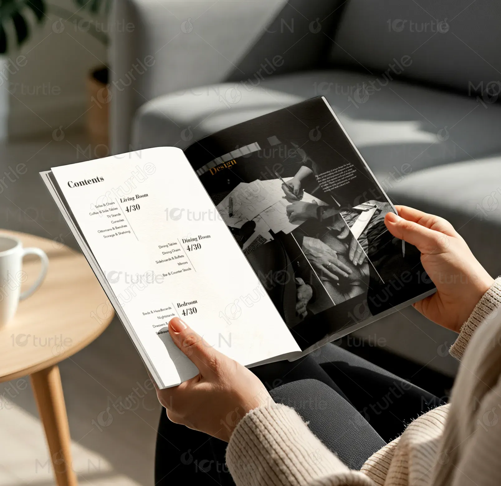
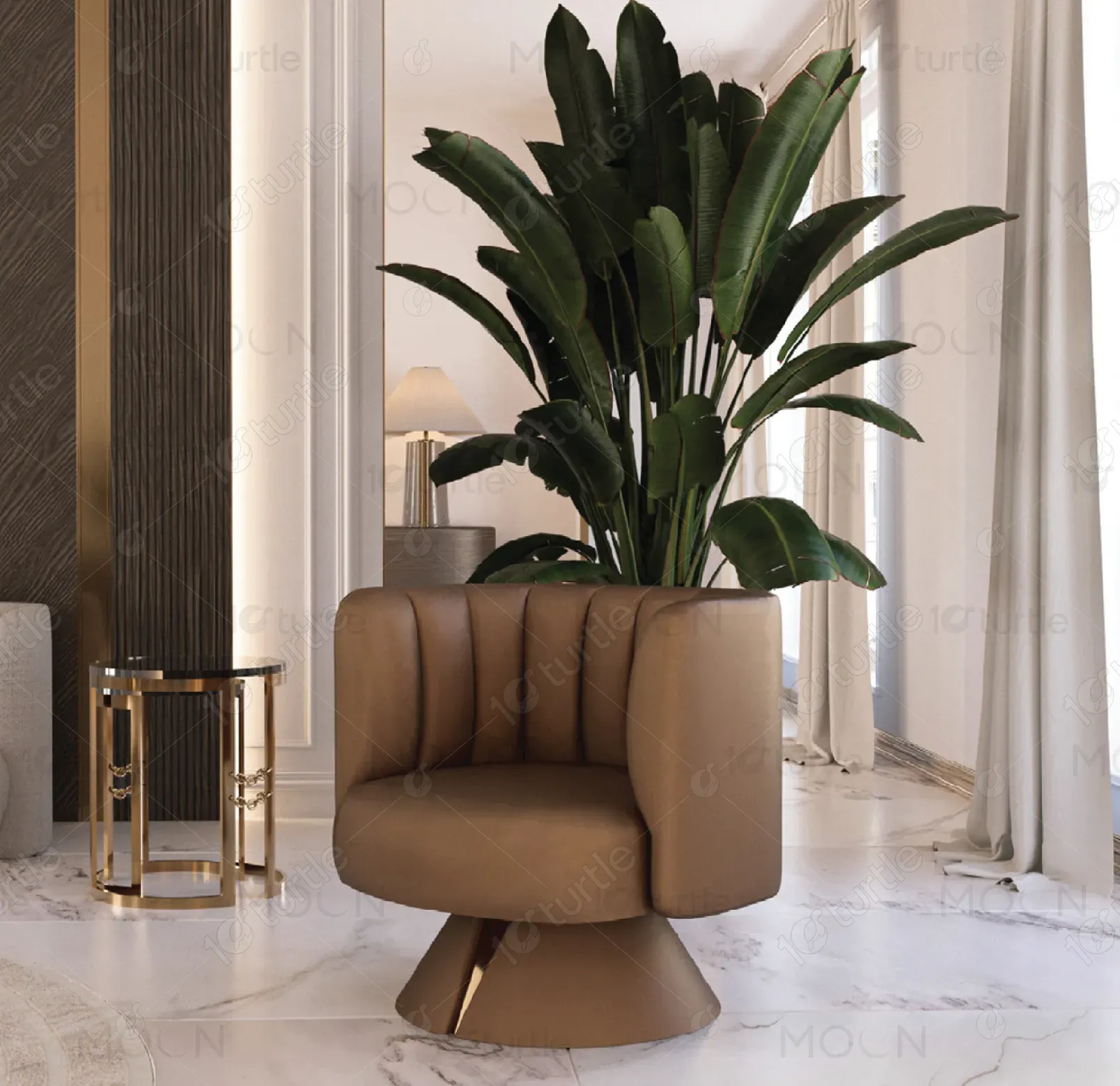
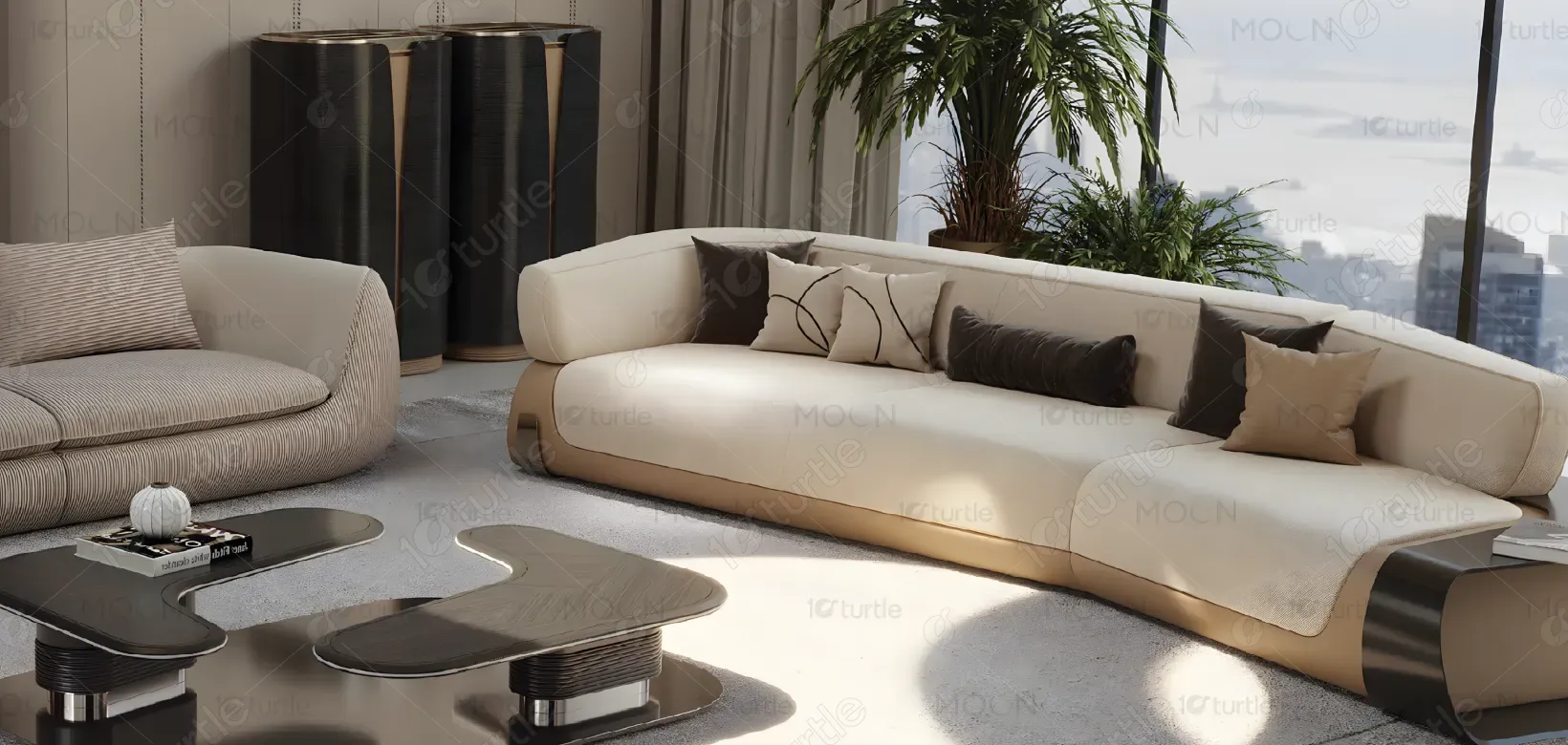
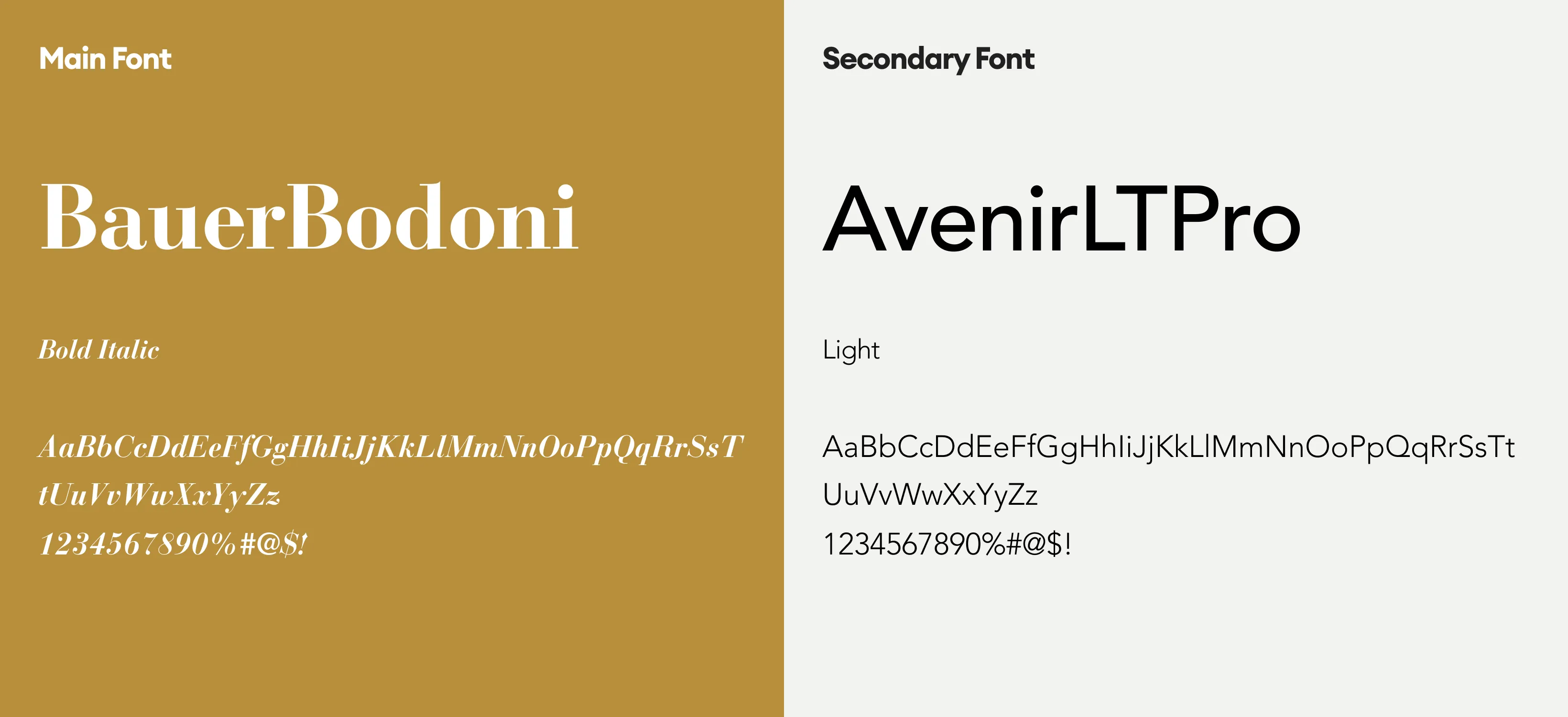
The catalogue follows a clean, editorial layout that balances elegance with functionality. Minimal typography, generous white space, and structured grids ensure clarity, while high-quality imagery highlights product craftsmanship. A neutral color palette enhances sophistication, allowing the furniture to stand out. Consistent visual hierarchy guides the reader smoothly, creating a seamless browsing experience aligned with premium lifestyle branding.
Catalog Design
Graphic Design
Industry
Fashion, Beauty & Lifestyle
Tools we used


Project Completion
2025
Key Market
Global
This catalogue represents a curated collection of modern furniture designed for contemporary living spaces. It showcases a wide range of products across living, dining, and bedroom categories. The primary goal is to present the brand’s offerings in a refined, accessible format, emphasizing quality, comfort, and design versatility while positioning the brand within the premium home furniture market.
Industry
Fashion, Beauty & LifestyleWhat we did
Catalog DesignGraphic DesignPlatform
-Furniture catalogues often suffer from cluttered layouts, inconsistent visuals, and unclear product presentation, leading to reduced engagement and confusion. Customers struggle to visualize products within real spaces or differentiate between collections. This lack of clarity impacts purchasing decisions, weakens brand perception, and limits the ability to communicate design value effectively in a competitive market.
The design adopts a structured and user-centric approach, using clear categorization, consistent layouts, and strong visual hierarchy. High-resolution imagery paired with minimal text enhances readability and focus. Strategic spacing and alignment improve navigation, while cohesive styling across pages builds brand consistency. This approach ensures better product visibility, intuitive browsing, and an elevated overall user experience.
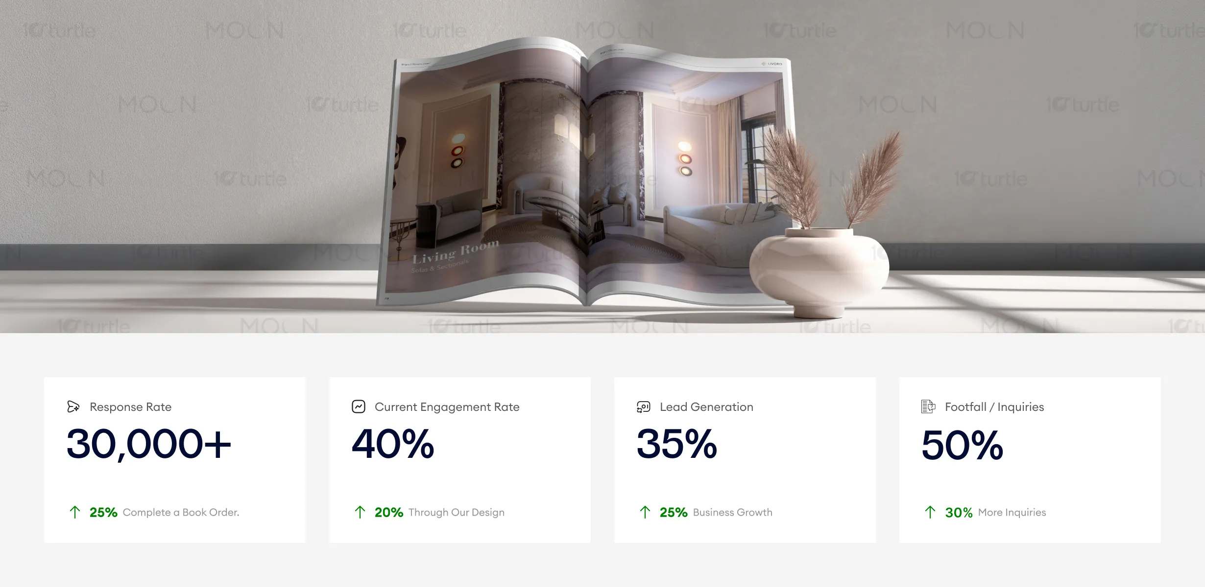
This catalogue design performs well in aligning with premium lifestyle branding, using minimal typography, high-quality images, and clear visual hierarchy to engage and inspire the audience. The balance of elegance and functionality drives higher response rates and inquiries, increasing lead generation significantly. To enhance these metrics, incorporating personalized calls-to-action and refining distribution channels could further improve engagement and footfall.
The catalogue is designed to support long-term brand growth by establishing a recognizable and adaptable visual identity. It creates a foundation that can extend across digital and print platforms, maintaining consistency. By emphasizing timeless design and clarity, the brand positions itself as a reliable, design-forward furniture provider capable of evolving with changing consumer preferences and global trends.
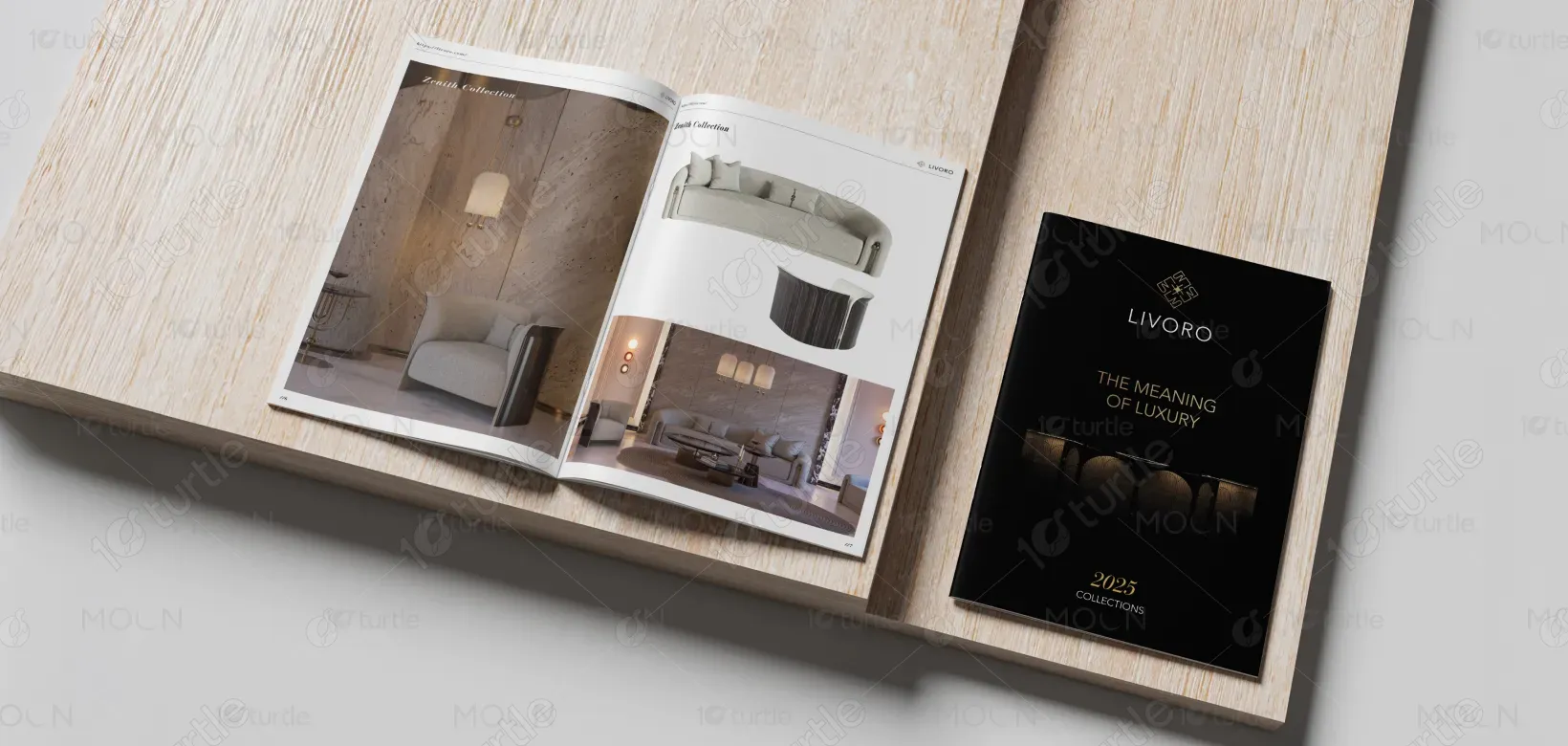
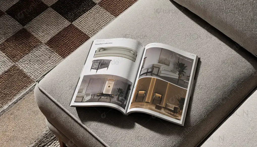
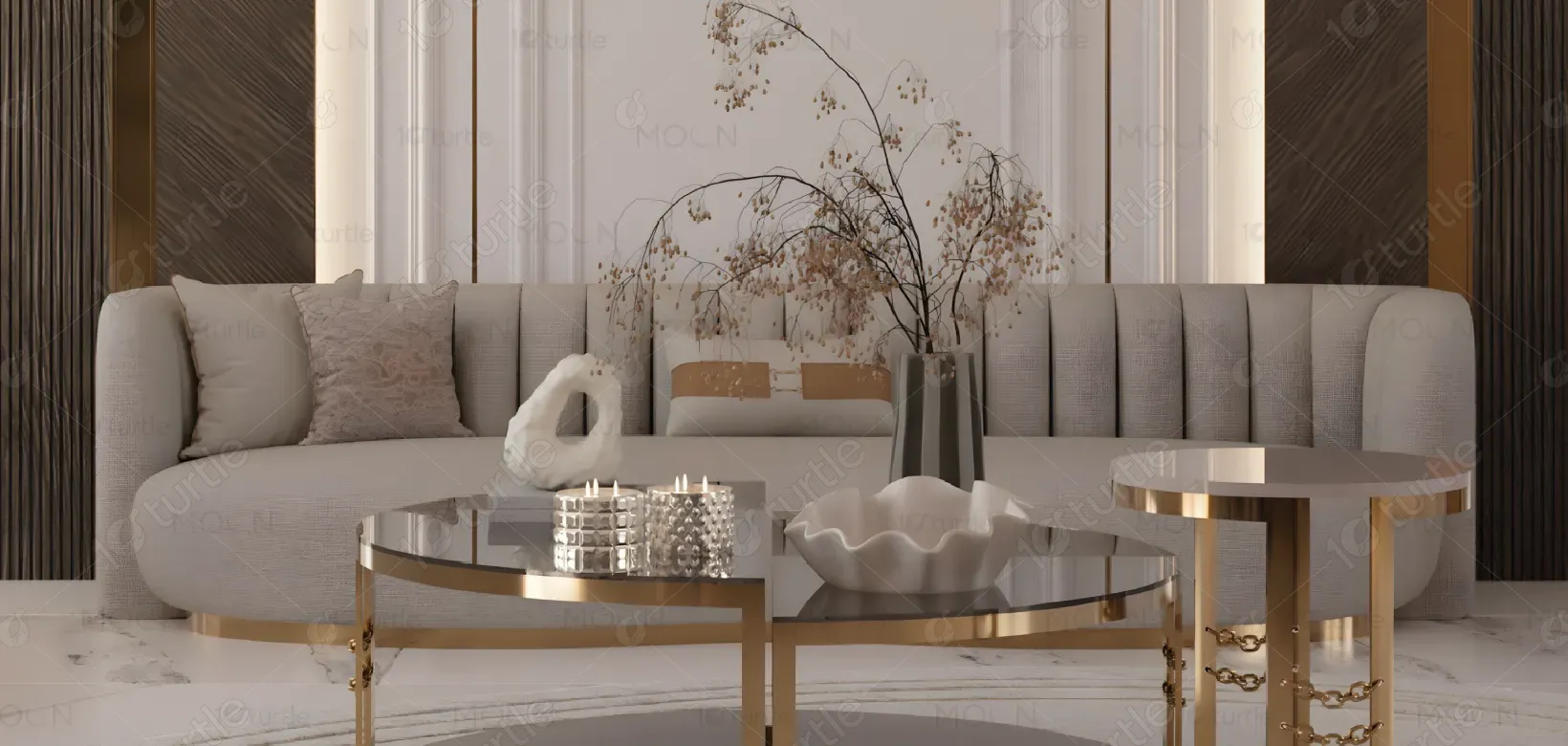
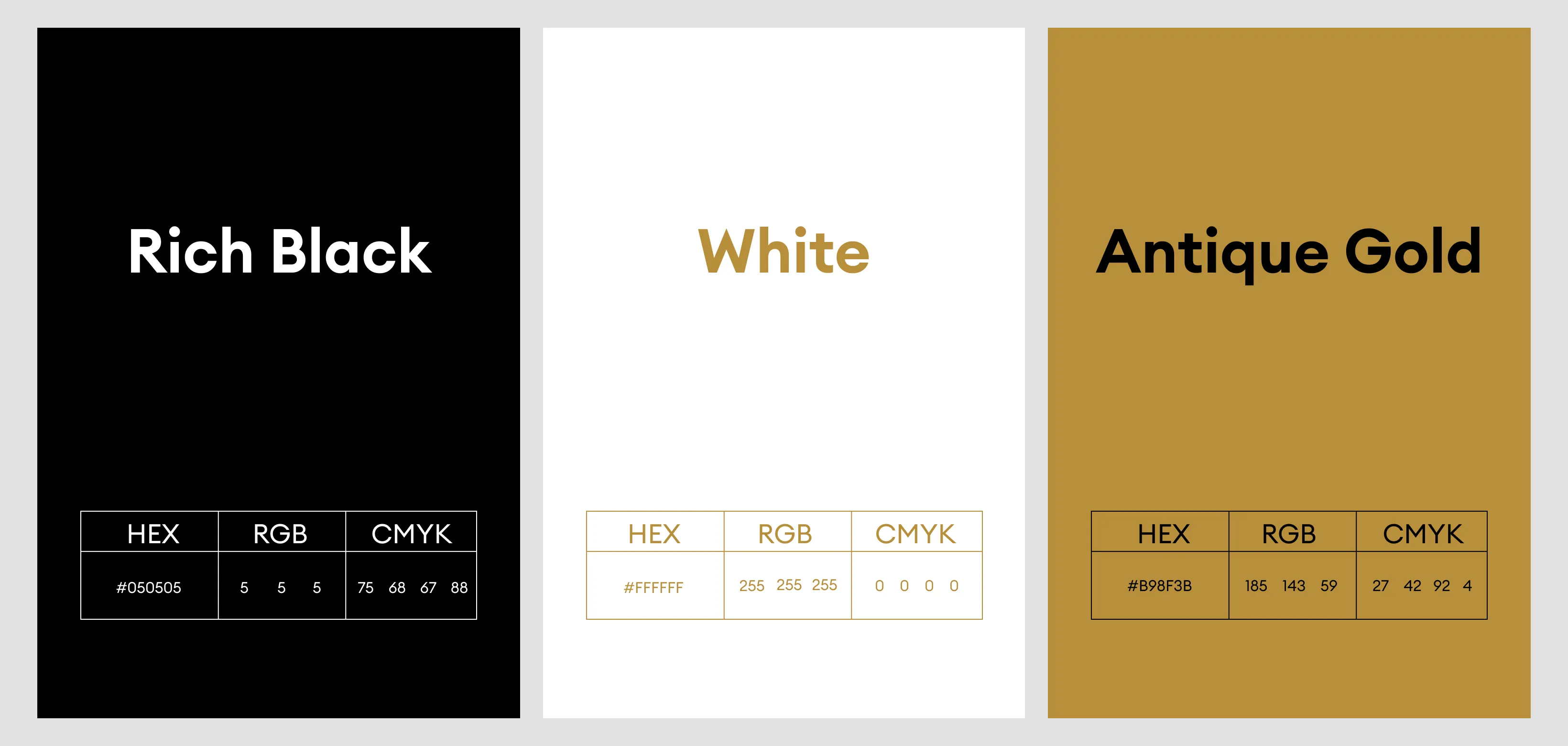
The design uses a neutral and sophisticated color palette, primarily consisting of whites, soft greys, and muted tones. These colors create a calm and premium feel while ensuring content readability. Subtle contrasts and clean visual elements enhance structure without overwhelming the layout, allowing the furniture designs to remain the focal point and reinforcing a modern, elegant brand identity.