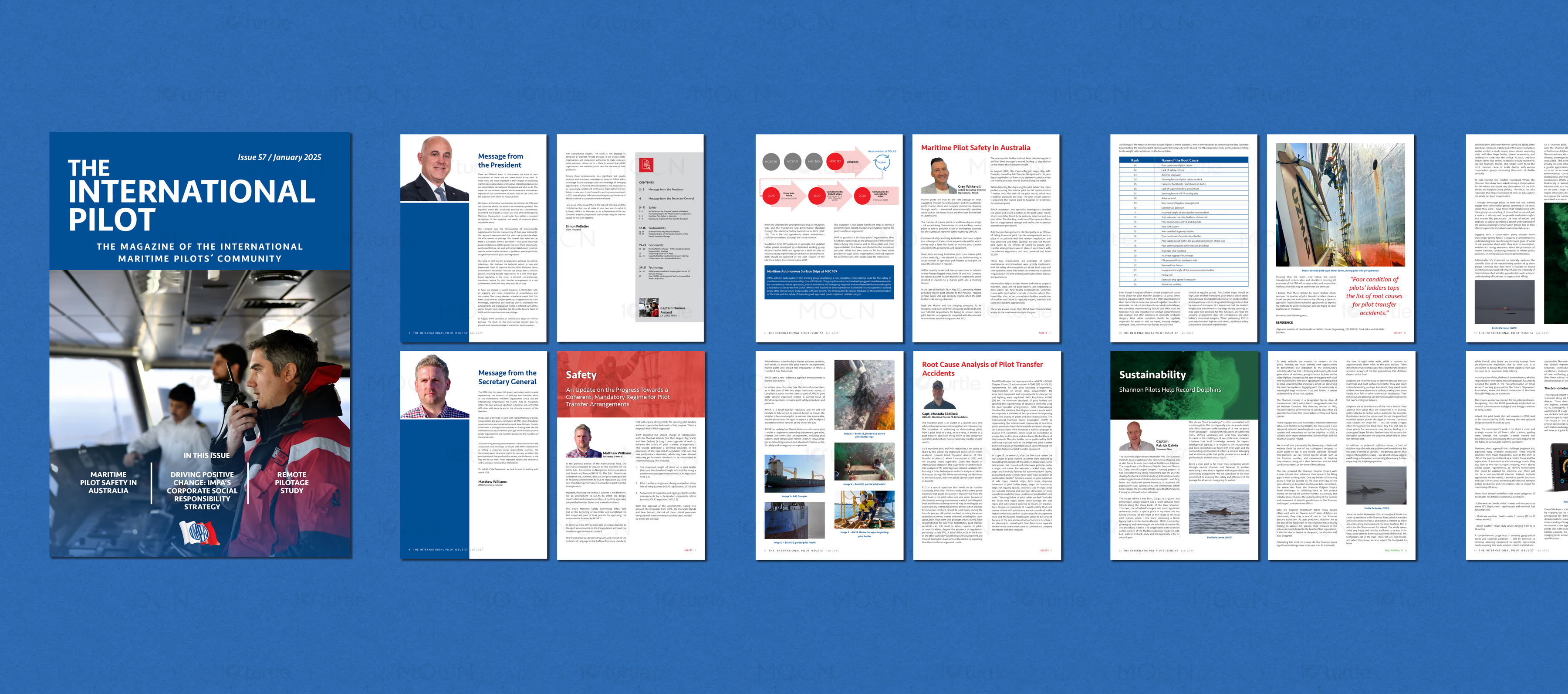
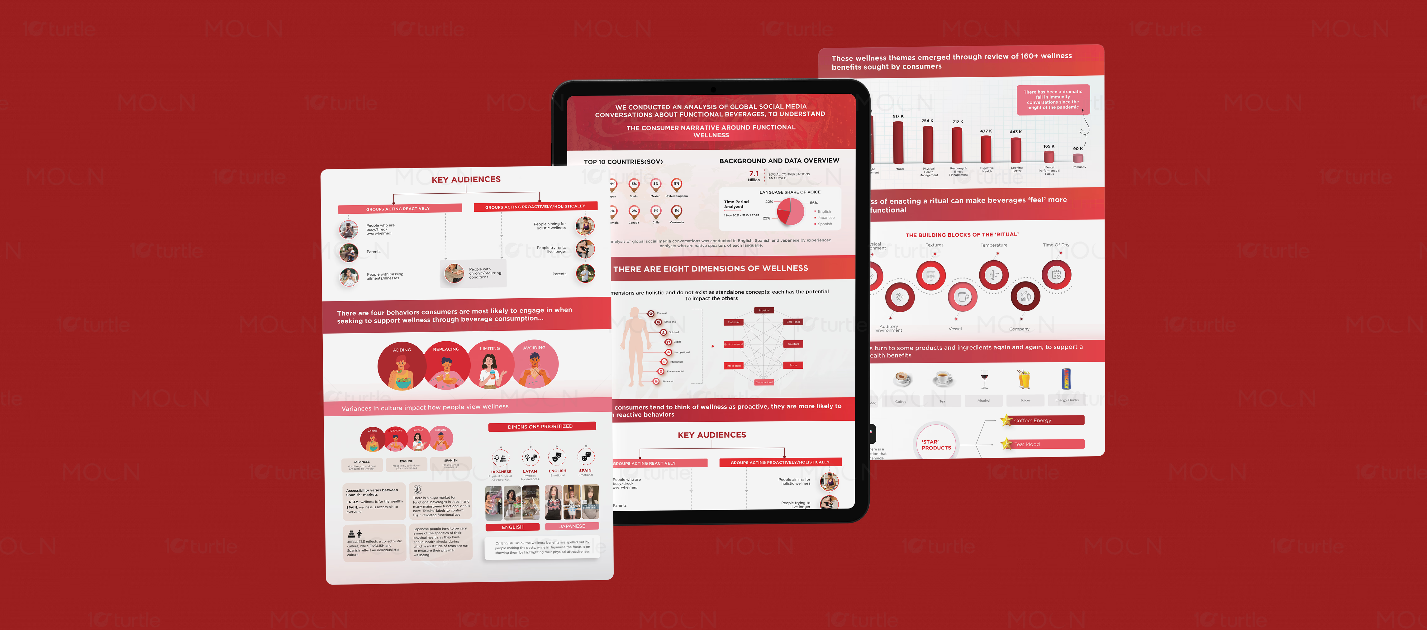
A two-piece infographic design set converting research findings, wellness trends, audience behavior, and WhatsApp business benefits into clear, structured visuals for reports, presentations, print displays, and digital presentation use cases.
Infographic Design • Data Visualization Design • Report Design • Infography
Industry
Business & Corporate Communications
Tools we used


Project Completion
2025
Key Market
Global
Industry
Business & Corporate CommunicationsWhat we did
Platform
-Infographic design must turn heavy data into information that feels quick, useful, and easy to follow. Research reports, consumer insights, and business service explanations often become difficult to read when they rely only on long paragraphs or unstructured data. Poor hierarchy can cause users to miss key findings, percentages, comparisons, and benefits. For professional communication, the biggest challenge is making complex content look credible without making it visually overwhelming.
The collection uses strong section-based layouts, bold headings, charts, icons, and circular callouts to guide the viewer through each information layer. The functional wellness infographic uses a red and white system with bar charts, pie charts, audience segments, and behavioral diagrams to organize research findings clearly. The Lithos WhatsApp Business Account infographic uses a dark navy, cream, and gold palette with numbered benefit points arranged around a central WhatsApp icon. Both designs create visual order through spacing, contrast, iconography, and structured content grouping.