The design follows a structured and clarity-focused visual approach tailored for academic learning. A clean layout, organized content blocks, and clear typographic hierarchy ensure easy navigation and readability. The use of structured sections, consistent spacing, and minimal distractions enhances comprehension. Neutral academic colors and well-defined headings guide students through information efficiently, while logical content flow improves focus, engagement, and accessibility for learners preparing for examinations.
Document Design
Graphic Design

Industry
Education & Training
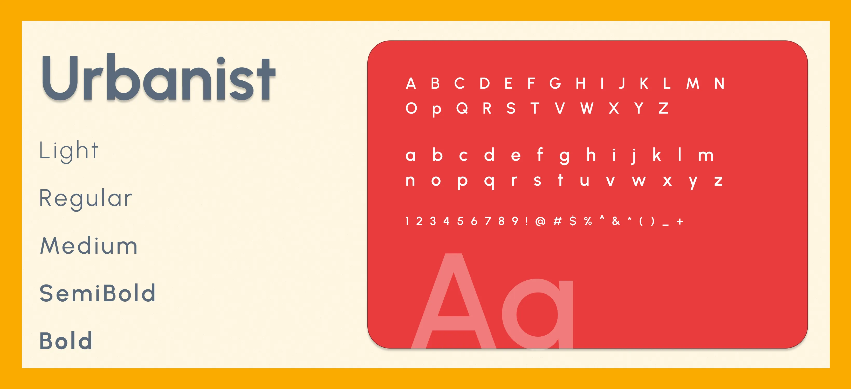
Tools we used


Project Completion
2025
Key Market
Global
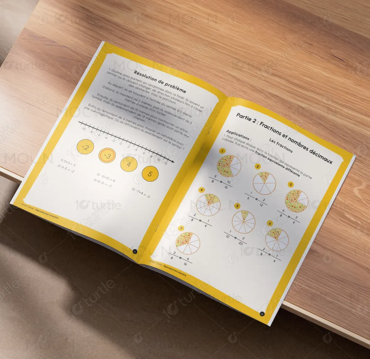
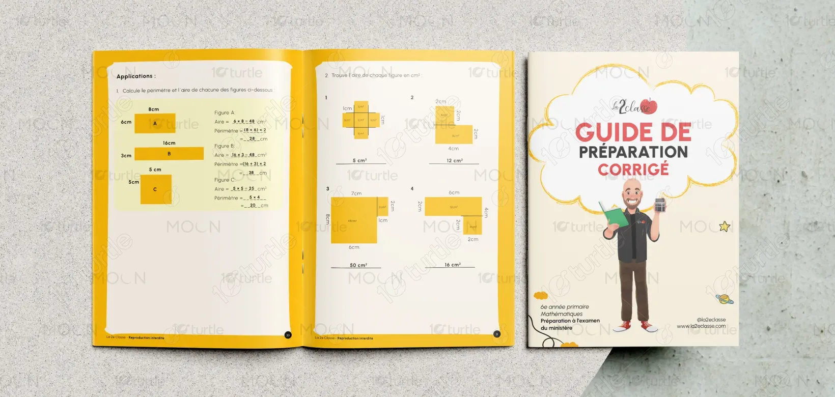
The design represents an educational preparation guide aimed at helping primary-level students strengthen mathematical understanding and exam readiness. Its primary purpose is to simplify complex concepts through organized presentation and step-by-step explanations. Positioned within the education and training sector, the design emphasizes clarity, structured learning, and accessibility, supporting both students and educators with reliable preparation material while reinforcing trust and academic credibility.

Industry
Education & TrainingWhat we did
Document DesignGraphic DesignPlatform
-Students preparing for examinations often struggle with poorly structured study materials, overwhelming information layouts, and unclear explanations that reduce learning efficiency. Traditional academic resources may lack visual organization, making concepts difficult to understand and retain. This challenge affects student confidence, engagement levels, and overall academic performance, while also limiting educators’ ability to provide effective learning support.
The design addresses these challenges through a structured, learner-centered layout that prioritizes clarity and comprehension. Clear information hierarchy, readable typography, and organized sections simplify complex mathematical concepts. Consistent visual patterns improve usability and cognitive flow, while intuitive navigation helps students locate information quickly. This strategic approach enhances learning efficiency, supports knowledge retention, and improves engagement with academic content.
The design supports both comprehension and retention, making it highly effective in educational settings. Clear visual hierarchy and well-organized content ensure ease of use, which can directly contribute to increased engagement and lead generation. The well-structured layout, combined with intuitive design, can improve both response rates and footfall for educational products or services.

The long-term vision is to create a reliable and scalable educational resource that supports continuous academic growth and student success. The design establishes a strong foundation for future learning materials, digital platforms, and educational touchpoints. By promoting clarity, accessibility, and trust, the brand aims to position itself as a dependable provider of high-quality exam preparation resources within the education sector.

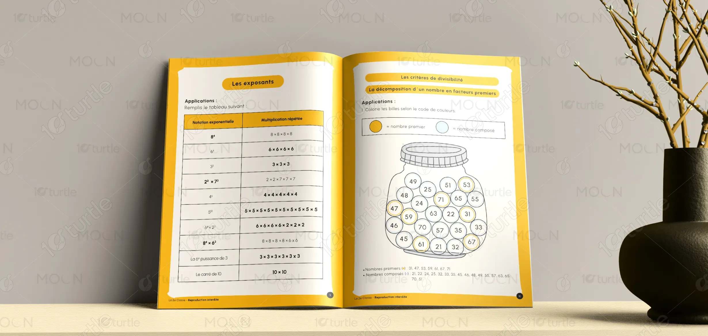
The color palette emphasizes clarity, focus, and academic trust through clean, neutral tones and structured visual elements. Subtle contrasts between headings, sections, and content areas enhance readability and visual hierarchy. The minimal and professional visual language supports cognitive ease, reduces distractions, and aligns with the educational purpose of the material. Consistent typography and structured formatting reinforce reliability and ensure recognition across different academic formats.