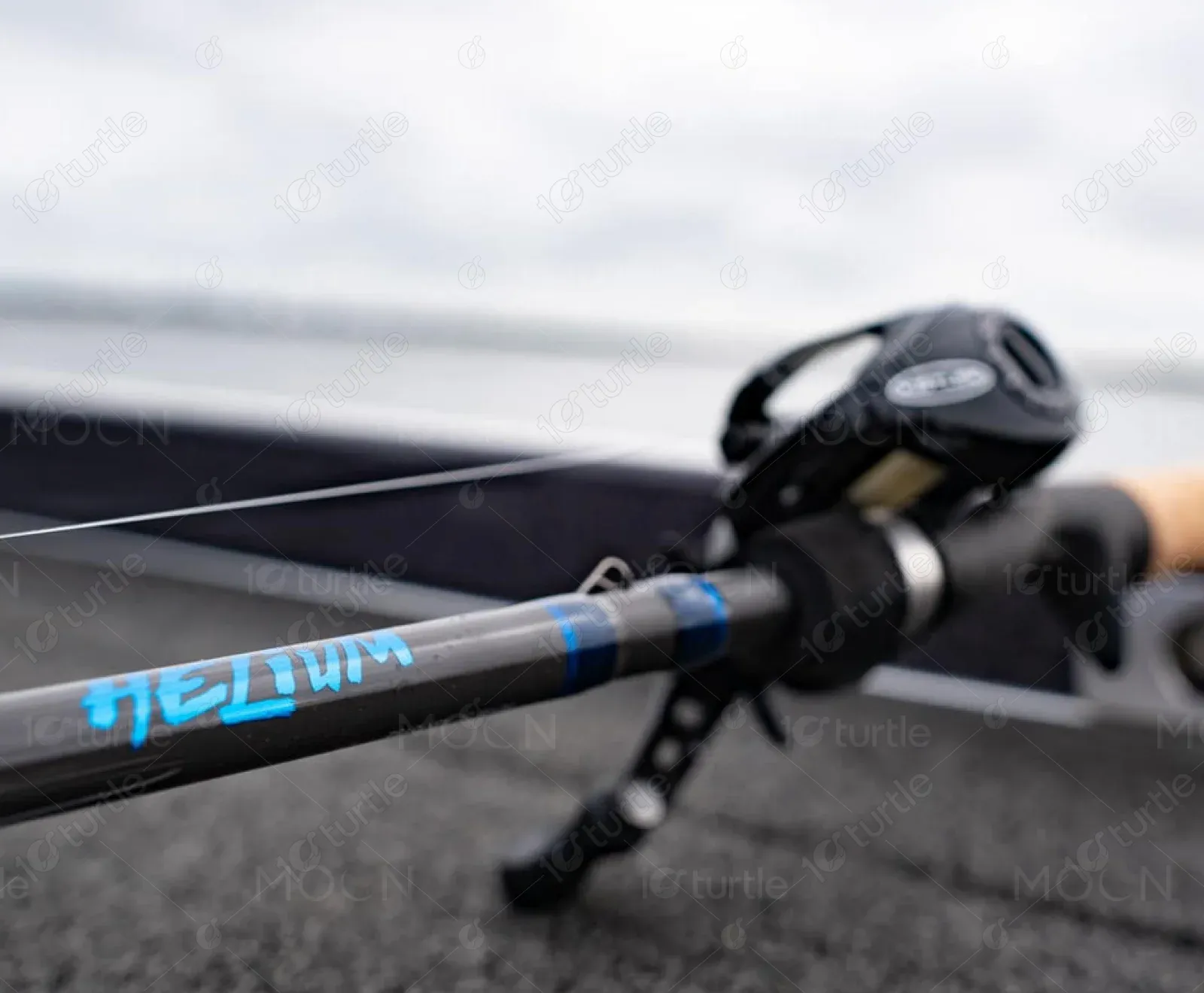
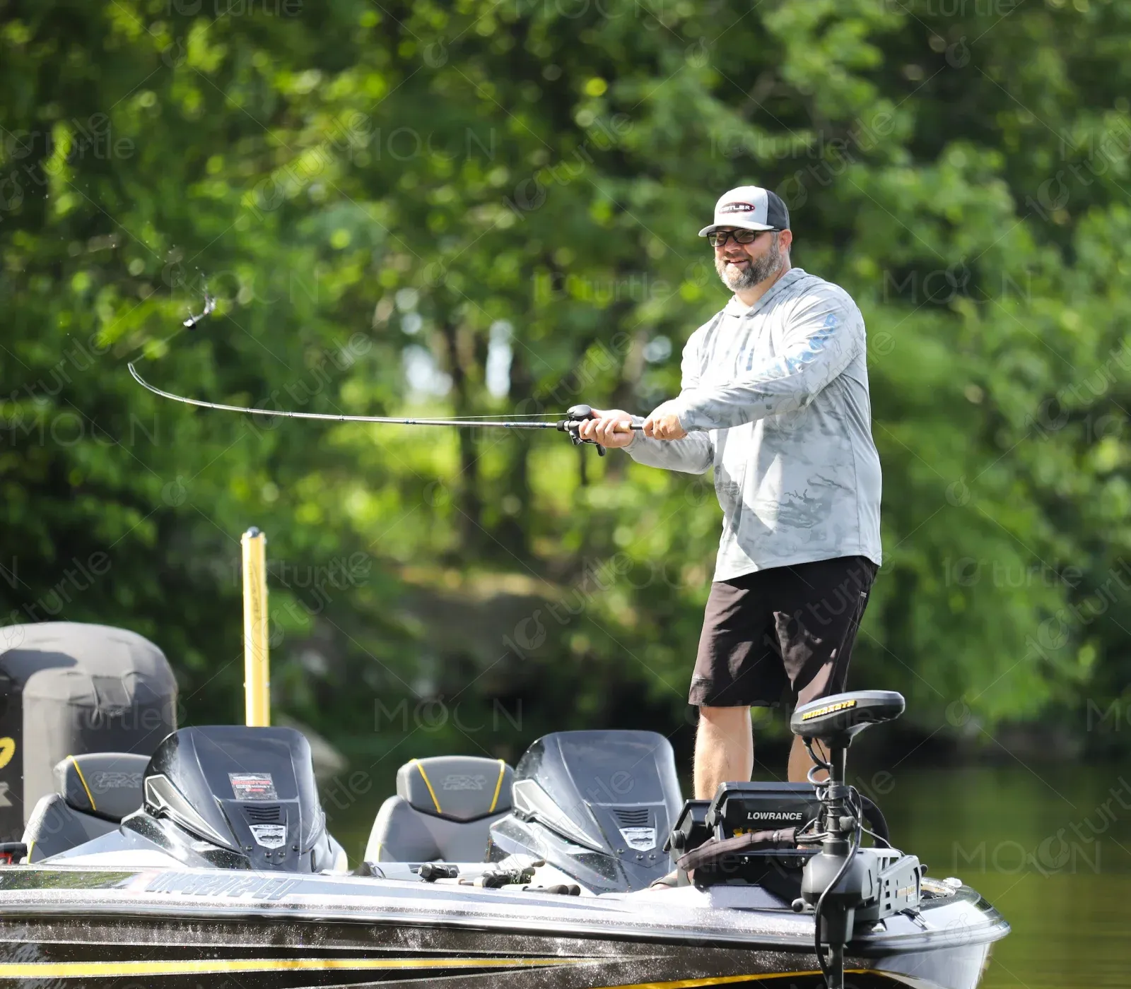
Kistler is a high-performance fishing gear brand committed to innovation, quality, and conservation. Known for their top-tier rods, reels, and apparel, Kistler has established itself as a trusted name among anglers seeking cutting-edge gear designed and crafted in the USA.
UX Design
UI Design
Websites Design
Industry
Consumer Goods & Retail
Tools we used


Project Completion
2024
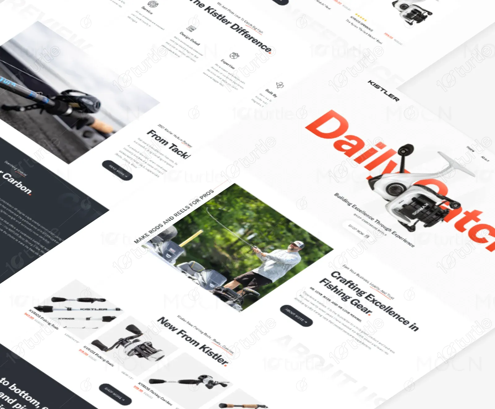
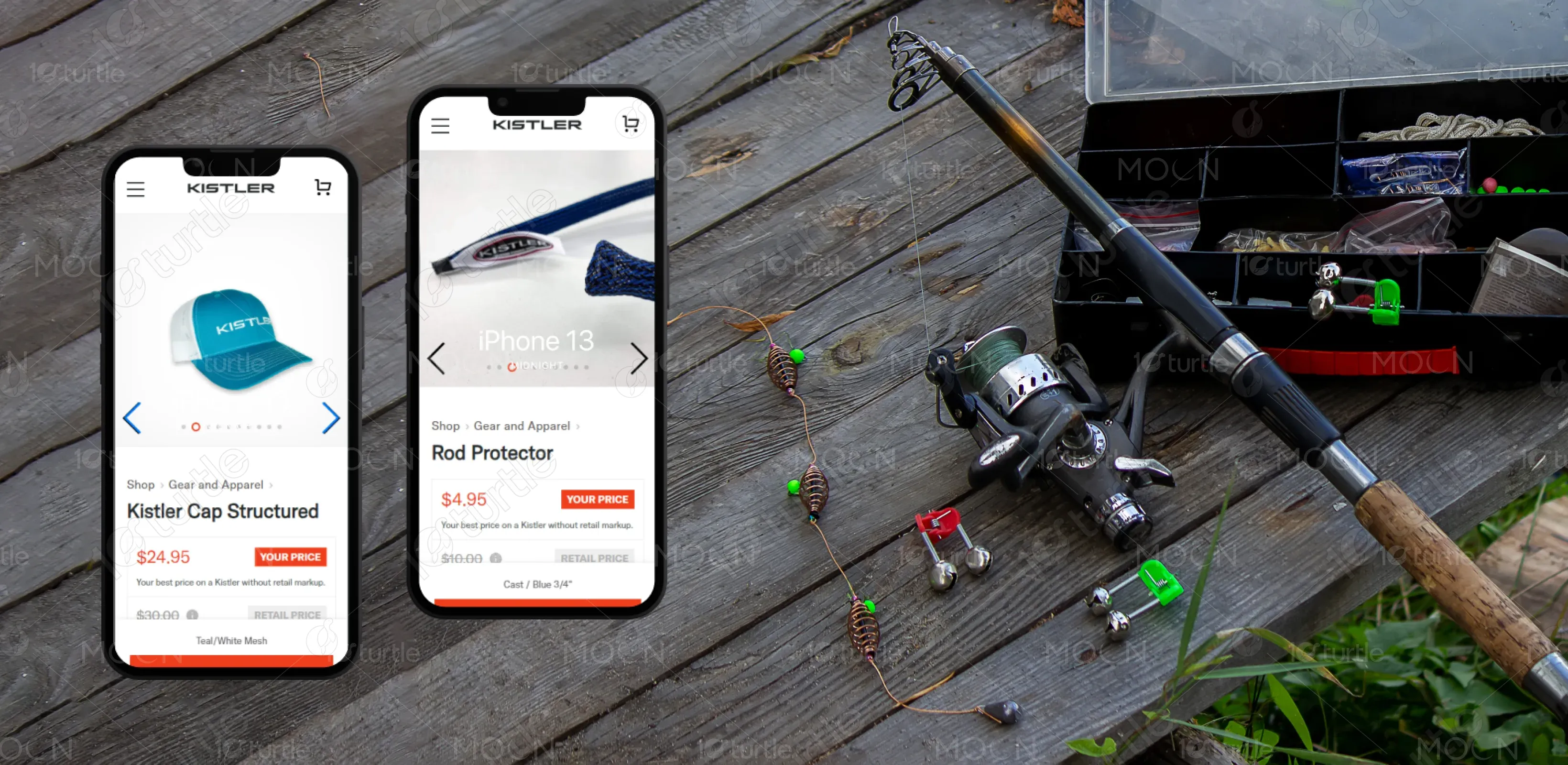
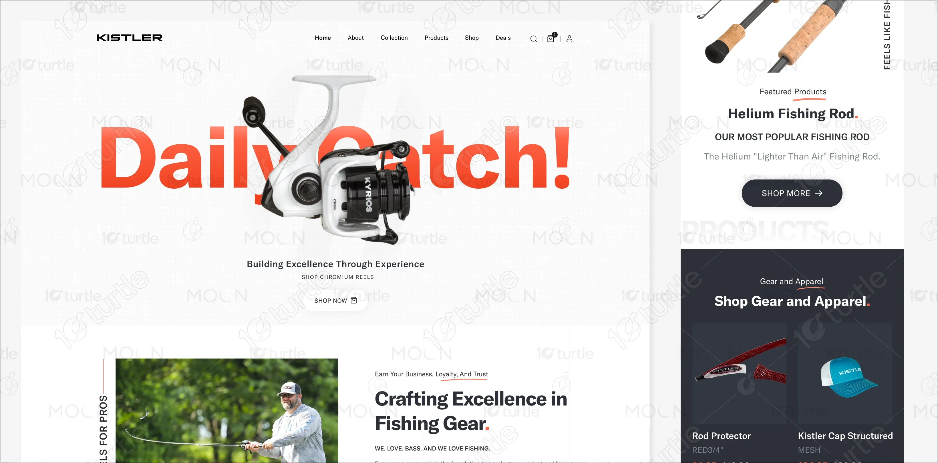
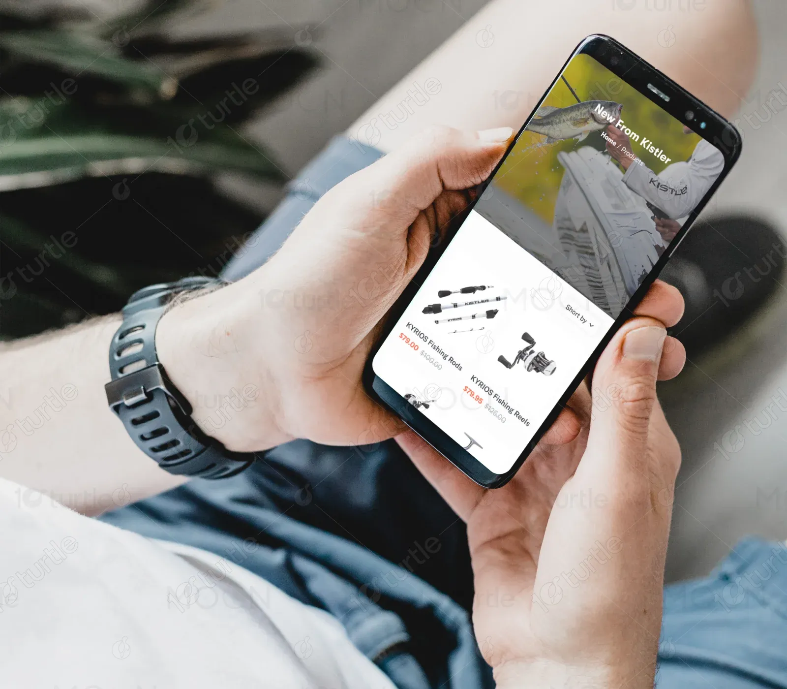
The Kistler homepage redesign features distinct sections that introduce their latest collections, best-selling gear, apparel, custom rod design, and brand differentiators. From educational video content to conservation messaging, every element reinforces the brand’s authority and connection to the fishing community.
Industry
Consumer Goods & RetailWhat we did
User ResearchUI UX DesigningPlatform
-Kistler’s previous site design lacked visual excitement and didn’t fully represent the brand's cutting-edge products or strong ethos. The experience felt outdated, and users had difficulty navigating to the right product categories quickly.
We created a bold and engaging homepage that puts Kistler’s product excellence and brand values front and center. With high-quality photography, easy-to-navigate sections, and a cohesive design system, we crafted an experience that educates, inspires, and converts. Clear CTAs and custom highlights like “Design Your Own Rod” and “Kistler Carbon” sections set the brand apart.
Kistler aimed to create a platform that embodies their reputation for high-quality craftsmanship and industry leadership in fishing gear. The client wanted a website that felt both professional and personal—where their passion for conservation, product innovation, and community stories could be showcased.
The Kistler logo is minimalist and strong, echoing the precision and craftsmanship found in their gear. Clean, sans-serif typography ensures visibility on digital and physical mediums, while the logo's simplicity matches the sleekness of their product design.


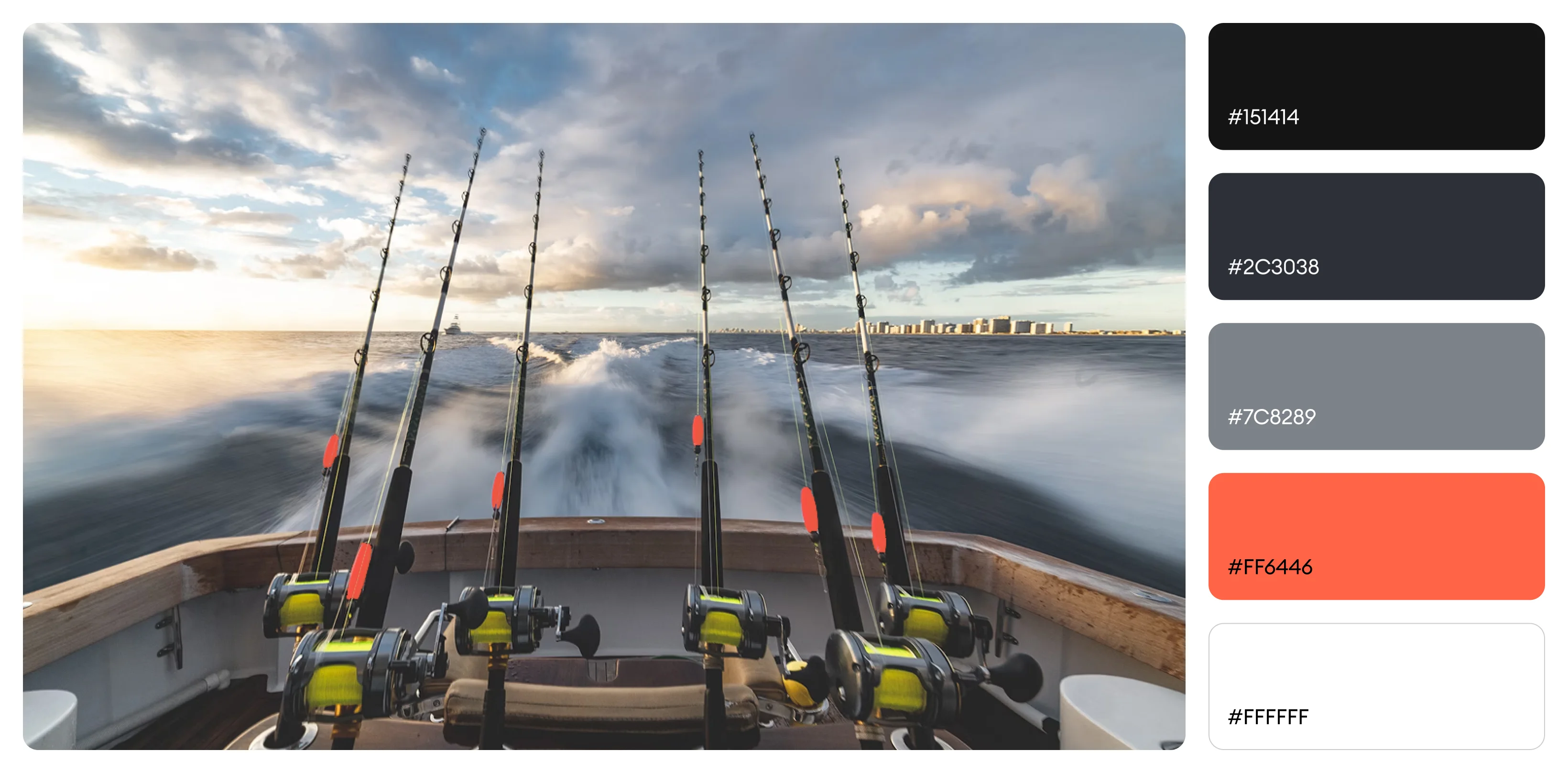
The homepage design uses a sharp and masculine palette: a base of dark slate (#151414), paired with white (#FFFFFF) for clarity and emphasis. Accents of vibrant red (#FF6446) are used strategically to call attention to key buttons and highlights, enhancing the boldness of the brand while maintaining a professional outdoor aesthetic.
The homepage starts strong with a high-impact hero image and the tagline "Daily Catch," immediately introducing the brand’s energy. Key products, blog content, and collections follow in clear sections.