Crafting a vibrant, user-centric website redesign that captures the essence of Mad Kanna’s brand, enhances user experience, and tells a compelling story of passion, creativity, and commitment to excellence
UX Design
UI Design
Research
Website Design
Industry
Consumer Goods & Retail
Tools we used

Project Completion
2024
Mad Kanna is a cannabis brand committed to delivering premium-quality products while fostering a culture of transparency, innovation, and community empowerment. Recognizing the need to modernize their digital presence, the website redesign aimed to better represent the brand’s identity, improve user engagement, and provide an intuitive shopping experience. The redesign focused on creating a cohesive visual language and a streamlined interface to effectively communicate Mad Kanna’s values and product offerings.
Industry
Consumer Goods & RetailWhat we did
User ResearchUI UX DesigningE-commerce DesignVisual StrategyPlatform
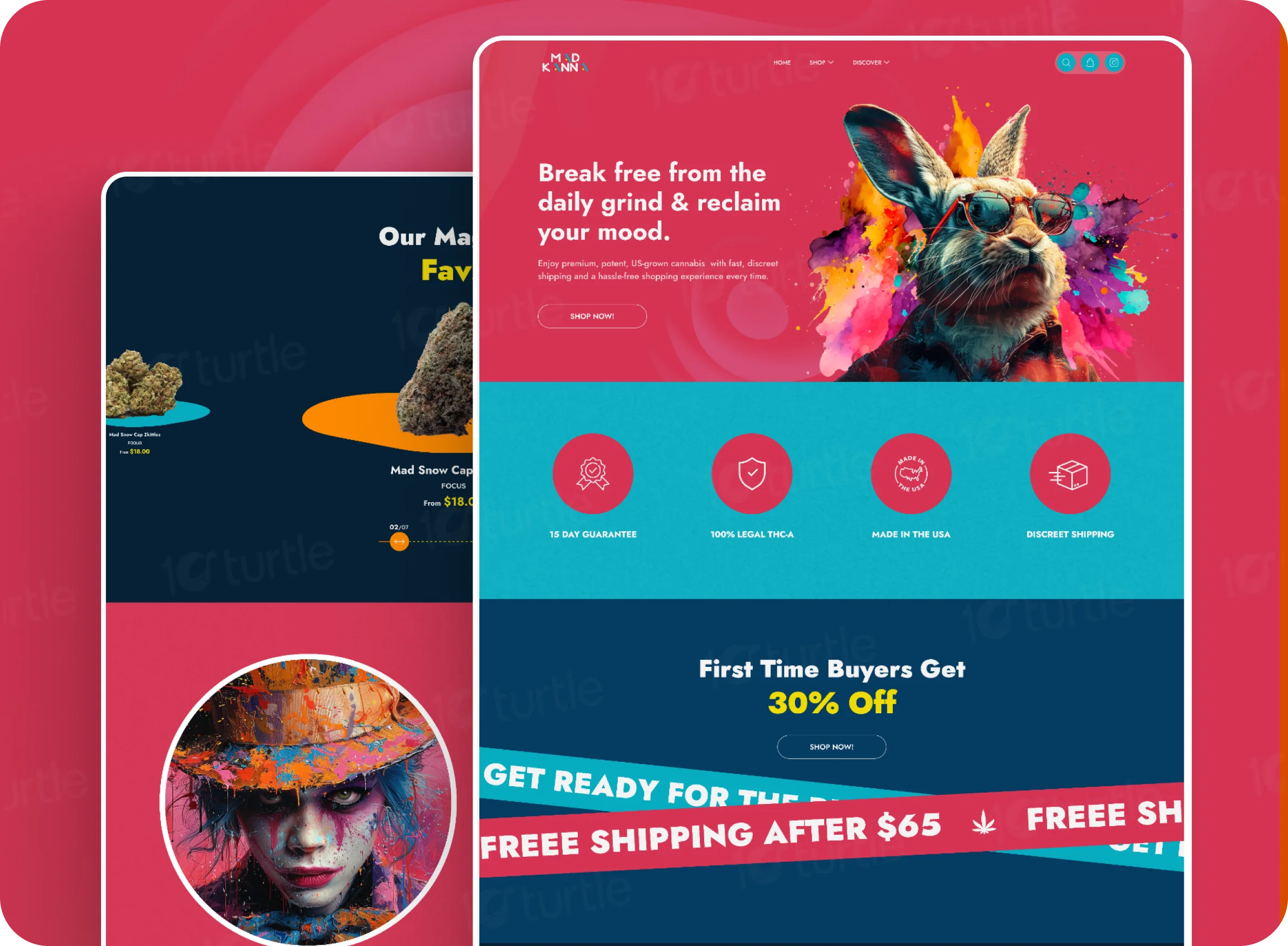
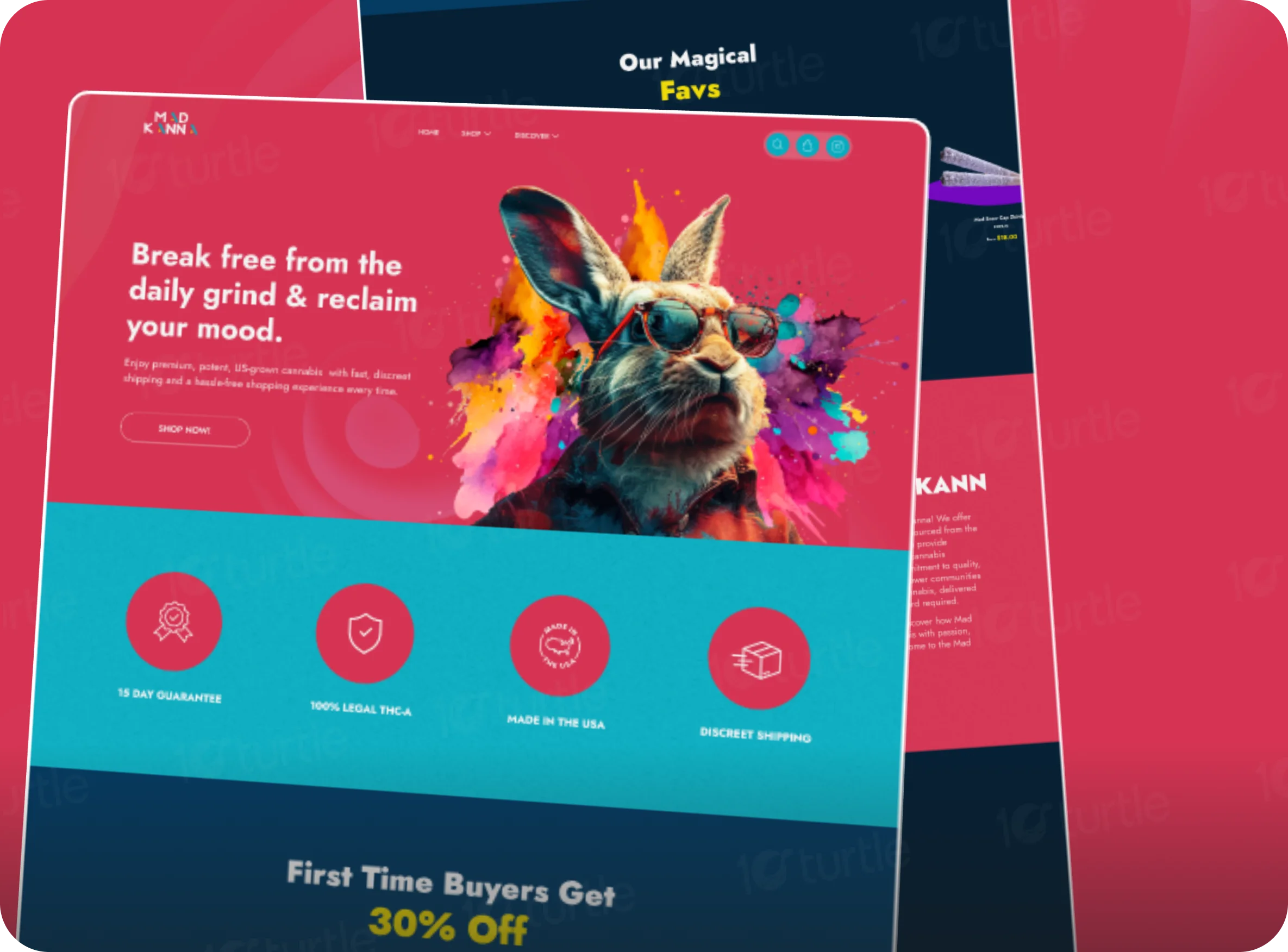
WebsiteThe previous iteration of the Mad Kanna website failed to encapsulate the vibrant and dynamic spirit of the brand. It lacked a unified visual identity, making it difficult for users to resonate with the brand’s personality. Additionally, the user interface felt outdated, and the navigation system did not cater to a seamless shopping experience. These issues hindered the site’s ability to build trust, retain visitors, and convert them into loyal customers.
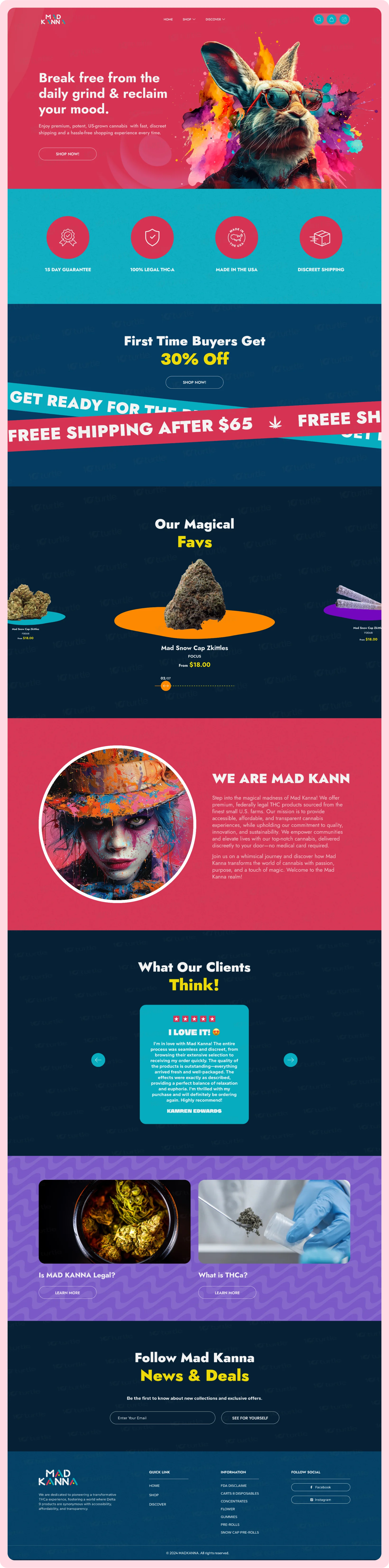
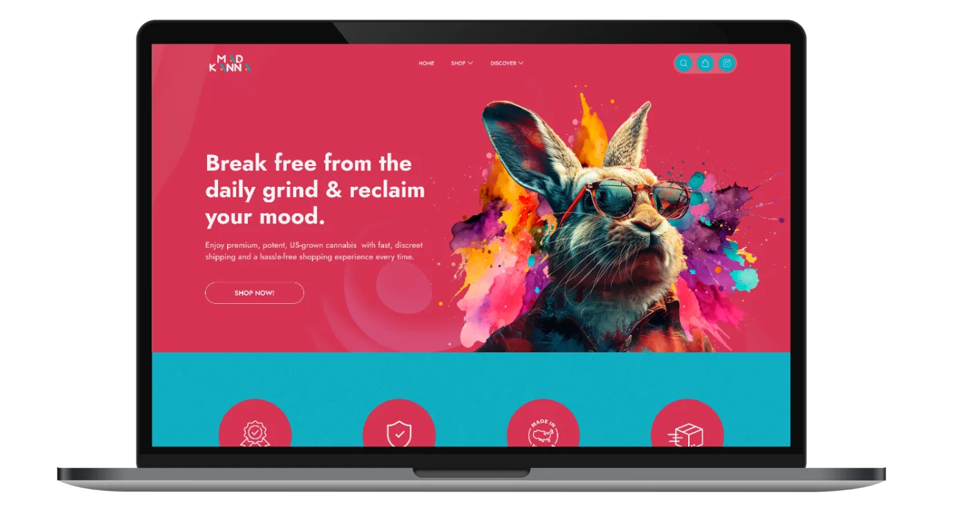
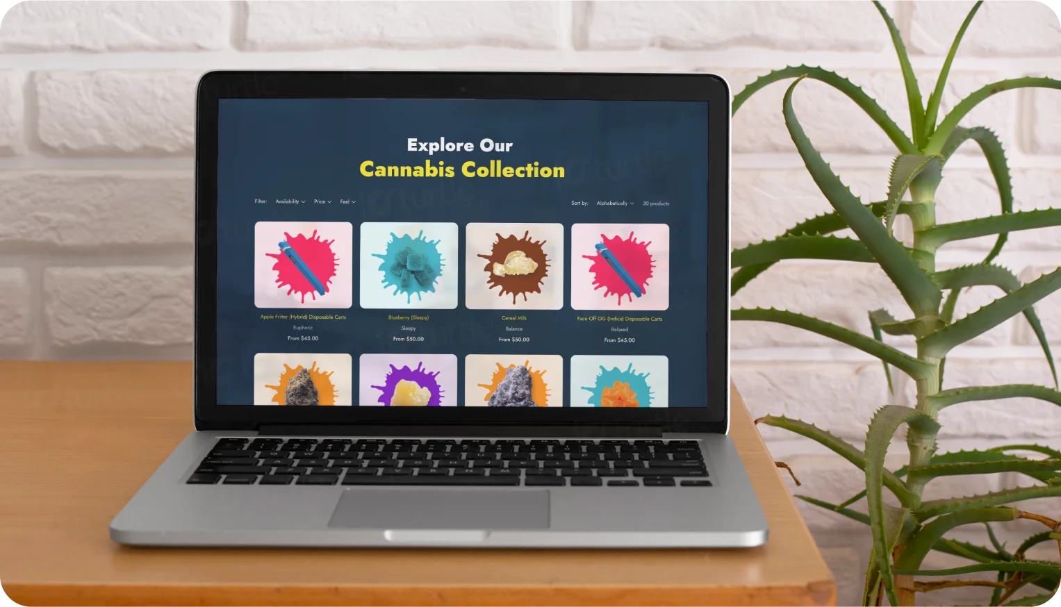
To address these challenges, a comprehensive redesign was undertaken. The new design emphasizes vibrant, bold visuals and a clean, modern layout to reflect Mad Kanna’s dynamic ethos. By integrating a user-centric approach, we optimized the website’s structure, improved its navigation, and incorporated impactful storytelling to build emotional connections. The result is a visually engaging and functionally robust website that effectively showcases the brand's offerings and values.
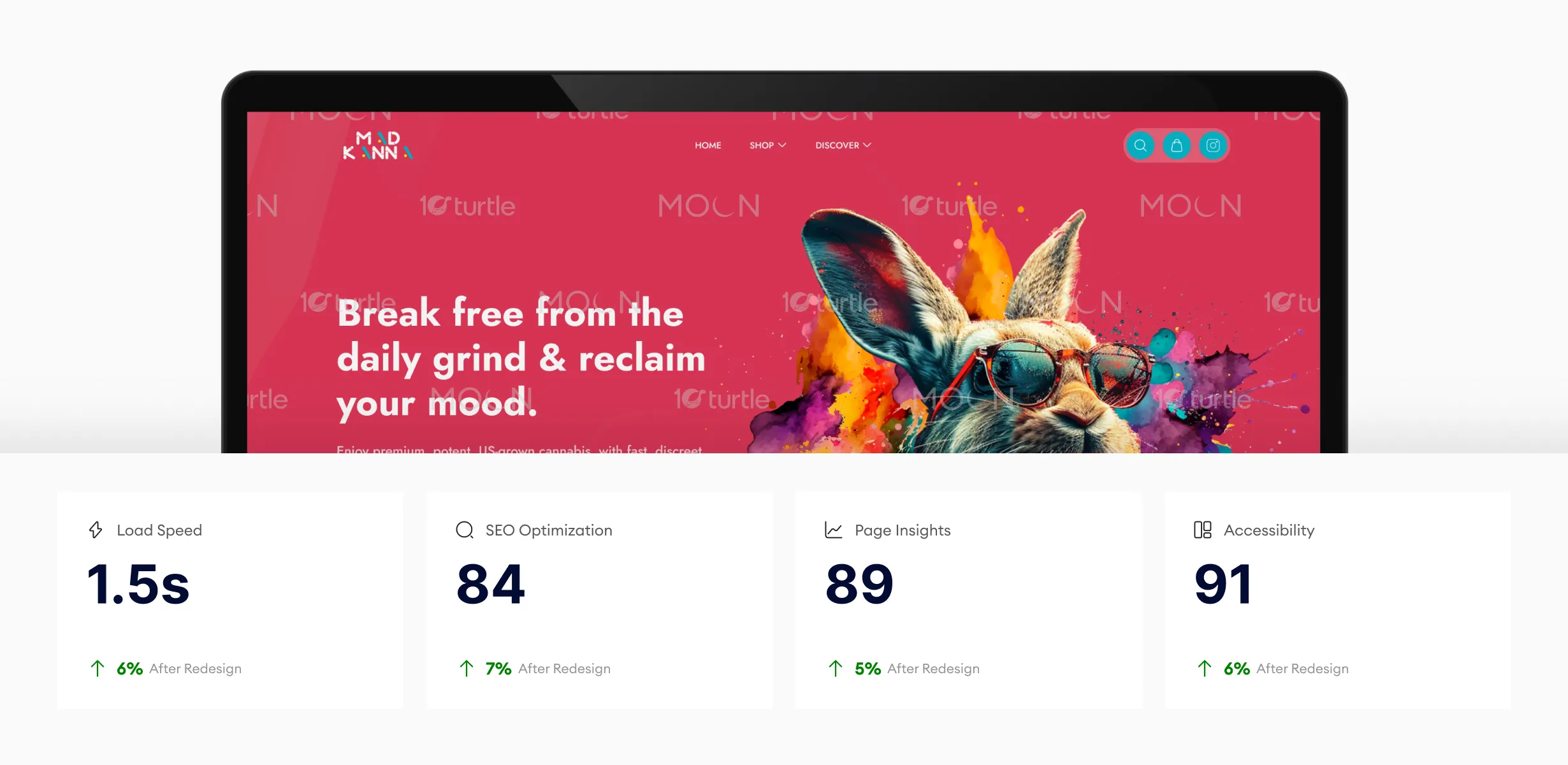
The design’s optimizations in load speed, SEO, and accessibility provide a faster, more engaging experience for users. The higher page insights score indicates strong user engagement, while the accessibility improvements ensure smoother navigation for all users. These enhancements help drive higher conversion rates and a better overall experience.
Mad Kanna envisioned a website that encapsulated their unique identity—a vibrant, bold, and modern platform that aligned with their innovative approach to cannabis products. The design needed to convey authenticity, build trust, and provide a seamless shopping experience. The client prioritized high-impact visuals, a narrative-driven layout, and user-friendly functionality to leave a lasting impression on customers while standing out in a competitive market.
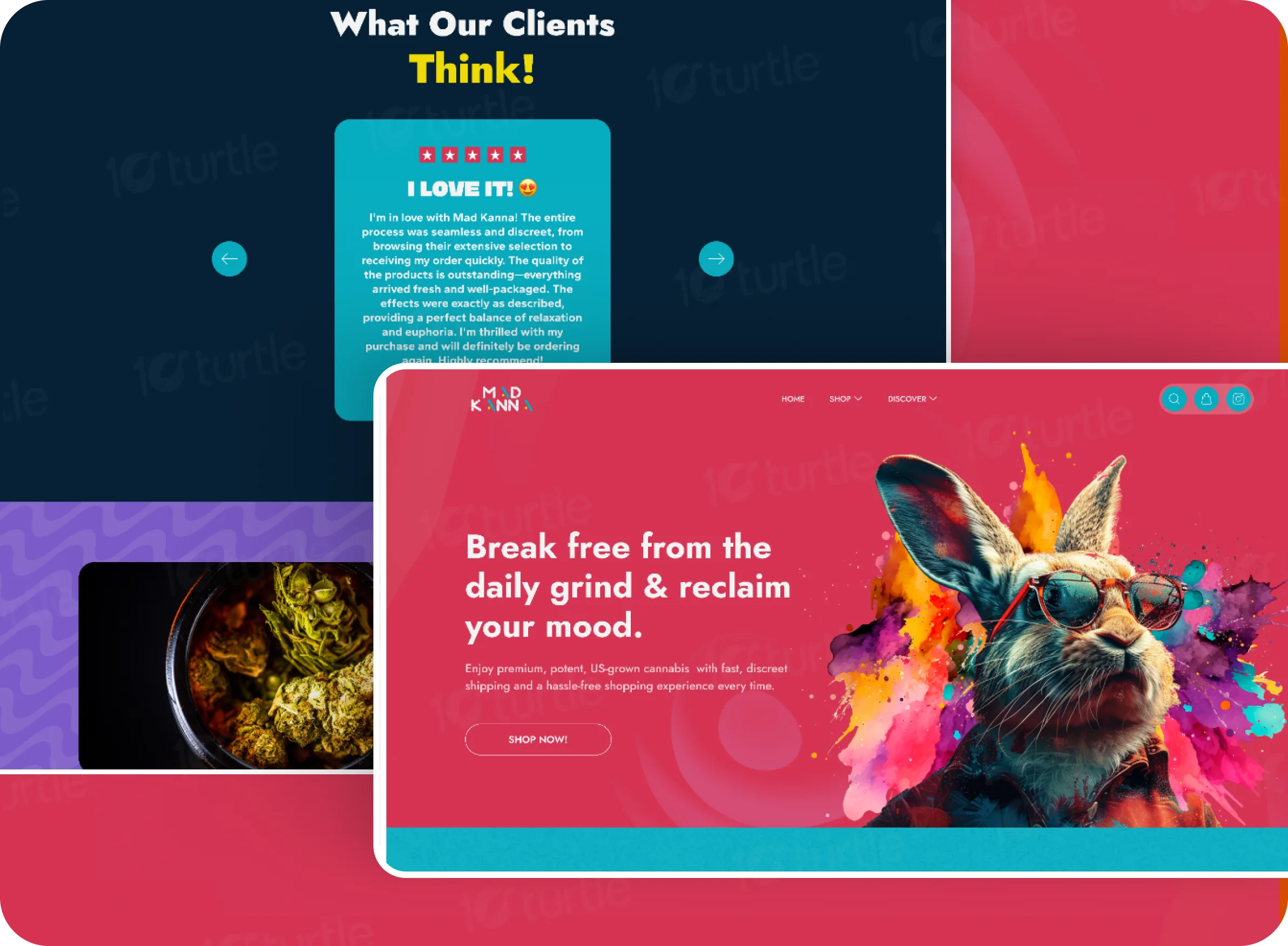
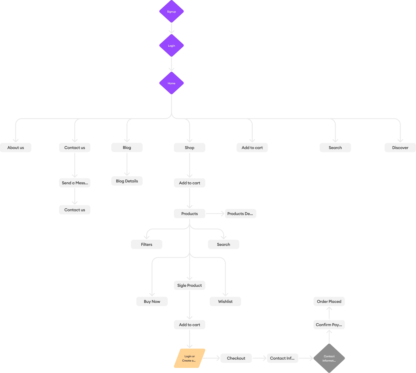
The redesigned user flow prioritizes accessibility and simplicity. From the homepage, users can effortlessly navigate to key sections, such as the product catalog, the “About Us” page, and the FAQs. The shopping process was streamlined to ensure users could easily browse products, learn about their benefits, and make informed purchasing decisions. Clear calls-to-action and intuitive pathways guide users through product discovery to checkout, minimizing friction and maximizing satisfaction.
The Mad Kanna logo is designed to embody the vibrant and dynamic personality of the brand. Its playful typography, featuring colorful accents and geometric styling, captures the innovative and bold approach that Mad Kanna brings to the cannabis industry. The rounded edges and bright elements convey a sense of energy, approachability, and trustworthiness, reflecting the brand's commitment to excellence and inclusivity.

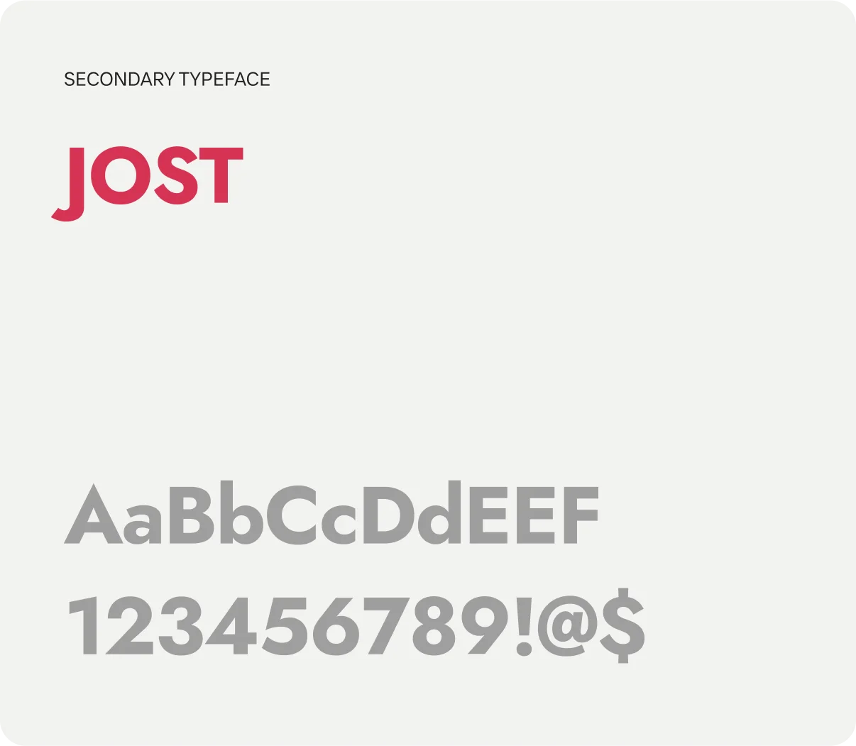
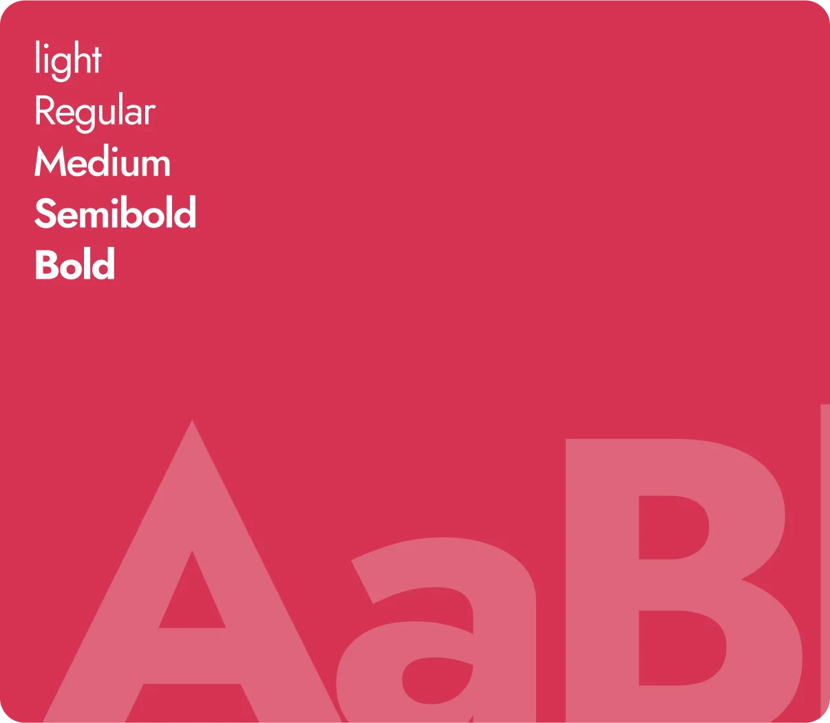
The chosen font, Jost, offers a clean and contemporary look that enhances readability and aligns with the modern aesthetic of the Mad Kanna brand. Its geometric sans-serif style complements the bold, energetic vibe of the logo while maintaining a professional and user-friendly tone throughout the website.
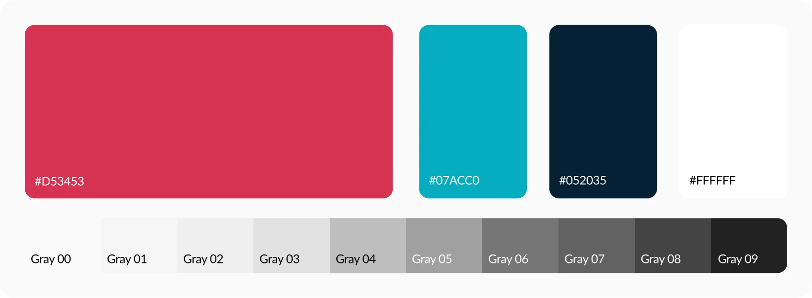
Mad Kanna’s primary brand color is #D53453, a vibrant red that exudes passion and creativity. Supporting this are the secondary colors: #07ACC0 (a bright cyan symbolizing freshness and innovation), #052035 (a deep navy blue conveying trust and stability), and #FFFFFF (pure white for a clean and minimal aesthetic). Together, these colors create a visually striking palette that enhances the brand’s bold identity and ensures consistency across digital and print platforms.
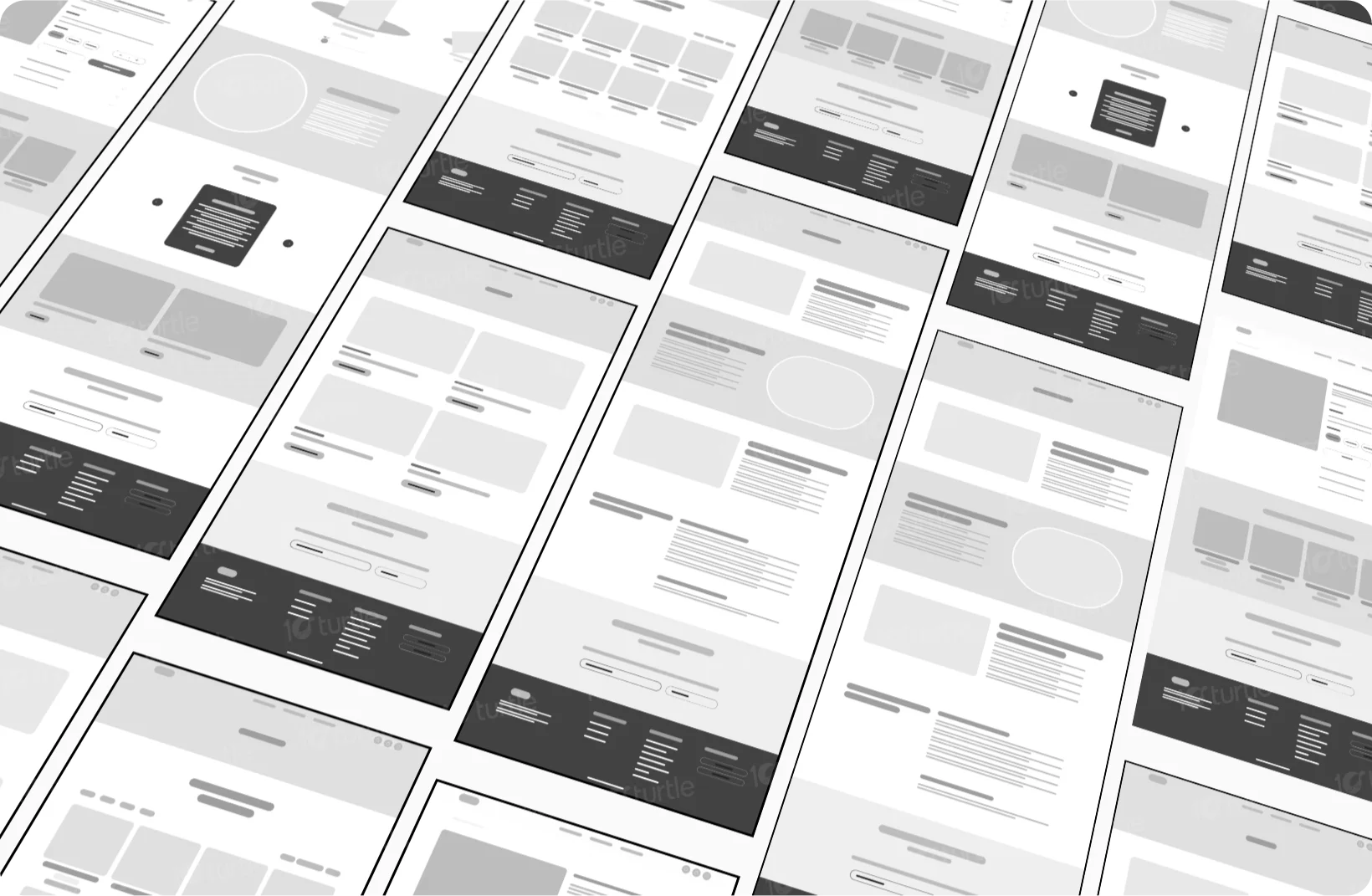
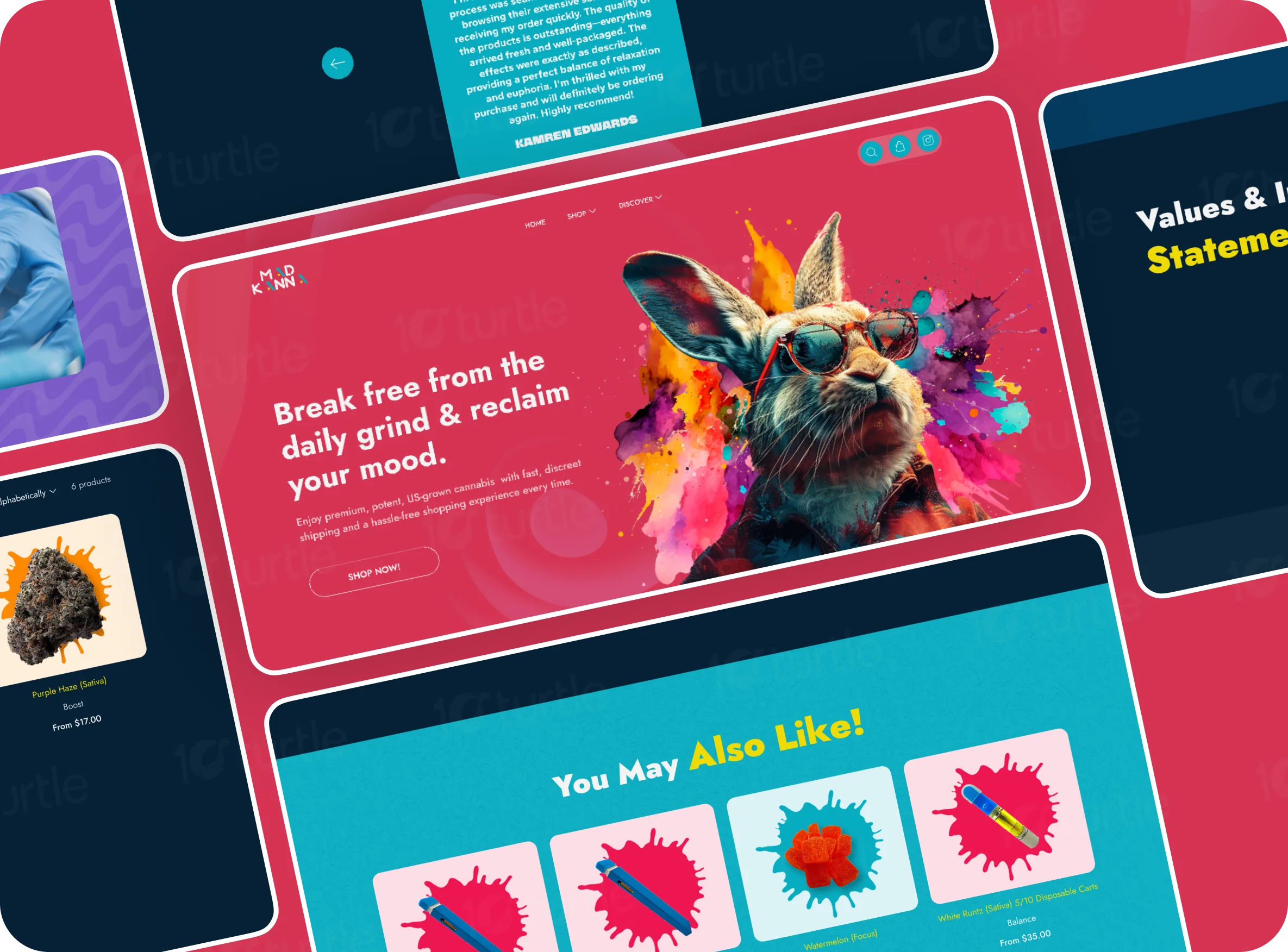
The wireframe for Mad Kanna’s redesign focused on creating a user-centric experience. Key design elements included a prominent hero section, well-defined content blocks for storytelling, and a strategically placed navigation bar. The wireframe allowed for the seamless integration of visuals, product details, and calls-to-action, ensuring users could intuitively interact with the website. The structure emphasized a natural flow from brand introduction to product exploration and checkout.