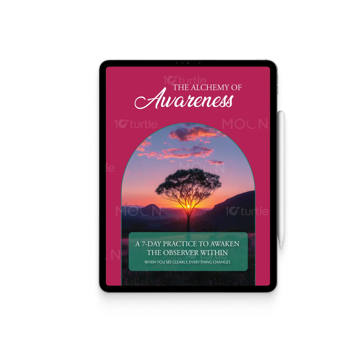
The design embraces a calm, immersive, and reflective visual language that mirrors the theme of awareness and inner stillness, using soft organic shapes, rounded containers, and balanced white space to create a sense of openness and safety. Elegant serif headers combined with subtle script accents introduce warmth while maintaining clarity and authority, and nature-inspired imagery such as sunsets, flowers, and expansive landscapes supports the emotional tone without overwhelming the content. Deep rose, forest green, muted earth tones, and structured layouts work together to establish consistency, guide the reader’s eye naturally, and create a clear hierarchy that ensures key ideas, reflections, and practices are easily understood and visually cohesive.
E-Book Design
Graphic Design
Industry
Healthcare & Wellness
Tools we used


Project Completion
2025
Key Market
Global
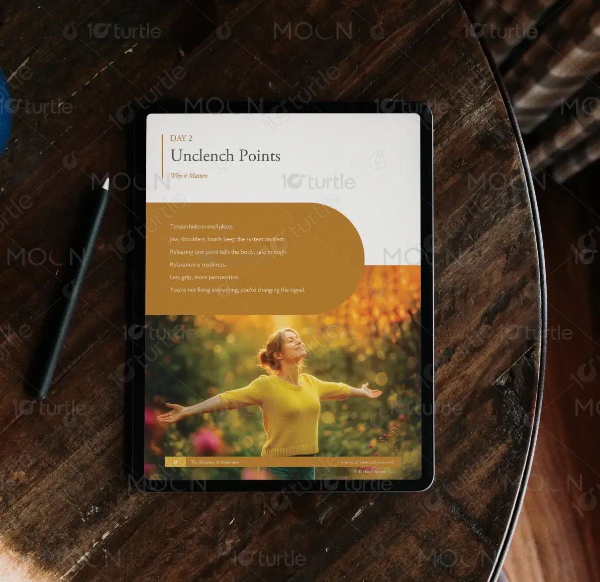
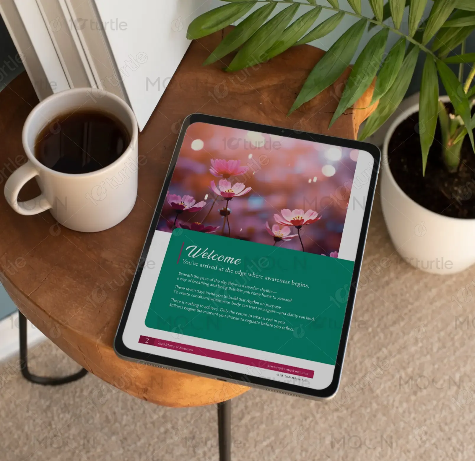
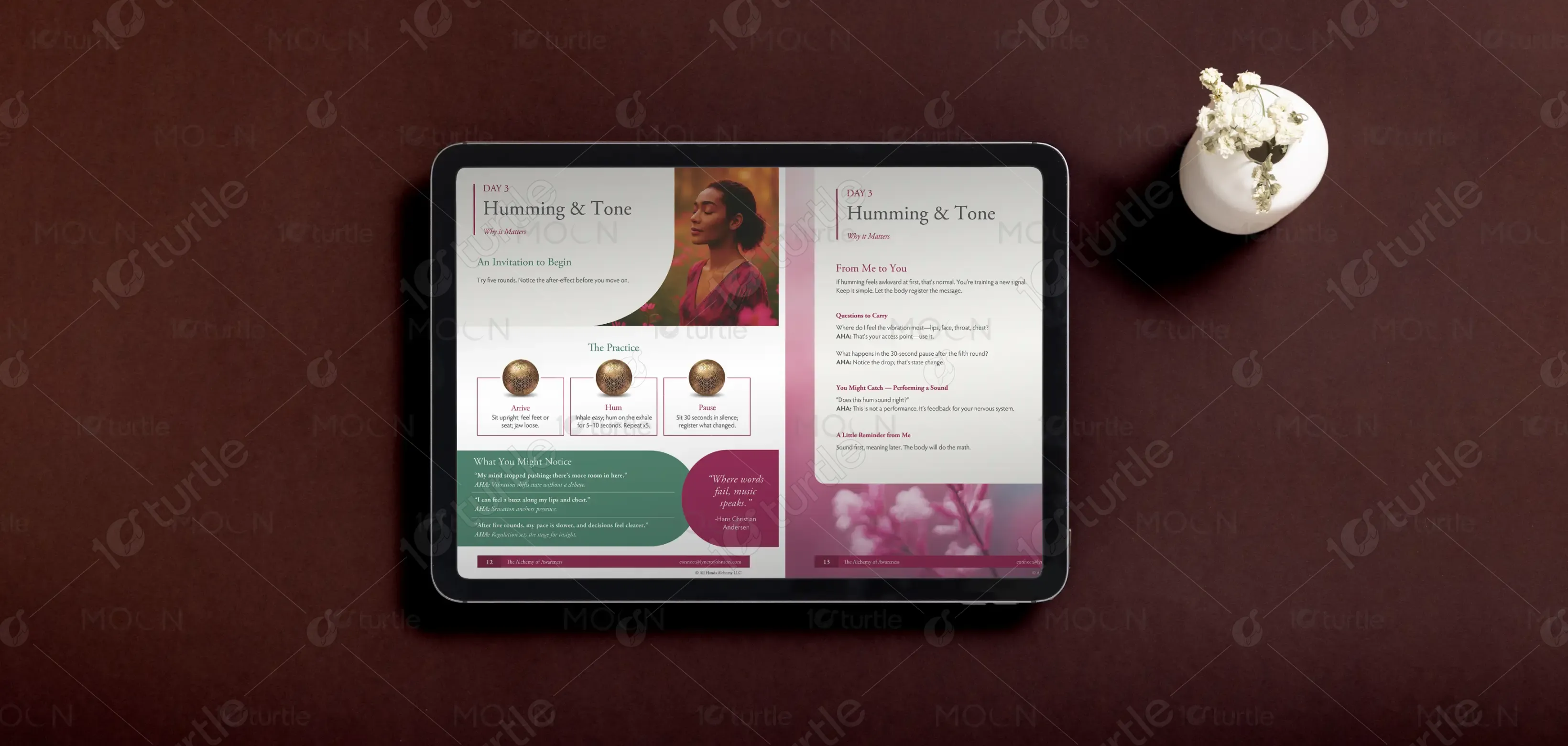
The Alchemy of Awareness is a 7-day guided mindfulness e-book designed to help individuals reconnect with their breath, body, and inner observer through short, practical exercises and reflective prompts that build emotional regulation and clarity. Positioned within the personal development and nervous system awareness space, the design supports a structured yet gentle experience where each day introduces a focused theme and integrates reflection, explanation, and action in a clear, approachable format that encourages daily engagement and sustained participation.
Industry
Healthcare & WellnessWhat we did
E-Book DesignGraphic DesignPlatform
-Many mindfulness and self-development resources suffer from dense text, inconsistent layouts, abstract messaging, or visually overwhelming presentations that reduce engagement and make it difficult for users to apply concepts in real life, often contributing to cognitive overload rather than calm. For individuals already navigating fast-paced environments and mental strain, unclear visual hierarchy and scattered communication diminish trust and retention, creating a gap between intention and practical implementation that limits the effectiveness of the content.
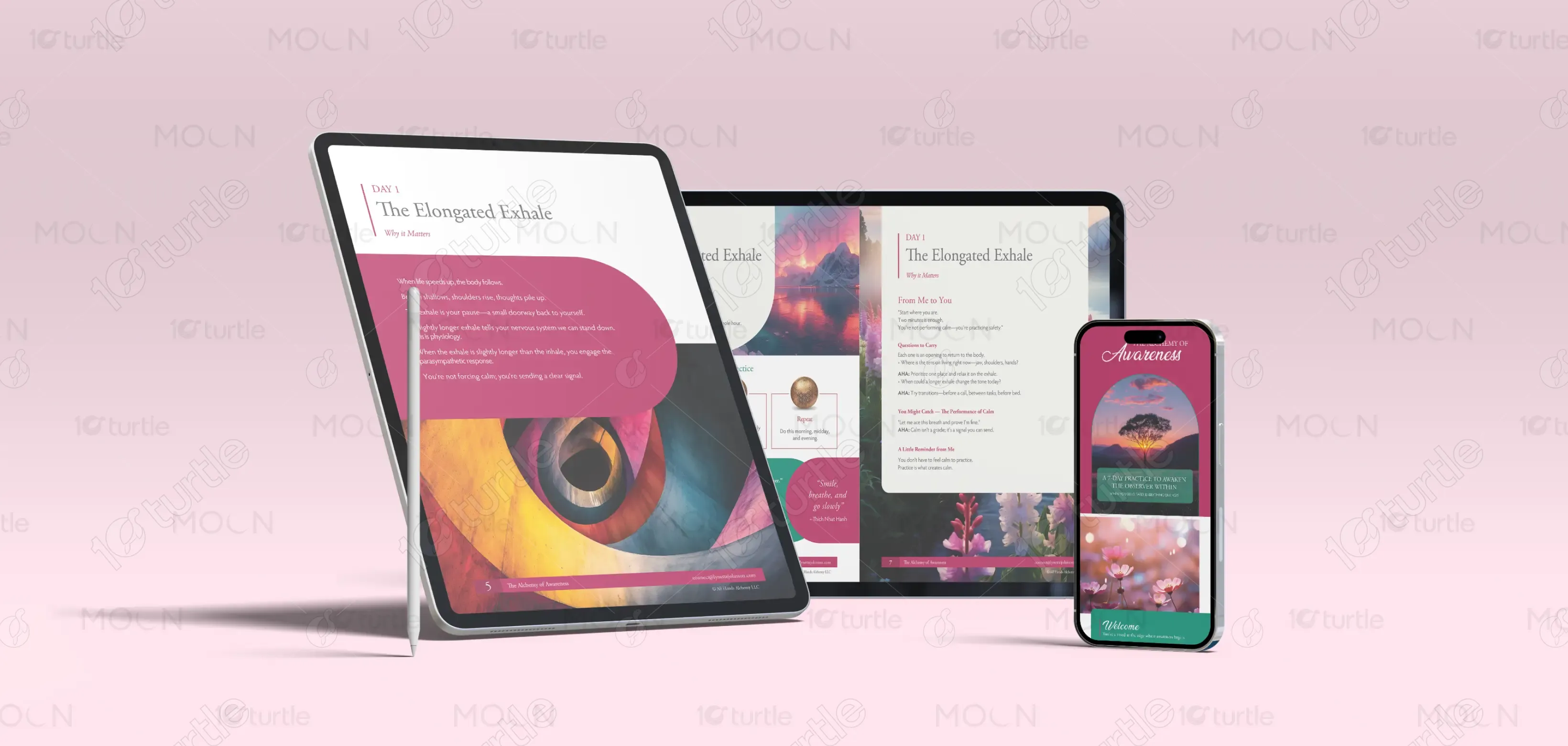
The design resolves these challenges by prioritizing clarity, rhythm, and structured visual hierarchy, presenting each day with consistent headings, clearly separated content sections, and thoughtfully spaced layouts that reduce cognitive strain and support easy navigation. Rounded containers and color segmentation distinguish reflections, practices, and key insights, while a balanced integration of imagery and text enhances emotional resonance without distraction, creating a modular system that allows each day to function independently while contributing to a cohesive and scalable overall experience.

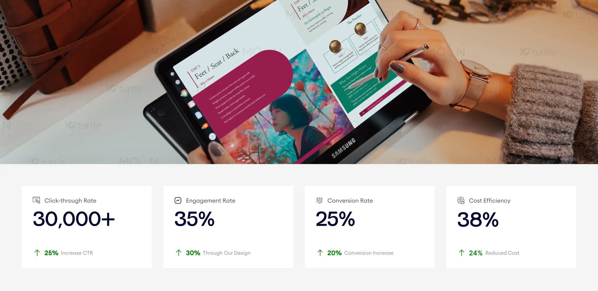
This digital design effectively communicates mindfulness and clarity with soft organic shapes and calming imagery, which directly correlates with higher engagement and increased conversions. The structured content hierarchy ensures users are naturally guided through the process, while the design's warm, yet clear tone fosters trust. Business metrics like conversion rate and engagement rate are positively impacted by the well-executed emotional appeal and visual flow, driving both customer satisfaction and retention.
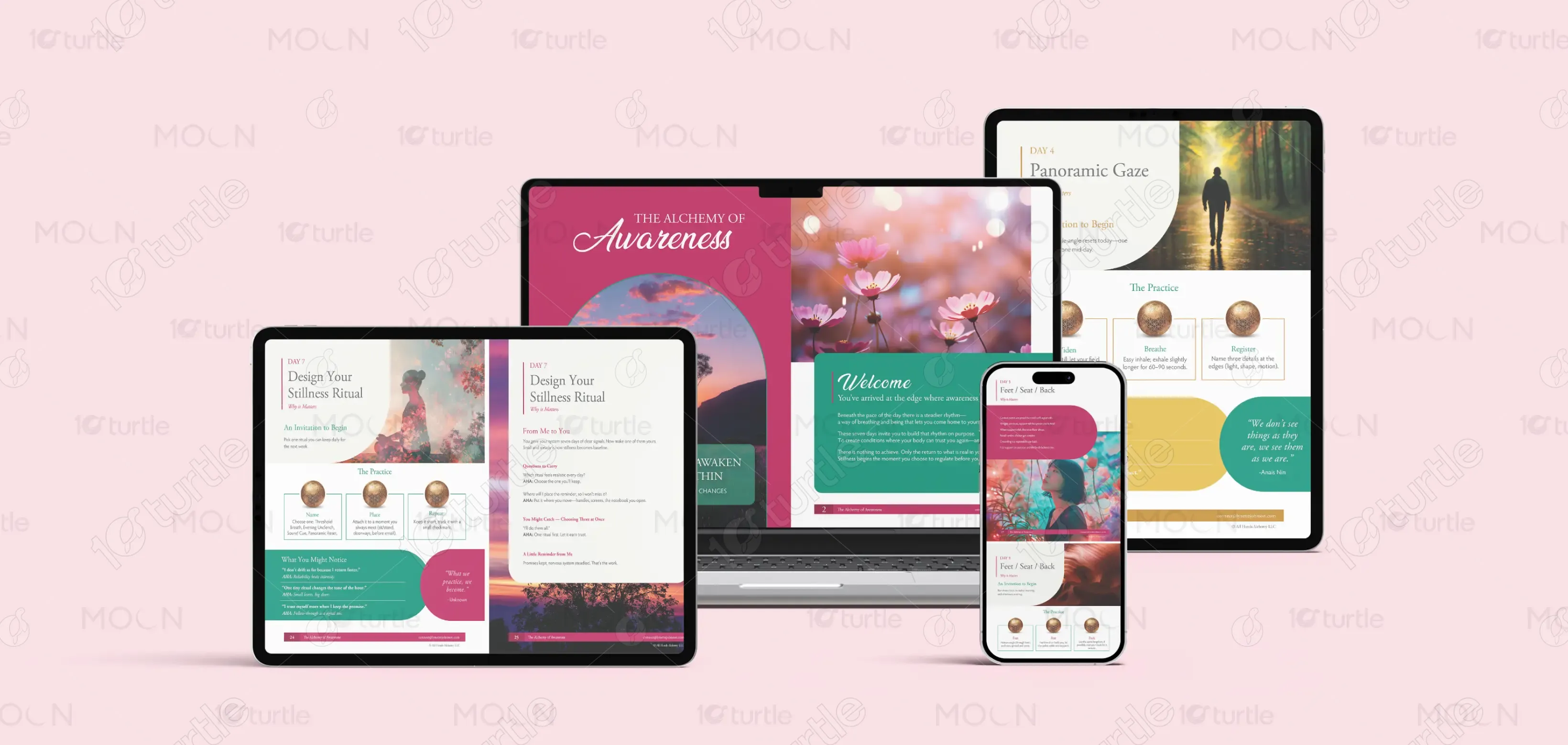
The long-term vision for The Alchemy of Awareness is to establish a refined and recognizable design system that can expand into journals, workshops, digital courses, and additional guided programs while maintaining visual consistency and emotional integrity. By combining timeless typography, a signature color palette, and a calm yet structured layout approach, the design positions the brand as a credible and enduring presence in the mindfulness and emotional regulation space, supporting growth across multiple platforms without losing clarity or identity.

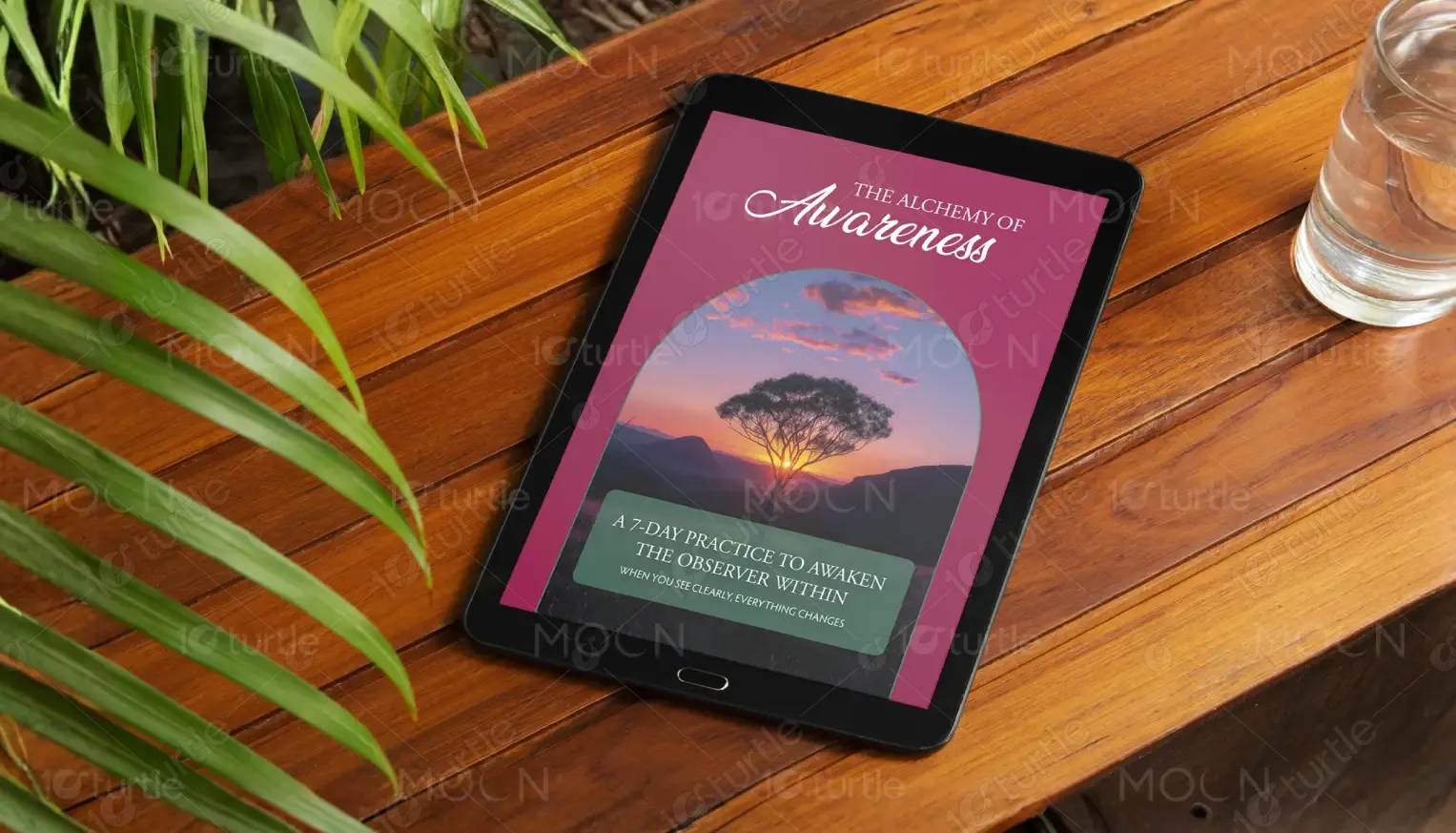
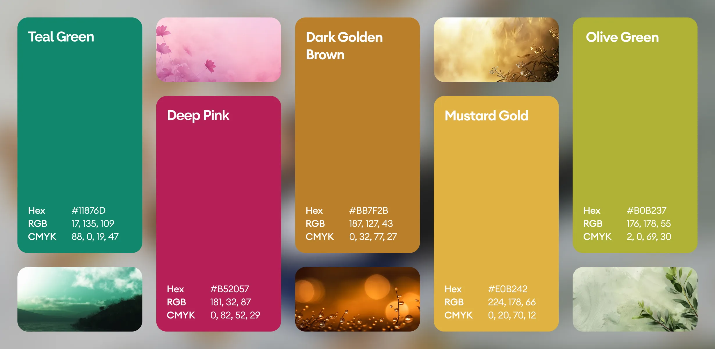
The color palette combines deep rose and magenta tones to express emotional depth and transformation, forest and olive greens to convey grounding and growth, and soft neutral backgrounds to ensure readability and visual calm, while nature-based imagery reinforces themes of transition, reflection, and renewal. The overall visual language is organic, spacious, and refined, using warm gradients, curved forms, and balanced composition to evoke safety and continuity while maintaining clarity and adaptability across print and digital formats.